Gonçalo Barreto Ferreira Marcelino
Master of ScienceA computational approach to the art of visual
storytelling
Dissertation submitted in partial fulfillment of the requirements for the degree of
Master of Science in
Computer Science and Informatics Engineering
Adviser: Dr. João Miguel da Costa Magalhães, Assistant Professor, NOVA University of Lisbon
Examination Committee Chairperson: Dr. João Leite
Raporteur: Dr. Bruno Martins Member: Dr. João Magalhães
A computational approach to the art of visual storytelling
Copyright © Gonçalo Barreto Ferreira Marcelino, Faculty of Sciences and Technology, NOVA University Lisbon.
The Faculty of Sciences and Technology and the NOVA University Lisbon have the right, perpetual and without geographical boundaries, to file and publish this dissertation through printed copies reproduced on paper or on digital form, or by any other means known or that may be invented, and to disseminate through scientific repositories and admit its copying and distribution for non-commercial, educational or research purposes, as long as credit is given to the author and editor.
This document was created using the (pdf)LATEX processor, based in the “novathesis” template[1], developed at the Dep. Informática of FCT-NOVA [2].
Ao meu eu futuro. Que não te arrependas das minhas escolhas, que o esforço que estou a fazer agora te ajude a ser
um moço feliz. Um bem haja.
Ac k n o w l e d g e m e n t s
I would like to thank,
my Advisor, João Magalhães, for all the help, the recommendations and indispensable encouragement that made this project possible. It was a pleasure to work under the your guidance;
my colleagues and friends David Semedo, Flávio Martins, André Mourão, Gustavo Gonçalves, not only for the technical help you provided me during the course of the year that passed (I learned much from you) but also for... everything else;
All the friends I made during these past 5 years, even those those to whom I eventually stopped speaking to or who stopped speaking to me;
my family, Ana Baru, Vanessa Sofia, André Pontes and my mother Luisa, without you I wouldn’t be myself;
FCT/UNL, for 5 years worth of knowledge, friendships and new experiences.
CMU Portugal research project GoLocal Ref. CMUP-ERI/TIC/0033/2014; the H2020 ICT project COGNITUS with the grant agreement No687605 and the NOVA LINCS project Ref. UID/CEC/04516/2013 for funding this work.
A b s t r a c t
For millennia, humanity as been using images to tell stories. In modern society, these visual narratives take the center stage in many different contexts, from illustrated chil-dren’s books to news media and comic books. They leverage the power of compounding various images in sequence to present compelling and informative narratives, in an imme-diate and impactful manner. In order to create them, many criteria are taken into account, from the quality of the individual images to how they synergize with one another.
With the rise of the Internet, visual content with which to create these visual storylines is now in abundance. In areas such as news media, where visual storylines are regularly used to depict news stories, this has both advantages and disadvantages. Although con-tent might be available online to create a visual storyline, filtering the massive amounts of existing images for high quality, relevant ones is a hard and time consuming task. Fur-thermore, combining these images into visually and semantically cohesive narratives is a highly skillful process and one that takes time.
As a first step to help solve this problem, this thesis brings state of the art computa-tional methodologies to the age old tradition of creating visual storylines. Leveraging these methodologies, we define a three part architecture to help with the creation of vi-sual storylines in the context of news media, using social media content. To ensure the quality of the storylines from a human perception point of view, we deploy methods for filtering and raking images according to news quality standards, we resort to multimedia retrieval techniques to find relevant content and we propose a machine learning based approach to organize visual content into cohesive and appealing visual narratives.
R e s u m o
Desde os tempos primórdios que a humanidade tem feito uso da imagem como meio de transmitir histórias. No entanto, na sociedade actual, estas narrativas visuais ganharam uma nova importância. Desde ilustrar livros infantis, até informar no contexto de peças jornalísticas, este medium é frequentemente usado pela sua habilidade de apresentar informações de maneira interessante e imediata.
Com o crescimento da Internet, o conteúdo visual através do qual é possível criar estas narrativas tornou-se abundante. Para a imprensa, que faz uso frequente de narrati-vas visuais para ilustrar noticias, esta mudança trouxe ambas vantagens e desvantagens. Embora possa existir conteúdo de qualidade, online, para ilustrar uma notícia, o processo de encontrar esse conteúdo e organiza-lo de uma forma coesa e apelativa, é uma tarefa demorada e difícil.
Como primeiro passo para resolver este problema, nesta tese propomos trazer o uso de metodologias que são o estado da arte na area das ciências da computação, para auxiliar jornalistas e editores neste processo criativo. Fazendo uso destas metodologias, definimos uma arquitectura composta por três módulos que permite a criação de narrativas visuais através de conteúdos retirados das redes sociais.
C o n t e n t s
List of Figures xvii
List of Tables xxi
1 Introduction 1
1.1 Context, motivation and challenges . . . 1
1.1.1 Social media in the newsroom . . . 2
1.2 Problem statement . . . 3
1.3 Objectives and proposed solution . . . 4
1.3.1 Ranking by news quality . . . 5
1.3.2 Retrieving relevant content . . . 5
1.3.3 Creating the storyline. . . 6
1.4 Contributions . . . 6
1.5 Document structure . . . 7
2 Related work 9 2.1 Introduction . . . 9
2.2 Identifying quality content . . . 9
2.2.1 Aesthetics . . . 10 2.2.2 Memorability . . . 11 2.2.3 Interestingness . . . 13 2.2.4 Exoticism. . . 13 2.2.5 SPAM detection . . . 14 2.2.6 Other . . . 14 2.3 Multi-document summarization . . . 15 2.3.1 Social media . . . 15
2.3.2 Personal photo stream . . . 17
2.3.3 Other . . . 18
2.4 Storyline creation and editing . . . 18
2.4.1 Professional . . . 18
2.4.2 Automatic . . . 19
C O N T E N T S
3 An evaluation framework for visual storylines 23
3.1 Introduction . . . 23
3.2 Dataset and queries . . . 24
3.3 Ground truth generation . . . 25
3.4 Visual storyline quality metric . . . 25
3.5 Metric evaluation . . . 28
3.6 Visual storylines guidelines . . . 28
3.7 Conclusion . . . 29
4 Ranking news-quality multimedia 33 4.1 Introduction . . . 33
4.2 Finding news-quality pictures . . . 34
4.3 Ranking by news-quality . . . 35
4.3.1 Visual quality . . . 36
4.3.2 Visual concepts . . . 37
4.3.3 Social signals . . . 38
4.4 Visual SPAM and redundancy . . . 39
4.4.1 Coarse filtering . . . 40
4.4.2 Synthetic images detection . . . 40
4.4.3 Visual redundancy . . . 40
4.5 Evaluation . . . 41
4.5.1 Datasets . . . 41
4.5.2 News-quality photos ground truth . . . 42
4.5.3 Results and discussion . . . 43
4.6 Conclusions . . . 48
5 Story illustration candidates 49 5.1 Introduction . . . 49
5.2 Retrieving relevant content . . . 50
5.2.1 Text retrieval. . . 50
5.2.2 Reranking with social signals . . . 51
5.2.3 Reranking with visual concepts . . . 52
5.2.4 Reranking with temporal signals . . . 52
5.3 Evaluation . . . 54 5.3.1 Protocol . . . 54 5.3.2 Ground truth . . . 54 5.3.3 Results . . . 54 5.3.4 Discussion . . . 58 5.4 Conclusions . . . 58
6 Structuring visual storylines 61 6.1 Introduction . . . 61
C O N T E N T S 6.2 Definitions . . . 63 6.3 Transition quality . . . 63 6.3.1 Visual aesthetics. . . 65 6.3.2 Semantics . . . 65 6.4 Story illustration. . . 66
6.4.1 Sequence of bipartite graphs - Shortest path . . . 66
6.4.2 Multipartite graph - Minimal clique . . . 68
6.5 Evaluation . . . 71
6.5.1 Crowd sourcing transition quality data. . . 71
6.5.2 Transition quality model . . . 73
6.5.3 Creating storylines . . . 74
6.6 Conclusion . . . 77
7 Conclusions and future work 81 7.1 Conclusion . . . 81
7.2 Impact in the newsroom . . . 82
7.3 Future work . . . 82
7.4 Research opportunities . . . 83
L i s t o f F i g u r e s
1.1 Examples of how our ancestors used images to tell stories. On the left, carvings of acient Egyptians fishing, present in the tomb of Kagemni, a vizier of ancient Egypt. Source: [51]. On the right the interior of the Scrovegni chapel situated
in Padua, Italy, with murals depicting the life of Christ. Source: [45].. . . 1
1.2 Topics and segments and the process of creating a visual storyline. Source of the Tour de France news story being illustrated: https://www.bbc.com/sport/ cycling/36879128. . . 4
1.3 Visual storyline creation framework. . . 5
2.1 Usage of the Rule of Thirds in a photography by Henri Cartier-Bresson with Rule of Thirds division lines in overlay. The degree to which the rule is applied greatly varies from photography to photography while also being highly open to interpretation. Source: [50]. . . 10
2.2 High level features used in [10] to predict aesthetic quality of images. Source: [10]. . . 11
2.3 Different images and their memorability in the context of a memory game. The percentages presented are the amount of participants in the memory game that
remembered the images. Source: [20] . . . 12
2.4 Pipepile for image interestingness prediction with low level features extracted from [24]. Source: [10]. . . 13
2.5 Images unsuitable for summarization. Source: [37]. . . 14
2.6 Spikes in the volume of data published to Twitter relative to three different football matchs. As shown the spikes tend to align with the important parts of the match. Source: [34]. . . 16
2.7 The pair of scenes on the left does not follow the gaze continuity rule, while the pair of scenes on the right does. Source: [30]. . . 20
2.8 The column on the left shows the scenes selected in an automated way by the system proposed in [48] for the trailer of the movie Morgan. The column on the right shows the final trailer’s scenes, after being manually improved by professional editors. The blue arrows show the chance in order applied to the
L i s t o f F i g u r e s
3.1 Visual storyline interface used in the experiments conducted throughout this thesis. In this particular case presenting a storyline created using content extracted from Twitter. Source: [33] . . . 26
3.2 Methodology for evaluating visual storyline illustration. . . 27
4.1 Highlight of the first module of the visual storyline generation framework. . 33
4.2 The framework for ranking news-quality pictures in social-media is leveraged by a machine learning algorithm that merges social, visual, semantic and aesthetic evidence.. . . 34
4.3 Example of a Decision Tree for binary classification using binary features, after training. Here the problem is that of predicting if a traffic accident will occur given the state of the driver as input. . . 35
4.4 A visual representation of the features presented in Table 4.1. . . 37
4.5 Examples of unwanted images that can be immediately discarded (i.e., logos, adverts and memes). . . 39
4.6 Example of near-duplicate images. The first is the original image. The second is a cropped version of the first with different contrast. . . 40
4.7 True positives: examples of images the annotators correctly assessed as being extracted from news media. . . 43
4.8 False negatives: examples of images the annotators incorrectly assessed as not being extracted from news media. . . 44
4.9 Precision recall curves of the various ranking models. . . 46
4.10 The importance of each feature measured through its gain and cover in the
Gradient Boosted Trees regression model. . . 47
5.1 Highlight of the second module of the visual storyline generation framework. 49
5.2 Finding relevant candidate images to illustrate each segement of a story.. . . 50
5.3 Amount of tweets containing the wordfireworks in the 2016 Edinburgh Festival
dataset published per day of the event. . . 53
5.4 Average performance of the baselines in the task of illustrating the EdFest 2016 (dark blue) and TDF 2016 (light blue) stories, according to the annotators,
measured by the quality metric proposed in Chapter 3. . . 55
5.5 Illustrations of the “Happy moments at Tour de France 2016” story achieved
by resorting to theBM25 and #Duplicates baselines. Although all images of
both storylines were considered relevant by the the annotators to the segments they illustrate, the transitions of the storyline created by the#Duplicates bae-selines were consistently annotated as having higher quality then those of the storyline created by theBM25 baseline.. . . 55
L i s t o f F i g u r e s
5.6 Illustrations of the “Music shows at Edinburgh Festival 2016” story achieved
by resorting to theConcept Pool, Concept Query, Temp. Modeling and #Retweets
baselines. From top to bottom, they attained an average score of 0.83, 0.5, 0.25 and 0.17 regarding illustration relevance, respectively, according to the annotators. . . 57
6.1 Highlight of the third and last module of the visual storyline generation frame-work. . . 61
6.2 Generating visual storylines by taking into account transition quality and the relevance of illustrations to their respective segments. Green arrows represent the need to find relevant content in a pool of candidate images while red
arrows represent the need to optimize for transition quality.. . . 62
6.3 Example of a graph for storyline creation using theSequential approach, for a 4 story segment. Images are represented by the vertices of the graph, each vertex belonging to a candidate set Ci. The cost associated with an edge directed from
vertices vxto vy is given by the pairCost(vx, vy) function. . . 67
6.4 Example of 3-partite graph for storyline creation using the Fully connected
approach, for a 3 story segment. Images are represented by the vertices of the
graph, each vertex belonging to a candidate set Ci. The cost associated with
an edge connecting vertices vx to vyis given by the pairCost(vx, vy) function. 69
6.5 Example of a clique containing three vertices, each from a different candidate set, for graph depicted in Figure 6.4. Highlighted vertices (images) and the
green edges indicate the parts of the graph that belong to the clique. . . 70
6.6 Average performance of the baselines described in Section 6.5.1 in the task of illustrating the EdFest 2016 (dark blue) and TDF 2016 (light blue) stories, ac-cording to the annotators, measured by the quality metric proposed in Chapter 3. . . 72
6.7 Illustrations of the “Music shows at Edinburgh Festival 2016” story achieved by resorting to theColor histogram and Entropy baselines. The transitions of the
storyline created with theColor histogram baseline obtained an average score
of 1 while the ones in the storyline created by theEntropy baseline obtained
an average score of 0.6. . . 73
6.8 Illustrations of the “Wide variety of performers at Edinburgh Festival 2016”
story achieved by resorting to theCNN Dense and Luminance baselines. The
transitions of the storyline created with theCNN Dense baseline obtained an
average score of 0.93 while the ones in the storyline created by theLuminance
baseline obtained an average score of 0.87. . . 74
6.9 The performance of the different graph based approaches at illustrating the EdFest 2017 stories. . . 76
6.10 The performance of the different graph based approaches at illustrating the TDF 2017 stories. . . 77
L i s t o f F i g u r e s
6.11 Illustrations of the “What is Edinburgh Festival 2017” story achieved by re-sorting to methods described in Section 6.4. From top to bottom, they attained an average score of 0.76, 0.81, 0.75 and 0.86 regarding the quality metric, respectively. . . 78
L i s t o f Ta b l e s
3.1 Summary of the characteristics of the 4 datasets. . . 25
3.2 Performance of the metric proposed in 3.4, when compared against the judge-ment of the annotators. . . 28
3.3 Edinburgh Festival 2016 stories and segments. . . 30
3.4 Tour de France 2016 stories and segments. . . 31
4.1 Visual features and respective descriptions. Figure 4.4 presents a visual rep-resentation of each of these features. . . 36
4.2 Most common visual concepts associated with news-worthy and
non-news-worthy images present in the news quality photos dataset described in
Sec-tion 4.5.1, ordered by decreasing probability of appearance. . . 38
4.3 Results of the annotations performed on the news-quality dataset according to the question "Could this image have appeared in the New York Times?". . 42
4.4 News-quality assessment results on the filtering task. Models were tested on
30% of the news-quality images dataset. . . 45
4.5 Results of the performance tests done on the various ranking models. . . 45
4.6 Examples of images ranked by four distinct models with increasing ranks from left to right. . . 46
5.1 Performance of the baselines described in the task of illustrating the EdFest 2016 and TDF 2016 stories, measured by the average relevance and transition scores provided by the annotators. . . 54
6.1 Visual features, respective distance functions and descriptions. . . 64
6.2 Semantic features, respective distance functions and descriptions. . . 64
6.3 Performance of the baselines described in Section 6.5.1 in the task of illustrat-ing the EdFest 2016 and TDF 2016 stories, measured by the average transition scores provided by the annotators. . . 72
6.4 Average performance of the graph based storyline generation methods on the task of illustrating the 2017 Edinburgh Festival and Tour de France stories, measured through the relevance and transition quality scores provided by the
C
h
a
p
t
e
r
1
I n t r o d u c t i o n
1.1
Context, motivation and challenges
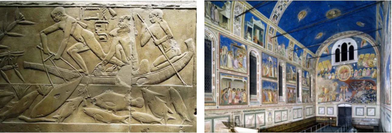
For thousands of years humanity has been telling stories through images. From carvings in prehistoric caves retelling hunts, to classical paintings of bible scenes and modern children’s books illustrations, the image has always been a key tool in the process of storytelling. It provides an immediate way of sharing narratives that transcends language barriers while having the capacity to be immensely descriptive.
This unique quality of the medium allows us to still be able to understand the stories the ancient Egyptians carved in stone 4000 years ago. Figure1.1presents such a carving. By analyzing it, one can get to know their fishing methods, even without prior knowledge
Figure 1.1: Examples of how our ancestors used images to tell stories. On the left, carvings of acient Egyptians fishing, present in the tomb of Kagemni, a vizier of ancient Egypt. Source: [51]. On the right the interior of the Scrovegni chapel situated in Padua, Italy, with murals depicting the life of Christ. Source: [45].
C H A P T E R 1 . I N T R O D U C T I O N
of the ancient Egyptian civilization and culture. Similarly, in the middle ages, it was through the visual depiction of religious scenes that Christianity came to be understood and worshiped by the general populace. In 1305, Giotto di Bondone finished his famous series of frescos in the Scrovegni chapel, depicting the life of Christ. These murals work in tandem to tell a narrative that can be understood by anyone just by observing them, proving that imagery is able to express complex tales and depict the passage of time. Although, much as changed since the these murals where painted, the inherent qualities of visual stories are still highly valuable in modern society. In fact, since the 19th century we saw the rise of many new mediums that focus on telling stories through images, such as comic books, graphic novels, manga, photography and cinema.
Today, with the large amounts of information available in the most varied contexts, the importance of being able to present compelling and informative narratives in an immediate and impactful fashion has revitalized the importance of the image. As a prime example of this, news media is focusing more and more on the usage of images to tell news stories, providing news in formats such as BBC’sIn Picture1, where news pieces are presented to the audience through selections of images accompanied by small captions.
However, the high amounts of information and images available, specially online, has also brought new challenges to the task of creating visual narratives. Rooted in the need to help solve these challenges and introduce new technologies to the millenia-old human tradition of telling stories through images, this thesis approaches visual storylines from a computational perspective, a problem yet to be solved by the research community.
In particular, we focus on the problem of creating visual storylines to illustrate news pieces using social media content.
1.1.1 Social media in the newsroom
In the context of news media, visual storylines are consistently used as way to present information to the reader in a concise yet interesting manner. Not only are news pieces normally illustrated by a carefully selected sequence of high quality images, but the image becomes the central focus of the news piece in slide shows as the ones that populate most news websites (BBC In Pictures1, Reuters Pictures2and Euronews NoComment3are just some examples). Hence, in the news room, it is the job of the journalist and the news editor to select news worthy images and to organize them in a semantically, visually coherent and appealing fashion.
However, with the advent of large scale social media platforms like Twitter, Facebook and Flickr, interesting and appealing images that can illustrate a piece of news are no longer only present in the portfolio of news photographers. User generated content has become a great source of news images as the photographic quality of mobile devices
1www.bbc.com/news/in_pictures
2www.reuters.com/news/pictures
3www.euronews.com/nocomment
1 . 2 . P R O B L E M S TAT E M E N T
continues to rise. Additionally, social media users document the events they participate in themselves, taking photos that cover many more places and perspectives, than a group of photo journalists could ever be able to create. Consequently news editors are now using user generated content found on social media when creating visual storylines.
1.1.1.1 Social media challenges
Despite the previously described advantages of using social media images to create news media storylines, there are various downsides to the approach:
• Not all social media content presents the same aesthetic quality;
• Fake and altered media are prominent on social media;
• Sources reputation varies greatly;
• There are massive amounts of content to be considered and analyzed;
• Resorting to social media content means dealing with its heterogeneous style and characteristics;
• Finding relevant content to a particular topic can be hard and time consuming.
Consequently, using social media content to create news media visual storylines is highly impractical if the full extent of the task is to be performed manually.
Hence, there is a need for the development of new tools to help the news journalists and news editors in their task. These technologies range from intelligent methods of content filtering based on respective quality and characteristics, to automated suggestions for news illustration and visual storyline creation. With these tools the news editor will be able to take full advantage of the benefits of using social media content without having to deal with the aforementioned problems.
Developed in the context of project COGNITUS, an European project that aims to combine news media, broadcasting technologies and user generated content, this thesis is a first step in this direction. It focuses on the study and development of a method to assist news editors in the process of visual storyline creation. This composes a novel research task, one that, to our knowledge, is yet to be tackled in literature.
1.2
Problem statement
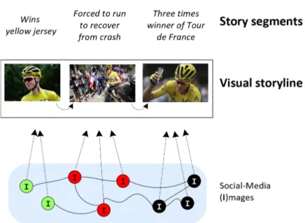
In the context of this thesis we define a visual storyline as an organized sequence of
images illustrating a sequence of textsegments related to a particular topic. Creating a
visual storyline from a topic and a set of segments means picking images to illustrate each segment. These images must not only make sense in the context of the text segment they are illustrating individually but must also form a cohesive and appealing whole when organized sequentially into a visual storyline. The objective of this thesis is to automate
C H A P T E R 1 . I N T R O D U C T I O N
Figure 1.2: Topics and segments and the process of creating a visual storyline. Source of
the Tour de France news story being illustrated:https://www.bbc.com/sport/cycling/
36879128.
this illustration process resorting to content extracted from social media. Figure 1.2
presents the topic - segments hierarchy as well and the illustration process of creating a
visual storyline for a real BBC news story with social media content.
Formally we define our query, a story as consisting of N text segments, each denoted by ui, as:
StoryN = (u1, u2, ..., uN) (1.1)
The main objective of this thesis is to create a framework, that takes as input a story
StoryN and a set of social media posts D, and outputs one or more visual storylines
StorylineN containing N social media images, each denoted by wiwhere wi∈D:
StorylineN = (w1, w2, ..., wN) (1.2)
Furthermore we aim to understand, from a computational point of view, what are the key characteristics that make particular images more apt to be used in a visual storyline, in the context of news media, and what characteristics make a storyline more appealing and coherent to the viewers consuming them.
1.3
Objectives and proposed solution
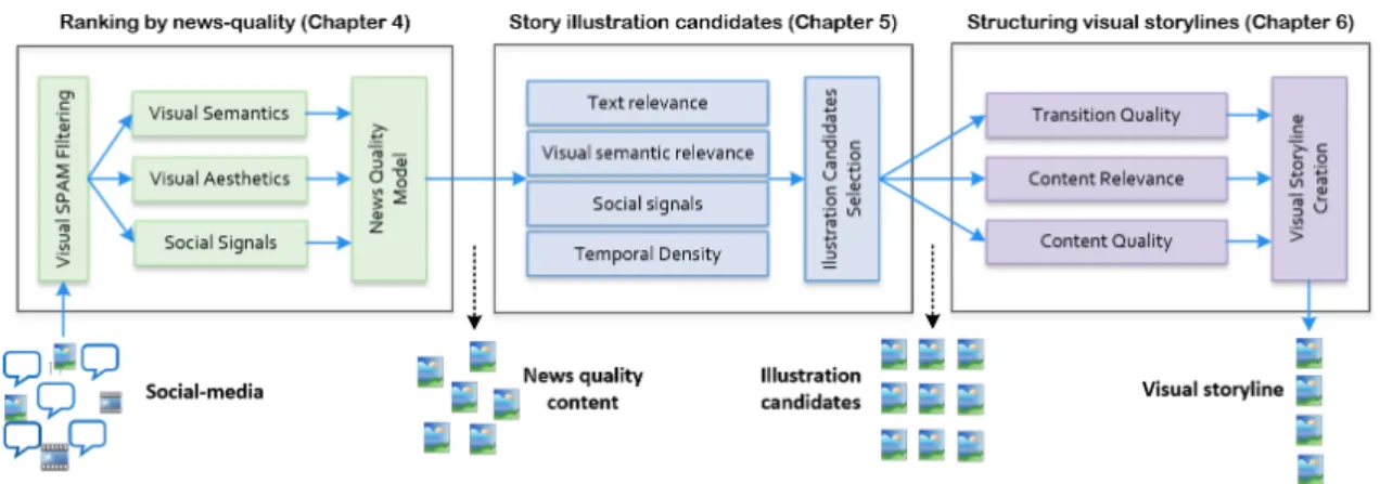
Figure1.3summarizes the architecture of the framework, composed by three modules, we propose to tackle stated problem. This linear pipeline corresponds directly to part
1 . 3 . O B J E C T I V E S A N D P R O P O S E D S O LU T I O N
Figure 1.3: Visual storyline creation framework.
of the structure of this thesis, as the first, second and third modules are described and studied in detail in Chapters 4, 5 and 6.
Our research hypothesis is that, by taking advantage of this three part architecture we are able to generate visual storylines that are perceived as having high quality by their viewers. Additionally, by taking advantage of this system we also aim to understand what key criteria can be used to optimize the process of storyline creation from a computational point of view.
The modules that compose the framework are designed as follows.
1.3.1 Ranking by news quality
The first module of the framework is designed to find content inline with news media standards in a pool of social media posts.
This means dealing directly with SPAM and content that is, overall, not suitable for use in a news media context (e.g.: digital adverts). Moreover, after filtering out SPAM one is still left with images of various degrees of quality. This means also taking into account more nuanced news media criteria when picking content. However, understanding and enforcing news media criteria in visual content is, as detailed in Chapter 2 (Related Work), a complex and nuanced task that, as far as we could tell, has not been tackled in literature. The social media images that pass this filter are then given as input to the second module of the framework.
1.3.2 Retrieving relevant content
Ensuring the storyline is comprised of quality content is not enough, as illustrating a story with quality content that is not relevant to the topic the story describes mutes the purpose of the illustration. Hence, the second module tackles the problem of retrieving relevant social media content to a particular story in an automated way. Taking as input the images filtered by the first model and a story to illustrate, this module finds candidate
C H A P T E R 1 . I N T R O D U C T I O N
images to illustrate each segment of the story and provides them to the third and final module that composes the framework.
1.3.3 Creating the storyline
As already described, a visual storyline is an ordered sequence of images and, as noted in Chapter 2, the way these images are ordered affects how they are perceived: from a human cognition point of view a visual storyline is expected to be semantically and visually coherent while providing an interesting narrative that unfolds over time. Taking the candidate images outputted by the second module as input, this final module is tasked with generating storylines with the candidate images that reflect these characteristics. As discussed in Chapter 2, although there is already research work on tasks such as semi-automated video editing, no works could be found on visual storyline generation in the context of news media. As such this task is also one that is one that is also yet to be tackled in literature.
1.4
Contributions
This thesis resulted in the following contributions:
• A paper published in the proceedings of the 2018 ACM International Conference on Multimedia Retrieval titled Ranking News Quality Multimedia, which was nom-inated for best paper of the conference.
• Two modules that were integrated in the COGNITUS European project. The first module designed to evaluate images according to news quality standards and the second designed to evaluate the transitions between images in the context of visual storylines.
• A dataset composed of images extracted from social media annotated according to their news quality in the context of news media through crowd sourcing. This is the first dataset of this kind to be publicly available as far as we know.
• A visual storylines dataset created using social media content and annotated accord-ing to quality through crowed sourcaccord-ing. Again, this is also the first dataset of this kind to be publicly available as far as we understand.
• Finally, the work in this thesis contributed to the organization of the first "Social-media video storytelling linking"TRECVid competition, a workshop where world-wide multimedia retrieval and analysis competitions are held. The task focuses on developing a system similar to the one proposed in this thesis. The storyline evalation framework described in Chapter 3 was used to evaluate the competing systems.
1 . 5 . D O C U M E N T S T R U C T U R E
1.5
Document structure
The remaining document is organized as follows:
• Chapter 2 discusses related works that either influenced this thesis or that can be used to complement it;
• Chapter 3 proposes an evaluation framework for visual storylines that is the basis for the experiments conducted throughout this thesis;
• Chapter 4 describes the first module of the visual storyline generation framework developed for image quality assessment and filtering, according to news media standards;
• Chapter 5 describes the methods that compose the second module of the framework, used to identify and retrieve candidate images relevant to the stories provided as input to the framework;
• Chapter 6 details the third and final module of the framework, designed to structure candidate images into cohesive and pleasant visual storylines;
C
h
a
p
t
e
r
2
R e l a t e d w o r k
2.1
Introduction
In this Chapter we perform an analysis on previous research works in order to understand what methodologies already established in literature can be helpful when tackling the problems posed in the context of this thesis.
We start by review works related to various methods of qualifying visual content in Section 2.2. These serve as a first basis for the first module of the storyline genera-tion framework. In turn, Secgenera-tions 2.3 and 2.4 discuss works related to multi-document summarization, storyline creation and editing. They serve as ground work for the remain-ing two modules of the framework, tasked with findremain-ing media to illustrate stories and organizing this media into a cohesive storyline, respectively.
Finally, we provide a critical review of the works analyzed, identifying their most valuable take away messages as well as possible gaps in existing literature.
2.2
Identifying quality content
Image quality is an abstract concept that describes a large set of characteristics and criteria whose value is variable according to both context and personal subjective preference. A photography may be highly suitable to be used in the context of an advert while not presenting the necessary characteristics that would make it a good image to be used to illustrate a news piece. Additionally, different image characteristics provide different effects on the individuals viewing them. Even so, on average some images tend to be considered more aesthetically pleasing, memorable, interestingness or even exotic then others.
C H A P T E R 2 . R E L AT E D WO R K
Figure 2.1: Usage of the Rule of Thirds in a photography by Henri Cartier-Bresson with Rule of Thirds division lines in overlay. The degree to which the rule is applied greatly varies from photography to photography while also being highly open to interpretation. Source: [50].
to distinguish between newsworthy and non-newsworthy images. In order to understand what makes an image newsworthy one can turn to works on photographic technique, both older [1] and more recent [11,13] as well as works on photojournalism [25]. These detail the importance of visual criteria like exposure quality, composition and the use of color, among many others, while also elaborating on the importance of semantics in photography, all explained through the photographer’s point of view.
However, although of high importance, this perspective is not enough, as translating and combining some of the photographic concepts presented in these works into a com-putational context is a hard and subjective task. An example of such a concept is the Rule of Thirds [11], as its degree of application is highly subjective in some images and the improvement it provides is fully dependent on the remaining characteristics of the image. The application of this rule is presented in Figure2.1.
Although the study of methods for measuring the quality of textual news pieces, such as the one described in [3], are a popular topic in literature, no research work could be found on the subject of understanding newsworthy images from a computation point of view. As such, we turn to research on other types of image quality and characteristics as a basis for our work.
2.2.1 Aesthetics
In [32], Marchesotti et. al. attempt to predict the aesthetic quality of images by making use of local generic image descriptors. The approach attempts to implicitly find quality images that adhere to photographic rules by training a machine learning model using low
2 . 2 . I D E N T I F Y I N G Q UA L I T Y C O N T E N T
Figure 2.2: High level features used in [10] to predict aesthetic quality of images. Source: [10].
level features. The evaluation of the method was conducted using two distinct datasets, one created for research purposes through crowd sourcing [24] and one leveraging the opinions of the community of Photo.net1, a photography social network. This approach to experimentation underlines the trending method of using datasets annotated via crowd sourcing for evaluation purposes in this type of task.
Complementing the focus on low-level visual features, other works make use of high-level visual and semantic features, like compositional attributes, semantic content of the images and illumination quality, as a way to tackle the same task. One such work is [10], where the Dhar et. al. try to predict both aesthetic quality and the percieved interestingness of images using high level features, extrapolated from low level ones. Figure 2.2presents some of these features and Subsection 2.2.3discusses this work in greater detail.
Interpreting the choice of features used in [10] and [32] highlights the value of both high and low level features when tackling this type of task.
2.2.2 Memorability
Now focusing on other kinds of quality in [20,21] Isola et. al. tackle task of computa-tionally quantifying the memorability of different images. They propose a memory game and resort to crowd sourcing as a way of understanding the key factors that make an image more or less memorable. To do so, they consider a collection of visual attributes such as the aesthetics of the image, the emotions the images projects, the location the image depicts, if the image contains people, among others. The authors then correlate memorability with these features by analyzing the results of the memory game that was
C H A P T E R 2 . R E L AT E D WO R K
Figure 2.3: Different images and their memorability in the context of a memory game. The percentages presented are the amount of participants in the memory game that remembered the images. Source: [20]
conducted. Figure2.3presents different images and their memorability to the users who participated in the memory game.
Following the approaches to quantifying memorability in images proposed in [20,21], in [31] Mancas et. al. again tackle the same task, however this time by researching the possible relationship between memorability and attention. More specifically the authors research memorability and its connection to a proxy for attention: the eye movements of users (analyzed by an eye-tracking system) when viewing images in the context of a mem-ory game. Additionally, the authors expand on the feature set analyzed in the context of [20,21] by taking into account two low level image features related to attention: salience map coverage and contrasted structures. Through this novel approach the authors proved the importance of considering attention in the context of image memorability, showing that fixation duration (as measured through an eye-tracking system) is a valuable criteria in the task of predicting image memorability.
2 . 2 . I D E N T I F Y I N G Q UA L I T Y C O N T E N T
Figure 2.4: Pipepile for image interestingness prediction with low level features extracted from [24]. Source: [10].
2.2.3 Interestingness
Also leveraging a similar approach as the one proposed by Isolda et. al.[20, 21], but towards a different goal, Dhar et. al. [10], research the characteristics of images that make them generally more interesting to viewers. In order to tackle the task the authors propose a pipeline where low-level features are first extracted from visual content and are then used to infer a set of high level characteristics related to the images under scrutiny. These higher level features are then given to a classifier tasked with inferring interestingness. Figure2.4presents a diagram of the full pipeline specifying all low and high level features used.
Of note is that, both the authors of [10] and [21] make use of a greedy feature selec-tion method as a way of finding the features that best correlate to their respective goals, establishing the method as a solid approach to the task, even if works such as [23] show that other methods could also have been employed.
2.2.4 Exoticism
Tackling a novel problem in research, in [6] Ceroni et. al. approach the problem of automatically identifying exotic images using deep learning techniques. Although the authors acknowledge that an image can be seen as less or more exotic in a continuous scale, in [6] the task is simplified and tackled from a binary classification perspective. Additionally, the use of deep learning techniques means losing the ability to interpret the learned models. Consequently, although the authors were able to achieve a high precision at the task they were unable to provide insight into what makes an image more or less exotic.
C H A P T E R 2 . R E L AT E D WO R K
Figure 2.5: Images unsuitable for summarization. Source: [37].
2.2.5 SPAM detection
Although identifying high quality content is important, we are also interested in identi-fying very low quality content to ensure such content is never used in visual storylines. Consequently, besides optimizing for image quality, we also have to consider and filter out SPAM content, as it accounts for a large portion of the content found on social media. In a context akin to this, McParlane et al. [37] and Schinas et al. [43] address the prob-lem of automatically detecting images unsuitable for visual summarization, stating the importance of dealing with images such as "memes"and captioned images like the ones presented in Figure2.5. Particularly in [37], the authors also deal with the problem of identifying duplicated and near-duplicated images resorting to techniques such as pHash, as a way to deal with the large amount of duplicate content found on social-media.
2.2.6 Other
Previously discussed research works approach the task of evaluating images by taking only into account their visual characteristics. However, content posted to social media tends to be attached to other types of informative characteristics, as social signals and general metadata. Consequently, we now review works that use such information to infer the quality of content under evaluation.
In this context, Agichtein et. al. [2] propose an architecture for qualifying content in Q&A dedicated forums like Yahoo! Answers. The approach of the authors takes into account the social signals attached to the content under scrutiny, the intrinsic quality of the content calculated by examining it independently and the metadata associated with the content. Although the framework proposed in this research work is designed specif-ically to evaluate answers posted to Q&A forums, the authors make clear that, with the appropriate modifications, it could be used to qualify any type of user generated content posted to social media. More specifically, in the particular case of this study, intrinsic content quality is evaluated by examining text characteristics like punctuation, orthogra-phy, and grammatical correction. In the context of image evaluation these characteristics could be replaced by visual ones, like exposure quality or focus quality, as made explicit by the authors.
Finally, the authors of [37] also take into account social signals to rank images while tackling the problem of visual summarization of events using social media content. In
2 . 3 . M U LT I - D O C U M E N T S U M M A R I Z AT I O N
this context, an image attains a higher rank in function of the quantity of retweets it is associated with and of how many near-duplicates exist of it. Higher ranked images are then chosen as candidates to be part of the summary. A more thorough analysis of this work is detailed in the next Section which regards literature on summarization tasks.
2.3
Multi-document summarization
In the context of this thesis, creating a storyline means organizing content in a way that forms a cohesive, short and pleasing narrative. Consequently, we analyze approaches to summarization tasks. Although, for some of these tasks, the pleasantness or inter-estingness of the summary may not be a priority, by definition they focus on ways to automatically compile an abridged version of a large pool of information.
2.3.1 Social media
Summarization of social media content has been the focus of various research works throughout the years. This has happened as a result of the increasing need to take advan-tage of the large amounts of content being posted every day on social media.
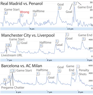
In [40], Nichols et. al. propose a methodology to perform automated text summariza-tion of sporting events using data collected from Twitter. In this case, the authors find the most important moments of an event by identifying spikes in the volume of tweets over time, an approach also applied in TwitInfo [34]. A visualization of the result of this approach can be observed in Figure2.6. After acquiring these tweets and applying spam removal techniques to the set, a phrase graph is created from the text present in the tweets. This graph details the chance of a word appearing next to a previously estab-lished sequence of words in the context of a phrase. The phrase graph is used to generate possible sentences that summarize the event. These sentences are also scored through the phrase graph and the best scoring ones are outputted. As a possible alternative to this graph based algorithm, the authors propose Sharifi’s modified TF.IDF [46] as a method for generating a text summary of the event. Although not directly related to visual storyline generation, these works highlight the importance of considering the amount of content being posted to social media, at any particular time, as metric for finding if interesting and important events are taking place.
Three years after Nichols et. al. published [40], the authors of [43], Schinas et. al., tackled a similar the problem, by rooting their research in a similar approach. In this work the task of visual event summarization using social media content, again from Twitter, is tackled through the use of topic modeling and graph based algorithms. The authors start by filtering a stream of tweets from a specific event in order to obtain only the most informative ones. This filtering process takes into account image size, image type, text size, text morphology through part-of-speech tagging, among other criteria. A multigraph
C H A P T E R 2 . R E L AT E D WO R K
Figure 2.6: Spikes in the volume of data published to Twitter relative to three different football matchs. As shown the spikes tend to align with the important parts of the match. Source: [34].
is then created. Each node representing a tweet and being connected by an edge to other nodes as many times as the following criteria are applicable:
• Text similarity between tweets below a specific threshold.
• Image similarity between tweets below a specific threshold.
• Temporal proximity between tweets below a specific threshold.
• One tweet is a reply to another.
Re-posts are then discarded and tweets with duplicated images are clustered with the help of the graph. The tweets in these clusters are removed from the graph and are replaced by a single node that encompasses the information of the removed tweets. The authors then intent on discovering which tweets are part of the targeted event. In order to do this, they apply the SCAN [55] algorithm to the graph, which returns a set of subgraphs, each corresponding to a different topic. Finally, for each subgraph, the authors extract the respective images and rank them according to their popularity, relevance to the topic and the amount of information they provide.
These approaches emphasize the trend that is the usage of graphs in summarization tasks. In most cases they are used to represent the connections between pieces of content. This then allows for the application of already established graph algorithms, in order to find content highlights and appropriately structuring them in chronological fashion.
2 . 3 . M U LT I - D O C U M E N T S U M M A R I Z AT I O N
In [37] the authors also tackle the problem of visual summarization, although in this case the summarization is done with images not only from Twitter but also from other websites found in the URLs of tweets. After filtering the obtained images in a manner similar to the one proposed in [43], the authors rank the remaining images using social signals. Finally, besides taking into account the popularity of an image the authors also factor into its rank the diversity of said image when compared to the remaining available ones. They achieve this by grouping the images through semantic clustering and then giving priority to the ones with the highest TF.IDF.
Of note is that both authors of [43] and [37] tackle the problem of filtering duplicated content, although through different methodologies. In order to reconcile both approaches one could use pHash as proposed by [37] and cluster the results through a graph based approach in a way similar to what is described in [43].
Additionally, works such as [4] and [5] were also studied. In this particular case the authors discuss the importance of taking into account the media content present in microblog posts during the process of summarization. Consequently they tackle the task of filtering irrelevant or noisy content, as using this type of media may severely degrade the quality of the generated summaries. This problem is approached trough the use of a spectral filtering model. Having filtered the content, the authors propose and define a variation of LDA, CMLDA (or Cross-Media-LDA) designed to simultaneously deal with the textual and visual aspects of social media content.
2.3.2 Personal photo stream
With the advent of the smartphone cameras the act photographing and self documenting events as become a common practice. As such, paralell to social media summarization, contemporary research has focused on applying and developing summarization tech-niques in the context of personal photo streams. This field of research attempts to help with the process of filtering, cataloging and organizing this kind of content.
As an example of research done on this field we analyze the work of Yang et. al. [56]. In this work the authors tackle the task of creating a temporally organized summary of an event from a set of photo streams extracted from different sources. The authors give as an example events like weddings and family vacations where multiple cameras are used to capture different perspectives and subjects at different moments in time. In this situations organizing the available images into a chronological summary can be complicated: image files may not have a correct timestamp associated with them and the set of available images may contain similar and redundant content. To tackle this problem the authors align photo streams in a common timeline using a bipartite kernel sparse representation graph. Finally, a master stream, corresponding to the summary, is obtained by removing redundant photos and leveraging the informations obtained from the graph.
C H A P T E R 2 . R E L AT E D WO R K
2.3.3 Other
In [28], Li et. al. aproach the problem of summarization from a different perspective.
Although the authors are interested in generating summaries from multimedia content, the generated summaries are composed only of textual information. In this context the authors propose a framework to summarize text, images, video and audio into text. To do so, the media content is first characterized in textual form. A speech recognition method is applied to audio and a graph approach is used to measure the importance of each piece of content. Videos are separated into key-frames and image semantic extraction is performed on both video key-frames and still images. Although the task tackled by the authors is fairly different from the one approached in this thesis, the work draws attention to the value of considering different types of media in summarization tasks. In the context of visual storyline generation, this can mean analyzing not only the images extracted from social media, but also the text of the posts they were extracted from. Additionally, the approach of decomposing videos into key-frames provides a possible method to easily extend the work developed in the context of this thesis regarding images to video content as well.
2.4
Storyline creation and editing
A visual storyline must be succinct and cohesive but also pleasing to the viewer. Overall it must present a sequence of images as an interesting and informative narrative. Whether in the news room or in the context of cinema, the processes of ordering and cutting content to fit these criteria is the job of the editor. Consequently, emulating this process in an automated way means understanding what makes a sequence of images cohesive, interesting and appealing, or not, to the viewer.
2.4.1 Professional
To do so, we could turn to literature on the topic, approaching it first from a non-computational point of view. However, analyzing works on film and video editing such as [42] or [38] yields less interesting insights then those extracted from the previously de-scribed literature on photography. This is the case as techniques and rules in editing are generally highly subjective, context driven and, consequently, hard to mimic algorithmi-cally. Regardless, these works elaborate on the importance of ensuring the cohesion and pleasantness in the content as a whole, but also of the transitions between its individual pieces of media that compose it. More specifically, as per [38], the quality of individ-ual transition between two pieces of content is a result of both the visindivid-ual and semantic characteristics of the pair.
2 . 4 . S T O RY L I N E C R E AT I O N A N D E D I T I N G
2.4.2 Automatic
Since no works could be found that specifically tackle the task of visual storyline genera-tion, we turn to works on various forms of content editing, in order to understand what technologies and methods where proposed by previous authors as basis and support for the work developed in the context of this thesis.
In [15] the authors approach the task of semi-automated (not fully automated) home video editing as opposed to professional video editing. Additionally, they focus on opti-mizing only for simple and few editing techniques and shot characteristics, like bright-ness and length. Although works like this approached the task of editing in a simplified manner, they were the basis for the more complex approached that proceeded them.
In [30], Lino et. al. also approach the task of automated video editing, this time taking into account more complex rules and editing concepts. Here, the goal of the authors is to automate the decision process of which cameras to use, when to cut a shot and which camera to cut to, in the context of animated computer generated videos. All of this while taking into account notions of shot composition, continuity and pacing. To do this, the authors propose an approach in which they try to minimize the total cost of a full video edit. This is calculated by taking into account the cost per shot and the cost per transition between each pair of shots in a final video. In turn, these costs are calculated as the the weighted sum of the violations the shots or transitions incur in. As a whole, this allows the authors to approach the difficult problem that is the subjective evaluating an edit of a video, in a algorithmic way. To optimize for individual shot quality both shot composition and shot duration are taken into account. Here shot composition is used as a metric of the pleasantness of the shot, while shot duration is used to ensure all shots in the video have a similar duration. Regarding transition quality the authors consider the following rules:
• Screen continuity: the eyes of the actors should remain in similar position on screen after a cut. This is a simplification of an editing technique that has as an objective preventing the viewers to be forced to search the images for their main subjects after each cut. This creates a more pleasant and balanced viewing experience. Although, in editing, this technique applies to the general subjects of the shots, the authors of this work took only into account the eyes of the actors as a way of simplifying the complex problem that is identifying the subject or subjects of a shot.
• Gaze continuity: preserving the actor’s gaze direction. This technique is used in editing to help assert and preserve both the position and direction the actors occupy in relation to each other and their surroundings, in the viewers perspective. Figure
2.7gives an example of a transition that follows this rule and one that does not.
• Motion duration: preserving the actor’s movement and motion directions. This is done for the same reason and the rule presented above.
C H A P T E R 2 . R E L AT E D WO R K
Figure 2.7: The pair of scenes on the left does not follow the gaze continuity rule, while the pair of scenes on the right does. Source: [30].
Although interesting, it is much easier to take advantage of these criteria in the context of animated computer generated videos, then in the context of live action ones. As an example, in a computer generated video finding the orientation and direction of the gaze of an actor requires simply the model of the actor to be tracked, while in a live action scenario the only automated approach would require taking advantage of face recognition techniques.
Hence, we move away from editing in the context computer generated videos to edit-ing in the context of live action ones, analyzedit-ing the work of Smith et al., [48]. In this work the authors tackle the task of creating a trailer for a full length feature film in a automated way. As opposed to earlier works the edit provided by the system was actually used in a real life situation, although with manual alterations, serving as a movie trailer for Morgan, a 2016 horror movie. The system leveraged deep learning, audio, visual aes-thetics and shot semantics, sentiment analysis and statistics associated with the content of horror movies, to decide which scenes to include in the trailer. Figure2.8shows the scene selection and organization for both the fully automated version of the trailer as well as the final, manually edited one.
Finally, not many research works could be found directly regarding news media edit-ing. In this context, one of the few works that provide insight into the task is [9]. In it, the authors observe that presenting repeated images/videos in the context of news related storylines makes viewers perceive said storylines as having less quality, even if relevant information is being shown. A simple but very relevant insight regarding the task tackled by this thesis.
2.5
Critical summary
Regarding literature on identifying quality images, as debated throughout this Chapter, multiple research works have already been conducted regarding various forms of im-age quality, although none was found that tackled the task of identifying news quality content.
This novel computer vision task, following computational approaches to aesthetics, interestingness, memorability and more recently exoticism, is of less abstract character than previous ones. In itself, this poses new challenges, as we are working with a more constrained and defined set of quality criteria then, for instance, works on general image
2 . 5 . C R I T I C A L S U M M A RY
Figure 2.8: The column on the left shows the scenes selected in an automated way by the system proposed in [48] for the trailer of the movie Morgan. The column on the right shows the final trailer’s scenes, after being manually improved by professional editors. The blue arrows show the chance in order applied to the scenes in the final edit that where present of the automated one. Source: [48]
aesthetics. Additionally, because this is a novel task, no datasets and ground truth are available to evaluate possible approaches to the problem. As such, we propose to follow an approach similar to the one documented in [24], crowd sourcing the creation of a ground truth for a dataset containing images extracted from social media. Additionally, inspired by the works on image aesthetics, interestingness and memorability, we aim to leverage machine learning methodologies, supplementing them with a large set of low and high level features, in order to tackle the task. Since we aim to, not only correctly identify news quality content, but also explain why a piece of content was deemed as having news quality, models like the one presented in [6] are not valid approaches to the problem. This because, deep learning models suffer from low interpretability, regardless of overall performance.
C H A P T E R 2 . R E L AT E D WO R K
field that has received a lot of attention in recent years and as such, many summarization methodologies have been proposed, discussed and evalutated in literature, be it in the context of social media or otherwise. However, these methods tend to focus solely on the task of creating abridged versions of a large amounts of data, without tackling the problem of optimizing the resulting summaries for aesthetic quality and pleasantness. This makes sense in the context of problems where the objective is only to provide a useful synthesis of the information available. This is not, however, true in the context of this thesis. Although it is our aim to develop a method for automatically creating visual storylines able to summarize a targeted news story, we want to do so while ensuring the aesthetic quality and cohesion of said storylines. As such, we aim to build on the approaches of previous authors while also providing the necessary modifications in order make them fit the specifications of the problem at hand.
Finally, with respect to storyline creation and editing, no research work could be found that tackles the exact challenges and problems posed in Chapter 1. However, there is research on automated video and film editing, even if mostly from a semi-automated perspective. These approaches base themselves on simplified versions of techniques and criteria put forward in the context of professional manual editing. These simplifications are required as editing techniques are highly subjective, context dependent and require the understanding of the visual and semantic characteristics of the content available, all of which is extremely hard to achieve from a computational stand point. Of these works, [48] presents both a particularly interesting problem and approach, leveraging deep learning methodologies to create the first semi-automatically generated trailer for a full length feature film. Inspired by this approach, we intend to leverage machine learning methodologies to identifying and understand what semantic and visual criteria result in a visual storyline being perceived as cohesive and pleasing to the viewer.
Summarizing, various gaps can be found in literature regarding computational ap-proaches to visual storyline evaluation, identifying and understanding news quality vi-sual content, editing in vivi-sual storylines and overall automated storyline generation. By tackling the novel research task purposed in this thesis we aim to research and evaluate possible solutions to the aforementioned problems, providing a stepping stone for future works on related subjects.
C
h
a
p
t
e
r
3
A n e va lua t i o n f r a m e w o r k f o r v i s ua l
s t o r y l i n e s
3.1
Introduction
Achievingquality is only possible after understanding what characteristics quality derives
from. In the context of this thesis, this means understanding by what characteristics should we evaluate a tool designed for visual storyline creation, as by doing so we gain insight into the process of optimizing such a tool. In this context we face two main challenges. The first relative to the high degree of subjectivity associated with the process of visual storyline creation and evaluation. The second associated with the fact that, to our knowledge, no evaluation framework has been proposed in literature for the task at hand.
Hence, in this Chapter we propose a novel framework to evaluate the various ap-proaches to storyline creation that are proposed in this thesis and that may be proposed in future research work. Additionally, this evalutation framework has already been cho-sen to evaluate the systems submitted to the “Social-media video storytelling linking” competition (https://www-nlpir.nist.gov/projects/tv2018/Tasks/lnk/) that took place during TRECVid 2018, an annual workshop where worldwide multimedia retrieval and analysis competitions take place.
To create this framework we based ourselves in the Cranfield Experiments [52], a literature standard for evaluating the performance of information retrieval systems. In this context the systems are evaluated by receiving as input a set of queries and being tasked to retrieve documents from a dataset. The quality of the retrieved documents to a particular query is evaluated according to ground truth.
C H A P T E R 3 . A N E VA LUAT I O N F R A M E WO R K F O R V I S UA L S T O RY L I N E S
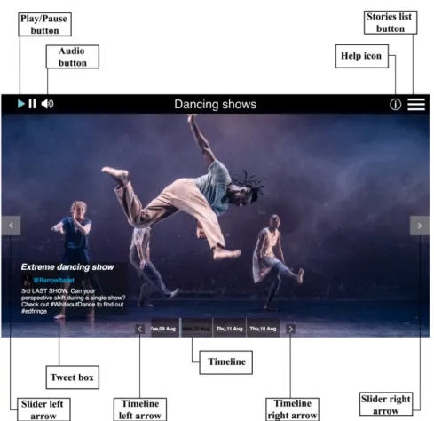
As such, we first establish and detail four distinct datasets composed of images col-lected from Twitter, leveraging a pool of social media content with heterogeneous char-acteristics. Complementing these datasets, we also define the queries, these being a manually curated set of stories extracted from news media, with which it is possible to create quality visual storylines, by using the images from the datasets. Additionally, we define the method by which the ground truth was created through crowd sourcing. In this context there is the need for an interface in order to present visual storylines to the viewers (the annotators). Furthermore, the quality of the interface may interfere directly with the viewers perception of a storyline. Consequently, we establish the interface devel-oped by Marcucci et. al. in the context of [33] as the one used to present visual storylines to the viewers during evaluation processes, elaborating on the characteristics that make it a solid choice for the task.
Finally, we derive a metric for visual storyline evaluation composed of two distinct dimensions that are easier to evaluate then overall quality. This metric provides an empirical method to qualify visual storylines that is consistently used in the process of attaining ground truth throughout this thesis.
3.2
Dataset and queries
Image datasets and curated stories (the queries) are necessary to evaluate storyline gen-eration methods. These datasets must contain images from which it is possible to create quality visual storylines that illustrate the stories. Since no datasets with these charac-teristics could be found, our approach was to pick a set of datasets for which no ground truth or stories existed, create the stories and, as required, proceed to the creation of ground truth through crowd sourcing.
Due to the nature of the task we pursued datasets containing only posts from social media related to individual events. We chose Twitter as the source of social media images. This choice is supported by a proven correlation between what is posted on the social network and news media. As an example, [27] shows that over 85% of the topics trending on Twitter are also covered by the news. As criteria for picking the events we focused on those that span over multiple days and that gather a lot of social media and news media traction like music festivals and sports competitions. This allows us to have large amounts of content to analyze and use for experimentation, with varied quality and characteristics. Finally, the focus on events covered by news media means that we can look directly at news pieces in order to find stories to illustrate. In total four datasets where chosen. The targeted events were:
The Edinburgh Festival (EdFest) a celebration of the performing arts, including dance, opera, music and theatre performers from all over the world. The event takes place in Scotland and has a duration of 3 weeks.
3 . 3 . G R O U N D T R U T H G E N E R AT I O N
Event Stories Docs Docs w/images
EdFest 2016 20 82348 15439
EdFest 2017 13 102227 34282
TDF 2016 20 325074 34865
TDF 2017 15 381529 67022
Table 3.1: Summary of the characteristics of the 4 datasets.
Le Tour de France (TDF) a world famous road cycling race competition. The event takes place mainly in France and has a total duration of 16 days.
More specifically, we considered EdFest 2016 and 2017 and TDF 2016 and 2017. For each event we then created stories with 3 to 4 segments each based on news media content we researched, related the events. A sample of these stories for TDF 2016 and EdFest 2016 can be found in Tables3.4and3.3. Throughout this thesis we will evaluate methods of storyline generation by their ability to pick content from the EdFest and TDF datasets to ilustrate these stories.
Table3.1summarizes the content of the datasets and the amounts of stories created for each dataset.
3.3
Ground truth generation
In order to present a visual storyline to a viewer (or crowd source annotator) an interface is required. For this task, we carefully choose an interface that was purposefully designed for visual storyline visualization, which provides us with some guaranty that bias in the annotation process is reduced. We opted for the interface proposed in [33] by Marcucci et. al., an interface designed specifically to present visual storylines composed of social media content, carefully build and tested through an iterative development process in which testers were constantly being interview to provide quality feedback. Hence, all ex-periments elaborated throughout this thesis where viewers were shown visual storylines were conducted using this interface. Figure3.1presents the interface.
3.4
Visual storyline quality metric
As detailed in Chapter 2 media editors are constantly judging the quality of news mate-rial to decide if it deserves being published. The process is highly skillful and deriving a methodology from such a process is not straightforward. The motivation for why some content may be used to illustrate specific segments can derive from a variety of fac-tors. While subjective preference obviously plays a part in this process (which cannot be replicated by an automated process), other factors are also important which come from common practice and general guidelines, and which can be mimicked by objective quality assessment metrics.
C H A P T E R 3 . A N E VA LUAT I O N F R A M E WO R K F O R V I S UA L S T O RY L I N E S
Figure 3.1: Visual storyline interface used in the experiments conducted throughout this thesis. In this particular case presenting a storyline created using content extracted from Twitter. Source: [33]
Therefore we propose a metric, inspired by [30], aimed at qualifying storylines by means of judging specific, more objective characteristics – Figure3.2illustrates the visual storyline quality assessment framework. In particular, visual storylines are assessed in terms ofrelevance of illustrations (blue links in Figure3.2) andtransition quality (red links
in Figure3.2). Formally, given
StoryN = (u1, u2, ...uN) (3.1)
and
V isualStorylineN = (w1, w2, ...wN) (3.2)
we consider si, therelevance of illustration wito the segment ui. Similarly with respect to
transition quality of the pairs of images in a visual storyline we consider ti,k, representative
of the visually and semantic coherence of a transition between illustrations wi and wk. Both siand ti,k are values ranging between 0 and 1. These two dimensions are then used
to obtain overall expression of the "quality" of a given visual storyline for a story of N

![Figure 2.2: High level features used in [10] to predict aesthetic quality of images. Source:](https://thumb-eu.123doks.com/thumbv2/123dok_br/14992638.1008678/33.892.262.612.161.415/figure-high-features-predict-aesthetic-quality-images-source.webp)

![Figure 2.4: Pipepile for image interestingness prediction with low level features extracted from [24]](https://thumb-eu.123doks.com/thumbv2/123dok_br/14992638.1008678/35.892.131.749.163.472/figure-pipepile-image-interestingness-prediction-level-features-extracted.webp)
![Figure 2.8: The column on the left shows the scenes selected in an automated way by the system proposed in [48] for the trailer of the movie Morgan](https://thumb-eu.123doks.com/thumbv2/123dok_br/14992638.1008678/43.892.260.623.154.704/figure-column-scenes-selected-automated-proposed-trailer-morgan.webp)