Users’ perceptions of the arrangement of links in government websites: an
investigation using think-aloud and interview methods
A percepção dos usuários sobre a organização de links em websites governamentais:
uma investigação com os métodos think-aloud e entrevista
Virgínia T. Souto
think-aloud method, interface design, links, World Wide Web
The aim of this study is to find out what users think about the arrangement of links in government websites. The paper describes a study which used both think-aloud and interview methods. The study investigates real online government websites in the users’ natural environment of Internet use. Four online government websites are the object of the present study. It also investigates where users look first when using a government website, the search strategy and the link characteristics which help or hinder users in finding information on screen. The findings show that where the participants look first and their search strategy are both dependent on the layout of the website. In addition, the findings show the link features that help the users find information, such as a clean website, with not too many links. The findings also indicate that think-aloud and interview method is an efficient way to record users’ perceptions of real websites.
método pensar alto, design de interface, links, World Wide Web
O objetivo deste estudo é investigar o que os usuários pensam sobre a organização dos links em websites governamentais. O artigo descreve um estudo no qual são utilizados os métodos think-aloud (pensar alto) e entrevista. O estudo investiga websites governamentais reais no ambiente do usuário. Ele também investiga onde os usuários olham primeiro quando usam um website governamental, a estratégia de pesquisa e as características dos links que ajudam ou atrapalham os usuários a encontrar informação na tela. Os resultados mostram que onde os participantes olham primeiro e a estratégia de pesquisa dependem do leiaute do website. Além disso, os resultados mostram quais características dos links ajudam os usuários a encontrar informação na tela, tais como um website de visual “limpo”, sem muitos links. Os resultados também mostram que os métodos “pensar alto” e entrevista são apropriados para investigar os percepção dos usuários usando websites reais.
1. Introduction
With the growth in the number of Internet users in the last decade researchers have been investigating the ease of use of websites. Different methods have been used in order to investigate the usability of websites (e.g. thinking aloud, performance measurement, non-empirical methods). It seems that experimental research has been one of the most usual methods.
In experimental research the investigator manipulates and controls independent variables (i.e. properties of objects or events) and observes dependent variables (i.e. the data) (HOWELL, 1982). Examples of dependent measures commonly used are: performance times, preference, accuracy, and efficiency.
While the controlled experiment is considered the ‘desired model of science’ for research ‘with the purpose of discovering, classifying, and measuring natural phenomena and the factors behind such phenomena’ (KERLINGER, 1986), there are some restrictions on when controlled experiments followed by a questionnaire can be applied. In experimental research one or a few variables should be isolated and the influence of other variables should be controlled. These limitations may mean that some research questions related to interface design cannot be answered through experimental research. Furthermore, the interface designed for experimental research may appear unfamiliar in some cases due to the need to isolate the controlled variables.
The use of a questionnaire after the controlled experiment can be an effective way of discover-ing the users’ preference. However, when questionnaire responses are applied after a controlled
experiment, users are required only to judge and/or to choose among the variables being tested in the experiment. Therefore, the users probably make their judgements in relation to the controlled variables and do not consider the overall characteristics of the interface.
In order to get the users’ thoughts on and/or perception of typical websites, types of methodologies other than experimental research followed by a questionnaire response can be used. Other methods can provide the perception of the user in relation to a more naturalistic environment. A commonly used method in Human-Computer Interaction studies is concurrent protocols, more specifically the think-aloud protocols. Think-aloud method refers to a test where participants are asked to verbalise their thoughts while performing tasks. Many authors claim that the think-aloud test is an effective method for getting people’s thoughts on mediating the completion of a task (e.g. BIRNS et al, 2002).
Another type of method that can be used to elucidate the user’s view on an interface is the interview method. Face-to-face individual interviews can be very useful in discovering the users' thoughts and opinions about the layout of a web page. An interview is a similar method to a questionnaire. A possible advantage of interview over questionnaire method is that with the former participants may be more spontaneous in giving their thoughts. This is because in an interview they do not have to write their thoughts down and therefore may give a more detailed contribution. In addition, with unstructured interviews the interviewer may add new questions in order to get a deeper understanding of participants' thoughts, which is not possible with questionnaires.
This study uses both think-aloud and interview methods to investigate users’ perception of the arrangement of links in government websites. Government websites were chosen as the focus of this study because they have become an important source of information for world citizens. It seems that many users have problems finding information due to the complexity of the layout in these websites. The study investigates real online government websites in the users’ natural environment of Internet use. This study also investigates where users look first when using a government website, the search strategy and the link characteristics which help or hinder users in finding information on screen. After the users had experienced the online websites, an interview was conducted to get the users’ perception of the arrangement of links in these websites. Four online government websites are the object of the present study.
2. Related research
There are many studies that investigate different arrangements of links on websites. Most commonly the studies use experimental research to investigate users´expectations about the position of links, effect of link position and orientation, screen layout, types of links, number and organization of links. The results of some of these studies are briefly described below.
Bernard (2000, 2001, and 2002) and Oulasvirta et al. (2005) investigated the position of links as well as other elements on a web page. According to Bernard (2001) it is important to locate web elements in places expected by users because they quickly develop common schemas for the position of web elements. Oulasvirta et al. (2005) found that participants expected to find links in certain areas of the screen, but this did not affect performance.
Other types of studies investigated the effect of different positions and orientation of links instead of the users´ expectations. For instance, van Schaik and Ling (2001), Kalbach and Bosenick (2003) and Pearson and van Schaik (2003) investigated whether users perform better with links positioned in different areas of screens. The findings of these studies are contradictory: one did not find significant differences between left and right position, and another confounds position of links with type of link variables. As a result it is not clear which areas on screen most help the user find information on websites.
The effect on search performance of presenting the links together or separate from the web content was also investigated. De Cossio and Dyson (2002) examined different methods of manipulation of web pages. Their findings indicate that the effect of presenting links either together with or separately from the web content may be dependent on the method of manipulation of the document. Souto and Dyson’s (2004 and 2005) findings show that presenting links on a separate screen from the web content is better than presenting the links on the same screen as the web content.
Many researchers investigated the effect of types of links in websites. Hochheiser and Shneiderman (2000) and Tsunoda et al. (2001) found that for simple tasks the participants
and expandable links Zaphiris, Shneiderman and Norman (2002) found that the participants performed faster with sequential links than with expandable links. Another study by Zaphiris, Kurniawan and Ellis (2003) found an interaction between participants’ age and type of links. Their results show that senior participants performed faster with expandable links, while younger participants performed faster with sequential links. Souto and Dyson (2005) found an interaction between screen layout (same and separate screen), type of links (expandable, sequential and stable), and type of task (simple and comparative) for users' efficiency (i.e. number of wrong clicks).
Other researchers have investigated the number of links on a single screen, but unrelated to the depth of the hierarchy. Khan and Locatis (1998) found that with a lower number of links (3 links) on screen participants performed faster and more accurately than with a higher number of links on screen (6 links). Katz and Byrne’s (2003) findings indicate that with more links on screen participants use the links more and the search aid less.
Apart from the number of links on screen, the organisation of the links into groups seems to be an important aspect of the design of websites (MARKS AND DULANEY, 1998; CZERWINSKI AND LARSON, 2002). Researchers on screen interfaces claim that the perception of grouping is a relevant topic to the field of interface design (NORMAN, 1991; TULLIS, 1997). Nygren (1996a, 1996b) found that users scan a single long vertical list faster than multiple short vertical lists, and Hornof (2001) and Hornof and Halverson (2003) found that users perform faster with fewer groups of links (and fewer links). In summary, these studies show evidence that the number of groups of links affects the user's search performance. Users perform faster with fewer groups than with more groups on screen.
3. Method
Experimental Design
The study compared four different online government websites. Each participant used all the websites. The participants were asked to talk aloud while trying to find specific information on each of the four websites. The presentation order of the four websites was determined by a Latin square balanced design. After the test the participants were interviewed.
Participants
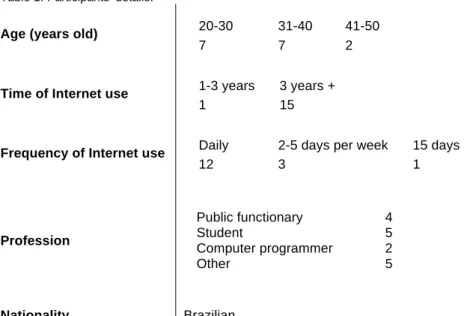
Sixteen volunteers took part in the study. Most of the participants had experience in using the Internet for three or more years (94%), used the Internet every day (75%), and were between 20 and 40 years old (90%). They had different professional backgrounds. Table 1 gives participants’ details.
Table 1: Participants’ details.
Age (years old) 20-30 31-40 41-50
7 7 2
Time of Internet use 1-3 years 3 years + 1 15
Frequency of Internet use Daily 2-5 days per week 15 days
12 3 1 Profession Public functionary 4 Student 5 Computer programmer 2 Other 5 Nationality Brazilian
Material
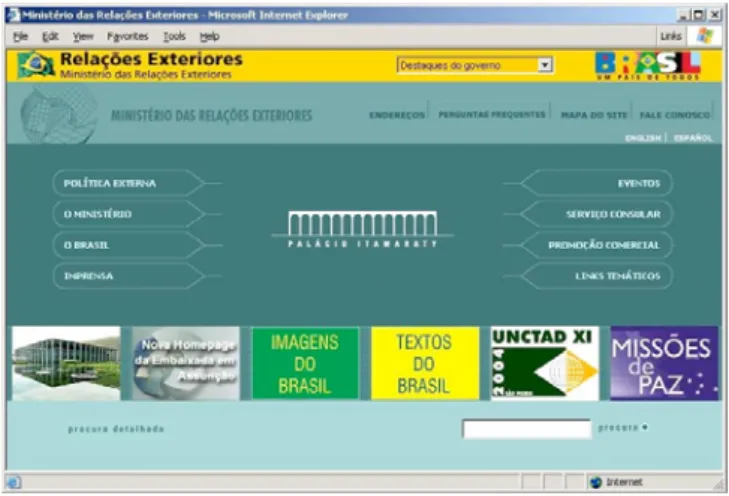
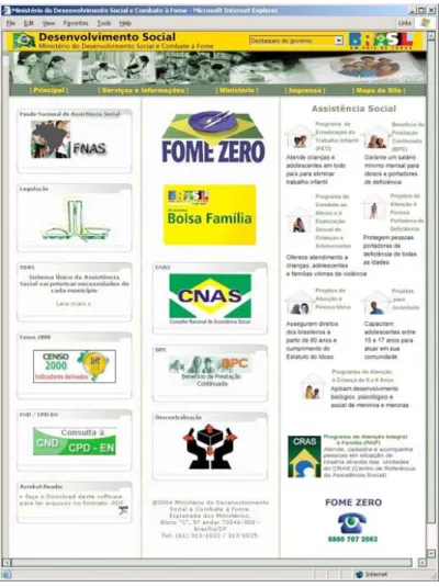
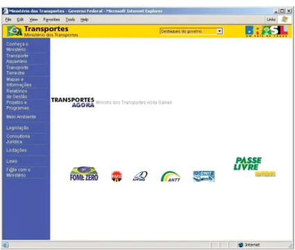
The content was provided by four Brazilian government websites: Ministry for Development, Industry and Foreign Trade (MDIC), Ministry for Social Development (MDS), Ministry for Foreign Relations (MRE) and Ministry for Transport (MT). They are all ministries of the Brazilian Federal Government. The study was carried out in Portuguese.
These websites were chosen because (1) they are at the same hierarchical level in the Brazilian government and, because of this, present a similar structure; (2) they had a varying number of links and number of groups of links. Government websites with different numbers of links and groups of links were chosen in order to investigate the users' perception of different layouts.
At the top of the screen all the four homepages had a bar on a yellow background with the name of the Ministry on the left, a drop-down menu with links to some of the main Brazilian government websites and a logotype of the Brazilian Federal Government. Apart from this bar, these websites differ in almost all visual aspects, such as image characteristics, size and style of the typefaces, colours, and distribution of information.
The perceptions of users as to how many groups there were in each of these websites were tested. This was done in order to verify if they perceived the number of groups of links as was expected. Ten participants took part in this activity. The authors' perception of the number of groups in each website was confirmed. Most of participants perceived both MDIC and MDS as having more groups of links than MRE and MT websites. The number of links, the number of groups of links, the types of links used, and the position of links on screen of each of these homepages are described in table 2. Figures 1 to 4 show the homepages and each of these websites.
Table 2: Number of links, number of groups of links, types of links, and position of links in the four homepages.
MDIC MDS MRE MT
Number of links on homepage 80 26 20 19
Number of groups perceived by the author of thesis
14 8 5 3 Types of links used Cascading,
sequential, and stable Sequential and stable Cascading Sequential and stable Position of the links on screen Bottom,
centre, left, right, and top
Centre, left, right, top Bottom, centre, and top Bottom, centre, and left
Participants performed five tasks in each of these websites. The test was done in their own environment of Internet use, either at work or home. They also used their own computer. Most of the participants used a desktop computer, 15 inch-monitor with a resolution of 800 x 600 pixels. Both the think-aloud test and the interview were recorded by an audio tape recorder. In addition to the recorded data, the investigator observed and took notes during the tests.
Figure 2: Illustration of the homepage of the Ministry for Social Development (MDS) website
Figure 4: Illustration of the homepage of the Ministry for Transport (MT) website
Procedure
The participants were tested individually. The purpose of the study and the instructions on how to do it were explained to each participant. The participants were required to think aloud and explain (a) where they look on the screen and (b) the links they choose to click on while they try to find answers for questions using four online government websites. After completing their tasks, the participants were asked to answer some questions relating to the interfaces used and a short questionnaire on their familiarity with using the Internet.
The participants were asked to find five topics in each of the four websites. They had five minutes to try to find the topics while speaking aloud. Each participant received a paper with the instructions and the topics to be searched for. Example of a task is: 'Please find in the website of the 'Ministry of Transport' information about: the history of the ministry.
A pilot study tested the level of difficulty of the topics and those that caused problems were replaced and a further pilot study conducted. In total, five participants performed the pilot test.
The topics to be searched for were presented in the same sequence for all participants. This was done so that all participants would perform the tasks of different complexity in the same order and have similar experience with the websites. Because of this, the search strategy of participants could be compared. Participants were instructed to follow the order of the topics. However, they could move on to the next one if they could not find the previous answer. No previous knowledge of the web content was necessary in order to find the topics. After participants had finished the tasks, they were interviewed about their perception of the websites they had used.
After participants had finished the tasks, they were interviewed about their perception of the websites they had used. Seven questions were pre-determined for the interview. They were:
1. What helped you to find information on screen?
2. In relation to the links, which characteristics do you think helped you find information on screen?
3. Did you think that a particular place/position in which the links appear helped you to find information? Which place?
4. Does website (a) have the right number of links on a single screen, too few, or too many? Repeat for remaining 3 websites.
5. Does website (a) have the right number of groups of links on a single screen, too few, or too many? Repeat for remaining 3 websites.
6. Was it easier to find the information in one of the four websites? Which one? Why? 7. If you had to choose one of these websites, which one would you choose? Why?
4. Results
The results section is divided into three main parts: think-aloud test, accuracy, and interview.
Think-aloud test
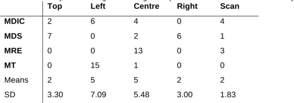
The participants were required to speak aloud and explain (a) where on the screen they are looking, and (b) the links they choose to click on while they are trying to find the answers to questions using four online government websites. The information about in which direction participants looked and the clicks that they made was extracted from the data (both tape recorded information and notes taken). Then, from the extracted information there was a check on how many participants looked first at one of the 5 main areas of the screen (bottom, centre, left, right, and top). Some participants, however, reported not looking initially for a specific place. They scanned the homepage in different areas. Table 3 shows the summary of the findings of the users' first look on the homepage.
Table 3: Summary of the findings concerning which part of the screen was looked at first by users.
Top Left Centre Right Scan
MDIC 2 6 4 0 4 MDS 7 0 2 6 1 MRE 0 0 13 0 3 MT 0 15 1 0 0 Means 2 5 5 2 2 SD 3.30 7.09 5.48 3.00 1.83
A comparison between the data collected of where users first looked on screen and the position of the links in each website showed that most of the participants looked first for the area of the web page with most links. Table 4 shows the number of links per area of the web page on the four homepages.
Table 4: Number of links per area of the web page on the four homepages.
Top Left Centre Right Bottom
MDIC 5 32 22 16 6 MDS 7 6 5 8 0 MRE 6 0 8 0 6 MT 0 12 1 0 6 Means 5 13 9 6 5 SD 3.11 13.89 9.13 7.66 3.00
Participants varied their strategy across websites. The strategy most used was to stay at the second page level and try to find the next piece of information from the links provided on this page. However, almost all participants used more than one strategy to find the information required. Table 5 shows participants' search strategy. Other details of the think-aloud data (for each website) are described below.
Table 5: Summary of the findings of participants' search strategy.
Link strategy Homepage strategy Double strategy
MDIC 5 5 6 MDS 6 3 7 MRE 7 6 3 MT 11 1 4 Means 7 4 5 SD 2.63 2.22 1.83
For the MDIC website, most of the participants looked first to the left area of the website, or to the centre, or they scanned the page. Most of the links were positioned in the left and the central areas of the screen (Figure 1). The left area showed the links related to Foreign Trade and Industry; at the centre most links were related to news. By looking at the think-aloud data, it was observed that the left-centre-right movements and left-right movements were the most common.
In the MDS website most of the participants looked at the top and right links. The main topics of the website were in the top area of the screen, whereas links to projects were in the right area of the screen, and links to some highlighted topics were placed to the left/centre. Most of these topics could also be found by clicking on the top of the screen.
On the other hand, the majority of the participants looked first to the centre of the page in the MRE, where there were the main topics of the website and an image of Itamaraty Palace (the Ministry of Foreign Relations building). Fewer participants scanned the page before directing their attention to a specific place on the screen. The participants usually started checking the links on the centre-left and then on the centre-right. It was observed that some participants took some time to understand that if they passed the mouse on top of the main topics, subsections would appear. This fact was also observed in the MDIC website, but to a lesser degree because the MDIC website displayed fewer cascading links.
In relation to the MT website, almost all the participants directed their attention to the left area of the website where most of the links were placed. They looked at the main links in the left area and then at the link in the central area of the screen. However, they did not click on this link, perhaps because they did not think that the text was a link. Participants used a different search strategy from the other websites while using the MT website. They usually tried to find the next piece of information from the second page level onwards instead of going back to the homepage. This behaviour may be explained by the fact that this website kept the same links in the left area of the screen.
Accuracy
A simple analysis of variance did not find significant differences in the number of correct answers for any of the four websites. The participants generally found the answers to most of the questions during the time limit of 5 minutes. The data show that some participants did not find all the information required in the other websites because they were not able to find all the information in the five minutes allowed for the test. The data also shows that accuracy increased from the first website to the second, although no differences in accuracy among second, third, and fourth websites were found. This finding indicates that participants became familiar with the tasks after completing the tasks for the first website.
Interview
The results are presented under six headings based on the predetermined questions discussed during the interview. In addition, some extra questions were asked depending on the participants’ answers.
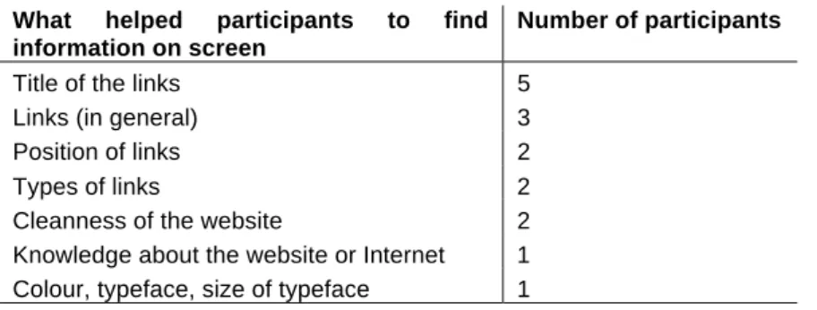
What helped the users to find information on screen
Most participants thought that some characteristics of the links helped them to find information on screen. More specifically, participants said that the titles of the links, the use of cascading links, and the links positioned on the left helped them to find information on screen. Apart from the links, some participants also thought other website features helped them find information on screen. For example, some participants mentioned that ‘cleanness’ of the website helped them to find information on screen. According to them they felt lost with a lot of information on screen. The table 6 shows that most participants thought that some characteristics of the links helped them to find information on screen.
Table 6: Topics that participants mentioned when asked what helped them to find information on screen.
What helped participants to find information on screen
Number of participants
Title of the links 5
Links (in general) 3
Position of links 2
Types of links 2
Cleanness of the website 2 Knowledge about the website or Internet 1 Colour, typeface, size of typeface 1
Link features that helped the users to find information on screen
The answer to this question varied considerably. Table 7 shows the links features that participants thought helped them to find information on screen. The most commented features of links that helped participants to find information on screen were both the position of links on screen and the types of links. The position of the links mentioned by the participants as being the link feature that most helped them to find information on screen were: right, left, left and right, and centre. In relation to the type of links, two mentioned that cascading links helped them to find information on screen, one said stable links and another said that it was broader structures (i.e. with more links on a single page and fewer page levels) that helped them to find information on screen.
Table 7: Link features that participants thought helped them to find information on screen.
Link features Number of participants Position of links 5
Types of links 4
Number of links 3 Typeface size and/or colour 3
Links group 1
Other link features mentioned by the participants were: the number of links, typeface size and colour, and grouped links. In relation to the number of links, two participants said that they thought that web pages with fewer links helped them to find information on screen, whereas one participant said that more links are more helpful in finding information on screen.
Link position that helped the users to find information on screen
The participants were asked whether the particular position in which the links appeared helped them find information on screen. Table 8 shows the position of links that participants thought helped them find information on screen.
Table 8: Position of the links that participants thought helped them find information on screen.
Centre Left Right Top
Number of participants 6 6 2 4
Most of the participants thought that links in the central and left areas of the screen helped them find information on screen. The main reason for thinking that the link on the left helped them to find information on screen was the fact that they were used to links placed on the left of the screen. In addition, in the current study a participant said that she thought that the link on the left helped her to find information on screen because of the way we read (occidental reading system) from left to right.
Users’ perception of the number of both links and groups of links
In relation to the number of links on screen, the majority of participants said that they preferred fewer links on screen because they felt that it was easier to find information with fewer links on screen. In relation to the question of whether the participants prefer the links grouped or spread on screen, almost all of the participants mentioned that they preferred links grouped in fewer areas on screen. The quotation below illustrates one participant’s reason (translated from Portuguese).
'I prefer websites with fewer links on screen. I don’t understand why there are so many links on some websites. I think that nowadays people don’t click on the links anymore because is easier find to information using the search tool.'
In relation to the question of whether the participants prefer the links grouped or spread on screen, almost all of the participants (13/16) mentioned that they preferred links grouped in fewer areas on screen. The main reason why they prefer the links grouped on the screen is illustrated by a quotation from one participant:
'I prefer links that are grouped together even though there is a lot of information and I need to use the scroll bar. In that way I only need to look at one place, do not get lost and consequently can be more effective.'
On the other hand, a participant mentioned that the number of groups of links should be considered in relation to the number of links in each group. The quotation below illustrates the participant’s statement:
'Fewer groups of links on screen (maximum two groups) are more helpful. In addition, it is necessary to limit the number of links in each group. This is because I don’t always use the scroll bar to see all information at the bottom of the page. Therefore, if the group of links is very long I may not see all links in this group.'
Comments on the layout and link features of each website
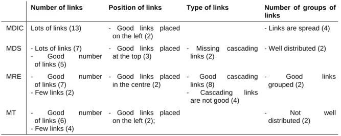
The participants were asked to comment on the layout and on the link features of the homepage of each website. Table 9 shows the main comments on each website divided according to link arrangement features.
Table 9: Participants’ main comments on each website divided by the arrangement of link topics.
Number of links Position of links Type of links Number of groups of links
MDIC Lots of links (13) - Good links placed on the left (2)
- Links are spread (4) MDS - Lots of links (7)
- Good number of links (5)
- Good links placed at the top (3)
- Missing cascading links (2)
- Well distributed (2)
MRE - Good number
of links (7) - Few links (2)
- Good links placed in the centre (2)
- Good cascading links (8)
- Cascading links are not good (4)
- Good links grouped (2)
MT - Good number of links (6)
- Few links (4)
- Good links placed on the left (2);
- Not well distributed (2)
For the MDIC website, almost all participants thought that there was a lot of text on screen. In relation to the quantity of text the participants commented that: the website was visually polluted, confused, heavy, or participant felt lost.
On the other hand, the perception of the quantity of text (links and text) in the MDS website varied. They either felt that it was a lot of text or that the quantity of links and text was good. Some participants mentioned that the website was polluted. In relation to the number of images, most participants thought that the images helped them to find information on screen.
website. The majority of the participants liked the use of cascading links in this website. However, some participants highlighted some problems with cascading links. Among the problems with the cascading links that participants pointed out were: difficult to read as the mouse moves and the subtopics disappear; good only when there are not a lot of subtopics because of the movement of the mouse; the need to make clear for the user that the links are cascading.
As with the MDS website, the participants’ impression of the number of links on the MT website varied. Most of the participants thought that the quantity of information displayed on the homepage of this website was good. On the other hand, some of the participants thought that there was little information on the homepage and that information in the white area of the homepage was missing.
Reasons why the users preferred a specific website
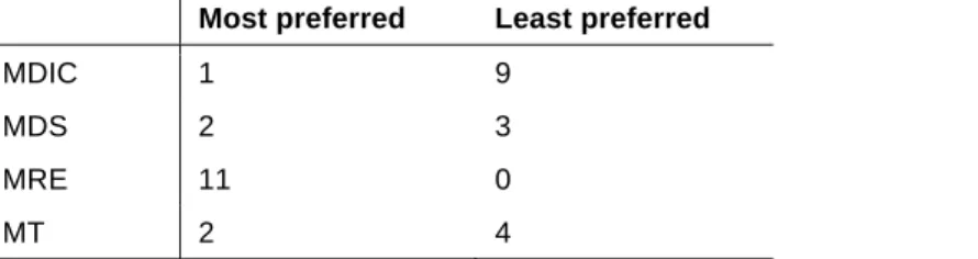
The participants were asked to choose the website that they liked most and the one that they liked least from the four websites and explain their choice. Table 10 shows the number of participants who chose each of the websites as their most and least preferred website.
Table 10: Number of participants who chose each of the websites as their most and least preferred website.
Most preferred Least preferred
MDIC 1 9
MDS 2 3
MRE 11 0
MT 2 4
Most participants preferred the MRE website. This finding confirms the findings of link features that most helped participants find information. The main reasons for choosing this website were: the use of cascading links, easier to find information, good arrangement of links, and visually clean quality. Other reasons for the preference for the MRE website were: good quantity of information on screen, good layout, attractive, beautiful, and well organised.
The participants’ least preferred website was the MDIC website. The main reason mentioned by the participants for disliking this website was the number of links on screen. They also claimed that the homepage was polluted, confused, without highlight, with small letters, and difficult to read.
5. Conclusions
Based on this data it can be concluded that the layout of the website in relation to the position, number and arrangement of links affects the user’s search strategy and therefore may make it easy or difficult for users to find information in websites.
Although the areas of the screen that users most frequently said that they looked at first were also the central and left areas, the findings indicate that users said they looked first for the area of the screen with most links and not for a specific area of the screen (e.g. central area). The findings suggest that the layout can direct the users’ attention to a specific place on screen. Furthermore, participants’ strategy, be it staying at a second page level while looking for new information, or going back to the homepage, seems also dependent on the layout of the website.
In relation to the types of links, users seems to like cascading links, which show the main links of the website and allow the sub-links to appear on demand. However they think that cascading links have some drawbacks. Users seem to like images associated with links. However, the participants claim that a lot of images are not helpful. Therefore, the use of images associated with links should be carefully considered.
In addition, users did not like websites with a lot of links on screen and they also thought it more difficult to find information in these websites. The results provide support for an improvement in users' speed with fewer links than with more links on screen (KHAN AND LOCATIS, 1998; TULLIS, 1997). In addition, the findings of this study show that users do not like visually polluted websites, or websites that appeared confused to them.
Users also thought it was easier to find information in websites that display fewer groups of links on screen. This is because the separation of links into many groups may divide users’ attention and make them feel lost. This finding is thus consistent with studies by Hornof and Halverson (2003). In addition, it supports Feature-Integration Theory of Attention (TREISMAN AND GELADE, 1980),
which claims that searching grouped items (with different characteristics) would be easier than searching ungrouped items.
Finally, in relation to the methodology used, the findings of the current study show that the use of think-aloud test followed by an interview is a valid method for identifying user perception in relation to the arrangement of links in websites. This is because the data collected in the current study captured the thoughts of many users and elucidated their perceptions of the topics investigated. In addition, through these methods researchers can investigate how users perform tasks with real websites in their natural work environment. Therefore, the author of this paper agrees with the claim by some researchers (BIRNS ET AL., 2002; VAN WAES, 2000) that the think-aloud test is an efficient method for investigating the usability issues of websites.
However, think-aloud followed by an interview does not seem to be the most appropriate method for indicating the effects of some specific link arrangement features, such as the types of links on screen. This is because asking participants to think aloud while doing the test may be disruptive and may therefore influence the performance of the participants. Therefore, the use of a think-aloud test together with a performance test needs to be treated with some caution. In general terms, a think-aloud test and interview seems more appropriate for investigating users' thoughts, while experimental research seems more appropriate in the investigation of users' performance.
Acknowledgement
Virginia Souto was supported by a doctoral grant from CNPq – Brazil (National Council for Scientific and Technological Development).
References
BERNARD, M. L. 2000. Examining user expectations of the location of web objects. Internetworking, 3.3. Retrieved 28 July 2003, from the World Wide Web:
http://www.internettg.org/newsletter/newsletter.html.
BERNARD, M. L. 2001. Developing schemas for the location of common web objects. Proceedings of the Human Factors and Ergonomics Society 45th Annual Meeting, 8-12 October, Minneapolis, USA, pp. 1161-1165.
BERNARD, M. L. 2002. Examining user expectations for the location of common e-commerce web objects. Usability News. 4.1. Retrieved 28 July 2003, from the World Wide Web: http://psychology.wichita.edu/surl/usabilitynews/41/web_object-ecom.htm
BIRNS, J. H. et al. 2002. Getting the whole picture - the importance of collecting usability data using both concurrent think aloud and retrospective probing procedures. Proceedings of 11th Annual UPA Conference - Humanizing Design, 8-12 July, Orlando, Florida, USA [CD-ROM]. CZERWINSKI, M. and LARSON. K. 2002. Cognition and the web: moving from theory to design. In
J. Ratner (Ed.), Human Factors and Web Development: 147-165. Mahwah: Lawrence Erlbaum Associates.
DE COSIO, M. G. AND DYSON, M. C. 2002. Methodology for manipulating electronic documents in relation to information retrieval. Visible Language, v.36, n.3: 282-306.
HOCHHEISER, H. and SHNEIDERMAN, B. 2000. Performance benefits of simultaneous over sequential menus as task complexity increases. International Journal of Human-Computer Interaction, v.12, n.2: 173-192.
HornOf, A. J. 2001. Visual search and mouse-pointing in labelled versus unlabeled two-dimensional visual hierarchies. ACM Transactions on Computer Human Interaction, v.8, n.3: 171-197.
HORNOF, A. J. and HALVERSON, T. 2003. Cognitive strategies and eye movements for searching hierarchical computer displays. In G. Cockton, P. Korhonen (Ed.), Proceedings of the ACM CHI 2003 Human Factors in Computing Systems Conference, April 5-10: 249-256. Florida, USA. HOWELL, D. C. 1982. Statistical Methods for Psychology. London: Duxbury.
KALBACH, J. and BOSENICK, T. 2003. Web page layout: a comparison between left- and right-justified site navigation menus. Journal of Digital Information, v.4, n.1. Retrieved 1 May 2003,
KATZ, M. A. and BYRNE, M. D. 2003. Effects of scent and breadth on use of site-specific search on e-commerce web sites. ACM Transactions on Computer-Human Interaction, v.10, n.3: 198-220.
KHAN, K. and LOCATIS, C. 1998. Searching through cyberspace: the effects of link display and link density on information. Journal of the American Society for Information Science, v.49, n.2: 176-182.
KERLINGER, F. N. 1986. Foundations of Behavioral Research. London: Holt, Rinehart and Winston.
MARKS, W. and DULANEY, C. L. 1998. Visual information processing on the World Wide Web. In C. Forsythe, E. Grose and J. Ratner (Ed.), Human Factors and Web Development: 25-43. Mahwah: Lawrence Erlbaum Associates.
NYGREN, E. 1996a. From Paper to Computer screen. Human Information Processing and User Interface Design. PhD Thesis, Department of Technology, Uppsala University, Uppsala, Sweden. Retrieved 29 October 2004, from the World Wide Web: http://virtual.inesc.pt/rct/show.php?id=10.
NYGREN, E. and ALLARD A. 1996b. Between the clicks: skilled users scanning of pages. Designing for the Web: Empirical Studies, 30 October, Redmond, USA. Retrieved 30 June 2003, from the World Wide Web: www.microsoft.com/usability/webconf/nygren.rtf.
NORMAN, K. L. 1991. The Psychology of Menu Selection: Designing Cognitive Control of the Human/Computer Interface. Norwood: Ablex Publishing Corporation.
OULASVIRTA, A. et al. 2005. Expectations and memory in link search. Computers in Human Behaviour, v.21, n.5:773-789.
PEARSON, R. AND VAN SCHAIK, P. 2003. The effect of spatial layout and link colour of web pages on performance in a visual search task and an interactive search task. International Journal of Human-Computer Studies, v.59, n.3: 327-353.
SOUTO, V. T. & DYSON, M. C. 2004. Location of the table of contents in web documents: same screen or separate screen. In: P. Isaias & N. Karmakar (Eds.). Proceedings of WWW/Internet 2004: 519-526, Madrid: IADIS.
SOUTO, V. T. and DYSON, M. C. 2005. Exploring the effects of different types and locations of web links on search performance. Proceedings of the Information Design International Conference, 8-10 September, Sao Paulo, Brazil. Sociedade Brasileira de Design da Informação [CD-ROM]. TREISMAN, A. M. and GELADE, G. 1980. A feature-integration theory of attention. Cognitive
Psychology, v.12, n.1: 97-136.
TSUNODA, T., YAMAOKA, T., YAMASHITA, K., MATSUNOBE, T., HASHIYA, Y., NISHIYAMA, Y. and TAKAHASI, K. 2001. Measurement of task performance times and ease of use: comparison of various menu structures and depth on the web. Proceedings of the Human Factors and Ergonomics Society 45th Annual Meeting. 8-12 October, Human Factors and Ergonomics Society: 1225-1229, Minneapolis, USA.
TULLIS, T. S. 1997. Screen design. In M. Helander, T. K. Landauer and P. V. Prabhu (Eds.), Handbook of Human-Computer Interaction: 503-530. Oxford: Elsevier.
VAN SCHAIK, P. and LING, J. 2001. Design parameters in web pages: frame location and differential background contrast in visual search performance. International Journal of Cognitive Ergonomics, v.5, n.4: 459-471.
VAN WAES, L., 2000. Thinking aloud as a method for testing the usability of websites: the influence of task variation on the evaluation of hypertext. IEEE Transactions on Professional Communication, v. 43, n.3: 279-291.
ZAPHIRIS, P., KURNIAWAN, S. H. and ELLIS, R. D. 2002. Age related differences and the depth vs. breadth tradeoff in hierarchical online information systems. In N. Carbonell, C. Stephanidis (Ed.), Proceedings of the 7th ERCIM Workshop on 'User Interfaces for All', 25 October: 23-42, Paris: Springer Verlag.
ZAPHIRIS, P., SHNEIDERMAN, B. and Norman, K. 2002. Expandable indexes vs. sequential menus for searching hierarchies on the World Wide Web. Behaviour and Information Technology, v.21, n.3: 201-208.
About the author
Virgínia Tiradentes Souto, PhD, University of Brasilia. Souto is a lecturer in the Department of Design at the University of Brasília, Brazil. She has a PhD in Typography and Graphic Communication from the University of Reading, UK. Her main areas of interest are the design of electronic media and the theory and history of graphic design.