A Work Project, presented as part of the requirements for the Award of a Master Degree in Management from the NOVA – School of Business and Economics.
COLOUR AS A VISUAL CUE: HOW DOES PACKAGE COLOUR AFFECT CONSUMERS’ PERCEPTIONS?
Maria Margarida Bartolomeu Silva, 2959
A Project carried out on the Master in Management Program, under the supervision of: Professor Luís F. Martinez (Nova SBE) and Luísa Martinez (Universidade Europeia)
1
Abstract
Visual stimuli play an important role in forming consumers’ perceptions regarding food products. Thus, the colour of packaging makes a significant contribution in promoting product sale and in influencing consumers’ buying desires and preferences. The purpose of this research is to try to fill the perceived gap in the existing literature in the field of food packaging and to enlighten the effects of colour on packaging. The present study used a quantitative approach to explain the link between colour combinations (complementary versus analogous colours) and consumers’ perceptions on calories, healthiness and purchase intention. Through a questionnaire, 383 respondents were asked to rate their perceptions on the variables mentioned, regarding two different packages for cookies: one coloured with blue and orange and another coloured with blue and green. The results demonstrated that blue and orange packages were perceived to be less healthy and more caloric, but participants revealed a higher intention to purchase them. Finally, managerial implications, limitations and future research directions are discussed.
Keywords: Food packaging; Colour; Calorie estimation; Healthiness perception; Purchase intention.
2
Acknowledgements
This project was the most interesting and demanding project I have ever accomplished in my academic life. It allowed me to explore my preferred topic: consumer behaviour. It was really enthusiastic for me to explore how consumers’ purchasing intentions, preferences, and decisions may be affected when confronted with different circumstances. Undoubtedly, this project contributed immeasurably to the enlargement of my knowledge in marketing and consumer behaviour.
I would like to thank my thesis’ supervisor, Professor Luís F. Martinez (Nova SBE), as well as to Luísa Martinez (Universidade Europeia), for the excellent research assistance.
I would also like to deeply thank my sister, Carolina Silva, for the support given in the edition of packages using Photoshop, my friend Mariana Ribeiro, for the endless guidance in the statistical component of this research and teacher Graça Moreira, for the key advices regarding English matters.
Last but not the least, I would like to extend my sincerest thanks and appreciation to my friends for the exhaustive share of the questionnaire through their personal Facebook accounts. Without their help, it would be much more difficult to obtain such a great number of participants in so little time.
3
Table of Contents
1. Introduction ... 4
2. Literature Review ... 5
2.1. Research Question and Hypotheses ... 7
3. Methodology ... 10 3.1. Procedure ... 10 3.2. Measures ... 12 3.3. Sample ... 12 4. Results ... 13 4.1. Data Analysis ... 13 4.2. Hypotheses... 13 5. General Discussion ... 15 5.1. Managerial Implications ... 17
5.2. Limitations and future research ... 18
6. Conclusion ... 20
7. References ... 20
8. Appendixes ... 23
8.1. Appendix 1 – Demographics ... 23
4
1. Introduction
In our days, consumers are confronted with many different packages that allow a wide choice. They come in all shapes, colours and sizes. The ever- increasing competition, forces marketers to find more and more efficient strategies that may catch potential customers. One of these strategies is the packaging of a product; it can be the crucial factor for a purchasing decision. Research has shown that visual engagement must be created, since customers spend, on average, .03 of a second glancing at each product at the point of purchase (Chavan-Patil, 2012). In this sense, consumers’ decisions at the point of purchase are highly affected by package appearance.
There is a consensus among researchers that colour has the utmost importance in a person’s daily life and, particularly, in marketing. Previous research has documented that consumers’ assessment of a product is mostly based on colour (Mohebbi, 2014). Different colours have different connotations, once, colour is an excellent source of information. Thereby, colour can, definitely, arouse the interest in a product and can motivate customers towards its buying.
As health concerns rise, consumers are paying more and more attention to the food’s caloric content. This fact motivates product managers to enhance their products to a healthier path. Previous research has revealed that colours influence calorie perception (Dong, 2013). However, there is a gap in the literature examining the influence of packaging using complementary and analogous colours. Therefore, the present study is designed to supplement the existing literature about colour and packaging by analysing the effects of packages using complementary and analogous colours in consumers’ expectations on calories, healthiness perception and purchase intention.
5 In order to examine the variables described, the present study focuses on a hedonic product: cookies. Cookies are a very popular snack food. In general, they are consumed by people of all ages. Moreover, cookies’ packages are available in lots of different colours.
2. Literature Review
In a world where people are permanently being confronted with many products, packaging has the utmost importance in communicating the brand personality and the product characteristics, through several structural and graphic elements (Ampuero and Vila, 2006). Furthermore, packaging enables product differentiation in the market place, which is a key element, since the mentioned research has shown that approximately three-quarters of purchase decisions are made at the point of sale.
According to Venter, Van der Merwe, De Beer, Kempen and Bosman (2011), the attributes of product packaging that capture consumers’ attention, work as a stimulus. With this stimulus, people start processing information in order to form perceptions. For instance, findings in the study performed by the authors mentioned, indicated that consumers associate specific types of packaging with specific types of food products.
The package design comprehends three main dimensions: graphic design, structure design and product information. According to Cahyorini and Zalfiana Rusfian (2011), the graphic design, which includes imagery, colour and typographic elements, is the most impactful dimension in impulsive buying.
Creusen and Schoormans (2005) documented that there are six main roles of product appearance that influence consumer choice: attention drawing, categorization, symbolic, communication of aesthetic, functional and ergonomic information. Furthermore, the authors stated that, for food products, there is a positive relation between the ability of a package to
6 draw attention and product choice. In this sense, it has been demonstrated that colour plays an important role in drawing consumers’ attention (Singh, 2006).
Although many people may not be aware of how they are influenced by colours, many researchers have documented that colour plays an important role in many aspects of our lives. Specifically, literature has shown that colour is one of the most important variables in marketing and it has been proved to influence consumers’ perceptions of advertising (Gorn, Chattopadhyay, Tracey and Dahl, 1997). According to Aslam (2006), in marketing, colour is a critical component of product, brand/logo, package, advertisement and store layout. Moreover, Singh (2006) documented that people’s characteristics such as gender, age, culture, among others, affect responses and preferences to colours.
Research has also shown that colours are linked to emotions. On one hand, Lichtlé (2007) evidenced that colours influence emotions aroused in an individual, including pleasure, arousal and attitude towards an ad or package. On the other hand, Lee and Andrade (2010) demonstrated that a perceiver’s emotion affects his/her colour preferences. For instance, when people are happy, they prefer stimulating colours such as red and yellow.
In what regards to products and packaging, colour reveals product attributes and it is a useful factor of differentiation. Additionally, colour can be used as a visual mnemonic device to support recognition (Labrecque, Patrick and Milne, 2013). Besides that, the package colour influences the perceptions of product healthiness (Huang and Lu, 2013), volume and willingness to pay (Lajos and Chattopadhyay, 2011), and food taste (Huang and Lu, 2015). Also, Guéguen (2003) confirmed the influence of colours on perceived taste by evidencing that colours influence the perception of the thirst-quenching quality of a beverage. Thereby, product managers must consider associations and expectations that consumers have with colours, so that the brand and product qualities are successfully and effectively communicated.
7 It is important to clarify some concepts related to colours. First, the high wavelength hue includes colours such as red, orange and yellow and the low wavelength hue includes green, purple and blue. Second, the concepts of complementary colours and analogous colours have to be explained. Complementary colours are those opposite to each other on the colour wheel (e.g., orange and blue). These colours create a high-contrast. Analogous colours are those found next to each other on the colour wheel (e.g., blue and green). This colour scheme has less contrast.
Different colours have different connotations. Singh and Srivastava (2011) have attested that red conveys energy, excitement and power; orange transmits heat, desire and also power; yellow is associated to the sunlight and intelligence; blue conveys tranquillity and confidence; green is associated to nature and health; and, at last, purple transmits humility, wisdom and nobility. Thereby, designers must consider colour connotations, when designing packages, in order to attract consumers' attention when making purchase decisions (Mohebbi, 2014). Likewise, Crowley (1993) stated that the high wavelength hue is more arousing and the low wavelength hue is seen as more pleasant; Lajos and Chattopadhyay (2011) stressed that packages coloured with the high wavelength hue are perceived to have greater volume than the ones coloured with the low wavelength hue, and that consumers’ willingness to pay is greater for packages coloured with the high wavelength hue; and Beneke, Floyd, Rono and Sherwood (2015) stated that purple is one of the most powerful colours in perpetuating brand loyalty, whereas orange is the one of the weakest.
2.1. Research Question and Hypotheses
Nowadays, people are becoming more and more attentive to health issues and, therefore, the calorie intake is now a concern for many people (Koo and Suk, 2016). Besides that, Carels,
8 Harper and Konrad (2006) documented that consumer’s evaluations of product healthiness are systematically associated with the product calorie estimation.
Although food packages encompass full information on health and nutritional content, research suggested that consumers, usually, do not read this information (Cowburn and Stockley, 2005). Moreover, Vasiljevic, Pechey and Marteau (2015) revealed that overall nutritional labels have a little impact on consumer’s perceptions and no impact on consumer’s choice of snack foods. Consequently, visual cues, such as colour, become critical when consumers form their perceptions about product healthiness and caloric content (Huang and Lu, 2013). Furthermore, package colour generates visual engagement, which is becoming a critical issue in the success of a product sale.
The existing research on the effect of packaging colours on consumer behaviour has mainly focused on packages coloured with only one colour, particularly, packages coloured in red versus packages coloured in blue. Therefore, there remains a need for research in packages using colour combinations – packages coloured with complementary colours, in contrast with packages coloured with analogous colours. In order to guide this exploratory study, the following research question was formulated:
RQ. How does packaging using complementary versus analogous colours affect
consumer expectations on calories, healthiness and purchase intention?
According to Dong (2013), red (vs. blue) package colour leads to greater calorie perception. Thereby, it is expected that packages coloured with at least one high wavelength colour will be perceived as more caloric, when comparing to packages with only low wavelength colours. Moreover, according to Carels, Harper and Konrad (2006), consumers perceive healthy products as having a low calorie content and unhealthy products as having a high calorie content. Accordingly, it is predicted that packages using “healthy” colours will be perceived as having less calories. Therefore, the following hypothesis is proposed:
9 H1. Orange and blue (as complementary colours) packaged cookies are perceived as
having more calories than blue and green ones.
Research suggests that packages coloured with a high wavelength hue are perceived to be less healthy than low wavelength hue (Huang and Lu, 2013). Moreover, Schuldt (2013) documented that there is, in fact, an association between green and “healthy”. He argues that this association is probably justified by the generic positive associations carried by green and its associations with nature. Blue is also associated with healthier products; it can be verified that most of the food products considered “light” are coloured with blue. Therefore, it is expected that packages using only one “healthy” colour, in comparison with packages using two “healthy” colours, will lead to a less healthy product perception, so that the following hypothesis is proposed:
H2. Orange and blue (as complementary colours) packaged cookies are perceived as
being less healthy than blue and green ones.
Although consumers are becoming more concerned with health issues, it is not predicted that they will prefer packages perceived as healthier, when buying hedonic food products such as cookies. It is expected that consumers will prefer packages that attract more their attention. Research in psychology indicates that high wavelength colours attract more attention than low wavelength colours. This way, it is expected that consumers will reveal a higher intention to purchase packages using high wavelength colours. Additionally, complementary colours, in comparison with analogous colours, create a higher contrast and, consequently, a stronger visual engagement. This way, it is expected that consumers will preferably buy packages using complementary colours and therefore the following hypothesis is proposed:
H3. There is a higher intention to purchase orange and blue packaged cookies (as
10
3. Methodology
The present study aims at measuring the impact of the use of complementary versus analogous colours in consumers’ perceptions. Therefore, the dependent variables are focused on calorie estimation, healthiness perception and purchase intention, and the independent variables are focused on hues (blue and orange versus blue and green).
3.1. Procedure
The present study uses a quantitative approach. An online survey was developed and shared among people in the researcher’s own environment, using Facebook as the main sharing channel. To gather information from the most heterogeneous demographics, the survey was sent to people of both gender and all age groups.
In order to pilot the questionnaire, a trial run was applied to four people of different gender and age. The purpose of the pilot questionnaire was to test how long it takes participants to complete it and to check if the wording and format of the questions were clear. The results of this exercise suggested that it took two to three minutes to complete the questionnaire. Additionally, some wording was reformulated in order to enable participants to better comprehend the questions.
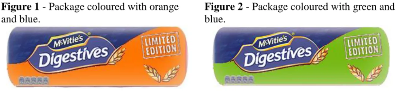
Along the survey, participants were presented with two different packages: one coloured with blue and orange and the other coloured with blue and green. The two packages were designed by manipulating a regular package of digestive cookies, using Photoshop. In order to avoid biases in responses, due to the brand or the type of cookies, it was chosen a brand that is not sold in the common supermarkets in Portugal and the pictures of the cookies were also removed from the original package. The brand logo and the wording of the package were edited and coloured with a neutral colour in order to avoid interferences in the image reading. The following pictures show the packages used in the study.
11 Figure 1 - Package coloured with orange
and blue.
Figure 2 - Package coloured with green and blue.
At the beginning of the questionnaire, participants were told that the purpose of the study was to understand people’s purchase and consumption of cookies. Hence, the questionnaire contained six blocks of questions. The first block aimed at gathering demographic data about participants, such as age, gender and occupation. The second block entailed a colour vision test. The ability to see colours as they are, was fundamental for the purpose of the present study. This test of colour-blindness was performed, since it is common that colour-blind people are not aware of their inability. The test consisted of eight coloured circles with numbers inside. The responses of the participants who failed two or more numbers were not considered for the study. The third block was developed to support the cover story (Koo and Suk, 2016). Therefore, participants were asked about the frequency of consumption and their preferred brands of cookies. In the fourth and fifth blocks of the questionnaire, participants were confronted with two different packages. In the first question of the block, participants were asked to rate healthiness and calorie perceptions (Huang and Lu, 2015); afterwards, they were also asked to estimate the calorie content of the presented package compared to a traditional package of digestive cookies. Similar comparative judgements have been previously used by Schuldt (2013). In the last question of the block, participants were asked to report their likelihood of purchasing the package shown (Dong, 2013). In the last block, the two packages were displayed in a random order and participants were asked to choose the one they would prefer to buy.
12 3.2. Measures
The questionnaire combined related researches selected from a vast collection of papers on consumer behaviour concerning packaging and colours. The data collection aimed at determining which hypotheses were to be either accepted or rejected.
In order to measure which combination of colours is perceived as being healthier and less caloric, participants had to rate their perceptions regarding the two packages. To reach the aim, a semantic differential rating scale consisting of six bipolar adjectival statements, separated by a 7-point scale was employed (McCroskey, Pricitard and Arnold, 1967). The relevant adjectives used in the research were healthy/unhealthy and high calorie/low calorie. Nevertheless, four statements were added as control variables (sweet/not sweet, pleasant/unpleasant, tasty/distasteful and satiating/not satiating). Participants also estimated the calorie content of the packaging comparing to a reference package, using a 7-point scale, ranging from “1 - less calories” to “7 – more calories”. At last, the statements from the variable purchase intention were previously used by Mullet and Karson (1985), ranging from “definitely will buy” to “definitely will not buy”, using a 5-point scale.
3.3. Sample
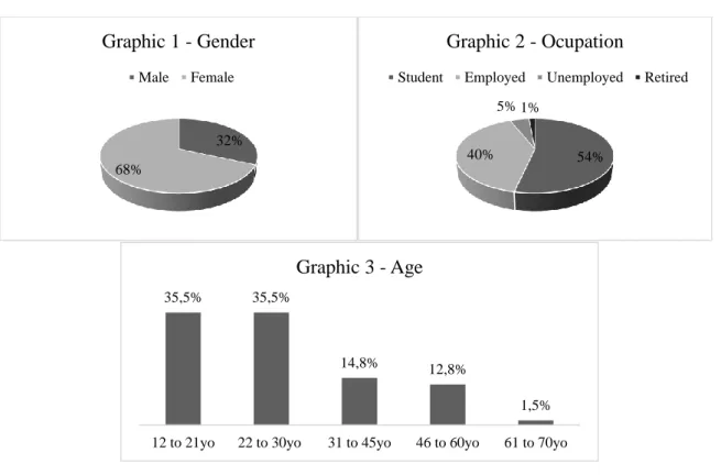
In factor analyses, it is important to have a sample as large as possible, to ensure reliability and a representative selection of the population. In this questionnaire, there were no limitations to the characteristics of participants to ensure diversity among responses. In total, 383 people responded to the questionnaire. However, 39 answers were considered invalid due to missing responses or failure in the colour blindness test. Thereby, the final sample included 344 men and women ranging from 12 to 70 years old. Among the final sample, 31.7% were men and 68.3% were women, being the average age 28 years old. Within the participants, 53.5%
13 of them are students, 40.4% are currently employed, 4.7% are unemployed and only 1.5% are retired.
4. Results
4.1. Data Analysis
The collected data was analysed using a quantitative approach, with the help of the software SPSS, through which the appropriate statistical tests were carried out to identify and describe the perceptions of consumers with regard to colour combinations of packages.
In order to explore the effects measured in the questionnaire, parametric hypothesis tests were performed. Specifically, t-tests were applied, since the objective was to analyse whether the means of the two samples were statistically different from each other. Therefore, according to the central limit theorem, it is assumed that the population follows a normal distribution. All statistical tests were carried out considering a significance level of 5%.
4.2. Hypotheses
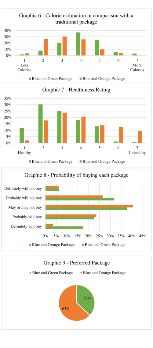
To measure the participants’ calorie perception concerning each package, two items were analysed: the “high calorie/ low calorie” item and the calorie estimation in comparison with the traditional package of digestive cookies. Regarding the first item, the blue and orange package was rated as the package containing more calories (M = 4.64; SD = 1.651). Accordingly, the blue and green package was perceived as having less calories (M = 3.65; SD = 1.398). Thereby, the data analysis was performed using a paired-sample t-test. This statistical test revealed that, the package coloured with blue and orange, is significantly different in perceived calories in comparison with the package coloured with blue and green, as t (343) = 10.366 and p < .001 (p = .000).
14 The analysis of the second item mentioned reinforced the previous findings. Therefore, the blue and orange package was perceived as containing more calories than a traditional package (M = 4.03; SD = 1.192) and the blue and green package was perceived as containing less calories (M = 3.25; SD = 1.178). The paired-sample t-test revealed, once again, that the package coloured with blue and orange is significantly different in perceived calories in comparison with the package coloured with blue and green, as t (343) = 11.070 and p < .001 (p = .000). Therefore, hypothesis 1 is confirmed.
To evaluate participants’ perception concerning product healthiness, only the “healthy/unhealthy” item was analysed. The 7-point scale applied ranges from “1 – healthy” to “7 – unhealthy”. Descriptive statistics show that the blue and orange package was rated as being the less healthy (M = 4.01; SD = 1.617). Accordingly, the blue and green package was perceived as being the healthiest (M = 2.96; SD = 1.297). Again, the data was analysed using a paired-sample t-test. Supporting the initial expectations, the statistical test showed that the package coloured with blue and orange is significantly different in perceived healthiness when compared with the package coloured with blue and green, as t (343) = 9.800 and p < .001 (p = .000). Concluding, hypothesis 2 is confirmed.
To analyse which package participants show higher intention to purchase, two dimensions were explored; the first was the likelihood of purchasing each package and the second was the participants’ preferred package. Regarding the first dimension mentioned, descriptive statistics revealed participants are, on average, more likely to buy the package coloured with blue and orange (M = 3.19; SD = .913) than the package coloured with blue and green (M = 3.08; SD = .938). Again, the data was analysed using a paired-sample t-test. According to the initial expectations, the statistical test showed that the probability of buying the blue and orange package is significantly different from the probability of buying the blue and green package, as t (343) = 2.620 and p < .01 (p = .009).
15 Regarding the second dimension mentioned before, descriptive statistics revealed that, when participants have to choose only one of the two packages, they prefer the package coloured with blue and orange. In order to perform the appropriate t-test, a dummy variable was created, where participants, who preferred the blue and orange package, were assigned with 0 and participants who preferred the blue and green package were assigned with 1. In this case, a one sample t-test was carried out. Supporting the initial expectations, the statistical test indicated that the preference for the blue and orange package is significantly different from the preference for the blue and green package, as t (343) = 24.209 and p < .001 (p = .000). Therefore, hypothesis 3 is confirmed.
5. General Discussion
This experiment was designed to enrich the colour research literature, by demonstrating the importance of colour combinations in packaging on consumers’ perception of calories and food healthiness, as well as purchase intention.
The presented results confirmed many of the issues addressed in the literature review. Accordingly, there is statistical evidence to say that colour combinations influence consumer’s perceptions and preferences. Analysing results with more detail, it can be concluded that the use of complementary versus analogous colours in packaging influences consumers’ calorie and healthiness perceptions and purchase intention.
Results indicate that, when complementary colours are combined in a package, consumers perceive that package as being less healthy and having more calories. In contrast, when analogous colours are combined in a package, that package is perceived as having less calories and as being healthier. One explanation for this finding is that analogous colours transmit balance, which is associated to healthiness and welfare. However, it is plausible that the colours used in each package also influenced participants’ responses, since high wavelength
16 colours - for instance, orange - are perceived to be less healthy than low wavelength colours, such as blue and green (Huang and Lu, 2013).
The findings of this study also suggest that consumers demonstrate a higher intention of purchasing packages coloured with complementary colours, rather than packages coloured with analogous colours. This result may be explained by the fact that complementary colours attract more attention due to their inherent contrast, as previous research in psychology confirmed, and that consumers choose products that draw their attention easily, when buying low involvement products. Although analogous colours transmit pleasantness and harmony, those may not be the feelings that consumers seek when purchasing low involvement goods, such as cookies. Furthermore, participants were asked which package they would prefer to buy, but they were not asked to justify their choice. Therefore, it may be the case that participants chose the blue and orange package as the preferred one because these colours are used more often in cookies packages than blue and green, which reveals that consumers are more familiar with packages coloured in blue and orange. This result contradicts the findings of Huang and Lu (2013), which evidenced that there is a higher intention to purchase blue- than red-packaged products.
In line with the existing literature, the results of this study also indicate that there is an association between healthiness perception and calorie estimation. Consumers perceive healthy products as having a low calorie content and unhealthy products as having a high calorie content (Harper and Konrad, 2006). Therefore, the package rated as the healthiest was also classified as having less calories.
The observed results about consumers’ purchase intention suggest that consumers are not so concerned about health issues, since they prefer to buy the package they rated as being the less healthy and the most caloric.
17 Table 1 – Summary of Hypotheses
Hypothesis Results Decision
H1. Orange and blue (as complementary colours) packaged cookies are perceived as having more calories than blue and green ones. p < .001 t (343) = 10.366 Accepted p < .001 t (343) = 11.070 H2. Orange and blue (as
complementary colours) packaged cookies are perceived as being less healthy than blue and green ones.
p < .001
t (343) = 9.800 Accepted
H3. There is a higher
intention to purchase orange and blue packaged cookies (as complementary colours) than blue and green ones.
p < .01 t (343) = 2.620 Accepted p < .001 t (343) = 24.209 5.1. Managerial Implications
Managers have become increasingly concerned with product packaging, since it has been proven to be one of the most effective tools in attracting consumers’ attention in the marketplace. Research has shown that different product packages communicate different meanings to consumers, through package features, such as material, shape, size, colour and imagery.
In line with the reviewed literature in marketing and psychology, the noteworthy impact of colour addressed in this research points out the potential of using package colour as a marketing tool. Nevertheless, the way colours are combined was demonstrated to be an issue that managers must pay close attention. Despite the limitations of this research, findings may work as guideline for product managers.
18 Calorie estimations and healthiness perceptions are two critical factors that influence consumers’ food choice at the marketplace. The findings of this research suggest that package colour is a relevant issue in these perceptions.
In accordance with Huang and Lu (2015), the observed results indicate that colour works as a visual marketing cue, so that it communicates key information to consumers. Specifically, there is evidence to say that if managers want a product to be perceived as healthier and with low calories, they should use a package using analogous colours – in particular, orange and blue. However, the findings lead managers to a trade-off. As asserted above, consumers demonstrated a higher intention to purchase packages using complementary colours. Therefore, managers have to ponder whether they prefer to be perceived as healthy or they want to have a product with higher levels of purchase intention.
Finally, managers are becoming more and more concerned with healthy issues and are changing products’ image. Therefore, brand positioning and repositioning strategies can benefit from the findings of this research.
5.2. Limitations and future research
This research has some limitations. First, time constraints may have reduced the robustness and validity of the present project. The narrow deadline resulted in a smaller sample collected and in lack of time for some tasks. Moreover, the imposed page limit restricted the research and may have led to the omission of additional relevant content.
The fact that the sample was dominated by Portuguese people limits the validity of this study, since previous research has shown that perceptions and meanings of colours may vary across cultures (Madden, Hewett and Roth, 2000). Therefore, future research should examine potential cultural differences in perceptions. Also, the demographic range that the selected
19 sample encompasses may not achieve full representation of the population, since most of the participants are young adults.
Another limitation of this study is the fact that participants were given unlimited time to answer each question. In future larger scale researches, participants should be given approximately the same time they spend in a supermarket looking at the product, so that the results will be closer to the real in-store situation.
Though the packages designed were based on an existing package, the edition of the packages using Photoshop may have affected respondents’ perceptions, since there are many features impacting these perceptions, such as font, imagery, shape and size. Additionally, further research should use a larger range of colours in order to confirm the validity of the observed results.
It could be also interesting for future research to develop a qualitative research, with the purpose of gathering directly participants’ opinions, perceptions and considerations.
Future large-scale researches should follow a between-subject design, in order to avoid having the participants answer the same questions twice. This way, participants would be assigned into different colour conditions, which would result in less contamination by extraneous factors. Furthermore, this study is limited in its external validity, since it explored only one product category. Future research could analyse other low involvement products.
Another potential way for future research is to examine how other packaging features may affect calorie perceptions and perceived healthiness. For instance, the material of the package may play a role in consumer’s perceptions. Moreover, matching consumers’ healthy eating concerns with colour choice may provide an additional direction for further research.
Without a shadow of doubt, it can be concluded that it is needed more research to confirm the accuracy and consistency of the current results.
20
6. Conclusion
The design of a product influences consumers’ perceptions and, consequently, their choice. Thereby, it is important to explore in what extent the different dimensions of product design affect consumers. Though many research has been done in product packaging and consumer behaviour, it still lacks in some areas. In this sense, the present work examines how different combinations of colours (complementary versus analogous) influence consumers’ perceptions on calories and healthiness and their intention to purchase.
The limitations of this research make it difficult to draw robust conclusions, when so little is known about colour combinations in packaging. Nevertheless, this research is a significant contribution for colour literature in marketing. Thereby, important conclusions may be drawn and may work as a guideline for product managers to help them enhancing a product performance.
7. References
Ampuero, O., & Vila, N. (2006). Consumer perceptions of product packaging. Journal of Consumer Marketing, 23(2), 100–112.
Aslam, M. M. (2006). Are You Selling the Right Colour? A Cross-cultural Review of Colour as a Marketing Cue. Journal of Marketing Communications, 12(1), 15–30.
Beneke, J., Floyd, V., Rono, C., & Sherwood, K. (2015). Chocolate, Colour and
Consideration: An Exploratory Study of Consumer Response to Packaging Variation in the South African Confectionery Sector. International Journal of Marketing Studies, 7(1), 55–65.
Cahyorini, A., & Zalfiana Rusfian, E. (2011). The Effect of Packaging Design on Impulsive Buying. Journal of Administrative Science & Organization, 18(1), 11–21.
Carels, R. A., Harper, J., & Konrad, K. (2006). Qualitative perceptions and caloric estimations of healthy and unhealthy foods by behavioral weight loss participants. Appetite, 46(2), 199–206.
Cowburn, G., & Stockley, L. (2005). Consumer understanding and use of nutrition labeling: a systematic review. Public Health Nutrition, 8(1), 21–28.
21 Creusen, M. E. H., & Schoormans, J. P. L. (2005). The different roles of product appearance
in consumer choice. Journal of Product Innovation Management, 22(1), 63–81. Dong, P. (2013). The effect of package color on food calorie judgment. AMA Winter
Educators' Conference Proceedings, 24, 438–439.
Gorn, G. J., Chattopadhyay, A., Tracey, Y., & Dahl, D. W. (1997). Effects of Color as an Executional Cue in Advertising: they're in the Shade. Management Science, 43(10), 1387-1400.
Guéguen N. (2003). The effect of glass colour on the evaluation of a beverage’s thirst-quenching quality. Current Psychology Letters, 2, 1–6.
Huang, L., & Lu, J. (2013). When Color Meets Health: The Impact of Package Colors on the Perception of Food Healthiness and Purchase Intention. Advances in Consumer
Research, 41, 625–626.
Huang, L., & Lu, J. (2015). Eat with your eyes: Package color influences the expectation of food taste and healthiness moderated by external eating. State University of New York at Fredonia. Marketing Management, 25(2), 71–87.
Koo, J., & Suk, K. (2016). The effect of package shape on calorie estimation. International Journal of Research in Marketing, 33(4), 856-867.
Krishna, A. (2006). Interaction of Senses: The Effect of Vision versus Touch on the Elongation Bias. Journal of Consumer Research, 32(4), 557-566.
Labrecque, L. I., Patrick, V. M., & Milne, G. R. (2013). The Marketers' Prismatic Palette: A Review of Color Research and Future Directions. Psychology & Marketing, 30(2), 187-202.
Lajos, J., & Chattopadhyay, A. (2011). Effects of package color on consumers’ judgments of product volumes. Advances in Consumer Research, 9, 30-31.
Lee, C. J., & Andrade, E. (2010). The Effect of Emotion on Color Preferences. Advances in Consumer Research, 37, 846–847.
Lichtlé, M. C. (2007). The effect of an advertisement’s colour on emotions evoked by an ad and attitude towards the ad. International Journal of Advertising, 26(1), 37–62.
Madden, T. J., Hewett, K., & Roth, M. S. (2000). Managing Images in Different Cultures: A Cross-National Study of Color Meanings and Preferences. Journal of International Marketing, 8(4), 90–107.
McCroskey, J. C., Pricitard, S. O., & Arnold, W. E. (1967). Attitude intensity and the neutral point on semantic differential scales. Public Opinion Quarterly, 31(4), 642
22 Mohebbi, B. (2014). The art of packaging: An investigation into the role of color in
packaging, marketing, and branding. International Journal of Organizational Leadership, 3(2), 92–102.
Mullet, G. M., & Karson, M. J. (1985). Analysis of Purchase Intent Scales Weighted by Probability of Actual Purchase. Journal of Marketing Research (JMR), 22(1), 93-96. Patil, D. (2012). Coloring consumer’s psychology using different shades the role of
perception of colors by consumers in consumer decision making process: a micro study of select departmental stores in Mumbai city, India. Journal of Business & Retail Management Research, 7(1), 60–74.
Schuldt, J. P. (2013). Does green mean healthy? Nutrition label color affects perceptions of healthfulness. Health Communication, 28(May 2015), 814–21.
Singh, N., & Srivastava, S. K. (2011). Impact of colors on the psychology of marketing-A comprehensive overview. Management and Labour Studies, 36(2), 199–209.
Singh, S. (2006). Impact of Color on Marketing. Management Decision, 44(6), 783–789. Vasiljevic, M., Pechey, R., & Marteau, T. M. (2015). Making food labels social: The impact
of colour of nutritional labels and injunctive norms on perceptions and choice of snack foods. Appetite, 97(1), 56-63.
Venter, K., Van der Merwe, D., De Beer, H., Kempen, E., & Bosman, M. (2011). Consumers’ perceptions of food packaging: An exploratory investigation in Potchefstroom, South Africa. International Journal of Consumer Studies, 35(3), 273–281.
23
8. Appendixes
8.1. Appendix 1 – Demographics 8.2. Appendix 2 – Frequencies 32% 68% Graphic 1 - Gender Male Female 54% 40% 5% 1% Graphic 2 - OcupationStudent Employed Unemployed Retired
14,5% 12,8% 27,0% 12,5% 11,6% 21,5% Less than once a week
Once a week 2/3 times a week
4/5 times a week
Everyday Rarely
Graphic 4 - Frequency of cookies consumption
0,00% 5,00% 10,00% 15,00% 20,00% 25,00% 30,00% 35,00% 1 Low Calorie 2 3 4 5 6 7 High Calorie Graphic 5 - Calorie Rating
Blue and Green Package Blue and Orange Package
35,5% 35,5%
14,8% 12,8%
1,5% 12 to 21yo 22 to 30yo 31 to 45yo 46 to 60yo 61 to 70yo
24 0% 10% 20% 30% 40% 1 Less Calories 2 3 4 5 6 7 More Calories Graphic 6 - Calorie estimation in comparison with a
traditional package
Blue and Green Package Blue and Orange Package
0% 5% 10% 15% 20% 25% 30% 35% 40% 45%
Definitely will buy Probably will buy May or may not buy Probably will not buy Definitely will not buy
Graphic 8 - Probability of buying each package
Blue and Orange Package Blue and Green Package 0% 5% 10% 15% 20% 25% 30% 35% 1 Healthy 2 3 4 5 6 7 Unhealthy Graphic 7 - Healthiness Rating
Blue and Green Package Blue and Orange Package
37% 63%
Graphic 9 - Preferred Package