Visualization of Clusters in Geo-referenced Data Using Three-dimensional
Self-Organizing Maps
by
Jorge Manuel Lourenço Gorricha
Dissertation Submitted in Partial Fulfillment of the Requirements for the Degree of
Mestre em Estatística e Gestão de Informação (Master in Statistics and Information Management)
Instituto Superior de Estatística e Gestão de Informação da
Visualization of Clusters in Geo-referenced Data Using Three-dimensional
Self-Organizing Maps
This dissertation was prepared under the supervision of Professor
Doutor Victor José de Almeida e Sousa Lobo
“Everything is related to everything else, but closer things are more closely related.”
Acknowledgments
I wish to express my gratitude to my supervisor, Professor Doutor Victor Lobo, who introduced me to this topic. This dissertation would not be possible without his help, comments and suggestions.
I also want to thank my family, and in particular to my wife, Florbela, whose support was decisive to conclude this work.
Finally, I dedicate this dissertation to my daughters, Helena and Laura.
v
Visualization of Clusters in Geo-referenced Data Using Three-dimensional Self-Organizing Maps
Abstract
vi
Visualização de clusters em dados georreferenciados com recurso ao Self-Organizing Map tridimensional
Resumo
O Self-Organizing Map (SOM) é uma rede neuronal artificial que opera simultaneamente um processo de quantização e projecção vectorial. Devido a esta característica, o SOM é um método particularmente eficaz como ferramenta de análise de clusters via visualização. O SOM pode ser visualizado sob o ponto de vista do espaço de output, usualmente uma rede estruturada com duas dimensões, e pelo espaço de
input, onde se pode observar essencialmente o resultado do processo de quantização vectorial. Entre todas as estratégias de visualização do SOM, existe particular interesse em explorar as que permitem lidar com a dependência geo-espacial, especialmente os métodos que estabelecem a ligação entre o SOM e a representação cartográfica dos dados georreferenciados através da cor. Uma das abordagens possíveis, e utilizadas
usualmente, consiste em representar cartograficamente os elementos
georreferenciados com uma cor obtida em função das unidades do SOM com duas dimensões. Contudo, no caso especial dos dados georreferenciados, é possível equacionar a utilização do SOM tridimensional para o mesmo propósito, permitindo desta forma incluir uma nova dimensão na análise. Nesta dissertação é apresentado um método de análise de clusters para dados georreferenciados que integra ambas as perspectivas de visualização do SOM: a representação cartográfica dos dados georreferenciados com base num conjunto de cores ordenadas a partir do espaço de
vii
Keywords
Self-Organizing Map
Clusters analysis
Geo-referenced data
3D SOM
Visualization
Frontiers
Unsupervised Neural networks
viii
Contents
Acknowledgments
... ivAbstract
... vResumo
... viKeywords
... viiList of Figures
...xList of Abbreviations
... xi1. Introduction
... 122. The Self-Organizing Map
... 142.1. ALGORITHM... 14
2.2. PARAMETERIZATION OF THE SOM ... 17
2.2.1. The size of the map ... 18
2.2.2. The output space dimension ... 18
2.2.3. The initialization ... 18
2.3. QUALITY MEASURES FOR SELF-ORGANIZING MAPS ... 19
2.3.1. Quantization error ... 20
2.3.2. Topological Error ... 20
2.3.3. Alternative measures for quantifying the goodness-of-fit of SOM’s ... 21
2.4. SOFTWARE TOOLS FOR SOM ... 23
2.5. THE VISUALIZATION OF THE SOM ... 24
2.5.1. The Output Space ... 24
2.5.2. The input space ... 25
2.5.3. Combining elements from both Input and Output Space ... 26
2.5.4. Geo-referenced data - A special case ... 29
3. Clustering Geo-referenced Data With a 3D SOM
... 313.1. VISUALIZING THE OUTPUT SPACE USING A COLOR LABEL ... 31
3.2. USING FRONTIERS TO VISUALIZE THE INPUT SPACE OF A SOM... 33
3.2.1. Defining the frontier width ... 33
3.2.2. The plotting methodology ... 34
4. Experimental Results
... 364.1. EXPERIMENT WITH ARTIFICIAL DATA... 36
4.1.1. Artificial data set ... 36
ix
4.2. EXPERIMENT WITH REAL DATA ... 44
4.2.1. Lisbon’s metropolitan area ... 44
4.2.2. Experiment and results ... 44
4.3. CONCLUSIONS FROM EXPERIMENTS ... 49
5. Conclusions and Future Work
... 515.1.1. Conclusions ... 51
5.1.2. Future work ... 51
References
... 53x
List of Figures
Figure 1 –Two perspective of one single Sammon’s Projection ... 25
Figure 2 – Clustering using the U-Matrix ... 27
Figure 3 – U-Matrix e Component Planes ... 27
Figure 4 – Combining SOM with other projections through colour ... 28
Figure 5 – Combining the distances matrix with similarities on the output space ... 29
Figure 6 – Adding other type of information to U-Matrix ... 29
Figure 7– Clustering of the principal causes of death with a 2D SOM ... 30
Figure 8 – Linking SOM to cartographic representation ... 31
Figure 9 – The Cutting distance ... 35
Figure 10 - Artificial Dataset ... 36
Figure 11 – Cartographic representation with 2D SOM ... 39
Figure 12 – U-Matrix 2D SOM ... 39
Figure 13 – Cartographic representation with 3D SOM ... 39
Figure 14 – 3D SOM projection using PCA ... 40
Figure 15 – The Cutting distance of the 3D SOM ... 41
Figure 16 – Visualization of both input and output space of the 3D SOM ... 41
Figure 17 – Using frontier lines as a clustering tool ... 42
Figure 18 – The Cutting distance of the 2D SOM ... 42
Figure 19 – Visualization of both input and output space of the 2D SOM ... 43
Figure 20 – Lisbon Metropolitan Area ... 44
Figure 21 – U-Matrix of a 3D SOM ... 45
Figure 22 – Lisbon centre visualized with both 2D SOM and 3D SOM ... 46
Figure 23 – Zone 910: 2D SOM and 3D SOM visualization ... 47
Figure 24 – Zone 910: using frontiers to visualize the input space ... 47
Figure 25 – The cutting distance ... 48
Figure 26 –“Parque das Nações” ... 48
xi
List of Abbreviations
ANN Artificial Neural Network
SOM Self-Organizing Map
3D SOM Three-dimensional Self-Organizing Map
2D SOM Two-dimensional Self-Organizing Map
DM Data Mining
RGB Red-Green-Blue
U-Matrix Unified distance matrix
BMU Best Matching Unit
PCA Principal Component Analysis
CCA Curvilinear component analysis
QE Quantization error
12
1.
Introduction
There is a wide range of problems that need to be addressed in a geo-spatial perspective. These problems are often associated with environmental and socio-economic phenomena where the geographic position is a determinant element for analysis (Openshaw, 1995, p. 4). Moreover, there is a growing trend in the volume of geo-referenced data, opening new opportunities to generate new knowledge with the use of appropriate tools (Openshaw, 1999).
In such kind of analysis, frequently based on geo-referenced secondary data (Openshaw, 1995, p. 3), we are particularly interested in the search of patterns and spatial relationships, without defined a priori hypotheses1 (Miller & Han, 2001, p. 3). In fact, a substantial part of this kind of analysis, common to most multidimensional data, is focused on clustering, defined as the unsupervised classification of patterns into groups (Jain, et al., 1999, p. 264).
The visualization2 can be considered a potentially useful technique when the objective is to search patterns in data. It is also recognized that exploratory analysis via visualization can contribute effectively to discover new knowledge (Fayyad & Stolorz, 1997). Moreover, when applied to geo-referenced data, this technique may allow the explanation of complex structures and phenomena in a spatial perspective (Koua, 2003).
It is in this context that unsupervised neural networks, such as the SOM (Kohonen, 1990, 1998, 2001), have been proposed as tools for visualizing geo-referenced data (Koua, 2003). In fact, the SOM algorithm performs both vector quantization3 and vector projection, making this artificial neural network a particularly effective method for clustering via visualization (Flexer, 2001).
One of the methods used to visualize geo-referenced data using the SOM consists in assigning different colours to the units of the SOM network, defined only in two dimensions (2D SOM), so that each geo-referenced element can be geographically represented with the colour of its Best Matching Unit4. This approach, supported by a non-linear projection of data on a two-dimensional surface, performs a
1 Geo-referenced data have specific characteristics which make inappropriate the use of statistical models that
impose too many restrictions, as the dependence among observations, the existence of local relations between data and the often non-normal distribution (Openshaw, 1999).
2 The use of visual representations of data obtained from the use of interactive computer systems, in order to
amplify cognition (Card, et al., 1999, p. 6).
3 Process of representing a given data set by a reduced set of reference vectors (Buhmann & Khnel, 1992; Gersho, 1977, p. 16, 1978, p. 427).
13
dimensionality reduction, and for this reason there is a strong probability that some of the existing clusters remain undetectable (Flexer, 2001, p. 381).
For common data, it is very difficult or even impossible to visualize SOM’s with more than two dimensions (Bação, et al., 2005, p. 156; Vesanto, 1999, p. 112). However, geo-referenced data have one specific characteristic that allow the visualization of three dimensional SOM’s through a similar process to that is adopted for clustering in geo-referenced data with two dimensional SOM’s: the trivial representation in a two-dimensional space, the cartographic map.
As we shall see later, the inclusion of a third dimension in the analysis will allow us to identify some of the clusters that remain undifferentiated in SOM’s with the output space5 defined only in two dimensions. Nevertheless, it appears that some geo-referenced elements still remain with a high degree of uncertain. In order to solve this problem, we used the natural frontiers among geo-referenced elements to incorporate information from the input data space6.
This dissertation is divided into five parts and is organized by chapters as follows: Chapter 2 is dedicated to present the theoretical framework of the problem under review, especially regarding the use of the SOM as a tool for visualizing clusters; In Chapter 3 we present a method for visualizing clusters in geo-referenced data that combines information from the output space of a three dimensional SOM with distances between SOM units measured in the input space; Chapter 4 is dedicated to present the results and discussion of practical applications of the presented method, including experiments with real and artificial data; In Chapter 5 we present the general conclusions and future work.
5 Map grid space.
14
2.
The Self-Organizing Map
The SOM is an artificial neural network based on an unsupervised learning process that performs a gradual and nonlinear mapping of high dimensional input data onto an ordered and structured array of nodes, generally of lower dimension (Kohonen, 2001, p. 106). As a result of this process, and by combining the properties of an algorithm for vector quantization and vector projection, the SOM compresses information and reduces dimensionality (Vesanto, et al., 2000).
Because the SOM converts the nonlinear statistical relationships that exist in data into geometric relationships, able to be represented visually (Kohonen, 1998, 2001, p. 106), it can be considered as a visualization method for multidimensional data specially adapted to display the clustering structure (Himberg, 2000; Kaski, et al., 1999), or in other words, as a diagram of clusters (Kohonen, 1998). When compared with other clustering tools, the SOM is distinguished mainly by the fact that, during the learning process, the algorithm tries to guarantee the topological order of its units, thus allowing an analysis of proximity between the clusters and the visualization of their structure (Skupin & Agarwal, 2008, p. 6).
In this chapter we will overview the SOM. The main objective is to review the most important aspects of this neural network, namely:
– The basic incremental SOM algorithm (and the basic notation associated);
– The parameterization of the SOM;
– How to quantify the quality of the mapping;
– Software tools;
– The SOM visualization.
2.1. ALGORITHM
In its most usual form, the SOM algorithm performs a number of successive iterations until the reference vectors associated to the nodes of a bi-dimensional network represent, as far as possible, the input patterns (vector quantization7) that are closer to those nodes8. In the end, every sample in the data set is mapped to one of the network nodes (vector projection).
7 The K-means and the Maximum Entropy Algorithm are other examples of vector quantization algorithms. All this algorithms perform an iterative process during which they try to fit and represent data with a certain number of clusters. The main difference between these algorithms is the way they update the centres of the clusters along the iterative process (Vesanto, 1999, p. 113).
15
During this optimization process, the topology of the network is, whenever possible, preserved, allowing that the similarities and dissimilarities in the data are represented in the output space (Kohonen, 1998). Therefore, the SOM algorithm establishes a non-linear relationship between the input data space and the map grid (output space).
More formally, the basic incremental SOM algorithm may be briefly described as follows (Kohonen, 1990, 1998, 2001):
Let us consider a set 𝒳of m training patterns defined with p dimensions (variables):
𝒳= 𝒙𝑗:𝑗= 1,2,…,𝑚 ⊂ ℐ
Where:
ℐ ⊂ ℛn: The input data space, a subspace ofℛn, where the set of training
patterns can be observed;
𝒙𝑗 = x𝑗1, x𝑗2,…, x𝑗𝑝 T ∈ ℐ.
Each node 𝑖 is associated to a reference vector 𝒎i defined on the input data spaceℐ and to a location vector 𝒓i defined on the output space𝒪 of the map grid, with k-dimensions9:
𝒎𝑖= m𝑖1, m𝑖2…, m𝑖𝑝 T ∈ ℐ
𝒓𝑖 = r𝑖1, r𝑖2…, r𝑖𝑘 T ∈ 𝒪
Where:
𝒪 ⊂ ℛn: The output space (or Map space) of a k-dimensional SOM:
𝒓𝑖 ∈ ℛ𝑘 (For the 2D SOM: k=2).
Before the learning process start, all the reference vectors 𝒎i must be initialized and
defined in the input data space. Also the output space of the SOM, i.e., the SOM
9 Each node of the network as two types of coordinates and can be seen through the input space or through the
16
coordinates, will be defined according to the lattice type (e.g., rectangular or hexagonal).
During the training process each input pattern 𝒙𝑗 is presented to the network and compared (usually by the evaluation of the Euclidean distance) with all the reference vectors 𝒎𝑖 associated to the nodes of the map. The node c associated to the reference vector 𝒎𝑐 that verifies the smallest Euclidean distance to the vector 𝒙𝑗 is then defined the BMU:
𝑐= arg min
𝑖 d 𝒙𝑗,𝒎𝑖
Where d 𝒙𝑗,𝒎𝑖 is the Euclidean distance between two vectors in the input data space (p-dimensional):
𝒟×𝒟 → ℛ+: d 𝒙𝑗,𝒎𝑖 = (xjk−mik p
k=1
)2
After the BMU is found, the network will start learning about the input pattern𝒙𝑗. This kind of learning is achieved by approaching 𝒎𝑐 and some of the reference vectors within a certain distance (neighbourhood) to𝒙𝑗, as follows:
𝒎𝑖 𝑡+ 1 =𝒎𝑖 𝑡 +α 𝑡 𝑐𝑖 𝑡 [𝒙𝑗 𝑡 − 𝒎𝑖 𝑡 ]
Where:
t= 0, 1, 2,...𝑡𝑚𝑎𝑥 is the discrete-time coordinate;
α 𝑡 is the learning-rate factor 0 <α 𝑡 < 1 ∶ A monotonically decreasing function of t that usually starts with a relatively large value in the begin, corresponding to the ordering phase, or unfolding phase, and ends with a small value, corresponding to the fine-adjustment phase;
𝑐𝑖 𝑡 is the neighbourhood function that converge to 0 when 𝑡 →∞ : It defines
17
function can be a simple neighbourhood set of nodes around the node c or be defined as in the following examples10 :
Bubble:
𝑐𝑖 𝑡 =𝟏 σt−d 𝒓𝒄,𝒓𝑖
Gaussian:
𝑐𝑖 𝑡 = e− d2 𝒓𝒄,𝒓𝑖
2σt2
Cutgauss:
𝑐𝑖 𝑡 = e− d2 𝒓
𝒄,𝒓𝑖
2σt2 𝟏 σt−d 𝒓𝒄,𝒓𝑖
Where,
d2
𝒓𝒄,𝒓𝑖 = 𝒓𝒄−𝒓𝑖 𝟐
σtis the neighbourhood radius at time t and 1(x)is the step function such that:
𝟏 𝑥 = 0, 𝑥< 0
1, 𝑥 ≥0
The training process ends when a predetermined number of training cycles (epochs) is reached (Skupin & Agarwal, 2008).
2.2. PARAMETERIZATION OF THE SOM
Depending on the initial parameterization, the SOM can produce different results. In fact, there are multiple choices that have significant consequences on the final result, such as: the size of the map; the output space dimension; the initialization and the neighbourhood function.
18 2.2.1.The size of the map
As regards the size of the SOM network (the number of nodes) for clustering tasks, three main lines of action can be followed (Bação, et al., 2008, p. 22):
– Defining the SOM with a very large number of units, possibly even larger than the number of input patterns (Ultsch, 2003, p. 225; Ultsch & Mörchen, 2005; Ultsch & Siemon, 1990).
– Establishing a network with a smaller number of units than the input patterns, but allowing each cluster to be represented by several units (Bação, et al., 2008, p. 22). – Only one unit per expected cluster (Bação, et al., 2004).
The first two approaches are more appropriate for clustering via visualization, since their representation with appropriate tools, such as the U-Matrix, let us explore the clustering structure (Ultsch, 2003, p. 225).
2.2.2.The output space dimension
The decision about the output space dimension of a SOM should be closely related with the intrinsic dimension of the input data set, that is, the minimum number of independent variables necessary to generate that data (Camastra & Vinciarelli, 2001).
Despite all the attempts and recent developments in this area, the intrinsic dimension estimation is, for most cases, still a largely unsolved problem (Bação, et al., 2008, p. 23). Nevertheless, most common data is not truly high-dimensional, but embedded in a high-dimensional space and can be represented in a much lower dimension (Levina & Bickel, 2004).
Furthermore, although the output space may have as many or more dimensions than the input space, it is rarely defined with more than two dimensions, essentially because it is difficult or even impossible to visualize (Bação, et al., 2008, p. 23).
However, it is important to note that choosing the incorrect map dimension may cause a negative impact on the mapping quality, namely, causing an increase in the topological error. This error is a sign that the SOM algorithm is trying to approximate an unsuitable output space to a higher-dimensional input space (Kiviluoto, 1996).
2.2.3.The initialization
19
that whatever the initialization process, the algorithm will tend to converge to an ordered map (Kohonen, 2001, p. 142).
Although the initial values of the reference vectors can be arbitrary, sometimes it is useful starting the initialization process by spreading the reference vectors along the sub-space defined by the two first principal components (Kohonen, 2001, p. 142). This strategy does not necessarily lead to the best map, but can serve as a basis for comparison.
Generally, a good strategy consists in trying an appreciable number of random initializations to select the best map according to some optimization criterion (Kohonen, 2001, p. 142).
2.3. QUALITY MEASURES FOR SELF-ORGANIZING MAPS
The SOM algorithm is broadly dependent on several factors that have influence in the quality of adjustment of the model. The final result may vary significantly depending on the neighbourhood function, the way the algorithm is initialized, the network topology and the training schedule. Therefore, it becomes necessary to select some indicators to conclude about the quality of each model found, not only in relative terms (for comparison), but also in absolute terms, especially to detect problems that occurred during the network training phase.
Generally, the quality of a SOM can be usually summarized and evaluated as follows (Kiviluoto, 1996, p. 294):
– By measuring the quality of the continuity of mapping;
– By evaluating the mapping resolution.
The degree of continuity of a SOM reflects how the vectors (associated to the training patterns) that are close in the input space are also mapped with similar proximity in the output space. Moreover, a good resolution of a SOM implies that the training patterns positioned in remote areas aren’t mapped to units next to each other in the output space.
To evaluate the resolution and continuity of mapping two types of errors are usually computed:
– The Quantization error;
– The Topological error.
20 2.3.1.Quantization error
The Quantization Error (QE) is a measure to evaluate the resolution of the mapping that can be considered inherent to the process of modelling. At the end of the learning process, all the training patterns will be assigned (or mapped) to one single unit of the lattice. Therefore, all the vectors associated to each of the training patterns will be represented in the SOM by the vector associated to its BMU. So, unless the training pattern fits exactly to its BMU, there will be always a distance between data and its model.
This distortion measure (Kohonen, 2001, p. 146) is the average Euclidean distance between the m input patterns 𝒙𝑖 and the reference vector 𝒎𝑐 associated to their Best Matching Units:
QE = d 𝒙𝑖,𝒎𝑐 m
i=1 m
Where,
𝒎𝑐is the reference vector associated to the BMU of 𝒙𝑖: c = arg minj d 𝒙𝑖,𝐦j
d 𝒙𝑖,𝒎𝑐 is the Euclidean Distance
m is the number of input patterns
The quantization error is one of the most important indicators about the quality of learning of a SOM and gives an idea how the map fits to data. However it is important to understand that a very low quantization error can be associated to an over fitted model (Alhoniemi, et al., 2002b).
2.3.2.Topological Error
The topological error (TE), also known as topographic error, measures the topology preservation and the continuity of the mapping. It is defined by the proportion of all data vectors where the BMU and second BMU are not adjacent units (Kiviluoto, 1996, p. 296):
TE = 𝑓 𝒙𝑖 m i=1
m
Where,
21
2.3.3.Alternative measures for quantifying the goodness-of-fit of SOM’s
The quantization error and the topological error together provide a good indicator about the quality of learning of a SOM. However, it is recognized that in some cases it is necessary to find an optimal balance between resolution and continuity.
In order to address this issue, Kaski & Lagus (1996) proposed a new measure that tries to combine the evaluation of both errors in one single representation.
This measure denoted by C, increases when there is a discontinuity on mapping and can be more formally described as follows:
𝐶= 𝐷 𝒙𝑖,𝒎𝑐′ m
i=1 m
Where,
𝒎𝑐′ is the reference vector associated to the second BMU of 𝒙𝑖
𝐷 𝒙𝑖,𝒎𝑐′ is a distance computed from 𝒙𝑖 to its second BMU reference vector 𝒎𝑐′
passing first from the BMU reference vector ( 𝒙𝑖− 𝒎𝑐 ), and after that along the shortest path along the map grid, adding all the Euclidean distances between the reference vectors until the second BMU reference vector is found (Samuel & Krista, 1996, p. 810).
Beyond the methods listed before, there are other approaches proposed for monitoring the quality of learning of SOM, of which we highlight the following:
2.3.3.1. The topographic product
As mentioned in sub chapter (2.2.2.), there is still another reason why the SOM does not preserve topology after the learning process. Depending on the output space, the SOM may experiment difficulties on mapping really high dimensional input data, causing an increase in topological error.
The topographic product (Bauer & Pawelzik, 1992) was a first attempt to address this issue by measuring the preservation of the neighbourhood between the SOM units in both output and input space. More formally, the topographic product (P) is computed as follows:
22
𝑑𝐼(𝒘
𝑗,𝒘𝑖) is the input space distance between the reference vectors associated to
the j-th SOM unit and the i-th SOM unit, and in a similar way, 𝑑𝑂(𝑗,𝑖) is the output space distance between those units.
Defining the quantities 𝑄1 and 𝑄2 as follows:
𝑄1=
𝑑𝐼 𝒘
𝑗,𝒘𝑛𝑘𝑂 𝑗
𝑑𝐼 𝒘
𝑗,𝒘𝑛𝑘𝐼 𝑗
𝑄2=
𝑑𝑂 𝑗,𝑛 𝑘 𝑂 𝑗
𝑑𝑂 𝑗,𝑛 𝑘𝐼 𝑗
The products𝑃1, 𝑃2 and 𝑃3 are:
𝑃1(𝑗,𝑘) = 𝑄1(𝑗,𝑖) 𝑘
𝑖=1
1 𝑘
𝑃2(𝑗,𝑘) = 𝑄2(𝑗,𝑖) 𝑘
𝑖=1
1 𝑘
𝑃3(𝑗,𝑘) = 𝑄1(𝑗,𝑖)𝑄2(𝑗,𝑖) 𝑘
𝑖=1
1 2𝑘
Finally, the topographic product is:
𝑃= 1
𝑁(𝑁 −1) log𝑃3(𝑗,𝑘) 𝑁−1
𝑘=1 𝑁
𝑗=1
23
small or too large, respectively. Nevertheless, this measure only gives good results when the input space is almost linear (Villmann, et al., 1994b).
2.3.3.2. The topographic function
The topographic function (Villmann, et al., 1994a) is another method to measure the continuity of the mapping and unlike the topographic product, this measure isn’t so affected by the nonlinearity of the input data space. This function is defined as the number of map units that have adjacent Voronoi regions in the input space (D), but a city-block distance greater then S in the output space (Kiviluoto, 1996):
Φ𝐿𝐷(𝑆) = # 𝑛𝑗|𝑗𝜖𝐿, 𝑛𝑖− 𝑛𝑗 >𝑆,𝑛𝑖𝑎𝑛𝑑𝑛𝑗 𝑎𝑣𝑒𝑉𝑜𝑟𝑜𝑛𝑜𝑖𝑎𝑑𝑗𝑎𝑐𝑒𝑛𝑡𝑟𝑒𝑔𝑖𝑜𝑛𝑠 𝑖𝜖𝐿
Where,
L is the index set for the map units
𝑉𝑖 is the Voronoi region of each reference vector𝒘𝑖 associated to the 𝑛𝑖, such that:
𝑉𝑖 = 𝒛 |𝒛𝜖𝐷: 𝒛 − 𝒘𝑖 < 𝒛 − 𝒘𝑗 , ∀𝑗 ≠ 𝑖
As mentioned by Kiviluoto et al. (Kiviluoto), although this function incorporates a lot of information about the quality of mapping, it is important to note that, by its very nature, a function plot brings additional difficulties in analysis.
2.4. SOFTWARE TOOLS FOR SOM
Currently there are numerous implementations of the SOM and it is difficult, or even impossible to enumerate all of them. However, as mentioned Kohonen (2001, pp. 327-328), not all implementations allow the elementary level of parameterizations of training and many of them are designed for restricted applications.
One of the more widespread implementations in use is the SOM_PAK (Kohonen, 2001; Skupin & Agarwal, 2008, p. 315) that allows the analyst an almost complete parameterization of all stages. The utilization of this software, written in C language, includes four phases: initialization, training, evaluation and visualization of the model (Kohonen, et al., 1996).
24
one of the most widely used implementations of the SOM (Skupin & Agarwal, 2008, p. 17).
For most common data sets, the SOMToolbox meets all the requirements (Kohonen, 2001, pp. 311-315) to be used for Data Mining. Broadly speaking it allows data pre-processing, the definition of the initialization and training process, the evaluation of models and finally, the visualization of the SOM.
Despite SOMToolbox allow any output space dimension, the visualization functions are defined only for two-dimensional maps (Vesanto, et al., 2000, p. 14). However, it is important to emphasise that this apparent limitation does not have any impact on the current work.
2.5. THE VISUALIZATION OF THE SOM
The SOM is generally presented as a tool for visualizing high dimensional data (Kohonen, 1998). By its own characteristics, the SOM is indeed an extremely versatile visualization tool and there is a wide variety of methods based on both perspectives of SOM: the output space and the input space.
The reduction in data set performed by the SOM is also followed by a simultaneous projection in a lower dimensionality space (Vesanto, 1999, p. 114), corresponding to the output space of the network.
In order to transform the SOM in to a real tool for exploratory data analysis, several methods have been developed that increase the possibilities of this algorithm for this purpose. The aim of this chapter is to describe some of these approaches divided in two major perspectives: the output space and the input space.
2.5.1. The Output Space
Although the output space of the SOM tries to preserve the topology of the input space, it does not display properly the existing clusters (Ultsch & Siemon, 1990). In fact, the non-linear projection implemented by the SOM is restricted to the BMU assignment and, in general, it is difficult to understand the data only by examining the output space.
25
proportional in low density areas of input space, in what is called the magnification effect (Claussen, 2003; Cottrell, et al., 1998).
2.5.2. The input space
Because SOM units are associated to reference vectors of the same dimension of the input space, it is possible to explore the visualization of the SOM through this perspective (Vesanto, 1999, p. 116). Nevertheless, all the approaches based on exclusively this perspective, only take advantage from the vector quantization capabilities of this Artificial Neural Network.
Generally, the main objective of this technique is to achieve some sort of representation of the input space distances between the SOM units according to the minimization of a given error function. Sammon's projection, or Sammon's mapping (Sammon & W., 1969) is an example of this kind of projection closely related with the
Multidimensional Scaling (Torgerson, 1952; Young & Householder, 1938).
Figure 1 illustrates two perspectives of a 3D Sammon’s projection where we can identify three clusters. It is important to note that the use of tools for displaying three dimensional projections always involve the need to display different perspectives and in general, they are not sufficient to understand the data structure (Vesanto, 1999, pp. 116-117).
Figure 1 –Two perspective of one single Sammon’s Projection
The use of tools for displaying three dimensional projections always involves the need to display different perspectives. In this example we can identify three clusters.
26
As the SOM units are represented in the input space, it’s also possible to consider any kind of projection of those units (i.e., the reference vectors associated) in some subspace of the input space. For instance, we can consider the use of linear vector projections, such as PCA. Nevertheless, it seems that all the attempts to visualize the SOM considering only the distances in the input space between the reference vectors, disregard one of the most important properties of SOM: its projection capabilities.
A final reference to the Curvilinear Component Analysis (Demartines & Herault, 1997). In truth, this is not a projection of SOM, but an adaptation of the original algorithm. This method is based on a self-organizing map neural network and tries to link the input space to the output space. The fundamental difference is that the output space is no more a fixed lattice like in basic SOM, but a continuous space able to fit the data.
2.5.3. Combining elements from both Input and Output Space 2.5.3.1. The U-Matrix
The use of SOM for "clustering via visualization” is generally based on two -dimensional abstractions such as the U-Matrix (Ultsch & Siemon, 1990) or the
Kohonen projection method (Kraaijveld, et al., 1992) , obtained from the 2D SOM.
The basic idea of these two methods is based on the principle of using colour as a way to represent the distance matrix between the all the reference vectors associated to the SOM units. Units that are near their neighbours are represented in light tones and distant units of its neighbours are represented in dark (Kohonen, 2001, p. 165).
The main difference between the methods is how the degree of proximity to the neighbourhood of a given network unit is calculated. In the case of U-matrix, the choice falls on the average distance between the unit and its neighbourhood in the network. In the Kohonen projection method, the degree of neighbourhood is a function of the maximum distance observed between the unit and the neighbouring units (Kraaijveld, et al., 1992).
By using these methods we can see the structure in the data. The U-Matrix is, in fact, the most used method to visualize patterns by SOM (Skupin & Agarwal, 2008, p. 13).
27
(a) (b)
Figure 2 – Clustering using the U-Matrix
In this example we show a U-Matrix using two sets of different colours. In both examples we can identify the clustering structure with three well defined clusters. In the first figure (a), the dark areas of the U-Matrix represent the SOM units that have the greatest distances for the neighbouring units. The figure (b) is similar but in this case using blue tones to represent the homogenous areas (the colorbar shows the distance scale).
2.5.3.2. Component Planes
The Component Planes are another important tool to visualize the final result of a SOM. The distribution of each variable is represented on the map grid by the variation of colour. This way we can characterize each cluster (Kaski, et al., 1998b), and identify correlations between variables (Vesanto, 1999, p. 118). However, it is important to note that the SOM algorithm is particularly suitable to detect clusters, not correlations (Vesanto, 1999, p. 119).
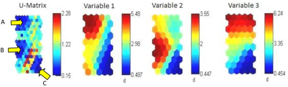
Generally, this method is used in combination with the U-Matrix. In the next Figure is represented an example that uses the U-Matrix and Component Planes to visualize data.
Figure 3 – U-Matrix e Component Planes
Associations between clusters and variables can be easily interpreted using Component Planes. For example, the cluster C is characterized by low values of all variables.
A
28
2.5.3.3.Visualizing the similarity and dissimilarity between the SOM units
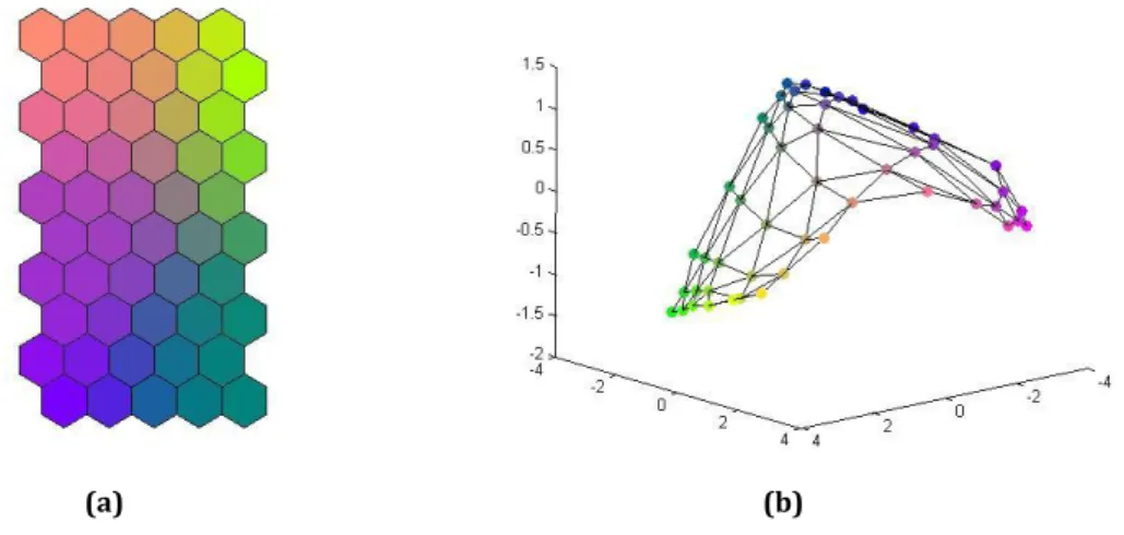
By exploring the similarities and dissimilarities between the units of the network we can find the existing clusters. In this context, another particularly effective approach is to assign similar colours to the units of the network that are also similar (Kaski, et al., 1998a). Thus, we can project those units in another space and observe the output space of the network.
The main advantage of this approach is allowing the possibility to explore combined approaches exploiting colour and position (Vesanto, 1999, p. 117).
A possible example of visualization that combines colour and position is shown in Figure4. This approach is the framework of all strategies that use colour to link the output space of the SOM to other data representations (as the cartographic map).
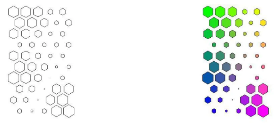
With regard to similarity and dissimilarity it should be noted that most of the existing software can put in evidence other features of the network units. Views of the number of input patterns represented by each unit of the network and the quantization error are possible. The many combinations available, as can be concluded from the analysis of Figure 5 and Figure 6, give an idea of how flexible SOM is in what concerns visualization.
(a) (b)
Figure 4 – Combining SOM with other projections through colour
First we attribute a colour to each SOM unit (a) based on some criterion (generally, the topology of the network). Then, the coloured units are projected in another space, specially adapted to visualize some
29
Figure 5 – Combining the distances matrix with similarities on the output space
The size of each SOM unit on the U-matrix is function of the distances between that unit and its neighbours. Units that are near their neighbours (according to distances in the input data space) are greater than those who are far. This approach can be also combined with the use of colours.
Figure 6– Adding other type of information to U-Matrix
Adding the number of SOM hits to the U-Matrix visualization, i.e., the number of input patterns associated to each BMU. Each unit gets a black hexagon dimensioned according to the number of input patterns that it represents.
2.5.4. Geo-referenced data - A special case
Typically, a clustering tool must ensure the representation of the existing patterns in data, the definition of proximity between these patterns, the characterization of clusters and the final evaluation of output (Jain, et al., 1999, pp. 266-268). In the case of geo-referenced data, the clustering tool should also ensure that the groups are made in line with the geographical closeness (Skupin & Agarwal, 2008, p. 5). The geo-spatial perspective is, in fact, a crucial point that makes the difference between clustering in geo-referenced data and common data.
30
In this context, an alternative way to visualize the SOM taking advantage of the very nature of geo-referenced data can be reached by colouring the geographic map with label colours obtained from the SOM units (Skupin & Agarwal, 2008, p. 13). One approach is proposed in the “Prototypically Exploratory Geovisualization Environment” presented by Koua & Kraak (2008, pp. 51-52) and developed in MATLAB®. This prototype incorporates the possibility of linking SOM to the geographic representation by colour, allowing dealing with data in a geo-spatial perspective.
A possible application of this method that constitutes the bottom line of this dissertation is explored by assigning colours to the map units of a 2D SOM with some kind of criterion (similarity by example) and finally colouring the geo-referenced elements with those colours.
Figure 7 shows an example of clustering geo-referenced data based on the application of this method. A colour was assigned to each map unit of a 2D SOM defined with nine units (3x3) and trained with data related to the main causes of death in several European countries. As we can see through this example, the geo-spatial perspective is essential to understand some phenomena.
(Data Source: EUROSTAT)
Figure 7– Clustering of the principal causes of death with a 2D SOM
31
3.
Clustering Geo-referenced Data With a 3D SOM
3.1. VISUALIZING THE OUTPUT SPACE USING A COLOR LABEL
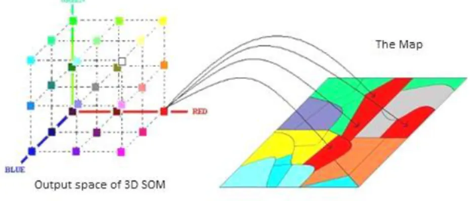
In this sub chapter we purpose a clustering method for geo-referenced data based on the visualization of the output space of a 3D SOM. This method is no more than a single projection of the network units on a three-dimensional space defined by three orthogonal axes (x, y and z) which are then associated to the three primary colours (RGB).
As a result, each of the three dimensions of the 3D SOM will be expressed by the change of tone in one particular primary colour (RGB). After that we can paint each geographic element with its BMU colour.
Figure 8 represents schematically the projection of a SOM with 27 units (3x3x3) in RGB space. That projection is followed by the geographical representation of several geo-referenced elements painted with colours function of the coordinates of their BMU's in the SOM’s output space.
Figure 8 – Linking SOM to cartographic representation
A colour is assigned to each SOM unit (following the topological order). Then the geo-referenced
elements are painted with the colour of their BMU’s in the SOM.
Formally, let us consider a 3D SOM defined with three dimensions u v w and a rectangular topology. The map grid or the output space (𝒪) is a set of (u × v × w) units (nodes) defined inℛ3, such that:
𝒪= 𝒓𝑖 = 𝑥𝑦𝑧 T ∈ ℛ3: 𝑖 = 1,2. . , (𝑢×𝑣×𝑤)
Where 𝑥,𝑦 and 𝑧 are the unit coordinates in the output space, such that:
32
𝑦 = 0,1,…, 𝑣 −1
𝑧= 0,1,…, (𝑤 −1 )
This coordinates must be adjusted to fit the RGB values, which typically vary between 0 and 255. The new coordinates (𝑥′,𝑦′,𝑧′) of the unit𝒓𝑖, can be obtained through the range normalization of the initial values:
𝑥′= 𝑥
𝑢 −1 × 255
𝑦′= 𝑦
𝑣 −1 × 255
𝑧′= 𝑧
𝑤 −1 × 255
Now, the interior of the polygon that defines each geo-referenced element mapped to the unit 𝒓𝑖(BMU) can receive the colour (𝑥′,𝑦′,𝑧′), as may be seen in the Figure 8. The process is then repeated for all units of the map grid.
The application of this method for SOM’s with only two dimensions is also trivial. However, it is highly recommend using a heuristic colour code instead of combing two single colours.
The SOMToolbox provides several heuristic colour codes that can be used for this purpose. For example, considering a SOM with two dimensions 𝑢𝑣 the colour (𝑅,𝐺,𝐵) assigned to the unit 𝒓𝑖can be achieved this way11:
𝑅= 𝑥
𝑢 −1 × 255
𝐺= 255− 𝑦
𝑣 −1 × 255
𝐵= 𝑦
𝑣 −1 × 255
33
3.2. USING FRONTIERS TO VISUALIZE THE INPUT SPACE OF A SOM
In the previous sub chapter we presented a method for visualizing clusters based on the output space of the SOM. Now we propose to use the frontiers between geo-referenced elements in order to incorporate information from the input data space, or by other words, to explore the vector quantization capabilities of the SOM algorithm.
By following this strategy we expect to combine in the same visualization both information from output space and input space, and therefore to explore both capabilities of the SOM (vector quantization and vector projection).
3.2.1. Defining the frontier width
The frontier is generally a simple line that divides two geo-referenced elements. However, within certain limits we can consider transforming this static element into a dynamic element that varies according to a given criterion. Visually we can manipulate at least two characteristics of a line: the width and the colour, separately or simultaneously.
In this dissertation the main objective is to define the width of a frontier line between two geo-referenced elements in a way that the line can be informative about the input space distance between the BMU’s of those geo-referenced elements.
The width of a frontier line cannot grow beyond certain limits. Thus, it is necessary to establish a fixed range to avoid an unwanted distortion of the cartographic representation. After that it is necessary to set up a connection between the admissible range for the line width and the distances to represent.
Let us consider Fk the frontier line that divides two adjacent geo-referenced elements xi and xj .
The set of all distances (𝒟) between the reference vectors associated to the SOM units that represent (BMU’s) two adjacent geo-referenced elements (xi, xj) is:
𝒟= 𝑑𝑘 = d 𝒎𝑖,𝒎𝑗 ∶ 𝑘= 1,2. . ,𝐾;𝑖,𝑗= 1,2,…,𝑀
Where,
𝐾is the number of frontier lines
𝑀 the number of SOM units
34
𝒎𝑖,𝒎𝑗 are the reference vectors associated to the BMU’s of 𝒙𝒊 and𝒙𝒋 (adjacent
geo-referenced elements separated by 𝐹𝑘).
Considering that [a b] is the admissible range of values for the width𝑤𝑘 of the frontier Fk we adopt the following linear relationship:
𝑤𝑘= 𝑑𝑘−
min 𝒟
max 𝒟 −min 𝒟 𝑏 − 𝑎 +𝑎
3.2.2. The plotting methodology
If we plot all the frontiers the visualization will be, in most cases, incomprehensible. Moreover, we know that only the largest distances indicate a possible geo-cluster border. Thus, after computing all the widths of the frontier lines, it is necessary to decide which of them will be plotted.
To make that decision it is necessary to look into the input space and seek for what we call the cutting distance. Below the cutting distance, we do not plot the frontier lines. During the exploratory analysis we may vary the cutting distance in a gradual way, choosing between more detail and a high level perspective.
For this purpose we suggest to plot the order statistics of the frontier lines. Thus, we can analyse the input data space, specially the distances among the SOM units that are BMU’s of adjacent geo-referenced elements.
In the next figure is represented an example where the cutting distance seems to be obvious. However, in most cases the decision will be definitively not so easy. Rarely is there such a discontinuity on the input data space. In fact, common data generally presents a growing and smooth trend what makes it difficult to establish a cutting distance.
35
Figure 9 – The Cutting distance
36
4.
Experimental Results
To quantify the efficiency of the proposed method we conducted several experiments. In this chapter we present the experimental results obtained using two geo-referenced data sets: a first one using artificial data, where we know exactly the number and extension of the clusters; and finally, a second experiment using real data.
4.1. EXPERIMENT WITH ARTIFICIAL DATA 4.1.1. Artificial data set
To illustrate the use of three-dimensional SOM’s for clustering geo-referenced data, we designed a dataset for that purpose, inspired in one of the fields of application for this kind of tools, ecological modelling.
As we can see in Figure 10, the map has a total of twelve defined areas (geo-clusters), including small areas of spatial outliers. The figure also represents the distribution of each variable. The dark areas correspond to high values of each variable. The data set has a total of eight clusters.
Figure 10 - Artificial Dataset
The distribution of each variable it is also represented. The dark areas correspond to high values of each variable.
(a) Map (b) Variable 1 (c) Variable 2
37
In this special case, the geo-referenced dataset refers to a an area of intensive fishing where there is a particular interest in the spatial analysis of the distribution of five species of great commercial importance. The dataset was constructed in order to characterize 225 sea areas, exclusively based on the perspective of their biodiversity.
We simulated a sampling procedure along the coast, assuming that each sample was representative of an area approximately 50 square miles. All samples are geo-referenced to the centroid of the area, defined with geographical coordinates (x and y) and their attributes are the amount of each five species of interest, expressed in tons.
4.1.2. Experiment and results
4.1.2.1. Data pre-processing and parameterization of the SOM
The initial data set was designed so that variables are in the same scale. However, as the variables have very different variances a Z-Score normalization was carried out to guarantee that all the variances are equal to 1.
The first experiment was conducted in order to compare SOM’s with different dimensions (3D SOM versus 2D SOM). Thus, the map size of both SOM’s was selected to satisfy this condition and taking into account all the strategies enounced in chapter (2.2.1.). Considering the size of the data set (225 geo-referenced elements), we decided to use the following map sizes with a total of 64 network units for both models:
– 2D SOM: [8 8];
– 3D SOM: [4 4 4].
In the experiments, we always used the SOM Batch Algorithm implemented in SOMToolbox with the following parameterizations:
- Gaussian neighborhood function (Were tested several models with different neighborhood functions but the results were always better with this function);
- The lattice was defined rectangular for the 3D SOM (unique option allowed by SOMToolbox for SOM’s with more than two dimensions) and hexagonal for the 2D SOM. The lattice hexagonal gives better results for 2D SOM’s and as regards the number of connections between units is similar (except in extreme borders) to 3D SOM (by following this strategy we guarantee that the 3D SOM is compared with the best model of 2D SOM’s);
38
- In both models we used an unfolding phase with 12 epochs and a fine-tuning phase with 48 epochs;
- Random initialization and linear initialization were tested.
4.1.2.2. Finding the best model
Three hundred models were assessed for both topologies (random initialization), making it necessary to choose the best model. Considering that all the measures mentioned in chapter (2.3.) have advantages and disadvantages and it is not possible to indicate the best measure of map quality (Kohonen, 2001, p. 161), we opted for the two maps of both topologies that presented the minimum quantization error among all with an acceptable topological error, taking in account the average topological error among all the models.
The results are presented and summarized in table 1:
Table 1 – Quantization Error and Topological Error
Topology
Random Initialization Linear Initialization
Model with the Minimum QE Average values
QE TE
QE TE QE TE
2D SOM 0.3156 0.0178 0.3337 0.0261 0.3172 0.0889
3D SOM 0.3692 0.0533 0.4171 0.0584 0.4057 0.0889
4.1.2.3. Linking the output space of SOM to a Geographical map
Using the methodology proposed in sub chapter (3.1) we get the cartographic representation of both models, using the 2D SOM and 3D SOM. In Figure 11 we present the result of the application of color labels linking the output space of a 2D SOM with the cartographic representation.
As we can see, the cartographic representation of the 2D SOM does not evidence, by map visualization, all the eight clusters. In fact, we can hardly say by inspection of the map that there are more than six clusters. As regards the differentiation of the twelve defined areas, we may say that there is mixed zone composed by the zone 3 and zone 4, and there is a false continuous linking zone 1 to zone 3 and between zone 6 and zone 8. In the Figure 12 we show the U-matrix using the 2D SOM. The U-matrix exposes all the eight clusters.
39
zones, especially in zone 7. This is, in fact, a homogeneous zone and the visualization is not clear. Also in zone 5 there are areas that remain undifferentiated.
Figure 11 – Cartographic representation with 2D SOM
By inspection of the map we can’t identify more than six well defined clusters and there is a false
continuous linking several zones.
Figure 12 – U-Matrix 2D SOM
Despite the results obtained with the cartographic representation of 2D SOM (figure 11), it is important to note that the U-Matrix shows all eight groups very effectively. However, it is difficult to analyze this information in a geospatial perspective.
Figure 13 – Cartographic representation with 3D SOM
40
4.1.2.4. Linking the input space of a 3D SOM to the cartographic map using a PCA
As was mentioned before, the SOM can be seen through the output space or through the input space. In order to compare the output space visualization of a 3D SOM with the visualization of the input space reference vectors, we projected those vectors in the subspace defined by the two or three principal components computed using the initial dataset. Finally we transformed the obtained coordinates by PCA projection on the RGB space.
The result is shown on Figure 14 (a). As expected, the projection of the reference vectors on the two principal components, which represent 76% of the explained variance, does not allow us to identify neither the number of clusters nor to differentiate all the different zones.
Although the three principal components represent 89% of the explained variance, the projection of reference vectors on this subspace is not sufficient to expose the clustering structure (Figure 14 (b)).
(a) (b)
Figure 14 – 3D SOM projection using PCA
The reference vectors associated to the SOM units were first projected in the subspace defined by the two principal components (Figure 14 (a)) and after that, projected in the subspace defined by the three principal components. In both cases the results do not allow to identify de clustering structure.
4.1.2.5. Using frontiers to visualize the input space
41
The next figure represents the input data space of interest obtained from the analysis of the 3D SOM:
Figure 15 – The Cutting distance of the 3D SOM
The cutting distance seems to be on 77th percentile, because there is a sudden alteration on the trend.
Only the distances greater than the cutting distance will be plotted.
In Figure 16 all the frontier lines that separate adjacent geo-referenced elements whose BMU’s distances are greater than the 77th percentile are plotted in gray. The width of each frontier line is linearly defined according to the distance that represents. In the following map, the output space representation was also maintained.
42
As result of the proposed methodology all the zones where drawn and identified correctly. The combined visualizations of both input space and output space are, in this particular case, sufficient to classify all the existing geo-clusters.
In the next figure only the frontier lines defined according with the input space are represented. The visualization is self explanatory.
Figure 17 – Using frontier lines as a clustering tool
In this case, this plotting methodology allows, only by itself, discover the clustering structure existent in data. Nevertheless, it seems natural to expect that this SOM visualization is complementary of the output space visualization.
The proposed methodology can also be applied to 2D SOM. In fact, it can be applied to SOM’s of any dimension. The results for 2D SOM are presented in the next two figures:
43
The cutting distance is the same that for 3D SOM: percentile 77. And the results are as follows:
Figure 19 – Visualization of both input and output space of the 2D SOM
In this example, it seems that the application of the frontier lines to visualize the input space of the 2D SOM, mitigate the major problems associated to the visualization of the output space only by itself. The clusters are now well defined.
44 4.2. EXPERIMENT WITH REAL DATA 4.2.1. Lisbon’s metropolitan area
Another experiment was conducted using a real geo-referenced data set to train several SOM’s. This data set consists in 61 socio-demographic variables which describe a total of 3978 geo-referenced elements belonging to the Lisbon’s metropolitan area in Figure 20. The data was collected during the 2001 census and the variables describe the region according to five main areas of interest: type of construction, family structure, age structure, education levels and economic activities.
Figure 20 – Lisbon Metropolitan Area
The data set was collected during the 2001 census and consists in 61 socio-demographic variables which describe a total of 3978 geo-referenced elements belonging to the Lisbon’s metropolitan.
4.2.2. Experiment and results
4.2.2.1. Data pre-processing and parameterization of the SOM
Because the variables have different scales and ranges, we performed a linear range normalization to guarantee that all the variables take values between 0 and 1.
As the first experiment, the second test was also conducted in order to compare qualitatively SOM’s with different dimensions. Taking into account the size of the data set (3978 geo-referenced elements), we choose the following map sizes with a total of 512 network units for the 3D SOM and 504 network units for the 2D SOM:
- 2D SOM: [18 28];
45
Once again, we used the SOM Batch Algorithm parameterized this way:
- Neighborhood function: Gaussian;
- The lattice was defined rectangular for the 3D SOM and hexagonal for the 2D SOM;
- The learning rate was 0.5 for the unfolding phase and 0.05 for the fine-tuning phase;
- In both models we used a unfolding phase with 8 epochs and a fine-tuning phase with 24 epochs;
- Both random initialization and linear initialization were tested.
4.2.2.2. Finding the best model
More than one hundred models were assessed for both topologies (random initialization). Once more, we opted for the two maps of both topologies that present the minimum quantization error among all models with an acceptable topological error. The results are presented and summarized in table 2:
Table 2 – Quantization Error and Topological Error
Topology
Random Initialization Linear Initialization
Model with the Minimum QE Average values
QE TE
QE TE QE TE
2D SOM 0.6180 0.0365 0.6205 0.0378 0.6205 0.0422
3D SOM 0.6449 0.1415 0.6493 0.1453 0.6458 0.1362
4.2.2.3. Visualizing the output space of the 2D SOM
The analysis of the U-Matrix represented in Figure 21indicates that there are several clusters, including some with well defined borders. The most pronounced blue shades are indicative of dense areas in the input space. On the contrary, the red shades indicate sparse areas.
Figure 21 – U-Matrix of a 3D SOM
46
4.2.2.4. Linking the output space of SOM to a cartographic map
In this work the interest lies not in the analysis of existing clusters but essentially in the comparison between the representations offered by two the types of topologies (2D SOM and 3D SOM).
Figure 22 represents part of Lisbon’s city centre. The 2D SOM in Figure 22(a) is much less informative than the representation offered by the 3D SOM in Figure 22 (b). In the present cartographic representation, the 2D SOM, when compared with the SOM 3D, is much less detailed.
Naturally, the discrimination provided by 3D SOM may be artificial and forced. But the analysis of some particular differences between the maps points in the opposite direction: there are differences and some of those differences are visualized better with the inclusion of one more dimension.
Let us consider the zone highlighted on both maps. In the 2D SOM, the zone is similar to the neighbourhood; on the contrary, the 3D SOM indicates there is a difference. Zone 1514 (indicated in the map) is, in fact, different from its neighbours. The main difference is on the construction profile. It is, when compared with the nearby zones, a non residential area characterized by buildings constructed between the year of 1946 and 1980. The nearby zones are essentially residential areas with buildings constructed before 1919. In a global analysis it seems that the 2D SOM is not reflecting the main differences in the construction profile.
(a) (b)
Figure 22 – Lisbon centre visualized with both 2D SOM and 3D SOM
(a) Represents the 2D SOM visualization; (b) represents the 3D SOM visualization (only output space).
Let us take another example (Figure 23): the zone 910 is very different from the neighbour zones. The construction building profile of this zone is characterized by
47
recent buildings (constructed in the period 1995-2001), most of them rented. The population is also much younger than the other areas and presents a high level of employment. As we can see, the 2D SOM visualization does not reflect these accentuated differences. However it is important to note that the 2D SOM isolates this cluster, but only through the U-Matrix visualization.
(a) (b)
Figure 23 – Zone 910: 2D SOM and 3D SOM visualization
(a) Represents the 2D SOM visualization; (b) Represents the 3D SOM visualization (only output space).
4.2.2.5. Using frontiers to visualize the input space
Following the previous example, the next figure represents the same geo-cluster, now with frontiers defined according to the distances in the input space.
Figure 24 – Zone 910: using frontiers to visualize the input space
48
The plotted frontiers where calculated from the input space distances between the reference vectors associated to the BMU’s of the geo-referenced elements. The cutting distance was fixed in the percentile 89, because from this point the slope of the line is greater than 1 (among of all the criteria tested that proved to be the most appropriate).
Figure 25 – The cutting distance
The cutting distance was fixed in the 89th percentile, because from this point the slope of the line is
greater than 1.
Let’s now take this as an example to illustrate the use and utility in plotting the frontier lines according to the input space distance. In Figure 26, a particular Lisbon zone that encloses very special characteristics is represented: the “Parque das Nações” (represented in dark blue shades).
(a) (b)
Figure 26 –“Parque das Nações”
49
By the analysis of the Figure 26 (a) we can conclude that there is a special area, but it is difficult to understand if there is continuity between the areas represented in blue tones. As we can see on the Figure 26 (b), the frontier lines are decisive to conclude about the borders of that particular zone.
4.2.2.6. Analysing major trends
The 3D SOM is much more informative than the 2D SOM. However, that advantage may become a problem because visualization is much more complex. As we can see on the next Figure, in the 2D SOM it is easier to find major trends in data.
(a) (b)
Figure 27 – Lisbon Metropolitan area visualization
(a) 2D SOM visualization; (b) 3D SOM visualization.
4.3. CONCLUSIONS FROM EXPERIMENTS
The 3D SOM was compared with the 2D SOM using two datasets: one artificial dataset that consisted of 225 geo-referenced elements with 5 variables; and one real life data set that consisted of 3978 geo-referenced elements described by 61 variables. The experiments were conducted using several parameterizations of the SOM algorithm in order to optimize the final results of both topologies.
50
In what concerns to the effectiveness of the 3D SOM when applied to real data, we can say that the 3D topology was, in the tested data set, much more informative and revealing differences between geo-referenced elements that weren’t accessible with the application of 2D SOM. However, the high discrimination of geo-referenced data provided by the application of 3D SOM creates a complex visualization scheme that makes it difficult to identify the global trends in data. So, the application of 3D SOM seems better suited to a more fine and detailed analysis.
In the first experiment, the use of the width of frontier lines allows us to classify all the geo-referenced elements. The borders of geo-clusters were all well defined by the use of the proposed methodology. In fact, in that particular case, the frontier lines could be used alone for the clustering purposes. It is also important to note that the use of frontier lines can be used in both topologies (2D SOM and 3D SOM) with the same effectiveness.