NOVA Information Management School
Instituto Superior de Estatística e Gestão de Informação
Universidade Nova de LisboaEXPLORATORY DATA ANALYSIS USING SELF-ORGANISING MAPS
DEFINED IN UP TO THREE DIMENSIONS
by
Jorge Manuel Lourenço Gorricha
Thesis Submitted in Partial Fulfillment of the Requirements for the Degree of Doctor in Information Management, specialization in Information and Decision Systems.
Thesis Advisor: Professor Doutor Victor José de Almeida e Sousa Lobo
Three of the main strategies of data analysis are:
1. Graphical presentation,
2. Provision of flexibility in viewpoint and in facilities,
3. Intensive search for parsimony and simplicity.
ACKNOWLEDGMENTS
I wish to express my gratitude to Professor Doutor Victor Lobo that so often encouraged
me to continue my work.
Finally, I dedicate this thesis to my wife, Florbela and to my daughters, Helena and Laura.
v
ABSTRACT
The SOM is an artificial neural network based on an unsupervised learning process that
performs a nonlinear mapping of high dimensional input data onto an ordered and structured
array of nodes, designated as the SOM output space. Being simultaneously a quantization
algorithm and a projection algorithm, the SOM is able to summarize and map the data,
allowing its visualization. Because using the most common visualization methods it is very
difficult or even impossible to visualize the SOM defined with more than two dimensions, the
SOM output space is generally a regular two dimensional grid of nodes. However, there are no
theoretical problems in generating SOMs with higher dimensional output spaces. In this thesis
we present evidence that the SOM output space defined in up to three dimensions can be
used successfully for the exploratory analysis of spatial data, two-way data and three-way
data. Although the differences between the methods that are proposed to visualize each
group of data, the approach adopted is commonly based in the projection of colour codes,
which are obtained from the output space of 3D SOMs, in some specific bi-dimensional
surface, where data can be represented according to its own characteristics. This approach is,
in some cases, also complemented with the simultaneous use of SOMs defined in one and two
dimensions, so that patterns in data can be properly revealed. The results obtained by using
this visualization strategy indicates not only the benefits of using the SOM defined in up to
three dimensions but also shows the relevance of the combined and simultaneous use of
different models of the SOM in exploratory data analysis.
KEYWORDS
vi
RESUMO
O SOM é uma rede neuronal artificial, de treino não supervisionado, que processa o
mapeamento não linear de dados multidimensionais para uma rede ordenada e estruturada
de nós, designada por espaço de saída. Sendo simultaneamente um método de projeção não
linear e um algoritmo de compressão de dados, o espaço de saída do SOM é utilizado, na sua
forma simples ou através de algumas transformações, para visualizar dados de elevada
dimensionalidade. Todavia, porque é difícil analisar e visualizar, com os métodos usuais,
espaços de saída do SOM definidos com mais de duas dimensões, o SOM é geralmente
definido com um ordenamento bidimensional. Não existe, todavia, qualquer problema teórico
em gerar mapas com mais de duas dimensões, sendo que em muitos casos existe vantagem no
uso de tais modelos, uma vez que podem permitir um melhor ajustamento aos dados. Nesta
tese pretende-se demonstrar que o SOM definido até três dimensões pode ser usado com
sucesso na análise exploratória de dados espaciais, dados cúbicos (three-way data) e quadros
de dados regulares (two-way data). Apesar das diferenças na análise impostas por tão
diferentes categorias de dados, a abordagem genérica proposta nesta tese baseia-se na
visualização de cada uma daquelas categorias de dados através da projeção, utilizando códigos
de cor obtidos a partir do SOM 3D, numa determinada superfície bidimensional onde as
diversas categorias de dados possam ser representadas e visualizadas. Esta abordagem é
igualmente complementada com o uso simultâneo de SOMs definidos com uma e duas
dimensões, de forma a permitir a identificação dos padrões relevantes existentes nos dados.
Os resultados obtidos, que conjugam a informação evidenciada por cada um dos modelos do
SOM definido até três dimensões, apresentam claros benefícios face às abordagens usuais,
permitindo concluir que o seu uso é relevante no contexto da análise exploratória de dados.
PALAVRAS-CHAVE
vii
CONTENTS
ACKNOWLEDGMENTS ... iv
ABSTRACT ... v
RESUMO ... vi
LIST OF FIGURES ... ix
LIST OF TABLES ... xvi
LIST OF ABBREVIATIONS ... xviii
1. INTRODUCTION ... 19
1.1. RESEARCH STATEMENT ... 20
1.1.1. The inclusion of the third dimension in the SOM output space ... 20
1.1.2. The special case of geo-referenced data... 22
1.1.3. Three-way data analysis ... 23
1.1.4. Two-way data analysis ... 24
1.2. RESEARCH METHODOLOGY ... 25
1.3. ORGANIZATION OF THE THESIS ... 26
2. THE SELF-ORGANISING MAP ... 27
2.1. ALGORITHM ... 27
2.2. SOMPARAMETERIZATION ... 29
2.2.1. Map Size ... 29
2.2.2. The output space dimension ... 29
2.2.3. The algorithm initialization ... 29
2.3. ESTIMATING THE QUALITY OF SELF-ORGANISING MAPS ... 30
2.4. DATA VISUALIZATION USING THE SOM ... 31
2.4.1. Adapting the SOM output space ... 32
2.4.2. Combining the SOM output space with complementary information ... 33
2.5. THE USE OF SELF-ORGANISING MAPS IN SPATIAL DATA ... 35
2.5.1. Applications of the SOM in spatial data ... 35
2.5.2. About the use of the SOM and its variants in spatial data ... 37
3. SPATIAL DATA EXPLORATORY ANALYSIS ... 39
3.1. CLUSTERING SPATIAL DATA WITH THE SOM ... 39
3.1.1. Visualizing the SOM output space using a colour label ... 39
3.1.2. Using border lines to visualize the SOM through the input data space ... 41
3.1.3. A Framework for Spatial Data Exploratory Analysis Using 3D SOMS ... 44
3.1.4. Spatial U-MAT... 47
3.2. SPATIAL DATA EXPLORATORY ANALYSIS ... 51
3.2.1. Experiment with Artificial Data ... 51
viii
3.2.3. Spatial characterization of extreme precipitation in Madeira Island ... 60
3.2.4. Portugal 2009 parliament elections data set ... 65
3.2.5. Conclusion ... 69
3.2.6. Framework illustration (the case of Madeira Island) ... 69
4. TWO-WAY DATA EXPLORATORY ANALYSIS... 83
4.1. VISUALIZING THE SOMOUTPUT ... 84
4.1.1. Visualizing the SOM output space using a colour label ... 84
4.1.2. Visualizing the data continuity in the 2D SOM output space ... 86
4.1.3. Visualizing distances of 2D SOM units in the input data space... 87
4.1.4. Visualizing the connectivity between SOM units ... 89
4.1.5. Decoding the colour code in feature space ... 91
4.2. EXPLORATORY ANALYSIS AND RESULTS ... 92
4.2.1. Parametrization of SOM models ... 92
4.2.2. Experiment with artificial data ... 94
4.2.3. Experiment with IRIS data set ... 100
4.2.4. Experiment with ZOO data set ... 104
4.2.5. Conclusion ... 108
5. THREE-WAY DATA EXPLORATORY ANALYSIS ... 110
5.1. THREE-MODE DATA ANALYTIC TECHNIQUES ... 110
5.1.1. The study of global evolution through time (general trend) ... 112
5.1.2. The study of the T sets of points (subjects by variables) ... 112
5.1.3. The common projection space ... 112
5.2. THREE-WAY DATA EXPLORATORY ANALYSIS USING SOMS ... 113
5.2.1. The global evolution through time ... 113
5.2.2. The study of the T sets of points (subjects by variables) ... 114
5.2.3. The common projection space ... 115
5.3. RESULTS ... 116
5.3.1. Experiment with Artificial Data ... 116
5.3.2. Experiment with economic European data ... 126
5.3.3. Conclusion ... 132
6. CONCLUSIONS ... 135
REFERENCES ... 137
APPENDIX A – CODE ROUTINES FOR SPATIAL DATA EXPLORATORY ANALYSIS ... 145
APPENDIX B – CODE ROUTINES FOR TWO MODES DATA EXPLORATORY ANALYSIS ... 155
ix
LIST OF FIGURES
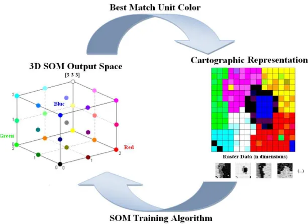
Fig. 1. Linking SOM’s knowledge to cartographic representation. A colour is assigned to each
SOM unit (following the topological order). Then, the geo-referenced elements are
coloured with the colour of their Best Matching Unit (the node that is associated with the
closest reference vector to the geo-referenced element). ... 22
Fig. 2. Linking a 2D SOM to the geographic map by colour. This example was obtained by
training a 2D SOM with data related to the main causes of death in several European
countries. Each country was painted with the same colour of its BMU in the SOM. Each
colour represents one specific profile of the main causes of death (percentage of death by
accident, by cancer, etc.). Countries of Southern Europe seem to share the same profile.
Data Source: EUROSTAT ... 23
Fig. 3. Linking SOM’s knowledge to cartographic representation. After training the SOM with
the geo-referenced data, a colour is assigned to each SOM unit (following the topological
order). Then, the geo-referenced elements are painted with the colour of their BMU’s,
i.e., the colour of the SOM unit where they were mapped. ... 40
Fig. 4. In this example are represented the rank distances (measured in the input data space)
between all the 3D SOM BMUs that represent adjacent geo-referenced elements in a
spatial data set that will be described in section 4 (the artificial data set). The cut distance
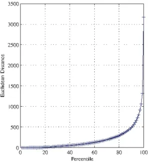
seems to be on the 77th percentile where there is a sudden alteration on the trend,
indicating a discontinuity. ... 43
Fig. 5. Distribution of meteorological stations over the Madeira island (NISHR network). ... 44
Fig. 6. Diagram of the proposed framework for exploratory analysis of events that are
characterized by several variables sampled in p stations. ... 46 Fig. 7. Neighbourhood of spatial element xu (n=8). ... 48 Fig. 8. Spatial-UMAT: Cartographic representation of an artificial data set with 900 raster cells.
The representation of the spatial elements is based on a 3D SOM model [4 5 3]. Each
raster cell receives a colour according to the correspondent height in one specific ordered
scheme of colours. ... 49
Fig. 9. Artificial Data set. The figure shows 12 contiguous geo-clusters. These contiguous
x
data in zone 11; data in Zone 10 is similar to data in zone 8; data in Zone 1 is similar to
data in zone 9; and data in Zone 5 is similar to data in Zone 12. Each square represent 4
raster cells. ... 49
Fig. 10. Visualization of the spatial pattern distribution of five precipitation indices along
Madeira Island: (a) Representation of the spatial patterns using the Cartographic
representation of Spatial-UMAT. (b) Representation of the spatial patterns that were
obtained by using the Framework analysis that will be discussed in sub-chapter 3.1.4.2.
The Spatial-UMAT identifies the border limits of spatial patterns ... 50
Fig. 11. Artificial Data set. The figure shows 12 contiguous clusters. These contiguous
geo-clusters correspond to only 8 different data geo-clusters (described in Table 1). Table 2
contains the correspondence between data clusters and geo-clusters. Therefore, data in
Zone 6 is similar to data in zone 11; data in Zone 10 is similar to data in zone 8; data in
Zone 1 is similar to data in zone 9; and data in Zone 5 is similar to data in Zone 12. ... 52
Fig. 12. Rank distances (measured in the input data space) between all the 2D SOM BMUs that
represent adjacent geo-referenced elements in the artificial data set. The cut distance
seems to be on 77th percentile. Only the distances above the cut distance will be plotted
in gray. ... 55
Fig. 13. Cartographic representation using the 2D SOM model and considering the cut distance
on the 77th percentile. The inclusion of information from the input data space (border
line) is definitely decisive to conclude the analysis... 56
Fig. 14. Cartographic representation using the 3D SOM model and considering the cut distance
on the 77th percentile. As in the case of the 2D SOM, the inclusion of information from
the input data space (border lines) is definitely decisive to find the correct clusters and
geo-clusters. The adopted methodology proved to be, in this special case, very effective.
... 56
Fig. 15. Eastern part of the city of Lisbon. Cartographic representation using the 3D SOM model
and considering the cut distance on the 85th percentile. ... 59
Fig. 16. Rank distances (measured in the input data space) between the BMUs (3D SOM) of
geo-referenced elements that are adjacent in the cartographic map. The cut distance
seems to be very difficult to define. The distances grow almost linearly up to the 85th
xi
Fig. 17. Rank distances (measured in the input data space) between all the 3D SOM BMUs of
geo-referenced elements that are adjacent in the cartographic map. The cut distance
seems to be on 95th percentile. Only the distances above the cut distance will be plotted
in grey. ... 63
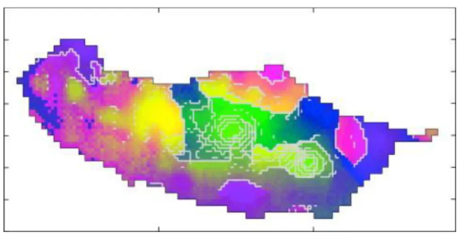
Fig. 18. Madeira Island. Cartographic representation using the 2D SOM model and considering the cut distance on the 95th percentile. ... 63
Fig. 19. Madeira Island. Cartographic representation using the 3D SOM model and considering the cut distance on the 95th percentile. The summary of the average values (precipitation indices) for each area is presented in the Table 8. ... 64
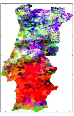
Fig. 20. The rank distances of the BMUs (3D SOM) that represent adjacent geo-referenced elements (2009 Electoral data). The cutting distance was defined in the 95th percentile. 66 Fig. 21. 2009 Electoral results projected in the cartographic representation using only the 2D SOM output space information. The representation without frontiers seems to be particularly useful to detect the major trends in data. ... 67
Fig. 22. 2009 Electoral results projected in the cartographic representation using only the 3D SOM output space information. ... 68
Fig. 23. Cartographic representation using the 3D SOM model with frontiers (zoom from Fig. 22). The cutting distance was defined in the 95th percentile. ... 68
Fig. 24. Madeira’s island elevation model. ... 72
Fig. 25. Distribution of meteorological stations over the island (NISHR network). ... 73
Fig. 26. Example of a Semivariogram: variable R1 assuming isotropic behaviour. ... 76
Fig. 27. OK interpolation of the averaged R1 index ... 77
Fig. 28. OK interpolation: (a) Averaged Rx1d index; (b) Averaged SDII index. ... 77
Fig. 29. Interpolation of the averaged Rx5d index using: (a) OK and the semivariogram model Rx5d-1; (b) OK and the semivariogram model Rx5d-2; (c) OCK and the semivariogram model Rx5d-3. ... 77
Fig. 30. Interpolation of the averaged CWD index using: (a) OK and the semivariogram model CWD-1; (b) OCK and the semivariogram model CWD-2. ... 78
Fig. 31. Visualization of the five precipitation indices: (a) Cartographic representation of data
xii
similar characteristics. (b) Matrix of Patterns. This representation of the values in table VII
allows interpreting the colours of spatial patterns and is obtained by the ordination of
variables and patterns (colours) according to the euclidean distance between those
variables and patterns and by using a colour scheme to express high/low values of the
variable (green-yellow-red). ... 79
Fig. 32. This figure represents schematically an example of a SOM with an output space
defined with one single dimension with four units. All colours (or variables) will be
mapped to one single unit so they will be ordered in the output space of the SOM. ... 80
Fig. 33. The figure represents schematically the colour projection of a 3D SOM with 27 units
(3x3x3) onto a 2D surface associated to a 2D SOM with 16 units (4 x4). Each square
correspond to one specific 2D SOM node and is coloured with the colour of its best
matching unit. ... 86
Fig. 34. Matrix of patterns. Colours and variables are ordered using a 1D SOM (1X20). The
values of the feature variables are represented in a grey scale and the blue line represents
greater distances in the input space between the units that are represented by colours. 91
Fig. 35. Quantization Error per SOM unit in each 1D SOM model (varying from 2 to 15 units). A
1D SOM model with 10 units was chosen, although there is no relevant decrease in QE per
unit from the eighth unit. It is important to underline that the 1D SOM is not used to
cluster data, but for express relevant distances between data. ... 95
Fig. 36. (a) Each of the 2D SOM unit is represented by a small square, centred in the output
coordinates of the 2D SOM unit, which receives the colour of its 3D SOM BMU and the
number of input patterns that have the 2D SOM unit as BMU. Grey borders, of different
widths, represent the distances in the input space between their (2D SOM units) 1D SOM
BMUs. (b) Each of the 2D SOM unit is represented by a small square that receives a
weighted colour based on the proximity of the unit to its first eight 3D SOM BMUs. White
borders, also of different sizes, represent the connectivity, i.e. the data continuity,
between the 3D SOM BMUs of those 2D SOM units. A larger border represents major
discontinuity among data. ... 97
Fig. 37. U-Matrix. In this case, the U-matrix based on the 2D SOM is able to identify the
existence of eight distinct clusters. However, the figure, by itself does not allow the data
characterization. One possible approach can be achieved by the use of component planes.
xiii
Fig. 38. Matrix Pattern (colours in Fig 35 vs Variables 3, 4, 1, 2 and 5). Colours of figure 35 are
now decoded. Dark values represent low values of the variable, while white values
represent higher values of the variable. The blue lines represent greater distances in the
input data space (quantized by the 1D SOM). ... 99
Fig. 39. Quantization Error per SOM unit in each 1D SOM model (varying from 2 to 15 units). A
1D SOM model with 10 units was chosen, although there is no relevant decrease in QE per
unit from the eighth unit. It is important to underline that the 1D SOM is not used to
cluster data, but for express relevant distances between data. ... 100
Fig. 40. Each of the 2D SOM unit coloured by the colour of its 3D SOM BMU. In this case we
also plotted the number of input patterns and the class they belong (example: 3/2 - three
input patterns from the class 2, Iris Versicolour), that is represent by that specific 2D SOM
unit, its BMU. ... 102
Fig. 41. Matrix Pattern (colours in Fig 39 vs Variables petal length, petal width, sepal length
and sepal width). Colours of figure 39 are now decoded. Dark values represent low values
of the variable, while white values represent higher values of the variable. The blue lines
represent greater distances in the input data space (quantized by the 1D SOM)... 103
Fig. 42. U-Matrix associated to the 2D SOM that was selected. In this case, the U-matrix based
on the 2D SOM is able to identify the existence of two distinct clusters. Moreover, the
figure, by itself does not allow the data characterization. One possible approach can be
achieved by the use of component planes. ... 103
Fig. 43. Quantization Error per SOM unit in each 1D SOM model (varying from 2 to 15 units). A
1D SOM model with 10 units was chosen, although there is no relevant decrease in QE per
unit from the eighth unit. It is important to underline that the 1D SOM is not used to
cluster data, but for express relevant distances between data. ... 105
Fig. 44. (a) Each of the 2D SOM unit coloured by the colour of its 3D SOM BMU. In this case we
also plotted the number of input patterns and the class they belong (example: 3/2 - three
input patterns from the class 2), that is represent by that specific 2D SOM unit, its BMU.
(b) Each of the 2D SOM unit is represented by a small square that receives a weighted
colour based on the proximity of the unit to its first eight 3D SOM BMUs. White borders,
also of different sizes, represent the connectivity, i.e. the data continuity, between the 3D
SOM BMUs of those 2D SOM units. A larger border represents major discontinuity among
data. ... 106
xiv
Fig. 46. U-Matrix. In this case, the U-matrix based on the 2D SOM is difficult to interpret.
Moreover, the figure, by itself does not allow the data characterization. One possible
approach can be achieved by the use of component planes. ... 107
Fig. 47. Projecting the 3D SOM in the 2D SOM output space can reveal mapping problems. . 108
Fig. 48. Matrix Pattern (colours in Fig 43 vs Variables Var 1 to Var 15). Colours of Fig. 43 are now decoded. Dark values represent low values of the variable, while white values represent higher values of the variable. The blue lines represent greater distances in the input data space (quantized by the 1D SOM). ... 109
Fig. 49. Three-way data. Schematically representation of the typical array of three-way data with n subjects, p variables and T occasions. ... 111
Fig. 50. Matrix of adjustment of each 2D SOM model to each Xt (the adjustment is measured by the QE). ... 114
Fig. 51. In the first frame, each coloured cell represents the colour (Ri, Gi, Bi) of the 3D SOM BMU of subject n in condition 2 (the unit i is the BMU of the subject n in condition 2). The second frame represents the label colours in a Pattern Matrix, where colours from the 3D SOM are associated to the feature variables. The blue lines represent greater distances in the input space between the units that are represented by colours (1D SOM). ... 115
Fig. 52. The global evolution through time. The 3D SOM information is plotted in a 2D SOM.117 Fig. 53. Pattern Matrix (colurs vs variables V.2, V.3 V. 5, V1 and V.4) used to decode the colours presented in Fig. 51. ... 118
Fig. 54. Grouping conditions according according to their evolution in terms of the relations between subjects and variables along the time. ... 119
Fig. 55. Matrix Pattern that decode the Fig. 53. Dark values means that the adjustment is best (EQ. 1, EQ. 2 and EQ. 3 fit the conditions coloured by red). ... 120
Fig. 56. Two-way analysis of data belonging to C. 11. ... 121
Fig. 57. Matrix Pattern that decode the colours in Fig. 55 ... 121
Fig. 58. Two-way analysis of data belonging to C. 19. ... 122
xv
Fig. 60. Representation of subjects along the time in a common space. All the nT subjects (or
by other words, to all the T sets of points) will be used to train several SOM models (1D,
2D and 3D). ... 124
Fig. 61. Matrix Pattern that decode the colours in Fig. 59. ... 125
Fig. 62. The global evolution through time. The colours must decoded with Fig. 63. The combined visualization of 62 and Fig. 63 allows concluding the existence of three main groups of data that correspond to three main phases along the period in study. ... 127
Fig. 63. Matrix pattern used to decode colours in Fig. 61. There are three major groups of data. ... 128
Fig. 64. Grouping conditions according according to their evolution in terms of the relations between subjects and variables along the time. ... 129
Fig. 65. Matrix pattern used to decode colours in Fig. 63. ... 130
Fig. 66. Matrix Pattern for the year 1999. ... 131
Fig. 67. Matrix Pattern for the year 2013. ... 131
Fig. 68. Representation of subjects along the time in a common space. All the nT subjects (or by other words, to all the T sets of points) will be used to train several SOM models (1D, 2D and 3D). ... 133
xvi
LIST OF TABLES
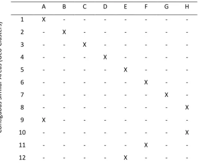
Table I. The amount of captured fish (average value), that characterize each of the 8 data
clusters (A, B, C, D, E, F and H), expressed in tons. Each of the twelve areas represented in
Fig. 3 is characterized only by one of these data clusters. The value of standard deviation
is between Brackets. ... 53
Table II. Correspondence between Clusters and Geo-Clusters. The twelve contiguous areas
represented in ... 53
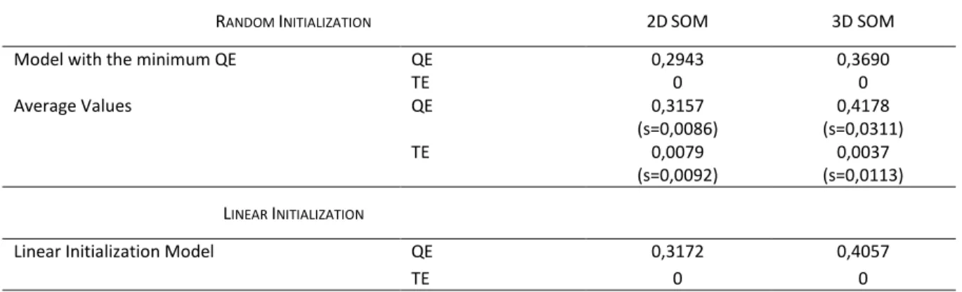
Table III. Results obtained with the artificial data set (Quantization error and Topological
error). Five hundred models were assessed for both topologies (2D SOM and 3D SOM)
with random initialization. The value of standard deviation is between Brackets. ... 54
Table IV. Confusion matrix (3D SOM model). The matrix refers to the number of predictions in
each cluster using the 3D SOM model. For example, from all the 27 zones that belong to
the cluster D, 7 were not correctly classified (they were classified as belonging to cluster
B). ... 57
Table V. Confusion matrix (2D SOM model). The matrix refers to the number of predictions in
each cluster using the 2D SOM model. Although there are other classification problems, it
is important to note that all the geo-referenced elements belonging to cluster F and H
were not correctly classified. ... 57
Table VI. Results obtained with the Lisbon’s metropolitan area data set (Quantization error and
Topological error). One hundred models were assessed for both topologies (2D SOM and
3D SOM) with random initialization. The value of standard deviation is between Brackets.
... 59
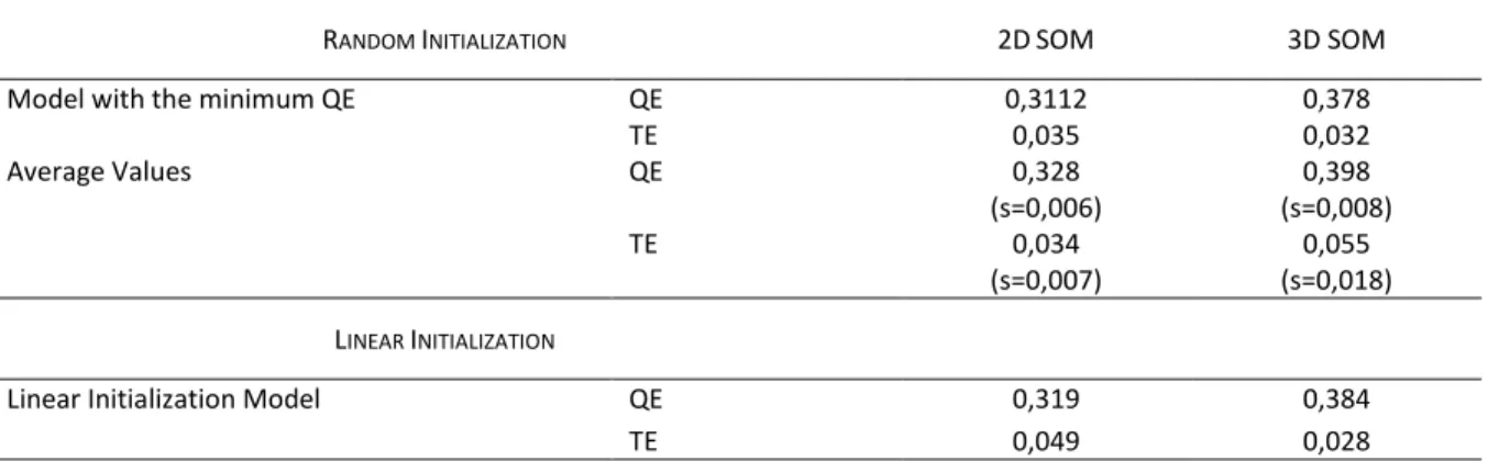
Table VII. Results obtained with the precipitation indices data set (Quantization error and
Topological error). Five hundred models were assessed for both topologies (2D SOM and
3D SOM) with random initialization. The value of standard deviation is between Brackets.
... 62
Table VIII. Summary of the average values (precipitation indices) for each area represented in
the Fig. 11 with a colour label obtained by mapping the output space of a 3D SOM to the
xvii
Table IX. Results obtained with the Portugal 2009 parliament elections data set (Quantization
error and Topological error). One hundred models were assessed for both topologies (2D
SOM and 3D SOM) with random initialization. The value of standard deviation is between
Brackets. ... 65
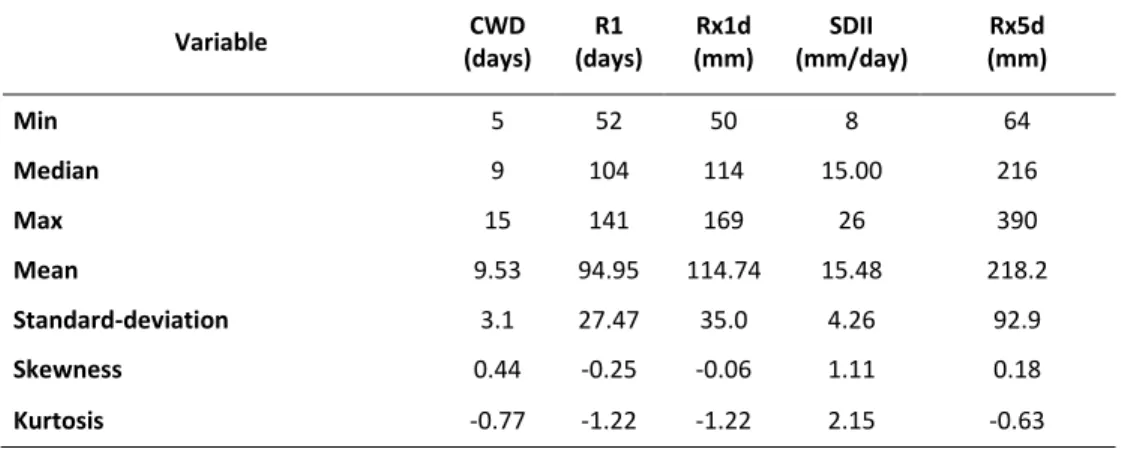
Table X. Summary Statistics of the Precipitation Indices Values Averaged in the Period 1998– 2000 ... 74
Table XI. Correlation Matrix Between Indices and Elevation (Elev.) ... 75
Table XII. Experimental Semivariogram Modeling Strategies ... 75
Table XIII. Semivariogram Parameters Estimated for the Models Indicated in Table XII ... 75
Table XIV. Cross-Validation Error Statistics Obtained in the Various Spatial Interpolation Strategies (Selected Models are in bold) ... 76
Table XV. 3D SOM Results (100 Models) ... 78
Table XVI. Summary of the Average Values for Each Area ... 80
Table XVII. Ordination Process of variables and Colour Patterns represented in Fig. 31. The SOM was defined with one single dimension (1X20) ... 81
Table XVIII. The amount of captured fish (average value), that characterize each of the 8 data clusters (A, B, C, D, E, F and H), expressed in tons. Each of the twelve areas represented in Fig. 3 is characterized only by one of these data clusters. The value of standard deviation is between Brackets. ... 94
Table XIX. Results obtained with the artificial data set (Quantization error and Topological error). Five hundred models were assessed for both topologies (2D SOM and 3D SOM) with random initialization. The value of standard deviation is between Brackets. ... 95
Table XX. Results obtained with the artificial data set (Quantization error and Topological error). Five hundred models were assessed for both topologies (2D SOM and 3D SOM) with random initialization. The value of standard deviation is between Brackets. ... 100
Table XXI. Results obtained with the artificial data set (Quantization error and Topological error). Five hundred models were assessed for both topologies (2D SOM and 3D SOM) with random initialization. The value of standard deviation is between Brackets. ... 105
xviii
LIST OF ABBREVIATIONS
ANN Artificial Neural Network
SOM Self-Organising Map
3D SOM Three-dimensional Self-Organising Map
2D SOM Two-dimensional Self-Organising Map
1D SOM One-dimensional Self-Organising Map
DM Data Mining
RGB Red-Green-Blue
U-Matrix Unified distance matrix
BMU Best Matching Unit
PCA Principal Component Analysis
CCA Curvilinear component analysis
QE Quantization error
TE Topological error
19
1.
INTRODUCTION
Since Exploratory Data Analysis (EDA) was presented by John W. Tukey (Tukey, 1977), many
researchers have formulated different definitions, classifications and taxonomies of the initial
concept (Chong Ho, 2010). The emergence of so many different variants of the EDA concept
(Hartwig and Dearing, 1979, Hoaglin, 2004, Myatt, 2007, Behrens, 1997, Behrens and Yu, 2003,
Fielding, 2006, Wendy and Angel, 2005, Nagaev et al., 2003, Velleman and Hoaglin, 1981) is not
surprising once that EDA was not presented as a fixed methodology of data analysis, but as a
philosophy of data analysis, where attitude and flexibility are the crucial elements. However and
although those different conceptual differences, most of the EDA approaches are still focused in
one specific objective: the discovery of the unexpected (Jones, 1987).
But more than different interpretations and definitions, there has been a real evolution of
the initial concept of EDA. Like many other areas of science, EDA was also not immune to the large
possibilities offered by the new technologies. The emergence of new computationally intensive
methods and graphical technologies have been progressively broadening the initial concept of EDA
(Wendy and Angel, 2005), allowing its convergence to other methodologies of data analysis, such as
data mining (Chong Ho, 2010). In fact, much due to the new techniques for collecting and storage,
data as also changed and can reveal extreme complexity not only in terms of dimensionality but
also in terms of size, structure and dependency among patterns. The huge amounts of
geo-referenced data and multi-way data, that are constantly generated and stored by numerous
information systems, are a typical example of this new reality.
The methods used to explore such data, more than providing a description, even complex,
of data, must reach the main goals of EDA: isolate and reveal patterns and features of the data
(Hoaglin, 2004). This complex task often requires the ability to obtain simplified views of data that
can handle with high dimensionality, summarize large amounts of data and explain the relations
between data, often verified in space and time.
One possible approach to perform EDA, that will be followed in this thesis, is through the
development of simplified visual abstractions of data sets, based on clustering and visualization
methods, that can summarize and reveal the patterns and features of high-dimensional data sets
(Kohonen, 2001), without any pre-conceived ideas about data. In fact, clustering, defined as
unsupervised classification of patterns into groups (Jain et al., 1999) and visualization, defined as
20
amplify cognition (Card et al., 1999), are standard tools in EDA and data mining (Wendy and Angel,
2005).
It is in this context that Self organising Maps (SOM) (Kohonen, 2001, Kohonen, 1998, Kohonen,
1990) can be proposed for EDA purposes. Although the SOM is generally and simply presented as a
tool for visualizing high dimensional data (Kohonen, 1998), this Artificial Neural Network (ANN) is
much more than a visualization tool. In fact, the SOM algorithm performs simultaneously vector
quantization (Gersho, 1978, Gersho, 1977, Buhmann and Khnel, 1992) and vector projection
(Torgerson, 1952, Young and Householder, 1938, Sammon and W., 1969), compressing information
and reducing dimensionality (Vesanto et al., 2000) through a data projection in a lower dimensional
space, making this ANN a very effective method for clustering via visualization (Flexer, 2001).
1.1.
R
ESEARCHS
TATEMENTThis thesis is focused in the use of the SOM defined in up to three dimensions for EDA. By
proposing the SOM for EDA, clustering via visualization will play the major role in the process of
analysis, taking advantage from the huge flexibility and visualization capabilities that this ANN
offers to explore data.
In the next sub-chapters the research questions will be detailed in order to justify the main
objectives of this thesis, which are:
- To present a new framework of spatial analysis using SOM’s defined in up to three dimensions;
- To present a new framework of three-way data using SOM’s defined in up to three dimensions;
- To present a new method to visualize and explore two-way data with SOM’s defined in up to three dimensions.
1.1.1.
The inclusion of the third dimension in the SOM output space
In its most usual form, the SOM algorithm performs a number of successive iterations until a set of
reference vectors, associated one by one to each of the ordered nodes in the SOM output space,
represent as far as possible, the input data patterns that are closer to those reference vectors.
Therefore, in the end of that iteration process, every input pattern in the data set will be mapped
to one of the network nodes of the SOM output space, which is generally defined with two
21
There are no theoretical problems in generating SOMs with higher dimensional output
spaces. However, because it is very difficult or even impossible to visualize SOMs with more than
two dimensions (Bação et al., 2005a, Vesanto, 1999), the output space of this ANN is defined by a
regular two-dimensional grid of nodes (2D SOM) and visualized using two-dimensional abstractions
such as the U-Matrix (Ultsch and Siemon, 1990, Ultsch, 2003b) or other similar variants (Ultsch,
2003b, Kraaijveld et al., 1995), or by exploring the data topology (Tasdemir and Merenyi, 2009). The
majority of those approaches, since are supported by a non-linear projection of data on a
two-dimensional surface, perform a two-dimensionality reduction that generally leads to a loss of
information and for this reason, there is a strong probability that some of the existing clusters will
be undetectable (Flexer, 2001). This poses a limitation on the quality of the results obtained when
only the 2D SOM is used.
Moreover, the decision about the output space dimension of a SOM should be also closely
related with the intrinsic dimension of the input data set, that is, the minimum number of
independent variables necessary to generate that data (Camastra and Vinciarelli, 2001). In fact, for
truly high dimensionality data, choosing the incorrect map dimension may cause a negative impact
on the quality of mapping, leading to the increase of the topological error, an important sign that
the SOM algorithm is trying to approximate an unsuitable SOM output space to a
higher-dimensional input data space (Kiviluoto, 1996).
Consequently, it is strongly reasonable to assume that the inclusion of a third dimension in
the analysis will allow the detection of some clusters that cannot be identified using the most
common visual abstractions based in SOM’s with the output space defined only in two dimensions. But the main question remains: how can we successfully explore and visualize a SOM output space
defined with three dimensions? One of the ways to achieve the simultaneous visualization of three
dimensions of some kind of projection is by associating each of the dimensions of the projection to
one colour (RGB): the data will be represented in some bi-dimensional surface by one specific
colour that results from the combination of the colours of each of the dimensions, stablishing a link
between the projection and the bi-dimensional surface where data is represented. This approach,
proposed in the context of spatial analysis with PCA (Hargrove and Hoffman, 1999), can be used
with any kind of projection in three dimensions, including the 3D SOM.
Despite this approach has been presented to visualize geo-referenced data, it can be applied
with success, with the necessary adaptations, in any kind of data analysis where the data allows its
22
in three dimensions is the existence of a two-dimensional plane where colour can be used to
stablish a link between data and the SOM’s output space, allowing its visualization and representation. However, depending from the complexity of data, the simple existence of a
bi-dimensional plane may not be enough to solve the problem in its entirety.
1.1.2.
The special case of geo-referenced data
Because geo-referenced data have a trivial representation in two dimensions (the cartographic
representation), it is possible to consider the use of 3D SOMs for exploratory spatial data analysis
(Gorricha and Lobo, 2011b).
The method exposed in Fig. 1, used to visualize geo-referenced data using 3D SOMs,
consists in assigning a ordered scheme of colours (RGB) to each of the dimensions of a 3D SOM
output space, so that each geo-referenced element can be geographically represented with the
colour of its Best Matching Unit (BMU) (Skupin and Agarwal, 2008), i.e., the SOM unit (node) where the geo-referenced element is mapped in the SOM output space.
23
This method extends the approach that was proposed in the “Prototypically Exploratory
Geovisualization Environment” (2008), by incorporating the possibility of linking a 2D SOM to the geographic representation of data by colour, allowing its analysis in a geo-spatial perspective. In Fig.
2 is presented an example where the profile of the main causes of death in Europe is represented
by one specific colour that results from a 2D SOM output space. First, each country was mapped to
one node in the SOM and then, coloured with the same colour of the node.
Fig. 2. Linking a 2D SOM to the geographic map by colour. This example was obtained by training a 2D SOM with data related to the main causes of death in several European countries. Each country was painted with the same colour of its BMU in the SOM. Each colour represents one specific profile of the main causes of death (percentage of death by accident, by cancer, etc.). Countries of Southern Europe seem to share the same profile. Data Source: EUROSTAT
1.1.3.
Three-way data analysis
As stated before, in the special case of spatial data, the link between data and the output space of
the 3D SOM, stablished with an ordered set of colours, is almost immediate. For two-way data the
representation is also possible but it is strongly limited by the quality and nature of the two
dimensional projection of data that will be used to represent the 3D SOM information. But for
other categories of data, as is the case of three-way data, the simple representation of data in two
dimensions is not enough to explore all perspectives of data.
The problem inherent to three-way exploratory data analysis is much more conceptual than
practical. In fact, although there are substantial differences between the design of three-way data
24
matrices, allowing, under certain conditions, the use of two-way methods of data analysis.
However, in most cases, those transformations will not allow that the individual differences among
patterns will be properly examined (Kroonenberg, 2007), contributing therefore to an incomplete
or even incorrect analysis. Furthermore, beyond the key issues that are generally inherent to
two-way data exploratory analysis, such as the relations between variables, the discovery of the trends,
the detection of different types of patterns, three-way exploratory analysis also encompasses the
answer to questions related with the way as the relations between variables change over time and
how does the structure of variables change over time for different groups of patterns
(Kroonenberg, 2007, Coppi, 1994).
In this thesis we propose a framework for exploratory analysis of three-way data that uses
the SOM in a very similar approach that Double Principal Component Analysis (DPCA) (Bouroche
and Dussaix, 1975) uses PCA. The objective of DPCA is to compare the general trends of the
correlations between the different variables and the trends of the different subjects. As clearly
specified by its authors, the purpose of DPCA is to analyse a particular case of three-way data:
subjects by variables by occasions.
The framework that we pretend to present extends DPCA and is not strictly limited to that
particular case of three-way data neither is achieved substituting PCA by the SOM. Despite the
conceptual similarities between PCA and SOM, because they are both data projections, there are
fundamental differences among those methods. While PCA is based on a linear projection, SOM is a
nonlinear projection that converts the nonlinear statistical relationships that exist in data into
geometric relationships, able to be represented visually (Kohonen, 2001, Kohonen, 1998). The
nonlinear approach is obviously limited in some perspectives, but it is much more flexible in what
concerns the development of new solutions of analysis. That is not only true to the case of
three-way data, but also for two-three-way data.
1.1.4.
Two-way data analysis
To visualize the output space information of a 3D SOM that is trained with two-way data it is
necessary to project data in a two dimensional plane where data can represent using colour. This
poses a problem: which projection to use?
There are lots of different options in what concerns to project data. PCA is probably the most
common, but sometimes it is not possible choose one single plane to represent data. Moreover,
25
division of the space is adopted (for instance, using a Voronoi diagram) there still on big issue: how
can we visualize large amounts of data?
In this thesis we also propose the use of the output space of a 2D SOM to visualize
information from 3D SOM’s, allowing the visualization of some data features that remain
imperceptible with the use of the most common visualization techniques. Complementarily, we
also propose the use of the SOM defined with one single dimension to visualize the input space
distances between neighbouring units of SOMs defined with two dimensions. With such kind of
approach, based on the simultaneous display of SOMs defined with one, two and three dimensions,
it is possible to take advantage from the most relevant information offered by those kind of models
for data exploratory analysis via visualization.
This option offers three major advantages:
Allows the representation of colour since the grid is squared and completely defined; Allows the representation of large amounts of data;
The output space of a 2D SOM tries to respect the topological order among data.
1.2.
R
ESEARCHM
ETHODOLOGYThe Design Research Strategy (DRS) (Oates, 2006) was the research methodology adopted to
achieve the goals that were set in the previous sub-chapter. This methodology is based on a
constructive research approach, whose outcomes are the production of practical or theoretical
artefacts that allow create knowledge about how a problem can be understood, explained or
modelled (Dodig-Crnkovic, 2010). DSR is also particularly suitable when the objective is the
development of new methods or methodologies, theories, instantiations, algorithms and
human-computer interfaces (Vaishnavi and Kuechler, 2004).
Usually, DRS uses an iterative design process that consists of five main stages (Vaishnavi and
Kuechler, 2004):
Awareness of the problem: by reviewing the literature we will identify the existing
solutions for the enounced problems, make the recognition and articulation of the
existing theory’s and look for new findings;
Suggestion of a possible solution: a creative process about how the problem might
26
Evaluation of results: by doing experimental work to examine the behaviour of the
developed concepts and methods presented;
Conclusion: a final stage where the knowledge gained is identified and the design
research is concluded.
Finally, the iterative process of DRS is completely compatible with EDA not only because is
extremely flexible, but also because implements the development of new solutions to create
knowledge. The results obtained allow us to conclude that this research methodology is
appropriate to address all issues of research identified in the research statement.
1.3.
O
RGANIZATION OF THET
HESISThis thesis is divided into five chapters as follows: Chapter 2 presents the literature review about
the SOM: the algorithm, its parametrization, the quality of models, the use of the SOM as a tool for
visualize data and some related work about the use of SOMS defined up to three dimensions;
Chapter 3 presents several methods and results regarding the application of 3D SOMs in the
exploratory data analysis of spatial data; Chapter 4 is dedicated to present the method proposed
for two-way analysis, the results and discussion of practical applications of the method, including
experiments with real and artificial data; Chapter 5 is dedicated to present the framework analysis
proposed to explore three-way data, including the results obtained with real and artificial data;
27
2.
THE SELF-ORGANISING MAP
In its most usual form, the SOM algorithm performs a number of successive iterations until the
reference vectors associated with the nodes of a bi-dimensional network represent, as far as
possible, the input patterns that are closer to those nodes (vector quantization). During this
optimization process, the SOM algorithm establishes a non-linear relationship between the input
data space and the SOM output space. In the end, every sample in the data set is mapped to one of
the network nodes (vector projection).
When compared with other clustering tools, the SOM is characterized mainly by the fact
that, during the learning process, the algorithm tries to guarantee the topological ordering of its
units, displaying the clustering structure (Himberg, 2000, Kaski et al., 1999) and allowing a visual
analysis of the proximity between the clusters (Skupin and Agarwal, 2008). The topological relations
amongst input patterns are, whenever possible, preserved through the mapping, allowing the
similarities and dissimilarities in the data to be represented in the output space (Kohonen, 1998).
2.1.
A
LGORITHMThe basic incremental SOM algorithm may be briefly described as follows (Kohonen, 1990,
Kohonen, 1998, Kohonen, 2001):
Let us consider a set 𝒳 of m data patterns (named training patterns) defined with n
dimensions (variables):
𝒳 = {xj: j = 1,2, … , m} ⊂ ℝn (1)
Where:
28
Each node of the network is defined in the input data space (ℝn) and in the SOM output
space, a regular grid of units. Node i is represented in the input data space by a reference vector mi
and by a location vector ri defined on the output space of the map grid, with p-dimensions (usually
p=2):
mi= [mi1, mi2… , min] T ∈ ℝn
(3) ri= [ri1, ri2… , rip] T ∈ ℕp
Before the learning process starts all reference vectors mimust be initialized and defined in
the input data space. Also, the output space of the SOM, i.e., the SOM coordinates, will be defined
according to the lattice type (e.g., rectangular).
During the training process each input pattern xj is sequentially presented to the network
and compared (usually by the evaluation of the Euclidean distance) with all the reference
vectors mi. Node c (represented in the input data space by the reference vector mc) that is closer
to vector xj is then defined the Best Matching Unit (BMU) for that particular input data pattern:
c = arg mini{d(xj, mi )} (4)
Where d(xj, mi ) is the Euclidean distance between two vectors in the input data space
(n-dimensional).
After the BMU is found, the network will start learning the input pattern xj, by approaching
mc and some of the reference vectors in its neighbourhood, to xj. The training process ends when a
predetermined number of training cycles (epochs) is reached or another stopping criterion is found.
Another variant of the SOM algorithm is the batch algorithm. As the basic incremental SOM
algorithm, the batch algorithm is also iterative. However, in this case, the units are updated with
the net effect of all input patterns only after the entire training set is presented to the map
(Vesanto et al., 2000).
The training algorithm used in the experiments presented in this thesis was the batch
algorithm. This is because it is much faster to compute than the sequential SOM algorithm, and the
results obtained are usually just as good or even better (Alhoniemi et al., 2002a). In fact, the batch
algorithm has no convergence problems and presents more stable asymptotic values for the
29
2.2.
SOM
P
ARAMETERIZATIONThe SOM is very sensitive to the initial parameterization of the algorithm. Among the several
factors that can affect the final result, we highlight the size of the map, the output space
dimension, the algorithm initialization and the neighbourhood function that is chosen.
2.2.1.
Map Size
The map size is expressed by the number of SOM units or neurons that define the output space of
the SOM. Generally, the SOM output space is defined by a number of units that is smaller than the
number of input patterns, allowing that each cluster will be represented by several SOM units
(Bação et al., 2008).
Another approach is to define the SOM output space with only one unit per expected
cluster (Bação et al., 2004a), following a strategy that is similar to other clustering tools, such as the
k-means.
The first approach is generally preferred because the SOM output space is used for
visualization purposes and clustering with SOM usually means clustering via visualization. In fact,
the tools that are used to amplify the SOM information, such as the U-Matrix (Ultsch, 2003a), are
based on large output spaces. There are some authors that argue there is advantage in defining the
SOM with a very large number of units, possibly even larger than the number of input patterns
(Ultsch, 2003a, Ultsch and Mörchen, 2005, Ultsch and Siemon, 1990).
2.2.2.
The output space dimension
As stated before, the output space dimension of a SOM should be closely related with the intrinsic
dimension of the input data set. But, despite all the attempts and recent developments in this area,
the intrinsic dimension estimation is, for most cases, still a largely unsolved problem (Bação et al.,
2008). Nevertheless, most common data is not truly dimensional, but embedded in a
high-dimensional space and can be represented in a much lower dimension (Levina and Bickel, 2004).
As in any other projection tool, the inclusion of more dimensions in the analysis will
probably explain features in data that were not visible until there. However, although the SOM can
be defined with more than three dimensions, rarely is defined with more than two dimensions.
2.2.3.
The algorithm initialization
Whatever the initialization process, the SOM algorithm will tend to converge to an ordered map
30
factors regarding the quality of mapping. In fact, the initial positions of reference vectors that are
associated to SOM units can be decisive in the result (Gorricha, 2009).
If random initialization is chosen it is necessary to be aware that the map that will emerge
can be far from the optimal. Generally, a good strategy consists in trying an appreciable number of
random initializations to select the best map according to some optimization criterion (Kohonen,
2001).
Although the initial values of the reference vectors can be arbitrary, sometimes it is useful
starting the initialization process by spreading the reference vectors along the sub-space defined by
the two first principal components (Kohonen, 2001). This strategy does not necessarily lead to the
best map, but can serve as a basis for comparison (Gorricha, 2009).
2.3.
E
STIMATING THEQ
UALITY OFS
ELF-O
RGANISINGM
APSBecause the SOM algorithm is strongly dependent on the initial parameters that have influence in
the quality of adjustment of the model, it is necessary to find indicators that reveal the quality of
each model found. As the SOM performs both vector quantization and vector projection, the
quality of SOM models is usually evaluated by measuring the quality of the continuity of mapping
and by evaluating the mapping resolution (Kiviluoto, 1996).
The Quantization Error (QE) is probably the most important measure used to evaluate the
resolution of mapping, or by other words, to evaluate the quality of the quantization process. A
good resolution of a SOM implies that the training patterns positioned in remote areas aren’t
mapped to units next to each other in the output space. QE is distortion measure (Kohonen, 2001)
that is generally calculated by the average Euclidean distance between the m input patterns xi and
the reference vector mc associated to their Best Matching Units.
Depending on the output space, the SOM may experiment difficulties on mapping really
high dimensional input data, causing an increase in topological error (Kiviluoto, 1996). The
topographic product (Bauer and Pawelzik, 1992) was a first attempt to address this issue by
measuring the preservation of the neighbourhood between the SOM units in both output and input
space. According to Bauer & Pawelzik (1992), the topographic product indicates if the output space
is properly defined. When the topographic product is near zero that means the topology was
preserved and the output dimension is correct. On the contrary, if it is negative or positive, that
indicates that the output dimension is too small or too large, respectively. Nevertheless, this
31
A simple, but very important, measure that is used to evaluate SOM is the topological error
(TE). TE is focused in the quality of the projection obtained and it is defined by the proportion of all
data vectors where the BMU and second BMU are not adjacent units (Kiviluoto, 1996). TE or
topographic error, measures the topology preservation and the continuity of the mapping,
reflecting how the vectors, associated to the training patterns, that are close in the input space are
also mapped with similar proximity in the output space.
The topographic function (Villmann et al., 1994a) is another method to measure the
continuity of the mapping and unlike the topographic product, this measure isn’t so affected by the
nonlinearity of the input data space. This function is defined as the number of map units that have
adjacent Voronoi regions in the input space (D), but a city-block distance greater then S in the
output space (Kiviluoto, 1996). As mentioned by Kiviluoto et al. (Kiviluoto), although this function
incorporates a lot of information about the quality of mapping, it is important to note that, by its
very nature, a function plot brings additional difficulties in analysis.
QE and TE are, in fact, the most common measures used to evaluate the quality of SOM.
However, it is difficult to find models where QE and TE are simultaneously low. In fact, a very low
quantization error can be associated to an over fitted model (Alhoniemi et al., 2002b), where
topology is not always respected. This problem was addressed by Kaski & Lagus (1996), proposing a
new measure, denoted by C, that increases when there is a discontinuity on mapping and tries to
combine the evaluation of both errors in one single representation, trying a balance between
resolution and continuity. However, without neglecting the merits of this approach, we are
convinced that the separate assessment of quality of continuity and resolution are essential to
evaluate the quality of SOM models.
2.4.
D
ATAV
ISUALIZATIONU
SING THESOM
There is a wide variety of visualization methods based on both perspectives of SOM: vector
quantization and vector projection. All these techniques aim to obtain a representation of data in a
two-dimensional surface where the visual interpretation of the data structure is possible. However,
the most effective visualization methods are those that include information from both
perspectives: the output space and the input data space. In the next two sub-chapters it will be
discussed the most relevant methods and approaches used to visualize the SOM: first, by adapting
the SOM output space; secondly, by combining the SOM output space with complementary
32
2.4.1.
Adapting the SOM output space
Although the output space of the SOM tries to preserve the topology of the input data space, does
not display properly, only by itself, the existing clusters (Ultsch and Siemon, 1990). In fact, it is
difficult to visualize the data only by examining the output space, since the non-linear projection
implemented by the SOM is restricted to the BMU assignment. Moreover, when there is
discontinuity in the data, the SOM inevitably does some kind of interpolation, positioning some
units of the network between the clusters, which may induce some degree of error in the
interpretation of results (Vesanto, 1999). This issue is also closely related with the magnification
effect (Cottrell et al., 1998, Claussen, 2003) since that the distribution of SOM units is not
proportional in low density areas of the input data space.
An approach that has been largely proposed consists in generating some degree of distortion
in the SOM output space in order to achieve better data visualization. When the aim is to detect
the cluster structure, there is no specific interest in preserving all the distances between the nodes
of the network, but above all, to get a projection that makes visible such structure. On example of
this approach is the Curvilinear Component Analysis (Demartines and Herault, 1997). In truth, this is
not a projection of SOM, but an adaptation of the original algorithm. This method is based on a
self-organising map neural network and tries to link the input data space to the output space. The
fundamental difference is that the output space is no more a fixed lattice like in basic SOM, but a
continuous space able to fit the data.
Adaptive Coordinates (AC) (Merkl and Rauber, 1997) is also another example. According to
the authors, AC capture the movement of weight vectors occurred during the learning process
within a two-dimensional “virtual” output space, but different from the SOM output space.
Another particularly effective approach is to assign similar colours to the units of the network
that are also similar (Kaski et al., 1998a). The basic idea consists in projecting units in some colour
space to explore the output space of the network. By exploring the similarities and dissimilarities
between the units of the network we can find the existing clusters. An example of such approach is
the nonlinear projection proposed by Kaski et al. (Kaski et al., 1999), where reference vectors are
projected into a colour space so that similar map units are assigned to similar colours, based on the
preservation of local distances.
Another different approach is to consider other projections of SOM. Because SOM units are
also associated with reference vectors of the same dimension of the input data space, it is possible
33
subspace obtained with some vector projection method, such as Principal Component Analysis
(PCA). Typically, the goal is to obtain some sort of representation of the input data space distances
between the SOM units, according to the minimization of a given error function. Sammon's
projection, or Sammon's mapping (Sammon and W., 1969) is another example, closely related with
the Multidimensional Scaling (Torgerson, 1952, Young and Householder, 1938), that can be used for
that purpose. Nevertheless, most of these approaches only take advantage from the vector
quantization capabilities of this ANN and disregard one of the most important properties of SOM:
the projection capabilities of the SOM output.
2.4.2.
Combining the SOM output space with complementary information
The SOM output space presents important properties that, when properly combined with other
information retrieved from the SOM algorithm, allow a complete overview over data and their
structure.
Most of the methods that use complementary information are based in some representation
of the SOM output space that is also used to represent another particular aspect that may
characterize data. Many possibilities and combinations of such approach are proposed in Vesanto
(Vesanto, 1999), giving an idea of how flexible SOM output space is in what concerns visualization.
There we can find multiple examples of visualization approaches based on the SOM output space,
including views of the number of input patterns represented by each unit of the network (Data
histograms), views that represent distances of units to their neighbours (Distance matrix), views
that allow the discovery of similarities and dissimilarities using colour codes (Similarity coding),
views of the relative goodness of units (Response surfaces) and views of mapping quality.
The majority of those techniques produce data abstractions that are effective for clustering
via visualization. However if the goal is to explore data in all their features, all this visualization
techniques must be complemented with the use of other tools, such as component planes, another
important tool to visualize the final result of a SOM (Vesanto, 1999). In component planes the
distribution of each variable is represented on the map grid by the variation of colour. Therefore, it
is possible not only identify each cluster but also provide some kind of characterization (Kaski et al.,
1998b) including the identification of correlations between variables (Vesanto, 1999). An approach
that extends the component planes is the metro map metaphor (Neumayer et al., 2007). In this
approach Component Lines are drawn connecting the lowest and highest values in each plane,
34
As stated before, U-Matrix (Ultsch and Siemon, 1990), P-Matrix (Ultsch, 2003b) and
U*-Matrix (Ultsch, 2003c) and other similar variants (Kraaijveld et al., 1995) focused in cluster
identification via visualization, are the most used tools to visualize high-dimensional data using the
SOM and they are part of almost software used to cluster data using the SOM. The basic idea of
these methods is based on the principle of using colour as a way to represent the distance matrix
between the all the reference vectors associated to the SOM units. U-Matrix uses a colour coding
strategy to represent distances between neighbouring units in the SOM output space, capturing
that way not only the border line of eventual existing clusters but also allow the representation of
different densities that exists in the input space data: generally, units that are near their neighbours
are usually represented in light tones; and units distant from their neighbours are represented in
dark (Kohonen, 2001). P-Matrix represents the density relationships in the input data space using
Pareto Density Estimation and U*-Matrix combines the distance and density information in the
same display. Neighbourhood Graphs (Poelzlbauer et al., 2005) connect the output space nodes
with graphs resulting from distance calculations in data space. The method allows the visualization
of clusters, the identification of outliers and is effective to visualize the quality of topology
preservation of the mapping.
The visualization of the strength of connections between units has been explored by several
authors. The research has been focused not only in the representation and interpretation of
connections between units, but also in the definition of connection. Cluster Connections (CC)
(Merkl and Rauber, 1997) is one example. CC and AC (exposed in the previous sub-chapter) are,
according to the authors, two visualization techniques that can be combined in order to improve
the analysis of the inherent structure of input data and simultaneously allow the identification of
cluster boundaries. However, while AC provides a representation of clusters without any further
user interaction, CC requires the definition of a set of thresholds to obtain a grid of connections.
CONNvis (Tasdemir and Merenyi, 2009) is another visualization of SOM focused in the identification
of cluster boundaries using a connectivity matrix. This technique introduces a weighted Delaunay
triangulation, a connectivity matrix that results from data topology, which is displayed over the
SOM output. The number of input data vectors that share two SOM units as first and second BMUs,
define the connection strength. This visualization is special adapted to provide an overview of the
cluster structure, to identify homogenous clusters and to detect topological errors occurred during