i
VISUALIZATION
AND
VISUAL
ANALYTICS
OF
GEOSPATIAL DATA FOR PSYCHOLOGICAL TREATMENT
ii
VISUALIZATION AND VISUAL ANALYTICS OF GEOSPATIAL
DATA FOR PSYCHOLOGICAL TREATMENT
Dissertation Supervised by
Sven Casteleyn, PhD
Professor, Institute of New Imaging Technologies,
University Jaume I,
Castellón, Spain
Dissertation Co-supervised by
Carlos Granell, PhD
Professor, Institute New Imaging Technologies,
University Jaume I,
Castellón, Spain
Roberto Henriques, PhD
Assistant Professor
NOVA Information Management School
Nova University of Lisbon
Lisbon, Portugal
i
ACKNOWLEDGMENTS
First of all, I would like to express my deepest and sincere gratefulness to my supervisor Prof. Dr. Sven Casteleyn and co-supervisors, Prof. Dr. Carlos Granell and Prof. Dr. Roberto Henriques, whose diligence, aspiring guidance, suggestions, encouragement and helpful comments led me to accomplish this dissertation.
Also, I would like to thank to the staff of GEOTEC research group, especially Nacho Miralles, Luis Enrique Rodríguez and Aida Monfort Muriach for helping and supporting me during all this period.
This work would be incomplete without the support of LabPsiTec (Laboratory of Psychology and Technology) team. Special thanks to Juana Maria Bretón López and Diana Virginia Castilla López for their kindness and willingness to help. Also, I am thankful to the rest of the members of LabPsiTec for participation in the evaluation and helping me to complete my work.
Thanks also to all the organizers of this program for giving us an opportunity to expand our knowledge in European universities and meet with students from different countries. I would like also to express my thankfulness to all my professors and administrators for their effort, teaching and support during my study.
Last but not the least I wish to present my special thanks to my beloved family and friends for their endless assistance, encouragement and love.
ii
VISUALIZATION AND VISUAL ANALYTICS OF GEOSPATIAL
DATA FOR PSYCHOLOGICAL TREATMENT
ABSTRACT
Current location-tracking solutions, along with general advances in software (e.g., development frameworks, visualization libraries) and hardware (e.g., cloud computing, mobile devices), make it increasingly easy to capture and store geospatial data to be exploited in various application areas. In this dissertation, we study the possibilities of visualization techniques and visual analytics of geospatial (user) data with the aim of helping/improving therapies in the realm of psychological health. To this aim, a web-based visualization application was created as part of a larger ecosystem of applications created by GEOTEC, including a mobile app to systematically capture user’s geospatial data (i.e., GPS coordinates), and a metrics analytical platform, which is capable of storing captured data and performing useful analysis/calculations. The visualization tool was developed to support therapists to make informed decisions pertinent to psychological illness depression interventions, by allowing them to visually inspect, compare, and analyze captured and processed data from monitored patients. Next to determining what visual elements of the visualization tool best suited the needs of the case study, a quantitative and qualitative evaluation was performed with therapists, in order to measure the resulting usefulness of the tool, find out the drawbacks for further improvement, and to generate ideas for future work and further applications in psychological health. As a result, the visualization tool was generally found to be useable (SUS score of 86.5625), useful for therapists to help during and to determine their therapy, and various useful extensions and further application areas were discovered. Based on the result, we can conclude that the tool may indeed become a beneficial mechanism for psychological intervention in real-world settings.
iii
KEYWORDS
Geospatial Data
Innovative Psychological Intervention Psychological Health
Visualization Visual Analytics
iv
ACRONYMS
API - Application Programming Interface EU - European Union
GDPR - General Data Protection Regulation GEOTEC - The Geospatial Technologies
ICT - Information and communication Technology LabPsiTec - Laboratory of Psychology and Technology NoSQL - Not Only Structured Query Language
NPM - Node Package Manager
PTSD - Post-Traumatic Stress Disorder REST - Representational State Transfer SDK - Software Development Kit SUS - System Usability Scale
SUMI - Software Usability Measurement Inventory WAMMI - Website Analysis and MeasureMent Inventory WHO - World Health Organization
v
Table of Contents
ACKNOWLEDGMENTS ... i ABSTRACT ... ii KEYWORDS ... iii ACRONYMS ... ivINDEX OF TABLES ... vii
INDEX OF FIGURES ... viii
1. INTRODUCTION ... 1
1.1 Research Context ... 1
1.2 Goal ... 2
1.3 Approach ... 3
1.4 Outline ... 3
2. BACKGROUND AND RELATED WORK ... 4
2.1 Psychology and Psychotherapy ... 4
2.2 Information and Communications Technology (ICT) in Psychological Treatment ... 7
2.2.1 Web-based Intervention ... 8
2.2.2 Mobile phone intervention ... 9
2.2.3 Gamification for psychological intervention ... 9
2.2.4 Virtual Reality ... 11
2.3 Visualization and Visual Analytics ... 12
2.3.1 The role of Visualization and Visual Analytics in the Field of Health ... 14
2.4 Evaluation of Visualization ... 16
2.5 Summary ... 19
vi
3.1 Metrics System and Client Applications ... 20
3.2 Technology Stack ... 22
4. THE VISUALIZATION TOOL ... 27
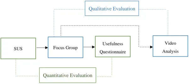
5. EVALUATIONS OF THE SYSTEM ... 34
5.1 Quantitative Assessment ... 35 5.2 Qualitative Assessment ... 40 6. CONCLUSION... 44 6.1 Summary ... 44 6.2 Limitations... 45 6.3 Future Work ... 46 7. REFERENCES ... 47 8. APPENDICES ... 52
8.1 Appendix A: GitHub Repository ... 52
8.2 Appendix B: System Usability Scale (SUS) Form ... 53
8.3 Appendix C: Questionnaire Form ... 56
vii
INDEX OF TABLES
Table 1: The Result of System Usability Scale Scores ………..35 Table 2: Key Points Taken Out From Qualitative Evaluation………41
viii
INDEX OF FIGURES
Figure 1: Conceptual, layered architecture for spatial-aware metrics(Rodríguez-Pupo,
Canut, & Casteleyn, 2017)……….……….……...20
Figure 2: Technology Stack: Framework and tools used in scope of this work... 22
Figure 3: The workflow of angular web app...……….………….….23
Figure 4: The main services provided by Firebase……….……….…..… 26
Figure 5: The structure of the app….……….…….…27
Figure 6: a) the overall view of log in system, b) the overall view of log in system in case of not registered user …………..……….………….……..…28
Figure 7: The general view of Dashboard ……….…….…28
Figure 8: The general view of Maps ………..………….……….….….29
Figure 9: The general view of Charts ……….……….………..……30
Figure 10: Travelled distance in different time interval…….……….…..….…31
Figure 11: The spent time inside / outside from home……….….…...31
Figure 12: Number of times that patient has left home………...…32
Figure 13: The workflow of the evaluation (quantitative and qualitative)…..………34
Figure 14: A comparison of mean System Usability Scale (SUS) scores by quartile, adjective ratings, and the acceptability of the overall SUS score(Bangor, Kortum, & Miller, 2008)………...………36
Figure 15: Usefulness of app in general: preference, benefit for treatment and time-saving factor ………..…….…38
Figure 16: Usefulness of the way of data visualization, map-based and graph-based view ………..…….….39
Figure 17: Usefulness of each element embedded in the app ……….……..….39
Figure 18: The discussion of the focus group during qualitative evaluation …….…40
1
1. INTRODUCTION
1.1 Research Context
New technologies increasingly embedded in our daily routines, such as mobile phones, smart watches and smart bracelets, are capable to get and store massive amounts of data. Along with other types of data, they also collect geospatial data. This data is very valuable and there are many studies which confirm its usefulness. For example, geospatial data is useful for urban planning and understanding the movement of pedestrians (Calabrese, Colonna, Lovisolo, Parata, & Ratti, 2010), for finding out critical points in urban infrastructure (Ratti, Frenchman, Pulselli, & Williams, 2006), for exposing travel behavior in order to develop and improve tourism and marketing services (Asakura & Iryo, 2007), and also it can be a powerful tool for decreasing mortality after a disaster (Bengtsson, Lu, Thorson, Garfield, & von Schreeb, 2011). The usage of geospatial data may be beneficial also for other, a priori more distant, application domains like psychological treatment, which in combination with other datasets obtained from patients, has huge potential to monitor patient’s behavior and response to treatment especially when data is collected and available in (quasi) real time (Gaggioli et al., 2014).
Psychological treatment traditionally included face-to-face interventions (e.g. interviews, meetings) and paper-based data collection methods (surveys, questionnaires, etc.). However, new technologies entered the area of psychology and brought new digital, technology-based methods into this field. These methods may be classified according to the type of technology being employed such as web-based interventions, virtual reality interventions and so on (we will detail these categories later on), and studies showed that these methods compared with traditional ones are positively affecting the developed and execution of psychological intervention on several factors such as decreasing time and cost. The usage of different devices during the treatment is giving an opportunity to record huge data about patients, (both geospatial (location) and otherwise) as never before imagined or conceived.
However, even though large quantities of data can be potentially collected, their interpretation and understanding in order to understand the behavior of patients during treatment and diagnose them properly remain a difficult and challenging issue. For this
2 reason, visualization and visual analytics provide promising methods to alleviate these difficulties. Visualization and visual analytics of geospatial data for psychological treatment is the focus of the present thesis.
The data we used in this study was generated by a mobile application and was stored in a server-side analytical platform for metric analysis created by GEOTEC team. Collected data was stored in the analytical platform, and underwent some metric computations to produce indicators. Through querying RESTful data retrieval services, we retrieved both types of data, collected data (input data for metric analysis) and processed data (metric outputs), and visualize them in our visualization tool (later we will discuss in more details). We also performed a quantitative and qualitative evaluation with the aim to assess the usability of the tool. The result of the System Usability Scale (with 86.5625 scores) and of our own questionnaires with discussion during qualitative evaluation gives us a sign that the tool will induce more effective and efficient therapy.
1.2 Goal
During treatments, therapists may become overwhelmed with potentially large volumes of collected data, as for example geospatial data (GPS coordinates) being systematically captured (configurable time interval) from a user’s mobile smartphone. The more patients being monitored, the more difficult it becomes to interpret and analyze the data, and to find out valuable information and insights. Thus, it is becoming vital to create tools that help therapists to do their work more effective and efficient than using traditional, often paper-based, data collection and analysis tools.
Therefore, our main goal is to design and develop a visualization tool to help therapists to analyze and visualize spatial and non-spatial data derived from treatment by providing the required means to access, compare and visually analyze such datasets and, ultimately, support them in making informed decisions. The tool is particularly designed to provide useful insights for therapists with respect to a certain mental illness. As a starting point, among other mental illnesses, “depression” was taken. But a further goal is to explore how such information and appropriate visualization can also be used for other illnesses.
3
1.3 Approach
In order to achieve our goal we followed the following steps:
1. State of context and research questions 2. Literature review
3. From therapists, find out which information, based on user location, is useful to develop / improve their therapy (aimed at tackling depression)
4. Establish a connection with the systematically collected geospatial data (GPS coordinates) through the mobile app developed at GEOTEC
5. Based on the data collected (see step 2), develop a tool that ingests this data, and appropriately visualizes it according to the requirements of the therapists 6. Evaluate the visualization tool with therapists using a quantitative and
qualitative evaluation
7. Further explore the use of the tool to address other psychological illnesses, using a qualitative technique
8. Writing up.
1.4 Outline
Our work consists of several chapters. The first chapter is the introduction including research context, goal, and steps that we did to reach the goal. In the second chapter, we describe related works, other similar studies, introduce background concepts related to psychological treatment, and give a general overview about visualization, visual analytics and existing methods for tool assessment and evaluation. In the final section of the second chapter, we describe how the tool that we are proposing can help therapist in their treatment. Then, in the third chapter, we represent the metrics platform, mobile application and give a detailed description about technologies used during our work. After all these steps in the fourth chapter is brought a comprehensive description about the application created in the scope of this master thesis. In order to understand if an application meets the initial requirements, an evaluation is performed. Therefore, in the fifth chapter, we bring a description of the process of evaluation. The work finishes with the conclusion (chapter six) where the main points represented in this thesis are summarizing.
4
2. BACKGROUND AND RELATED WORK
In this section we introduce background concepts and technologies that are required to contextualize the use case for which the visualization tool is developed in next chapter.
2.1 Psychology and Psychotherapy
The aim of this work is to develop tools that help therapists to improvement of psychological health interventions, so it is essential to get first an overall view of the field of psychology and its main elements, to understand how psychologists work, research and observe people during experiments.
Psychologists consider people’s behavior as raw data. By analyzing this data they confirm or reject some hypotheses. This is the fundamental tenet. Yet, there are many types or variants of psychology1 that need to be considered, such as:
Clinical psychology - it is mainly focused on preventing dysfunction and making better the situation of the patients.
Cognitive psychology - it is trying to understand how people memorize information.
Developmental psychology - it is used to study some processes or phenomena during lifespan, to understand how these processes change during life development, and observe how certain feeling or behavior is developing throughout life.
Evolutionary psychology - it is trying to investigate how evolution effects on mind and behavior.
Forensic psychology - it is an interaction between other types of psychology with the legal field.
Health psychology - it usually refers to psychological disorders that affect directly to physical health. This type of psychology studies how certain psychological disorders affect in human health and what kind of treatment is necessary to apply in each case.
Neuropsychology - it studies the connection between brain and psychological disorder.
5 In our use case, therapists are focused on clinical psychology. One of the practices in clinical psychology is psychotherapy. Psychotherapy is a word coming from ancient Greek and means psyche – “breath; spirit; soul” and therapeia – “healing; medical treatment”2. The aim of psychological treatment or psychotherapy is to help people
who suffer from different psychological disorders, to guide them to understand their emotions and feelings and to overcome these disorders.
There are different types of methods in psychotherapy3, such as psychoanalysis and psychodynamic cognitive-behavioral, interpersonal, Integrative or holistic therapy, humanistic therapies. Below is brought a brief description for each of them.
Psychoanalysis and psychodynamic therapies - this type lasts longer compared with other types of therapies. The principal idea is to help patients to understand their inner world and by obtaining skills step by step to change and improve their thoughts and feelings.
Cognitive-behavioral therapy - it is concerned with the integration of cognitive and behavioral therapy, mainly, focusing on how we think, feel and behave. In the related literature we can see them separate, but, mostly, these two types are very connected and it is better to discuss them as a unique type. This therapy believes that by changing thoughts and behavior, it will be possible to change feelings and emotions. In our life, different events, both positive and negative, are happening every day. Different people interpret these events differently. Some of them are tended to focus and remember negative ones, and they are usually very sad and get depressed easily. On the other hand, there are people who, on the contrary, seek to perceive the environment positively and fill their lives with positive energy. Therefore, it is very important how we interpret the world surrounding us. Cognitive process is aimed to study mental process, which includes the following categories: attention, memory, language, perception, and metacognition4. It is mainly about how people perceive and
remember information. Behavioral process is the study about our behavior, how environment affects us and how we can change unhealthy behavior.
2 https://en.wikipedia.org/wiki/Psychotherapy
3 https://www.medicalnewstoday.com/articles/156433.php 4 https://en.wikipedia.org/wiki/Cognitive_psychology
6 Cognitive-behavioral therapy is usually time-limited (approximately 10-20 sessions) (Somers & Querée, 2007), principally, focusing on current problems and following a structured style of intervention, which helps to teach patients particular skills for overcoming negative emotions. Usually, therapists and patients collaborate; they discuss and try to find alternative ways, they create the structure and during intervention, they follow the tasks mentioned in the structure. In the beginning, the aim of this therapy was to treat people who had depression, but later on, it has become a healing method also for other disorders.
Interpersonal therapy (IPT) (Robertson, Rushton, & Wurm, 2008) - it is a time-limited method whose aim is to make better relations or to change interpersonal relations. It believes that the communication with other people is very important and has influence on one’s feelings. There are five distinct phases in the IPT approach: assessment, initial sessions, middle sessions, termination sessions or conclusion of acute treatment, and maintenance sessions. In the beginning, therapists investigate patients, in order to understand if a patient is ready to start this intervention. Next steps are to decide the number of sessions, to create an agenda and follow it.
Integrative or holistic therapy5 - it comprises things from other types of
therapies. Therapists consider that it is impossible to treat just one part of the body separately because everything is connected and it is necessary to take into account everything together. This intervention integrates mind, body, and spirit.
Humanistic therapy - this type does not categorize people into groups based on some symptoms. Rather, humanistic therapists look at the person as an individual and they try to observe and understand personal behavior.
Narrative therapy - it is a process during which patients write a story about their life and later therapists analyze the words, which helps them to understand what is the weakness of the patient or strength and they continue to do treatment based on these findings.
7 From the above-mentioned types of psychotherapy, therapists in this study are applying psychoanalysis and psychodynamic therapies.
2.2 Information and Communications Technology (ICT) in
Psychological Treatment
As we already mentioned new technologies have a huge influence on many fields, including psychology too. According to Scharff (Scharff, 2012), it is necessary to adapt psychotherapy to the development of new technologies. As the use of video camera or telephone reduces the distance between therapists and patients, so it can reduce the duration or numbers of sessions. Integrating innovative technology into interventions might definitively increase the effectiveness of psychotherapy by treating more patients during a certain time. There are new terms regarding innovative psychology, such as:
Telehealth - which is the combination of technology and mental health. This term includes all steps, from consultation to treatment by ignoring geographical distance (Glueckauf, Pickett, Ketterson, Loomis, & Rozensky, 2003; Wade & Wolfe, 2005). E-therapy6 - which does not change the theory nor modify the essence of psychotherapy, but it affects the communication between therapists and patients by notably increasing accessibility. Involving new technologies in psychotherapy allows at any time to contact with each other, to treat people who physically are very far. One example is Alaska Telemedicine Program (Stamm, 1998). Additionally, e-therapy is very useful for patients who have chronic disabilities as they need continuous treatment, so contributing to reducing drastically costs for treatment.
Unfortunately, the number of people having a psychological disorder is increasing. For instance, according to WHO (World Health Organization) common psychological disorders like depression affects about 300 million, bipolar disorder affects 60 million, dementia affects about 47.5 million, and schizophrenia affects about 21 million people in the world7. Many people suffer from more than one disorders at a certain time, for example, people who suffer from depression most likely suffer from anxiety disorder too. Here is given some statistical overview in different countries. In the USA 14.8
6 https://psychcentral.com/etherapy/
8 million persons above 18 years old have a major depressive disorder and about 40 million have an anxiety disorder in a given year8. People having a serious type of psychological disorder tend to do suicide. In England, around 6.7% has tried a suicide9. For reducing these numbers, it is very important to apply effective psychological treatments. Based on the advantages of innovative treatment, such as the growth of client accessibility, cost and time effectiveness, more professionals became interested in ICT for innovative treatment, which includes telephone and videoconferencing, Web-based interventions (also called Internet interventions), intervention integrating mobile devices, sensors for patient monitoring, social media, virtual reality and gaming (Mohr, Burns, Schueller, Clarke, & Klinkman, 2013).
2.2.1
Web-based Intervention
Web-based intervention includes tutorials, videos and so on. One example of this intervention is MoodGYM site (Christensen, Griffiths, & Korten, 2002), whose aim is to treat and prevent depression in young people. The site consists of five modules, workbooks, an interactive game, and a feedback evaluation form. The Mobilyze! (Burns et al., 2011) is another site with tools to give feedback to patients about their current situation. During eight weeks trial the authors evaluated the technical potential of the system. These websites consist of some tutorials and interactive graphs. Patients are allowed to report their mood and finally to see the relation between mood with reported locations. Patients could also see the pattern in certain time and based on the result they could change their behavior.
Web-based intervention has some disadvantages, for example, patients cannot keep an appointment, they can forget about accessing the system easily, so some of the systems are automatically sending messages for reminding about intervention (Mohr et al., 2013). It is very important to mention that internet based application is helpful for people who do not have severe symptoms and are interested in this way of treatment. Another factor of this treatment is the support groups in web-based intervention, which can be very helpful because there are people with similar problems, they can share and can support each other (Tate & Zabinski, 2004).
8 http://www.apa.org/helpcenter/data-behavioral-health.aspx
9
2.2.2 Mobile phone intervention
Mobile phone intervention is a new developing type that is growing faster. The main reason is that patients always carry mobile phones with them. Yet, it is important to understand how patients are using phones and based on that pattern to make suitable models. Patients can be notified in real-time via their smartphones to encourage them to change their behavior.
The core features of this system are self-reporting, automatic data sampling, behavioral patterns recognition, data visualization, therapeutic feedback, and easy communication. The technical possibility of the phone includes GPS, which is essential for tracking patient’s movement, to let advance analytical tools to analyze patient’s mobility behavior. It is possible to know the amount of time spent outdoors, compute clusters (most visited places so user/patient spent more time there), travelled distance, frequency of visited places, and regularity of daily habits (Gravenhorst et al., 2015). From a psychological point of view, the above-mentioned parameters can give valuable information about a patient, because usually depressive people do not want to go out from home and expose different behavior than people without depression who like go outside frequently.
Not only can smartphones be used for measuring and data collection, but also for daily treatment. There are many applications such as GET.ON PAPP for people with panic disorder (with and without agoraphobia) (Stegemann, Ebenfeld, Lehr, Berking, & Funk, 2013). Another example is Mobilyze! (Burns et al., 2011) system, which is mentioned in web-based intervention, has also mobile phone system. Using the capacity of phone, this system treats people with depressive disorder and gathers information about patient’s location, activity, social context, mood, emotions, and cognitive/motivational states.
2.2.3 Gamification for psychological intervention
Gamification strategies smoothly embedded into offline and online games are very useful methods to motivate patients to engage in treatment. A game can be a very helpful treatment for young people. According to statistical data in 2015 over 42% of the United States population plays video games at least three hours per week (Entertainment Software Assotiation, 2015). The result shows that computer games
10 help to enhance concentration, change behavior, etc. According to Deterding et al, (Deterding, Dixon, Khaled, & Nacke, 2011) “Gamification is the use of game design elements in non-game contexts”. In parallel of gamification, there is another concept, serious games, with the aim of applying for serious purposes (e.g., scientific exploration, emergency management, city planning, engineering and so on). Gamification and serious games are considering as inseparable elements of applied games. There are several types of applied games, such as virtual reality games, cognitive behavior therapy (CBT)-Based serious Games and Gamification, entertainment computer games, cognitive training games (Fleming et al., 2017). In gaming technology, there is one new term exergames (J. Li, Theng, & Foo, 2016), which includes video games and physical exercises. This is the part of therapy, which does not require much money and does not have side effects. According to this study exergame has an antidepressive effect and it is affecting more on adults than on the young generation. The reason is that young generation can be depressed because of relations, financial situation. However old generation may get depressed because of physical illness, and their sedentary way of life, and that is why this type of games has more effect on adults.
Gamification can effect on the behavior of users. We can use that to decrease negative, undesired behavior and replace it with better behavior. For gamification, important factors are motivation and culture. People from different countries behave differently, and consequently, their approach to games is also different (Almarshedi, Wanick, & Wills, 2017). According to Fogg in order to change behavior, there must be three elements: motivation, ability and trigger and these three elements must happen at the same in order to get a result (Fogg, 2009). For attract a user to play a game, the game must be appropriate to their skills and step by step to make it difficult for keeping motivation to continue to play that game.
There are a lot of games related to psychological health, one of them is Go Go Game (Hiniker, Daniels, & Williamson, 2013). This game is for children who have Autism Spectrum Disorders. The authors tested it with 30 children. It was a success because it was played by 47% of app owners.
11
2.2.4 Virtual Reality
It is worth mentioning also the role and importance of virtual reality in psychotherapy. Virtual reality is a way to create a digital environment very similar to the real world through technologies such as head-mounted displays, gesture-sensing gloves and so on in which responding to the actions in the real time is vital to make virtual reality environment more natural and credible. Patients during this treatment can repeat the procedure when they want, and how many times they want. Because it depends on the situation of the patients, it is possible to manipulate the treatment, step by step adding difficulties in the procedure which will help patients adapt to new conditions. Having a safe and protected environment will give an opportunity for a patient to become ready for overcoming challenges and fears and will make easier to understand feared situations. Usually, 25% of people who take in vivo exposure did not have success. Virtual reality simulates different real situation in a tridimensional computer-generated environment. Compared with the real world in virtual reality there are no unpredictable events, so patients are feeling safer (Botella et al., 2007; Maples-Keller, Bunnell, Kim, & Rothbaum, 2017; Riva et al., 2004).
Much research is related to virtual reality intervention. For example, Difede and Hoffman (Difede & Hoffman, 2002) describe the role of virtual reality for Post-traumatic Stress Disorder. Virtual reality is not only affecting on the imagination but also it can improve listening and visual skills of patients. In this paper, the patient who obtained post-traumatic stress disorder (PTSD) after World Trade Center (WTC) attack on September 11, was treating by applying virtual reality intervention. After six sessions, the result showed that around 83% was reduced depression and 90% PTSD. Li et al (W. H. Li, Chung, & Ho, 2011) focused on the effectiveness of virtual reality for preventing the appearance of psychological disorder for hospitalized children having cancer. Usually, the risk to fall in depression for these children is very high. The authors did an experiment that included 30 minutes intervention consisting of virtual reality computer games. The game created a good atmosphere for children. A PlayMotion system was installed, which transformed the patient’s space into a dynamic playground. There are many companies focused on this type of
12 psychotherapy, such as CleVR in the Netherlands, Psious in Spain, Mimerse in Sweden and etc.10
One of the challenges of using virtual reality was the price of the technologies, however, recently, there is a noticeable decreasing of prices, so virtual reality interventions and related technology, for example Gear VR11, are becoming more affordable.
2.3 Visualization and Visual Analytics
Nowadays, we are living in the world with an ever-increasing amount of information. Thanks to the technological development, it is possible to store more and more data and day by day is generating huge amount of data. Therefore, it is causing difficulties for handling and using this data. The majority of this data is not filtered. There is a risk to lose valuable information latent in this data. Visual Analytics is helping to filter data faster, to analyze it, to find patterns and knowledge that help in decision making processes. Because of either conscious or non-conscious errors, raw data usually contain outliers, duplicate data, errors, and sometimes, it can miss valuable data. Thus, it is becoming very important to clean, to pre-process raw data for further usage. After pre-processing it will be possible to develop some idea about data. There are several types of techniques for reduction and handling of (large) datasets:
Filtering, Aggregation, Compression,
Principle component analysis and etc. (Keim, Mansmann, Schneidewind, & Ziegler, 2006)
According to the VisMaster Coordinated Action community “Visual analytics combines automated analysis with interactive visualizations for effective understanding, reasoning and decision making on the basis of a very large and complex dataset” (Keim Daniel & Mansmann, 2010).
10
https://techcrunch.com/2016/01/06/virtual-reality-therapy-treating-the-global-mental-health-crisis/
13 There are two types of visualization: Scientific12 and Information Visualization13. Developed in 1980’s, scientific visualization is aimed to visualize spatial and non-spatial alike, to allow scientists to understand phenomena. On the other hand, information visualization was developed 1990’s and it is mainly focused on the visualization of abstract data (Nagel, 2006; Rhyne et al., 2003). The fact that information visualization is the combination of different disciplines and theories makes difficulties regarding the validation, defense of the tools used for visualization. The important task of information visualization is to choose the right tool for the dataset to be visually explored. It helps to see a pattern, which later can be the essential feature for creating a model. Knowing in advance which type of pattern is necessary, the tool designers can concentrate to create tools for specific needs. The important step is first, to understand which kind of pattern could exist for a different dataset, which will help to create tools for detecting those patterns (Purchase, Andrienko, Jankun-Kelly, & Ward, 2008).
Visualization is essential for gaining an understanding of data and underlying phenomena. It has to be effective and efficient. In other words, visualization should do what it is supposed to do, and has to do this using a minimal amount of resources. There are three major goals of visualization: presentation, confirmatory analysis, and exploratory analysis (Keim et al., 2006). Which technique will be used for
Presentation mainly depends on a user. A Confirmatory analysis is related to the fact
that there are some hypotheses in the beginning of the visualization and in the end the result of the visualization will reject or confirm those hypotheses. The last one,
Exploratory analysis, is for exploring data, for finding useful information, which was
undiscovered before visualization.
The main challenges of visual analytics are scalability, the ability to integrate heterogeneous data sources, and interpretability (the ability to understand data correctly). Another worth mentioning problem is wrong and misleading visualization. Related to the latter one, Edwin Tufte (Tufte 1983) represents lie factor and below is presented the formula:
12 https://en.wikipedia.org/wiki/Scientific_visualization 13 https://en.wikipedia.org/wiki/Information_visualization
14 Lie Factor = Size of effect shown in the graphic/Size of effect in data (The closer the Lie Factor is to 1.0, the more accurate the graphic is.).
There are some techniques which show how is possible to lie with visualization, such as by hiding relevant data to highlight what benefits us, by displaying too much data to obscure reality and by using graphic forms in inappropriate ways (distorting the data) (Cairo, 2015). Therefore, during visualization, it is important to prevent above-mentioned technique for lying.
To design and achieve a good visualization it is necessary to follow these steps: mapping, selection, presentation, interactivity, usability (Human factors), and evaluation. In the first step, named by mapping, it is important to think how to visualize information. Then, the next step is selection, which includes the selection of proper data for further visualization. After mapping and selection it is important to think how to present data effectively (presentation). Afterward, it is significant interactivity, which refers to proper techniques to allow users to explore and interpret data easily and correctly. Another step that we need take into consideration is human factors which include usability and accessibility. The final step, evaluation, helps to understand whether or not the methods used for visualization are effective (Khan & Khan, 2011).
2.3.1 The role of Visualization and Visual Analytics in the Field of Health
Different categories of visualization and visual analytics from the periodic table (Data, information, Concept, Strategic, Metaphor, Compound visualization)14 are applied to
many fields, including the health field. Some use cases are brought below.
In many hospitals sometimes, emergency calls are increasing and it is becoming impossible to access more patients. The ability to visualize the current situation of hospitals, to model processes will cause the improvement of the healthcare system. The main challenge, in this case, is the data collection. It is difficult to collect complete dataset. However, it still can be very helpful. Fitzgerald and Dadich (Fitzgerald & Dadich, 2009) tried to find strategies for further improvement. They took into consideration many parameters, like the number of rooms, equipment, the number of
15 inpatients and outpatients, average time for waiting, average time for treatment and etc. The next step was clustering, by creating groups of the processes having some similarity, which allowed to control and manipulate these processes. Later, they created the visual model using Tecnomatix Plant Simulation® software. Validation was done by asking staff members. And finally, when the model was approved, next step was based on that model to suggest ways for improving the system.
Kim et al (Kim, Snodgrass, Pietrowicz, Karahalios, & Halle, 2013) presented the tool BEDA, which handles huge data related to psychological treatment. Receiving data from different sources creates barriers to analyze consistently heterogeneous data and BEDA is helping to overcome these difficulties. As psychologists are taking different data in different ways, for example, using videos or different sensors, it is very important to synchronize these datasets. This tool allows to load different data and synchronize it. It is possible also to load MATLAB and R scripts and run them. Another interesting way of visualization is applied for Fish’n’Steps game. This game is helpful for people who have problem with obesity, which is one widespread problems because of sedentary life style, also the huge use of fast food. Fish’n’Steps is focused on daily step count, to see how many steps during a day a person walks. As the number of steps increases the state of virtual pet ( in this case is fish ) grows up, motivating players to compete with each other to do more steps (Lin, Mamykina, Lindtner, Delajoux, & Strub, 2006).
Here it is worth to mention the MONARCA system. An important question is how to design an easy to use a system for therapists and patients alike. The fact that a patient usually carries a smartphone permits to monitor the patient’s mood, to give feedback at any time, to recommend some actions or tasks. Usually, these patients are in a stressful situation and it is very important to pay attention to the design of the system. Patients sign in MONARCA system for self-assessment, to get feedback, and to be guided for taking medicine. MONARCA is mainly for bipolar disorder. The main task is to assess patient, visualize this data and give real-time feedback. The MONARCA android application consists of several parts: (a) inputting self-assessment data, (b) historic data visualizations, (c) prescribed medicine; (d) activated ‘triggers’ and suggestions for ‘actions to take’; and (e) a screen for various settings, such as an alarm
16 reminding the patients to enter their self-assessment data. By studying 12 patients during 14 weeks using MONARCA system, the result was positive (Bardram et al., 2013).
Another example related to visualization is the design of Tactical Breather application. During inhalation, holding and exhalation the size and the color of circle are changing and the voice instruction is saying the name of one of the above mentioned phase and then is giving information to user about the progress. Therefore, it is very important that visualization helps to understand instruction of application, not distract user’s attention during controlling the breath (Chittaro & Sioni, 2014).
2.4 Evaluation of Visualization
Parallel with development information visualization, many techniques and tools are created. Related to that it is becoming important to evaluate these techniques and tools, to understand when to use them. The role of evaluation is valuable, because it is not just telling whether the product is effective or not, but also it is helping to understand which part of the product needs to improve, which element needs to fix.
Visualization evaluation integrates the essential elements of usability: satisfaction, effectiveness and efficacy. According to ISO 9241-11 usability is the extent to which a system can be used by specified users to achieve specified goals with effectiveness, efficiency and satisfaction in a specified context of use15. Below is a brief description
of each element.
Effectiveness - it is capability to complete a task. For measuring effectiveness, it takes into account accuracy and errors that are coming during performance of a task.
Efficiency - it measures performance and learning time while executing a task. Satisfaction - it is mainly about how people feel when they finish a task. Are their feelings negative or positive? Satisfaction can be measured by providing questionnaires16.
15 https://en.wikipedia.org/wiki/Usability
16
17 For easy tasks efficiency can be a valid indicator, but for complex tasks the only important thing is to complete the tasks. According to some studies, efficiency is an indicator because it assumes that when the tasks are executed in time, it means that the tasks are completed properly. This study (Frøkjær, Hertzum, & Hornbæk, 2000) concludes that there is a weak correlation between these three factors, that is why for measuring usability we need take into account the three of them.
For evaluation we need take into account the following tasks:
1. Purpose – it is important in advance to know the purpose of the evaluation. 2. Users – there are different education level, demographic status, it is useful to
choose the group of users, who are similar related to above-mentioned tasks. 3. Tasks – the tasks that visualization must support.
4. Datasets - to understand which type of dataset need to be used in evaluation: real or synthetic. It is preferable to use synthetic dataset to be able to control and manipulate process. The evaluation with real data is time-consuming. 5. Collected data – this data can be discrete or continuous and depend on measure
factor can be qualitative/ categorical or quantitative/numerical.
6. Data analysis – which is one of the most important steps. It is important in advance to plan how and what type of data must be collected (Sousa Santos & Dias, 2013).
Evaluation process involves the following steps:
Comparing design elements
Check the usability of the tool
Compare two or more tools
Case studies of tools in realistic settings (Plaisant, 2004)
Depending on the aim of evaluation, there are different types, different aspects of evaluation, such as:
Process evaluation – the aim of this form is to find out if the product meets the requirement for which it was planned and created.
Impact assessment – this type is for measuring the impact of the product, in order to understand if it has some impact if before creating the product and after something changed and had an impact on the target group.
18 Outcome evaluation – to measure successfulness, for example, if the aim of the product is to treat patients, to see if it is really helping to treat them during an intervention.
To choose an evaluation method depends on the type of evaluation. For the process evaluation, is better to perform a qualitative method, with focus group’s discussions or with open questions. However, for outcome and impact evaluation is preferable to apply quantitative evaluation with different types of questionnaires (World Health Organization, 1998).
Evaluation can be analytical and empirical (Khan & Khan, 2011). First one includes expert review and all necessary changes are being done during development, the second one includes focus group, questionnaires and etc. and all changes are being done after implementation. Speaking about usability we need to concentrate on the context in which certain product is used, we need to know a user who will use this product and the tasks that this product is supposed to perform.
To generalize usability is very difficult because some factors in one system can increase the usability and in another do the opposite. Nevertheless, there were some trials to create some tools which will be general and will be applicable to every system. For that purpose, the System Usability Scale (SUS) was created by John Brooke in 1986. It consists of 10 questions and the score can range between 0-100. For calculating SUS score we need to do the following steps:
1. for odd numbered statements their score minus 1 and for even numbered statements 5 minus the score
2. to sum the result obtaining in the previous step 3. multiply the sum with 2.5 (Brooke, 1996).
However, this method has disadvantages. If your product gets a low score, it is impossible to know which part of a product you need to fix. This score just gives you overall impression or view of the product17.
SUMI or the software usability measurement inventory is another tool for measuring usability of the product. It consists of 50 statements, each of them has three options of
19 answer, “agree”, “don’t know” and “disagree”. In order for the results to be effective, the authors suggested the participation of at least 10 users in the evaluation process (Kirakowski & Corbett, 1993).
WAMMI is another example (Website Analysis and MeasureMent Inventory). This tool has questionnaires. For evaluating website the main task is to understand how people feel, think when they use certain website18.
2.5 Summary
In section 2.2, we saw that the number of people having a mental disorder is increasing. To treat these persons is needed time. Therapists need time to monitor patients' progress during treatment and parallel with time to give feedback to patients in order to change their behavior depends on their situation. In order to monitor and observe patients therapists need details about them. In our case, before applying our tool, patients filled in surveys about details (habits) that therapists needed for the treatment, for example, where they went, how many times they left home, how long they were outside. Later based on these obtained details therapists were analyzing patient's progress. This process is time-consuming because therapists need to wait until patients inform them about details and they also need time for interpreting these details. Having into consideration the above-mentioned issues, we are proposing a tool which will help therapists in real time to see what a certain patient is doing, where he/she is going, how many times he/she left home in given period. Moreover, in the previous case, for patients was difficult to tell how many kilometers they did, but our tool based on the generated data will show by graph the distance that they did.
Therefore, we can conclude that our tool will help therapists significantly to reduce the time of treatment and, furthermore, the analysis will be more accurate, this tool will provide therapists information based on real data, instead of the previous case when the details were entirely based on patients’ willingness to tell the truth.
The advantages that this tool can provide will help therapists relatively to treat more patients at a certain time.
18 http://www.wammi.com/
20
3. OVERALL TECHNOLOGICAL SOLUTION
3.1 Metrics System and Client Applications
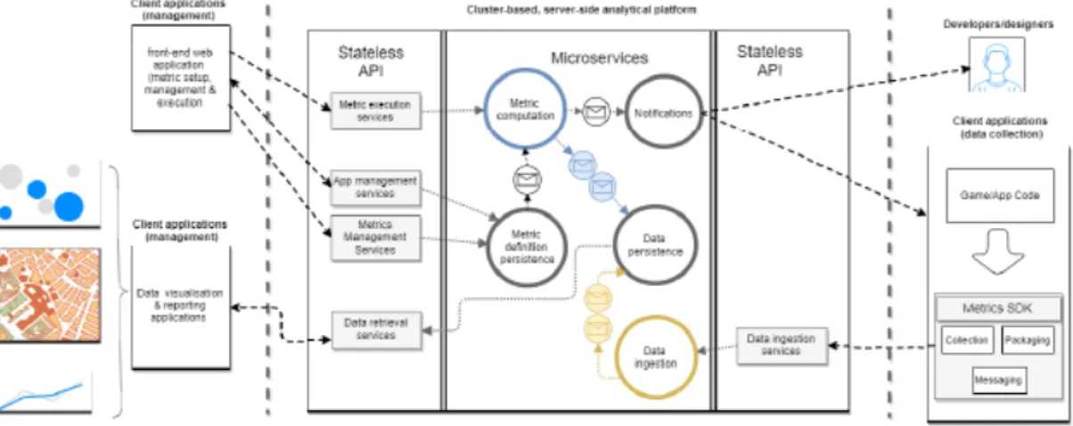
The visualization tool created in the scope of this thesis is directed to visualize data generated from a mobile app which is stored in a metrics analytical platform created by GEOTEC. The concept of metric is central to the analytical platform. A metric allows to monitor some phenomena and takes the form of a function, which is based on input data to produce comparable outputs allowing to compare phenomena between each other. Based on this concept GEOTEC team created the location-based and context-aware metrics platform which consists of server side and client side developments. In the central part of Figure 1 is the server side platform which is able to manage and process big data involving both batch and stream-processing methods. Stream-processing methods are aimed for fast data ingestion while batch-processing ones are for metric computation and analysis execution. The client side, which is adjacent parts of the server side platform in Figure 1, involves management for configuring and visualizing metrics results (left side) and end-user applications for generating data and receiving notifications (right side). These two types of client applications connect to server-side stateless services through convenient Application Programming Interfaces (APIs).
Figure 1: Conceptual, layered architecture for spatial-aware metrics (Rodríguez-Pupo et al., 2017).
21 End-user applications (right side in Figure 1) are aimed to collect data, validate, package and send them to the server side of the platform. The Metrics SDK (software development kit) embedded into end-user application helps a developer in performing these activities. Once the data is transferred to the server side of the platform, multiple components take place for storing and processing massive amounts of input data. Details about the analytical platform are beyond the scope of this work and are fully described in the following journal paper (Rodríguez-Pupo et al., 2017).
Whereas end-user applications in the form of mobile apps are one type of client application designed mainly for data collection, other ways of interaction with the server-side platform are focused on visualizing output data, i.e. the result of metric executions. That is what we state that the last element in the chain of platform's structure is data visualization and reporting tools which interact with the platform by means of RESTful data retrieval services to retrieve input and output data. The visualization tool presented here falls into this category of end-user application in order to support map-based and tabular-based visualizations of input data (metric inputs) and processed data (metric output).
The metrics platform is generic enough to adapt to different applications and use case scenarios. For the time being, the platform has two ongoing use cases for demonstration purpose: location-based game and psychological health. The former is aimed to improve physical activity by tracking user’s location and giving customized, context-aware notification based on the environment conditions (Miralles, Granell, Rodríguez-Pupo, Casteleyn, & Huerta, 2017). The second one is related to psychological health to treat people having depression. A mobile application is helping to track user’s movement (e.g. trajectories), while a dedicated metric is executed through the analytical platform to extract some information about the user, for example, how much time the patient spends outside from home or how many times the patient exits or enters home, how long does the patient walk. The web application for data visualization allows researchers and therapists to visualize spatial and non-spatial variables based on input data (trajectories) and output data (metric results), as we will discuss in details in the next chapter.
22
3.2 Technology Stack
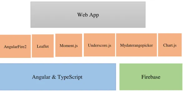
After describing the metrics analytical platform and the mobile app in the previous section, it is time to present the essential feature of this thesis, the visualization tool. It was built on top of a series of framework and libraries what all are referred to as technology stack (Figure 2).
Figure 2: Technology Stack: Framework and tools used in scope of this work.
The above figure is made up of three layers. The bottom layer corresponds to well-known frameworks in which the developed tool is compliant with. The primary tool in this layer was Angular 19. It is a front-end web application platform developed by
Google. The history of Angular is a little confusing. In the beginning was AngularJS, then 2014 was created Angular 2, which was totally different from the first version. Later, in 2016 and 2017 Angular 4 and Angular 5 were released respectively, which have a few difference from Angular 2. Angular 2, 4 and 5 are based on Typescript 20, which is developed by Microsoft. Typescript is superset of JavaScript. The main function of this language is to develop applications and later compile to JavaScript. For our application we used Angular 4.
19 https://angular.io/
20 http://www.typescriptlang.org/
Angular & TypeScript Firebase Web App
23
Firebase Hosting
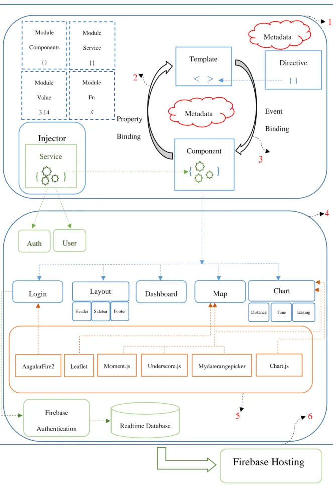
Figure 3: The workflow of angular web app
Layout
Header Sidebar Footer
Directive
{ }
Template
< >
Chart
Distance Time Exiting Injector Service
{
}
Property Binding Event Binding Component{
}
Map FirebaseAuthentication Realtime Database
Auth User Login Dashboard Metadata Metadata Module Components {} Module Service {} Module Value 3.14 Module Fn ʎ Leaflet
AngularFire2 Moment.js Underscore.js Mydaterangepicker
1 4 5 6 2 3 Chart.js
24 Figure 3 shows the workflow of our angular web app. The part surrounded with the rounded rectangle mentioned with (1) is the architecture of angular, which is the core of any angular application. As can be seen, it consists of components, templates, services, directives, metadata and modules. Certainly, Angular’s constituent elements are not limited to the above-mentioned list but these are the fundamental items. Below is demonstrated a concise characterization of these items.
A template is an HTML form that tells Angular how to display a component. A
component, in turn, controls a view, and is in charge of managing templates. For
connecting data between components and templates angular has the mechanism named data binding. In the Figure 3, we can see two complementary types of binding: property and event binding shown with (2) and (3) arrows. Metadata is the element for telling angular what is the essence of the certain class, whether it is components or it is Injectable and so on. Metadata, component, and template are defining view of the app. Another important element of angular is directive which instructs the template. There exist two kinds of directives: structural and attribute. Structural directives modify layout (e.g., ngIf, ngFor), attribute directives modify an existing element's appearance (e.g., ngSwitch, ngModel). Services are for logic part, they fetch data from the server, validate user input and so on. Sometimes we need to use the same function or method in different components, to escape tedious work every time writing the same, angular has services, where we are writing all necessary methods and later calling them in a proper component. Services and components are registered in modules. Every Angular app has at least one root module, AppModule, which by bootstrapping induces that an app is being launched in a browser.
Based on this core architecture of angular, we expanded and created our own architecture adding new elements conforming to our application, which is encircled by (4) rounded rectangle in Figure 3. As shown we created two new services: Auth and
User, the following components: Layout (child components: Header, Sidebar and Footer), Login, Dashboard, Map, Chart (child component for each graph: Distance, Time, Exiting).
Our app has several modules including Features module, such as ChartModule,
25
HTTPModule, BrowserModule, RouterModule, FormsModule. Each module has its
investment for creating a complete app, for example, RouterModule allows to navigate between different pages easily, HTTPModule is responsible for retrieving data from remote server and so on.
Angular has many libraries, for installing them npm (node package manager/module) comes to help and then we import them with the import statement. Moreover, in the angular app, there is one file named package.json, where we can see all installed libraries. For our app, we used libraries from @angular/core, also external or third-party libraries shown by (5). The latter one includes Leaflet.21, Chart.js22,
Moment.js23, Underscore.js 24, mydaterangepicker25 and AngularFire226.
The data that we need to visualize is divided into two categories: spatial and non-spatial. For visualizing spatial data we used Leaflet, which is a JavaScript library for creating web mapping applications. For non-spatial data it was used Chart.js. It includes different types of graphs such as bars, pies and so forth. To format dates we used Moment.js and to group data based on the experiment days, was used
Underscore.js, which has more than 100 functions and helps to make programming
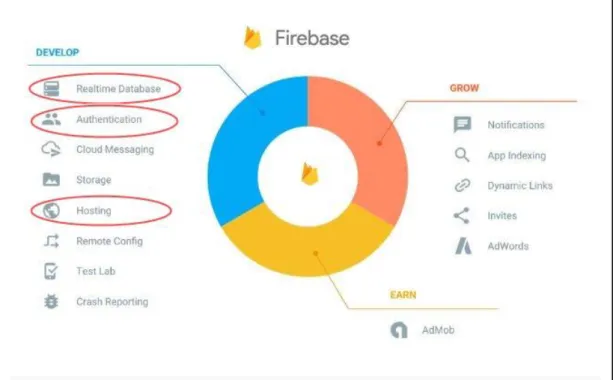
faster. For showing dates, we used mydaterangepicker calendar, which has several options, such as disable or enable dates, mark a current day, month or year and so on. To complete the development of the app there had remained to fix Login component and deploy the app. To resolve the latter one we used Firebase. The connection between Angular and Firebase is supported by AngularFire2 library. Firebase is free online database service, founded in 2011 and Google acquired it in 2014. It is a platform for developing web and mobile applications. It includes different services such as Realtime Database, Firebase Authentication, Firebase Hosting, Cloud Firestore, Test Lab and so on (Figure 4). For executing login we applied Firebase Authentication. It supports user authentication with passwords, phone numbers, Google accounts, Facebook accounts and so forth. For our app, we chose 21 http://leafletjs.com/ 22 http://www.chartjs.org/ 23 https://momentjs.com/ 24 http://underscorejs.org/ 25 https://github.com/kekeh/mydaterangepicker 26 https://github.com/angular/angularfire2
26 authentication with Google account and for giving permission to access to the system certain users, we registered their emails in the Realtime Database, which is a cloud-hosted NoSQL (Not only SQL) database․ Finally, for deploying the app we used Firebase Hosting which helps to deploy faster and effortlessly marked with (6) in Figure 3.
Figure 4: The main services provided by Firebase27.
27
4. THE VISUALIZATION TOOL
After a brief overview of the technologies used for development of visualization tool in the previous chapter, now we introduce the tool itself including all its elements and functional features. Here we need to mention that throughout the development of the system first step was to meet with therapists from LabPsiTec (Laboratory of Psychology and Technology), and through (unstructured) interviews, we discussed and retrieved the informational requirements that according to therapists were useful for treating patients with depressive disorder. Below are presented the main points provided by therapists.
1. The spent time inside / outside from home (to know how long a patient has been inside and outside from home each day)
2. Number of times that a patient has left home (to know how many times he/she has entered / left home each day)
3. The travelled distance (to know how many meters a patient has travelled each day, without distinction if he/she has done walking or with a vehicle)
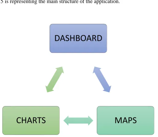
4. Maps with trajectories (to know where a patient has been) Figure 5 is representing the main structure of the application.
Figure 5: The structure of the app.
DASHBOARD
MAPS
CHARTS
28 To access to the system it is necessary to log in with Google account (Figure 6a), but not everybody having Google account can access (Figure 6b) because this system is for psychological treatment and includes personal details about patients. Taking into consideration the privacy factor, we give permission to log in only limited number of persons by registering their emails in Firebase Realtime Database.
Figure 6: a) the overall view of log in system, b) the overall view of log in system in case of not registered user.
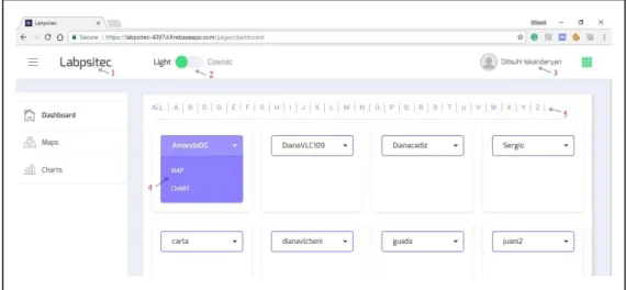
After successful login, a user enters into the system, which consists of three pages (left panel) as shown in Figure 7: Dashboard, Maps and Charts. Below is given general description for each page.
29
Dashboard is the default page to allow users (therapists) to search and select a patient
to explore associate data in detail. In Figure 7 is represented Dashboard page with its elements: (1) is the name of the tool, (2) is the button for changing the color for the whole page, (3) is the name of a user and clicking on that will pop up “Log out” window, (4) shows the names of other two pages, which appear by clicking on a patient’s name and choosing one of them will navigate to the corresponding page, (5) is for filtering patients based on their name.
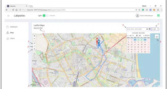
Maps page is aimed to display spatial data related to a chosen patient (trajectories,
home, etc.). For creating map page we used Leaflet map (Figure 8). In this page (1) is the name of a patient which we select in Dashboard page, (2) is a scale control that shows the scale of the current center of screen, (3) is a control button for showing Home, which is displayed on the map with blue pin, (4) is a control button for setting a map view containing an area of interest, (5) is for displaying starting point and on the map is demonstrated with red pin, (6) is the calendar in which only the dates are enable, during which patients had treatment, so therapists can choose one day or certain range easily, (7) is a dropdown button for time interval (whole day –“0-24”, morning – “0-8”, afternoon – “8-16”, evening – “16-24”), which allows to filter and see trajectories in a certain time. For example, Figure 8 shows trajectory for patient “DianaVLC109” during 03.01.2018 - 06.01.2018 for whole days. Furthermore, user can switch between Open Street Map and Google Hybrid with (8) layers control.
30
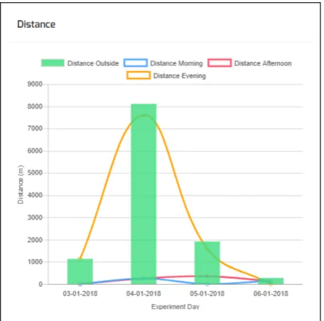
Charts page is aimed to display non-spatial processed data related to a chosen patient
(travelled distance, time outside/inside and etc.) using Chart.js JavaScript graphics library. In Figure 9 is shown the overall view of Charts’ page. In this page, we have a calendar and a dropdown button, which give users the ability to filter data by a certain time interval. The page contains three different graphs: Travelled distance (Figure 10), the spent time inside / outside from home (Figure 11) and number of times that a patient has left home (Figure 12). The bars in the graphs show total values for whole day and lines show values in a different time interval (morning, afternoon and evening). On the X axis are shown experiment days (time) and on the Y axis are the values. Moreover, a user can switch off/on the bars or certain line by clicking a proper rectangle in the legend.
The link of the source code repository is placed in Appendix A.
31 Figure 10: Travelled distance in different time interval.
32 Figure 12: Number of times that patient has left home.
By inspecting the values displayed on the graphs therapists need to diagnose patients based on these values. It will be useful to have certain standard values about a healthy person (control group), which will permit therapists to compare those values with each other. It is worth noting here that the experiment conducted (see next Chapter) was for testing, where therapists themselves took the role of patients. As the tool is in a testing stage, the strategy to diagnose patients is based on the relative comparison of the same patient’s values between different days with the aim to see progress during these days, rather than comparing it against a control group. In the future, however, it is expected therapists use the application with real patients divided into two groups according to well-established clinical research practices.
Here it is also important to mention about GDPR (General Data Protection Regulation)28. This European directive will enter into force on May 25, 2018, paying special attention to companies that share personal data of EU (European Union)
33 citizens which can eventually get fined. As our work is being done before the regulation will become enforceable, so there is no reason to worry. However, the application was tested with therapists, we ensured that ethical protocols and standard mechanisms to safeguard personal data were properly applied to. For example, the issue of the privacy is already under the control by creating an ID for each patient and in the web app will appear their ID, not any personal data of the user (patient). Furthermore, for the experiment, participants were asked to accept and sign an informed consent form explaining them the aims and scope of the experiment that they participate in a volunteered basis, given their agreement to get involved in this type of treatment/experiment.