Developing visualisations for urban mobility data:
a user-centred design approach
Thiago Sobral Marques da Silva
Dissertação de Mestrado
Orientador na FEUP: Prof. Maria Teresa Galvão Dias
Faculda de de Engenharia da Universidade do Porto
Resumo
Desde as últimas décadas, observa-se um aumento notório dos níveis de mobilidade em áreas urbanas, causados por fatores como evoluções econômicas e mudanças políticas. Esse fenómeno evidencia a necessidade de se identificar tendências de mobilidade urbana periodicamente. As entidades que se preocupam em analisar tais tendências podem contribuir positivamente para a qualidade de mobilidade urbana, obter vantagens competitivas e descobrir oportunidades de inovação.
Os Sistemas Inteligentes de Transportes configuram-se como uma forma de melhorar o transporte através da integração entre a infraestrutura de transporte e as tecnologias de comunicação e informação. Esses sistemas geram grandes quantidades de dados que geralmente não são explorados em profundidade pelos intervenientes que os detêm. Da mesma forma, a crescente evolução da área de Visualização da Informação tem oferecido novas técnicas que auxiliam a extração de conhecimento a partir de conjuntos de dados de larga escala. As visualizações podem oferecer contribuições poderosas para autoridades e empresas ligadas ao setor de transporte, permitindo melhor compreensão acerca dos padrões e tendências de mobilidade de uma cidade. Embora a Visualização da Informação seja reconhecida como uma área centrada no utilizador, ainda é possível observar a escassez de abordagens efetivas centradas no utilizador para o desenvolvimento de visualizações. O envolvimento de utilizadores potenciais durante todas as fases de desenho de um sistema é crucial, dado que estes serão os maiores beneficiados durante as suas rotinas e decisões diárias.
A fim de reduzir esta lacuna e enfatizar a necessidade de se explorar o grande volume de dados de mobilidade urbana existente, este estudo empírico propõe uma abordagem completamente centrada no utilizador para o desenvolvimento de visualizações para o setor de mobilidade urbana, identificando que tipos de visualizações podem contribuir efetivamente para extração do conhecimento, dependendo do tipo de dados em causa. Utilizou-se diferentes tipos de dados de mobilidade urbana da cidade do Porto, os quais foram obtidos através de diversas fontes como contadoras de tráfego, bilhética e uma aplicação móvel que fornece informações em tempo real sobre transportes públicos. A metodologia compreendeu uma caracterização formal dos dados obtidos e a modelação temporal dos mesmos. Posteriormente, iniciou-se o processo de desenvolvimento de visualizações altamente iterativo, focado na prototipagem rápida e avaliação através de testes de usabilidade exploratórios com peritos em mobilidade urbana.
Finalmente, os peritos constataram o potencial dos conjuntos de dados que possuem e propuseram melhorias valiosas para as técnicas de visualização que foram aceites. Pretende-se que os resultados deste estudo evidenciem a importância de se envolver continuamente os utilizadores durante o processo de desenvolvimento de visualizações para o setor de mobilidade urbana e outros possíveis domínios onde também sejam aplicáveis.
Abstract
Mobility levels have increased notoriously in urban areas on the last decades driven by economic and political changes. This change poses the need of identifying mobility trends periodically. Entities that are concerned with those trends can positively contribute to citizens’ perception of urban mobility quality, gain competitive advantage and uncover innovation opportunities.
Intelligent Transport Systems have been one of the approaches for improving transport by integrating infrastructure with information and communication technologies. They generate massive amounts of raw data that usually are not explored in-depth by the ones who own them. Likewise, the evolution of Information Visualisation provides new techniques for assisting knowledge extraction from large datasets. Visualisations can be a powerful asset for authorities and transport related services for identifying mobility trends and gaining in-depth understanding about a city’s dynamics. Although Information Visualisation is acknowledged as user-centric, current research is still scarce in applying thorough user-centred design approaches. Involving potential users during all phases of any design process is crucial, as they are the ones who will benefit from visualisations on their daily routines and decisions. In order to reduce this gap and emphasise the need of exploring data, this empirical research propose a thorough user-centred approach for developing visualisations for the urban mobility domain, in order to assess what types of visualisations can effectively support knowledge extraction depending on the type of data that is concerned. Different types of urban mobility data from Porto were used, which were extracted from different sources including traffic counter sensors, ticketing and a mobile application that provides real time information about public transport. The methodology comprised a formal characterisation of data and time modelling. After, a highly iterative design process started, which focused on rapid prototyping and evaluation through exploratory usability tests with experts in urban mobility.
Finally, experts realised the hidden potential of datasets and proposed valuable improvements for the approved visualisation techniques. The results of this research are expected to enlighten researchers and practitioners about the need of actively involving users, as well as to serve as a reference for developing visualisations for the urban mobility domain.
Acknowledgements
I am deeply grateful to Professors Teresa Galvão and José Luís Borges for their confidence, motivation and continuous support. This work immensely benefited from our fruitful conversations about urban mobility and Information Visualisation. I feel honoured for the opportunity of doing this research at IBM Centre for Advanced Studies – Portugal.
I extend my gratitude to Professors João Falcão e Cunha and Lia Patrício, directors of the Master in Services Engineering and Management, the academic and secretariat staff for their friendliness and dedication to this program.
This work benefits from the kind support and participation of the staff of OPT S.A, the Mobility Division of the Porto City Hall, STCP S.A. and other urban mobility experts from Porto who provided datasets and participated in this research. Thank you very much for collaborating with the success of this research.
Words cannot describe how grateful I am for my family’s love and support during these two years distant from home; especially for my parents who always supported my academic career and the decision to study abroad, always pouring cheering words in times when the fact of being far from home were harder to endure.
Last but obviously not least, I express my deep gratitude for the precious friendships I settled here in Portugal and the good memories I will carry from now on. I am grateful for their care and continuous support. Thank you for making me feel at home in Porto.
Index of Contents
Chapter 1 Introduction... 1
1.1 Objective and research questions ... 1
1.2 Outline ... 2
Chapter 2 Literature Review ... 4
2.1 Usability and User-centred design ... 4
2.2 Information Visualisation ... 11
2.3 User-centred design approaches to Information Visualisation ... 17
2.4 Conclusions and research contributions... 19
Chapter 3 Methodology ... 21
3.1 Analysis of datasets ... 21
3.2 A User-Centred Design process for developing visualisations ... 23
Chapter 4 Analysis of datasets ... 27
4.1 Exploration of datasets ... 27
4.2 Data characterisation ... 33
Chapter 5 Results of the User-Centred Design Process ... 37
5.1 Context of Use Analysis ... 37
5.2 Prototyping for Domain Visualisation ... 37
5.3 Interaction and usability studies ... 52
Chapter 6 Discussion ... 63
6.1 The User-Centred Design process ... 63
6.2 Visualisation prototypes ... 65
Chapter 7 Conclusions and evolution perspectives ... 68
7.1 Research questions revisited ... 68
7.2 Research limitations and evolution perspectives ... 69
References ... 71
APPENDIX A: Examples of initial mock-ups from Domain Visualisation phase ... 74
APPENDIX B: Guide for semi-structured interview (Domain Visualisation phase) ... 76
Index of Figures
Figure 1 - Usability framework (Adapted from ISO 9241-11 1998) ... 4
Figure 2 - User-centred design process according to ISO 9241-210 (Adapted from Jokela et. al 2003) ... 6
Figure 3 - The two dimensions of prototyping (Adapted from Nielsen 1993) ... 8
Figure 4 - A waterfall model approach (Adapted from Preece, Rogers and Sharp 2002)... 9
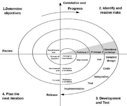
Figure 5 - A spiral model approach (Adapted from Boehm 1988) ... 10
Figure 6 - The star lifecycle model approach (Adapted from Hartson and Hix 1989)... 10
Figure 7 - An example of information visualisation (left) in contrast to a scientific visualisation produced by scientific computing application (right) (Sources: http://www.infovis-wiki.net and http://www.designworldonline.com) ... 12
Figure 8 - Immigration settlement across the USA. Overview of immigration by different nationalities is shown on the top. Filtering by Mexican citizens immediately provides the visualisation on the bottom (Source: http://www.nytimes.com/interactive/2009/03/10/us/20090310-immigration-explorer.html) ... 13
Figure 9 - Differences of representation between a space-time-cube (left) and an animated map representing spatiotemporal data over a static 2D map (right) ... 14
Figure 10 – Artistic visualisation experiment of the London Underground network ... 15
Figure 11 – Metro Viz visualisation tool (Source: Du et al. 2013) ... 16
Figure 12 - AllAboard user interface (Source: footnote 2) ... 16
Figure 13 - Visualisation of urban mobility data (Source: http://fmachado.dei.uc.pt/sandbox/visualizing-urban-mobility) ... 17
Figure 14 - UCD approach for visualisations proposed by Lian Chee et al. (Source: Lian Chee et al. 2011) ... 18
Figure 15 - Pyramid framework for characterising data (Adapted from Mennis, Peuquet, and Qian 2000) ... 22
Figure 16 - UCD process used in this project adapted from Lian Chee et al. ... 24
Figure 17 - Move-me mobile application ... 27
Figure 18 - Validation of Andante Card (Source: http://www.stcp.pt) ... 30
Figure 19 - Example of traffic counter sensor on a street. In this example, the sensor is linked to 3 coils, each at a street lane ... 31
Figure 20 - Pyramid model for Move-me data ... 33
Figure 21 - Pyramid model for STCP data ... 34
Figure 23 – Visual query control ... 38
Figure 24 - Circle Markers for July 2013 (left) and November 2013 (right) ... 39
Figure 25 - Overview of Clustered Markers visualisation ... 39
Figure 26 - Clustered Markers for July 2013 (left) and November 2013 (right)... 40
Figure 27 - Heat maps for July 2013 (left) and November 2013 (right) ... 40
Figure 28 - Overview of a heat map representing schedule requests for a given day in Oporto ... 41
Figure 29 - Heat map for St. John’s Night 2013 ... 41
Figure 30 - Heat map for traffic flows at Bolhão city zone for a specific day ... 42
Figure 31 - Preliminary colour-coding strategy for heat maps ... 42
Figure 32 - Density circles for Valentine's Day 2013 ... 43
Figure 33 - Density circles for St. John's Night 2013 ... 44
Figure 34 - Calendar heat map for Trindade Metro stop with focus on a specific date ... 44
Figure 35 - Line chart comparing schedule requests between bus stops ... 45
Figure 36 - Line chart of average validations per stop for a specific bus line... 45
Figure 37 - Radial heat chart of ticketing data for two bus stops ... 46
Figure 38 - Google Earth based visualisation ... 47
Figure 39 - Chord Diagram for travel intentions in Metro do Porto network (November 2013) ... 48
Figure 40 - Visual filter for the Chord Diagram (focus on Trindade stop) ... 49
Figure 41 - Geographic Graph: travel intentions on the Metro do Porto Network (November 2013) ... 50
Figure 42 - AADT variation for traffic counter sensors between 2013 and 2012 (Sized circles) ... 51
Figure 43 - Line plot for historical AADT data for a traffic counter sensor ... 52
Figure 44 - Overview of clustered markers (monochromatic blue scale and filtered clusters) 54 Figure 45 - Clustered markers focusing on downtown city zone ... 54
Figure 46 - Monochromatic map coupled with heat maps (grayscale) ... 55
Figure 47 - Monochromatic map coupled with heat maps (blue scale)... 55
Figure 48 - Calendar heat chart prototype after experts' requirements ... 57
Figure 49 - Comparison between line and bar plots for the same data ... 58
Figure 50 - Average accumulated validations for a specific line ... 58
Figure 51 - The UCD process adopted in this research, with changes regarding the Context of use analysis phase ... 63
Index of Tables
Table 1 - Structure of relevant attributes of the Move-me dataset ... 28
Table 2 - Structure of relevant attributes of the STCP dataset ... 30
Table 3 - Structure of relevant attributes of the vehicle traffic dataset ... 32
Table 4 - Conceptual example for the traffic flow dataset ... 32
Table 5 - Classification of structural similarities between data primitives ... 36
Table 6 - List of visualisations developed for this study and the data they support ... 38
Chapter 1
Introduction
Mobility levels have increased notoriously in urban areas on the last decades driven by economic and political changes. It is forecast that 6.3 billion people will live in urban areas by 2050, which sum up to 70% of the world population (United Nations 2012). Moreover, factors such as lifestyle, longer life expectancy and migration have direct impact on urban mobility behaviour and urban infrastructure demands, including public transport. Hence, authorities and transport services should identify mobility trends periodically, analyse and (re)shape their operations based on those changes. These attitudes can contribute to citizens’ perception of service quality, offer competitive advantage to transport services and uncover opportunities for innovation.
Intelligent Transport Systems (ITS) have been one of the approaches for improving transport by integrating Information and Communication Technologies (ICT) into transport infrastructure. ITS allows retrieving data such as travel behaviour, ticketing and traffic flows, which is made possible by telematics, electronic ticketing, travel information systems and traffic sensors. Through the lens of Big Data, those data sources are powerful for understanding the dynamics of urban mobility within cities.
Likewise, the evolution of Information Visualisation brought new forms of extracting knowledge from large datasets, and has been applied to diverse areas. The variety of techniques and tools allows the continuous development of creative and scalable ways of visualizing data. Nonetheless, the richness of technological features does not waive understanding the domain of application and the users who will take benefit from visualisations.
Notwithstanding that Information Visualisation is considered to be ‘user-centred’, current research is still scarce in providing examples of thorough approaches that involve users actively during the design process. Most studies found on literature focus on presenting and demonstrating visualisation techniques, either not emphasising evaluation with potential users or not evaluating at all. This puts to question how adequate those techniques actually are, considering the perspective of those who will use them. Users cannot extract knowledge from flawed or context-inadequate visualisations. Also, authorities and transport services typically do not explore the data they own at its full extent, missing a potential opportunity to understand the dynamics of a city.
1.1 Objective and research questions
The aforementioned scenario motivates this research, which encompasses the areas of Information Visualisation and User-Centred Design (UCD) within the Urban Mobility domain. It adopts a thorough user-centred approach for developing visualisation techniques oriented to urban mobility experts who belong to strategic and operational levels of transport
related services and authorities. We took advantage of available datasets from Porto’s bus ticketing system; travel planning (retrieved from Move-me1) and traffic counter sensors. This research addresses the following research objective and its associated research questions:
O1. Design and evaluate the adequacy of visualisation techniques oriented to the urban
mobility domain by following a user-centred design approach.
RQ1. Can the proposed user-centred design methodology produce meaningful
visualisations for the urban mobility domain?
RQ2. Depending on the data that is concerned, which visualisation techniques support
knowledge extraction and collaborate on decision-making routines of urban mobility experts?
We adopted a user-centred methodology that emphasises rapid prototyping and continuous evaluation, involving experts in urban mobility from public transport services, city authorities and researchers in order to evaluate prototypes, retrieve feedback and elicit user requirements. The involvement of experts ensures that the visualisations are consistent and reliable regarding the activities they will support. Also, given that experts are the ones who will make extensive use of visualisations, it is appropriate to prototype visualisations according to their needs and contexts of use.
Concretely, the outcome was a successful UCD process that generated a set of visualisation prototypes aligned with the needs and perceptions of urban mobility experts. Moreover, the results allowed identifying which visualisations are more adequate for knowledge extraction, depending on the underlying data and context. Those visualisations are expected to play a relevant role in decision-making and better understanding urban mobility phenomena after their future implementation. The conclusions also confirm that this UCD process for developing visualisations can produce satisfactory outcomes for the urban mobility domain. Although visualisations are typically evaluated on an empirical basis and it is difficult to infer generalisations, the results presented herein are not limited by their validation scope, and may be used as a reference for guiding and encouraging other researchers and practitioners to take advantage of user-centred design methods for developing visualisation techniques for urban mobility and other domains.
1.2 Outline
The remainder of this thesis comprises the following topics:
Chapter 2 – Literature Review: Presents the most relevant findings in the domains of User-Centred Design and Information Visualisation. Also, it presents the main synergies between UCD and Information Visualisation, with focus on spatiotemporal data and urban mobility. Finally, a summary of the main findings collaborates to delimiting the research context and justifying the relevance of this thesis.
Chapter 3 – Methodology: Describes the stages for analysing datasets: data characterisation and time modelling. It also describes the issues that naturally arise when manipulating data from different sources. Finally, it describes the proposed UCD process for designing visualisations.
Chapter 4 – Analysis of datasets: Presents the results from the analysis of datasets phase and its underlying stages.
Chapter 5 – Results of the User-Centred design process: Presents the visualisation prototypes and other results and requirements derived from the exploratory usability tests with experts.
Chapter 6 – Discussion: Presents the interpretation of the research findings about the UCD process and the resulting visualisation prototypes, aligned with the topics regarded in the Literature Review (Chapter 2).
Chapter 2
Literature Review
This chapter comprises a critical review of the areas of User-centred Design and Information Visualisation; the latter focusing on visualising spatiotemporal data and current studies in the urban mobility domain. Finally, it links both areas by presenting the most significant UCD approaches to Information Visualisation found in current literature.
2.1 Usability and User-centred design
2.1.1 Usability
DEFINITION
A well-known definition of usability belongs to Nielsen, who describes it as “Usability has multiple components and is traditionally associated with [the] five usability attributes: learnability, efficiency, memorability, error recovery and satisfaction” (Nielsen 1993). The ISO standard 9241-11 proposes another definition of usability, defining it as “the extent to which a product can be used by specified users to achieve specified goals with effectiveness, efficiency and satisfaction in a specified context of use” (ISO 9241-11 1998). The term product can be extended without loss of generalization to other scopes, like an interactive system.
Figure 1 - Usability framework (Adapted from ISO 9241-11 1998)
CONTEXT OF USE AND GOALS
Figure 1 shows the usability framework proposed by the ISO standard. The user’s intended objectives generate the goals, i.e. what the user wants from the system. Interaction designers should understand the system’s context of use, which comprises the users themselves and the tasks they will be performing within it in order to satisfy the aforementioned goals. This includes understanding the users’ profiles, their experience and typical routines. Likewise, technological aspects are also relevant, thus implying the need of understanding the technical and environmental constraints that will surround the system use. Naturally, the users who interact with a system play a crucial role for its usability. This implies the need of understanding users and specifying their differences. Shneiderman defined three types of user abilities for specifying users: physical (age, height, keystroke speed); cognitive and perceptual
(memory, learning, problem-solving, decision making) and personality (habits, attitudes towards computers, emotional states) (Shneiderman 1998).
USABILITY MEASURES
Usability measures define the extent to which a system is usable in a particular context (ISO 9241-11 1998). Therefore, they build the basis for comparing the usability between different systems. According to the aforementioned definition, the ISO standard states the following usability measures:
Effectiveness: Determines whether users are able to perform the intended tasks or not, and up to a certain degree of completeness, achieving the respective goals related to a system.
Efficiency: Determines the effectiveness of users’ resources and effort that are needed in order to perform the intended tasks. Typically, time is a measure for determining efficiency. Satisfaction: Naturally subjective, it determines if users are comfortable with a system, and if they find it easy to use and adequate to its context of use.
Naturally, the specification and detail of the usability measures are not subject to a general rule, thus admitting flexibility for adaptation depending on the context. However, when compared to Nielsen’s definition of usability, three other measures are relevant (Nielsen 1993):
Learnability: Determines whether a system is easy to learn or not.
Memorability: Determines how easy to be remembered a system is, after a considerable
period of time without using it.
Errors: Determines if the number of errors made by users while using a system is low, and
how easy is for a user to recover from error scenarios.
Noticeably, both definitions include its respective measures naturally. All well-structured design processes should outcome systems with successful usability measures.
2.1.2 User-centred design
DEFINITION
The term User-Centred Design was introduced by Norman and Draper (Norman and Draper 1986) and has been widely acknowledged by researchers and practitioners. Moreover, other equivalent terms exist, such as Usability Engineering and Human Centred-Design. For the sake of consistency, this thesis adopts the term User-Centred Design. Despite the variety of equivalent terms and their acceptability, there is a lack of agreement upon a definition of UCD. However, several definitions were proposed throughout time (Gulliksen et al. 2005). This review highlights two significant perspectives regarding the definition of UCD. The first emphasizes the need of having a good understanding about users, their needs and interests (Norman and Draper 1986). Nonetheless, there is no mention of involving users during the design process. The second one emphasizes the involvement of potential users of a system during the design process (Karat 1996). On the other hand, Karat considers that the lack of an agreement on a common process is also considered to be an inherent quality to UCD, giving openness for designers regarding the way they involve users along the process (Karat 1997).
The ISO 9241-210 standard formalises UCD as a process for interactive system development that focus on enhancing usability of a given system (ISO 9241-210 2008, Bevan 2009). This definition is not generally accepted, and the ISO standard does not specify the methods and techniques that should be applied throughout the design process (Jokela et al. 2003). This lack of agreement has generated efforts in order to propose a definition and a set of guiding principles for the UCD process (Gulliksen et al. 2005). However, most of the referred principles are based on usability principles found in earlier literature on usability (Gould and Lewis 1985):
1) Early focus on users and tasks: designers must understand the users that will take benefit from a system.
2) Empirical measurement: users should manipulate simulations and prototypes, and their performance and reactions should be observed, recorded and analysed.
3) Iterative design: there is a need of having a design cycle, driven by the problems that are found during empirical measurement.
THE UCD PROCESS
The ISO 13407 standard describes UCD as an iterative process consisting of five phases as represented in Figure 2. After planning the UCD process, the identification and further study of potential users and the contexts of use take place. This should result in the specification of user and organizational requirements, which should be constantly followed during the prototyping phase. Prototypes are finally evaluated with potential users in order to identify issues or gaps, according to users’ satisfaction and the aforementioned requirements. Typically, no prototype is sufficiently valid in the first trial, which naturally implies the iterative nature of a user-centred design process.
(i) Understand and specify the context of use
A UCD process is grounded on understanding the users of a product/system, who belong to a specific context (see Figure 1). Hence, the first step should consist on identifying its users, their tasks and the environment to which they belong. One way of specifying users is to define user groups based on characteristics or abilities (ISO 9241-210 2008, Jokela et al. 2003, Shneiderman 1998). Secondly, the identification and description of the tasks that users need a system to perform takes place. Furthermore, the description should include the overall goals to be achieved when using the system (ISO 9241-210 2008).
Finally, a thorough understanding and specification of the context of use requires the description of the social and physical environment, which includes the equipment that support the interaction between the user and a system. The ISO 9241-210 standard does not make reference to any available methods for information gathering about the context of use. Nonetheless, other works suggest widely accepted methods such as interviews, questionnaires, surveys and observation (Benyon 2010, Preece, Rogers, and Sharp 2002). The completion of this first stage of the UCD process provides the basis for eliciting requirements and elaborating the first prototypes.
(ii) Specify the user and organizational requirements
Requirements are statements about a product or system that specifies what it should do or perform (Preece, Rogers, and Sharp 2002). This second stage of the UCD process makes use of the outcomes from the first stage, structuring the retrieved information by using a variety of methods. Requirements should have a clear structure, as they might appear in different forms and levels of abstraction. Scenarios, personas and use cases are some of these methods. They are not mutually exclusive, thus a combination of them might be relevant depending on the design context.
Scenarios and personas consist on narrative descriptions that allow the exploration and discussion of contexts, needs and requirements, even though they do not describe explicitly how the user-system interaction occurs (Benyon 2010) and do not provide any flexibility for the user (Nielsen 1993). On the other hand, use cases emphasize this interaction rather than the user’s tasks (Preece, Rogers, and Sharp 2002).
The resulting requirements should be validated and probably rated according to relevance and importance for the client and users. After defining the system requirements, the design activities take place.
(iii) Prototype design solutions
The iterations of the UCD process should result in prototypes that progressively fit the users’ needs in their specific tasks. There is no problem in having simple or immature prototypes during the first iterations. Moreover, initial prototypes are crucial for validating design ideas and finding key issues that are typically easier to overcome during the initial phases, thus reducing design costs and avoiding delays (Nielsen 1993). Prototypes also answer questions and support the design team on decision-making (Preece, Rogers, and Sharp 2002). Typically, the outcomes of prototypes are paper sketches, mock-ups or simulations. The iteration of the prototyping phase should continue until the desired design goals are met.
In order to save time and costs and still be able to develop solutions that can be tested by users, designers can either limit the number of features in the prototype or reduce the level of functionality of the features in a way that they apparently work but do not actually do anything (Nielsen 1993). These two perspectives on prototyping are characterized as vertical and horizontal prototyping respectively (see Figure 3).
Figure 3 - The two dimensions of prototyping (Adapted from Nielsen 1993)
A horizontal prototype is a representation (simulation) of the interface where no real activities can be performed. Instead, it contains the entire user interface, so users should be able to navigate and explore the system but without retrieving any real results from these commands. A vertical prototype consists of a limited part of the full system, which can be tested under real conditions with real user tasks. Therefore, it is possible to retrieve real results within their limitations.
(iv) Evaluate design solutions
After producing a set of prototypes, the evaluation of the design solutions takes place. The goal of this stage is to generate feedback from the client and users in order to fix detected issues or inconsistencies and improve the system, ensuring that the proposed design fulfils the user and organizational requirements and usability goals (Benyon 2010). Evaluation can employ usability experts or regular users, through expert or participant-based methods respectively.
Expert-based methods employ usability experts during the evaluation of prototypes. Examples of those methods are: heuristic evaluations, cognitive walkthroughs and consistency inspections (Benyon 2010, Nielsen 1993). Participant-based methods employ potential system users. Usability tests are one of the essential methods for evaluating usability, as real system users manipulate the system. Basically, a test user performs a set of pre-defined tasks within the system interface. These tests might occur in pre-set laboratories or in real work environments, and are always carried by a moderator (Nielsen 1993).
CONCURRENT UCD APPROACHES
The ISO 9241-210 cannot be regarded as a general rule. Moreover, it can be considered as an effort for the development of guidelines for researchers and practitioners, even though it resembles UCD as a highly sequential process, which is frequently different from reality. The phases that compose the ISO standard are based on previous approaches to the UCD process. A direct comparison between methods shows that those phases are typically inherent to the existing approaches, only differing by the way they are ordered or performed along the processes.
(i) Waterfall model
The waterfall model was the dominant approach for decades in the software development industry. It is characterised by a rigid structure oriented to projects where schedule commitment is crucial. The result of this structure is an inflexible method but typically easy to track, given that deadlines for each phase are established in the beginning of the process. Nonetheless, there is limited feedback among its phases, especially between non-adjacent ones. Typically, this might cause the late discovery of issues in the design process. As a consequence, if the issues are critical in the context of the project, the process might need to restart at an earlier phase and go through the subsequent ones, thus leading to schedule slippage and costs overruns.
Figure 4 - A waterfall model approach (Adapted from Preece, Rogers and Sharp 2002)
(ii) Spiral model
The spiral model proposed by Boehm is an effort to overcome the limitations of the waterfall model, by bringing flexibility and enhanced feedback between all project phases through a highly iterative process. In addition, it offers a risk-driven approach to the design process that encourages the consideration of design alternatives. Concretely, the spiral model consists of four main phases: 1) Definition of objectives, alternatives and constraints; 2) Risk analysis and Prototyping; 3) Developing and Testing and 4) Planning the next phase. The underlying concept of this model relies on minimising risk by making repeated use of prototypes in every iteration until a prototype is acknowledged as final. Noticeably, phases 2 and 4 concentrates on answering to two questions that are inherent to this model: “What should be done next?” and “For how long should it continue?” (Boehm 1988). This approach is costly but suitable for high-risk and complex projects.
Figure 5 - A spiral model approach (Adapted from Boehm 1988)
(iii) Evolutionary model
The Star lifecycle model derives from empirical studies with interface designers and the on-going projects (Hartson and Hix 1989). This approach considers evaluation in the centre of design activities. At each phase of the design process, evaluation should take place with users. This contrasts with the spiral model, in the sense that smaller loops take place within the star model. In addition, there is a minimized stress on the ordering constraints of the design process. It is possible to start (or move) to any design phase, assuming that the results of the preceding phase were already evaluated. For example, developers are not constrained from prototyping only after requirements are established.
Figure 6 - The star lifecycle model approach (Adapted from Hartson and Hix 1989)
EXPECTED BENEFITS OF UCD
A well-structured design process following a user-centred approach shall offer substantial benefits to the usability of a system, as well as financial advantages for the system developer (Earthy 1998):
Increased productivity and quality: Systems with good usability can allow an increase on work output with a reduced occurrence of errors.
Reduction of production costs: A UCD approach can prevent the over-design of a system, thus reducing overall development times and costs. It facilitates the discovery of issues during the early development phases.
Reduced of training and support costs: Systems with good usability require less training and user support, thus reducing their related costs.
2.2 Information Visualisation
Information Visualisation is a recent yet wide field that has been gaining attention from researchers and practitioners. It consists of a multi-disciplinary area that intersects fields such as Computer Science, Human-Computer Interaction, Design and Cognitive Psychology. The maturation of the Information Age and the settlement of the Big Data paradigm motivate the need of visually representing data from large datasets to support knowledge extraction. Visualisation has a crucial role in human cognitive systems, especially for the fact that visual displays provide the highest bandwidth channel from the computer to the human (Ware 2004).
DEFINITION
One of the first definitions of Information Visualisation regards it as “the use of computer-supported interactive visual representations of abstract data to amplify cognition” (Shneiderman, Mackinlay, and Card 1999). Spence defines it as the formation of a mental model or mental image of data (Spence 2007). Despite the diversity of applications inside itself, it is a consensus that visualisation techniques can help informing and improve analysis and decision-making. Furthermore, Ward et al. emphasize that Information Visualisation does not rely solely on computer graphics, and that it is the connection to data that is crucial (Ward, Grinstein, and Keim 2010).
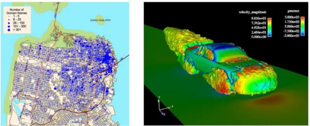
Information Visualisation is one of the major areas of Visualisation besides Scientific Visualisation and Geovisualisation. Even though this classification is generally acknowledged, this classification lacks precision and it is possible to identify substantial overlap between areas. Information Visualisation generally concerns the representation of abstract data like prices or social habits. Scientific Visualisation typically comprises scientific data which might include a spatial component like three-dimensional simulations (see Figure 7). Geovisualisation is considered to be similar to Scientific Visualisation, differing by having maps as the centre of data display. The scope of this thesis naturally admits the overlap (or a better term: synergy) between Information Visualisation and Geovisualisation, given that abstract information about urban mobility is embedded into a spatiotemporal context but it is not necessarily restricted to geographic representations.
A common misconception consists in overlapping the definitions of Information Visualisation and Visualisation tools. The latter can be defined as computer-based systems which are designed to display encoded data with a view in order to support the visualisation process (Spence 2007).
Figure 7 - An example of information visualisation (left) in contrast to a scientific visualisation produced by scientific computing application (right) (Sources: http://www.infovis-wiki.net and
http://www.designworldonline.com)
TAXONOMIES FOR DATA TYPES AND VISUALISATION TECHNIQUES
Visualisations are not merely based on data; they are true representations of it. Therefore, it is crucial to analyse and classify the data concerned before starting the development of visualisation techniques. Shneiderman proposed a taxonomy for seven types of data (Shneiderman 1996):
One-dimensional (1D): e.g. alphabetic lists of names Two-dimensional (2D): e.g. geographic maps
Three-dimensional (3D): e.g. molecules N-dimensional (ND): e.g. relational databases
Temporal: e.g. timelines associated to medical records Tree: e.g. sales data
Network: e.g. links between pages in the World Wide Web
The aforementioned taxonomy is not stiff and overlaps are possible between two or more data types. The main goal of providing taxonomy for data is to facilitate discussion and lead to discoveries that might be useful for developing visualisations. Prior to developing visualisations, it is important to ensure that data is retrieved from a reliable and accurate source (Ward, Grinstein, and Keim 2010). Shneiderman suggests a useful starting point for designing visualisations named “visual information seeking mantra”: “Overview first, zoom and filter, then details-on-demand” (Shneiderman 1996):
Overview: gain overview about the object in analysis Zoom: zoom in on objects that are of interest
Filter: filter unwanted objects
Details-on-demand: select an object (or a group of) and get further details Relate: view relationships between objects
History: keep track of actions to support undo, replay and progressive refinement Extract: allow extraction of subgroups of objects and of query parameters
The pluralistic nature of data implies a variety of visualisation techniques to represent it. Ward et al. divide them into six broad categories: spatial data; geospatial data; multivariate data; trees/graphs/networks and text/documents (Ward, Grinstein, and Keim 2010).
VISUALISATION AND INTERACTION
Technology has made responsive interaction possible within the context of visualisation. Visualisation tools now benefit from the capability of facilitating users to change their view about data. This change of view can be defined as movement within the information space (Spence 2007). Rather than static visual representations of information, visualisation tools allow users to interact with it through navigation and have immediate feedback. The example in Figure 8 depicts a highly responsive visualisation tool that provides an initial overview of the density of immigration settlement of different foreign-groups across the United States. It allows further exploration by filtering for specific nationalities, skimming through a timeline or zooming for details, in accordance to what has been proposed by Shneiderman.
Figure 8 - Immigration settlement across the USA. Overview of immigration by different nationalities is shown on the top. Filtering by Mexican citizens immediately provides the visualisation on the bottom (Source: http://www.nytimes.com/interactive/2009/03/10/us/20090310-immigration-explorer.html)
VISUALISATION OF SPATIOTEMPORAL DATA
Depending on the context of application, visualising spatiotemporal data can also make use of non map-based techniques, thus adopting abstract graphic entities such as lines, bars, circles or other geometric forms. However, when the spatial component is of visual concern by the users who will take benefit from visualisations, approaches take place in order to suggest ways of presenting both dimensions simultaneously.
Two main visualisation approaches have been applied for visualising spatiotemporal data. The first attempt appears within the context of Time Geography coined by Hägerstraand, and consists of representing paths of moving instances through a time dimension which is perpendicular to a geographic plane – which is defined as a Space-Time-Cube (Hägerstraand 1970). Given that time is an inherent component of the visualisation, it is possible to continuously track the movement of an entity through space over a timespan. However, the amount of entities to be plotted might imply intense visual cluttering, which would require workarounds in order to reduce it. Hägerstraand’s approach precedes the era of Geographic Information Systems (GIS), even though it is possible to identify applications of the Space-Time-Cube approach to GIS (see Figure 9 left) (Kraak and Koussoulakou 2005).
The second approach consists of using animated maps (see Figure 9 right) to allow users to visualise changes in spatial data over time. At every frame of the animation, the position of an entity is redrawn. In order to avoid visual clutter, animated maps should preferably plot spatiotemporal data on a static bi-dimensional map. However, this requires additional measures in order to avoid designing visualisations that force users to create mental associations between different time intervals. Instead, they should allow instant view of changes of an entity through time. Methods for displaying data within animated maps were proposed by Adrienko et al. (Adrienko, Adrienko, and Gatalsky 2005).
Figure 9 - Differences of representation between a space-time-cube (left) and an animated map representing spatiotemporal data over a static 2D map (right)
VISUALISATIONS FOR URBAN MOBILITY
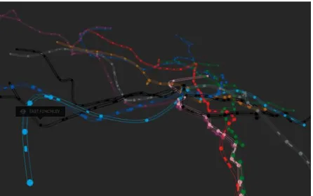
Urban mobility data is typically collected from systems such as Global Positioning System (GPS) or telematics systems such as Automatic Vehicle Location (AVL) and Automatic Passenger Count (APC). There are uncountable examples of visualisations of this kind available online, although they typically resemble more of artistic experiments (see Figure 10) than systematic approaches with actual intentions of collaborating with visual analytics for knowledge extraction.
Figure 10 – Artistic visualisation experiment of the London Underground network Source: http://brunoimbrizi.com/experiments/#/07
We present recent significant studies that explore visualisation of urban mobility. They rely either on the visual representation of information, or on the presentation of new techniques for extracting knowledge with the support of visual analytic tools, or on the algorithmic aspects for developing visualisations.
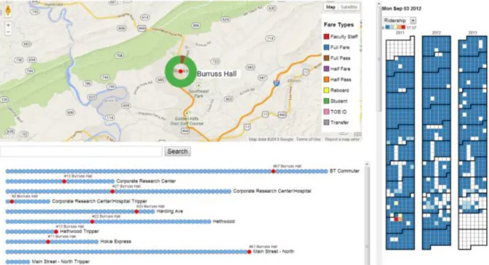
MetroViz (Du et al. 2013) is a visualisation tool for supporting the exploration of historical data of a bus network. In accordance to Shneiderman’s recommendations, MetroViz follows an Overview-to-Detail approach, progressively revealing details according to users’ input. It features an overview of the bus transport network by laying all stops on a map. Further information is made available by clicking on each stop, allowing detailed information about average patronage and individual information for each bus or route. Users participate during the evaluation phases through usability tests by executing pre-determined tasks.
Figure 11 – Metro Viz visualisation tool (Source: Du et al. 2013)
Two studies took advantage of mobile network traffic for understanding urban mobility trends. The first one focuses on the use of this kind of data for identifying social patterns and questions whether visual representations could be used successfully in order to detect them (Sagl, Loidl, and Beinat 2012). The second presents AllAboard2 (see Figure 12), a visual analytics tool for optimizing and exploring public transport networks by using mobile network traffic data (Lorenzo et al. 2014).
Figure 12 - AllAboard user interface (Source: footnote 2)
Finally, another study carried by Polisciuc et al. investigates anomalies on the number of passengers for a bus network (Polisciuc et al. 2013). It does so by developing and experimenting visualisation techniques that benefit from computer graphics techniques (see Figure 13). The visualisation represents the standard deviation of the number of passengers for each bus stop in Coimbra during the day. Red spots indicate an abnormal increase of passengers at a stop (positive deviation). Green spots represent negative deviation.
Figure 13 - Visualisation of urban mobility data (Source: http://fmachado.dei.uc.pt/sandbox/visualizing-urban-mobility)
2.3 User-centred design approaches to Information Visualisation
The involvement of users during the whole development process of visualisations is well acknowledged by researchers (Christopher et al. 2003, Slocum et al. 2003, Robinson et al. 2005, Tory and Moller 2005, Roth et al. 2010, Lian Chee et al. 2011). Visualisations have mostly been technology-driven, and it is now possible to identify a shift towards more user-centred approaches. These approaches differ on the way users are engaged throughout the process. These methods appear in diverse contexts such as epidemiology, hydrography and crime spotting visualisations, although they can be analysed from a general UCD perspective for visualisation. To the best of our knowledge, no traces of UCD approaches to visualisations for urban mobility context were found. Hence, this section exhibits the most significant results from other areas.
Slocum proposes a UCD process consisting on a six-phase cascade for the creation of a visualisation tool for water-balance issues: 1) prototyping; 2) domain expert evaluation; 3) software refinement; 4) usability expert evaluation; 5) software refinement and 6) decision maker evaluation (Slocum et al. 2003). A noticeable disadvantage is that end-users only participate in the end of the design process, after domain and usability experts have addressed the design and functionality related issues.
The method proposed by Robinson et al. extensively involves users throughout the process along six phases: 1) work domain analysis; 2) conceptual development; 3) prototyping; 4) interaction and usability studies; 5) implementation and 6) debugging (Robinson et al. 2005). Phases 2 to 5 occur multiple times in a loop. The work domain analysis phase consists of the first contact between stakeholders and developers, in which they communicate the initial ideas and requirements. The conceptual development outlines the results from the work domain study. This approach suggests that if the work domain is not completely understood, the
prototyping phase shall not proceed. From a critical perspective, it is still possible to proceed with prototyping, looping back to the work domain analysis phase if needed.
In response to this issue, Roth et al. proposes a modification to Robinson et al.’s UCD process with the following phases: 1) prototyping; 2) interaction and usability studies; 3) work domain analysis; 4) conceptual development; 5) implementation and 6) debugging (Roth et al. 2010). Prototyping now has an initial role in the process, where designers develop visualisations according to the way they think about them. After performing interaction and usability studies, the prototype is used as a final component of the work domain analysis to catch new ideas from users. Finally, the results from the interaction and usability studies and work domain analysis formalise the conceptual development phase.
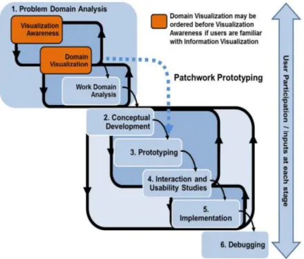
It might happen that the potential users of visualisation tools are not familiar with visualisation concepts, or are not aware of their true potential. This might compromise the effectiveness of their participation. In order to overcome these issues, Lian Chee et al. (Lian Chee et al. 2011) propose relevant additional phases based on the approaches of Robinson et al. and Roth et al (see Figure 14). These additional phases improve awareness of users about the power of visualisation in a general context, but also within their own context by visualising their own data.
Figure 14 - UCD approach for visualisations proposed by Lian Chee et al. (Source: Lian Chee et al. 2011)
The Visualisation Awareness phase consists of introducing general concepts of Information Visualisation to users in case they are not familiar with the field. In this phase, the first discussions for retrieving ideas of the development of their own visualisations are held. The Domain Visualisation phase incorporates the development of the first prototypes tailored to the users’ own data.
THE ROLE OF EVALUATION
Visualisation techniques and tools abound, but it is still possible to identify lack of engagement of visualisation researchers with users. In fact, visualisation tools are useless if users cannot effectively interact with them, thus naturally compromising the processes of knowledge extraction and decision-making. A study by Ellis and Dix – one of the few about evaluation for Information Visualisation – supports this statement: after analysing 65 papers describing new visualisations, it finds that only 12 of them engaged users within evaluation processes (Ellis and Dix 2006). Moreover, the effectiveness of the evaluation is also questioned, given that a small amount of studies that implemented evaluation as part of the development process are somewhat problematic. A further complicating factor is the inherent nature of visualisation itself that turns evaluation into a complicated process. Again, the authors indicate some factors that contribute to making evaluation in Information Visualisation a hard process:
1) Variety of datasets: despite some earlier efforts in creating a standard for datasets, datasets are heterogeneous and hardens the evaluation process, as it might limit the availability and quality of data to be visualised.
2) Indeterminacy of tasks: the tasks to be performed during the evaluation process are usually more structured, which usually differs from the ones to be performed in “real life” that are more exploratory; these ones are harder to replicate in an experiment 3) Participants in context: depending on the complexity of the application context,
participants need to have a clear understanding of the problem that the visualisations are trying to solve. Some authors suggest that it is possible to obtain better information by involving domain or usability experts, even though it is typically harder to have access to those people (Christopher et al. 2003, Tory and Moller 2005).
2.4 Conclusions and research contributions
User-centred design approaches are widely accepted and well posed. Concurrent approaches towards involving users in the design of interactive systems enforce the fact that it is difficult to engage users in order to design usable and useful systems. Moreover, it shows that there is not a general rule for carrying a UCD process. However, it is crucial to formalise it by developing a coherent structure that matches the context of application into which is embedded.
It is evident that current UCD approaches are highly iterative. In the context of Information Visualisation, prototyping during initial phases seems to be promising, rather than only on later stages. This contrasts with the ISO 9241-210 standard, which places the prototyping phase after the specification of user and organizational requirements. Early prototyping does not deviate the design process from the user-centred perspective at all, as it is possible to iterate and refine prototypes by revisiting the work domain analysis while it is needed. Likewise, early prototypes can benefit domain users if they are not familiar with Information Visualisation.
We presented recent and significant studies on visualisations for urban mobility data, each of them belonging to different facets. As mentioned in this chapter, Information Visualisation is an interdisciplinary field, thus it is expectable (and positive) to find studies with diverse perspectives within this field. Nonetheless, the existence of few relevant studies on user-centred design approaches – especially within the context of urban mobility domain – was considered of concern.
Based on our findings during the literature review, we conclude that this research offers a novel contribution by carrying a thorough user-centred design approach for the development of visualisations in the urban mobility domain, based on similar studies applied to the development of visualisations within other domains.
Chapter 3
Methodology
This research addresses the problem of developing visualisations for urban mobility. Our focus on adopting a user-centred approach is based on the lack of thorough user engagement during the development of visualisations in current literature, especially in the domain of urban mobility, although it is possible to identify UCD approaches that were successfully applied in other domains as mentioned in Section 2.3. Besides the visualisations themselves, we are also interested in assessing the benefits of involving users during the design process. Our research methodology consisted of two phases: analysis of urban mobility datasets and a User-Centred Design process for developing visualisations. The analysis of urban mobility datasets consisted of two activities: exploration of datasets, which identified the data primitives they contained and the inherent issues that arise when manipulating raw data; a formal data characterisation and time modelling, in order to understand how data and time should be regarded within each visualisation. Finally, the UCD process took advantage of the results of the first phase for the development of visualisation prototypes.
We collected three datasets acquired from different sources that summed up to 3 gigabytes of raw data. The first contained users’ requests from Move-me, a mobile application that provides real-time information about public transport. The second contained bus-ticketing data from Sociedade de Transportes Coletivos do Porto S.A. (STCP). The latter contained readings from traffic counter sensors for a set of streets from Porto. Data primitives were conceptually tied to a date, time and location. Depending on the data primitive, it was necessary to translate the conceptual locations (e.g. “Aeroporto”) into geographical coordinates, which is commonly regarded as geocoding. Finally, raw data were further ported to a Database Management System (DBMS).
3.1 Analysis of datasets
3.1.1 Exploration of datasets
The exploration phase analysed the contents of each dataset, in order to identify which data primitives they contained, their data type and format. Datasets are typically heterogeneous in terms of structure, as they derive from different sources (Ellis and Dix 2006). This creates technological constraints that should be identified prior to the design stage, so as to prevent unforeseen drawbacks. Most of these constraints were related to the format of data primitives (e.g. special characters at the end of a string, data in XML syntax), which usually required manual intervention before parsing them to a DBMS. Four questions guided this exploration:
What is the nature of each dataset?
What is the meaning of each entry (row) in each dataset?
Which attributes (columns) are relevant as inputs for our visualisations?
Does the relevant attributes require prior adaptation before using them as inputs for our visualisations?
3.1.2 Data characterisation
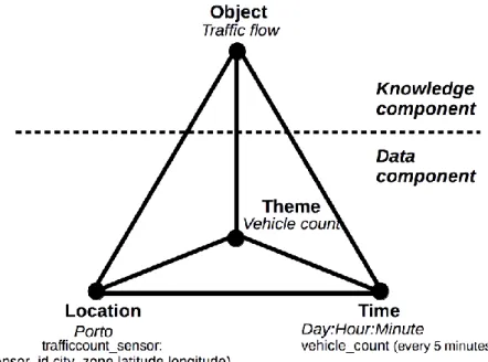
In order to provide a formal characterisation of data, this research considered the pyramid framework (see Figure 15) proposed by Mennis et al., which defines three perspectives for data: location (where is it?), time (when is it?) and theme (what is it made of?) (Mennis, Peuquet, and Qian 2000). These perspectives form the data component, which can be regarded as un-interpreted observational data. The derived knowledge from those perspectives forms the knowledge component, and can be regarded a semantic object: a conceptual entity. A semantic object may belong to a taxonomy (classification) and may have part-whole relationships with other semantic objects (partonomy).
Figure 15 - Pyramid framework for characterising data (Adapted from Mennis, Peuquet, and Qian 2000) 3.1.3 Time modelling for visualisations
We considered a formal time modelling for designing a time model that fit adequately to the characteristics of our visualisations, i.e. how time should be conceived while querying data to be used as inputs for visualisations. According to Aigner et al., it is possible to model time using a variety of models or taxonomies. That depends on the context in which time is being modelled (Aigner et al. 2011). The adopted time model comprises four perspectives: scale, scope, arrangement and viewpoint, which are briefly explained herein:
Scale regards the distribution of events along the time domain, which can be ordinal, discrete
and continuous. An ordinal time domain only considers the relative order of the events and can be useful when no quantitative information about time is available; i.e. given two events, it is only possible to discern and convey meaningful information if both are considered at the same time. A discrete time domain maps the time of an event to a timestamp and is frequently used in information systems. Finally, a continuous time domain maps time to the set of real numbers, thus being possible to exist an event between any two events given.
Scope regards the quantification of events, which can be point-based or interval-based.
happened but not for how long. Interval-based domains overcome this “limitation” by grouping events in order to introduce the notion of temporal extent.
Arrangement regards how time domain is arranged, which can be linear or cyclic. Linear
domains resemble our natural perception of time, where events are lined from the earliest to the farthest one. Cyclic domains group events according to reoccurring time cycles like seasons or weekdays and weekends.
Viewpoint regards the perspective at which time is viewed, which can be ordered, branched
or multi-perspective. An ordered viewpoint aligns events sequentially according to an attribute. A branched viewpoint considers alternative scenarios for a sequence of events that will happen during a certain timespan, which is useful in decision-making processes and simulations. Finally, multi-perspective considers events that belong to distinct time instants depending on how they are interpreted (e.g. a birth of a child is tied to a date, but the date in which he/she was registered might differ).
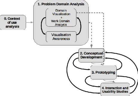
3.2 A User-Centred Design process for developing visualisations
We considered the UCD methodology proposed by Lian Chee et al. described in Section 2.3 with some changes (see Figure 16). This choice enforces the commitment of involving potential users throughout all phases and acknowledges rapid prototyping in order to foster feedback and to overcome time constraints. According to Section 2.3, prototyping could be performed anytime, even if not all specifications or requirements were gathered (Lian Chee et al. 2011).
The aforementioned changes included a preliminary phase that consisted in selecting experts in urban mobility interested in participating in this research and studying the underlying context of use for visualisations. Implementation and Debugging phases were removed, as the objective did not consist in developing a complete system for visualising urban mobility data, but identifying which visualisations were more adequate for representing the urban mobility data we collected. Therefore, prototyping and evaluation were the core of this research.
We conducted semi-structured interviews with experts for evaluating visualisations and retrieving feedback and ideas. Quantitative approaches such as questionnaires were not adopted, as they would not outcome detailed results, especially when considering the exploratory nature of this research. Moreover, it is well acknowledged that interviews best suit exploratory studies (Nielsen 1993). Most of the sessions with experts took place at their working environments. Given that most experts already had knowledge about Information Visualisation, the Visualisation Awareness phase did not receive extensive focus. All interviews were recorded in audio format and had the support of note taking, in order to ensure that all qualitative inputs were considered during our analysis.
Figure 16 - UCD process used in this project adapted from Lian Chee et al.
3.2.1 Context of use analysis
A typical User-Centred Design cycle starts when a stakeholder requests the design of a system. Since this research went the opposite way, it was crucial to identify experts willing to participate on this process, and to make effective use of visualisations in the future. 10 experts in urban mobility from Porto participated in this research:
5 experts from strategic and operational staff levels of transport organisations
2 experts from OPT – Optimização e Planeamento de Transporte S.A, which develops solutions for transport planning, management and public information;
2 experts from the Urban Mobility Division of Porto City Hall
1 researcher on urban mobility from the Faculty of Engineering of University of Porto 3.2.2 Problem Domain Analysis
We developed vertical prototypes using real data and limited functionality. For the first exploratory usability test with experts, we proposed an initial set of prototypes in order to catalyse the generation of ideas for the further iterations of the UCD cycle. Also, given the limited available time of participants, we wanted to retrieve substantial feedback in every contact opportunity with them.
The first iteration of Domain Visualisation consisted in presenting static mock-ups and the first prototypes, which showcased real data from specific periods of time and events (e.g. St. John’s Night in Porto). Experts also had the opportunity to manipulate the prototypes. The subsequent iterations of this phase were named ‘Interaction and Usability Studies’, which instead presented more advanced prototypes.
Work Domain Analysis phase was integrated with Domain Visualisation and Interaction/Usability Studies phase, and consisted in gathering requirements and potential suggestions for visualisations based on their context of use.