CARTO-SOM
Cartogram creation using self-organizing
maps
by
Roberto André Pereira Henriques
Dissertation submitted in partial fulfilment of the requirements for the
degree of
Mestre em Ciência e Sistemas de Informação Geográfica
[Master in Geographical Information Systems and Science]
Instituto Superior de Estatística e Gestão de Informação
da
CARTO-SOM
Cartogram creation using self-organizing
maps
Dissertation supervised by
Professor Doutor Fernando Lucas Bação
Professor Doutor Victor José de Almeida e Sousa Lobo
ACKNOWLEDGMENTS
I would like to express my great gratitude towards my supervisors, Professor Doutor Fernando Bação and Professor Doutor Victor Lobo. They were extremely patience, spending long hours discussing and reviewing this dissertation. Also, their encouragment and pragmatic view of the problems was fundamental to me and to this work. May our collaboration continue on for many years.
I would like to thank the friendship from my colleagues from LabNT. I want also to thank Miguel Loureiro for all the discussions we had about my dissertation and for his great review. Good luck on your dissertation!
Finally, I would like also to express my gratitude to my family for being my support in this dissertation. To my wife Nucha, I must thank all the patience and help she gave me in this time. To my parents I must thank all the oportunities and belief they give me allowing the conclusion of this stage. To my brothers my special thanks for all the support and friendship. Also, my gratitude goes to my parents-in-law and brother-in-law.
CARTO-SOM
Cartogram creation using self-organizing
maps
ABSTRACT
CARTO-SOM
Cartogram creation using self-organizing
maps
RESUMO
KEYWORDS
Cartograms Neural networks
Kohonen Self-Organizing Maps Geographic Information Systems Population
Matlab
PALAVRAS-CHAVE
Cartogramas Redes Neuronais
Mapas Auto-organizáveis de Kohonen Sistema de Informação Geográfica População
ABBREVIATIONS
BGRI Information Referencing Geographic Basis (Base Geral de Referenciação de Informação )
BMP Best matching pattern
BMU Best matching unit ce Cartogram error
ESRI Environmental Systems Research Institute
GA Genetic algorithms
GIS Geographic Information System
ICA International Cartographic Ass
INE Portuguese National Statistics Institute (Instituto Nacional de Estatística)
Kd Kocmoud area error Km Keim area error mqe Quadradic mean error
NCGIA National Center for Geographic Information & Analysis qe Quantization error
SA Simulated annealing se Simple average error
SOM Self-Organizing Map te Topologic error
TABLE OF CONTENTS
Acknowledgments ... iii
Abstract ... iv
Resumo...v
Keywords ... vi
Palavras-chave ... vi
Abbreviations ... vii
List of Tables... xi
List of Figures... xii
1.
Introduction ...1
1.1. State of Art ... 1
1.2. Objectives... 1
1.3. General overview ... 2
2.
Cartograms ...3
2.1. Cartograms definition ... 3
2.1.1. Types of cartograms... 6
2.1.1.1. Non-continuous Cartograms... 6
2.1.1.2. Continuous cartograms... 7
2.1.1.3. Dorling Cartograms... 8
2.1.1.4. Pseudo-cartograms... 9
2.2. Cartogram applicability... 9
2.3. Cartograms algorithms ... 10
2.3.1. Contiguous Area Cartogram... 10
2.3.2. Contiguous Area Cartogram using the Constraint-based Method .. 12
2.3.2.1. Simulated Annealing (SA)... 13
2.3.3. Rubber-map Method... 16
2.3.4. Pseudo-cartogram Method ... 17
2.3.5. Medial-axes-based Cartogram ... 18
2.3.6. RecMap: Rectangular Map Approximations ... 20
2.3.7. Diffusion cartogram ... 21
2.3.8. Line Integral Method... 22
2.3.9. Cartograms comparison ... 23
3.1. Introduction... 25
3.2. Overview ... 25
3.3. SOM algorithm ... 27
3.3.1. Sequential training... 29
3.3.2. Batch Training ... 30
3.3.3. Leaning rate functions ... 31
3.3.4. Neighbourhood functions... 32
3.4. General considerations on SOM ... 33
3.5. SOM training evaluation ... 35
3.6. SOM visualization... 36
4.
SOM based cartogram methodology ...39
4.1. Carto-SOM variants... 43
4.1.1. Variant 1 (no frame)... 44
4.1.2. Variant 2 (mean density frame) ... 45
4.1.3. Variant 3 (variable density frame)... 46
4.1.4. Variant 4 (uneven shape) ... 48
4.2. Carto-SOM labelling process ... 50
4.3. Quantitative quality measures for cartograms ... 53
4.3.1. Error measures for each individual region... 54
4.3.2. Global cartogram error ... 55
5.
Experimental results ...57
5.1. Artificial dataset ... 57
5.1.1. Dataset characteristics ... 57
5.1.2. Experimental settings ... 58
5.1.3. Results... 59
5.1.3.1. Maps ... 59
5.1.3.2. Quantitative evaluation ... 60
5.2. Portugal population based cartograms... 61
5.2.1. Dataset characteristics ... 61
5.2.2. Experimental settings ... 64
5.2.3. Results... 68
5.2.3.1. Maps ... 68
5.2.3.2. Quantitative evaluation ... 70
5.3. USA population based cartograms... 72
5.3.2. Experimental settings ... 74
5.3.3. Results... 77
5.3.3.1. Maps ... 77
5.3.3.2. Quantitative evaluation ... 79
5.4. Comparative analysis and results ... 81
5.4.1. Map Folding... 81
5.4.2. Visual comparison overview ... 82
5.4.3. Quantitative evaluation overview... 83
6.
Conclusion ...87
References...91
Appendixes ...97
Appendix 1 - Cartograms ... 99
Appendix 2 - Matlab routines ... 109
Appendix 3 – SOM training tests... 131
Appendix 4 – soMGis application... 133
LIST OF TABLES
Table 1 – Cartogram comparison table... 23
Table 2 – SOM parameters used in the toy cartogram; ... 59
Table 3 – Error evaluation made on the Portuguese dataset cartograms... 61
Table 4 – Portugal layer metadata ... 62
Table 5 – SOM parameters used in the several tests for Portugal; ... 65
Table 6 – Tests made on the Carto-SOM and Dougenik cartograms using the Portuguese dataset. ... 71
Table 7 – USA layer metadata ... 72
Table 8– SOM parameters used in the several tests for the USA; ... 75
Table 9 – Error evaluation made on the USA dataset cartograms... 80
Table 10 – Global error evaluation made on the Carto-SOM and Dougenik cartograms. ... 84
LIST OF FIGURES
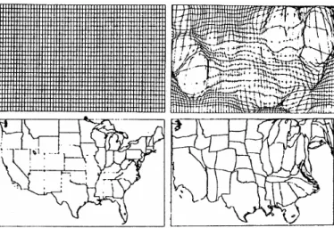
Figure 1 – Different map representation of USA population data and soil pH. ... 4
Figure 2 – USA population cartogram... 5
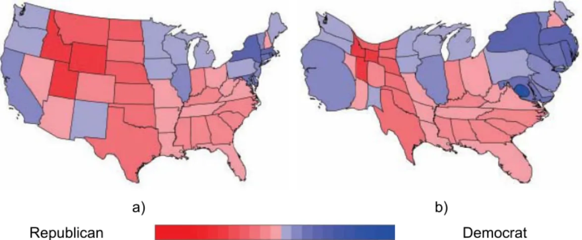
Figure 3 – USA 2004 presidential election results. Represented in blue are counties with more votes for Kerry and in red are counties with more votes for Bush. (Gastner and Newman 2004) ... 6
Figure 4 – USA population non-continuous cartogram. ... 7
Figure 5 – USA population continuous cartogram. ... 8
Figure 6 – England and United Kingdom Dorling cartograms. (NCGIA 2002) ... 8
Figure 7 – Tobler pseudo-cartogram example. (Tobler 1986). ... 9
Figure 8 – Continuous area cartogram example. a) exerted forces in California state b) resulting cartogram... 11
Figure 9 – Key vertices identification and border simplification. (House and Kocmoud 1998) ... 14
Figure 10 – USA population cartogram using the Continuous Cartogram Construction using the Constraint-based Method algorithm. (House and Kocmoud 1998). ... 16
Figure 11 – USA population cartogram using the Rubber Map Method. (Tobler 1973). ... 17
Figure 12 – World population cartogram using the Pseudo-cartogram Method. (Tobler 1986). ... 18
Figure 13 – Medial axes. a) rectangle object b) triangle object c) polygon. (Keim, North et al. 2005)... 18
Figure 14 – Medial-axes-based algorithm a) medial-axes creation b) design of scanlines perpendicular to the medial axes c) scaling factor calculation. (Keim, North et al. 2005) ... 19
Figure 15 – Medial-axes-based cartogram. USA 2000 presidential elections 2000 (Bush-blue; Core-red). (Keim, North et al. 2005)... 19
Figure 16 – RecMap algorithm example. a) Variant 1 (no empty space) b) Variant 2 (preserved topology). (Heilmann, Keim et al. 2004) ... 21
Figure 18 – Line Integral Method Cartogram example... 23
Figure 19 –SOM structure... 26
Figure 20 – Best match unit in an N x M SOM structure... 27
Figure 21 – Voronoi regions. Space division where all the interior points are closer to the corresponding generator than to any other... 30
Figure 22 – Learning rate functions. (Vesanto, Himberg et al. 1999) ... 32
Figure 23 - Neighbourhood functions... 33
Figure 24 – SOM visualizations. (Vesanto, Himberg et al. 1999),(Vesanto 2000)... 37
Figure 25 - SOM train... 39
Figure 26 – Proposed methodology example ... 41
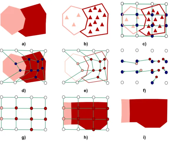
Figure 27 – SOM rectangular shape superposed in a non-regular shape dataset; a) two regions with a non regular shape; b) random point creation based on a region attribute; c) SOM initialization with an even density. 42 Figure 28 – SOM rectangular shape superposed in a non-regular shape dataset; a) SOM training; b) labelling process; c) units migration to its original position. ... 42
Figure 29 – Cartogram creation; a) units labelling; b) space allocation to the regions based on the units labels. ... 42
Figure 30 – Input space nomenclature; a) SOM mapped in the input space; b) input space area definition. ... 43
Figure 31 – Variant 1 cartogram. ... 44
Figure 32 – Methodology for variant 2. ... 46
Figure 33 – Methodology for variant 3. ... 48
Figure 34 – Methodology for variant 4. ... 50
Figure 35 – Standard labelling process... 51
Figure 36 – Cartogram using the standard labelling process... 52
Figure 37 – Cartogram using the inverse labelling process ... 52
Figure 38 – Density differences based on standard and inverse labelling... 53
Figure 39 – Artificial dataset... 57
Figure 40 – Artificial dataset. High densities in the 2nd and 4th quadrants and low densities in the 1st and 3rd quadrants... 58
Figure 41 – Carto-SOM and Dougenik cartogram of the artificial dataset. ... 60
Figure 42 – Portuguese population data. ... 62
Figure 44 – Different point datasets created from Portuguese 2001 population
values. ... 64
Figure 45 – Units mapped in the input space after the training process for each variant... 66
Figure 46 – Quantization error and topographic error for Portuguese tests... 67
Figure 47 – Portugal population traditional maps and cartograms using the Carto-SOM methodology ... 69
Figure 48 – Portugal population cartogram using Dougenik’s cartogram algorithm... 70
Figure 49 – Distribution of the Portuguese cartogram error (ce) for variant 2... 71
Figure 50 – USA population data. ... 73
Figure 51 – USA population density... 74
Figure 52 – Different point datasets created from USA 2001 population values. .... 74
Figure 53 – Units mapped in the input space after the training process for each variant... 76
Figure 54 – Quantization error and topographic error for USA tests... 77
Figure 55 – USA population cartograms. ... 78
Figure 56 – Dougenik Cartogram for the USA population... 79
Figure 57 – Distribution of the USA cartogram error (ce) for variant 2... 80
Figure 58 – Network folds in variant 4 due to the irregular shape of the border and to ocean units’ immobilization. ... 81
1. Introduction
1.1. State of Art
A cartogram is a presentation of statistical data in geographical distribution on a map (Tobler 1979; Tobler 2005). The basic idea of a cartogram is to distort a map. This distortion comes from the substitution of area for some other variable (in most examples population). The objective is to scale each region according to the value it represents for the new variable, while keeping the map recognizable. The use of cartograms is previous to the use of computerized maps and computer visualization (Tobler 2004). The first cartograms were created to show the geographic distribution of population, in the context of human geography (Raisz 1934). Typically, cartograms are applied to portrait demographic (Tobler 1986), electoral (House and Kocmoud 1998) and epidemiological data (Gusein-Zade and Tikunov 1993; Merrill 2001). Cartograms can be seen as variants of a map. The difference between a map and a cartogram is the variable that defines the size of the regions. In a map this variable is the geographic area of the regions, while in the cartogram any other georeferenced variable may be used.
The self-organizing map (SOM) (Kohonen 1982) was introduced in 1981 and is a neural network particularly suited for data clustering and data visualization. The SOM’s basic idea is to map high-dimensional data into one or two dimensions, maintaining the most relevant features of the data patterns. The SOMs objective is to extract and illustrate the essential structures in a dataset through a map, usually known as U-matrix, resulting from an unsupervised learning process (Kaski and Kohonen 1996).
1.2. Objectives
smaller values. This grow/shrink process is focused on creating an equal-density map where high values will be represented by larger areas, and small values by smaller areas. In our proposal the cartogram will be created based on the unit’s movement during the learning process of the SOM.
1.3. General
overview
This thesis is organized as follows: on section 2 we define cartograms, its applicability and review some existing cartograms construction algorithms.
Section 3 introduces the self-organizing maps (SOM) used in the proposed methodology. A general overview of this type of neural network is made along with the algorithm presentation and some parameters used in the training.
Section 4 presents the proposed methodology in cartogram construction using the SOM. This new methodology includes four different variants used to achieve the best cartogram as possible. A new labeling process (a process used in the SOM) is proposed in this section. In order to evaluate the cartogram quality some quantitative measures are reviewed in this section, while a new quantitative measure is also proposed.
In section 5 we implemented the methodology using 3 different datasets: artificial data, Portuguese population from 2001 and USA population from 2001. Cartograms produced for the four variants using SOM different parameters are also presented. Cartograms using another algorithm (Dougenik continuous cartograms) are also produced to perform comparisons. Some tests were made to quantitative evaluate these cartograms.
2. Cartograms
2.1. Cartograms
definition
Maps have always been an important part of human life, constituting one of the oldest ways of human communication. The oldest maps known in existence today were created around 2300 BC in ancient Babylonia on clay tablets. Today, maps continue to play a vital role in our society, supporting storage and communication of numerous geographic (and other) phenomena. Since its invention maps have never ceased to improve and can be found at the root of many Human brilliant endeavours, such as the Portuguese discoveries. The advent of personal computers and the related increase in geoprocessing capabilities had a tremendous impact not only on the availability of maps but also on the availability of map making tools. Today almost everybody has access to tools which make maps at the push of a button.
Cartography can be defined “as the science of preparing all types of maps and charts and includes every operation from original survey to final printing of maps. Cartography can also be seen as the art, science and technology of making maps, together with their study as scientific documents and works of art” (ICA (International Cartographic Association) 1973).
aggregated to a pre-defined unit but to the data based unit. This means that new spatial units are build according to data attributes (Figure 1d).
Using the choropleth map one can discover which is the most populated state (California) but due to the color class one cannot order the three states that are next (Texas, Florida and New York) in terms of population size. Analysing the dots or the proportional symbols one can identify which are the most populated states in the US but it is difficult to represent anything else in those maps.
A different way of representing the same data is the cartogram (Figure 2a). In the cartogram one can confirm the population through the size of each state. This is achieved using a distortion process which makes each state size representative of the population value. One of the advantages of this method is the fact that other variables can be added to the map. In Figure 2b an example is shown were the number of families per state is mapped on a population cartogram, thus resulting in the representation of two variables.
Texas California
Florida New York
±
POP2001
POP2001 495345 - 2112980 2112981 - 4081550 4081551 - 7203904 7203905 - 12520522 12520523 - 21355648 21355649 - 34516624
±
Legend usa
1 Dot = 160.000 POP2001
a) USA population choropleth Map b) USA population dots map
±
Legend usa POP2001
100.000 1.000.000 10.000.000
c) USA population proportional symbol map d) USA soil pH. (National Atmospheric Deposition Program 2003)
“Cartograms can be defined as a purposely-distorted thematic map that emphasizes the distribution of a variable by changing the area of objects on the map” (Changming and Lin 1999). “Area cartograms are deliberate exaggerations of a map according to some external geography–related parameter (variable) that communicates information about regions through their spatial dimensions”
(Dougenik, Chrisman et al. 1985). “These dimensions have no correspondence to the real world but are a representation of one variable other than the area”
(Kocmoud 1997). Object distortions allow the representation of one variable in the object sizes. In a population cartogram, for example, the sizes of regions are proportional to the number of inhabitants. While population is the most commonly used variable, any social, economic, demographic and geographical variable can be used to build a cartogram. A cartogram can also be seen in the context of traditional map generalisation. While the map represents objects based on their real area, cartograms uses some other variable instead (Heilmann, Keim et al.).
In Figure 3a, a map of the counties of the United States in which each state is colored in red if George W. Bush (Republican presidential candidate) had more votes or in blue if John F. Kerry (Democratic presidential candidate) had more votes. Analysing Figure 3a it is clear that the red area is larger than the blue area. As we know George Bush won the 2004 presidential elections. But does this map represents what real happened in the 2004 elections? Did Mr. Bush won with such a big difference (as the map suggests)? The map can give a wrong
Texas California Florida New York
±
POP2001 POP2001495345 - 2112980 2112981 - 4081550 4081551 - 7203904 7203905 - 12520522 12520523 - 21355648 21355649 - 34516624
±
FAMILIES 1,744 - 1,914 1,702 - 1,743 1,668 - 1,701 1,647 - 1,667 1,616 - 1,646 1,586 - 1,615 1,556 - 1,585 1,437 - 1,555 1,436
a) Population cartogram b) Population cartogram showing the number of families (in blue)
impression since the size of each county does not represent the number of voters. A cartogram using the number of voters in each county can improve the interpretation (Figure 3b). The cartogram gives us a very different idea of the results. We can guess that George Bush won the elections but with a much smaller difference than the traditional map would suggest.
2.1.1. Types
of
cartograms
Cartograms can be classified according to a number of characteristics like topology, perimeter and the shape. According to NCGIA (2002) there exists four major types of cartograms: non-continuous cartograms, continuous cartograms (Dougenik, Chrisman et al. 1985), Dorling cartograms (Dorling 1994) and pseudo-cartograms (Tobler 1986).
2.1.1.1. Non-continuous Cartograms
Non-continuous cartograms are the simplest cartograms to build. These cartograms do not necessarily preserve topology (Olson 1976). This means that the object connectivity with adjacent objects is not preserved. Each object is allowed to grow or shrink, positioning its borders in a way that the resulting area represents one variable. A non-continuous cartogram is shown in Figure 4 using the population variable. In this example the cartogram was produced by shrinking
a) Choropleth map b) Cartogram
all the states. Each state shrink factor is given by the value of population resulting in similar shapes for the most populated states (California, Texas and New York) and in smaller shapes for the less populated states. Different results are possible if expansion processes are used, causing in some cases different objects to overlap which is another way of building non-topological cartograms.
±
L e g e n d a
L e g e n d a
POP2001
POP2001
495345 - 2112980 2112981 - 4081550 4081551 - 7203904 7203905 - 12520522 12520523 - 21355648 21355649 - 34516624
Figure 4 – USA population non-continuous cartogram.
2.1.1.2. Continuous cartograms
Continuous cartogramas (Figure 5) differ from non-continuous cartograms due to the topology preservation. In this case topology is maintained (the objects remain connected with their original neighbours) usually causing great distortions in shape. These are the most difficult cartograms to produce since the objects must have the appropriate size to represent the attribute value and at the same time maintain topology and the original shape of objects (as best as possible), so that the cartogram can be easily interpreted.
Figure 5 – USA population continuous cartogram.
2.1.1.3. Dorling Cartograms
Although Dorling area cartograms do not maintain shape, topology or the objects centroids it has prove to be a useful type of cartogram. Shape expansion/shrink processes are used, producing new shapes which represent the variable of interest. Dorling cartograms differ on the type of the shapes. Instead of preserving the original shape of objects new regular shapes are used, normally circles. This type of cartogram can be seen as a generalization of rectangles cartograms proposed by (Raisz 1934). In Figure 6 two examples of circular cartograms are presented representing England and United Kingdom population.
2.1.1.4. Pseudo-cartograms
Finally, pseudo-cartograms are representations that are visually similar to cartograms but do not follow the same building rules. Tobler cartogram is the most famous pseudo-cartogram and it is obtained using a grid which is superimposed on the map. Distortions on the grid are then made to produce an equal-density grid. Applying the movement on each grid cell to the geographic objects will result on a representation where the variable of interest has an equal density.
Figure 7 – Tobler pseudo-cartogram example. (Tobler 1986).
2.2. Cartogram
applicability
is familiar to the reader, in order to convey more abstract concepts and distributions.
2.3. Cartograms
algorithms
In this section we describe some of the major algorithms for building cartograms. There are other algorithms which we will not review. The algorithms selected represent different approaches to the problem and constitute the most widely used. The following algorithms are reviewed:
• Contiguous Area Cartogram (Dougenik, Chrisman et al. 1985)
• Contiguous Area Cartogram using the Constraint-based Method (House
and Kocmoud 1998)
• Rubber-map Method (Tobler 1973)
• Pseudo-cartogram method (Tobler 1986)
• Medial-Axes-based Cartograms (Keim, North et al. 2005)
• RecMap:Rectangular Map Aproximations (Heilmann, Keim et al. 2004)
• Diffusion Cartogram (Gastner and Newman 2004)
• Line Integral Method (Gusein-Zade and Tikunov 1993)
2.3.1.
Contiguous Area Cartogram
This is one of the most famous algorithms to build continuous (the authors opted for the use of the word contiguous to express the topology preservation characteristic of this method) cartograms. This algorithm uses a model of forces exerted from each polygon centroid, acting on each boundary coordinates in inverse proportion to distance (Dougenik, Chrisman et al. 1985). The concept of force model can be explained in the formula:
(
j j)
jij
ij
P
q
P
F
where:
Fij = is the force applied by polygon j on vertex i
Pj=
_
Actual area
π
qj=
_
Desired
area
π
dij= distance from centroid j to vertex i.
In this method each polygon centroid applies a force Fij to their vertices. This force will move to vertices away if Fij is a positive value and will bring them close if Fij is negative. The intensity of the force exerted on each polygon is determined by the selected variable and is proportional to the difference between the current and the desired polygon area. The current area is assumed to be the actual area of polygon, while the desired area is the distorted area of the final cartogram. As shown in Figure 8 , the California State will exert a positive Fij force moving the vertices away from the centroid. This is the result of having a higher value of population in California than in the neighbourhood states. Inversely, the Nevada State will suffer a negative Fij force making its vertices moving closer to the centroid. Utah California Nevada Oregon Idaho Arizona Colorado Wyoming New Mexico Montana Nebraska South Dakota Washington Oklahoma North Dakota L e g e n d a
L e g e n d a
POP2001
POP2001
495345 - 2112980 2112981 - 4081550 4081551 - 7203904 7203905 - 12520522 12520523 - 21355648 21355649 - 34516624
±
Utah California Nevada Oregon Idaho Arizona Colorado Wyoming New Mexico Montana Nebraska South Dakota Washington Oklahoma North Dakota L e g e n d aL e g e n d a
POP2001
POP2001
495345 - 2112980 2112981 - 4081550 4081551 - 7203904 7203905 - 12520522 12520523 - 21355648 21355649 - 34516624
±
In each iteration, the sum of the forces exerted on every vertex of the map is calculated in order to displace the vertex. In the end, the area of every polygon is calculated and compared to the "desired area". When the difference between the two areas is smaller than a specified threshold then the process is stopped and the cartogram finished.
2.3.2.
Contiguous Area Cartogram using the Constraint-based
Method
House and Kocmoud (1998) propose that the cartogram construction problem should be seen as a constrained optimization problem. Optimization problems are function maximization or minimization problems in which the objective is to find the best of all possible solutions. These problems were first formalized in XVII century physics and geometry. An example of such a problem is the travelling salesman problem (TSP) (Lawler, Lenstra et al. 1985). The TSP consists on finding the best path between points (cities) through a weighted graph (paths between cities) ending at the starting point. The possible solutions are all the combinations between cities passage order. The best solution is the one with the lowest cost.
In the cartogram problem, the map is assumed to be a connected collection of polygons and an area function determines each region area, according to the total map area. The goal is to rescale each object maximizing the map recognition using the following constraints:
• Each rescaled region area is given by an area assignment function;
• Regions topology is maintained;
• Region borders orientation similarity between original map and cartogram;
• Each border length should stay as much as possible proportional to their
original size;
The optimization problem posed is a high-dimensional problem with a non trivial solution. The objective function and the constraints are conflicting. For example, two regions sharing borders can have an inverse behaviour in terms of getting the final area. Thus, according to the objective function, one of these regions will grow in area and the second will shrink. In this case maintaining topology makes it impossible to retain the borders proportion in both regions. Due to the problem dimensionality simulated annealing (Metropolis, Rosenbluth et al. 1953; Kirkpatrick, Gelatt Jr. et al. 1983; Mitchell 1997) was used as the optimization strategy of the algorithm.
2.3.2.1. Simulated Annealing (SA)
The name of this algorithm is inspired in the process of annealing (process of gradual cooling of a liquid). In an annealing process a melt, initially at high temperature and disordered, is slowly cooled so that the system at any time is approximately in thermodynamic equilibrium. As the cooling proceeds, the system becomes more ordered and approaches a "frozen" ground state at T=0. As an example of simulated annealing we can think of a ball (its position represents the actual function value) exploring an irregular surface (possible solutions) reaching a valley after some time. Due to the potential energy in the ball, it will not stop, continuing searching for deeper valleys even if in order to reach them some mountains have to be transposed. As the potential energy lowers and exploration capacity on the ball will decrease stopping in some valley.
Regions := LoadFullResolutionMap (MapDataFile);
coarseness := max_coarseness;
AreaTargets := CalculateDesiredArea (Regions);
repeat
SimplifyMap (Regions, coarseness);
repeat
AchieveAreas (Regions, AreaTargets);
RestoreShapeWhileMaintainingArea (Regions);
until adverse effect of area upon shape increases;
ReconstructMapToFullResolution (Regions, coarseness);
coarseness := coarseness / 2;
until coarseness < min_coarseness;
Initially the map is loaded along with the variable of interest in order to perform the cartogram. In this phase the coarseness is defined. Area targets are then calculated for each region according to the original area and the selected variable. An iterative process begins ending only if the coarseness reaches the value defined by the user. In this phase the first operation is to identify in the map all the vertices that are not key vertices. Key vertices are those that will provoke topology changes when removed (Figure 9a). If all non key vertices were eliminated the map would get too simple (Figure 9b).
a) b) c)
Figure 9 – Key vertices identification and border simplification. (House and Kocmoud 1998)
on the map. Iteratively this distance will decrease improving map detail. A similar procedure is taken in Douglas-Peuker algorithm (Robinson, Morrison et al. 1984) allowing line generalisation on maps. The next step is to achieve region areas using linear physically based area springs elements that exert force outward along their length when compressed and inward when stretched. An n vertex (xi,
yi) region area is given by:
(
)(
1)
1 0 1
2
1
⊕ − = ⊕+
+
=
∑
n i ii
i
i
y
x
x
y
A
Where:
A is the area of a region;
yi is y coordinate of vertex i;
xi is x coordinate of vertex i;
and the operator ⊕is addition module n and i ∈ [0,…n-1]
The force projected by the springs is proportional to the percentage area error of a region:
(
desired)
desired Area=
100
A
−
A
/
A
ε
Where:
εAreais the percentage error area of a region;
A is the region area and Adesired is the region desired area.
The area spring force to be applied to each region vertex is:
KAS is a scaling parameter defined by the user
Nvertices is the number of each region vertices and
u is the direction that divides the angle formed between the adjacent vertex and vertices.
After calculating the forces applied in each vertex the regions are rebuild and the coarseness factor is update. If this factor is bellow the user threshold then the process is finished and the produced map is the cartogram. On Figure 10, USA population cartogram using this algorithm is shown.
Figure 10 – USA population cartogram using the Continuous Cartogram Construction using the Constraint-based Method algorithm. (House and Kocmoud 1998).
2.3.3.
Rubber-map Method
Rubber-map cartogram (Tobler 1973) was one of the first methods for cartogram creation. This method is based on map distortion as if it is a rubber surface. On a rubber map, for example, every person might be represented by a dot. The rubber sheet is stretched so that all the dots are at an equal distance from each other.
Since there is a one-to-one mapping between the initial and final grids a double bivariate interpolation is used to project the map vertices to and from the final grid. Figure 11 shows on the left the original map space and on the right the cartogram space. On the top of this figure is the grid used to obtain an equal-density population map.
Figure 11 – USA population cartogram using the Rubber Map Method. (Tobler 1973).
One of the disadvantages of this method is the dependence on the selected coordinate system. Another disadvantage is the time needed to converge to a minimum since each cell will take into account only the four adjacent cells density.
2.3.4. Pseudo-cartogram
Method
coordinate axes. Also Tobler’s method is known to produce a large cartographic error and is mostly used as a pre-processing step for cartogram construction.
Figure 12 – World population cartogram using the Pseudo-cartogram Method. (Tobler 1986).
2.3.5. Medial-axes-based Cartogram
This cartogram method is based on the medial axes of the map (Keim, North et al. 2002; Keim, North et al. 2004; Keim, North et al. 2005). The medial axis has been used as a simplification of the shape of an object, and thus could be used as a starting point to the computation of cartograms.
In a polygon the medial axes are defined by connecting all the centers of possible circumferences drawn inside the object with a radius as big as possible. In Figure 18 we can visualize the construction of the medial axes. These axes can also be obtained using Delaunay triangulation (Robinson, Morrison et al. 1984).
a) b) c) Figure 13 – Medial axes. a) rectangle object b) triangle object c) polygon. (Keim, North et
Based on the medial axes concept this method uses scanlines to guide the process of cartogram creation. The scanline approach uses a line drawn through the map to inspect the direction in which to extend or contract polygons. These axes represent the orientation of each polygon (Figure 14a). Based on this, scalines are used to guide the process of cartogram creation (Figure 14b). These segments are perpendicular to the axes created before and represent possible breaking zones on the map. Expansion or compression is applied on these zones which will have a small effect in the general appearance of the map. The next step is to calculate the scaling factor (Figure 14c) determinating if the break zone will be expanded or contracted. This scaling factor is obtained by the error function that depends on the actual and desired area on each polygon.
a) b) c) Figure 14 – Medial-axes-based algorithm a) medial-axes creation b) design of scanlines
perpendicular to the medial axes c) scaling factor calculation. (Keim, North et al. 2005)
An example of this cartogram is shown in Figure 15 where the 2000 election results were mapped.
2.3.6. RecMap:
Rectangular Map Approximations
The basic idea on this algorithm is based on representing regions through rectangles in a map. Each rectangle area is proportional to some variable. In order understand all the information represented in the cartogram rectangles are placed as much as possible in the original position and topology is preserved. Two variants of the algorithm are presented. Both create cartograms where the area on each rectangle is proportional to the study variable. The difference between these two methods is related with the fact that the first method does not allow any empty space, while the second variant preserves the shape polygons.
Five different components were added to the objective function in order to evaluate the quality of produced cartograms. These are area, shape, topology, polygon relative position and empty space. Area is evaluated based on difference between actual area and desired area; topology is quantified checking neighbourhood differences between original map and cartogram; polygons relative position based on the mass centers (centroids) evaluate if the rectangles position is corresponding to original polygons; finally the empty space, allows to compare the existing empty space in the initial map and on the cartogram.
a) b) c) Figure 16 – RecMap algorithm example. a) Variant 1 (no empty space) b) Variant 2
(preserved topology). (Heilmann, Keim et al. 2004)
2.3.7. Diffusion
cartogram
This method is based on the fact that a true cartogram will have an equal-density for all regions. Thus, once the areas of regions have been scaled to be proportional to their population, density is the same everywhere (Gastner and Newman 2004). To create a cartogram, given a particular population density, diffusing from high-density areas into low-density ones is allowed. The linear process of the diffusion of the elementary physics appears to be a good solution to this method.
a) b)
Republican Democrat
Figure 17 – Diffusion Cartogram. a) 2004 USA presidential elections b) 2004 USA presidential elections cartogram using diffusion cartogram (Gastner and Newman 2004)
2.3.8.
Line Integral Method
Figure 18 – Line Integral Method Cartogram example.
2.3.9. Cartograms
comparison
A summary of all the studied algorithms is presented in Table 1 where some of the most important cartogram characteristics are related to each algorithm.
Cartogram
characteristics
Conti
guo
us Area Carto
g ram ( D ou gen ik, Chri sman e al. 198 5) Conti guo
us Area Carto
g
ra
m
usin
g the Co
ns traint-base d Metho d (Hous
e and K
o cmoud 1 9 9 8 ) Rubber-map Method (T ob ler 1 973) Pseud o-carto g ram (T obler 1 9 86) Medi al-Axes-b a sed C a rtogra m
s (Keim, North et al.
200 5) RecMa p :Recta ngu
lar Map A
p roximatio n s (Heilm an n, Kei m
et al. 2004)
Diffusio n Carto g ram (Gastner and N e wma n 2 004) Lin e Integra
l Method (Guse
in-Z ade an d T iku nov 199 3)
Cartogram type CC CC CC CC CC DC CC CC
Radial process Y N N N N N N Y
Maintaining Topology Y Y Y Y Y Nn Y Y
Optimization
algorithms used - Sa - - - Ga - -
Legend:
CC – continuous cartogram DC – Dorling cartogram Y – yes
N – no
3. Self-Organizing Map
3.1. Introduction
Self Organizing Maps (SOM) were first proposed by Tuevo Kohonen in the beginning of the 1980s (Kohonen 1982), and constitute the product of his work on associative memory and vector quantization. Since then there have been many excellent papers and books on SOM, but his book Self Organizing Maps (edited originally as (Kohonen 1995), and later revised in 1997 and 2001 (Kohonen 2001))is generally regarded as the main reference on the subject.
Kohonen's SOMs draw some inspiration from the way we believe the human brain works. Research has shown that the cerebral cortex of the human brain is divided into functional subdivisions and that the neuron activity decreases as the distance to the region of initial activation increases (Kohonen 2001). There are several public-domain implementations of SOM, of which we would like to highlight the SOM_PAK and Matlab SOM Toolbox, both developed by Kohonen’s research group. The SOM Toolbox is currently in version 2.0, with the latest revision dated 17th of March 2005, and it is publicly available at http://www.cis.hut.fi/projects/somtoolbox. The SOM Toolbox has, besides the core Matlab routines, an excellent graphic-based user interface, that makes it a very simple tool to use, simplifying the experiments with SOMs. In this thesis a Visual Basic based software, using ESRI´s MapObjects component (ESRI 2005b), was also created in order to improve the connection between geographic data and the SOM algorithm (this approach will be described in appendix 4 (Henriques and Bação 2004).
3.2. Overview
and Kohonen 1996; Kaski, Nikkilä et al. 1998). The SOM is normally used as a tool for mapping high-dimensional data into a one, two, or three dimensional feature maps. This map is an n-dimensional (usually with n=1 or 2) grid of neurons or units. That grid forms what is usually referred to as the output space, as opposed to the input space which is the original space where the data patterns lie (Figure 19).
The main advantage of the SOM is that it allows us to have some idea of the structure of the data through the observation of the map. This is possible mainly due to preservation of topological relations, i.e., patterns that are close in the input space will be mapped to units that are close in the output space. The output space is usually 2-dimensional, and in most implementations it is a rectangular grid of units (the grid can also be hexagonal (Kohonen 2001)). Single-dimensional SOMs are also common (e.g. for solving the travelling salesman problem) (Bação and Lobo 2005), and some authors have used 3-dimensional SOMs (Seiffert and Michaelis 1995; Kim and Cho 2004). Using higher dimensional SOMs is rare, for although it poses no theoretical problem, the output space is difficult, if not impossible, to visualize.
Output space 2d grid Input space
3d grid
Unit in the output space Unit in the
input space
Training pattern
BMU
Figure 19 –SOM structure.
Each unit of the SOM, also called neuron, is represented by a vector of dimension
n, mi=[mi1...,min], where n equals the dimension of the input space. In the training
is selected. This unit is called the BMU (best match unit) (Figure 20). The unit’s vector values (synaptic weights in neural network jargon) and those of its neighbours are then modified in order to get closer to the data patter x:
)
)(
(
)
(
:
i ii
m
x
m
m
=
+
t
h
t
−
ci
α
Where
α
(
t
)
is the learning rate andh
ci(
t
)
is the neighbourhood function centred in unit c. Both parameters decrease with time in the learning phase.M N
mi1 mi2 … min
BMU
Figure 20 – Best match unit in an N x M SOM structure.
Independently of the quality of the training phase there will always be some residual distance between the training pattern and its representative unit. This difference is known as quantization error. This value is used to measure the accuracy of the map’s representation of data.
3.3. SOM
algorithm
Define the network size, learning rate and neighbourhood radius
Randomly initiate the unit’s weights
For n iterations
For each individual from dataset
Present individual to the network
Find the BMU
Update the BMU weights
Update BMU neighbours’ weight
Update learning rates and neighbourhood radius
The first step is to define the network size, the initial learning rate and neighbourhood radius. There are no theoretical results indicating the optimal values for these initial parameters. This way the user’s experience plays a major role in the definition of these parameters and can be of paramount importance in the outcome of the method. The next step is the initialization of the unit’s weights. These may be randomly generated, providing they have the same dimensionality as the training patterns. The next step is to initialize the training phase of the algorithm. For a number of iterations defined by the user, each pattern from the dataset is selected and presented to the network. Based on Euclidean distance the nearest unit (BMU) is found. The update phase consists on the update of the unit weights and depends on the distance of each unit to the BMU and to the training pattern, and on the neighbourhood function and learning rate.
In order for the SOM to convergence to a stable solution both the learning rate and neighbourhood radius should converge to zero. Usually these parameters decrease in a linear fashion but other functions can be used. Additionally, the update of both parameters can be done after each individual data pattern is presented to the network (iteration) or after all the data patterns have been presented (epoch). The former case is known as sequential training and the latter is usually known as batch training.
3.3.1. Sequential
training
The basic SOM algorithm consists in three major phases: competition, cooperation and updating (Silva 2004). In the first phase, competition, all units compete in order to find the BMU for a given training pattern. In the cooperation phase, the BMU neighbourhood is defined based on the neighbourhood radius. Finally, in the update phase the BMU’s weights along with those of its neighbours are updated in order to be closer to the data pattern. The algorithm can be written as follows:
Let
X be the set of n training patterns x1, x2,..xn
W be a p×q grid of units wij where i and j are their coordinates
on that grid
α be the learning rate, assuming values in ]0,1[, initialized to a given initial learning rate
r be the radius of the neighbourhood function
h(wij,wmn,r),initialized to a given initial radius
1 Repeat
2 For k=1 to n
3 For all wij ∈ W, calculate dij = || xk - wij ||
4 Select the unit that minimizes dij as the winner wwinner
5 Update each unit wij ∈ W: wij = wij + α h(wwinner,wij,r)
||xk –wij||
6 Decrease the value of α and r 7 Until α reaches 0
3.3.2. Batch
Training
The difference in batch training when compared to sequential training relies on the unit’s updating process, and on the non-obligation to randomly present the training patters to the network (and sometimes the learning rate may also be omitted (Vesanto 2000)). In this algorithm units are updated only after an epoch,
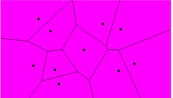
i.e. after all training patterns are presented once. In each epoch the input space is divided according to the distance between the map units. The division of the input space is made using Voronoi regions (known also as Thiessen polygons). These regions are polygons which include all points which are closer to a unit than to any other (Figure 21),
Figure 21 – Voronoi regions. Space division where all the interior points are closer to the corresponding generator than to any other.
http://www.cs.cornell.edu/Info/People/chew/Delaunay.html
The new units’ weights are in this case calculated according to (Vesanto 2000):
1
1
( )
(
1)
( )
Nbi j j
i N
bi j
h t x
m t
h t
=
=
+ =
∑
∑
Where t is the time, b is the BMU for the training pattern xi, and hbi(t) is a
weighted average of the training patterns where the weight of each data pattern is the neighbourhood function value hbi(t) to it´s BMU b (Vesanto 2000).
Another way to get the new units’ weights, computationally more efficient, is using the Voronoi set centroids nj:
∑
∈= i j i
j
j x V x
N
n 1
∑
∑
= =
=
Mi i ij M
i i ij i
h
N
n
h
N
mj
1 1
Where Nj is the number of points in Voronoi set Vj.
3.3.3.
Leaning rate functions
The learning rate (α) assumes values in [0, 1], having an initial value (α(to)) given
a) b) Figure 22 – Learning rate functions. “Linear” (in red)
α
(
t
)
=
α
0(
1
−
t
/
T
)
; “Power” (inblack)
α
(
t
)
=
α
0(
0
.
005
/
α
o)
t/T e “Inv”(in blue)α
(
t
)
=
α
0/(
1
+
100
t
/
T
)
, where T is the training length and αo is the learning initial rate. (Vesanto, Himberg et al. 1999)3.3.4.
Neighbourhood functions
a) b)
Figure 23 - Neighbourhood functions. From the left, “bubble” hci(t)=1(σ.i−dci); “Gaussian”
h
ci(t)
=
e
−dci2/2σt2; “Cutgass”h
(t)
2/2 21
(
)
ci i ci
d
d
e
ci t−
=
− σσ
and “Ep”
}
{
2)
(
1
,
0
max
)
(
t cici
t
d
h
=
−
σ
−
,Where σt is the neighbourhood radius at time t, and dci= || rc - ri|| is the distance between
units c andi in the output space. a) Neighborhood function using a one-dimension output space. b) Neighborhood function using a two-dimension output space and a neighbourhood radius σt=2. (Vesanto, Himberg et al. 1999)
3.4. General considerations on SOM
The SOM objective is to adjust the units to the data in the input space, so that the network is (the best possible) representative of the training dataset. One of the problems related to this adjustment on the network is the fact that the network tends to tends to underestimate high probability regions and overestimate low probability areas (Bishop, Svensen et al. 1997).
use of Genetic Algorithms (GA) in order to estimate the training parameters of a SOM (Silva and Rosa 2002).
The SOM dimension and size depends on the problem at hand. This is mainly an empirical process (Kohonen, 2001), where usually a two-dimension SOM is used due to its representation in the space. The size of the SOM must also take into consideration the size of the dataset of training patterns. Three fundamentally different approaches are possible when choosing the size of the SOM, commonly known as “k-means SOMs”, “emergent SOMs”, and “average SOMs” (Bação, Lobo et al. 2005a). In “k-means” SOMs, the number of units should be equal to the expected number of clusters, and thus each cluster should be represented by a single unit. In “emergent SOMs”, a very large number of units is used (sometimes as many or more than the number of training patterns), so as to obtain very large SOMs. These very large SOMs allow for very clear U-Matrices (Ultsch and Siemon 1990) and are useful for detecting quite clearly the underlying structure of the data. Finally, most authors will use far less units than training patterns available (Lobo 2002), but still many more than the expected number of clusters. This leads to SOMs where each unit maps a large number of training patterns, and thus covers a fair amount of input space. However, each expected cluster can still be represented by a number of different units. In this case, if there is a clear separation in the input space between the different clusters, there will be units that, because they are “pulled” both ways, will end up being positioned in the regions between the clusters, and may not map any of the training patterns.
The training of a SOM is more effective if it is done in two phases: the unfolding phase, and the fine-tuning phase. In the unfolding phase the objective is to spread the units in the region of the input space where the data patterns are located. In this phase the neighbourhood function should have a large initial radius so that all units have high mobility and the map can quickly cover the input space.
these two parameters are smaller, the map will need more time to adjust its weights and that is why the number of iterations or epochs is normally higher.
In order to best understand the units’ position and their relation with the training patterns one can proceed by giving labels to each unit, according to some attribute (from now on called label) of its training patterns. This process is called the labelling, or calibration (Kohonen 2001). Some variations are possible in this process: each unit can get the labels from all its training patterns; each unit can get only a unique label from its training patterns (say, the label of the nearest training pattern); or each unit can get the most frequent label from its training patterns.
3.5. SOM training evaluation
There are several ways to evaluate the quality of a SOM after the training phase. In this thesis we focus on the quantization error (qe) and the topographic error (te) (Kohonen 2001). The quantization error is given by the average distance between a unit and the training patterns mapped to it, i.e. all the input data patterns that share it as BMU.
n
qe
n
k
∑
=−
=
1||
||
x
kw
BMUWhere xk is the training pattern, wBMU is the BMU for the training pattern xk and n
is the number of existing training patterns.
∑
==
nk
u
n
te
1
)
(
1
k
x
Where xkis the training pattern, n is the number of data vectors and u(xk) equals
one (1) if the BMU and the BMU2 are not adjacent and zero (0) otherwise.
3.6. SOM
visualization
There are several ways to visualize the SOM in order to improve the understanding of the data patterns processed. One of the ways is to use the output space matrix and map the units along with their labels (Figure 24a). This map allows users to visualize the way training patterns were mapped into the SOM. Another possible way to present the SOM is to map the units in the input space. This process is possible only if the input space has one, two or three dimensions, since the representation of more than three dimensions is not feasible. Another possibility in this process is to map the units using only one, two or three vector components (Figure 24b) but in this case not all information is being used and the results may be misleading. The visualization of the training patterns’ positions on the map is often not enough to see structures, because high dimensional distances are distorted in the projection. Units that are immediate neighbours on the map can still be separated by large distances in the input space.
Component planes are also used in the SOM visualization and exploration. In a component plane each unit is colored according to the weight of each variable in the SOM (Figure 24d). Through the analysis of the component planes, data patterns can be detected. For instance, it is quite simple to identify variables which are correlated (their component planes will have the same shape), and it is also possible to have an improved understanding of the contributions of each variable to the SOM.
a) b) c)
d)
4. SOM based cartogram methodology
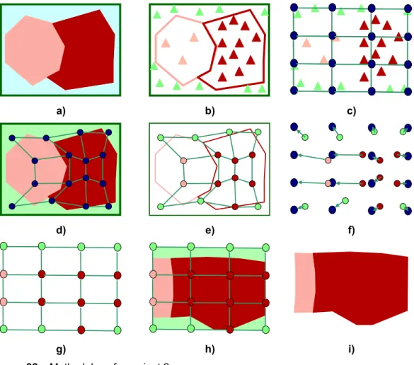
In this dissertation we present a new algorithm to build cartograms based on the Self-Organizing Map (SOM). Usually, when creating cartograms, areas with a high value on the variable of interest “grow”, occupying the geographic space made available by areas with smaller values. This grow/shrink process is focused on creating an equal-density map where high values are represented by larger areas, and small values by smaller areas. In our proposal the cartogram is built based on the unit’s movement during the learning process of the SOM (Kaski and Lagus 1996; Skupin 2003; Henriques, Bação et al. 2005).
As already described, the SOM is usually used to project high-dimensional data into lower dimensions. However, two-dimension training patterns can be used to project a SOM with the same dimension. In this case, data visualization is not the goal, since it is possible to visualize data without the use of a SOM. The SOM will adapt the units, as best as possible, to the training patterns. One can imagine a surface of points (Figure 25a), with known positions and with different densities. Using these points as training patterns the SOM (Figure 25b) will adapt to the surface (Figure 25c). As expected, more units are projected into higher density areas and fewer units will be placed in low density areas.
a) Training patterns b) SOM units’ initial weights c) Trained SOM
As already described in section 2, the cartogram objective is to make an equal density map based on a variable of interest. In our surface example (Figure 25a) a perfect cartogram would be produced by moving the units (Figure 25c) to equidistant positions. If we think of the surface as a rubber-like surface, we can imagine the surface being distorted along with the movement of the units. The new cartogram construction methodology is based on the surface distortion (Figure 25c).
a) b)
c) d)
e) f)
g) h)
Figure 26 – Proposed methodology example
a) b) c)
Figure 27 – SOM rectangular shape superposed in a non-regular shape dataset; a) two regions with a non regular shape; b) random point creation based on a region attribute; c) SOM initialization with an even density.
The initialization of some units in areas without any training patterns will cause the units to move to areas populated with training patterns. The Figure 28 shows the application, to this specific case, of processes already described of training, labelling and units migration to its original position.
a) b) c)
Figure 28 – SOM rectangular shape superposed in a non-regular shape dataset; a) SOM training; b) labelling process; c) units migration to its original position.
The next phase on the cartogram creation is the mapping of the units in the input space (Figure 29a) with the label and the allocation of the space to the original regions (Figure 29b).
a) b)
When comparing the produced cartogram with the original regions shape we verify that the cartogram regions will occupy all the area on the input space and the original regions shape is lost.
In order to better describe this problem we define in the input space three different areas (Figure 30). We assume the input space as our domain area (D); the area occupied by the original regions as the region area (ra) and the remaining area as the buffer area (δ).
ra
D
δ
a) b)
Figure 30 – Input space nomenclature; a) SOM mapped in the input space; b) input space area definition.
The input space can now be defined as:
D− =
δ
raAs already shown when no training patterns exists in the buffer area (δ) the produced cartogram will occupy the domain area (D) and the original shape of the region area (ra) will be lost. In order to try to solve this problem we create and test four variants of the methodology. The first variant follows the already explained methodology where the ra is reshaped to the D area.
4.1. Carto-SOM
variants
1. Variant 1 (no frame), where standard SOM algorithm was used with training patterns generated only inside the region area (ra)
2. Variant 2 (mean density frame), where standard SOM algorithm was used with training patterns generated in the entire domain (D). The training patterns generated in the buffer area (δ) are proportional to the mean density of the regions on the ra.
3. Variant 3 (variable density frame), where standard SOM algorithm was used with training patterns generated in the entire domain (D). In this variant the buffer area (δ) is divided according to the nearest region of the ra and its density was used.
4. Variant 4 (uneven shape), where a variant of SOM algorithm was used with training patterns generated only inside the region area (ra)
4.1.1.
Variant 1 (no frame)
This is the first variant tested to construct cartograms and the standard SOM algorithm was used. The SOM algorithm used only differs from the original one in the initialization phase. Usually, units are randomly initialized but in this methodology units were equally spread along the data space (Bação, Lobo et al. 2005c). This variant uses the methodology already explained and produces a cartogram where the domain area is occupied, causing a big distortion on the regions shape and making the cartogram difficult to recognize.
a) b)
4.1.2.
Variant 2 (mean density frame)
The variant 2 tries to improve the resulting shapes by generating training patterns were in the entire domain (D) (Figure 32a), in contrast to the variant 1 in which the training patterns were only generated to in ra. The training patterns generated in the buffer area (δ) are proportional to the mean density of the regions on the ra.
The green triangles in Figure 32b represent the mean density. In Figure 32c the SOM is initialized in the same way used in variant 1. The SOM training (Figure 32c) and labelling (Figure 32d) is then performed. In Figure 32f is possible to see the units’ migration to its original position and in Figure 32g the final network is presented. As we can see in this figure some units have the label of the δ area.
This fact causes the inclusion of a region representing the δarea in the produced cartogram (Figure 32h). Due to the limited number of units presented in the figure, the cartogram does not maintain the general shape of the regions. In practice with a bigger number of units this property is generally maintained.
a) b) c)
d) e) f)
g) h) i)
Figure 32 – Methodology for variant 2.
4.1.3. Variant
3
(variable density frame)
In variant 3 the δ area is also populated with training patterns. The difference in this variant relies on the fact that the training patterns generated in the δarea are
As shown in Figure 33a the δ area is subdivided in two smaller areas (δ1 andδ2)
according to the regions in the ra (ra1 and ra2). Each of these smaller areas is
populated with random patterns in a way that:
i i
i i
ra
ra
tp
tp
A
A
δ
δ
=
Where:
tprai is the number of training patterns generated in the region rai
tpδi is the number of training patterns generated in the region δi
Arai is the area of the region rai
Aδiis the area of the region δi
As we can see in the Figure 33b the density of the training patterns in the δi areas
is similar to the density in the rai areas Figure 33c shows the SOM initialization,
δ
1δ
2ra
1ra
2a) b) c)
d) e) f)
g) h) i)
Figure 33 – Methodology for variant 3.