Comparing and evaluating data-driven journalism:
data visualization performance from the perspective of web analytics
Ilo Aguiar Reginaldo Alexandre
Julho, 2019
Doctoral Thesis in Digital Media
Tese de Doutoramento em Media Digitais
Thesis submitted in accordance with the requirements for the degree of Doctor of Philosophy in Digital Media, under scientific supervision of Prof.
António Granado.
Tese apresentada para cumprimento dos requisitos necessários à obtenção do grau de Doutor em Media Digitais, realizada sob a orientação científica
de Prof. António Granado.
Declarações
Declaro que esta tese é o resultado da minha investigação pessoal e independente. O seu conteúdo é original e todas as fontes consultadas estão devidamente mencionadas no texto, nas notas e na bibliografia.
O candidato,
____________________
Lisboa, 19 de Julho de 2019
Declaro que esta tese se encontra em condições de ser apreciado pelo júri a designar.
O orientador,
____________________
Acknowledgments
First, I would like to thank Fundação para Ciência e a Tecnologia and the UT Austin-Portugal program for funding this research. Without this support, this work might never have seen the light of day. Thanks to Professor António Granado for being my thesis supervisor and for supporting me since the very beginning of this journey, I appreciate your patience and good advice.
I would like to thank Professor Rosental Alves for the insights and guidance during my semester at UT Austin. Thanks to The Texas Tribune, especially Rodney Gibbs, for allowing me the access the data that I needed for this research. Thanks to O Globo, especially Vivianne Cohen and Mariana Musa, for helping me in collecting the data from the newspaper. Thanks to Público, especially Elisabeth Fernandes, for making available the data I required and for the availability and kindness in explaining concepts and techniques of web analytics. Still on the topic of web analysis, I also have to thank the contributions of colleagues Tiago Dias Pinheiro, Mariana Ruggeri, and Emanuel Lima.
Finally, I would like to express my gratitude to my family, especially Caroline Ribeiro, for their continuous encouragement and support, and for the informal reviews and contributions and advice throughout all the PhD process. Thank you very much.
Abstract
Data journalism is one of the hottest trends in journalism. Although the practice of using numbers to tell stories is not particularly new to newsrooms, the interaction present in data visualizations allows the active participation of the user, rarely possible before. The production of data-driven and interactive pieces increases every year, as well as the number of studies in the field. However, there is still a lack of research on user behavior in interactive news pieces. This gap can be explained in part by researchers’ difficulty in accessing real quantitative data from media outlets since such data are considered sensitive and strategic. In this thesis, we compare the performance of interactive data journalism pieces with the most read news articles, and with news stories of the same topic published in the same period as the interactive ones. This analysis is based on 90 pieces of data journalism pieces and on the access to Google Analytics, an online web analytics tool, from three media outlets from three different countries: The Texas Tribune (United States), O Globo (Brazil) and Público (Portugal). The investigation begins by recalling important moments in the use of data in journalism in the three analyzed countries. Then, we present a brief history of media audience measurement and the relationship of journalists with the public. We present the individual results of each media outlet analyzed and all together to try to identify patterns and trends in the consumption of interactive news pieces. Among the key findings of this research are: data journalism pieces continue to be visited years after publication in a much higher proportion than other news on the same topic; users spend more time on interactive news than on the most read articles and related news stories; the recirculation rate in data journalism pieces is higher than the rate in the related news; the bounce rate is higher in the data visualization than in the most read news articles and the related news stories.
Resumo
O jornalismo de dados é definitivamente uma das principais tendências do jornalismo atualmente. Apesar de a prática de usar dados para contar histórias não ser algo particularmente novo nas redações, o recurso da interação nas visualizações de dados permite uma participação ativa do usuário, como poucas vezes foi possível anteriormente. A produção de peças orientadas por dados e interativas aumenta a cada ano, assim como o número de estudos na área. Todavia, ainda há uma ausência de investigações sobre o comportamento do usuário em notícias interativas de jornalismo de dados. Essa lacuna pode ser explicada em parte pela dificuldade dos investigadores em aceder a dados quantitativos reais dos meios de comunicação social, uma vez que esses dados são considerados sensíveis e estratégicos. Nesta tese, comparamos o desempenho de notícias interativas de jornalismo de dados com as notícias mais lidas e com notícias do mesmo tópico publicadas no mesmo período em que as matérias interativas. Essa análise é realizada com base em 90 peças de jornalismo de dados e no acesso ao Google Analytics, ferramenta online de análise de métricas, de três veículos de comunicação de três países diferentes: The Texas Tribune (Estados Unidos), O Globo (Brasil) e Público (Portugal). A investigação começa por recontar momentos importantes do uso de dados no jornalismo nos três países analisados. Em seguida é realizado um breve histórico da mensuração da audiência nos meios de comunicação social e da relação dos jornalistas com o público. Apresentamos os resultados individuais de cada veículo de comunicação e em conjunto para tentar identificar padrões e tendências no consumo de notícias interativas de jornalismo de dados. Entre as principais descobertas dessa investigação estão: visualizações de dados seguem sendo visitadas anos após a publicação em uma proporção muito superior do que outras notícias do mesmo tópico; os usuários passam mais tempo nas visualizações interativas do que nas notícias mais lidas e nas notícias relacionadas; a taxa de “recirculation” nas peças de jornalismo de dados é superior à taxa das notícias relacionadas; a taxa de rejeição é maior nas matérias com visualização de dados do que nas notícias mais lidas e nas notícias relacionadas.
Palavras-chave: jornalismo de dados, web analytics, The Texas Tribune, O Globo, Público.
Contents
List of Figures ... x
List of Tables ... xviii
Introduction ... 1
I – Data Journalism: past and present ... 6
1.1. The roots of Data Journalism ... 8
1.2. Databases, statistical graphics and the “Golden Age” of data visualization ... 19
1.3. The legacy of early social surveys to journalism and data visualization ... 23
1.4. Computer-assisted reporting and the Precision Journalism ... 38
1.5. Data journalism and data visualization ... 49
II – Web Analytics and the quantitative audience ... 58
2.1. Brief history of traditional media measurement ... 61
2.2. Online audience measurements ... 63
2.3. From values-oriented to analytics-driven news ... 66
2.4. From data-driven to data-informed newsrooms ... 74
III – Methodology... 79
3.1. Quantitative content analysis ... 82
3.2. Quantitative analysis ... 84
3.3. Selection of the case studies and limitations ... 89
IV – The Texas Tribune ... 92
4.1. History ... 92
4.2. Data journalism pieces from 2014 and the average of the 500 most read articles ... 93
4.3. Data journalism pieces from 2014 and their related stories ... 96
4.4. Data journalism pieces from 2015 and the average of the 500 most read articles ... 100
4.5. Data journalism pieces from 2015 and their related stories ... 103
4.6. Data journalism pieces from 2016 and the average of the 500 most read articles ... 106
4.7. Data journalism pieces from 2016 and their related stories ... 110
V – O Globo ... 114
5.1. History ... 114
5.2. Data journalism pieces from 2014 and the average of the 500 most read articles ... 115
5.3. Data journalism pieces from 2014 and their related stories ... 118
5.4. Data journalism pieces from 2015 and the average of the 500 most read articles ... 121
5.6. Data journalism pieces from 2016 and the average of the
500 most read articles ... 128
5.7. Data journalism pieces from 2016 and their related stories ... 131
VI – Público ... 136
6.1. History ... 136
6.2. Data journalism pieces from 2014 and the average of the 500 most read articles ... 137
6.3. Data journalism pieces from 2014 and their related stories ... 140
6.4. Data journalism pieces from 2015 and the average of the 500 most read articles ... 144
6.5. Data journalism pieces from 2015 and their related stories ... 147
6.6. Data journalism pieces from 2016 and the average of the 500 most read articles ... 150
6.7. Data journalism pieces from 2016 and their related stories ... 153
VII – Discussion and Conclusions ... 157
7.1. The Texas Tribune’s data journalism pieces performed impressively; those from O Globo and Público, not so much ... 157
7.2. Data journalism pieces are not a landing page ... 158
7.3. Related news dies as (some) data journalism pieces flourish .... 159
7.4. Users spend more time on data journalism pieces than on other news ... 160
7.5. Data journalism pieces visits are single-page visits ... 162
7.6. Data journalism pieces drive more recirculation ... 164
7.7. A quarter of the data journalism pieces are accessed again and again ... 166
7.8. Select is the most commonly used feature in data journalism pieces ... 167
7.9. Politics/governance is the most covered subject among data journalism pieces ... 170
7.10. Data journalism pieces are appealing to international audiences ... 171
7.11. Data journalism pieces shift from the desktop dominance to mobile devices ... 173
7.12. Once the main source for data journalism pieces, Google is dethroned by Facebook ... 174
7.13. Over the years Chrome reinforces its sovereignty among data journalism pieces ... 175
7.14. Final considerations and further research ... 176
Bibliography ... 180
Appendix A: The Texas Tribune data journalism pieces ... 221
A.1. Interactive pieces from 2014 ... 221
A.2. Interactive pieces from 2015 ... 231
Appendix B: O Globo data journalism pieces ... 251
B.1. Interactive pieces from 2014 ... 251
B.2. Interactive pieces from 2015 ... 261
B.3. Interactive pieces from 2016 ... 271
Appendix C: Público data journalism pieces ... 281
C.1. Interactive pieces from 2014 ... 281
C.2. Interactive pieces from 2015 ... 291
List of Figures
Figure 1 – Search interest related to the topic of Data Journalism between 2004 and 2018 worldwide. A value of 100 is the peak popularity for the term. A score of 0 means there was not enough data for the term. ... 1 Figure 2 – “Afghanistan war logs: IED attacks on civilians, coalition and Afghan troops”, a data journalism story published on July 26, 2010, by The Guardian. ... 7 Figure 3 – “Table of Casualties” from Natural and Political Observations on the Bills of Mortality printed in The Economic Writings of Sir William Petty (1986)... 9 Figure 4 – The highlight shows a data journalism piece published on page 2 of The Guardian (then The Manchester Guardian) on May 5, 1821. ... 11 Figure 5 – The highlight shows a data journalism piece published on page 2 of the New York
Herald on February 5, 1842... 13
Figure 6 – The highlight shows a data visualization published on the front page of the New York
Tribune on September 29, 1849. ... 14
Figure 7 – The highlight shows a data journalism piece published on pages 1 to 3 of O
Observador Constitucional on January 17, 1831. ... 15
Figure 8 – The highlight shows a data journalism piece published on front page of Diário
Popular on March 9, 1868. ... 17
Figure 9 – The highlight shows a data journalism piece published on the front page of O
Repórter on April 21, 1888. ... 18
Figure 10 – Reproduction of the original map made by the physician John Snow in 1854. Cholera cases are highlighted in black. ... 21 Figure 11 – Reproduction of “Diagram of the causes of mortality in the army in the East” made by the nurse Florence Nightingale in 1858. ... 22 Figure 12 – Reproduction of the engineer Charles Joseph Minard’s map from 1869 depicting Napoleon’s disastrous Russian campaign of 1812. ... 23 Figure 13 – Reproduction of the industrialist Charles Booth’s Descriptive Map of London
Poverty published in 1889. ... 27
Figure 14 – Reproduction of Hull-House’s Wage Map 1-4 by Residents of Hull-House (1895). . 29 Figure 15 – Compilation of charts and tables present in the sociologist W. E. B. Du Bois’ study
The Philadelphia Negro (2010). ... 30
Figure 16 – Compilation of charts and tables present in A Modern Church to Meet a Modern
Figure 17 – The highlight shows a data visualization published on page 10, 4th section of The
Sun, on March 24, 1912. ... 33
Figure 18 – The highlight shows a data visualization published on the front page of The New York Times on November 3, 1920. ... 34
Figure 19 – Reproduction from Fortune’s November 1940 edition, pages 74 and 75. ... 35
Figure 20 – The highlights of charts in Seara Nova’s March 22, 1941 edition (above) and in the edition of May 24, 1947. ... 36
Figure 21 – The highlights of charts and maps in Realidade’s November 1967 edition (above) and the edition of January 1968. ... 37
Figure 22 – Reproduction of page 4b of the Detroit Free Press of August 20, 1967. ... 39
Figure 23 – The highlight shows data used in Mário Rosa’s scoop published on page 2 of Jornal do Brasil on August 27, 1991... 43
Figure 24 – Reproduction of the article on the computerization of O Comércio do Porto, published on November 29, 1985. ... 44
Figure 25 – The highlight of the 24 Horas’ front page, published on January 13, 2006. ... 45
Figure 26 – Reproduction of the Miami Herald’s page 16SR, published on December 20, 1992. ... 46
Figure 27 – Reproduction of the Chicago Tribune’s webpage “1995 Chicago Homicides”. ... 49
Figure 28 – Reproduction of Adrian Holovaty’s website “Chicago Crime Map”. ... 50
Figure 29 – Reproduction of the Estadão’s webpage “Basômetro”. ... 55
Figure 30 – Reproduction of the Público’s webpage “Doze Anos de Incêndios”. ... 56
Figure 31 – Reproduction of W3Techs survey showing the top 10 traffic analysis tools for websites. ... 59
Figure 32 – Reproduction of Pew Research Center’s graph showing the estimated advertising and circulation revenue of the newspaper industry in the United States. ... 70
Figure 33 – Reproduction of Pew Research Center’s graph showing the employment in newspaper newsrooms in the United States. ... 70
Figure 34 – Reproduction of “A conta dos passaralhos” graph showing the number of journalists fired from newsrooms in Brazil. ... 71
Figure 35 – Chart with the estimated circulation between 2007 and 2018 of the 3 largest daily newspapers in Portugal. ... 71
Figure 37 – Reproduction of the Financial Time’s Lantern system. ... 75 Figure 38 – Performance in pageviews of The Texas Tribune interactive pieces compared to the average of the most read articles in 2014 (represented as 100%). ... 94 Figure 39 – Performance in pageviews of The Texas Tribune interactive pieces (represented as 100%) compared to their related news stories in 2014. ... 96 Figure 40 – Evolution in pageviews of The Texas Tribune 2014 interactive pieces and their related news stories over time. ... 97 Figure 41 – Performance in pageviews of The Texas Tribune interactive pieces compared to the average of the most read articles in 2015 (represented as 100%). ... 101 Figure 42 – Performance in pageviews of The Texas Tribune interactive pieces (represented as 100%) compared to their related news stories in 2015. ... 103 Figure 43 – Evolution in pageviews of The Texas Tribune 2015 interactive pieces and their related news stories over time. ... 104 Figure 44 – Performance in pageviews of The Texas Tribune interactive pieces compared to the average of the most read articles in 2016 (represented as 100%). ... 108 Figure 45 – Performance in pageviews of The Texas Tribune interactive news pieces
(represented as 100%) compared to their related news stories in 2016. ... 110 Figure 46 – Evolution in pageviews of The Texas Tribune 2016 interactive pieces and their related news stories over time. ... 111 Figure 47 – Performance in pageviews of O Globo interactive news pieces compared to the average of the most read articles in 2014 (represented as 100%). ... 116 Figure 48 – Performance in pageviews of O Globo interactive pieces (represented as 100%) compared to their related news stories in 2014. ... 118 Figure 49 – Evolution in pageviews of O Globo 2014 interactive pieces and their related news stories over time. ... 119 Figure 50 – Performance in pageviews of O Globo interactive pieces compared to the average of the most read articles in 2015 (represented as 100%). ... 123 Figure 51 – Performance in pageviews of O Globo interactive pieces (represented as 100%) compared to their related news stories in 2015. ... 125 Figure 52 – Evolution in pageviews of O Globo 2015 interactive pieces and their related news stories over time. ... 126 Figure 53 – Performance in pageviews of O Globo interactive pieces compared to the average of the most read articles in 2016 (represented as 100%). ... 130
Figure 54 – Performance in pageviews of O Globo interactive pieces (represented as 100%)
compared to their related news stories in 2016. ... 132
Figure 55 – Evolution in pageviews of O Globo 2016 interactive pieces and their related news stories over time. ... 133
Figure 56 – Performance in pageviews of Público interactive pieces compared to the average of the most read articles in 2014 (represented as 100%). ... 138
Figure 57 – Performance in pageviews of Público interactive pieces (represented as 100%) compared to their related news stories in 2014. ... 140
Figure 58 – Evolution in pageviews of Público 2014 interactive pieces and their related news stories over time. ... 141
Figure 59 – Performance in pageviews of Público interactive pieces compared to the average of the most read articles in 2015 (represented as 100%). ... 145
Figure 60 – Performance in pageviews of Público interactive pieces (represented as 100%) compared to their related news stories in 2015. ... 147
Figure 61 – Evolution in pageviews of Público 2015 interactive pieces and their related news stories over time. ... 148
Figure 62 – Performance in pageviews of Público interactive pieces compared to the average of the most read articles in 2016 (represented as 100%). ... 152
Figure 63 – Performance in pageviews of Público interactive news pieces (represented as 100%) compared to their related news stories in 2016. ... 154
Figure 64 – Evolution in pageviews of Público 2016 interactive pieces and their related news stories over time. ... 154
Figure 65 – Average time on page. Most read news are represented as 100%. Interactive pieces’ results are relative to that value. ... 161
Figure 66 – Average bounce rate. Most read news are represented as 100%. Interactive pieces’ results are relative to that value. ... 163
Figure 67 – Average exit rate. Most read news are represented as 100%. Interactive pieces’ results are relative to that value. ... 165
Figure 68 – Interaction techniques most frequent in the data journalism pieces analyzed. ... 168
Figure 69 – Topics most frequent in the data journalism pieces analyzed. ... 170
Figure 70 – “Government Salaries Explorer” screenshot. ... 221
Figure 71 – “Election Night” screenshot. ... 222
Figure 73 – “Texas Prison Inmates” screenshot. ... 224
Figure 74 – “Public Schools Explorer” screenshot. ... 225
Figure 75 – “Interactive: Search CSCOPE Lesson Plans” screenshot. ... 226
Figure 76 – “Map: Comparing the 2010 and 2014 Governor's Races” screenshot. ... 227
Figure 77 – “Texas Hospitals Face Penalties Over Infections” screenshot. ... 228
Figure 78 – “Higher Education Explorer” screenshot. ... 229
Figure 79 – “Interactive Map: Find Texas' Remaining Abortion Clinics” screenshot. ... 230
Figure 80 – “Interactive: Undocumented Students on In-State Tuition” screenshot. ... 231
Figure 81 – “Ethics Explorer” screenshot. ... 232
Figure 82 – “Faces of Death Row” screenshot. ... 233
Figure 83 – “Texas Hospitals Explorer” screenshot... 234
Figure 84 – “Texas Reservoir Levels” screenshot. ... 235
Figure 85 – “Interactive: Demographics of Texas' Undocumented Population” screenshot. .. 236
Figure 86 – “The 84th Texas Legislature, by the Numbers” screenshot. ... 237
Figure 87 – “Interactive: How Many Texans Resemble You?” screenshot. ... 238
Figure 88 – “Texas vs. the Feds” screenshot. ... 239
Figure 89 – “See Vaccine Exemptions in Texas by School District” screenshot. ... 240
Figure 90 – “Ballpark Figures” screenshot. ... 241
Figure 91 – “Nov. 8 general election results” screenshot. ... 242
Figure 92 – “Track how many Texans are voting early” screenshot. ... 243
Figure 93 – “2016 Primary Election Results” screenshot. ... 244
Figure 94 – “See which counties in Texas Trump and Clinton won” screenshot. ... 245
Figure 95 – “The Price of Admission” screenshot. ... 246
Figure 96 – “Why Isn’t Texas Ready for the Next Big Hurricane?” screenshot. ... 247
Figure 97 – “Can you tell real news from fake news? Take our quiz to find out” screenshot. . 248
Figure 98 – “Bordering on Insecurity” screenshot. ... 249
Figure 100 – “Apuração das eleições 2014 – 1º Turno” screenshot. ... 251
Figure 101 – “O peso eleitoral dos estados” screenshot. ... 252
Figure 102 – “As divisões socioeconômicas da votação para presidente” screenshot. ... 253
Figure 103 – “Evolução das bancadas” screenshot. ... 254
Figure 104 – “Os números da Pnad 2013” screenshot. ... 255
Figure 105 – “A seleção dos sonhos da Copa do Mundo 2014” screenshot. ... 256
Figure 106 – “O Brasil nos Mundiais” screenshot. ... 257
Figure 107 – “Você sabe qual a sua expectativa de vida?” screenshot. ... 258
Figure 108 – “Mapa da taxa de suicídio no mundo” screenshot. ... 259
Figure 109 – “Campanha versus realidade” screenshot. ... 260
Figure 110 – “DNA do Congresso Nacional” screenshot. ... 261
Figure 111 – “A distribuição dos clientes e valores do ‘Swissleaks’” screenshot. ... 262
Figure 112 – “Ataques terroristas no mundo desde 1970” screenshot. ... 263
Figura 113 – “Raio-x dos atrasos dos voos no Brasil” screenshot. ... 264
Figura 114 – “Qual o futuro do PT?” screenshot. ... 265
Figura 115 – “Consulte a media da sua escola no Enem 2014” screenshot. ... 266
Figura 116 – “Os medalhistas brasileiros” screenshot. ... 267
Figura 117 – “Duelo entre os lados sombrio e luminoso da Força” screenshot. ... 268
Figura 118 – “Ranking da liberdade de imprensa no mundo em 2015” screenshot. ... 269
Figura 119 – “Personagens da Lava-Jato” screenshot. ... 270
Figure 120 – “Placar do Impeachment” screenshot. ... 271
Figure 121 – “O mapa das coligações” screenshot. ... 272
Figure 122 – “A votação no Rio de Janeiro, por zona eleitoral” screenshot. ... 273
Figure 123 – “Você consegue escalar um time melhor que o Dream Team?” screenshot. ... 274
Figure 124 – “Partido do ‘você não me representa’” screenshot. ... 275
Figure 125 – “Calculadora de aposentadoria” screenshot... 276
Figure 127 – “Com qual candidato a prefeito do Rio você mais se identifica?” screenshot. ... 278
Figure 128 – “O trajeto da toca olímpica no Brasil” screenshot. ... 279
Figure 129 – “Mapa das manifestações do dia 13 de março” screenshot. ... 280
Figure 130 – “O ranking das escolas 2014” screenshot. ... 281
Figure 131 – “O ranking dos preços da água em 2013” screenshot. ... 282
Figure 132 – “A vida desde 1820” screenshot. ... 283
Figure 133 – “Taxa de sobrevivência de cancros em Portugal” screenshot. ... 284
Figure 134 – “80 anos de Verão” screenshot. ... 285
Figure 135 – “As linhas da liberdade” screenshot. ... 286
Figure 136 – “Retrato dos aeroportos nacionais” screenshot. ... 287
Figure 137 – “VIH: O vírus que apareceu em Kinshasa em 1920 e alastrou para o mundo inteiro” screenshot. ... 288
Figure 138 – “A I Liga vista de dez maneiras diferentes” screenshot. ... 289
Figure 139 – “Os salários dos gestores do PSI 20 à lupa” screenshot. ... 290
Figure 140 – “A água que gastamos mas não vemos” screenshot. ... 291
Figure 141 – “Radiografia da TAP” screenshot. ... 292
Figure 142 – “As melhores praias para este Verão” screenshot. ... 293
Figure 143 – “O que pomos no prato… não é o que devíamos pôr” screenshot. ... 294
Figure 144 – “Relações que matam” screenshot. ... 295
Figure 145 – “Uma década de pobreza e algumas medidas” screenshot. ... 296
Figure 146 – “Esta Primavera vá ver os passarinhos” screenshot. ... 297
Figure 147 – “Cristiano Ronaldo em golos” screenshot. ... 298
Figure 148 – “Menos alunos para as provas do secundário” screenshot. ... 299
Figure 149 – “Todos os resultados das legislativas” screenshot. ... 300
Figure 150 – “Os exames chegaram” screenshot. ... 301
Figure 151 – “Portugal no pódio olímpico” screenshot. ... 302
Figure 152 – “Um século de energia em Portugal” screenshot. ... 303
Figure 154 – “Como se elege um Presidente nos EUA” screenshot. ... 305
Figure 155 – “De que é feita a cerveja” screenshot. ... 306
Figure 156 – “ZZZZZZ... Zika” screenshot. ... 307
Figure 157 – “A crise dos refugiados em números” screenshot. ... 308
Figure 158 – “Os 16 desportos de Portugal no Rio 2016” screenshot. ... 309
List of Tables
Table 1 – Definition of Google Analytics metrics used in this study. ... 81 Table 2 – Definition of the interaction techniques used in this study. ... 83 Table 3 – Hypothetical performances in 2014. ... 86 Table 4 – The 10 interactive pieces chosen in 2014 from The Texas Tribune and their specific aspects. ... 93 Table 5 – The 10 interactive pieces chosen in 2015 from The Texas Tribune and their specific aspects. ... 100 Table 6 – The 10 interactive pieces chosen in 2016 from The Texas Tribune and their specific aspects. ... 107 Table 7 – The 10 data journalism pieces chosen in 2014 from O Globo and their specific
aspects. ... 115 Table 8 – The 10 data journalism pieces chosen in 2015 from O Globo and their specific
aspects. ... 122 Table 9 – The 10 data journalism pieces chosen in 2016 from O Globo and their specific
aspects. ... 129 Table 10 – The 10 data journalism pieces chosen in 2014 from Público and their specific
aspects. ... 137 Table 11 – The 10 data journalism pieces chosen in 2015 from Público and their specific
aspects. ... 144 Table 12 – The 10 data journalism pieces chosen in 2016 from Público and their specific
Introduction
The Google Trends website1 enables the analysis and comparison of search
queries popularity in Google engine. In other words, “this allows us to measure the interest in a particular topic across search, from around the globe” (Rogers, 2016, p. n.p.). Figure 1 shows the interest in the topic of “Data Journalism” over time. Insignificant until 2010, curiosity about the subject begins to grow in the period in which major news organizations produce a series of interactive visualizations to make sense of the large volume of data leaked by WikiLeaks.2
Figure 1 – Search interest related to the topic of Data Journalism between 2004 and 2018 worldwide. A value of 100 is the peak popularity for the term. A score of 0 means there was not enough data for
the term.
The line chart makes it clear that people’s interest in data journalism has never ceased since. Neither has the creation of interactive pieces in newspapers. On the contrary, data journalism has gained increasing popularity in large and small newsrooms around the world (Gray, Bounegru, & Chambers, 2012; Mair, Keeble, Lucero, & Moore, 2017; Radcliffe, 2017). The 8th edition of the Data Journalism Awards
received the submission of 608 projects. Organized by the Global Editors Network,3 the
1 Available at https://trends.google.com/trends/. Accessed on February 25, 2019.
2 WikiLeaks is self-described as “multi-jurisdictional public service designed to protect whistleblowers,
journalists and activists who have sensitive materials to communicate to the public.” Available at https://wikileaks.org/wiki/Wikileaks:About. Accessed on February 25, 2019.
3 Global Editors Network is an “international association of over 6,000 editors-in-chief and media
executives with the mission of fostering digital innovation in newsrooms all over the world.” Available at
Data Journalism Awards are the first international awards in the field of data journalism. In 2012, in the first edition, 200 pieces were submitted. In 2019 the United States was the country with the highest number of submitted projects: 139. 47 were submitted from Brazil, the third country with the highest number of projects. Portugal had 3.
The number of scholarly publications on data journalism has also increased in recent years (Ojo & Heravi, 2018; Souza et al., 2018) showing that researchers are aware of the growing interest in the field in newsrooms. There are studies investigating the production of data journalism pieces in the United States (Fink & Anderson, 2015; Parasie & Dagiral, 2013; Royal, 2010; W. Weber & Rall, 2013; Young & Hermida, 2015), Brazil (Abras, 2018; Moura, 2018; A. P. B. de Oliveira, 2018; Träsel, 2014a), Portugal (Abras, 2018; Alexandre, 2014; Martinho, 2013; Moura, 2018), Canada (Hermida & Young, 2017; Roy, 2016), Argentina (Vázquez-Herrero, Negreira-Rey, & López-García, 2019), sub-Saharan Africa (Cheruiyot & Ferrer-Conill, 2018), Spain (Rodríguez & Castilla, 2016), the United Kingdom (Borges-Rey, 2016, 2017; Dick, 2014; Hannaford, 2015), Norway (Karlsen & Stavelin, 2014), Sweden (Appelgren & Nygren, 2014), Netherlands (Smit, de Haan, & Buijs, 2014), Germany (Ausserhofer, 2015; Weinacht & Spiller, 2014), Belgium (De Maeyer, Libert, Domingo, Heinderyckx, & Le Cam, 2015), Russia (Valeeva, 2017), China (Zhang & Feng, 2019), and Australia (Wright & Doyle, 2018).
Often working with public data obtained through the right to access public information and/or with leaked databases, scholars recognize that data journalism can reinforce transparency, accountability, and journalism’s watchdog role through scrutiny of those in power (Anderson, Bell, & Shirky, 2014; S. Cohen, Hamilton, & Turner, 2011; Loosen, Reimer, & De Silva-Schmidt, 2017). Works like “The Panama Papers”4 and “The Swiss Leaks”,5 for instance, show that “watchdog journalism can
4 The Panama Papers is “an unprecedented investigation that reveals the offshore links of some of the
globe’s most prominent figures.” Available at
https://www.icij.org/investigations/panama-papers/pages/panama-papers-about-the-investigation/. Accessed on February 25, 2019.
5 The Swiss Leaks is an investigation based on “leaked files that provide details on over 100,000 HSBC
clients and their bank accounts.” Available at https://www.icij.org/investigations/swiss-leaks/explore-swiss-leaks-data/. Accessed on February 25, 2019.
rightly be considered a flag-bearer of the growing interest in data journalism” (Waisbord, 2016, p. 4).
Another critical characteristic of data journalism is “its participatory openness and cross-field hybridity” (Coddington, 2015a, p. 337). Interactive news stories encourage active user participation in the exploration of data (Toledo, 2014), and many projects are tools to assist the user in making decisions (Parasie & Dagiral, 2013).
There is research that examines the main topics addressed by data journalism pieces, the interaction techniques implemented, the most used visualization types, the sort of the data sources used in the article, and the number of people involved in each data project (M. Knight, 2015; Loosen et al., 2017; Ojo & Heravi, 2018; Stalph, 2018; Tabary, Provost, & Trottier, 2016; Tandoc & Oh, 2017; Young, Hermida, & Fulda, 2018).
However, there are research divisions within the field of data journalism that have not yet been properly explored. There are not many studies that investigate how the audience behaves and interacts with data visualization. Does the user explore the data when given the opportunity? What are the audience’s favorite interaction techniques? Does the user understand and feel comfortable when faced with more sophisticated data visualization?
Likewise, there is an insufficient number of works that address the performance of data journalism pieces and whether there is a distinct behavior between who accesses interactive stories and other news content. Who performs best in pageviews, the “metric of success” (Groves & Brown, 2011, p. 16)? Who has the highest bounce rate? Does the audience spend more time on interactive news than on static pieces?
All these questions are related and are very important in order for journalists to improve their work by creating data journalism pieces in a clearer, more comprehensive, engaging and memorable way. Thus, it may be that journalists’ fear of dismissing or alienating the data-averse audience decreases.
This work attempts to shed light on the points related to the second group: how is the consumption and performance of data journalism pieces in comparison to other news articles? To answer this main question, we used web analytics data to compare performance, engagement, and audience behavior. We selected interactive
pieces from 3 newspapers from 3 different countries: The Texas Tribune (United States), O Globo (Brazil), and Público (Portugal). 90 interactive pieces were chosen: 10 from each news organization in 2014, another 10 from 2015 and 10 more from 2016. Each interactive piece was compared: (1) with the average of 500 most read news in the year it was published; (2) with two news articles on the same topic and published in the same period as the data journalism piece.
This approach allows, on the one hand, to evaluate the performance of data journalism pieces compared to the most read content of the website. On the other hand, general news organizations such as O Globo and Público have a wide range of content and the comparison with news pieces on the same topic allows for a more targeted comparison, theoretically with an audience interested in that subject.
We had access to the Google Analytics6 data from The Texas Tribune, O Globo,
and Público, which allowed us to use real data for analysis, which is rare in audience analytics studies (Zamith, 2015). However, in the results we tend to concentrate on proportions rather than absolute numbers because of potential commercial implications and because it is a way to give more context and meaning to the data.
In any case, we present an overview of the consumption of data journalism pieces in 3 newspapers from 3 different countries. We explain what brings together and what separates the interactive pieces from the other news in each newspaper and what patterns and divergences can be observed in the audience behavior in data journalism pieces from different news organizations.
To accomplish this, we begin by demonstrating that the news pieces with data are quite old. Rich and complex maps and graphics were often used as early as the 19th
century. We show that long before Philip Meyer borrowed methodological procedures from social sciences, this field played an important role in the development of data visualization. Finally, we argue that interactive stories of data, rather than being something completely new, are a new phase of a long path, featuring the key points of this journey in the countries of the case study media outlets. This is Chapter I.
6 Google Analytics is a web analytics service by Google that “provides extensive data with regard to the
In Chapter II, a brief history of the audience measurement in traditional media is performed. From the virtual monopoly players in the press, radio, and television to the cacophony of services to measure the online audience. The 3 main methods to measure audience ratings online are described, highlighting their strengths and weaknesses. We review the literature on the increasing influence of web analytics in the newsrooms, showing that, once ignored, the audience is now tracked to the minute, click to click. We conclude by emphasizing that impact and engagement are gaining space among the most important metrics.
We present the methodology used in this work in Chapter III. We describe the 11 metrics used in this work and introduce the questions they raise. We explain how the data journalism pieces will be compared with the most read news stories and the related news pieces. In addition to this quantitative analysis, content analysis is also performed in this work. In this way, 10 interactivity techniques are presented, which will be used to identify the most used functions in the interactive pieces. We also feature 10 topics that will serve to determine the most recurrent main subject of data projects. Finally, the contributions of the adopted approach and its limitations are stated.
Chapters IV, V, and VI present the results of the analyses carried out in The Texas Tribune, O Globo and Público, respectively. In Chapter VII the results presented separately in the previous chapters are discussed together. In this way, we try to understand the points of convergence and divergence of the data journalism pieces from the 3 news organizations in relation to: (1) the performance of this content; (2) level of audience engagement; (3) and the behavior of users. The key findings are stated, the contributions to the field of data journalism, audience data and metrics in online journalism are reiterated and future research on the topic is recommended.
I – Data Journalism: past and present
WikiLeaks played a key role in the popularization of the term “Data Journalism”. In July 2010, the organization (founded by the computer programmer Julian Assange) shared with the German magazine Der Spiegel, the British newspaper The Guardian and the American newspaper The New York Times some 92,000 leaked documents related to the War in Afghanistan. Three months later, in October 2010, Wikileaks released more than 391,000 reports on the Iraq War (Wikileaks & Assange, 2016). The Qatar-based broadcaster Al Jazeera, the British broadcaster Channel 4 and the French newspaper Le Monde were added to the list of news organizations with earlier access (Meikle, 2012). The solution found by some of these media outlets to make sense of this large volume of data and tell complex stories in a compelling way was to create interactive data visualization that would help the reader navigate through the information.
The interactive piece “Afghanistan war logs: IED attacks on civilians, coalition and Afghan troops”,7 shown in Figure 2, is a good example of how to present a lot of
information in a didactic, compelling and interactive way for the reader. The piece displays a map with the 16,000 incidents caused by improvised explosive devices (IED) between January 4, 2004, and December 31, 2009, with data on the location of IEDs and the number of casualties. Along with the interactive map, the visualization features a timeline of all attacks and highlights that contextualize important moments. The reader can zoom in and out to see each incident better, and clicking on a particular attack shows details of the number of casualties and victims. By pressing start, all incidents appear on the map chronologically and automatically.
7 Available at
Figure 2 – “Afghanistan war logs: IED attacks on civilians, coalition and Afghan troops”, a data journalism story published on July 26, 2010, by The Guardian.
Wikileaks’ exposé – and collaboration with established media organizations – was important because it compelled journalists to move forward in a new approach. Whether for the bold way in which the data were presented or because of the importance of the information and its repercussion, the fact is the episode of the War Logs was a milestone in data journalism, raising this form of reporting to a new level, with much more prominence. Simon Rogers, then The Guardian’s data editor and creator of the Datablog,8 one of the first blogs dedicated to data journalism,
acknowledges this.
But the game-changer for data journalism happened in spring 2010, with the WikiLeaks war logs. That is just one set of stories, a single high-point in data journalism’s road to acceptance. There are still reporters out there who don’t know what all the fuss is about, who really don’t want to know about maths or spreadsheets. But for others, this new wave represents a way to save journalism. It represents a new role for journalists as a bridge and a guide
between those in power who have the data (and are rubbish at explaining it) and the public who desperately want to understand the data and access it but need help. We can be that bridge. (Rogers, 2013, p. 43)
Nevertheless, the Chicago Tribune, The Texas Tribune, The Washington Post, The New York Times and The Guardian are some media outlets that were already producing data journalism before the War Logs (Aitamurto, Sirkkunen, & Lehtonen, 2011; Parasie, 2011). In fact, the collection and display of numerical data and the lineage of quantitative research can be traced back some centuries.
1.1.
The roots of Data Journalism
In his report about data journalism, Alexander Howard points out that at least since the Han dynasty – with the Tipao – and the Roman Empire – with the Acta Diurna –, “governments produced and circulated news of military campaigns, politics, trials, and executions”9 (Howard, 2014, p. 9). Scott Klein, deputy managing editor at
ProPublica, highlights Bills of Mortality as another example of data journalism before newspapers (Klein 2016a). The bills were documents with the number of baptisms and mortalities and the cause of death in London. It is not easy to say when these documents began to circulate since no bills survived the Great Fire of London (1666), but since 1603 these bills began to be written by the printer E. Cotes and published weekly by the Company of Parish Clerks (Poovey, 2004), two years before the publication of the first newspaper.10
Nevertheless, it was neither the first nor the most complete report of the time. Since the plague became endemic in Europe – in the 14th century –, some cities
organized disease surveillance and started to identify each victim individually, typically by name, social status, and location of death (Heitman, 2017). Nonetheless, it was
9 Tipao and Acta Diurna were primitive newspapers with a daily record of political and social events. The
ancient Chinese gazette (also called Dibao) began to circulate during the 3rd century B.C., while the
minutes about ancient Rome were first published in 59 B.C. (Demir, 2012; Stephens, 2007).
10 Historians consider Johann Carolus’ Relation aller Fürnemmen und gedenckwürdigen Historien,
established in Strasbourg, Germany, in 1605, the world’s first newspaper (Borchard, 2019; J. Weber, 2006).
from the bills’ database that the merchant John Graunt built the groundbreaking Natural and Political Observations on the Bills of Mortality (1662).11
Figure 3 – “Table of Casualties” from Natural and Political Observations on the Bills of Mortality printed in The Economic Writings of Sir William Petty (1986).
Known as the “father of statistics”, Graunt is pioneer in modern demography (Bayatrizi, 2008) and his extensive “Table of Casualties”, present in the Observations and reproduced in Figure 3, indicating causes of deaths in London for some years between 1629 and 1660, is the first known table of public health data. Analyzing the data gathered from the bills, Graunt calculated death rates, noticed that women lived longer than men, observed that Autumn is the most unhealthful season, that more than one-third of London’s children died before their sixth birthday, among other things. The researcher Kristin Heitman summarizes the relevance of Graunt’s work:
Graunt provided a master table constructed from several decades of published annual summaries and worked through a structured series of questions to show how to mine their data. He identified trends, exposed inexplicable outliers as likely errors, demonstrated divergence and covariance among causes of death, and suggested where additional data
11 There is some dispute over the authorship of this book, which historically is also attributed to his
would help answer questions of clear civic value. (Heitman, 2017, p. 13)
If we have Meredith Broussard’s (2018) definition of data journalism in mind, “the practice of finding stories in numbers and using numbers to tell stories”, Graunt’s Natural and Political Observations on the Bills of Mortality fits these demands better than Acta Diurna, Tipao or Bills of Mortality itself. Graunt not only finds stories in his investigations but also, by publishing the “Table of Casualties”, allows the readers to scrutinize the data, verify his claims and make their own observations.
Newspapers began to print the price of commodities, information on ship arrivals and departures, currencies quotes, etc., since their very beginning. In such cases, as in the examples of Howard and Klein, numbers are records, reproduced without analysis or context. There is no investigative work, nor a “story” as enunciated by Broussard’s definition. Only in the 19th century would newspapers start looking for
stories in numbers and report them as news, not simply reproducing data.
One of the first examples is from The Manchester Guardian on May 5, 1821, shown in Figure 4. The piece contains a table with data about schools in the cities of Manchester and Salford, shows the number of pupils in each one and the annual spending of every institution and analyzes the state of public education in these cities, looking at how many pupils received free education – and how many poor children there were in the city (Rogers, 2013).
In the United States, data journalism began to emerge after the popularization of the penny press12 in the 1830s. Before that few newspapers reported facts.
It is now widely agreed that the 1830s, a remarkable decade in so many ways, marked a revolution in American journalism. That revolution led to the triumph of “news” over the editorial and “facts” over opinion, a change which was shaped by the expansion of democracy and the market, and which would lead, in time, to the journalist’s uneasy allegiance to objectivity. (Schudson 1981)
12 The newspapers used to be sold for six cents and by annual subscription, while the penny papers
began to be sold for a penny on the streets every day by noisy newsboys. Quickly the circulation of the penny papers became far greater than the six-penny journals (Schudson, 1981).
Figure 4 – The highlight shows a data journalism piece published on page 2 of The Guardian (then The
Manchester Guardian) on May 5, 1821.
In May 1835, James Gordon Bennett founded one of the most innovative, profitable and important newspapers in the United States history, the New York Herald (Crouthamel & Jackson, 1973; Douglas, 1999). From the beginning, one of Bennett’s concerns was to contextualize the numbers. He knew that probably only professional traders understood the data on Wall Street prices lists, which were published daily in the newspapers. Hence, he launched the column “Money Market”, where Bennett not only presented the information with details but explained why stock prices rose and fell (Schudson 1981). The column was a huge success, also in the business classes, and for a few weeks, Bennett printed the following explanation: “The spirit, pith, and philosophy of commercial affairs is what men of business want. Dull records of facts, without condensation, analysis, or deduction, are utterly useless. The philosophy of
commerce is what we aim at, combined with accuracy, brevity, and spirit.”13 With this
approach, not only printing records but contextualizing it with analysis, the Herald added human interest to the abstractions of the market and its daily tables while developing the best financial section in the penny press (P. Knight, 2016; Roush, 2012).
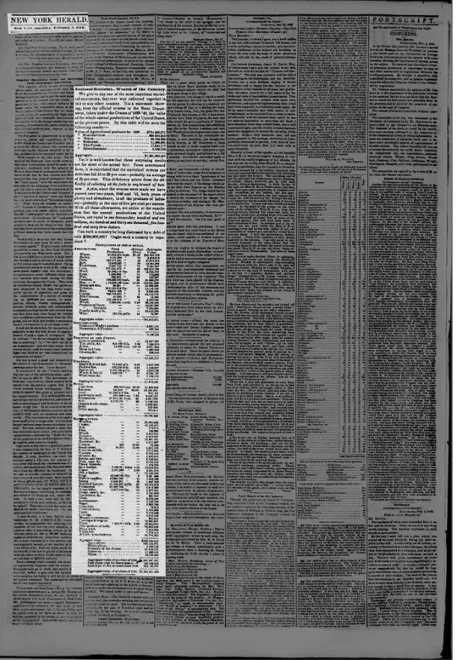
In the edition of February 5, 1842, in the section “National Statistics – Wealth of the Country”, the New York Herald showed what we consider to be one of the earliest examples of data use beyond reproduction in the United States. The newspaper presented in an exclusive and detailed way the value of the annual Gross Domestic Product (GDP) of the United States in 1839, as shown in Figure 5. It then projected the GDP of 1841 to a value 20 percent higher, adding up the annual productions of the United States to $1.6 trillion and questioning: “Can such a country be long distressed by a debt of only $200,000,000? Ought such a country to repudiate?”.14
13 New York Herald (then Morning Herald), March 5, 1838. Available at
https://chroniclingamerica.loc.gov/lccn/sn83030312/1838-03-05/ed-1/seq-1/. Accessed on February 25,
2019.
14 New York Herald, February 5, 1842. Available at
https://chroniclingamerica.loc.gov/lccn/sn83030313/1842-02-05/ed-1/seq-2/. Accessed on February 25,
Figure 5 – The highlight shows a data journalism piece published on page 2 of the New York Herald on February 5, 1842.
Klein (2016b) credits to one of Herald's competitors one of the first data visualizations printed in American newspapers history. The New York Tribune published on September 29, 1849, a line chart tracking the deaths in New York City from the cholera epidemic that summer (Figure 6). The graph begins on May 19 and runs through September 22 – a week before its publication – and is accompanied by an explanatory text of how the chart should be read. Klein points out how innovative this chart is:
Although graphical displays of data were not unheard of in scholarly and engineering books, they were
exceedingly rare in U.S. newspapers of that time. Maps became common during the U.S. Civil War in the 1860s, but in the 1840s, illustrations of any kind (let alone data visualization) were rare. I’ve spent the past few years studying the history of data visualization in news. I have seen hundreds of examples of data displays in antique newspapers. Few have struck me as much as the cholera chart has. It is rare almost to the point of anachronism. (...) The Tribune graphic is a snapshot in miniature of a standard yet to come, revealing a growing sense of awareness of the potential for well-designed information displays to help people understand and solve problems. (Klein 2016b)
Figure 6 – The highlight shows a data visualization published on the front page of the New York
While in the United States news pieces from data begin to appear with the rise of a “democratic market society” (Schudson 1981, 30), in Brazil the first examples occur still during the reign of Dom Pedro I.15
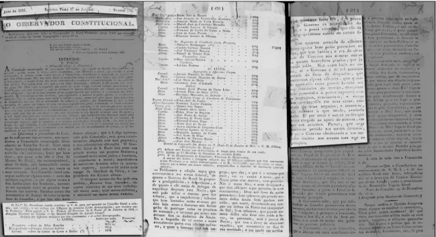
Founded in October 1829 by the Italian doctor Giovanni Battista Líbero Badaró, the Brazilian newspaper Observador Constitucional had a short life, closing three years later in 1832 (C. E. F. de Oliveira, 2009; Sodré, 1999). But in that brief period, the conservative and economically liberal newspaper fought for the freedom of the press and antagonized the president of the province of São Paulo (Cruz, 2000; Filho, 2013; Sodré, 1999). One of these confrontations took place in the edition of January 17, 1831 (Figure 7).
Figure 7 – The highlight shows a data journalism piece published on pages 1 to 3 of O Observador
Constitucional on January 17, 1831.
The paper printed a news piece with the name, position, and salary of 40 military officers who were unemployed but continued to be paid by the province of São Paulo, totaling more than 17 contos de réis. At one point the editor complained about these expenses: “We publish the above account to convince our readers of how much the Government of Brazil is prone to prodigalities and waste (…) Here is the bagatelle of 17 contos annually spent with military officers to whom the Government
has no job to give; which is the same as saying, here are 17 contos that the Nation spends without reason or need.”16,17
In Portugal, the penny press and the early newspapers that were predominantly interested in news and facts began to circulate in 1865, following the pioneer Diário de Notícias (Sousa, 2009; Tengarrinha, 2013; Traquina, 2004). One of the earliest examples of data journalism can be found in the Diário Popular. Founded by the politician and professor Mariano de Carvalho in 1866, Diário Popular was one of the most prestigious newspapers of the monarchy (P. J. Fernandes, 2011a, 2011b; Tengarrinha, 2013).
In the edition of March 9, 1868, shown in Figure 8, the newspaper dismantled the proposal of a commission that said it was possible to build popular houses whose rents would cost between $15 and $30 thousand réis. With the reproduction of a possible model of a house for workers and the list of costs of works (land, material, and professionals), it shows that the cost would not be less than $45 thousand réis. The piece ends in a tone of challenge: “Here, then, is the utopia undone. They want to build houses for rents of 15 and 30 thousand réis and a stingy budget does not allow them to get it for less than 10 pounds a year. If you can respond.”18
16 In the original: “Publicamos a relação supra para convencermos aos nossos leitores, de quanto o
Governo do Brazil he propenso a prodigalidades, e desperdicios (...) Eis a bagatella de 17 contos e tanto annualmente gastos com officiaes militares, a quem o Governo não tem emprego, que dar; o que é o mesmo que dizer, eis 17 contos e tanto, que a Nação gasta sem motivo, nem precizão.”
17 Observador Constitucional, January 17, 1831. Available at
http://memoria.bn.br/docreader/814326/261. Accessed on February 25, 2019.
18 In the original: “Aqui está pois a utopia desfeita. Querem construir casas para rendas de 15 e 30 mil
réis, e um orçamento mesquinho não lhes permitte obtel as para menos de 10 libras por anno. Se poderem, respondam.”
Figure 8 – The highlight shows a data journalism piece published on front page of Diário Popular on March 9, 1868.
Another early example of data journalism in Portugal appears in the pages of O Repórter in 1888. Then directed by historian Oliveira Martins, O Repórter focused on reportages and had a lot of projection at the end of the 19th century (Matos, 1993;
Tengarrinha, 2013). The April 21, 1888, edition featured a news piece structure that began to be frequent in the newspapers. The story shows a table with imports, exports and the Portuguese deficit between the years 1882 and 1887 (Figure 9). It described how much is spent on imports of food, clothing and furniture and how much these categories represent in total imports. The piece concluded that the growth of the Portuguese deficit in 1887 was worrisome because there were no signs that imports would fall in subsequent years. It is interesting that the article begins by protesting the lack of detailed public data on Portuguese imports, information that the paper claims
to be easily accessible in other countries: “one deficiency in our customs statistics is that we do not classify imports into the three major categories that are of most interest to a country's economy – food, industrial raw materials and factory products – as we see in English or French trade.”19
Figure 9 – The highlight shows a data journalism piece published on the front page of O Repórter on April 21, 1888.
19 In the original: “Um defeito, que teem as nossas estatisticas aduaneiras, é não classificarem as
importações nas tres grandes categorias que mais interessam a economia de um paiz – os alimentos, as materias primas industriaes e os productos fabrís – como se ve nos quadros commerciaes inglezes ou francezes.”
1.2.
Databases, statistical graphics and the “Golden Age” of data
visualization
As Klein (2016b) points out, statistical graphs were very rare in newspapers in the 1840-1850s, in part for technical reasons. The technological advances brought by the industrialization of the newspapers in the mid to late nineteenth century made the impression of maps, images and charts less laborious. This period also witnessed an outbreak of data provided by scientists, companies, state and federal bureaus, etc. (Reilly 2017; Örnebring 2010; Douglas 1999; Schudson 1981). Although databases are present in journalism from the beginning, it is in this period, with the use of documents (Anderson, 2015), the invention of the interview (Schudson, 1996), and the commitment to objectivity and facts (Schudson, 1981, 2001), that databases begin to gain some prominence in newsrooms. At the end of the 1870s, early box scores for sports arose, and more complex tables appeared with the rise of specialized business journals, such as the Wall Street Journal in 1889, and by 1896 maps with electoral information emerged on front pages (Usher, 2016). Nevertheless, it is outside the newsrooms that databases, charts, and maps develop more during this period.
In the United States, for example, Ellen Gruber Garvey (2013) imagines a prehistory of the database claiming that by isolating and recontextualizing data collected in a giant mass of clippings, the book American Slavery As It Is: Testimony of a Thousand Witnesses, published anonymously in 1839, helped to create the modern concept of information. The authors of the book, the abolitionists Theodore Dwight Weld and the Grimké sisters, gathered thousands of runaway slave advertisements on papers and firsthand testimonies of southern slaveholders to expose the tremendous brutality perpetrated against slaves in the United States (Trudeau & Morrissey, 2017). “It was the work of trimming, sifting, and aggregating the material that recreated it as a database and not just a collection of anecdotes. This work allowed for its recontextualization and analysis” (Garvey 2013: p. 96-97).
In Europe, since Graunt, statistics and databases began to be used in several countries in different areas, to calculate life insurance and war finance, imports and exports, in public finance and public health, in astronomy and physics, etc. (Hudson & Ishizu, 2017; Poovey, 2004). Only in the 19th century, however, great advancements
start to happen in the collection and display of statistics. First with the “statistical movement” in the United Kingdom, a mobilization that appears in the 1830s and the 1840s as an attempt to better understand the consequences of industrialization and to promote social reform. The Board of Trade's Statistical Department, the General Register Office, the London (later Royal) Statistical Society, the Manchester Statistical Society and 20 other provincial societies in Great Britain were created in those years and, together with private bodies, conducted surveys of health and sanitary conditions of the working classes (Cullen, 2016; O’Brien, 2011; Porter, 2011).
Some of the leaders of this movement, such as Richard Jones and Charles Babbage, explained that their methods of investigation differed from others by embracing the facts and rejecting speculation and opinions (Poovey, 2004). Although, as some scholars point out (Cullen, 2016; Hudson & Ishizu, 2017; Porter, 2011), these early statisticians often confused propaganda with facts, leaning their research to reinforce their own prejudices and opinions.
The statistical movement as a whole and the nature of data collected and classified in the nineteenth century whether by public or voluntary agencies shared a common purpose: to assist economic and social engineering and social reform. (…) In addition, the social, political and economic preoccupations of nineteenth-century bureaucrats, civil servants and reformers conditioned and controlled the nature of the information gathered and of that left out. Even the very act of quantification itself, across the many areas of social and economic data, necessarily ignored the array of meanings and connotations that attached to things measured. (…) One of the major biases of statistics gathered at this time came from the tendency amongst reformers to vindicate industrial progress by blaming social problems on other causes such as the growth of cities, alcohol consumption, the moral weakness of the poor or the evils of Anglicanism. (Hudson & Ishizu, 2017, pp. 32– 33)
Still, the statistical movement was crucial for the development of the Victorian information society. By the mid-nineteenth century the researchers started to conduct more open-ended investigations and to display the conclusions in maps and charts that enabled a better understanding of the examination and the results. The developments in graphics and visual representation in the following decades are so substantial that Michael Friendly, researcher of the history of data visualization, even calls this period the Golden Age, “with unparalleled beauty and many innovations in graphics and thematic cartography” (Friendly, 2008, p. 14).
In fact, this expansion began in the 18th century with the engineer and
economist William Playfair, who, inspired by Joseph Priestley’s timelines of historical data (Beniger & Robyn, 1978; Rosenberg, 2007), has probably become the “single most influential individual for data visualization (…) he single-handedly invented the majority of business charts still in use today such as line plots, bar graphs, pie charts, or silhouette graphs” (Tominski, Aigner, Miksch, & Schumann, 2017, p. 31). Although Playfair’s work was well ahead of its time, they virtually vanished to re-emerge only in the mid to late 19th century (Hudson & Ishizu, 2017).
Figure 10 – Reproduction of the original map made by the physician John Snow in 1854. Cholera cases are highlighted in black.
In 1854, the physician John Snow disclosed a detailed street map of cholera deaths in his Soho neighborhood of London (Figure 10). He argued that the disease was exclusively waterborne and not airborne, and his map illustrates a geographical relationship between cholera cases and the public water pump on Broad Street, the source of contamination (Koch, 2017; Sederstrom, 2018). Snow obtained much of his data from the Registrar-General’s Weekly Return that was compiled by William Farr, member of the statistical movement (Bingham, Verlander, & Cheal, 2004; Cicak & Tynan, 2015).
Another member of the statistical movement was Edwin Chadwick, who had as his disciple the nurse Florence Nightingale (Gill & Gill, 2005). In 1858, Nightingale published her rose diagram, which showed that more British soldiers died from illnesses than from battle wounds (Figure 11): “with her diagrams, Nightingale was able to capture the whole picture of the disaster, from the high mortality rate to the cause of death to the reasons for the disaster and its solution” (Brasseur, 2005, p. 180).
Figure 11 – Reproduction of “Diagram of the causes of mortality in the army in the East” made by the nurse Florence Nightingale in 1858.
Another well-known historical representation of wartime mortality was designed not by a British, but a French engineer. Charles Joseph Minard in 1869 presented a flow map that illustrated Napoleon’s deadly Russian campaign of 1812
(Figure 12). The statistician Edward Tufte acknowledges this chart as one of the best ever made: “Minard’s graphic tells a rich, coherent story with its multivariate data, far more enlightening than just a single number bouncing along over time. (...) It may well be the best statistical graphic ever drawn” (Tufte, 2001, p. 40).
Figure 12 – Reproduction of the engineer Charles Joseph Minard’s map from 1869 depicting Napoleon’s disastrous Russian campaign of 1812.
Those are some of the most iconic examples of the Golden Age’s data visualization (Friendly, 2008; Spence, 2014). They show how visualization can help communicate complex data effectively. It also shows how graphs and maps were being used quite successfully in other fields.
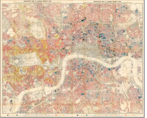
But there is at least one other map from the 19th century that was relevant to
the development of the visual representation of quantitative information, caused political debate and was much discussed in the British newspapers: Charles Booth’s Descriptive Map of London Poverty, from 1889 (Bales, 1999). Booth’s inquiry is so important that the context in which it was produced and its legacy deserve special attention.
1.3.
The legacy of early social surveys to journalism and data visualization
As stated before, in the United States since the 1830s there was an expanding interest in journalism on getting the facts, but, as Schudson put it: “in journalism, as in other fields, the idea of an empirical inquiry concerning human society did not triumph all at once. It is important to ask, in the case of journalism, not only why the
journalists’ belief in facts was so strong by the end of the nineteenth century, but why it was no stronger” (1981, 77).
Part of the answer lies in the fact that American newspapers at the time advocate that the news had to have a human interest, must be both informative and entertaining, with facts, but also lively and colorful, even if it required some elements of fiction. Therefore, some editors and reporters were less interested in facts than in increasing the paper circulation and creating popular styles of writing (Douglas 1999; Schudson 1981). By the mid-nineteenth century, Bennett’s Herald and Charles Dana’s New York Sun routinely used picturesque interviews with fictional elements, celebrity gossip, sensational headlines, and other tricks to retain readers. These techniques will be appropriated and developed some years later by Joseph Pulitzer’s New York World and William Hearst’s New York Journal. These techniques will also cross the Atlantic and succeed in Great Britain much because of W. T. Stead, editor of the London-based Pall Mall Gazette (Wiener, 2011).
In his famed series on child prostitution and trafficking in London, “The Maiden Tribute of Modern Babylon” (1885), Stead used some of the techniques he learned from American newspapers such as fictionalization and narrativization, sensational and provoking subheadings – “The Violation of Virgins”, “Strapping Girls Down”, and “Virgins Willing and Unwilling”. The articles were the high point of Stead’s journalistic career and promoted a debate that led to Parliament passing legislation raising the age for sexual consent for girls from 13 to 16 years old. At the same time, Stead was charged for “peddling pornography” and imprisoned for using illegal investigative methods (Baylen, 1972; Regard, 2014; Westwood, 2010).20
A couple of years later, in 1887, the English poet Matthew Arnold published a critique of this style of reporting that he credited to W. T. Stead and called it New Journalism.21
We have had the opportunities of observing a new journalism22 which a clever and energetic man has
20 Stead purchased a child virgin from her impoverished mother to show how easily it could be done
(Baylen, 1972; Regard, 2014).
21 Although Stead cannot be referred to as inventor of the New Journalism, he was definitely one of the