SPATIAL PATTERNS AND IRREGULARITIES OF THE ELECTORAL DATA:
GENERAL ELECTIONS IN CANADA
SPATIAL PATTERNS AND IRREGULARITIES
OF THE ELECTORAL DATA:
GENERAL ELECTIONS IN CANADA
Dissertation supervised by
PhD Jorge Mateu Mahiques,
PhD Marco Painho,
PhD Edzer Pebesma
ACKNOWLEDGEMENTS
First of all, I would like to express my gratitude and appreciation to EU
educational bodies, particularly EACEA and MSGT consortium, which made this study possible for me and many people from different countries.
I wish to acknowledge the help provided by Dr. Mateu, who initially raised my interest to statistics, being a teacher, and then kindly agreed to be my thesis
supervisor. His guidance was enthusiastic and patient at the same time, making our work a great pleasure for me. My co-supervisors from WWU and ISEGI, Dr. Pebesma and Dr. Painho, have provided valuable suggestions and additional points of view on
the problem, helping me to clarify things where necessary.
I would like to give special thanks to Dori Apanewicz who was helping us from the very first till the last days of our stay and made many things much easier than they could be for us.
SPATIAL PATTERNS AND IRREGULARITIES
OF THE ELECTORAL DATA:
GENERAL ELECTIONS IN CANADA
ABSTRACT
Democratic elections are one of the most important social phenomena of the last centuries. Countries which publish elections results on the polling station level
KEYWORDS
Electoral geography Spatial analysis
Voter turnout Party share Electoral district
Polling division Distribution Variability
Correlation
Spatial autocorrelation
Moran’s Index Local Moran’s Index
Cluster and outlier analysis Clustering
Neighborhood
INDEX OF THE TEXT
ACKNOWLEDGMENTS... 3
ABSTRACT... 4
KEYWORDS... 5
INDEX OF TABLES... 6
INDEX OF FIGURES ... 7
1 INTRODUCTION... 8
1.1 Theoretical Framework... 11
1.2 Objectives... 11
1.3 Assumptions... 12
1.4 General Methodology... 12
1.5 Dissertation Organization... 12
2 DATA DESCRIPTION... 18
2.1 How are the elections organized... 18
2.2 Election results data... 20
2.3 Geographic features... 21
2.4 Data access... 24
3 EXPLORATORY ANALYSIS... 26
3.1 Distribution and variability... 26
3.2 Correlation between voter turnout and party shares ... 38
3.3 Electoral fraud modelling: a simulation study (I)... 44
4 SPATIAL ANALYSIS... 48
4.1 Spatial autocorrelation... 48
4.2 Multivariate spatial analysis... 56
4.3 Electoral fraud modelling: a simulation study (II)... 65
CONCLUSION AND FURTHER WORK... 71
BIBLIOGRAPHIC REFERENCES... 72
Annex 1: Data structure tables... 74
INDEX OF THE TABLES
TABLES IN THE TEXT:
Table 1. Matrix of correlation coefficients for the main variables
(Canada, 2011)... 38
Table 2. Examples of Local Moran statistics for voter turnout (Canada, 2011)... 53
TABLES IN ANNEX 1: Table 1. “pollbypoll_bureauparbureau” CSV format of General elections results data... 72
Table 2. “pollresults_resultatsbureau” CSV format of General elections results data. ... 73
Table 3. Example of “pollresults” format of General elections results data... 73
Table 4. Structure of the summarized data... 74
Table 5. An example of data aggregation... 75
Table 6. The attribute structure of polling division data... 75
INDEX OF THE FIGURES
Figure 1. Modifiable Aerial Unit Problem... 14
Figure 2. Aggregation problem... 15
Figure 3. Electoral districts (Canada, 2011)... 18
Figure 4. Electoral districts and polling divisions (Canada, 2011)... 19
Figure 5. Number of voters in polling divisions of Canada... 19
Figure 6. ST_Centroid and ST_PointOnSurface functions in PostGIS... 22
Figure 7. Administrative and electoral districts (Canada, 2011)... 23
Figure 8. Urban municipalities and polling divisions (Canada, 2011)... 24
Figure 9. Number of polling division inside territory units at different aggregation levels (Canada, all years)... 26
Figure 10. Global distribution of the main variables... 27
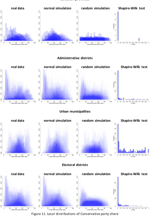
Figure 11. Local distributions of Conservative party share at main aggregation levels (Canada, 2011)... 31
Figure 12. Simple and interquartile ranges for Conservative party share at the main aggregation levels (Canada, 2011)... 33
Figure 13. Standard deviations and outliers for Conservative party share at main aggregation levels (Canada, 2011)... 34
Figure 14. 3D plots showing the amount of outliers in 2006, 2008 and 2011... 36
Figure 15. Voter turnout against party shares for all polling divisions (Canada, 2011)... 39
Figure 16. Voter turnout against Conservative party share at polling division level (entire country, Canada, 2011), combined with point clouds and convex hulls for selected Canadian provinces... 39
Figure 17. Distribution of the correlation coefficients for voter turnout and Conservative party share at main aggregation levels (Canada, 2011)... 41
Liberal party lost its chairs in 2008... 44
Figure 21. Density scatterplots for voter turnout and party shares (modelled
data)... 46 Figure 22. Density scatterplots for voter turnout and Conservative party share (modelled data)... 47
Figure 23. Correlation between summarized voter turnout and Liberal party
share (modelled data, electoral districts, Canada, 2011)... 47
Figure 24. Moran’s Index for Conservative party share (Canada, 2011)... 49 Figure 25. Distribution of Conservative party share within the electoral district (Canada, 2011)... 50 Figure 26. Percentage of significant results of Local Moran statistics for
Conservative party share (Canada, 2011). ... 53
Figure 27. Exploratory plot of Local Moran’s statistics for voter turnout
(electoral district #53022, Canada, 2011)... 54 Figure 28. Distribution of the observations among the clusters with urban and
rural indicators for different clustering algorithms (Quebec, Canada, 2011)... 56 Figure 29. Average party shares and voter turnout for polling division classes, ordered by the amount of observations (Quebec, Canada, 2011)... 57
Figure 30. Examples of polling divisions with different similarity weights... 58 Figure 31. Stacked histogram of the similar neighbors weights (Quebec,
Canada, 2011)... 59
Figure 32. Instances of class #1 in middle-South Quebec... 60 Figure 33. Instances of class #3 in Montreal (Quebec, Canada, 2011)... 60 Figure 34. Stacked histogram of the similar neighbors weights (Quebec,
Canada, 2008)... 61
Figure 35. Stacked histogram of the similar neighbors weights (complete
randomization of classes, Quebec, Canada, 2011)... 62 Figure 36. Stacked histogram of the similar neighbors weights (randomized by
electoral district, Quebec, Canada, 2011)... 63
Figure 38. Percentage of significant results of Local Moran statistics for voter
turnout (Canada, 2011)... 66 Figure 39. Exploratory plots of Local Moran statistics for voter turnout
(Canada, 2011)... 66 Figure 40. Local Moran statistics for voter turnout (electoral districts #53022,
Canada, 2011)... 67 Figure 41. Percentage of detected observations for the electoral fraud
1 INTRODUCTION
1.1 Theoretical Framework
Democratic elections are one of the most important social phenomena of the last centuries. Since voting process requires personal presence of each voter
and must be completed in a strictly limited period of time, there should be a great number of polling stations. The electoral agencies aggregate voting results from the stations to get final results, i.e. selected party standings in the Parliament. In some
countries they publish data at polling station level, while in others they present only intermediate aggregation results. In any way, these are the valuable sources of data for different groups of scientists like geographers and statisticians.
One of the main research directions in the electoral science is the contextual study. Geographers and statisticians are trying to relate a certain voting behavior to socio-economic context of the particular geographic areas. This context can be very different, from the ethnicity to the level of income. Examples include, but are not
limited to:
Impact of Negro migration on the electoral geography of Michigan (P. Lewis,
1965)
The electoral geography of recession: local economic conditions, public
perceptions and the economic vote in the 1992 British general election (Pattie et al, 1997)
Protestant support for the Nazi Party in Germany (J. O'Loughlin, 2002) The territorial variable in the analysis of electoral behavior in Spain (A. de
Nieves and M. Docampo, 2013).
characterized for their electoral support to green parties”, “deactivated rural ... is certainly one of the habitats with highest percentages of electoral support to right-wing parties” (A. de Nieves and M. Docampo, 2013) and so on.
Moreover, the local context has a synergetic effect because the local majority affects the local minority: “people tend to vote in a certain direction based upon the relational effects of the people living in the neighborhood” (Cox, 1969). To
describe this phenomenon, K. Cox introduced the term “neighborhood effect”. His approach was actively developed by a group of British researchers, mainly R.
Johnson, C. Pattie and W. Miller. Their findings “provided a very strong circumstantial evidence of neighborhood effects, local polarization produced
through social interaction in which the area’s majority political opinions is
accentuated through processes of ‘conversion through conversation’” (Johnson et al, 2000).
Going further, we could expect that neighborhoods tend to share similarity between each other. As so-called Waldo Tobler's first law of geography says,
“everything is related to everything else, but near things are more related than
distant things” (Tobler, 1970). This concept was developed for socio-economic data by L. Anselin in “Spatial Econometrics: Methods and models” (Anselin, 1988). We could expect that if the independent socio-economic variables are spatially determined, dependent variables like voting behavior could inherit such kind of distribution. Also, some people move between the neighborhoods, so the process
of ‘conversion through conversation’ could work not only internally but externally as well. It raises a relevant question about the spatial determinance of the voting behavior.
Besides completely theoretical conclusions, research of the spatial
determinance of the voting behavior could give a new insight about the electoral fraud detection. All of the existing methods are based on the assumption that i f the electoral data is manipulated, statistical analysis might reflect the interference by
Scacco, 2008) refer to the stability in distribution of the digits in real datasets . If the
distribution is different, it is the evidence of manipulation. These methods are not very sensitive, and they were proven as non-effective for the electoral data by Deckert, Myagkov and Ordeshook: “Deviations from either the first or second digit version of that law [Benford’s Law] can arise regardless of whether an election is free and fair. In fact, fraud can move data in the direction of satisfying that law and thereby occasion wholly erroneous conclusions.” (Deckert et al, 2009). Another method, a more important one, is voter turnout and party share regression
(Myagkov et al, 2009, Mebane and Kalinin, 2009, Klimek et al, 2012, Sonin, 2012). Researchers state that there is no or a very week correlation between the voter turnout and the winner party share in old democracies where the elections are
considered being fair, while in developing democracies like Russia and Uganda such correlation can be observed clearly. Summarizing, we have to stress that none of the abovementioned methods deal with geographic data.
Nevertheless, we could find some papers dealing with the geographical
context of the electoral fraud. We could mention the work Skye S. Christensen, who tried to explain the level of fraud in Afghanistan, Kazakhstan and Sierra-Leone by linking the modeled levels of the electoral fraud with population density, natural
resources distribution and security events (Christensen, 2011). Although some valuable conclusions were made, the analysis was done on a very large scale (second-order administrative division) and it could not provide a detailed picture.
Another remarkable paper dedicated to detecting the electoral fraud was written by J. Chen. He analyzed the distribution of the financial aid after 2004 Florida hurricane by Bush administration and its impact on the changes in turnout and vote shares on the electoral district level (Chen, 2008). Finally, he stated that Bush administration
had concentrated the aid on core Republican districts, increasing the voter turnout and the Republican share, and claimed that votes were bought by using public funds. Anyway, the mentioned studies are contextual (i.e. population vs. fraud, aid
spatial regularity in the voting patterns, spatial irregularities could point on the
fraud.
Working on geographical analysis of the electoral data, we have to consider one of the fundamental problems of spatial statistics: so-called Modifiable Areal Unit Problem (MAUP). Per ESRI GIS dictionary, it is “a challenge that occurs during the spatial analysis of aggregated data in which the results differ when the same analysis is applied to the same data, but different aggregation schemes are used. For example, analysis using data aggregated by county will differ from analysis using
data aggregated by census tract.” This issue was described by S. Openshaw, 1983,
who stated that “the areal units (zonal objects) used in many geographical studies are arbitrary, modifiable, and subject to the whims and fancies of whoever is doing,
or did, the aggregating.” An example of such statistical bias can be seen on Figure 1 below. It is clear that grouping of the observations in different ways can give absolutely different results:
Figure 1. Modifiable Aerial Unit Problem.
Of course, given a set of polling divisions we can do nothing to change the division schema, but this is a problem not only in case of transforming the point data to the
Figure 2. Aggregation problem.
When we group all the demonstrated observations into a single group there is a
strong correlation pattern, but when we break them into two groups the result changes dramatically. Most of the researchers analyze the elections results at the level of the entire country or at the first level of administrative divisions (i.e.
Canadian provinces). Meanwhile, aggregation of the data at the level of the administrative districts or cities could give unexpected results. Thus, we strongly believe all methods that are related to geographic data have to be tested at
different aggregation levels.
1.2 Objectives
While the old democracies have made a substantial progress in developing
free, fair and transparent election process which results are considered to be legitimate in most cases, the electoral outcomes in some of the young democracies are often quite questionable. For establishing any method of the electoral fraud
detection, countries from the first category should be compared with ones from the second. We suggest that the initial step in this direction is to analyze the first category. Canada is a good example of such country, and we can easily access all the
necessary data on polling division level (both tabular and geographic). This is why Canada is selected as the study area.
1.3 Assumptions
There is a set of assumptions regarding different parts of the research: Elections results are spatially determined;
Electoral data has certain statistical and spatial characteristics , deviations
from which would let the researcher expect the data manipulation;
1.4 General Methodology
Taking into account the pursued goal, we decided to use the following
methods:
Estimate the variability and distribution of the main variables by getting
ranges, interquartile ranges, etc. and building plots and histograms,
Evaluate the bivariate distribution of the voter turnout and party shares by
building density scatterplots, convex hulls, etc.;
Explore correlation between the voter turnout and party shares by getting
correlation coefficients;
Define spatial autocorrelation for the main variables by calculating Moran’s Index;
Perform cluster and outlier analysis by calculating Local Moran’s Index for the main variables;
Work on multivariate analysis of the data by using hierarchical clustering
algorithms and estimating spatial distribution of the classes;
Perform simulation studies to model the electoral fraud and repeat the
abovementioned methods to estimate how the interference is reflected in the results.
1.5 Dissertation Organization
real-life situation of the electoral fraud and discussed how the exploratory analysis
reveals the data manipulation. The fourth chapter is related to the spatial analysis. It is dealing with spatial autocorrelation and multivariate spatial analysis , and also ends with a simulation study. There is one annex which contains an example of a function written in R. Complete set of code and graphs set can be found in a digital
2 DATA DESCRIPTION
2.1 How are the elections organized
Since the electoral data describes a real-world process of elections, before making any research it is necessary to understand how are the elections organized.
Representation in the Canadian House of Commons is based on electoral districts, also known as constituencies or ridings (“electoral districts” further). Each electoral district elects one member to the House of Commons, and the number of
electoral districts is established through a formula set out in the Constitution. Their boundaries are designed in a way that they contain similar amounts of people. This
is done to represent of people’s political preferences in the government in an equal
way.
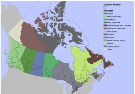
In 2011, there were 308 electoral districts in Canada. Their boundaries can be seen of Figure 3, within Canadian provinces:
Figure 3. Electoral districts (Canada, 2011).
Some of the provinces, like Northwest Territories, include just one electoral district due to their low population, while heavily inhabited provinces, like Quebec, contain many of them. Each electoral district is divided into a set of polling divisions, again in accordance with the amount of population. Polling divisions can be seen on
Figure 4. Electoral districts and polling divisions (Canada, 2011).
Each polling division has a certain number of citizens that live within its area and are eligible to vote, being older than 18. In most cases, this number is between 200 and 600:
2006 2008 2011
Figure 5. Number of voters in polling divisions of Canada.
In Canada, there is no obligatory participation in any kind of elections, so
some of these people participate and some do not. Thus, the number of possible and actual voters on each station is different. Ratio between these two numbers is called voter turnout and is represented as a percentage between 0 (no actual electors) and 100 (when everybody participated). Each electoral district has its own set of candidates. People vote for different candidates which are associated with their political parties. About 20 parties have participated in General elections in 2010. Among these parties, there are three main parties: Conservative, New
Also there is one strong regional party: Bloc Québécois, which is represented in
French-speaking province Quebec. All the rest parties are minor parties represented in a small number of federal districts, except Green Party which had 304 candidates but was elected only in one electoral district.
The winning candidate has more votes within the electoral district than any
other candidate. This is called “first-past-the-post” election, or “winner-takes-all”,
or “simple plurality”. Party who gained majority of the chairs in the Parliament is
called “Government”, the second is the “Official Opposition”, and there are “Third”, “Fourth” and “Fifth” parties. The Government was formed by Conservatives from 2006 to 2011, while Liberal party was the Official opposition in 2006 and 2008, replaced by New Democratic party in 2011. In that year, Liberal party became the
third party, replacing Bloc Quebecois which was there in 2006 and 2008.
2.2 Elections results data
Elections Canada is an organization responsible for conducting the federal elections. All data related to elections is available on their website. Election results are published for each polling division since 2000. At the same time, the
representation format was changed throughout the years. For example, in 2004 we can find only the vote count for each candidate called by name (without related political party), which makes the analysis of party support impossible. This format is
called "pollbypoll", and its structure is described in Table 1 (Annex 1). Since 2006, Elections Canada published CSV files with political affiliation of candidates included. The new format is called "pollresults". Its structure is described in Table 2 (Annex 2). Since 2006, data is published as two sets of CSV files, one per each electoral district
in both formats. It was decided to use only “pollresults” tables because they contain all the necessary information. Tables for each election were created in PostgreSQL database, and a Python script was written to generate valid SQL scripts for data
import. The script retrieved all file names in the folder and pasted them into COPY statements. All the data was imported to text columns. This is a default setting in PostgreSQL to avoid misinterpretations and errors during the import, importing
The next step was to get data into a format appropriate for the analysis and
visualization. Only 5 parties won at least in 1 electoral district, so it was decided to summarize the data only for these parties, showing the total result of the rest parties in a single column. The structure of the summarized data can be found in Table 4 (Annex 1). The obtained structure described is more understandable and
more suitable for the analysis, since the vote count is assigned to political parties and not to the individual politicians which are different for each electoral district. It contains both absolute (vote count) and relative (percentage) values. This table is
the final attribute table holding the election results which will be used for the future analysis.
2.3 Geographic features
Geographic locations of the polling stations and/or polling divisions are necessary to perform spatial analysis of the electoral data. Since we have the necessary electoral data for 2006, 2008 and 2011 elections, we have to get related
geographic information for these years. Electoral district and polling division boundaries for General Elections are available for downloading at the website of Elections Canada. They are represented by polygon datasets in common geospatial
formats. The attribute structure of polling division data is described in Table 6 of Annex 1.
Since the electoral district number is assigned to each polling division, there
is no need to operate with electoral district geometries during the analysis. We already have the necessary identifier in the table. Electoral district geometries will be used just for mapping purposes. For analysis, only polling division geometries will be used.
In addition, there are datasets containing point locations of mobile polling stations and single-building electoral divisions like hospitals, etc.
All the described shapefiles for 2006, 2008 and 2011 elections were
“country code”_”year”.”dataset abbreviation”. Thus, the tables were named like this: “ca_2011.ed” (electoral districts), “ca_2011.pd” (polling divisions) and
“ca_2011.ps” (polling stations). Each combination of the country code and the year represents a database schema in this case. This is done for convenience, avoiding confusingly large number of tables in a single database schema.
In the electoral districts dataset, some districts were represented by several polygons, and these polygons were joined by SQL script. To enable the analysis which requires point geometries instead of polygonal, we derived point geometries
from polygons and placed them in separate column. For doing this, we utilized PostGIS function ST_Pointonsurface instead of ST_Centroid, since it creates point that lies inside polygon even if it has a concave shape (see Figure ):
ST_Centroid ST_Pointonsurface
Figure 6. ST_Centroid and ST_PointOnSurface functions in PostGIS.
One of the concerns about the electoral districts is that their boundaries might not match the administrative ones. If not, it can be useful to perform the analysis in administrative division context as well. To do this, we should find the relationship between electoral and administrative division of Canada. So, what is the administrative structure of Canada?
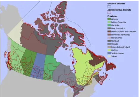
The second level of Canadian administrative division is administrative district
level. There are 293 administrative districts in Canada. This number is quite close to the number of the electoral districts (308). When overlaid, electoral district boundaries look quite arbitrary (see Figure 4 below). The administrative boundaries are likely to be less artificial than electoral boundaries because the first ones take
into account the historical and geographic differences, while the second ones are designed to contain approximately the same amount of population. This is why the electoral behavior analysis in the administrative context could give us different
results.
Figure 7. Administrative and electoral districts (Canada, 2011).
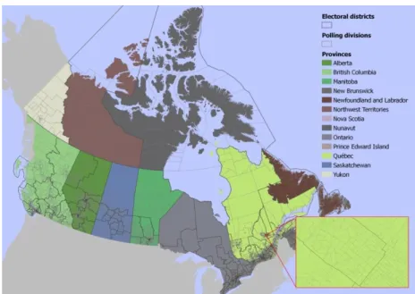
The third level is the municipal level. At this level, there are 5589 territory units. Municipal division is again quite different from electoral division, as can be seen on Figure 5. Municipalities vary in population greatly, the urban ones contain
much more polling divisions than the rural ones . For example, on the insert in Figure 5 you can see municipality of Saskatoon city which partly intersects with 4 federal districts: #47002, #47009, #47010 and #47011 (thicker grey boundaries) and contains 411 polling divisions (thin light grey boundaries). Aggregation the polling
Figure 8. Urban municipalities and polling divisions (Canada, 2011).
We related polling divisions to each of the administrative units and stored these relations in a table for improving performance of spatial operations (it is faster to get precalculated relationships than performing spatial joins each time). The structure of the table is described in Table 7 (Annex 1).
2.4 Data access
Since we have very similar datasets for several years of elections and keep the geographic relationships in a single table, the code to query this data will look the same for all cases, with a couple of parameters. In this case, an efficient solution is a stored procedure (in PostgreSQL terminology they are called functions). The created functions will take the following parameters:
level (integer) – specifies the aggregation level (see in the Table above) unit (varchar(150), default null) – territory unit filter. If not specified, returns all observations within the aggregation level
For example, getting all observations for Ontario province in 2011 is as easy as executing this line of code:
select * from ca_2011.getdata(1,"Ontario");
Another stored procedure was created to get the same data as the previous one does, and polling division geometries in addition:
select * from ca_2011.getgeodata(1,"Ontario");
This is very important because managing the SQL code in stored procedures
Short summary of the data description looks like this:
The main investigated variables are:
o Voter turnout
o Conservative party share
o Liberal party share
o New Democratic party share
o Bloc Quebecois share (only for Quebec province);
Each polling division is an observation consisting of ID and a vector of
variables;
Each electoral district and Canadian province, administrative district, city
and neighborhood is a territory unit;
A set of territory units is an aggregation level. If we analyze the distribution
of some variable at province level, it means that we describe this distribution for 13 sets of observations (1 for each province).
All data is imported to a PostgreSQL database and the access to this data is
3 EXPLORATORY ANALYSIS
Investigating patterns and irregularities, it is very important to start by doing the exploratory analysis. The character of distribution and variability of the
main variables is a key information in this case. A set of exploratory procedures should be done at all aggregation levels. First we are going to estimate global
distribution of the variables (then the population is the entire country’s data). Then,
we will look closer to the local distributions (distributions for different territories smaller than the country). The next thing to look at will be the ranges and standard deviations for our variables at different aggregation levels, and in the last subchapter we will work on correlation analysis.
3.1 Distribution and variability
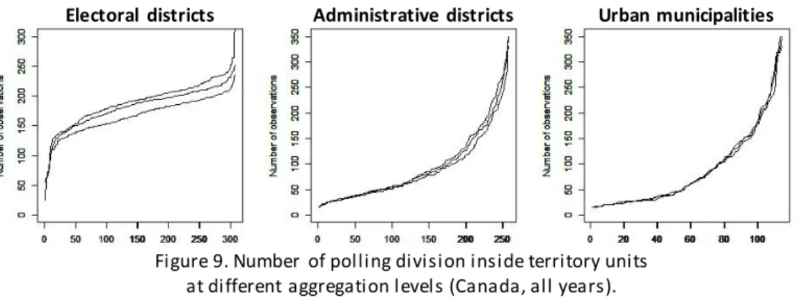
Starting with distribution, it is important to understand how many observations does each territory unit contain. These amounts can be very different:
Electoral districts Administrative districts Urban municipalities
Figure 9. Number of polling division inside territory units at different aggregation levels (Canada, all years).
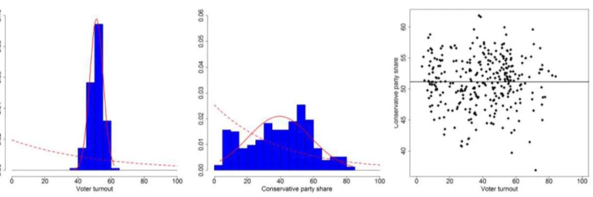
Distribution of the main variables for the entire Canada (except Bloc
Quebecois which participated only in Quebec) can be observed on the histogram matrix on Figure 10. Solid red line is the normal distribution curve, while dashed red line reflects the modelled exponential distribution curve.
Voter turnout
2006 2008 2011
Conservative party share
2006 2008 2011
Liberal party share
New Democratic party share
2006 2008 2011
Bloc Quebecois share (only for Quebec province)
2006 2008 2011
Figure 10. Global distribution of the main variables.
These histograms let us draw the following conclusions:
Voter turnout demonstrates very evident normal distribution with most
observations between 40 and 70% for all three years (a bit higher in 2006 but still
close to 2008 and 2011). It means that the level of participation in parliamentary elections seems to be stable, regardless of changes in people’s political preferences; There are no polling divisions with zero participation, i.e. having turnout
value equal to 0%; and there is only a tiny fraction with complete participation,
having turnout value >90%;
2011 was the most successful year for Conservative party. Its share had
distribution close to normal in 2006 and since then it started to change its nature to bimodal with the main peak at 40-60%. Still, without a peak at lower values the
distribution looks close to a normal one;
Liberal party support was slowly decreasing from 2006 to 2011, and the
New Democratic party (NDP) share has changed its distribution from
exponential to having a plain top between 20 and 50%. Indeed, 2011 elections were
the most successful for NDP, they became an Official Opposition in that year;
Bloc Quebecois had a strong support in Quebec in 2006 and 2008, but in
2011 their support has decreased dramatically (probably, in favor to NDP). At the same time, the distribution was close to normal in all years;
Parties with weaker support tend to have exponential distribution, while
parties with stronger support usually demonstrate distribution close to normal. All the variables demonstrate the stability of change, gradually moving
towards a one direction through time (3 years might not enough to make such
conclusions).
Though we have made a set of important conclusions, these histograms provide just a general picture of voting patterns. They indicate the “global” distribution for the entire country, while there are many local distributions in different geographic regions that can be very different from each other. As a rough example, a bipolar “global” distribution can be a result of two normal local distributions. So, we have to analyze the local patterns.
To estimate local distributions, we need to compute the number of samples, min, max, range, mean and standard deviation for each variable in each territory unit at all aggregation levels. If we presented each local distribution on a separate
histogram, it would be hard to compare them, since we will have hundreds of them. Instead, we decided to create the representation which would have all local distributions as semitransparent histograms drawn on the same canvas . Each
vector in the basis of these values. To simulate random distribution, we created
random vectors for each unit, taking the number of samples and the minimum and maximum value of the variable. Also, we have added a histogram of p-values from Shapiro-Wilk test for each territory unit (the right column). When p-value is less than 0.05 it means that with 95% chance the distribution is normal.
The procedure described above was done for each of the main variables at the level of provinces, administrative districts, urban municipalities and electoral districts for each year. An example of Conservative party share in 2011 can be seen
Canadian provinces
real data normal simulation random simulation Shapiro-Wilk test
Administrative districts
real data normal simulation random simulation Shapiro-Wilk test
Urban municipalities
real data normal simulation random simulation Shapiro-Wilk test
Electoral districts
real data normal simulation random simulation Shapiro-Wilk test
The graphs tell us the following:
Regardless of how does the global distribution look (normal, exponential,
bimodal, etc.) and regardless of how does it change through time, local distribution histograms for real data look very similar to normal simulation histograms. On the contrary, random simulation looks different;
Shapiro-Wilk tests confirm normality of most of the local distributions, but at
the same time there are many p-values higher than 0.05. For example, for Conservative party in 2011 they are 100 out of 306. At urban municipality level it is even more (86 out of 128), and this is related to more complicated political
landscape in the cities;
There is no difference in the normality of distribution for all variables. Voter
turnout and any of the party shares have the same pattern of distribution: around 2/3 of the local distributions is normal and 1/3 is not normal, and vise versa for
urban municipalities;
Higher p-values for different variables are usually represented in different
territory units, i.e. there is a very small number of units which have p-values >0.05 for all variables.
Conclusions confirm the assumption that the analysis of local patterns can give a lot of additional information to the global distribution analysis.
The next step is to analyze variability of the main variables at different
aggregation levels. The most basic indicator of variability is the range which the difference between maximum and minimum values. Interquartile range (IQR), which is the range between the upper and lower quartiles (50% of values which lie
Administrative districts
Urban municipalities
Electoral districts
a) b) c) d)
Figure 12. Simple and interquartile ranges for Conservative party share at main aggregation levels (Canada, 2011).
We decided to build graphs only for these aggregation levels since at province level
variability is too high and not meaningful. From the entire set of graphs for all years, the observations are the following:
Natural variability of the main variables is higher than expected. Units with
simple range <10% and IQR <5% for any variable are extremely rare;
For three aggregations levels, histograms look differently. There is a very
weak or no correlation between variability indicators and the number of observations for administrative and electoral districts, while for urban municipalities it is very strong. Polling divisions belonging to heavily populated
social and economic contrast than the small ones . So, it was decided to exclude
urban municipalities from the variability analysis . Large cities could be analyzed as the sets of neighborhoods, which is out of scope of this work;
Voter turnout range varies from 20 to 80%, with peak at 35-50%, and its IQR
varies from 5 to 15% (with is a couple of exceptions).
Simple range for all parties can be very different, from 20 to 80%, while IQR
mostly falls into the interval between 5 and 15% (generally, between 0 and 20%), with a couple of exceptions. It means that the electoral districts include the groups of polling divisions sharing the same behavior. These groups were not revealed by
the simple range, while IQR helps to indicate them;
Variability indicators of Conservative party and especially New Democratic
party share increase from 2006 to 2011, with the overall growth of these parties’ support. On the other hand, variability of Liberal party share decreases from 2006
to 2011, while its share had been decreasing. This tendency is reflected especially in IQR histograms. Probably, the larger is the overall party share, the larger the variability.
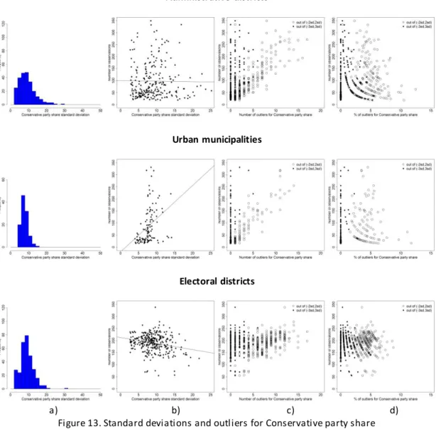
The next step is to calculate standard deviations. Standard deviation (SD) of the variable is an average difference between its values and its observed mean. It helps to measure the level of dispersion of the variable. Higher is the standard devotion, more dispersed the values are. SD also helps to find the outliers. These are the values which lie outside the symmetric intervals 2*SD,2*SD) and (-3*SD,3*SD) from the mean. Finally, we produced the graph matrix with 4 columns:
a) SD distribution;
b) scatterplot of SD and the number of observations;
c) scatterplot of the number of outliers and the number of observations (empty circles for (-2*SD,2*SD) and solid rhombi for (-3*SD,3*SD));
Again, this is done for the administrative districts, urban municipalities and electoral
districts. The described graph matrix for Conservative party s hare in 2011 is shown on Figure 13below:
Administrative districts
Urban municipalities
Electoral districts
a) b) c) d)
Figure 13. Standard deviations and outliers for Conservative party share at main aggregation levels (Canada, 2011).
Other graphs can be seen in Appendix 2. From what we can see on the obtained graphs, we can tell the following:
Standard deviations of voter turnout are stable throughout the years and
they are generally smaller than for party shares , almost all of them are between 6 and 10;
Standard deviation of the party shares depends the overall party share, the
Correlation between standard deviation and the number of observations is
the same as for range statistics, so we exclude urban municipalities from the
analysis;
For party shares, the amount of the outliers is the largest in the electoral
districts, varying from 5 to 15 for an interval (-2*SD,+2*SD) and less than 5, mostly 0, for an interval (-3*SD,+3*SD);
There in an exponential dependency between the percentage of outliers and
the number of observations. It means that when the number of observations increases, the amount of outliers remains stable.
Also if we have 3 years we could plot the percentage of outliers on a 3D
scatterplot, where each axis stands for a year of elections. Thus, if the amount of outliers is stable for each territory unit, the point cloud will be oriented diagonally, from the coordinate zero point towards the maximum values. On Figure 14 below,
there are such cubes for each of the main variables:
Voter turnout Conservative Liberal New Democratic
Figure 14. 3D plots showing the amount of outliers in 2006, 2008 and 2011.
Voter turnout and Conservative party share clouds are oriented as described above, while Liberal and New Democratic party clouds have more spherical nature. Still, they are located around the diagonal.
After all, the most important conclusions are:
Voter turnout has a very strong normal pattern in global distribution and
mostly in the local distribution;
Winning and losing parties have their own characters of distribution and
likely to be exponential, and variability is lower. There are intermediate stages of
transition between these two conditions;
Ranges and standard deviations in the electoral districts have their own
3.2 Correlation between voter turnout and party shares
One of the key points of the exploratory analysis is the regression analysis. As discussed in the Theoretical background chapter, some authors state that high correlation between the voter turnout and the winning party share points to the
electoral fraud (Myagkov et al, 2009, Mebane and Kalinin, 2009, Klimek et al, 2012, Sonin, 2012). In most cases, they investigate this correlation working only with the entire country without breaking the data into subsets for different geographic
regions.
The first step to do for an overview is to build a correlation coefficient matrix
for the entire dataset. It is shown below:
Voter turnout Conservative Liberal New Democratic
Voter turnout 1.00000000 0.07187695 -0.02489927 -0.1067010
Conservative 0.07187695 1.00000000 -0.22397221 -0.7158480
Liberal -0.02489927 -0.22397221 1.00000000 -0.3356734
New Democratic -0.10670100 -0.71584805 -0.33567338 1.0000000
Table 1. Matrix of correlation coefficients for the main variables (Canada, 2011).
It is obvious that correlation between different party shares is negative because these are the percentages from the entire amount of voters. The more votes one party gets, the less votes are left for the others. The brightest example is -0.7 between Conservative and New Democratic parties. This is somewhat natural, and in fact, the only relationship that is less natural is the relationship between voter turnout and party shares. It deserves a special investigation.
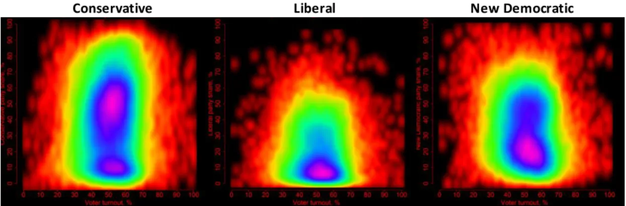
At the entire country level (without any aggregation) it is better to build a density scatterplot because there are too many observations for a typical scatterplot. We have created such scatterplots for the main parties, and in most cases they demonstrate the smooth bivariate distribution with a single hot spot in
Conservative Liberal New Democratic
Figure 15. Voter turnout against party shares for all polling divisions (Canada, 2011).
Klimek et al state that a smaller area at the bottom stands for French Canada (Quebec province) and a larger area on top is for English Canada (all the rest Canadian provinces and territories). This assumption was checked by looking at
province-level results which are published as well: “Looking at their results by province, they [Conservatives] tallied 16.5% of votes cast in Quebec but more than
40% of votes cast in 8 of the remaining 12 other provinces.” (Klimek et al, 2011). This can be enough but since we have defined the relationship between the provinces and polling divisions, we could visualize this on the same scatterplot. To do this, we are plotting semi-transparent white points above the existing graph for the selected provinces: Ontario (the largest English-speaking province) and Quebec:
Ontario Quebec
Figure 16. Voter turnout against Conservative party share at polling division level (entire country, Canada, 2011), combined with point clouds and convex hulls
The plots above confirm the given statement. We can see that the areas of
higher concentration of white points are located on respective hot spots of the density scatterplot. At the same time, they give more information: we can observe that even though the points are highly concentrated, there are the outliers which are very different from the main pattern. Convex hull shows the character of the
local bivariate variance and how does it match with the global bivariate variance. This is a very important outcome because if we are looking for data irregularities to detect fraud, we should take the presence of such outliers into account. In Annex II, the remaining scatterplots can be found.
Using the same method, we could build the graph for any geog raphic unit, whether it is an urban municipality or an electoral district. Of course, it is hard to
give estimation of each graph (i.e. 308 graphs for the electoral districts). Instead, we did the following:
get correlation coefficient for each geographic unit and draw a histogram
with their distribution, along with the plot for correlation coefficient and the
number of observations;
calculate the area of the convex hull for each territory unit and divide it by
the area of the convex hull for the entire dataset. If the ratio is closer to one, the variability of voter turnout and selected party share combinations is close to that
for the entire country. On the other hand, values closer to zero mean similar behavior within the unit.
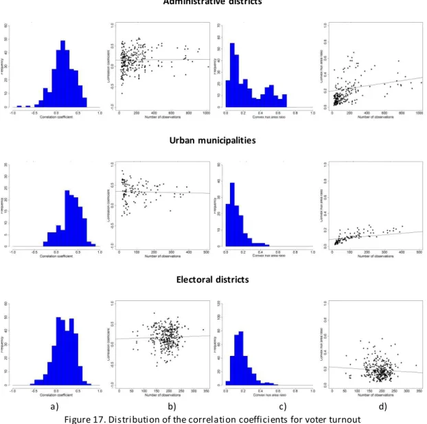
Correlation coefficients for Conservative party share and voter turnout in
2011 look like shown below:
a) distribution of local correlation coefficients;
b) scatterplot of correlations coefficient and the number of observations; c) distribution of convex hull area ratios;
Administrative districts
Urban municipalities
Electoral districts
a) b) c) d)
Figure 17. Distribution of the correlation coefficients for voter turnout and Conservative party share at main aggregation levels (Canada, 2011).
The remaining graphs are available in a digital annex. From all graphs, the outcomes are stated below:
Though the global correlation coefficient might be very small, there can be
large local coefficients. For example, the global coefficient for Conservative party share in 2011 is 0.07, while the local values for the electoral districts can go above 0.5;
Correlation coefficients distribution changes between years but still each
party has its own main range where most of the coefficients fall into: o Conservative party: -0.1 – 0.5,
o New Democratic party: -0.5 – 0.2;
Unlike variability indices, correlation coefficients for turnout and party
shares do not follow the overall party success or failure in time;
As opposed to variability indices, there is no relationship between the
correlation coefficients and the number of observations at any aggregation level. Least-squares equation lines on all graphs are mostly horizontal;
Relationship between the convex hull area ratios and the number of
observations is very weak. It means that variability of voter turnout and party shares does not depend of territory population. For example, New Brunswick province demonstrates the most similar results within itself, while Saskatchewan
province, having the same population, has much higher variability;
For the electoral districts, convex hull area ratio higher than 0.4 is extremely
rare. This means that each electoral district has its own set of combinations of voter
turnout and party shares but this set is always not as full as the entire country’s set;
We can see that convex hull area ratios follow the global party share. Better
is the result of the elections for a party, more dispersed is the behavior within the territory unit, and vice versa.
Everything we did before was done on the aggregated data, i.e. polling divisions data grouped into subsets according to some geographies. The result was a set of indicators, like correlation coefficients, etc. At the same time, it is necessary to summarize data variables within to the same geographies, i.e. have 1 value for each territory unit. For instance, by dividing the total amount of participating voters by the total amount of possible electors for each unit we get the summarized voter turnouts. Doing the same with party shares, we can estimate their regression. An example of such summarization for Conservative party share at the electoral district level in 2011 can be seen below:
a) distribution of summarized voter turnout values;
Figure 18. Correlation between summarized voter turnout and Conservative party share (electoral districts, Canada, 2011).
We can see that summarized data does not demonstrate any correlation patterns in any years for any variables.
As a conclusion, we can confirm that there is no expressed relationship between voter turnout and party shares. Though we observed local correlation in some of the territory units, the strongest pattern is the independence between the specified variables. Another important outcome is that the electoral districts are the best aggregation level for the study because they contain similar number of observations. When the number of observations is very different, i.e. there are very small and very big cities, it leads to a statistical bias in the analysis. Thus, using the
3.3 Electoral fraud modelling: a simulation study (I)
Doing the exploratory analysis, we have found a set of patterns. Our conclusions are valuable only if the detected patterns help to find out when the data is manipulated. The easiest way to check this is to model some data. In our
case, we could change some of the results, for example by imitating the ballot stuffing. According to Uslegal.com dictionary, “Ballot stuffing is a type of electoral fraud whereby a person permitted only one vote submits multiple ballots.”. Ballot stuffing elevates the share of some party, as well as the voter turnout. The first value increases because all stuffed ballots contain votes for a single party in favor to which the ballot stuffing is committed, and the second one grows since each ballot
(even the stuffed one) is accounted as an actual voter.
There can be several scenarios to model. For example, if Liberal party support had been decreasing from 2006 to 2011, we can model ballot stuffing process for 2011 on the basis of 2008 results. For modelling, we selected 6099 out
of 73862 polling divisions which belong to the electoral districts where Liberal party was elected in 2006, but was not elected in 2008, i.e. lost the chairs. This is around 8.25% from the total amount, so it can be a good number for performing the
simulation. In these polling divisions, voter turnout has the normal distribution, as usual:
a) b)
Figure 19. Voter turnout (a) and empty ballot count (b) in polling divisions where Liberal party lost its chairs in 2008.
Turnout values mainly fall into the range between 40 and 60, and the amount of
ballot stuffing techniques without the risk of overstuffing, when the turnout comes
close to 100%. Also, we selected only those polling districts where the number of empty ballots is more than 50 to avoid too clear evidence of stuffing. The number of stuffed ballots was calculated as a random number between 50 and 75% of the empty ballot count in 2008. To clarify the process, we provided is step-by-step
example:
a given polling division has 300 electors and 200 voters in 2008, i.e. turnout
66.6% and the number of empty ballots is 100;
between 50 and 75% (in this case, 60) extra ballots having Liberal party vote
are going to be used in ballot stuffing in 2011;
in 2011, the given polling district has 310 electors (its population has slightly
increased) and 220 voters participate (a bit more than in the last year), i.e. real turnout is 71% and a real number of empty ballots is equal to 90;
60 ballots are stuffed in the ballot box, making the turnout increase to
(220+60)/310=90%;
Real share of Liberal party was 50 votes, or 22%, while after ballot stuffing it
grew to 50+60=110, or (50+60)/(220+60)=39%.
2006 – real 2008 – real 2011 – real 2011 – modelled
Figure 20. Distribution of voter turnout for real and modelled data.
Local distributions of party shares did not reveal a significant change, the same for variability indices, ranges and standard deviations which changed just slightly.
Another visible change can be noticed in density scatterplots of voter turnout and party shares where the new hot spots appeared (highlighted by white circles on Figure ):
Conservative Liberal New Democratic
Figure 21. Density scatterplots for voter turnout and party shares (modelled data).
Anomalous hot spots tell that there are many polling divisions where bivariate distribution of voter turnout and party share deviates from the general pattern. It is also clear that these anomalies are in favor to Liberal party because its hot spot is
individual plots and convex hulls, we can not distinguish regions with predominant
concentration of points around any of the new hot spots:
Ontario Quebec
Figure 22. Density scatterplots for voter turnout and Conservative party share (modelled data).
Summarized values indicate the interference as well. On the histogram of summarized voter turnout distribution (Figure on the left) we can see the same artificial spike, while the exponential dis tribution of party share (in the middle) is
broken. On the scatterplot we can see that values breaking the real data patterns belong to the same observations, as indicated by the outlying group.
Figure 23. Correlation between summarized voter turnout and Liberal party share (modelled data, electoral districts, Canada, 2011).
4 SPATIAL ANALYSIS
4.1 Spatial autocorrelation.
This subchapter is dedicated to discussion about the level of spatial autocorrelation of the electoral data. This is a critical point of the work because confirmed spatial autocorrelation is an evidence of data’s geographic determinance. In the previous chapter we have found that there are some groups sharing the similar behavior in many territorial units. The next step of the analysis is to understand whether polling divisions belonging to these groups are geographically dispersed or they are located close to each other, forming groups, or clusters. As specified at the beginning of the work, we expect them to form groups. When
observations with similar values form groups in space, and observations with different values tend to be faraway from each other, we observe spatial autocorrelation. There is a set of mathematical indices designed to measure the level of spatial autocorrelation, and Moran’s Index is one o f them. It is defined as:
(1)
where N is the number of spatial units indexed by i and j; X is the variable of interest; X is the mean of X; and ωijis an element of a matrix of spatial weights. The index varies from -1 (perfect dispersion) to 1 (perfect autocorrelation). Random distribution is indicated by Morans’s I equal to 0.
Distribution of Moran’s indices for the electoral districts is given in a graph matrix with the following structure:
a) histogram of Moran’s index values for territory units;
b) scatterplot of Moran’s index values against the number of observations; c) scatterplot of Moran’s index values against the interquartile ranges of
Administrative districts
Urban municipalities
Electoral districts
a) b) c)
Figure 24. Moran’s Index for Conservative party share (Canada, 2011).
As always, the remaining graphs are available in digital annex. The summary is given below:
Histograms of Moran’s I values for each variable only slightly change between years, demonstrating stability of geographic distribution;
Among the aggregation levels, the highest values are observed for the
contain several electoral districts with very different results. Thus, we can say that
on a higher level of geographical division variables are more determined;
There are no negative values, except a couple, so there is no dispersion
pattern in the data;
For voter turnout in the electoral districts, Moran’s I mainly falls in a range between 0 and 0.15, meaning random distribution of this variable;
For Conservative party share in the electoral districts, Moran’s I is above
0.15 for 50% of districts and above 0.20 for 30%. This is a good result, taking what we can see on Figure .On Figure a there is a map showing the spatial distribution of the Conservative party share at Moran’s I equal to 0.22. Lower values are concentrated in one area, while higher shares can be observed in the periphery. This likely indicates urban and rural division. On Figure b, an example of the
electoral district having Moran’s I close to 0 can be seen. In general, such figures confirm the spatial determinance hypothesis;
a) b)
Figure 25. Distribution of Conservative party share within the electoral district (Canada, 2011).
For Liberal and New Democratic party shares, indices are smaller (around
30% above 0.15 and 20% above 0.20);
Relationship between Moran’s I and the number of observations is not expressed. So, more heavily populated territories can have both spatially
There is a strong relationship between Moran’s I and the interquartile range of party shares. Most of the correlation coefficients for these two values exceed
0.30. Taking this fact, we can say that more dispersed is the variable, more spatially determined this dispersion is. In other words, more different are the political preferences in the area, more they tend to form groups in space.
Besides Moran’s Index which describes spatial relationship between the
components for the entire geographic unit, there are local indicators of spatial association (LISA). They are designed to examine relationships between the closest neighbors. Each observation has its own value of LISA. For example, Local Moran’s index is defined as:
(2)
where xi is the variable value, X is the mean of that variable, ωijis a spatial weight between neighboring observations i and j, and
(3)
with n equal to the total number of observations. Z-scores are derived using this formula:
(4)
Local Moran’s statistics allow indicating hot spots, cold spots and outliers in geographic data. Positive z-scores indicate 1.96 clusters of two types: hot spots, called HH (high-high) associations, where both the core and the neighbors have
values higher than the mean value, and cold spots, named LL (low-low) associations, where values are lower than the mean value for all features. An observation is classified as HH or LL according to the difference between its value and the
outliers of two types: LH (low-high) and HL (high-low), where the central
observation has a magnitude different from its neighbors. Again, the type is selected on the basis of the difference between its value and the population mean. For all cases, p-values below 0.05 are necessary to confirm the statistical significance of the result.
Since our hypothesis is that variables are spatially autocorrelated, we expect to see some clusters and no or a very small number of outliers.
Function to calculate Local Moran’s statistics is implemented in R. Its main
parameters are a vector of values (for example, voter turnout for each polling division within a given electoral district) and a spatial weights li st which contains description of spatial relationships between polling divisions. This list can be
obtained from a spatial weights matrix which is a matrix of n rows and n columns, where n is the number of observations. Each cell of this matrix contains the value from 0 to 1 which shows the level of interaction based on the length of the common border. For example, if polling division A shares 50% of its boundary with polling
division B, spatial weight of B for A is equal to 0.5. We have completed the following procedure for each electoral district:
derived the spatial weights by a stored procedure in PostgreSQL (available in
Digital Annex I), according to the length of common borders with first level
neighbors, and imported them to R, along with the vector of variable values; constructed and filled spatial weights matrix;
passed the obtained matrix and the vector of variable values to a function
calculating Local Moran’s statistics;
written results back into PostgreSQL database; checked results for significance;
prepared a set of histograms and plots.
Type LL LH
Value 12.22 26.67
Population mean 56.41 52.62
Neighbors 32.34
33.74 27.65 37.39 43.94 38.03 80.25 62.50 84.93 57.06 45.32 55.97 58.97 56.57 57.07
Neighborhood mean 35.52 62.07
Local Moran statistic 14.438 -4.427
Expectation -0.004 -0.004
Variance 0.251 0.14
Z-score 28.793 -11.605 p-value 0.000 1.000
Table 2. Examples of Local Moran statistics for voter turnout (Canada, 2011).
Even if there are no statistically significant outliers, we still have to estimate the
number of HH and LL associations. In this case, histograms showing percentages of HH- and LL-classified observations are helpful. They have the following structu re, shown on Figure :
a) percentage of the observations having significant p-values and z-scores; b) percentage of the observations classified as HH associations;
c) percentage of the observations classified as LL associations.
a) b) c)
Figure 26. Percentage of significant results of Local Moran statistics for Conservative party share (Canada, 2011).
an electoral district where the percentage of statistically significant results is close
to an average (for example, 17.42% for Conservative party share in 2011). Data for this electoral district will be visualized with an exploratory plot showing observation values on x axis and neighborhood means on y axis (see Figure 27a). The scatterplot is divided into quarters by vertical and horizontal lines crossing the population
mean. Thus, the upper right quarter contains observations that can possibly be included into HH associations because their value and the average value of their neighborhood is higher than the population mean, and so on for other types of local
spatial associations. Grey points show for all polling divisions within a given electoral district, while statistically significant HH associations are marked with red color and LL groups are highlighted with blue. There are some points in the upper
left and lower right quarters that could probably be marked as HL and LH associations but they are not because their p-values are lower than 0.05.
a) b)
Figure 27. Exploratory plot of Local Moran’s statistics for voter turnout (electoral district #53022, Canada, 2011).
We can see that the orientation of the point cloud and the trendline indicate positive correlation between the variable value of the cores and their
and in other electoral districts this looks much the same. On Figure b, you can find
locations of the defined HH and LL spots on the map of the electoral district.
In general, results obtained from Moran and Local Moran tests confirm our hypothesis regarding the spatial determinance of the electoral data.
4.2 Multivariate spatial analysis.
The previous subchapter where we worked with Global and Local Moran statistics was dealing with univariate data, i.e. the investigation of a single variable. We studied voter turnout and each party share separately. To have a better picture, multivariate methods of the analysis should be used. Hierarchical clustering is one of such methods. If we group polling divisions into clusters, we can analyze the
distribution of the qualitative class identifiers. To produce the clusters, we can use all the main variables. If the instances of the same class are located together, and this class is related to a certain electoral behavior, we can say that such behavior
has concentrated nature. The amount of outliers (instances of one class surrounded by the instances of other classes) will let us know how random is the distribution of the main variables.
An appropriate geographic level for performing the analysis can be the entire country, but due to computational limitations (8Gb RAM was not enough to work with entire Canada) we have selected province level, particularly Quebec and Ontario provinces.
The first step is to find an appropriate clustering algorithm. We want to the clustering to reflect the patterns (there should be many classes with a large amount of observations), and to indicate the outliers (there should be some classes with a
small number of instances).