Dissertation
Master in Computer Engineering – Mobile Computing
DASHBOARD DESIGN TO ASSESS THE IMPACT
OF DISTINCT DATA VISUALIZATION
TECHNIQUES IN THE DYNAMIC ANALYSIS OF
SURVEY’S RESULTS
Renato Mauricio Toasa Guachi
DASHBOARD DESIGN TO ASSESS THE IMPACT
OF DISTINCT DATA VISUALIZATION
TECHNIQUES IN THE DYNAMIC ANALYSIS OF
SURVEY’S RESULTS
Renato Mauricio Toasa Guachi
Dissertation developed under the supervision of Doctor Marisa da Silva Maximiano, Professor at the School of Technology and Management of the Polytechnic Institute of Leiria, co-directed by Doctor Catarina Isabel Ferreira Viveiros Tavares dos Reis, Professor at the School of Technology and Management of the Polytechnic Institute of Leiria and co-directed by Ingeniero David Omar Guevara Aulestia, Professor at the Universidad Técnica de Ambato.
ii This page was intentionally left blank
iii
Dedication
A mis padres José Luis y Norma que han sabido formarme con valores y buenos sentimientos, los cuales me han ayudado a salir adelante en los momentos difíciles que me ha tocado vivir.
A mis abuelitos que siempre han estado junto a mí brindándome su apoyo y consejos con lo que he logrado afrontar los retos que se me han presentado a lo largo de mi vida. Y a los que no están presentes pero sé que siempre me cuidan desde el cielo.
A mis tíos, a mis padrinos Hilda y Carmelo que gracias a su ayuda desinteresada y sabios consejos logre culminar con mi meta trazada.
Y esta dedicado a todas las personas que de alguna manera fueron participes de mi desarrollo académico profesional y personal.
iv This page was intentionally left blank
v
Acknowledgements
Agradezco infinitamente a mis tutores Dra. Marisa Maximiano, Dra. Catarina Reis, Ing David Guevara que con su ayuda, conocimientos, exigencias, consejos y experiencia me permitieron seguir adelante para de esta forma lograr culminar con este difícil escalón hacia la vida profesional.
De igual manera mi sincero agradecimiento a La Secretaria de Educación Superior, Ciencia, Tecnología e Innovación (Senescyt) de Ecuador por financiar mis estudios de Maestría, y a la Universidad Técnica de Ambato por el apoyo brindado en el proceso de estudios de Maestría.
vi This page was intentionally left blank
vii
Resumo
É necessário realizar um estudo sobre as técnicas de visualização de dados disponíveis para exibir de forma compreensiva e precisa, informações em tempo real. Personalizar plataformas já existentes e projetar novos formatos específicos de visualização estão entre as tarefas importantes para obter uma visualização precisa das informações.
Neste trabalho realizámos uma revisão bibliográfica sobre visualização de dados, técnicas e plataformas de Dashboards existentes. Implementámos um dashboard genérico e dinâmico com base em informações recolhidas em tempo real. O objetivo foi o de avaliar o impacto das Técnicas de Visualização de Dados disponíveis no dashboard desenvolvido. Portanto, os utilizadores do Dashboard poderão interagir com a informação, acedendo numa fase inicial a um conjunto de gráficos, tabelas e relatórios pré-definidos, produzidos pelo próprio Dashboard. Numa fase posterior será possível aos utilizadores ter um controlo maior sobre a apresentação dos dados e personalizar as vistas apresentadas, gerando gráficos, tabelas e relatórios dinamicamente.
Esta implementação permite testar um conjunto existente de técnicas de visualização de dados e as novas formas geradas dinamicamente, mostrando que os Dashboards se podem tornar um meio exclusivo e poderoso de fornecer informação.
Palavras-chave: Técnicas de visualização de dados; painel de controle; informação em
viii This page was intentionally left blank
ix
Abstract
A study of available data visualization techniques is required to comprehensively and accurately display real-time information. Customizing existing platforms and designing new specific display formats are among the important tasks for getting an accurate view of information. In this work we have carried out a bibliographic review on visualization of data, techniques and platforms of existing Dashboards. We implemented a generic and dynamic dashboard based on information collected in real time. The objective was to assess the impact of the Data Visualization Techniques available on the developed dashboard.
Therefore, Dashboard users will be able to interact with the information, accessing at an early stage a set of pre-defined charts, tables, and reports produced by the Dashboard itself. At a later stage it will be possible for users to have greater control over the presentation of the data and to customize the views presented, generating graphs, tables and reports dynamically.
This implementation allows you to test an existing set of data visualization techniques and dynamically generated new forms, showing that Dashboards can become a unique and powerful means of providing information.
Keywords: Data visualization techniques; Dashboard; real-time information; platform; tailored
x This page was intentionally left blank
xi
Resumen
Es necesario realizar un estudio sobre las técnicas de visualización de datos disponibles para mostrar de forma comprensiva y precisa, informaciones en tiempo real. Personalizar plataformas ya existentes y diseñar nuevos formatos específicos de visualización están entre las tareas importantes para obtener una visualización precisa de la información. En este trabajo realizamos una revisión bibliográfica sobre visualización de datos, técnicas y plataformas de Dashboards existentes. Hemos implementado un Dashboard genérico y dinámico basado en información recopilada en tiempo real. El objetivo fue evaluar el impacto de las técnicas de visualización de datos disponibles en el tablero de instrumentos desarrollado.
Por lo tanto, los usuarios del Dashboard pueden interactuar con la información, accediendo en una fase inicial a un conjunto de gráficos, tablas e informes predefinidos, producidos por el propio Dashboard. En una fase posterior, los usuarios pueden tener un mayor control sobre la presentación de los datos y personalizar las vistas presentadas, generando gráficos, tablas e informes dinámicamente.
Esta implementación permite probar un conjunto existente de técnicas de visualización de datos y las nuevas formas generadas dinámicamente, mostrando que los Dashboards pueden convertirse en un medio exclusivo y poderoso de proporcionar información.
Palabras Clave: Técnicas de Visualizacion de Datos; Dashboard; Información en tiempo real; Plataforma personalizada
xii
List of figures
Figure 1 - Data Information, knowledge and decisions. ... 1
Figure 2 - Systematic Literature Review steps [5]. ... 5
Figure 3 - Results – Systematic Review. ... 7
Figure 4 - A word cloud shows the words or phrases associated with a topic. ... 13
Figure 5 - Network diagrams explore relationships within a data set, including connections across geographic areas. ... 14
Figure 6 - In this correlation matrix, darker boxes indicate a stronger correlation; lighter boxes indicate a weaker correlation. ... 15
Figure 7 - Autocharting in SAS Visual Analytics produces a bar chart to show the distribution of a single measure. ... 15
Figure 8 - A Sankey diagram displays a series of linked nodes, where the width of each node indicates the frequency of the link or value of the measure. ... 16
Figure 9 - Grid design translated to different screens. ... 17
Figure 10 - Pedagogical questionnaires. ... 19
Figure 11 - Questionnaire on patient satisfaction. ... 20
Figure 12 – Generic Data Model. ... 22
Figure 13 – General Architecture with the technology used. ... 23
Figure 14 – Menu and Statistics view sectiosn. ... 29
Figure 15 - Temporal Analysis. ... 29
Figure 16 - Home Section. ... 30
Figure 17 - Dynamic Chart section. ... 31
Figure 18 - Surveys section. ... 31
Figure 19 - Text Survey. ... 32
Figure 20 – Answers of Numeric Survey. ... 32
Figure 21 - Statistics of the Answers of Numeric Survey in a chart. ... 32
Figure 22 - Statistics of the Answers of Numeric Survey in a table. ... 33
Figure 23 - Users Section. ... 33
Figure 24 - Answers Section. ... 33
Figure 25 - Question Types Section. ... 34
Figure 26 - Questions Section. ... 34
xiii
Figure 28 - Seeder Structure, table user. ... 37
Figure 29 - Model factory of the tables. ... 37
Figure 30 - Seeders Call ... 38
Figure 31 - Data created in the table... 38
Figure 32 - Model Structure. ... 39
Figure 33 - Controllers Structure. ... 40
Figure 34 - Even Service Provide. ... 41
Figure 35 - Event and Listener. ... 42
Figure 36 – Views in the project structure. ... 43
Figure 37 - Main Dashboard view. ... 43
Figure 38 - Responsive Design. ... 44
Figure 39 - Date picker for data range. ... 44
Figure 40 - Carbon Function. ... 44
Figure 41 - Searh, Sort and Pagination. ... 45
Figure 42 - Line chart of Questions by User. ... 45
Figure 43 - Function to graph the Line chart. ... 46
Figure 44 - Pie chart of Question Types. ... 46
Figure 45 - Function to graph the Pie chart. ... 47
Figure 46 - Radar chart to show the Surveys Duration. ... 48
Figure 47 - Function to graph the Radar chart. ... 48
Figure 48 - Bar chart to show the Surveys Count... 49
Figure 49 - Function to graph the Bar chart. ... 49
Figure 50 - Doughnnut Chart to show the anonymous and non-anonymous surveys. ... 50
Figure 51 - Function to graph the Doughnut Chart. ... 50
Figure 52 - Socket.js content for communication. ... 51
Figure 53 - Function to connect. ... 51
Figure 54 - Literature Review Results. ... 71
Figure 55 - Prototype - User View. ... 75
Figure 56 - Prototype - Answer View. ... 75
Figure 57 - Prototype - Questions View. ... 76
Figure 58 - Prototype - Surveys View. ... 76
Figure 59 - Xampp Control Panel. ... 77
Figure 60 - Laravel dependences. ... 78
xiv Figure 62 - .env file. ... 80
xv This page was intentionally left blank
xvi
List of tables
Table 1 - Dashboard Platforms Comparison. ... 12 Table 2 - Test Results. ... 57 Table 3 - Reference Papers. ... 70
xvii This page was intentionally left blank
xviii
List of
acronyms
API APP BI CLI CGI CSS CRM DB HTML JS JSON IBM I/O KPI MVC OS PHP RWD SAS SLR URL/URI UI WWW XMLApplication Programming Interface. Application
Business Intelligence Command Line Interface Common Gateway Interface Cascading Style Sheets
Customer Relationship Management Database
Hyper Text Markup Language Javascript
JavaScript Object Notation
International Business Machines Corporation Input/ Output
Key Performance Indicator Model View Controller Operating System Hypertext Preprocessor Responsive Web Design
Analytics Software & Solutions Systematic Literature Review
Uniform Resource Locator / Identifier User Interface
World Wide Web
xix This page was intentionally left blank
xx
Table of Contents
DEDICATION III ACKNOWLEDGEMENTS V RESUMO VII ABSTRACT IX RESUMEN XILIST OF FIGURES XII
LIST OF TABLES XV
LIST OF ACRONYMS XVII
TABLE OF CONTENTS XIX
1. INTRODUCTION 1
1.1. Problem Description and Motivation ... 1 1.2. Research Contribution ... 2 1.3. Goals ... 3 1.4. Organization of the Document ... 3
2. LITERATURE REVIEW 5
2.1. Methodology – Systematic Literature Review ... 5 2.2. Dashboards ... 8
xxi 2.2.1. Type of Dashboards ... 9 2.2.2. Dashboard Platforms ... 10 2.2.3. Data Visualization Techniques ... 13
3. PROJECT OUTLINE 19
3.1. Case Studies ... 19 3.2. Data Model ... 21 3.3. Technologies and tools ... 22 Laravel... 23 MySQL ... 24 PHP ... 24 Artisan Console ... 24 Composer ... 24 Javascript Libraries ... 24 Chart JS ... 25 Highcharts JS ... 25 Bootstrap ... 25 Jquery.min.js ... 25 Carbon API ... 25 Redis ... 26 Node.js ... 26 Socket. IO ... 26 Font Awesome ... 26 Responsive Web Design ... 26 Operating System ... 26 XAMPP ... 27 Sublime Text ... 27 Git ... 27 Git-Hub ... 27 4. DASHBOARD IMPLEMENTATION 29
xxii 4.2. Implementation Details ... 34 4.2.1. Migrations ... 35 4.2.2. Seeders ... 36 4.2.3. Model factory ... 37 4.2.4. Models ... 38 4.2.5. Controllers ... 39 4.2.6. Events ... 40 4.2.7. Views ... 42 4.2.8. Date picker to Temporal Analysis ... 44 4.2.9. Date format ... 44 4.2.10. Search, Sort and Pagination ... 45 4.2.11. Data Visualization used ... 45 4.2.12. Real Time Communication ... 50 4.3. Security Considerations ... 52
5. PRODUCTION ENVIRONMENT, USER TESTING AND RESULTS 55
5.1. Project Web Hosting – Production Environment ... 55 5.2. Test and Results ... 55
6. CONCLUSIONS AND FUTURE WORK 59
7. REFERENCES 60 APPENDICES 68 Appendix A ... 68 Appendix B ... 72 Appendix C ... 73 Appendix D ... 74 Appendix E ... 75
xxiii Appendix F ... 77 Appendix G ... 81
Appendix H ... 82
xxiv This page was intentionally left blank
1
1. Introduction
In this chapter the search of work, articles, journals are carried out where several generic concepts referring to the visualization of data are mentioned. Based on this information, the description of the problem and the motivation that allows the development of this research work is made.
1.1.
Problem Description and Motivation
In Visualization, data, information and knowledge are three terms used extensively, often in an interrelated context. In many cases, they are used to indicate different levels of abstraction, understanding or truthfulness [1]. For example, Visualization is concerned with exploring data and information, and the primary objective in data visualization is to gain insight into an information space and the visualization of the information is for the mining of data and the discovery of knowledge, allowing the user to make correct decisions.
The information is data that has been given meaning by way of relational connection, while the knowledge is the appropriate collection of information, such that it's intent is to be useful. Knowledge is a deterministic process which allows decisions to be made [2]. Figure 1 presents the relationship between these concepts.
Information design is the art and science of integrating writing and design, so that people can use content in ways that suit their personal goals. Information design involves making communication artifacts by shaping verbal language and visual language [3]. Artifacts are physical objects, such as clothing, homes, and cars, that
2 indicate to others a person's personal and social beliefs and habits. Messages are thus conveyed in a nonverbal manner [4].
Infovis (Information visualization )is traditionally viewed as a tool for data exploration and hypothesis formation. Because of its roots in scientific reasoning, visualization has traditionally been viewed as an analytical tool for sensemaking. In recent years, however, both the mainstreaming of computer graphics and the democratization of data sources on the Internet have had important repercussions in the field of information visualization. With the ability to create visual representations of data on home computers, artists and designers have taken matters into their own hands and expanded the conceptual horizon of Information visualization as artistic practice [5].
The combination of infovis and mathematical deduction to extract patterns in massive, dynamically changing information spaces has, of late, become one of the main themes of the visualization academic community. As with research that supports scientific visualization, the emphasis has been on visualization as a tool for dispassionate analysis [5].
This relentless focus on visualization as a neutral tool may appear to be a forced move. At first, bias in a visualization might seem like a technical problem, much like chromatic aberration in a telescope. Yet a recent, separate stream of thought in visualization calls this assumption into question [5].
Due to the massive amount of information that exists and is created every day, the number of existing artifacts and the needs of all users and consumers of knowledge that exist, it is difficult to find ways to present the information in an accessible way or make sense. This is when the need arises to implement a tool that fulfills these functions. This type of tool, called Dashboard, is mainly aimed at technology managers of organizations to plan, design, implement and direct applications in real time, and thus monitor the information.
1.2. Research Contribution
There are several dashboards available in the market that are used by large companies for the visualization and analysis of their information, this is detailed in the following chapter. The majority of available dashboards are not free, so the user must pay for their services, also these has a general approach, when applied to surveys should be
3 configured by some expert. For these reasons it is very important to develop a free Dashboard where its focus is the analysis of surveys, since the surveys generate information of great value for the making of decisions in very different contexts, becoming relevant for all the companies of the world.
1.3. Goals
This work has been designed and implemented in order to be able to accomplish the following goals:
i. The objective is to produce a dynamic Board for the analysis of surveys. Therefore, Dashboard users will be able to interact with the information, based on an initial set of data, tables, graphs produced by the Board itself. This will allow testing an existing set of visualization data tools and techniques and discover a new set of visualization data tools and techniques;
ii. Conduct a core state of the art about Data Visualization techniques;
iii. Identify a set of distinct Data Visualization techniques to explore in the dynamic and real-time context;
iv. Design and implement a Dashboard solution for the context;
1.4. Organization of the Document
The present research is organized as follows: Chapter 2 succinctly describes literature review and state of the art of dashboards, Chapter 3 shows project outline, Chapter 4 presents Dashboard implementation. Next, Chapter 5 describes production environment, user testing and results and finally conclusions and future work are detailed in Chapter 6.
4 This page was intentionally left blank
5
2. Literature Review
This chapter describes the methodology used in the search for related work. The 5 steps of Systematic literature review are developed, oriented to the objectives of this research. In addition, the state of the art of this research is made.
2.1. Methodology – Systematic Literature
Review
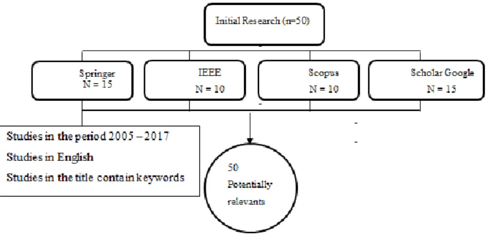
Before starting with the proposed research, it was necessary to make a Systematic Review of “Dashboard Design”, “Data Visualization Techniques” in the “Dynamic Analysis of Real-Time Information”.
In this research we conducted a Systematic Literature Review (SLR) [6] as a means to structure and organize the review. It is formed by 5 steps (see Figure 2).
Step 1. Framing questions for a review
The problems to be addressed by the review should be specified in the form of clear, unambiguous and structured questions before beginning the review work. Once the review questions have been set, modifications to the protocol should be allowed only if alternative ways of defining the populations, interventions, outcomes or study designs become apparent.
Framing questions for a review
Identifying relevant work
Assessing the quality of studies
Summarizing the evidence
Interpreting the findings
6
Step 2. Identifying relevant work
The search for studies should be extensive. Multiple resources should be searched without language restrictions. The study selection criteria should flow directly from the review questions and be specified a priori. Reasons for inclusions should be recorded.
Step 3. Assessing the quality of studies
Study quality assessment is relevant to every step of a review. Question formulation (Step 1) and study selection criteria (Step 2) should describe the minimum acceptable level of design. Selected studies should be subjected to a more refined quality assessment by use of general critical appraisal guides and design-based quality checklists (Step 3). These detailed quality assessments will be used for exploring heterogeneity and informing decisions regarding suitability of meta-analysis (Step 4). In addition, they help in assessing the strength of inferences and making recommendations for future research (Step 5).
Step 4. Summarizing the evidence
Data synthesis consists of tabulation of study characteristics, quality and effects as well as use of statistical methods for exploring differences between studies and combining their effects. Exploration of heterogeneity and its sources should be planned in advance (Step 3). If an overall meta-analysis cannot be done, subgroup meta-analysis may be feasible.
Step 5. Interpreting the findings
The issues highlighted in each of the four steps above should be met. The risk of publication bias and related biases should be explored. Exploration for heterogeneity should help determine whether the overall summary can be trusted, and, if not, the effects observed in high-quality studies should be used for generating inferences. Any recommendations should be graded by reference to the strengths and weaknesses of the evidence
7 Figure 3 - Results – Systematic Review.
Systematic reviews are types of literature reviews that collect and critically analyze multiple research studies or papers, using methods that are selected before one or more research questions are formulated, and then finding and analyzing studies that relate to and answer those questions in a structured methodology. In this case information was obtained as a starting point for carrying out this research.
As a result, we obtained 50 relevant documents as papers, books, chapters, on the subject of this research indexed in high impact academic databases and that they meet all the steps of the systematic review, which will serve as a starting point for the development of this research.
This revision is important since it allows to know in depth the concepts and techniques related to the visualization of information and the development of dashboards, allowing us to have a clear objective in the development of this research.
The table summarizing all the findings which contains detailed information on the investigations explored and analyzed is detailed in Appendix A.
8
2.2. Dashboards
The information can be presented through the use of suitable Dashboards, adequately designed for the context at hand. A Dashboard is the graphical and visual representation of information.
Dashboards are nowadays widely used for monitoring and analysis of business processes. Numerous companies such as IBM , SAP, Tableau Software or TIBCO Spotfire, to name a few well-known vendors, offer complete Business Intelligence (BI) or information visualization solutions [7].
Dashboards can provide a unique and powerful means to present information, but they rarely live up to their potential. Most Dashboard fail to communicate efficiently and effective, not because of inadequate technology, but because of poorly designed implementations. No matter how great the technology, a Dashboard's success as a medium of communication is a product of design, a result of a display that speaks clearly and immediately. Dashboard can tap into the tremendous power of visual perception to communicate, but only if those who implement them understand visual perception and apply that understanding through design principles and practices that are aligned with the way people see and think [8].
Dashboards and visualization are cognitive tools that improve your “span of control” over a lot of business data. These tools help people visually identify trends, patterns and anomalies, reason about what they see and help guide them toward effective decisions. As such, these tools need to leverage people’s visual capabilities. With the prevalence of scorecards, Dashboards and other visualization tools now widely available for business users to review their data, the issue of visual information design is more important than ever [9].
Before delving too deeply into what Dashboard software is capable of doing, it is important to figure out what you need it to do for your work. Next, it is presented a general overview of the types of Dashboard software available [10].
9
2.2.1.
Type of Dashboards
Nowadays, different types of Dashboard software are available, mainly:
BI Dashboards - This software usually offers a suite of Dashboards that focus on
specific areas of the business such as analytics, strategy, operations, overall performance, and Key Performance Indicator (KPI). Also find tools for monitoring parts of the business and for gathering informational data that tells a story [10];
KPI Dashboard Software - Often found as an element in BI Dashboards, this is a
Dashboard that focuses solely on delivering and analyzing key performance metrics. It can also be used to measure performance within a team [10];
Website Dashboards - There are Dashboards specifically designed to monitor
metrics and display them at a glance. They typically allow the user to add widgets for services like Google Analytics, GitHub, Pingdom, and Chartbeat to Dashboard software that monitors website performance. It also allows creating custom data sources and incorporating social media monitoring [10];
Free Dashboards - There are a variety of open source Dashboard software options
that you can use to build your own Dashboards. Many of the open source options are web-based, but there are a few that are server-based. Additionally, these Dashboards are ideal for integrating custom data streams. However, there typically isn’t a ton of support available [10];
Free Dashboards - There are plenty of free options available. However, the free
solutions are not as robust as other options available and have limited features. Free Dashboard software is a good place to start, to realize the power of real-time data analytics applied to a business [11];
Marketing Dashboards - This is another type of Dashboard that might be found in
a BI Dashboard. These tend to focus on how well marketing efforts are increasing sales or building awareness. Marketing Dashboards collect KPIs and critical metrics
10 and display that data in a meaningful way. These Dashboards can also cull data from cloud services [11];
Executive Dashboards - While not as in-depth as other options listed, executive
Dashboards are full of vital real-time data that provide executives an overview of their company’s performance. Typically, executive Dashboards consist of data from accounting software, website analytics, and Customer Relationship Management (CRM) [11];
Real-Time Dashboards - By their very definition, Dashboards provide real-time
data. Reports, conversely, offer information based on historical data. Real-time Dashboards are instantly updated so you can see how something is performing at that very moment. A visual display of the most important information needed to achieve one or more objectives, consolidated and arranged on a single screen so the information can be monitored at a glance [11].
2.2.2.
Dashboard Platforms
There are some Data visualization platforms available, that can automatically create visualizations, enable you to create your own, or offer both capabilities. Next, are the most popular platforms.
Zoho Reports - Zoho.com is a provider of award-winning online business
apps. The Zoho Applications’ suite lives in the cloud, so businesses can access their data wherever needed. A Dashboard is an effective way of organizing reports into a single page to have a quick insight into the Key Metrics at a glance. Zoho Reports provides a simple & intuitive drag and drop interface for creating Dashboards [12].
Sisense – Sisense it’s an intelligence software that provides analytic solutions and
market insights for small t-o enterprise-level businesses. Sisense is one of only a few fully-functioning BI software systems that let non-technologically inclined users combine multiple data sets, customize Dashboards, generate data visualizations, and share them with other users [13].
11
Tableau - Dashboarding with Tableau allows even non-technical users to create
interactive, real-time visualizations in minutes. Sharing a Dashboards requires no programming, whether it’s on Tableau Server, Tableau Online, or any portal or web page [14].
Google Analytics - The Google Dashboard is organized according to the products
you use, showing data associated with that product or service as well as direct links to that product's privacy and security settings. The Google Sites Dashboard is part of the Google Apps offering [15].
SAS Visual Analytics - SAS Visual analytics is a form of inquiry in which data that
provides insight into solving a problem is displayed in an interactive, graphical manner. SAS Visual Analytics provides a complete platform for analytics visualization, enabling to identify patterns and relationships in data that weren’t initially evident. Interactive, self-service BI and reporting capabilities are combined with out-of-the-box advanced analytics so everyone can discover insights from any size and type of data, including text [16].
Next, a comparative table was made showing the main characteristics of the mentioned platforms (see Table 1).
Zoho Reports Sisense Tableau Google
Analytics SAS Visual Analytics OS Windows iOS Web-Based Android Windows Mobile Windows Android iOS Web based Windows Android iOS Web based Windows Linux iOS Web-Based Windows Android iOS
12 Clients Worldwide Express, CH2MHill, Outdoor Sports Marketing NASDAQ, Merck, Dannon, Booking, Comcast, NASA, ESPN, Sony Accenture, Coco Cola, Bank of America, PayPal, Google, Skype, Citigroup, Dell, Walmart Panasonic, Progressive, TransUnion Staples, Scotia Bank, Australian Institute of Health and welfare
Price 50$ By quote 35$ Free Price is
based on server and user capacity
Cloud Platform
Yes Yes Yes Yes Yes
Free Versión Available
Yes No No Yes Yea
Table 1 - Dashboard Platforms Comparison.
All of the above platforms, summarized in Table 1, will serve as support to achieve this research. The work will evolve from an already designed and established platform that collects an extraordinary amount of data. The data used in this case study is related to surveys. The goal is to produce a dynamic Dashboard based on real-time / live information. Thus, Dashboard users will be able to interact with the information, based on an initial set of clues, charts, tables and reports, produced by the Dashboard itself. This will allow testing an existing set of data visualization techniques and tools and discover a new set of data visualization techniques and platforms.
The platforms mentioned above have a high cost for each of its services, and are very complex to understand, for this reason it is necessary to develop a Dashboard that meets the characteristics of these great platforms but which is free and easy to use by users. Thus, this is the starting point for this research to be successful in the academic and business area, in addition it is going to be our goal to make a web application responsive. Responsive web design is suitable for informational web pages, with information on the right side of the screen in desktop applications brought to the bottom of the page in mobile applications.
13
2.2.3.
Data Visualization Techniques
There are also data visualization techniques, which play a very important role in organizations and allow through the use of images and graphics display data to make them more understandable, attractive, manageable and useful [17].
Visualizing Semi structured and Unstructured Data Using Word Clouds and Network Diagrams.
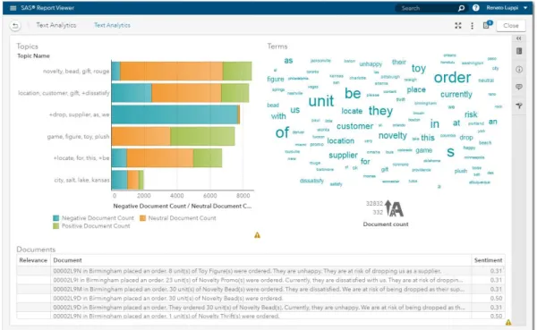
The variety of data brings challenges because semi structured, and unstructured data require new visualization techniques. A word cloud visual (where the size of the word represents its frequency within a body of text) can be used on unstructured data as a way to display high- or low-frequency words (see Figure 4 ) [18].
SAS Visual Analytics takes the concept of word clouds a step further by taking advantage of taxonomies and ontologies to make associations. Words are then organized into topics based on how the words are used. SAS Visual Analytics word clouds can display the hot topics of the day gleaned from such text analysis. Users can drill down by clicking on an individual topic to see exactly what words or phrases comprise that topic [18].
14 Another visualization technique that can be used for semi structured or unstructured data is the network diagram. Network diagrams view relationships in terms of nodes (representing individual actors within the network) and ties (which represent relation-ships between the individuals, such as friendship, kinship, organizations, business rela-tionships, etc.). These networks are often depicted in a diagram where nodes are represented as points and ties are represented as lines [18].
Network diagrams can be used in many applications and disciplines. For example, busi-nesses analyze social networks to understand their interactions with customers, while counterintelligence and law enforcement might map a clandestine or covert organization such as an espionage ring, an organized crime family or a street gang. You can also superimpose the network diagram on a map, for example, to show the relationship or product sales across geographic areas (see Figure 5) [18].
Figure 5 - Network diagrams explore relationships within a data set, including connections across geographic areas.
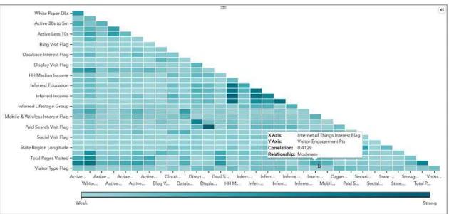
Visualization with Correlation Matrices
A correlation matrix shows a table which lists the correlation coefficients of the columns and rows and combines big data and fast response times to quickly identify which variables are related. It also shows how strong the relationships are between variables [19].
SAS Visual Analytics makes it easy to assess the relationships. Simply select a group of variables and drop them into a visualization pane. The intelligent autocharting function displays a color-coded correlation matrix that quickly identifies strong and weak
15 relationships between the variables [19] Darker boxes indicate a stronger correlation; lighter boxes indicate a weaker correlation (see Figure 6).
Figure 6 - In this correlation matrix, darker boxes indicate a stronger correlation; lighter boxes indicate a weaker correlation.
Data Visualization Made Easy with Autocharting
In SAS Visual Analytics, intelligent autocharting produces the best visual based on what data you drag and drop onto the visual palette. It is important to note that autocharting may not always create the exact visualization user had in mind. In that case, you also can select a specific visual to build. However, when you are first exploring a new data set, autocharts are useful because they provide a quick view of the data. For example, with autocharting, when a single measure is selected, distribution of that measure is shown [20] (see Figure 7).
Figure 7 - Autocharting in SAS Visual Analytics produces a bar chart to show the distribution of a single measure.
16
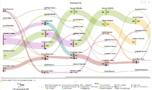
Visualizing Flow with Sankey Diagrams
Sankey diagrams use path analysis to show the dynamics of how transactions move through a system (e.g., how customers navigate on a website). The diagrams display a series of linked nodes, where the width of each link indicates the frequency of the link or the value of a measure. This enables you to see flow patterns and recognize trends such as where customers enter your website, where they navigate to and where they exit. It is possible to identify successful flow patterns or isolate flows that failed to deliver the desired action (see Figure 8) [21].
Figure 8 - A Sankey diagram displays a series of linked nodes, where the width of each node indicates the frequency of the link or value of the measure.
Visualization for Mobile Devices
Proliferation of mobile devices means that businesses need to deliver company information to smartphones and tablets any time and from anywhere [22].
In mobile devices is necessary to consider:
Fluid grids: The grid is the tool that designers use to lay out their designs,
regardless of whether those designs will be viewed online or offline. In the following figure, a grid design has been transformed for three screen shapes (see Figure 9);
17 Figure 9 - Grid design translated to different screens.
Flexible images: When you have images in a blog post or on your website, you
want to ensure that they’re not cut off or distorted. Making sure that your images can reformat themselves is important;
Media queries: When you enter a search term in a search engine such as Google or
Bing, you want to be able to view the results on any of your screens. The content needs to be viewed on any mobile device a user might have. What makes viewing it on a variety of devices a challenge is that the designer has no way to know what the returned result will be.
18 This page was intentionally left blank
19
3. Project Outline
In this chapter we describe the Case Studies, the data model, and the technologies and tools used in the development of the Dashboard.
3.1. Case Studies
This chapter will present the generic case studies considered in the implementation of the project. These were the basis of the analysis and specification of the data model to support the system to be implemented.
Pedagogical questionnaires
The pedagogical questionnaires elaborated by the pedagogical councils of the 5 schools of the Polytechnic of Leiria, where the student questionnaires are composed of 15 questions, 8 questions for assessing the functioning of the curricular unit and 7 questions for the evaluation of pedagogical performance (see Figure 10) were used as the first data source for the case study.
20
PPE-15
The partial questionnaire on patient satisfaction of health units developed by the Picker Institute (see Figure 11), composed of 15 questions, one of them with an alternative path, that is, whether the following question or questions depend on the subsequent response.
21
Requirements Identification
The questions of these questionnaires have many types of possible answers, such as [23]:
Open-ended Questions - An open-ended question cannot be answered with a "yes" or "no" response, or with a static response. Open-ended questions are phrased as a statement which requires a response;
Closed-ended Questions - Four types of closed-ended questions are most commonly used: rating scale, forced choice, dichotomous and demographic/firmographic questions;
Rating scale questions - Respondents assess the issue based on a given dimension. Two frequently used types of rating scale questions are Likert-type scales and semantic differential scales;
Semantic differential - In a semantic differential scale, each end of the scale marked is with different or opposing statements;
Multiple Choice Questions - Multiple choice questions ask the respondent to choose between two or more answer options. Questions can be as simple as “yes/no” or can give a choice of multiple answers.
3.2. Data Model
In this chapter we explain the logic of the data model used by the application (see Figure 12)
22
Figure 12 – Generic Data Model.
The model and the database were the result of another research, responsible for the collection of information from the surveys [24]. It has a generic structured in order to be able to accommodate other type of surveys in the future. The aim of this model is to support information related to surveys, mainly, considering the need to represent questions, answers, type of answer, etc.
The purpose of this research is to graphically represent through a dynamic Dashboard all the information related to the answers given by the users that fulfill the surveys implemented and made available in the platform. As mentioned previously, one important aspect of the data model it is the entire structure of the database that has been designed with the aim of being the most generic possible, so that all questionnaires containing open-ended questions or multiple types of multiple choice can be entered into the database, and the developed application. Throughout the structure care is taken to insert extra attributes especially for statistics, such as in the Survey entity, the start, created, and finish attributes, which contain the start, create, and end dates.
3.3. Technologies and tools
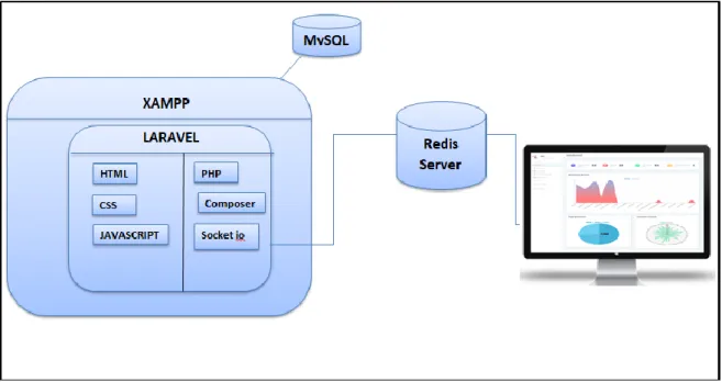
This project focuses on making a web Dashboard, for which we mention the tools that are used in the development (see Figure 13).
23 out, defining all the fields and relationships of the tables. Then are performed the controllers, where the functions required by the Dashboard are accomplished. In addition to this, are created access routes for the views. Laravel contains all web development, PHP, HTML, Javascript, CSS in a MVC Model.
The real-time communication of the Dashboard is accomplished by using a Redis server that is responsible for “notify” when new data is entered into the database which allows the updating of the Dashboard information and graphics.
Figure 13 – General Architecture with the technology used.
Laravel
Laravel [25] is a web application framework with expressive, elegant syntax. Laravel attempts to take the pain out of development by easing common tasks used in the majority of web projects, such as authentication, routing, sessions, and caching.
The Laravel framework has a few system requirements. Of course, all of these requirements are satisfied by the Laravel Homestead virtual machine, so it's highly recommended that you use Homestead as your local Laravel development environment [26].
However, if not using Homestead, need to make sure your server meets the following requirements: PHP >= 7.1.3, OpenSSL PHP Extension PDO PHP Extension, Mbstring PHP Extension, Tokenizer PHP Extension, XML PHP Extension, Ctype PHP Extension, JSON PHP Extension [26].
24
MySQL
MySQL [27] is a database management system. A database is a structured collection of data. To add, access, and process data stored in a computer database, a database management system such as MySQL Server was needed.
PHP
PHP [28] is a server-side scripting language designed for web development but also used as a general-purpose programming language PHP code may be embedded into HTML code, or it can be used in combination with various web template systems, web content management systems, and web frameworks. PHP code is usually processed by a PHP interpreter implemented as a module in the web server or as a Common Gateway Interface (CGI) executable. The web server combines the results of the interpreted and executed PHP code, which may be any type of data, including images, with the generated web page. PHP code may also be executed with a command-line interface (CLI) and can be used to implement standalone graphical applications.
Artisan Console
Artisan [29] is the command-line interface included with Laravel. It provides a number of helpful commands that can assist you while you build your application. To view a list of all available Artisan commands, you may use the list command: php artisan list, the commands are available in Appendix B.
Composer
Composer [28] is a tool for dependency management in PHP. It allow to declare the libraries in the project depends on and it will manage (install/update) . Composer is not a package manager in the same sense as Yum or Apt are[30]. Yes, it deals with "packages" or libraries, but it manages them on a per-project basis, installing them in a directory (e.g. vendor) inside the project. By default, it does not install anything globally. Thus, it is a dependency manager. It does however support a "global" project for convenience via the global command.
Javascript Libraries
Javascript libraries [31] will help to create and customizable charts for the projects. These libraries let present complex statistics quickly and effectively such as Chart.js, Highcharts,js, bootstrap,js, jquery.min.js.
25
Chart JS
Chart.js [32] is a JavaScript library which provides a toolkit for data visualization in web browsers. This means it is essentially a collection of prewritten JavaScript code. The char library was built to make working with HTML, CSS and SVG in conjunction with data easier.
Highcharts JS
Highcharts [33] is a charting library written in pure JavaScript, offering an easy way of adding interactive charts to your web site or web application. Highcharts currently supports line, spline, area, areaspline, column, bar, pie, scatter, angular gauges, arearange, areasplinerange, columnrange, bubble, box plot, error bars, funnel, waterfall and polar chart types.
Bootstrap
Bootstrap [34] is an open source toolkit for developing with HTML, CSS, and JS. Quickly prototype your ideas or build the entire app with our Sass variables and mixins, responsive grid system, extensive prebuilt components, and powerful plugins built on jQuery.
Jquery.min.js
jQuery [35] is a fast, small, and feature-rich JavaScript library. It makes things like HTML document traversal and manipulation, event handling, animation, and Ajax much simpler with an easy-to-use API that works across a multitude of browsers.
Jquery – Datatable
DataTables is a plug-in for the jQuery Javascript library. It is a highly flexible tool, build upon the foundations of progressive enhancement, that adds all of these advanced features to any HTML table [36].
Carbon API
Carbon [28] is a simple PHP API extension for DateTime, the Carbon class is inherited from the PHP DateTime class. Carbon has all of the functions inherited from the base DateTime class. This approach allows you to access the base functionality if you see anything missing in Carbon but is there in DateTime.
26
Redis
Redis [37] is an open source (BSD licensed), in-memory data structure store, used as a database, cache, and message broker. It supports data structures such as strings, hashes, lists, sets, sorted sets with range queries, bitmaps and geospatial indexes with radius queries. Redis has built-in replication, Lua scripting, LRU eviction, transactions and different levels of on-disk persistence, and provides high availability via Redis Sentinel and automatic partitioning with Redis Cluster. Redis also supports trivial-to-setup master-slave asynchronous replication, with very fast non-blocking first synchronization, auto-reconnection with partial resynchronization on net split.
Node.js
Node.js [38] is a platform built on Chrome’s JavaScript runtime for easily building fast and scalable network applications. Node.js uses an event-driven, non-blocking I/O model that makes it lightweight and efficient, thus, perfect for data-intensive real-time applications that run across distributed devices.
Socket. IO
Socket.IO [39] is a JavaScript library for time web applications that enables real-time, bi-directional communication between web clients and servers. Socket.IO has two components: a client-side library that runs in the browser, and a server-side library for Node.js. Both components have nearly identical APIs.
Font Awesome
Font Awesome [40] is a font and icon toolkit based on CSS and LESS. In the Dashboard was used in the tables, in the search, ordering and pagination.
Responsive Web Design
Responsive Web Design [41] is about using HTML and CSS to automatically resize, hide, shrink, or enlarge, a website, to make it look good on all devices (desktops, tablets, and phones).
Operating System
The tools and technologies used in this research are multiplatform, which guarantees that it works correctly in Windows, Linux and Mac OS.
27
XAMPP
XAMPP [42] is a completely free, easy to install Apache distribution containing MySQL and MariaDB [27], PHP [43], and Perl [44]. XAMPP provides a free all-in-one tool to install Drupal [45], Joomla [46], WordPress [47], Laravel [48], Codeignither [49] and many other popular open source apps on top of XAMPP. Also provides an ideal local development environment but is not meant for production deployments.
Sublime Text
Sublime Text [28] is a proprietary cross-platform source code editor with a Python application programming interface (API). It natively supports many programming languages and markup languages, and functions can be added by users with plugins, typically community-built and maintained under free-software licenses. The packages are available in Appendix C.
Git
Git [50] is a free and open source distributed version control system designed to handle everything from small to very large projects with speed and efficiency. Git is easy to learn and has a tiny footprint with lightning fast performance. The commands are available in Appendix D.
Bitbucket
Bitbucket [51] is a web-based version control repository hosting service owned by Atlassian, for source code and development projects that use either Mercurial or Git revision control systems. Bitbucket offers both commercial plans and free accounts. Bitbucket is more than just Git code management. Bitbucket gives teams one place to plan projects, collaborate on code, test and deploy. The source code is hosted in bitbucket.
Git-Hub
GitHub [52] is a development platform inspired by the way the work. From open source to business, can host and review code, manage projects, and build software alongside millions of other developers. The Documents are hosted in Git-hub
28 This page was intentionally left blan
29
4. Dashboard Implementation
In this chapter we describe the Dashboard development process, some security considerations in the Dashboard. Details about the Dashboard sections and web hosting are also presented.
4.1. Dashboard Sections and Features
Once the Dashboard is available, the sections are identified and are detailed below:
Menu and Statistics sections
This section shows the option menu and its content and details statistical data of the surveys such as number of questions, number of answers, number of users, type of questions, number of active and inactive surveys, the user with the most answers. (see Figure 14).
Figure 14 – Menu and Statistics view sectiosn.
Temporal Analysis
The Dashboard allows the user to navigate between dates, which allows a temporary analysis of the information depending on the selected dates. All graphics are updated through the selected dates (see Figure 15).
30
Home Section
This section contains the statistics, the temporal analysis and the visualization through charts of: Question by user, Types of question, Surveys Duration, Surveys count and Types of surveys (see Figure 16).
Figure 16 - Home Section.
Dynamic Chart Section
The Dashboard allows the user to select what to represent in the graphics: Question by user, Surveys by user, Answer by user, Question by types and allows the user to select the chart to graph: Line chart, Doughnut Chart, Pie Chart (see Figure 17).
31 Figure 17 - Dynamic Chart section.
Surveys Section
This section contains the list of all the surveys, this can be ordered by each field of the table, this can also be filtered by dates the information of the list of surveys (see Figure 18).
Figure 18 - Surveys section.
In the table can access the surveys by clicking on them in the title field. There are two types of surveys that are text type and numeric type. In the Text Surveys the content of the survey was shown (see Figure 19).
32 Figure 19 - Text Survey.
In the Numeric Surveys the content of the survey and a statistical analysis of the answers are shown. Figure 20 presents the answers of the Numeric Survey.
Figure 20 – Answers of Numeric Survey.
Figure 21 presents the statistics in a chart of the answers of the Numeric Survey.
Figure 21 - Statistics of the Answers of Numeric Survey in a chart.
33 Figure 22 - Statistics of the Answers of Numeric Survey in a table.
Users Section
This section shows the list of available users and the number of surveys that have answered (see Figure 23).
Figure 23 - Users Section.
Answers Section
This section shows the list of answers, the date, the survey to which it belongs and the user who answered (see Figure 24).
34
Question Types Section
This section shows the list of types of questions that exist, detailing their identification, type and description (see Figure 25).
Figure 25 - Question Types Section.
Questions Section
This section shows the list of questions and to what type they belong (see Figure 26).
Figure 26 - Questions Section.
4.2. Implementation Details
Once an initial prototype of a dashboard has been defined (see Appendix E). After that itit was necessary to prepare the work environment (see Appendix F).
35 First, the creation of the database in Laravel through the migration process and seeders, to the development process it was used models, controllers, events views, which are detailed below:
4.2.1. Migrations
Migrations are like version control for the database, allowing the team to easily modify and share the application's database schema. Migrations are typically paired with Laravel's schema builder to easily build the application's database schema [53].
In the console were used the next commands to create the tables used: php artisan make:migration create_users_table
php artisan make:migration create_questions_table php artisan make:migration create_question_types_table php artisan make:migration create_survey_table php artisan make:migration create_answers_table
php artisan make:migration create_survey_questions_table php artisan make:migration create_survey_users_table php artisan make:migration create_questions_table
php artisan make:migration create_question_type_answers_table php artisan make:migration
Migration Structure - The migration class contains two methods: up and down. The up
method is used to add new tables, columns, or indexes to your database, while the down method should simply reverse the operations performed by the up method (see Figure 27).
36 Figure 27 - Migration structure, Table users.
All tables contain this structure, but the content depends on the fields that each table has.
4.2.2. Seeders
Laravel includes a simple method of seeding the database with test data using seed classes. All seed classes are stored in the database/seeds directory. Seed classes may have any name you wish, but probably should follow some sensible convention, such as
UsersTableSeeder, etc [54].
In the console the next commands were used: php artisan make:seeder UserSeeder
php artisan make:seeder AnswerSeeder php artisan make:seeder QuestionSeeder
php artisan make:seeder QuestionTypeAnswerSeeder php artisan make:seeder QuestionTypeSeeder php artisan make:seeder SurveyQuestionSeeder php artisan make:seeder SurveySeeder
php artisan make:seeder SurveyUserSeeder php artisan db:seed
Seeders Structure - The class contains the run method, in this method the number of
37 Figure 28 - Seeder Structure, table user.
4.2.3. Model factory
In the directory database/factories is created a file named: ModelFactoty.php, in this file it will work. It is possible to use model factories to conveniently generate large amounts of database records (see Figure 29).
Figure 29 - Model factory of the tables.
In the file DatabaseSeeder located in the directory database/seeds is called the seed classes created (see Figure 30).
38 Figure 30 - Seeders Call
Figure 31 shows how the data is created in the tables of the database, these data respect the relationships between the tables.
Figure 31 - Data created in the table.
4.2.4. Models
Laravel provides a simple ActiveRecord implementation for working with the database. Each database table has a corresponding "Model" which is used to interact with that table. Models allow you to query for data in your tables, as well as insert new records into the table. For to generate a database migration is necessary use the –m option [54].
39 To create the model, in the the next commands were executed:
php artisan make:model Answer -m php artisan make:model Question -m php artisan make:model Question_type -m
php artisan make:model Question_type_answers –m php artisan make:model Survey –m
php artisan make:model Survey_questions -m php artisan make:model Survey_user -m
Model Structure - In the model the name of the table and its fields were defined, and in
a function the models of the tables with which it has a relationship were defined, the next figure shows an example (see Figure 32).
Figure 32 - Model Structure.
4.2.5. Controllers
Instead of defining all of the request handling logic as Closures in route files, it is possible to organize this behavior using Controller classes. Controllers can group related request handling logic into a single class. Controllers are stored in the app/Http/Controllers directory. The controllers have the main functions of the classes, such as queries to the database, control over the views to which the user will access [55].
In this case we have a controller that performs the functions of query, data insertion, depending on the case that is needed. And a general controller for the functions of the
40 Dashboard, such as real-time communication, connection to database queries to the database, to create the controllers, the next commands were executed in the console:
php artisan make:controller Answer php artisan make:controller Dashboard php artisan make:controller Question_types php artisan make:controller Questions php artisan make:controller Users
Controllers Structure - The structure of the controller will depend on the needs of the
programmer, in the specific case of the image ( see Figure 33), the functions perform paginations function, redirection to previously created views, and storage in the database from the view.
Figure 33 - Controllers Structure.
4.2.6. Events
Laravel's events provides a simple observer implementation, allowing to subscribe and listen for various events that occur in the application. Event classes are typically stored in the app/Events directory, while their listeners are stored in app/Listeners. Events serve as a great way to decouple various aspects of the application, since a single event
41 can have multiple listeners that do not depend on each other [56]. The dashboard implements events and listeners to real-time communication.
To create an event it was necessary add listeners and events to the EventServiceProvider we used the command:
php artisan event:generate
This command has generated any events or listeners that are listed in the EventServiceProvider (see Figure 34). Of course, events and listeners that already exist will be left untouched.
In this research it was created events and listener for: Answers, users, questions, questions_type and survey.
Figure 35 shows an example for an event and listener.
42 Figure 35 - Event and Listener.
4.2.7. Views
Views contain the HTML used by the application and separate the controller application logic from the presentation logic. Views were stored in the resources/views directory [57].
In the same way, views were made for each entity that was used in the Dashboard, to have the organized code, folders were created for each section that was availabled in the views. (see Figure 36).
43 Figure 36 – Views in the project structure.
The main view contains a menu of options to display and insert data in the tables, it also contains information of certain tables and shows the graphs in real time (Figure 37).
Figure 37 - Main Dashboard view.
Responsive web design
The Dashboard can be opened from any device since the design of the views was adaptable (see Figure 38).
44 Figure 38 - Responsive Design.
4.2.8. Date picker to Temporal Analysis
In the main view A datepicker "bootstrap-datepicker" was implemented, start and end variables are configured to update the information and charts of the Dashboard
Figure 39 - Date picker for data range.
4.2.9. Date format
Better manipulation of the dates used in the Dashboard, the Carbon API was used, as follows (see Figure 40). This is used in the tables.
45
4.2.10. Search, Sort and Pagination
To search, sorting and pagination a "jquery-Datatable [36]" was implemented in the list of data (see Figure 41).
Figure 41 - Searh, Sort and Pagination.
4.2.11. Data Visualization used
In this research are used, 5 types of graphics which are detailed below:
Line chart - Line Chart is drawn by interconnecting all data points in data series using straight line segments. Line Charts are normally used for visualizing trends in data varying continuously over a period of time or range [58].
Line chart is used to show the information about the number of questions answered by each user (see Figure 42).
46 In the configuration file, it was necessary to specify a function that calls the data used in the chart (see Figure 43).
Figure 43 - Function to graph the Line chart.
Pie chart - Pie Chart divides a circle into multiple slices that are proportional to their contribution towards the total sum. Pie chart is useful in comparing the share or proportion of various items [59].
Pie chart was used to show the information about the existing amount of question types as type ‘M’, ‘O’,’S’ stored in the database (see Figure 44).
47 The configuration file is in (see Figure 45).
Figure 45 - Function to graph the Pie chart.
Radar chart - In a radar chart, data points are drawn evenly spaced, clockwise around the chart. The value of the point is represented as the distance from the center of the chart, where the center represents the minimum value, and the chart edge is the maximum value. Each series is drawn as one complete circuit of the chart. The chart connects these points with straight or curved lines. So, a radar chart is essentially a line chart wrapped into a circle, where the y-axis goes from the center of the chart to the perimeter, and the x-axis is the perimeter of the chart, starting and ending at the 12:00 line[60].
Radar chart was used to show the average duration of the availability of a survey (see Figure 46).