Identifying clients’ bad experiences with their
internet service
Susana Margarida Silva Ferreira Lavado
Internship report presented as partial requirement for
obtaining the Master’s degree in Advanced Analytics
NOVA Information Management School
Instituto Superior de Estatística e Gestão de Informação
Universidade Nova de LisboaIDENTIFYING CLIENTS' BAD EXPERIENCES WITH THEIR INTERNET
SERVICE
by
Susana Lavado
Internship report presented as partial requirement for obtaining the Master’s degree in Advanced Analytics
Advisor / Co Advisor: Leonardo Vanneschi Co Advisor: Sabina Zejnilovic
ACKNOWLEDGEMENTS
Professor Leonardo, thank you for all your help during my internship and for believing in me from day zero when I applied to this master program. Your passion for machine learning and teaching is inspiring, and you gave me the confidence to become a data scientist.
Sabina, I will never forget my first interview with you for this internship. I remember being at the same time overwhelmed and really excited, which is what tells you have a great challenge ahead. Since that interview, I knew I would learn immensely from you and I was not mistaken. You were the best advisor I could hope for. Thank you for the guidance, the patience and the occasional chocolate!
Kevin, usually internships are little rollercoasters: we learn a lot, make a ton of mistakes and get frustrated occasionally, but always have fun. Thank you for amplifying all the good moments and making the less good moments easier. I had a blast sharing these nine months with you, and I am very grateful for all you taught me.
Sofia, I want to be just like you when I grow up! Only you combine that super smart brain with that giant heart (and the looks too!). Can we please, please, please do one more advanced analytics project together? Thank you for always having my back and being an awesome friend. And thanks for the patience to bear with me and David when we mispronounce famous mathematicians’ names! David, apparently you survived the craziness that was working with Sofia and I on almost all advanced analytics projects, which I am impressed by. You were the calmness of the group and I can still hear you assuring us that it would be ok in the end. I loved working with you and I’ll try to keep your chillness with me for life.
Pedro, this is the third thesis where you are in the acknowledgements. You should have learned by now not to support me in this crazy path of mine, but I am so grateful that you have not. I promise not to do a fourth thesis anytime soon!
ABSTRACT
Identifying clients who had experienced a bad internet service is important for network providers, as bad service experiences may lead to less client satisfaction. It is possible to measure quality of service by looking at objective network quality measures. However, a decrease in the quality of service will not translate into a bad quality of experience for all clients at all times. This is because a) if the client does not try to use the internet, he or she would not notice the deterioration of the service; and b) different clients have different needs in terms of service quality; a slight decrease in network quality maybe be noticed by an intensive user but not by a light user, even if the latter is using the internet. In the present report, we describe the work we have done to develop: a) a segmentation the clients according to their typical internet usage; b) a probability that a given client would use the internet at a given time. These two features were then fed to a classifier, along with the objective network quality measures. This classifier, a gradient boosted model, was able to classify clients who filled a service request due to lack of access to the internet with an accuracy of 0.98, sensitivity of 0.87 and specificity of 0.98. The results of the classifier and the role of the special features we developed is discussed, along with future directions for this work.
KEYWORDS
RESUMO
A identificação dos clientes que tiveram uma má experiência de serviço é importante para as empresas de comunicações, uma vez que uma má experiência pode levar a menor satisfação dos clientes. É possível medir a qualidade do serviço através da análise das medidas objetivas de qualidade de rede. No entanto, uma diminuição da qualidade do serviço não se traduz numa má experiência de utilização para todos os clientes e em todos os momentos, por dois motivos: a) se o cliente não tenta utilizar a internet, ele/ela não se apercebe que houve uma deterioração do serviço; e b) diferentes clientes têm necessidades diferentes em termos de qualidade do serviço; uma deterioração ligeira na qualidade da rede de internet pode ser detetada por um cliente que usa o serviço intensamente, mas não por um cliente que usa a internet para tarefas menos exigentes, mesmo que este último esteja a usar a internet. Neste relatório, descrevemos o desenvolvimento de a) uma segmentação de clientes de acordo com o seu uso típico da internet; b) uma probabilidade de o cliente utilizar a internet numa dada hora. Estes dois atributos foram depois utilizados num algoritmo de classificação, em conjunto com medidas objetivas de qualidade de rede. Este algoritmo de classificação, um gradient boosted
model, foi capaz de classificar clientes que fizeram um pedido de apoio técnico devido a falha no acesso
à internet com uma taxa de acerto de 98% (sensitivity = 0.87, specificity = 0.98). Os resultados do classificador e o papel dos atributos desenvolvidos são discutidos, assim como futuras direções para o trabalho.
PALAVRAS-CHAVE
Qualidade de experiência; Serviço de internet; Gradient boosted models; Análise de clusters; Utilização da internet
Contents
1. Introduction ... 1
1.1. Project description ... 1
1.2. Business contextualization ... 2
1.3. Structure of the present report ... 2
2. Theoretical framework ... 4
2.1. Internet users’ segmentation: clustering algorithm and related work ... 4
2.1.1. Cluster analysis ... 4
2.1.2. The K-Means algorithm ... 4
2.1.3. Related work on Internet users’ segmentation: ... 6
2.2. Identifying clients with a bad internet experience: Decision trees, random forests and gradient boosted trees algorithms ... 7
2.2.1. Decision trees ... 9
2.2.2. Random forests ... 11
2.2.3. Gradient Boosting Models ... 11
2.2.4. Evaluation of classification models ... 12
2.2.5. Interpretation of classification models ... 14
3. Segmentation of internet clients based on their upstream and downstream traffic ... 16
3.1. Data selection and preparation ... 16
3.2. Data exploration ... 17
3.2.1. Initial analysis ... 17
3.2.2. Outliers ... 18
3.2.3. Data distribution ... 18
3.2.4. Correlation among variables ... 22
3.3. Principal components analysis (PCA) ... 24
3.4. Clustering analysis ... 26
3.4.1. Clustering process ... 26
3.4.2. Clustering using all the variables ... 27
3.4.3. Clustering using a subset of variables ... 28
3.4.4. Clustering using the pcs ... 28
3.5. Validation of the results in a different dataset (data from September/October) ... 30
3.5.1. PCA with data from September/October ... 30
3.5.2. Cluster analysis with data from September/October – 5% sample ... 30
3.5.4. Match between May clusters and September/October clusters ... 32
3.6. Final results: Cluster characterization ... 34
3.7. External validity of the clusters ... 35
3.7.1. Validation of the clusters using service request variables ... 35
3.7.2. Validation of the cluster using the subscription of a mobile internet service ... 37
4. Predicting if clients would use the internet at a given time ... 38
4.1. What constitutes internet usage? ... 38
4.1.1. First approach: Consulting with the technical team ... 38
4.1.2. Second approach: Examining the traffic of a cable modem rarely used 40_Toc523390614 4.1.3. Final decision ... 42
4.2. Feature engineering using the 1MB threshold... 42
4.2.1. Unsuccessful approaches to build features ... 42
4.2.2. Final feature computation ... 42
4.3. Predicting internet usage ... 43
4.3.1. Variables used ... 43
4.3.2. Model implementation ... 43
4.3.3. Results ... 44
4.4. Probability of usage and service requests ... 47
5. Identifying clients with no access to the internet ... 50
5.1. Data gathering and cleaning... 50
5.1.1. Target variable ... 50
5.1.2. Population without experiences of no access ... 51
5.1.3. Input variables ... 51
5.2. Data exploration ... 53
5.3. Algorithm selection and implementation ... 54
5.4. Model development ... 54
5.4.1. Dealing with an unbalanced dataset ... 54
5.4.2. Dealing with missing values... 55
5.4.3. Tuning model parameters ... 55
5.5. Model evaluation ... 56
5.5.1. Validating the model ... 56
5.5.2. Comparison with other models ... 57
5.5.3. ROC CURVE and model output ... 57
5.6.1. Analyzing the false negatives ... 63
5.6.2. Analyzing the false positives ... 64
5.6.3. Analyzing the role of specific variables: probability of usage and segmentation of clients by internet usage ... 65
6. Discussion ... 71
6.1. Segmentation of internet clients ... 71
6.2. Identifying clients with no access to the internet ... 72
7. Future work ... 74
7.1. Segmentation of internet clients ... 74
7.2. Predicting internet usage ... 74
7.3. Identifying clients with no access to the internet ... 74
7.4. Other lines of work ... 75
LIST OF FIGURES
Figure 2.1 – K-fold cross-validation schema ... 8
Figure 2.2 – The “play tennis” decision tree. ... 9
Figure 2.3 – Confusion matrix schema ... 12
Figure 3.1a and b - Values considered for the 90 and 99 thresholds... 17
Figure 3.2 - Hourly average of up and downstream traffic, across the full month ... 18
Figure 3.3a, b, c, and d - Histograms representing the distribution of the hourly average traffic for the bottom 95% and the top 5%, for uploads and downloads. ... 19
Figure 3.4a and b - Histograms representing the distribution of the upload to download ratio for the bottom 95% and the top 5%, for uploads and downloads. ... 20
Figure 3.5 - Histogram of the variable representing the ratio of number of days with active internet usage. ... 20
Figure 3.6a and b - Histogram of the variables representing the number of hours with traffic higher than the average traffic of 90% of the sample, for uploads and downloads, respectively. ... 21
Figure 3.7a and b - Histogram of the variables representing the number of hours with traffic higher than the average traffic of 99% of the sample, for uploads and downloads, respectively. ... 21
Figure 3.8 - Histogram representing the difference in upload traffic for working and non-working days, for the middle 90% of the sample ... 22
Figure 3.9 - Histogram representing the difference in download traffic for working and non-working days, for the middle 90% of the sample ... 22
Figure 3.10 - Eigenvalues of the first ten principal components ... 25
Figure 3.11a and b - Within-cluster sum of square and silhouette plot for the cluster analysis using all available variables, for different sizes of k ... 27
Figure 3.12a and b - Within-cluster sum of square and silhouette plot for the cluster analysis using the PCs, for different sizes of k ... 28
Figure 3.13 - Eigenvalues of the first ten principal components, for the September/October dataset 30 Figure 3.14a and b - Within-cluster sum of square and silhouette plot, for different sizes of k, for the cluster analysis using September/October data ... 30
Figure 3.15 - Within-cluster sum of squares for September/October data, for the entire population 32 Figure 3.16a, b, c & d - Percentage of MAC addresses that belong to each cluster using Sept/October data, divided by their cluster in May (each pie chart corresponds to a cluster in the analysis using May data) ... 33
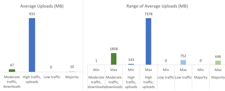
Figure 3.17a, b - Averages and range of hourly averages for uploads, across the entire month, per cluster ... 34
Figure 3.18a, b - Averages and range of hourly averages for downloads, across the entire month, per cluster ... 35
Figure 3.19a, b - Averages and range of days with active usage, per cluster ... 35
Figure 3.20 - Percentage of clients who made at least on service request, per cluster and per type of service request (all service requests, only technical service requests and only internet service requests) ... 36
Figure 3.21 - Average number of service requests, per cluster and per type of service request (all service requests, only technical service requests and only internet service requests) ... 36
Figure 4.1 – Percentage of clients using the internet according to the 5MB threshold, on a working
day ... 39
Figure 4.2 – Percentage of clients using the internet according to the 5MB threshold, on a non-working day ... 39
Figure 4.3 – Maximum hourly downstream traffic generated by a cable modem rarely used, per day, for 190 different days ... 40
Figure 4.4 – Percentage of clients using the internet according to the 70KB threshold, on a working day ... 41
Figure 4.5 - Percentage of clients using the internet according to the 70KB threshold, on a non-working day ... 41
Figure 4.6 – Decision tree predicting usage on February 1st, when complexity parameter = 0.01. ... 44
Figure 4.7 – Model evaluation metrics for each hour of the day ... 45
Figure 4.8 – Decision tree predicting usage on February 1st, when complexity parameter = 0.001. ... 46
Figure 4.9 – Distribution of clients with a service request for No Access, by the probability of usage they had on the hour where they made a service request ... 47
Figure 4.10 – Density plots of the probability of usage variable ... 48
Figure 4.11 – Histogram of the service requests per hour, for the month of January ... 49
Figure 5.1 – Monitoring points between the cable modem and network monitoring systems ... 52
Figure 5.2 – ROC curve ... 57
Figure 5.3 – Distribution of positive and negative cases according to the probability of being a positive case attributed by the model ... 58
Figure 5.4 - Distribution of positive and negative cases according to the probability of being a positive case attributed by the model (limiting the y-axis) ... 59
Figure 5.5 – Scaled variable importance for the GBM model (top 30 variables). ... 60
Figure 5.6 – Partial dependence plot for the number of events variable ... 61
Figure 5.7 – Partial dependence plot of the Signal-to-Noise Ratio variable ... 61
Figure 5.8 – Partial dependence plot of the signal-to-noise ratio variable, not considering missing values ... 62
Figure 5.9 – Partial dependence plot of the cable modem status in System 2 ... 62
Figure 5.10 – Model classification by sub-area of the service request ... 63
Figure 5.11 – Frequency of abnormal values in key variables, for the observed positive cases classified with lowest and highest probability ... 64
Figure 5.12 - Frequency of abnormal values in key variables, for the negative cases classified with lowest and highest probability ... 65
Figure 5.13 – Partial dependence plot for the probability of usage in the SR hour ... 66
Figure 5.14 – Partial dependence plot for the Probability of Usage in the hour of the SR ... 67
Figure 5.15 – Scatter plot of the probability of usage in the hour of the Service Request and the probability attributed by the model, by group ... 68
Figure 5.16 – Difference in the proportion of cases classified and observed as positive, by probability of usage in the hour of the service request ... 68
Figure 5.17 – Partial dependence plot for the variable corresponding to the segmentation of internet users ... 69
Figure 5.18 – Comparison of the proportion of clients on each cluster, for the population of clients with a no access service request (obsSRS), clients without a service request (obsNoSR) and clients classified as having a service request by the model (classSR) ... 70
LIST OF TABLES
Table 2.1 – Summary of model performance measures ... 13
Table 3.1 - Average and spread measures for the hourly averages and SD of traffic across the full month, in MB. ... 19
Table 3.2 - Correlation among the hourly average uploads for different date/time periods ... 23
Table 3.3 - Correlation among the hourly average downloads for different date/time periods ... 23
Table 3.4 - Description and naming of the three retained PCs ... 25
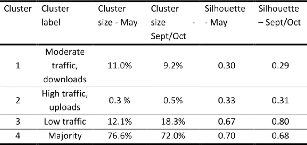
Table 3.5 - Cluster description, size and silhouette measure ... 28
Table 3.6 - Description, size and silhouette of the clusters obtained using the PCs ... 29
Table 3.7 - Cluster metrics when clustering using all variables, a subset of variables, and the PCs ... 29
Table 3.8 - Comparison between cluster sizes and silhouette values of May and September/October ... 31
Table 3.9 - Cluster metrics for cluster analysis using May and September/October data ... 31
Table 3.10 - Comparison between the distribution of MAC addresses per cluster using 5% or 100% of the population ... 32
Table 4.1 – Comparison of the percentage of clients using the internet when considering 5 MB or 1MB as the thresholds... 40
Table 4.2 – Evaluation metrics of the predicting usage model ... 44
Table 4.3 – Evaluation metrics of the predicting usage model ... 46
Table 5.1 - Input variables included in the model ... 52
Table 5.2 – Cross-validation results ... 56
Table 5.3 – Comparison of the performance of different algorithms ... 57
LIST OF EQUATIONS
Equation 2.1 – Within-cluster sum of squares ... 5Equation 2.2 - Silhouette ... 5
Equation 2.3 – Gap statistic ... 6
Equation 2.4 – Information gain ... 10
Equation 2.5 - Entropy ... 10
Equation 2.6 – Gini index ... 10
Equation 2.7 – Gradient descent formula ... 11
INTRODUCTION
1.1.
P
ROJECT DESCRIPTIONDuring the second year of the Nova University master program in Advanced Analytics, I enrolled in a 9-month internship at a network provider company. The present report summarizes some of the analytic activities developed during that period.
During the internship, I was part of a data science team mainly focused on understanding the factors related to customer’s experiences with the provided services. My work focused on identifying clients who may have had a bad experience the internet. More specifically, we tried to identify the customers’ who had no internet access.
The most obvious way to identify clients who may have had a bad experience with a service is to assess the service quality. In the case of the internet service, service quality is measured using data from the network monitoring systems. The company has different monitoring systems implemented, which register data from the quality of the service at different points in the network, and we had access to data from three of those monitoring systems. By combining the measures of these three systems, it may be possible to identify clients whose internet equipment may have had problems connecting to the internet.
However, a deterioration of the service may not always translate into a bad experience. Several other factors may affect the relationship between the quality of the service and the quality of experience, and some deteriorations of service may not be detected by clients (Fiedler, Hossfeld, & Tran-Gia, 2010). While the former is objective, in the sense that it is based on actual measurements of the network, the latter is subjective, depending on individual characteristics and behavior of the client.
The first aspect that may influence the translation of the quality of the service into the quality of experience is the way the client typically uses the service. Clients that use the internet for tasks that require fast connections with no transmission errors, such as calls or online games, may be more demanding than clients that use the internet mainly for emailing or browsing. Thus, the same service may translate as acceptable for some clients and unacceptable for others, depending on their usage. Still, there will be times when even a frequent user is not using the internet. If the internet signal degradation occurs at a time when the client did not use or attempted to use the internet, he or she will not notice the decrease in the quality of the service. This means that the client would not have a bad experience, no matter how bad the quality of the service is. Thus, usage of the service is a second aspect that influences the relationship between the quality of the service and the quality of the experience.
In the work reported in this document, we aimed to combine the objective parameters related to network quality of service with variables related to the usage of that service by the clients, to predict bad experience with the internet service. Ultimately, we aimed to identify a subset of clients who had multiple bad experiences with their internet access and may be dissatisfied with the internet service. Dissatisfaction with the internet service is one of the main key drivers of customer satisfaction identified by the company (internal communication); therefore, addressing the issues affecting satisfaction with the internet service is one of the companies’ priorities.
1.2. B
USINESS CONTEXTUALIZATIONThe work presented in this report was developed in a network provider company. The company provides television, fixed voice, fixed internet, mobile voice and mobile internet services. Clients can subscribe a single service or a bundle; usually, the latter options offers better prices and different bundles are available to tailor to different needs. Clients can also subscribe, rent or buy extra TV content (e.g., video on demand, premium channels), rent equipment, and or pay for communication and internet traffic not contained in their subscription.
Each service can be provided with different settings – for example, an internet client can have different internet speeds and there are TV equipment with different functionalities. Importantly, the service can be provided by a direct to home technology (satellite service) or by cable and/or fiber.
On the present report, we will focus on all internet clients that receive their service through a hybrid cable and fiber connection, which are the majority of the internet clients of the company.
The data used on the work described on this report was anonymized. We could not track any data to specific people, nor did we have access to any personal or sensitive information of the clients.
1.3. S
TRUCTURE OF THE PRESENT REPORTIn next chapter (Chapter 2 - theoretical framework), we will present a summary of the literature supporting our work. We will briefly review the available literature on quality of service and quality of experience and on segmentation of internet usage. We will also present a theoretical summary of the methodology of the algorithms used on this work (k-means and gradient boosted trees).
The empirical part of the work is described in chapters 3, 4 and 5. Because the empirical work required the application of different procedures and algorithms, we opted to present its methodological details within each chapter, instead of creating a separate methods chapter. In our perspective, this makes the report clearer and easier to read.
First, we started by segmenting clients based on their typical internet usage. While no information was available about what clients typically do online, we were able to look at the typical intensity and frequency of internet usage for each client, based on volume of upstream and downstream traffic. This work aimed to help identifying the clients that would have higher or lower needs and demands regarding the internet. Clients with lower typical usage are expected to fill less service requests for technical reasons, compared with clients who use the internet more frequently and intensely. If the client uses the internet service very seldom or for tasks that do not require much speed or large data streams, it is less likely that he or she would notice service degradation. Thus, a segmentation of the clients into different clusters can help identify clients who are more likely to have had a bad internet experience. This work is presented in chapter 3 (Segmentation of internet clients according to their
upstream and downstream traffic).
In chapter 4 (Predicting if clients would use the internet at a given time), we present the work done in developing and validating a special feature that represents the probability that the client would try to use the internet at a given hour. Different clients are likely to use the internet at different times. For instance, a client may always use the internet after 11 p.m., while other client may typically go to sleep before that time, and a third client may only use the internet at that time in alternate days. If a problem
in the network arises at 11 p.m., the first client will most certainly notice it; the second client probably would not notice it; and the third client may or may not notice it. This is important because a deterioration in the quality of internet service only translates to a deterioration in the service experience if the client tries to use the service. To contact a client because of a deterioration of service that the client did not notice could be damageable for the company image and a nuisance for the client. The work described in chapters 3 and 4 is complementary. In the segmentation analysis, clients are categorized clients according to their typical hourly usage. The most important variable is the volume of upstream and downstream traffic, on average. The probability of usage predicts whether the client typically uses the internet at a given hour, regardless of the volume of traffic generated. A client that streams internet content every day at a given hour will have the same score as a client who simply checks his or her email every day at that same hour. While the segmentation analysis helps us understand what the internet needs of the client are, the probability of usage helps us understand if the client would have noticed an eventual degradation of service.
In the last empirical chapter (chapter 5 – Predicting clients with no access to the internet), we describe the work we did developing and evaluating a classifier to identify clients who did not have access to the internet at a given time. In this model, we combined information about the network signals on three different network-monitoring systems with data indicating the segment the client belonged to and his or her probability of trying to use the internet at a given time (the work described in chapters 3 and 4, respectively).
The last two chapters are dedicated to a reflection on the strengths and limitations of our results. In chapter 6, we provide our conclusions about the work developed in the context of the internship, summarizing the main findings and their impact for the business. Finally, in chapter 7, we present the limitations of the work and suggest future work paths.
THEORETICAL FRAMEWORK
In this chapter, we aimed to give an overview of the theoretical background that supports the current report. To organize the chapter better, we divided its content into two main parts. In the first part, we focus on the framework of the segmentation of internet users. We present an overview of related work and a theoretical summary of cluster analysis. In the second part, we focus on the framework of the identification of internet users with a bad internet experience. We present a theoretical summary of the algorithms we used (decision trees, random forests and gradient boosted trees) and of the evaluation and interpretation of classification models.
2.1. I
NTERNET USERS’
SEGMENTATION:
CLUSTERING ALGORITHM AND RELATED WORK2.1.1. Cluster analysis
Cluster analysis aims to divide the dataset into clusters that are meaningful. That is, clusters that capture the internal structure of data and, therefore, can adequately describe the dataset through the characterization of the clusters, rather than individual points (Tan, Steinbach, & Kumar, 2006). Using this technique, it possible to reduce a large dataset into smaller, more interpretable groups (Hand, Mannila, & Smyth, 2001).
The goal in cluster analysis is to group cases that are similar to each other in the same cluster and, at the same time, maximize the difference between points in different clusters (Tan et al., 2006). Usually, similarity is established using distance-based measures, such as the Euclidean or the Manhattan distance, or correlation coefficients.
Clustering analysis is an unsupervised technique, meaning that there is no ground-truth to which the results of the analysis can be compared (Hand et al., 2001). Thus, evaluating the performance of the analysis is a little more challenging. Typically, the algorithm is evaluated through measures such as intra-cluster distance (the distance to a point to every point in the same cluster) and inter-cluster distance (the distance between a point and the closest point that belongs to a different cluster. Clusters can also be evaluated in terms of their external validation, that is, how meaningful they are in predicting variables that were not included in the initial cluster analysis; how stable they are in different time-points; and more subjective measures such as how the results match the users’ domain-knowledge and the purpose of the analysis.
Clustering algorithms can be classified into hierarchical methods and partition methods. In hierarchical methods, clusters are nested into each other, and can be viewed as a hierarchical tree. In partition methods, each point is assigned to a single, non-overlapping cluster.
In the work described in this report, we mainly used k-means, an algorithm that follows a partition method. K-means is one of the oldest and most common clustering algorithms, due to its simplicity and ability to handle large datasets (Tan, Steinbach & Kumar., 2006).
2.1.2. The K-Means algorithm
The first step in k-means is to randomly select k points in the dataset. The position of those points in the space will be the initial centers of the clusters, called centroids. Then, the following steps are completed:
1. For every point in the dataset, compute the distance between that point and each of the previously defined centroids.
2. Attributed the point to the closest centroid.
3. When all points have been attributed, recalculate each centroid, by averaging all the points that have been attributed to that cluster.
4. Calculate the distance between each new centroid and the centroid it is replacing. If the distance is bigger than a user-defined constant, go back to step one. If not, the algorithm terminates.
One of its biggest challenges in k-means is the definition of the number of clusters, k, beforehand. To define the number of clusters, several approaches can be followed, which include operational concerns (e.g., making sure that the number of clusters is actionable) and more objective metrics. Below, we present three of the most common metrics that help to select a k value:
Within-cluster sum of squares (WSS): WSS is a cohesion measure. It represents the sum of the distance of each point to the centroid of the cluster they were assigned to, summed across all clusters. It is calculated through the following formula:
∑ 𝑊(𝐶
𝑘) = ∑ ∑ (𝑥
𝑖− 𝜇
𝑘)
2 𝑥𝑖 ∈ 𝐶𝑘 𝑘 𝑘=1 𝑘 𝑘=1Equation 2.1 – Within-cluster sum of squares
Where
𝐶
𝑘is a cluster resulting from the analysis,𝑊(𝐶
𝑘)
is the within-cluster sum of squares of cluster𝐶
𝑘,𝑥
𝑖 is a point belonging to cluster𝐶
𝑘,
and𝜇
𝑘 is the centroid of cluster𝐶
𝑘,
corresponding to the average of all points in the cluster.
Increasing k typically reduces WSS, to the point where WSS is zero (each data point is in its own cluster). It is important to balance the benefit in the increase of cohesion and the cost of adding one more cluster to the solution. This is usually done by plotting the WSS and observing where the line starts to plateau (the “elbow”).
Average silhouette: silhouette is a measure of the similarity of a data point to its own cluster (cohesion), compared to its similarity to other clusters (separation). The silhouette can be calculated with any distance measure (e.g., Euclidean, Manhattan). It produces values between -1 and 1 and the highest the value, the better the clustering solution (Rousseeuw, 1987). For each cluster, it is calculated through the following formula:
𝑠(𝑖) =
𝑏(𝑖) − 𝑎(𝑖)
max {𝑎(𝑖), 𝑏(𝑖)}
Equation 2.2 - SilhouetteWhere a(i) is the average distance between a data point i and all points assigned to the same cluster as i, and b(i) is the lowest average distance between i and all points in any other cluster to which i was not assign to (Rousseeuw, 1987). The silhouette value across all clusters is calculated by averaging the silhouette values of all clusters.
Gap statistic: the gap statistic was developed by Tibshirani, Walther, and Hastie (2001). It compares the logarithm of the obtained intra-cluster variation1 log(𝑊
𝑘) with the expected
logarithm of the intra-cluster variation of a reference null distribution (𝐸𝑛∗log(𝑊𝑘)), a uniform
distribution with no obvious clustering structure. The bigger the gap statistic, the better the clustering solution. We present the formula for the gap statistic below.
𝐺𝑎𝑝
𝑛(𝑘) = 𝐸
𝑛∗log(𝑊
𝑘
) − log (𝑊
𝑘)
Equation 2.3 – Gap statistic
Typically, the user rans several iterations of the algorithm with different values of k, computing one or more of these measures for each k. Then, the k that leads to the best metric(s) is selected. These metrics can also be combined with more subjective evaluations of cluster interpretability, cluster size and even total number of clusters, if the main goal of the analysis is to define actionable and interpretable clusters.
K-means results may also vary a lot depending on the initial seeds, which are usually selected at random. Therefore, it is recommended that the algorithm be ran several times, with different initializations seeds. Since it is a distance-based algorithm, outliers have a lot of influence on k-means results.
Since the attribution of points to the cluster is based on distance, k-means assumes that clusters are spherical and has trouble identifying clusters with different shapes.
2.1.3. Related work on Internet users’ segmentation:
Several authors have tried to segment people according to their internet usage. However, most studies have used subjective measures of users, that is, they have conducted surveys that ask participants what they do online and with what frequency.
For instance, Ortega Egea, Recio Menéndez, and Román González (2007) used survey data on how frequently people accessed the internet and how frequently they engaged in activities such as online shopping and usage of eGovernment services. They used a two-step cluster algorithm, which first pclusters the datapoint into many small pclusters (using a modified cluster feature tree), and then re-cluster these re-clusters (using an agglomerative hierarchical re-clustering method), in order to be scalable and able to handle large datasets. The users were clustered in five segments, ranging from non-users (44% of the sample) to advanced users (19% of the sample). They then used demographic variables to perform external validation of the clusters and did discriminant analysis of the clusters (discriminant analysis uses the same variables used for clustering to predict the cluster to which each data point was attributed).
Brandtzæga, Heim, and Karahasanovic (2011) also clustered people according to their self-reported online behavior but included more questions regarding the frequency of specific online activities. They used k-means to identify five segments of users, according to frequency of internet usage and most common online activity: non-uses, sporadic users, entertainment users, instrumental users, and advanced users. To validate the clusters, they performed a logistic regression predicting the
1 Intra-cluster variation is the average of the distances between a point to all the other points in the same cluster, summed across clusters.
membership to a given clusters using variables such as age, gender and number of people in the household.
However, the most relevant study for our work is the analysis developed by Oliveira, Valadas, Pacheco, and Salvador (2007) and by Kihl, Lagerstedt, Aurelius, and Ödling (2010), who used objective variables to segment users.
Oliveira et al. (2007) segmented internet users according to their download transfer rate, measured every half-hour on a single day. They applied a principal components analysis to the measures of transfer rate for each half-hour and extracted two factors. The first factor was an average of the utilization throughout the day, and the second factor corresponded to the difference between the morning and the afternoon usage. Then, they applied an agglomerative hierarchical clustering method to the data, which they separately combined with two methods to decide which clusters to merge: The Ward method and the partitioning around medoids method. The two methods gave similar results, which consisted of three clusters:
• Cluster 1: High transfer rate in all periods.
• Cluster 2: Low transfer rate in the morning, high transfer rate in the afternoon. • Cluster 3: Low transfer rate in all periods.
The authors used discriminant analysis to validate the obtained clusters. In addition, the clusters were also externally validated by checking the most used applications in each cluster (e.g., f
ile sharing,
HTTP, Games)
.Kihl et al. (2010) clustered users according to their average daily inbound and outbound traffic, and the number of applications used over one month (without further classifying the applications according to their type). They identified three clusters:
Cluster 1: Lower inbound and outbound traffic, low number of applications used;
Cluster 2: Moderate inbound and outbound traffic, moderate number of applications used; Cluster 3: Higher inbound and outbound traffic, higher number of applications used.
It is noteworthy that 80% of the users were on cluster 2, the cluster with moderate usage. The authors did not perform any further validation analysis of the clusters, nor did they specify the clustering algorithm used.
2.2.
IDENTIFYING CLIENTS WITH A BAD INTERNET EXPERIENCE:
D
ECISION TREES,
RANDOM FORESTS AND GRADIENT BOOSTED TREES ALGORITHMSMachine learning algorithms are generally classified as supervised or unsupervised learning algorithms. Unsupervised learning algorithms are unsupervised in the sense that there is no ground truth they can “learn”. For instance, the clustering algorithms described in the previous section are unsupervised, because they aim to extract patterns from the data without those patterns being presented to them beforehand. Conversely, supervised learning algorithms are algorithms that have a ground truth – they aim to “learn” that ground truth and then apply it to new data. In other words, the algorithm is told what a given pattern looks like and then it tries to apply that pattern to novel situations.
One typical supervised learning problem is a classification problem. In these cases, the algorithm is presented with a dataset composed of a set of attributes and a target variable, which correspond to a
discrete class. The algorithm tries to learn which attributes correspond to which classification, to then classify new instances in one of the available classes. If there are only two classes available, it is a binary classification problem; if there are more than two classes in the dataset, it is a multi-classification problem.
Thus, to learn, the algorithm needs to be presented with some instances of data (a training set). Then, the algorithm performance is tested in new instances, which were not used to train the algorithm (the test set). This allows us to understand whether the patterns learned by the algorithm are generalizable outside the training set or if, instead, the algorithm over-fitted to the data. Over-fitting means that the algorithm learned the particularities of a given dataset too-well, in the sense that it learned patterns that are only present in that dataset (i.e., it learned noise in the data).
To test for the ability of the algorithm to generalize, two methods are generally used. The first method consists in dividing the dataset into two partitions: a training set and a test set. This is faster, but it may be biased depending on which instances end up in the training and testing sets. For instance, if the dataset is small, the test set may not be representative of the entire dataset, and the algorithm could perform much better (or much worse) on that particular subset of cases. Another way to validate the generalizability of the classifier is k-fold cross-validation. In k-fold cross-validation, the dataset is partitioned into k folds. Then, the k-1 folds are used to train the model, while the one partition is used to test the model. The procedure is then repeated until all folds were used to test the model, as represented in the following schema (Terribile, 2017):
Figure 2.1 – K-fold cross-validation schema
The performance of a given algorithm corresponds to the average of the performance in each of the test folds, also taking standard deviation into consideration (because a classifier can perform very well on some folds but poorly on others, which would lead to a high standard deviation; an ideal classifier would perform well across folds). This allows the user to have more confidence that the model would generalize well on different subsets of the data.
In the remaining of this section, we will present some theoretical background on tree-based classifiers: decision-trees, random forests and gradient boosted trees. These were the algorithms we used on the work we are presenting in this report, for interpretability (in the case of the decision trees) and performance reasons (in the case of random forests and gradient boosted trees models).
2.2.1. Decision trees
Decision trees are popular algorithms that can be used for classification (binary and multiclass) and regression problems. Decision trees can be conceptualized as a set of if-then rules that classify each data point according to its attributes. Each node of the tree is a rule that indicates the “path” on the tree a data point must follow, depending on the value the data point has on a given attribute. Ultimately, each data point will end on a “leaf”, that is, a final node of the tree, which has no children, and will be classified according to the value on that leaf. Below, we reproduce a classic example of a tree, to help visualize the algorithm.
Figure 2.2 – The “play tennis” decision tree.2
The value of the leaf is defined based on the proportion of train cases that ended up on that leaf and belong to each class (if it is a classification tree) or based on the average target-value of the train cases that ended up on that leaf (for regression trees).
Decision trees are built through recursive partitioning, meaning that the data space is sequentially partitioned into smaller spaces, with increasingly higher homogeneity and to which simpler models can be applied (Bishop, 2006). Depending on the decision tree algorithm, those splits can be binary, meaning that only two branches are generated at each split (as is the case with, for example, the CART algorithm) or have more branches (as is the case of the ID3 algorithm).
However, a typical dataset has many variables, and each variable is a candidate for a given node. We need some criteria to select the variable (and the cut-off points on that variable) that will be used in each partition. The most traditional tree-based classification algorithms (e.g., ID3, CART) are greedy, in the sense that the variable selected is the one that maximizes the information gain at that split, or, equivalently, minimizes the error of the model at that split. These measures capture the increase in “purity” of the resulting node, that is, the homogeneity of classes in that node. Typical measures used to measure information gain/error reduction in classification trees are entropy and the Gini index, which are based on the proportion of cases of each class in the resulting nodes. The formula for information gain is:
https://nullpointerexception1.wordpress.com/2017/12/16/a-tutorial-to-understand-decision-𝐺𝑎𝑖𝑛(𝑆, 𝐴) ≡ 𝐸𝑛𝑡𝑟𝑜𝑝𝑦(𝑆) −
∑
|𝑆
𝜈|
|𝑆|
𝜈 ∈𝑉𝑎𝑙𝑢𝑒𝑠(𝐴)
𝐸𝑛𝑡𝑟𝑜𝑝𝑦(𝑆
𝜈)
Equation 2.4 – Information gainWhere S is the population of a given node, A is a given attribute with v possible values and
𝑆
𝜈is thesubset of 𝑆 for which attribute A has value 𝜈.
Entropy for an attribute that has c possible values can be calculated using:
𝐸𝑛𝑡𝑟𝑜𝑝𝑦(𝑆) ≡ ∑ −𝑝
𝑖log
2𝑝
𝑖𝑐
𝑖=1
Equation 2.5 - Entropy
Where 𝑝𝑖 is the proportion of instances in the node S that have a given value i for the attribute.
Similarly, to entropy, Gini is also an impurity measure. If Gini index is the criteria selected for
selecting the variable for a given split, the reduction in the overall Gini index is considered. Gini index can be calculated using the following formula, where pj is the proportion of cases in each node:
𝜙(𝑝) = ∑ 𝑝
𝑗(1 − 𝑝
𝑗)
𝑗
Equation 2.6 – Gini index
The algorithm keeps producing splits until some stopping criteria is reached. That stopping criteria can be defined in different ways. It can be:
A limit in the maximum depth of the tree, that is, in the number of edges from the lowest node to the tree's root node;
The number of observations in a leaf node for an extra split to be attempted; The minimum number of observations on each leaf;
A complexity parameter that defines how much error the split needs to reduce to be considered;
These stopping criteria prevent the tree overfitting the training data. If the tree was allowed to grow indefinitely, it would eventually get a perfect classification of the training data, as it would cover all possible cases. However, this would typically mean that it would not generalize well to unseen data, because it had learned how to identify specific cases instead of more general rules of the dataset that are applicable to other cases.
Alternatively, some decision tree algorithms allow the tree to grow very large and, posteriorly, prune the tree, i.e., remove sections that add little value to the model (which is evaluated through a validation set). This technique also prevents overfitting and has the advantage of not forcing the user to estimate when the tree should stop growing.
2.2.2. Random forests
As the name suggests, random forests are groups of decision trees. In other words, they are an ensemble method, which rely in developing several (usually hundreds) of decision trees and then combining the results of all those trees. The results can be combined in several ways, such as voting or taking the average of the predictions of all trees. We note, however, that ensembles do not need to consist of tree-base algorithms (or any single type of algorithm for that matter) – any type of classifier can be part of an ensemble, which usually outperforms the individual classifiers in the ensemble. Each tree is built on a random subset of the data, which are usually drawn with replacement (meaning that each datapoint can be included in more than one tree), a technique called bagging. This could lead to much higher accuracy of the model, but this is only true if the classifier is unstable, that is, if its output varies a lot with small changes in the input data (see Breiman, 1996).
In addition, it is common that each tree in a random forest is built using only a subset of the features in the dataset, to increase diversity in the trees. The number of variables randomly selected for each tree is user-defined. In addition, the user may control all the parameters of each decision tree, as described in the above section.
2.2.3. Gradient Boosting Models
Like random forests, gradient boosted models are algorithms based on the ensemble of several weak classifiers to produce a better classifier. Typically, those classifiers are also decision trees (but can be any other algorithm) and are considered weak in the sense that their individual performance is only slightly better than chance. However, while in random forests the trees are built independently from one another, in boosted models the trees are built sequentially. Each additional classifier attempts to correct the classification errors of the previous classifier, by attributing more weight to the previously misclassified cases. Data points that are misclassified by successive classifiers receive an increasingly greater weight. After the training of all classifiers, the prediction is derived through a weighted majority voting scheme, where the weight given to each classifier depends on its performance (more accurate classifiers receive greater weight). This is the base of boosting algorithms such as AdaBoost (Bishop, 2006).
In gradient boosting (Friedman, 2001), a gradient descent (also called steepest-descent) function is applied, which is an optimization algorithm to find local optima. In this algorithm, a parameter vector 𝑤 is calculated using the formula:
𝑤
(𝜏+1)= 𝑤
(𝜏)− 𝜂 ∇ 𝐸
𝑛 Equation 2.7 – Gradient descent formulaWhere
∇ 𝐸
𝑛 is the gradient of the error function,𝜂
is a learning rate parameter and𝜏
is the iteration number (Bishop, 2006). In the case of gradient boosted models, this means that the algorithm will converge to a local minimum in the error function.Stochastic gradient boosting, which was proposed by Friedman (2002) mixes bagging and boosting procedures. This model, uses gradient boosting, but adds additional randomness by randomly selecting a subset of the sample at each interaction (without repetition). This means that only a subsample of
observation will be randomly selected for fitting each tree, which may improve the accuracy of the classifier, especially for small samples and high-capacity base classifiers (Friedman, 2002).
Several parameters can be tuned when applying a stochastic gradient boosted tree model. Below, we list the most common:
Depth of each tree: what is the maximum depth that each individual tree can achieve; Number of trees: how many trees should be sequentially grown;
Minimum number of observations in each node: minimum number of observations in the trees terminal nodes;
Bag fraction: the percentage of observations that is used to fit each tree;
Shrinkage: also called learning rate, is a weighting factor for the corrections by new trees when added to the model. It can be roughly understood as how fast the algorithm learns; a larger learning rate may mean that the model “misses” the optimum and starts to overfit; a smaller learning rate means that the model needs more step (in gradient boosted trees, more trees) to get to a certain error reduction (Laurae, 2016).
2.2.4. Evaluation of classification models
Several metrics can be used to assess a binary classification model performance. Most of these measures are based on the concept of true and false positives or negatives. True positives (TP) are cases that were classified by the model as positives and were actual positives. Accordingly, false positives are cases that were classified by the model as positives but were actual negatives. True and false negatives are cases that were classified as negative and were actual negative and positive, respectively. The distribution of cases among these classes is usually organized in a confusion matrix, which is schematized below.
AC TUAL C LASS PREDICTED CLASS
P
N
P
True positives (TP) False negatives (FN)N
False positives (FN) True negatives (TN) Figure 2.3 – Confusion matrix schemaBased on these classes, it is possible to derive several measures that inform about the model quality. Next, we summarize some of these measures.
Measure Description Formula Accuracy Measures the total number of correct
classifications, over the total cases
𝑇𝑃 + 𝑇𝑁 𝑇𝑃 + 𝑇𝑁 + 𝐹𝑃 + 𝐹𝑁 Sensitivity
Rate of positives cases correctly identified as positive, out of the actual positive cases. Also known as Hit rate, Recall, or
True Positive Rate.
𝑇𝑃 𝑇𝑃 + 𝐹𝑁
Specificity
Rate of negative cases correctly identified as negative, out of the actual negative cases. Also known as True Negative Rate.
𝑇𝑁 𝑇𝑁 + 𝐹𝑃 Precision Rate of true positives out of the total
number of cases classified as positives.
𝑇𝑃 𝑇𝑃 + 𝐹𝑃 F1
Harmonic mean of precision and sensitivity. By combining the two
measures, it allows
2𝑇𝑃 2𝑇𝑃 + 𝐹𝑃 + 𝐹𝑁 Table 2.1 – Summary of model performance measures
To compute these measures, it is necessary to establish a cutoff point for the probability attributed by the model. By default, most binary models assume a 0.5 cut-off point. If the probability is above this cut-off, the case is attributed to a class; if it is below, the case is attributed to the other class. However, the user can adjust the cut-off point, which is especially useful when the cost of mispredicting a class is higher than the cost of mispredicting the other. For instance, the cost of a false negative may be higher than the cost of a false positive, such as when failing to detect the onset of a disease is higher than the cost of sending the patient for further analysis.
Usually, the establishment of the cut-off point depends on a trade-off between sensitivity and specificity. To help define such a threshold, it is common to plot the Receiving Operator Characteristic (ROC) curve. The ROC curve plots the values of sensitivity and (1 – specificity) that would result from choosing different cutoff points.
The more the resulting curve approximates of the left corner of the plot (i.e., the more sensitivity = 1 and 1 – specificity = 0), the better the performance of the model. For comparison, it is usually also plotted the line corresponding to a random classifier. The picture below, adapted from Parkes (2018) helps understand this description better.
Besides helping to select a cut-off point (by selecting a point that maximizes a metric, without compromising the other metric too much), the ROC curve also provides a visual information about the model perform.
As an additional measure of model performance, it is also possible to calculate the Area Under the ROC Curve (AUROC). The AUROC represents the probability that a model will classify a randomly chosen positive instance higher than a randomly chosen negative one. Thus, a value of 1 for AUROC corresponds to a perfect classifier, and a value of 0.5 means that the model performance is at chance level.
2.2.5. Interpretation of classification models
When fitting a given model, it is important to understand how the predictors are related to the target value, to make sure the model learned something sensible and to help making model improvements. A frequent critic to complex machine learning algorithms such as gradient boosted models is that they are hard to visualize and interpret. To help overcome this difficulty, several techniques have been proposed.
One way to understand how variables are being used in the model is to look at the variable importance. In tree-based models, variable importance is usually based on the error reduction each variable is responsible for, considering not only the splits it is included in but also the splits to which it is one of the top candidates for the split. On boosted trees, the final variable importance is the sum of the importance in each boosting iteration (Kuhn, 2007). It is also common to scale variable importance by setting the importance of the most important variable as 100, and the importance values of other variables relative to that one.
However, variable importance does not inform about the way each input variable relates to the target variable. This limitation may be address by, for example, visualizing the target variable in relation with
Se
n
sit
ivi
ty
1 - Specificity
the input variable in a scatter plot, to understand how certain values of the input variable are related to the target variable. But this is also not a good solution, because it does not take into consideration the effect of other variables included in the model.
Partial dependence plots (Friedman, 2001) try to overcome these challenges, by representing the relation between predictors and the target, while considering the average effect of other predictors (Greenwell, 2017). Partial dependence plots can be interpreted in a way that is similar to the coefficients in linear or logistic regression, but they can be used with any model.
After fitting the model, partial dependence plots can be generated by varying the values of a given predictor and estimating the effect on the target value or the probability of the classification, across all observations (Becker, 2017). More specifically, the pseudo-code for partial dependence plots is the following (Greenwell, 2017):
Let 𝑥1 be the predictor variable of interest with unique values {𝑥11, 𝑥12,… , 𝑥1𝑘 }, and 𝑓̂(𝑥) the
prediction function.
1. For 𝑖 ∈ {1, 2, … , 𝑘}:
a. Copy the training data and replace the original values of 𝑥1 with the constant 𝑥1𝑖.
b. Compute the predicted values using the dataset resulting of step a. c. Compute the average prediction to obtain 𝑓̅ (𝑥1 1𝑖 ).
SEGMENTATION OF INTERNET CLIENTS BASED ON THEIR UPSTREAM AND
DOWNSTREAM TRAFFIC
Different clients may have different perceptions of the quality of the internet at a given time, even when objective parameters of that quality are the same, based on how much and for what they use the internet. However, to investigate these potentially different perceptions we need to first identify patterns of internet usage among clients. To do so, we performed a cluster analysis aiming to group clients based on the amount of uploads and downloads their modems registered per hour.
3.1. D
ATA SELECTION AND PREPARATIONFor data selection and transformation, we used Microsoft SQL server, which is a database management system that uses the SQL language to query, transform and extract data (Microsoft, 2018).
We retrieved the data describing the hourly traffic (uploads and downloads) associated with a clients’ cable modem MAC addresses (from now on, designated as MACs). We focused on non-business clients with an active HFC internet subscription in the month of May.
We note that data was anonymized, in the sense that we had only access to the MAC of each device and the account ID it was associated with, but not access to the actual name or address of the account holder. In addition, we had only access to the volume of traffic generated by each MAC; besides volume, we had no information about the online activity of the client (for instance if the internet was being used for browsing, gaming or streaming).
The data we used had a temporal granularity of an hour. After excluding null values and duplicate rows, we created the features for the clustering analysis, computing the following transformations of the traffic data:
Average hourly rate of uploads and downloads;
Standard deviation of the hourly rate of uploads and downloads;
Average hourly ratio of uploads to downloads; if the average of downloads was zero, we considered this ratio to be zero as well;
Each of these transformations was performed for several date/time periods, based on business insights:
Across the full month;
For working and for non-working days;
For the morning/afternoon, evening and night period;
For working days morning/afternoon, evening and night periods; For non-working days morning/afternoon, evening and night periods.
The available traffic data was computed in bytes. After the calculation of averages and standard deviations, we converted the values to kilobytes.
We also computed four additional variables that represented, for each MAC, the number of hours where the traffic was higher than a given threshold (calculated separately for uploads and downloads).
These thresholds were the approximated average hourly upload traffic and the average hourly download traffic (for the full month) of the top 90% and 99% of the sample. These thresholds are depicted in the figures below.
With these thresholds, we hoped to create variables that would reflect the intensity of usage of each client, since, for example, two users can have similar hourly average traffic if they used the internet moderately for many hours or very intensely for only a couple of hours.
Finally, we created a variable measuring the number of days each device had a significant traffic, that is, the number of days the device was actively used. To calculate this variable, we first analyzed the traffic of cable modems belonging to customers who do not have an internet subscription; the cable modems of these clients are only used to make voice calls. For 92% of these devices, the average daily consumption was less than 1MB, for both variables. We considered this value as our threshold and counted the number of days where each MAC had an upload and download traffic higher than 1MB. We then divided that number by the number of days the MAC had entries.
3.2. D
ATA EXPLORATIONAfter computing the variables described above, we proceeded to the exploration of the obtained data. To do so, we used Open Database Connectivity (ODBC) to read data from SQL Server into R. ODBC is an Application Programming Interface (API) that allows access to database management systems, designed specifically for relational data stores (Milener & Guyer, 2017). R is a programming language and an open-source environment typically used in data analysis and visualization (R Project, 2018).
3.2.1. Initial analysis
We first checked for data inconsistencies (e.g. values too big or too small to be possible; null values). After verifying that the data was consistent, we counted the number of clients who had zero hourly
90% 26MB
99% 206 MB
Hourly average traffic (uploads)
90% 267 MB
99% 740 MB
Hourly average traffic (downloads) Figure 3.1a and b - Values considered for the 90 and 99 thresholds
average consumption across the different date/time periods. We verified that these were less than 1% of the sample for all the considered variables.
3.2.2. Outliers
Regarding outliers, even though we had very high maximum values, we could not find a clear breaking point in the data that would remove enough data points to be meaningful. To illustrate this point, we present below a scatter plot relating the average hourly traffic for uploads and downloads, across the full month.
Figure 3.2 - Hourly average of up and downstream traffic, across the full month
Even though it was possible to identify cutting points that would remove perhaps around 10 outliers, it would not have much impact, considering that there over eight hundred thousand MAC addresses in the population. This finding was similar for the other traffic variables considered. Therefore, we decided to use the entire population in the analysis. This decision also addresses a business concern: each outlier was an actual client and we wanted to include all of them. In addition, high usage outliers are especially interesting from the business point of view.
3.2.3. Data distribution
The table below contain information about the average and spread of the average traffic for the full month.
Average Uploads (Month) Average Downloads (Month) SD Uploads (Month) SD Downloads (Month) Average 15.1 MB 98.9 MB 45.0 MB 242.4 MB Min. 0.0 MB 0.0 MB 0.0 MB 0.0 MB Median 3.7 MB 50.2 MB 11.4 MB 134.5 MB Max. 7447.8 MB 22754.1 MB 3826.9 MB 15723.4 MB
Table 3.1 - Average and spread measures for the hourly averages and SD of traffic across the full month, in MB.
It is possible to observe that the average, median and maximum for the hourly average of downloads was much higher than uploads. In addition, the spread of the variables was big, with very large maximum values for uploads and downloads.
The histogram of the average variables also suggested that these variables follow a long-tail distribution.
Figure 3.3a, 3.3b, 3.3c and 3.3d -
The variables measuring average traffic in specific date/time periods had similar average and spread values among themselves; the average and spread was also similar to the values of the monthly Figure 3.3a, b, c, and d - Histograms representing the distribution of the hourly average traffic for the
average presented above. For the sake of simplicity, we will not present them. Traffic was higher for evenings of non-working days and lower for the day period of working days, as expected.
The following histogram presents the distribution of the upload to download ratio variable:
Figure 3.4a and b - Histograms representing the distribution of the upload to download ratio for the bottom 95% and the top 5%, for uploads and downloads.
As it is visible from the right-hand plot, the distribution had a very long tail (up to 8000 uploads to downloads), but most clients had a much smaller upload to download ratio. 92% of the sample has an average upload to download ratio for the full month lower than 1, and 99% of the sample has a ratio lower than 4.5.
Finally, we analyzed the distribution of the threshold variables. We started by looking at the number of days each user had active internet usage, defined as the number of days where uploads and downloads were higher than 1MB.
Figure 3.5 - Histogram of the variable representing the ratio of number of days with active internet usage.
63% of the population had active internet usage for all the days there were entries available; 89% of the population had active usage for at least half of the days.
We present the histograms representing the distribution of the hourly threshold variables below. Recall that these variables indicated the number of hours each user generated traffic above the average hourly traffic of 90% and 99% of the population.
Figure 3.7a and b - Histogram of the variables representing the number of hours with traffic higher than the average traffic of 99% of the sample, for uploads and downloads, respectively.
We computed two additional variables, representing the difference between the average traffic on working days and the average traffic on non-working days, for uploads and downloads. To calculate these variables, we subtracted the average hourly traffic on working days from the average hourly traffic on non-working days.
As shown in the following histograms, many users have similar traffic on working and non-working days:
Figure 3.6a and b - Histogram of the variables representing the number of hours with traffic higher than the average traffic of 90% of the sample, for uploads and downloads, respectively.
Figure 3.8 - Histogram representing the difference in upload traffic for working and non-working days, for the middle 90% of the sample
Figure 3.9 - Histogram representing the difference in download traffic for working and non-working days, for the middle 90% of the sample
There are more users on the right side of the distribution, and the right tail of the distribution is larger, for both histograms. This means that more user traffic is larger on non-working days than working days.
3.2.4. Correlation among variables
For clustering, to include variables that are highly correlated may not only add unnecessary complexity to the analysis (because each cluster will behave very similarly in variables with high collinearity, which means that adding more variables does not help to differentiate the groups in the analysis) but also bias the results, particularly on distance-based clustering algorithms. Adding many variables that are highly correlated skews the analysis towards these variables, giving more importance to what these variables are measuring than to other aspects that can be equally important in the analysis. This tends to produce clusters who have only different average values in the highly correlated variables, leading to less interesting segments (Sambandam, 2003).