REM WORKING PAPER SERIES
How “Big” Should Government Be?
António Afonso and Ludger Schuknecht
REM Working Paper 078-2019
March 2019
REM – Research in Economics and Mathematics
Rua Miguel Lúpi 20, 1249-078 Lisboa,
Portugal
ISSN 2184-108X
Any opinions expressed are those of the authors and not those of REM. Short, up to two paragraphs can be cited provided that full credit is given to the authors.
1
How “Big” Should Government Be?
*António Afonso
$, Ludger Schuknecht
#2019
Abstract
We assess how “big” government should reasonably be in a number of advanced countries. First, we will link the recent findings of Data Envelope Analysis on efficient public expenditure with the question of the size of the government. Second, we report descriptive analysis of various government performance indicators in relation to public expenditure to provide indications of overall “optimal” across spending categories. In principle, the highest savings potential is in the biggest expenditure categories, public consumption and social expenditure
Keywords: government size; government efficiency; DEA; advanced economies JEL codes: C14; E62; H11; H50
* The usual disclaimer applies and all remaining errors are the authors’ sole responsibility. The opinions expressed
herein are those of the authors and not of their employers.
$ ISEG – School of Economics and Management, Universidade de Lisboa; REM – Research in Economics and
Mathematics, UECE. UECE – Research Unit on Complexity and Economics is supported by Fundação para a Ciência e a Tecnologia. email: [email protected]
2
“The question we ask today is not whether our government is too big or too small, but whether it works (…). Where the answer is yes, we intend to move forward. Where the answer is no, programs will end. And those of us who manage the public's dollars will be held to account – to spend wisely, reform bad habits, and do our business in the light of day – because only then can we restore the vital trust between a people and their government.”
(Barack Obama inaugural speech, 20 January 2009)
1. Introduction
How big should government be? This question has fascinated economists for decades and of course there is no right answer. The growth of government over the past century and a half allowed a significant expansion of public services. However, do governments have to spend as much money as they do today? How much spending is needed to do well on core objectives such as education, the rule of law, social safety nets or public infrastructure? Is it worth spending so much and pay high, growth-reducing taxes, and take the risk of growing debt?
There are important external factors that can influence the optimal size of government but the direction is not always clear. A small open economy may want to have a bigger public sector with more safety nets than a large closed one so that the stabilising effect of government is larger (Rodrick, 1998). Alternatively, it may face more competition internationally and, therefore, need a smaller public sector (Sinn, 1997; Potrafke, 2009).
Institutions matter in particular. A country with an effective and less distortionary tax system can finance a bigger government at the same cost as another country might with a less efficient tax system (OECD, 2018). Countries with well-functioning institutions and trust in government can afford a larger government than a country with weak institutions and a tendency to corruption and rent seeking. The incidence of strong spending increases in the context of financial crises may suggest smaller public sectors to provide a large buffer to stabilise the economy (Borio et. al 2019; Schuknecht, 2018).
In addition, and still being aware of efficiency losses, one needs to consider the need to finance the spending side of the budget. In this context, Afonso and Gaspar (2007) illustrate numerically that financing through distortional taxation causes excess burden (deadweight loss) magnifying the costs of inefficiency.
Tanzi and Schuknecht (2000) argued 20 years ago, that 30-35% of GDP might be enough, in some cases perhaps 40%. This was a pragmatic and realistic objective. Pevcin (2004) finds that the spending ratio of eight European countries (averaging around 50%) should have been 19% of GDP lower. Mladenova (2009) sees the optimum at 25% of GDP for maximising economic growth in 29 OECD countries.
3
In this study, we will take a pragmatic approach, looking at a number of advanced countries. First, we will link the recent findings of Data Envelope Analysis (DEA) on efficient public expenditure (Afonso and Kazemi, 2017) with the question of optimal government size. Second, descriptive analysis of various government performance indicators in relation to public expenditure provides indications of overall optimality and optimality across spending categories.
It is worth recalling public expenditure developments from an international and historical perspective. The size of government across advanced economies increased from about 10% of GDP in 1870 via nearly 30% in 1960 to about 45% in 2017. “Top spenders” 2017 reported ratios above 50% of GDP, Ireland and Singapore below 30%. Chart 1 provides the average spending ratio for a number of advanced countries in the ten-year period up to 2017.1
[Chart 1 Total Expenditure]
The result suggest that a pragmatic “optimum” of public expenditure still appears to lie in the 30-35% of GDP range. A few countries with very effective government may reasonably spend 40% or so, notably if they want to attain more equal income distribution. However, there are also countries that do well with spending below 30% of GDP. Significant savings are possible across all categories in many countries.
2. Non-parametric assessment of government size
A number of economist applied non-parametric techniques to measure public sector performance and efficiency (Herrera and Pang, 2005, Afonso, Schuknecht and Tanzi, 2005, 2010a, 2010b, Afonso and Aubyn, 2005, 2006, Sutherland 2007, Adam, Delis and Kammas, 2011, Afonso, Romero and Monsalve, 2013, Afonso and Kazemi, 2017, Herrera and Ouedrago, 2018, Mohanty and Bhanumurthy, 2018).
The underlying idea is simple. One or several expenditure inputs can affect one or several performance indicators. For instance, in the context of DEA, the most efficient countries are those on the “frontier” of expenditure and performance. The relative distance to the frontier in terms of expenditure and outcomes shows the degree of inefficiency of the countries not on the frontier. The analysis does not argue that the countries on the frontier are in fact fully efficient.
1 10-year averages may be a reasonable horizon against which government performance and efficiency should be
4
But for the lack of evidence that more efficiency is possible, it is prudent to assume that at least countries on the frontier are efficient.
Afonso and Kazemi (2017) undertook a DEA analysis for 20 OECD countries for the 2009-13 period. Following Afonso, Tanzi and Schuknecht (2005), they looked at a number of performance indicators and set them in relation to public expenditure. Administrative performance (based on a number of indicators of institutional quality) is affected by public consumption. Education, health and infrastructure spending affect schooling outcomes (PISA), health outcomes (life expectancy, infant mortality and infrastructure quality. Income distribution (Gini coefficient), economic stability (growth, inflation) and economic performance (growth, income, and unemployment) are set in relation to social and total spending. All indicators are combined to form an aggregate indicator.
Chart 2 presents the results for the aggregate indicator on public sector performance and total public spending. The production possibility frontier is determined by just one country: Switzerland. It spent less and performed better than any other country. Canada, Luxembourg and Norway came close from an outcome perspective though they spent more. The US and Japan were closest to Switzerland from an input perspective (i.e., having the next lowest expenditure ratio). Greece was furthest away from the frontier when adding the distance for spending and performance. A robustness analysis that excludes Switzerland does not change the relative results.
[Chart 2 DEA Analysis]
The relative distance to the frontier reflects the extent of inefficiencies. The first column reflects the possible savings to be on frontier as regards inputs, the third column shows the same relative to outcomes. Countries on average spent 27% more than necessary to attain their performance (score of 0.73). With average spending of 45% of GDP, this implies that 35% would have been enough. France (the biggest spender) could have saved 40% for the same performance.
[Table 1 DEA Analysis]
The DEA analysis on overall performance can also be conducted for the sub-indicators of government performance. Switzerland is on the “frontier”, that is most efficient, on public administration. Swiss public expenditure on its administration is very low (less than 12% of GDP). The input score of 0.56 suggests that the other countries spent on average 44% too much when looking at their administrative performance.
5
As regards education, four countries (Japan, Luxembourg, the Netherlands and Finland) are on the frontier in ascending order of expenditure and PISA score. Differences across countries are smaller for this task of government. The average input inefficiency is less than 20%. This means that the savings potential in education could have been, for example, 1% of GDP on a total of 5%. The savings potential for health and infrastructure is relatively similar to that for education.
3. Descriptive analysis of the savings potential and the optimum size of the State
The findings of DEA analysis can be illustrated by a descriptive graphical analysis. We start with public administration based on broadly the same indicators as used in Afonso, Schuknecht and Tanzi (2005) and in Afonso and Kazemi (2017).2 The results show that the
relation between public consumption and administrative performance is unclear; if anything it is slightly negative. Switzerland reports the highest performance and nearly the lowest spending at 11.8% of GDP (Chart 3). The US and Ireland also show high scores with around 16% of GDP public real expenditure. Hence, compared to the average of over 20% of GDP and up to 26% in some countries, there could be a significant amount of savings under this category in most countries.
[Chart 3 Admin]
As regards the second performance indicator, education, there is again no visible correlation between public expenditure and education performance (Chart 4). Spending for the four best performers ranges from about 3.5% of GDP in Korea and Japan and 6.5% in Finland. Canada with a 5% ratio is also rather efficient. Therefore, on the whole, public spending in the 3.5-5% range should allow a top performance.
[Chart 4 Education]
Turning to public health, Finland and Japan report roughly the same, strong performance while spending 6.8 and 8.5% of GDP respectively. Finland’s figure is still slightly below the average of 7.6% and Finland does not feature a huge private health system. This suggests that it probably takes about 7% of GDP to attain a good public health system.
[Chart 5 Public Health]
2 Secondary school enrolment was dropped, rule of law was added, calculations had to take into account negative
6
Infrastructure performance is another area where public spending—even when averaging 10 years data as we did—seems to show little correlation with performance (Chart 6). Germany, with the smallest public spending ratio, is the top performer. Belgium, Austria, Japan and Sweden also do well. However, their spending ratios differ enormously, ranging from 2.3 of GDP to almost twice that figure. Partly, this could be related to the fact that some countries like Germany have privatised much of their infrastructure provision, which seems to have been good for performance.
In any case, these figures suggest that public infrastructure spending does not need to be above 2 ½% of GDP compared to an average of almost 3.4% now. Economist who advise much higher spending should probably take a closer look at performance and the underlying micro structures (see various publications of IMF and OECD on this matter).
[Chart 6. Infrastructure]
Turning to income distribution the correlation with social expenditure is positive, even though the variation is high (Chart 7). When looking at income distribution from an efficiency perspective alone, the small governments Switzerland, Canada, Australia and Ireland show top results because income distribution is relatively equal and social spending is low at less than 20% of GDP. The Netherlands is another country with a strong Gini (28.5) and below average spending of 21.7% of GDP. From this, we can conclude that social expenditure of around 20% of GDP can provide a very good level of income equality, compared to an average of almost 24% for the past decade.
[Chart 7 Income distribution]
The data show that more spending beyond a calculated efficiency optimum can lead to better performance, albeit at diminishing marginal returns. The distributional performance of the Nordics, Belgium and Austria is clearly more equal than for the other countries. The key question is then whether it is worth spending 10% of GDP (or 20% of total spending) more for a limited gain in income distribution given that it needs to be financed through higher taxes or lower spending elsewhere. Moreover, there seems to be trade-off with higher unemployment (see below).
It is also important to note that these “best cases” are few, relatively small and homogenous European countries. Italy and France, for example, feature similarly high social
7
expenditure ratios. Nevertheless, in the case of France, income distribution is about the same as that in Switzerland. Italy even features amongst the most unequal advanced countries.
Economic stabilisation is another important role of government. The stability of economic growth and the attainment of price stability over the past decade proxy economic stability (Chart 8). The small government countries of Australia, Switzerland, the United States and New Zealand featured the most stable economic performance. Low public spending does not seem to conflict with stability, on the contrary.
[Chart 8 Economic Stability]
There is a strong negative correlation between the size of government and economic performance. This measure combines real economic growth, per capita GDP purchasing power adjusted and the unemployment rate (Chart 9). Switzerland and Australia come out on top. With many years of higher growth in small-government countries, the divergence of per-capita GDP has increased since the 1990s. Unemployment is lower in the small-government countries—even compared to the Nordic countries.
[Chart 9 Economic Performance]
The OECD has looked at the effect of public finances on output (OECD, 2018, and Fournier and Johansson, 2016) based on simulations following panel analysis for the period since 1981. They find big differences in the growth effect of the size and effectiveness of government and of public expenditure. Small governments tend to have a more positive effect than larger governments. Denmark and Finland are outliers with limited growth-spending trade-offs.
When looking at aggregate indicators, the results confirm the disaggregate picture (Chart 10). Three relatively small governments, Switzerland, Australia and Ireland report the best performance. The other small governments are all performing above the average of 1 and so do Germany and some of the smaller Europeans. The UK, Finland and Denmark are on the average line.
[Chart 10 Aggregate Government Performance]
4. How “Big” Should Government Be: a synthesis
When putting the findings of the previous discussion together, one can well argue that public expenditure does not have to be above 35 or at most 40% of GDP for governments to do well in all categories, including income distribution. A number of countries within (or even
8
below) that range, such as Switzerland, Australia and Ireland have a healthy and inclusive economy. Only as regards income distribution is there more to gain from higher spending, though at the price of higher taxes and unemployment.
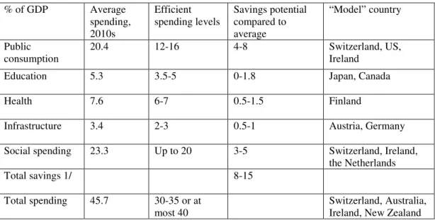
A final “exercise” identifies the savings potentials across spending categories in a more granular manner. Naturally, the savings potential depends on many external and country specific factors. Table 2 provides some ball-park figures.
[Table 2 Public Spending and Savings Potential]
The highest savings potential is in the biggest expenditure categories, public consumption and social expenditure. But the savings potential on education, health and infrastructure also adds up. An overall average savings potential of 8-15% would bring average spending down from 45% of GDP to somewhere in the 30-35% or at most 40% region. The Table also lists the “model” countries for each category and the aggregate.
5. Conclusion
There is significant scope for expenditure savings for many governments in advanced economies. Governments do not need to spend more than 30-35 or at most 40% of GDP to do well and keep more money in the hands of their citizens. Experience shows that this size of government is not some pipe-dream number but it is realistic and reachable for advanced economies.
There is a huge variation in performance and efficiency across countries. In some countries with big but well-functioning governments and strong policy programs, such as the Nordics, more spending may be less costly in terms of taxes, growth and employment (OECD, 2018, Tanzi, 2018). Whether the more equal income distribution is worth much higher spending – 10% of GDP or more – and more unemployment is a matter of judgement.
The future has, hence, the potential for smaller and better government in many countries. Naturally, on which policies and sectors public money is going to be spent is a decision linked to the choices of citizens and taxpayers. Countries should pursue reforms of their institutions and policies. International competition and peer learning should exert pressure in this direction. But there are also major clouds on the horizon. Population aging and financial instability are important fiscal risks, notably for short- and long-term fiscal sustainability, that are certain or likely to materialise and raise public expenditure even further in the future.
9
Bibliography
Adam, A., Delis, M., Kammas, P. (2011). “Public sector efficiency: leveling the playing field between OECD countries”, Public Choice, 146 (1-2), 163–183.
Afonso, A., Gaspar, V. (2007). “Dupuit, Pigou and cost of inefficiency in public services provision”, Public Choice, 132 (3-4), 485-502.
Afonso, A., Kazemi, M. (2017). “Assessing Public Spending Efficiency in 20 OECD Countries”, in Inequality and Finance in Macrodynamics (Dynamic Modeling and
Econometrics in Economics and Finance), Bökemeier, B., Greiner, A. (Eds). Springer.
Afonso, A., Romero, A., Monsalve, E. (2013). “Public Sector Efficiency: Evidence for Latin America”. IADB Discussion Paper IDB-DP-279.
Afonso, A., St. Aubyn, M. (2005). “Non-parametric approaches to education and health efficiency in OECD countries”. Journal of Applied Economics, VIII (2), 227-246.
Afonso, A., St. Aubyn, M. (2006). "Cross-country Efficiency of Secondary Education Provision: a Semi-parametric Analysis with Non-discretionary Inputs", Economic
Modelling, 23 (3), 476-491.
Afonso, A., Schuknecht. L., Tanzi, V. (2005). "Public sector efficiency: An international comparison," Public Choice, 123 (3), 321-347.
Afonso, A., Schuknecht, L., Tanzi, V. (2010a). “Public Sector Efficiency: Evidence for New EU Member States and Emerging Markets”, Applied Economics, 42 (17), 2147-2164. Afonso, A., Schuknecht, L. Tanzi, V. (2010b). “Income Distribution Determinants and Public
Spending Efficiency”, Journal of Economic Inequality, 8 (3), 367-389.
Borio, C., Contreras, J., Zampoli, F. (2019). Banking Crises: Implications for Fiscal Sustainability. BIS.
Chobanov, D., Mladenova, A. (2009). What is the Optimum Size of Government, Institute for Market Economics.
Fournier, J., Johansson, Å. (2016). “The Effect of the Size and the Mix of Public Spending on Growth and Inequality”, OECD Economics Department Working Papers 1344.
Herrera, S., Pang, G. (2005). “Efficiency of Public Spending in Developing Countries: An Efficiency Frontier Approach”. World Bank Policy Research Working Paper 3645. Herrera, S., Ouedraogo, A. (2018). Efficiency of Public Spending in Education, Health, and
Infrastructure: An International Benchmarking Exercise, World Bank Policy Research Working Paper 8586.
10
Mohanty, R., Bhanumurthy, N. (2018). “Assessing Public Expenditure Efficiency at Indian States”, National Institute of Public Finance and Policy, New Delhi, NIPFP Working Paper 225.
OECD (2018). “Public Finance Structure and Inclusive Growth”, OECD Economic Policy Paper 25.
Pevcin, P. (2004). “Does Optimal Spending Size of Government Exist?” Paper presented at the European Group of Public Administration Conference, 1-4 September 2004, Ljubljana, Slovenia.
Potrafke, N. (2009). “Did Globalization restrict partisan politics? Empirical evaluation of social expenditures in a panel of OECD countries”, Public Choice 140, 105-124.
Rodrik, D. (1998). “Why Do More Open Economies have Bigger Governments?”, Journal of
Political Economy 106 (5), 997-1032.
Schuknecht, L. (2018). “The Supply of Safe Assets and Fiscal Policy”. Intereconomics 53 (2), 94-100.
Sinn, H. (1997). “The Selection Principle and Market Failure in Systems Competition”,
Journal of Public Economics 66 (2), 247-274.
Sutherland, D., Hoeller, P., Merola, R., Ziemann, V. (2012). “Debt and Macroeconomic Stability”. OECD Economics Department Working Papers 1003.
Tanzi, V., Schuknecht, L. (2000) Public Expenditure in the 20th Century. Cambridge:
Cambridge University Press.
Tanzi, V. (2018). “Welfare Systems and Their Complexity, paper presented at Congress of the International Institute of Public Finance, Finland.
11
Chart 1 - Total Government Spending, Average 2008-2017 (% of GDP)
Source: OECD.
Chart 2 - DEA Model including all Countries
Source: Afonso and Kazemi, 2017. Public sector performance reflects aggregate performance across indicators as in Afonso, Schuknecht and Tanzi (2005) and Afonso and Kazemi (2017), with the average performance set as 1. 0 10 20 30 40 50 60 A U T B E L F IN F R A G E R G R C IR L IT A N D L P R T E S P D N K S W E U K D A U S C A N JA P K O R N Z L C H E U S A A v e ra g e AUT BEL CAN DNK FIN FRA DEU GRC IRL ITA JPN LUX NLD NOR PRT ESP SWE CHE GBR USA 0,2 0,4 0,6 0,8 1 1,2 1,4 25 30 35 40 45 50 55 60 P u b li c S e ct o r P e rf o rm a n ce
12
Chart 3 - Administration performance and real expenditure, 2017
Source: Own calculations. The horizontal axis shows public consumption expenditure in % of GDP, the vertical axis shows country performance across a set of indicators including corruption, red tape, independent judiciary, size of the shadow economy and rule of law with average performance set as 1.
Chart 4 - Education performance and education expenditure, 2017
Source: Own calculations. The horizontal axis shows public education expenditure as % of GDP, the vertical axis is based on 2015 Pisa scores with average performance set as 1.
AUT BEL FIN FRA GER GRC IRL ITA NDL PRT ESP DNK SWE UKD
AUS JAP CAN
KOR NZL SGP CHE USA 0,5 0,6 0,7 0,8 0,9 1 1,1 1,2 1,3 10 15 20 25 AUT BEL FIN FRA GER GRC IRL ITA NDL PRT ESP DNK SWE UKD AUS CAN JAP KOR NZL CHE USA 0,9 0,95 1 1,05 1,1 3,5 4 4,5 5 5,5 6 6,5 7
13
Chart 5 - Health performance and health expenditure, 2017
Source: Own calculations. The horizontal axis shows public health expenditure in % of GDP and the vertical axis reflects health performance as measured by life expectancy and infant mortality. The average performance is set as 1.
Chart 6 - Infrastructure performance and public investment, 2017
Source: Own calculations. The horizontal axis shows public investment in % of GDP, the vertical axis reflects performance according to the World Bank Infrastructure quality indicator with the average set as 1. AUT BEL FIN FRA GER GRC IRL ITA NDL PRT ESP DNK SWE UKD AUS CAN JAP KOR NZL CHE USA 0,7 0,8 0,9 1 1,1 1,2 1,3 1,4 3,5 4,5 5,5 6,5 7,5 8,5 9,5 AUT BEL FIN FRA GER GRC IRL ITA NDL PRT ESP DNK SWE UKD AUS CAN JAP NZL CHE USA 0,8 0,85 0,9 0,95 1 1,05 1,1 2 2,5 3 3,5 4 4,5 5
14
Chart 7 - Income Distribution and social expenditure, 2017
Source: Own calculations. The horizontal axis shows social expenditure in % of GDP, the vertical axis reflects the Gini index for disposable income. The average performance is set as 1..
Chart 8 - Economic stability and government spending, 2017
Source: Own calculations. The horizontal axis shows total expenditure in % of GDP, the vertical axis reflects economic stability as measured by the volatility of output growth and inflation in line with price stability. Average performance is set as 1.
AUT BEL FIN FRA GER GRC IRL ITA NDL PRT ESP DNK SWE UKD AUS CAN JAP KOR NZL CHE 0,85 0,9 0,95 1 1,05 1,1 1,15 1,2 7,5 12,5 17,5 22,5 27,5 AUT BEL FIN FRA GER GRC IRL ITA NDL PRT ESP DNK SWE UKD CAN JAP NZL CHE USA 0,7 0,8 0,9 1 1,1 1,2 1,3 30 35 40 45 50 55
15
Chart 9 - Economic performance and government spending, 2017
Source: Own calculations. The horizontal axis shows total expenditure in % of GDP, the vertical axis reflects economic performance as measured by real output growth, per capital GDP (PPP) and the unemployment rate. The average performance is set as 1.
Chart 10 - Government performance and total spending
Source: Own calculations. The horizontal axis shows total public expenditure in % of GDP, the vertical axis reflects performance across all indicators, equally weighted. The average performance is set as 1.
AUT BEL FIN FRA GER GRC ITA NDL PRT ESP DNK SWE UKD AUS CAN JAP NZL CHE USA 0 0,2 0,4 0,6 0,8 1 1,2 1,4 1,6 1,8 30 35 40 45 50 55 AUT BEL FIN FRA GER GRC IRL ITA NDL PRT ESP DNK SWE UKD AUS CAN JAP NZL CHE USA 0,6 0,7 0,8 0,9 1 1,1 1,2 32,5 37,5 42,5 47,5 52,5 57,5
16
Table 1 - OUTPUT (PSP) - 1 INPUT (TOTAL PUBLIC EXPENDITURE)
COUNTRY Input oriented
score Rank Output oriented score Rank Austria 0,65 14 0,854 5 Belgium 0,64 16 0,79 9 Canada 0,83 4 0,90 4 Denmark 0,62 19 0,75 15 Finland 0,64 16 0,76 14 France 0,61 20 0,79 10 Germany 0,74 9 0,79 10 Greece 0,63 18 0,43 20 Ireland 0,79 5 0,72 16 Italy 0,68 13 0,55 19 Japan 0,85 2 0,77 13 Luxembourg 0,79 5 0,92 2 Netherlands 0,74 9 0,84 6 Norway 0,77 8 0,91 3 Portugal 0,69 12 0,56 18 Spain 0,78 7 0,65 17 Sweden 0,64 15 0,81 8 Switzerland 1,00 1 1,00 1 United Kingdom 0,73 11 0,78 12 United States 0,85 2 0,82 7 MEAN 0,73 0,77 MINIMUM 0,61 0,43
17
Table 2 - Public Spending and Savings Potential
% of GDP Average spending, 2010s
Efficient
spending levels Savings potential compared to average “Model” country Public consumption 20.4 12-16 4-8 Switzerland, US, Ireland
Education 5.3 3.5-5 0-1.8 Japan, Canada
Health 7.6 6-7 0.5-1.5 Finland
Infrastructure 3.4 2-3 0.5-1 Austria, Germany Social spending 23.3 Up to 20 3-5 Switzerland, Ireland,
the Netherlands
Total savings 1/ 8-15
Total spending 45.7 30-35 or at most 40
Switzerland, Australia, Ireland, New Zealand