Homogeneous middles vs. heterogeneous tails,
and the end of the ‘Inverted-U’:
the share of the rich is what it’s all about
José Gabriel Palma
1Cambridge Working Papers in Economics (CWPE) 1111
(Available at http://www.econ.cam.ac.uk/dae/repec/cam/pdf/cwpe1111.pdf)
Abstract
This paper examines the current global scene of distributional disparities within-nations. There are six main conclusions. First, about 80 per cent of the world’s population now live in regions whose median country has a Gini not far from 40. Second, as outliers are now only located among middle-income and rich countries, the ‘upwards’ side of the ‘Inverted-U’ between inequality and income per capita has evaporated (and with it the statistical support there was for the hypothesis that posits that, for whatever reason, ‘things have to get worse before they can get better’). Third, among middle-income countries Latin America and mineral-rich Southern Africa are uniquely unequal, while Eastern Europe follows a distributional path similar to the Nordic countries. Fourth, among rich countries there is a large (and growing) distributional diversity. Fifth, within a global trend of rising inequality, there are two opposite forces at work. One is ‘centrifugal’, and leads to an increased diversity in the shares appropriated by the top 10 and bottom 40 per cent. The other is ‘centripetal’, and leads to a growing uniformity in the income-share appropriated by deciles 5 to 9. Therefore, half of the world’s population (the middle and upper-middle classes) have acquired strong ‘property rights’ over half of their respective national incomes; the other half, however, is increasingly up for grabs between the very rich and the poor. And sixth, Globalisation is thus creating a distributional scenario in which what really matters is the income-share of the rich — because the rest ‘follows’ (middle classes able to defend their shares, and workers with ever more precarious jobs in ever more ‘flexible’ labour markets). Therefore, anybody attempting to understand the within-nations disparity of inequality should always be reminded of this basic distributional fact following the example of Clinton’s campaign strategist: by sticking a note on their notice-boards saying “It’s the share of the rich, stupid”.
Key words: income distribution; income polarisation; inequality; institutional persistence; ‘Inverted-U’; ideology; neo-liberalism; ‘new’ left; poverty; Latin America; Africa; Brazil; Chile; Mexico; South Africa; US.
JEL classifications: D31, E11, E22, E24, E25, I32, J31, N16, N30, N36, O50, P16.
A shortened version of this paper was published in
Development and Change
42(1), 2011
1 To my Mother (who would have enjoyed reading this). Tony Atkinson, Carol Baltar,
“[...] in different stages of society, the proportions of the whole produce [...] which will be allocated to each of these classes
[rentiers, capitalists and labour], under the name of rent, profits and wages, will be essentially different. [...] To determine the laws which regulate this distribution is the principal problem in Political Economy.”
David Ricardo
It’s becoming so outrageously expensive to be rich nowadays!! Quino (Argentinian cartoonist).
1.- Introduction
As has been well documented, the period since the beginning of globalisation has been associated with increased inequality, leading to a significant upwards shift in overall global inequality. Oddly enough, as is evident in studies that use income tax statistics as their source, this trend began in high-income countries, notably the US and the UK, particularly after the elections of Reagan and Thatcher (see Atkinson, 2003; Piketty and Sáez, 2003). Soon after, inequality started to rise in low-income countries, mainly in Asia, and notably in China and Vietnam (and, in all probability, in India as well — although data is in short supply). Then came the turn of Eastern Europe and the former Soviet Union. And Latin America (always ready to join in a trend like this) did so in the wake of its neo-liberal reforms. As a result, within-country inequality — which for a long time had been a declining component of overall global inequality (probably since the industrial revolution) — is now again a growing component (Milanovic, 2002, 2009; Sutcliffe, 2001).
This shift towards greater inequality is also evident in household surveys; Cornia and Addison (2003), for example, found that between the 1960s and 1990s inequality increased in about two-thirds of the 73 countries they studied (accounting for about 80 per cent of the world’s population). They also found that in those where inequality increased, this was normally equivalent to at least 5 points in the Gini scale. Also, the turn toward rising inequality appears to have accelerated over time (i.e., more countries joined the rising-inequality group each year since the early 1980s). And several studies show that in many countries inequality continued to increase during the 2000s (Alderson and Doran, 2010).
unequivocal.
These are the types of issues that are now again at the core of the debate on the effects that increase international economic and financial integration would have on national and international income distribution and factor movements.2 In fact, of all Samuelson’s hypotheses, there is probably none that influenced US foreign policy in the early days of globalisation as much as the one that postulates (following the logic above) that an increased level of trade between two countries should reduce the incentive for labour to migrate across frontiers. In the case of the US’s relationship with Mexico, for example, following the 1982 ‘debt crisis’, the US — always frightened that worsening economic problems in Mexico could turn the flow of Mexican immigrants into a tidal wave — gave preferential access to Mexican exports, a process that led to the creation of NAFTA.3
As is well known, one of the main problems with any debate on income distribution is the difficulty of testing alternative hypotheses, especially time series formulations, due to the lack of appropriate historical data.4 From a cross-sectional perspective, at least, recent developments in household-surveys have improved the quantity and quality of the data substantially (for example, LIS, 2010; SEDLAC, 2010; WIDER, 2008; World Bank, 2010). The World Development Indicators (WDI), for example, now provides a relatively homogeneous set of data for 142 countries (WB, 2010). But there are still some significant problems with these new datasets (Székely and Hilgert, 1999). For example, some surveys report data on income and some on expenditure; this mix makes international comparison more difficult, as the distribution of consumption tends to be less unequal than that of income.5 The degree of accuracy of these surveys is still a problem too; in some sub-Saharan countries, surveys
undertaken in the midst of civil wars claim to have ‘national’ coverage. Another problem is that many datasets still report data only in terms of quintiles (Q); for deciles (D), the WDI, for example, only reports the shares of D1 and D10. Although this is a marked improvement over traditional datasets (e.g., Deininger and Squire, 1996), and over many official organisations (such as the US Census Bureau), it is clearly unsatisfactory. As will be discussed in detail below, crucial distributional information is lost when data are aggregated in quintiles (particularly at the top).
The main aim of this paper is to use the WDI dataset to take another look at differences in within-nation income distribution in the current era of neo-liberal
globalisation. The emphasis will be on the study of middle-income countries with high degrees of inequality, especially those that have implemented full-blown neo-liberal reforms, such as countries in Latin America and Southern Africa. Throughout the paper, unless otherwise stated, the WDI dataset will be used for all countries.6 The total number of observations included in this study is (a rather heterogeneous set of) 135 countries.7
2
See Kanbur (2000); Atkinson (1997); Aghion, Caroli and Garcia-Peñaloza (1999); IADB (1999), and UNCTAD (1996, and 2002).
3 When NAFTA was created there were already some ten million Mexicans living in the US. 4 One source that provides time-series coverage for inequality is the ‘University of Texas Inequality Project’ (UTIP, 2010). However, (surprisingly) their datasets have not been updated for many years.
5
The UK’s ‘Family Expenditure Survey’ reports that the difference between disposable income and expenditure is about two points in the Gini scale. See http://www.ofmdfmni.gov.uk/gini. pdf. The South African ‘Income and Expenditure of Households Survey for 2005/2006’, in turn, reports a difference of three points (IES, 2008).
6 It is important to keep to one source (that at least tries to homogenise data), because countries report distributional statistics using different definitions and methodologies. The South African 2005/06 survey, for example, reports four different Ginis (see Appendix 4) — and none is comparable with the ones reported in the WDI!
2.- Inequality Ranking
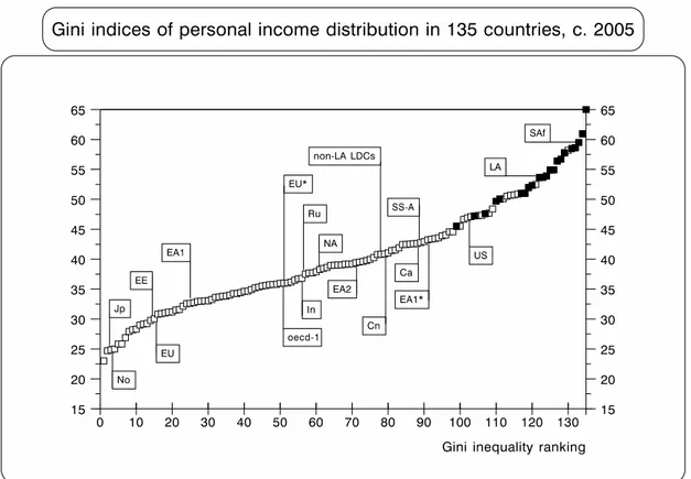
Figure 1 illustrates how these 135 countries were ranked according to their Gini index in (or close to) 2005.8
FIGURE 1
● Median values (multiplied by 100).9 Latin American and three middle-income Southern African countries (Botswana, Namibia and South Africa) are shown in black (this will also be the case in similar graphs below).10 The last country in the ranking is Namibia (Gini=70.7)!
●Ca=Caribbean; Cn=China; EA1=East Asia-1 (Korea and Taiwan); EA1*=(Hong Kong and Singapore); EA2=East Asia-2; EE=Eastern Europe; EU*=Mediterranean EU; EU=rest of Continental Europe; In=India; Jp=Japan; LA=Latin America; NA=North Africa; No=Nordic countries; non-LA LDCs=non-Latin American developing countries; OECD-1=Anglophone OECD (excluding the US, which is shown separately); Ru=Russia; SS-A=Sub-Saharan Africa
(excluding SAf); and SAf=middle-income Southern Africa. For the countries in each region, see Appendix 4.
●Sources: WB (2010). This will also be the case for the remaining graphs and tables.
8 I had to choose 2005 to have a large enough sample. As the WDI does not report data for 2005 for all countries, some correspond to a year after (e.g., for Chile 2006), and in some to one before (e.g., for Mexico 2004). Moreover, for a small number of countries the last reported data refer to an earlier date. Also, when the same source used by the WDI is available, I have updated data for which (surprisingly) the WDI stops doing so in 2000 (or even before) — such as the US, the UK and the Nordic countries.
9 For the non-specialist, the Gini coefficient is a measure of statistical dispersion, measuring the degree of inequality of an income distribution; it has a value of 0 when every person receives the same income (total equality), and a value of 100 when a single person receives all the income and the remaining people receive none).
Among several issues arising from this graph, there are two that stand out. First, there was a wide range of inequality across countries c. 2005 — from a Gini of 23 (Sweden) to 70.7 (Namibia). Second, middle-income Southern Africa and Latin America are clearly grouped at the very top end of the ranking; in the case of Latin America, with a median Gini of 53.7, the inequality is almost half as much again as the overall median for the rest of the sample (116 countries), and over one-third higher than that for the ‘developing-non-Latin-American’ group (70 countries).11
Another important issue is the difference between Anglophone and non-Anglophone OECD countries, with median Ginis of 36 and 30.9, respectively. The same contrast is found in the continental EU between the Mediterranean countries and the rest (35.3 and 30.9, respectively); and between the ex-communist countries of the former Soviet Union and those of Eastern Europe (35.7 and 30.6, respectively).
Finally, in the so-called ‘first-tier NICs’ (EA1), there is an even bigger difference between Korea and Taiwan (31.6 and 34), and Hong-Kong and Singapore (42.5 and 43.4), respectively.12
Unfortunately, it is very difficult to make historical comparisons of income distributions as the WDI dataset provides very little information pre-1980. All that is possible is to compare the distributional ranking of eighty countries in 2005 with their ranking in 1985 (taking into consideration that by 1985 a significant proportion of the distributional deterioration mentioned above had already taken place); this is
illustrated in Figure 2.
FIGURE 2
● Both rankings are made independently from the other.
●Br=Brazil; and Ma=Malaysia. In the c. 1985 distribution, the first two observations (the Czech and the Slovak Republics) have a Gini just under 20; and the last two (Zambia and Swaziland) have one just over 60.
11
Basically, in these two decades the distribution rotated clockwise around the median value; however, a remarkable deterioration at the low-inequality end (mostly due to ‘transition’ economies) contrasts with a relatively minor (but much heralded)
improvement at the other end.13 As a result, although the median remained static
(40.6 and 41, respectively), the harmonic mean increased significantly (from 35.7 to 40).14 And as there was a decline in the standard deviation, the coefficient of variation fell substantially (from 0.34 to 0.22). There are also important changes within the ranking, with some countries moving backwards (e.g., the US), and others forward (e.g., Malaysia). Also, others at the high-inequality end stayed still in their ranking despite some improvement in their inequality: Brazil, for example, improved its Gini from 59 to 56.4, but its ranking did so only from 77 to 75, while Chile did so from 56.4 to 54.9, and its ranking actually deteriorated from 73 to 74.
In turn, Figure 3 indicates a crucial (but in practice often ignored) distributional stylised fact: the contrasting behaviour of D9 and D10.
FIGURE 3
● Both rankings are made independently from the other.
●Br=Brazil; Cn=China; Ch=Chile; In=India; Ko=Korea; Na=Namibia; and ZA=South Africa. The last two observations in D10 are Botswana (51 per cent) and Namibia (65 per cent).
While the range for the income share of D9 in these 135 countries only extends across 4.5 percentage points (from 13.3 per cent in Namibia to 17.7 per cent in South Africa), D10 has a range 10 times larger (20.8 per cent in the Slovak Republic, 65 per cent in Namibia). This difference is also reflected in their coefficient of variation: that of D10 is more than four times larger than that of D9. Therefore, there is a major (and totally unnecessary) loss of information if distributive data are reported only in terms of
13
See, for example, López-Calva and Lustig (2010). 14
quintiles, as the top quintile is made by the aggregation of two very different deciles. This phenomenon is also corroborated by the fact that while the median value for the share of D10 in the Latin American and non-Latin American groups is very different (41.8 per cent and 29.5 per cent respectively), that for D9 is quite similar (15.8 per cent and 15.3 per cent, respectively). In other words, the key element that needs to be deciphered in order to understand within-country distributional diversity — and specially the huge degree of inequality in some middle-income countries — is the determinants of the share of D10; in fact, the real concentration of income is usually found within the first five percentiles of income recipients.15
There are also some interesting issues in the ranking of D9. For example, in Asia’s two major newly fast industrialising countries, China and India, there is significant contrast in their income-shares of D9. While these two countries have an almost identical ranking for their income-share of D10 (right in the middle of the distribution), they have opposite rankings for D9. The same type of contrast is found in Southern Africa between South Africa (and Angola) on the one hand, and Botswana and Namibia on the other. In D10 all four countries are located at the very end of the inequality ranking; however, in D9 the former are ranked as the two countries with the
highest share for this decile in the whole sample, while the latter are the countries with the lowest share (Namibia) and fifth lowest (Botswana); see Appendix 3.
Figure 3 also gives an indication that the contrasting behaviour of D10 and D9 has become part of one of the key characteristics of neo-liberal economic reforms: its ‘winner-takes-all’ proclivity (see also Figure 22 below). For instance, in the case of Chile, after the 1973 coup d’état (which also marked the beginning of an
uncompromising transformation towards open economy/close politics; see
Díaz-Alejandro, 1984), its income distribution suffered one of the fastest deteriorations ever recorded. However, it was only D10 that benefited (see the interval between ‘2 and 3’ in Figure 4).
15
FIGURE 4
● [Y1]=left-hand vertical axis (D9), and [Y2]=right-hand axis (D10). 1=election of Allende; 2=Pinochet’s coup d’état; 3=the year Pinochet had to call a plebiscite seeking a mandate to remain in power for another eight years; 4=first democratic government (centre-left coalition, the ‘Concertación’) that took office in 1990 after Pinochet lost his plebiscite (and was forced to call for presidential elections); 5=second democratic government (same coalition, but a return to more ‘free-market’ distributional policies); 6-7 and 7-8=next two governments by the same centre-left coalition.
●Source: calculations done by Pamela Jervis and author using the FACEA (2010) database. Unless otherwise stated, this will be the source of all historical data for Chile. Data refer to ‘household per capita income’, excluding from family incomes those of lodgers and domestic servants living in the house. We also exclude incomes when they are declared as ‘zero’, ‘does not know’, or ‘does not answer’.16 3-year moving averages.
While the income share of D10 increased by 51 per cent between 1973 and 1987 (from 34.2 per cent of national income to no less than 51.7 per cent), that of D9 actually fell from 17.5 per cent to 16.3 per cent. Not surprisingly, Chile’s D10 is currently ranked as the 124th largest among these 135 countries, while its D9 is only ranked 40th. Figure 4 also indicates another key characteristic of Latin America’s distributional struggle: how difficult it has been to sustain improvements in inequality; namely, the declines in inequality between ‘1’ to ‘2’ and ‘4’ to ‘5’ were followed by rapid
deteriorations between ‘3’ to ‘4’ and ‘5’ to ‘6’ (the first under dictatorship, the second under democracy).
3.- Income inequality and income per capita: the end of the “Inverted-U”?
The most common (and probably most meaningful) way of comparing income
distribution across countries is in relation to the level of income per capita. This form
of analysis started as a by-product of Kuznets’ 1955 “Inverted-U” time-path approach. However, as is well known, this debate has often confused some (often mixed) cross-section statistical evidence for an “inverted-U” path with Kuznets’ time-series
‘structural’ hypothesis. Furthermore, Kuznets’ hypothesis is, of course, only one of many possible explanations for a hypothetical “inverted-U” time-path (if this pattern were to exist at all).17 Furthermore, to extrapolate this hypothesis from a time-series to a cross-section scenario is no minor leap in the dark. Therefore, in this paper when I compare income distribution across countries vis-à-vis their income per capita I do so simply as a mechanism to visualise the geometry of within-country inequality across the world — i.e., it is just a cross-sectional description of cross-country differences in inequality, when categorised by income per capita; see Figure 5.
FIGURE 5
●[Y]=vertical axis (Gini indices); and [X]=horizontal axis (natural logarithm of income per capita — proxied here by GDP per capita). Regions and countries as Appendix 4. Regional figures are median values. However, in three regions where one country dominates, their data is used instead of the median; this is the case for Brazil in Latin America (Ecuador is the actual median country, Gini=53.7); South Africa in Southern Africa; and India in South Asia. Also, in the ‘Former Soviet Union’ the value for Russia and that for the median country (excluding Russia) are highlighted; as it is in the Anglophone OECD vis-à-vis the US. Unless otherwise stated, this will also be the case in figures below. Finally, continental EU is disaggregated between the Mediterranean countries (EU**), those with Ginis below 30 (EU*,Germany and Austria), and the rest (EU).
As this graph suggests, by 2005 the statistical evidence that seems to have existed for an “Inverted-U” path between inequality and income per capita had all but
disappeared. In fact, as the horizontal ellipse of Figure 5 indicates, the most
remarkable current stylised fact is that the great majority of the regions/countries of the world have, on average, a relatively similar income-distribution. In part this is due
17 See Kanbur (2000); for an early critique, see Saith (1983). In Palma (2010a) I also
to increased inequality at both ends of the spectrum, including the high-growth cum rising-inequality of many low-income Asian countries (which are moving in a north-eastern direction in the geography of Figure 5). Briefly, from Sub-Saharan Africa, through China and the Caribbean, to Singapore and Hong-Kong, the regional/country median index is now a Gini just above 40. And from India, through North Africa, Russia and the second-tier NICs, to the Mediterranean EU and the Anglophone OECD (excluding the US), the Gini is just below 40. Furthermore, some of the major
economies not included within regions are also located within this narrow distributional band, such as Israel (Gini 39.2) and Iran (Gini 38.3). So, clearly there is not much statistical evidence here for an “Inverted-U” path between inequality and income per capita among these regions/countries, which represent about 80 per cent of the world’s population.
Figure 5 also indicates another remarkable stylised fact of current distributional outcomes: the increasing distributional diversity among rich countries (see vertical ellipse) — from the US, Singapore and Hong-Kong with a Gini above 40 (and in the US, well above 40), to Austria, Germany, the Nordic countries and Japan with Ginis well below 30 (with Sweden, Denmark, Norway and Japan below 25).
Finally, this Figure also shows that among middle-income countries there are two groups of countries that are clear outliers. One is Eastern Europe and most countries of the Former Soviet Union with significantly lower inequality. The other is Latin America and Southern Africa, countries that comprise a small share of the world population (under 10 per cent) and clearly live in a distributional world of their own; however, in all probability, some countries of the oil-producing Middle East (for which there are no data) share the inequality heights of the latter group).18
This uniqueness of Latin American and Southern African is crucial for the testing of the “Inverted-U”.19 If these two regions are either excluded, or (more
appropriately) if they are controlled by a dummy variable, the “Inverted-U” hypothesis does not work. In the former case (reduced sample of 113), neither ‘t’ for the
parameters of the two slopes is significant even at the 5 per cent level (see regression 1 in Appendix 5).20 The same happens in the latter case (see regression 2).21 In fact, it is when these two regions are included without a dummy variable to account for their exceptionality, that the “Inverted-U” hypothesis works statistically (i.e., the two slopes are significant at the 1 per cent level; see regression 3). Nevertheless, as is evident in Figure 5, for a regression of this type to be meaningful it should account for all three phenomena discussed above; namely, the diversity among high-income OECD countries, the huge inequality found in Latin America and Southern Africa, and the opposite phenomenon found in Eastern Europe and the former Soviet Union. Figure 6 shows that despite the usual structural instability of this type of cross-country
regressions, and the added problems brought about by co-linearity between the two
18 In 2003, I met by chance in Geneva a salesperson for one of the most exclusive
watchmakers in Switzerland; in the conversation he mentioned that his wristwatches cost more than ten times an equivalent Cartier. When I asked who would buy such an expensive item, he replied (somehow surprised at my question) “mostly people from Latin America and the Middle East, of course”. And then he added that he was just back from a very successful trip to Argentina (even though this conversation took place a year after Argentina’s worst financial crisis in modern times). As the best Argentinian cartoonist said around that time, the problem for the Latin American oligarchy is that “[i]t’s becoming so outrageously expensive to be rich nowadays!!” (“¡¡Es una vergüenza lo caro que se está poniendo ser rico!!”), Quino (2000; see epigraph to this paper).
19 Where the logarithm of an inequality index (say, the Gini) is regressed on the logarithm of income per capita and income per capita squared.
20 All ‘t’ statistics reported in this paper are constructed using ‘White heteroscedasticity-consistent standard errors’. And the R2s are adjusted by the degrees of freedom.
21
explanatory variables within the actual range of the sample, the result of such an exercise is statistically significant (i.e., unlikely to have occurred by chance).
However, it is important to emphasise from the start that this regression, and other similar regressions below, are simply meant to be a cross-sectional description of cross-country inequality differences, categorised by income per capita. That is, they should not be interpreted in a ‘predicting’ way, because there are a number of
difficulties with a curve estimated from a single cross-section — especially regarding the homogeneity restrictions that are required to hold; see Pesaran, Haque and Sharma (2000). This is one reason why the use of regional dummies is so important, as they can provide crucial information regarding the required homogeneity restrictions — and as will become evident below, their evidence points in a different
(heterogeneous) direction. Hence, regional dummies will be reported below only within the income per capita range of their members.22
FIGURE 6
●[X]=horizontal axis. Regions and countries as Appendix 4 and Figure 5. 1=dummy for SAf; 2=dummy for LA; 3=base regression; 4=dummy for EE and the FSU; 5=dummy for the OECD-1 and EAOECD-1*; and 6=dummy for EAOECD-1 and OECD countries with a Gini below 30 (No, EU*, and Japan). All dummies are on the income per capita squared variable, except for EE and FSU (income per capita). There is also an intercept dummy for Namibia, not reported in the graph. All ‘t’ are significant at the 1 per cent level; the R2=72. For the summary statistics, see
regression 4 in Appendix 5.
What is most important in Figure 6 is that even when the two slopes of the ‘Inverted-U’ are re-established as statistically significant (by adding the appropriate dummies), there is still no evidence for the “upwards” (or first half) part of the “Inverted-U” hypothesis. That is, for the idea that posits that (for whatever reason) “things have to
22
get worse before being able to get better”.23 In the regional dummies there are two opposite paths. In one, inequality gets, on average, systematically worse as countries have higher income per capita (lines 1 and 2), even though some countries have already reached high middle-income levels.24 In the other, inequality gets, on
average, systematically better; this happens both in EA1* and Anglophone OECD (line 5), and in EA1, EU*, the Nordic countries and Japan (line 6). Also note that in Figure 6 the base regression is equidistant from lines 5 and 6 (the slope-dummies are 0.002 and -0.002, respectively). However, it is important to emphasise that the downwards shape of lines 5 and 6 does not necessarily mean that the distribution of income within individual countries is currently improving as they get richer; it only means that
although the distribution of income within many of these countries is currently
deteriorating (notably in the US), it does so in a way that does not change the fact that the richer the country the lower the level of inequality (as a group). Finally, in Eastern Europe and Former Soviet Union (line 4), distributional outcomes are initially stable, and then improve. It is only in the base relationship (line 3) — with the oddest
mixture of countries — that one finds a small initial distributional deterioration (of less than 2 points in the Gini scale) as countries move from low- to middle-income levels. But the end to the upwards side of the “Inverted-U” comes at a statistical cost: the relationship between inequality and income per capita is not homogeneous across regions and countries. As income per capita increases, some regions/countries move in one direction, others in the opposite. So, the homogeneity restrictions that are required to hold for ‘prediction’ are visibly not fulfilled. In other words, not only analytically but also statistically there is no reason to ‘predict’, for example, that Latin America and Southern Africa will improve their remarkable inequality as their income per capita continues to increase simply because countries in other regions have done so before. So, unless some odd mechanical extrapolations are made of historical experiences from other regions, even in this ‘Inverted-U-friendly’ specification, there is no evidence that the distributional deterioration that has been taken place so far in Latin America and Southern Africa is a necessary prelude to a later improvement — the age-old excuse used by many middle-income countries to justify their high inequality.
And, as is often the case, when work of this nature produces such statistically interesting results, this ‘involves the evolution of knowledge as well as ignorance’ (Krugman, 2000). That is, while political oligarchies all over the Third World would be only too happy to appropriate such a high share of the national income, the question that still needs to be answered is why is it that only those of middle-income Latin America and Southern Africa are able to get away with it?
Figure 7 looks at the distributional picture ‘inside’ this Gini. As mentioned above, there are important benefits in focusing on changes throughout the distribution rather than on summary inequality statistics alone.25
23
In previous papers (studying data for the mid-1990s) I did find some statistical evidence for the first part of the “Inverted-U” path for that period; see Palma (2002 and 2003). For
“Inverted-Us” at five points in time since 1960, see Alderson and Doran (2010).
24 In fact, as high as US$10,000 in Argentina (US$ of 2000 value; WB, 2010). Moreover, in PPP terms Argentina, Chile and Mexico have already reached around US$15,000; and Brazil, Colombia, Uruguay, Venezuela and South Africa around US$10,000 (EKS$ of 2009 value; see GGDC, 2010).
FIGURE 7
●[Y]=vertical axis; and [X]=horizontal axis. Regions and countries as Appendix 4, except for EU*=EU countries with a share below 23 per cent (Austria, Netherlands and Germany); EU is the rest of continental Europe. Note that in some regions the median country for D10 is different from that of the Gini in Figure 5.
As we might have expected, Figure 7 shows a particularly close correlation between the geography of regional Ginis and that of the income-shares of D10 (with the same three stylised facts). First, the horizontal ellipse of Figure 7 indicates that, on average, the great majority of the regions/countries have a relatively similar income-share for D10. Basically, from Sub-Saharan Africa to India, China, North Africa, Russia, the Caribbean, the ‘second-tier’ NICs, the Anglophone OECD, Hong-Kong and Singapore to the US, the top deciles are able, on average, to appropriate about one-third of national income. So, again, not much statistical evidence here for an “Inverted-U” among these regions/countries, representing about 80 per cent of the world population. Second, there is again a huge diversity among rich countries (see vertical ellipse) — from Hong-Kong, Singapore and the US (with well over 30 per cent of GDP), to the rest of the Anglophone OECD and most of continental Europe, to Korea and Taiwan, and the countries within the OECD with a share lower than 23 per cent (Germany and The Netherlands, Japan and the Nordic countries). Again, this distributional diversity is not found among low-income and low- to middle-income regions. Third, among
middle-income countries the same two groups of countries are clear outliers at either side of ‘middle band’.
FIGURE 8
●[Y]=vertical axis; and [X]=horizontal axis. Regions and countries as Appendix 4. 1 to 6 as Figure 6 (but this time, EU*=EU countries with a share below 23 per cent=Austria, Netherlands and German). All ‘t’ are significant at the 1 per cent level; the R2=70 per cent (see regression 5 in Appendix 5).
FIGURE 9
●EU*=Mediterranean EU).
Yet again, the same three stylised facts apply. Figure 10, and Regression 6 in Appendix 5, confirms this (except for the countries in ‘dummy 6’).
FIGURE 10
It is therefore fairly obvious that the Gini-scene for regional inequality is reflected rather well at both ends of the distribution. But what about the other half of the distribution? Figure 11 shows one of the key contributions of this paper: that the distributional picture changes completely when one looks at the 50 per cent of the world’s population located in ‘D5–D9’ (the ‘middle and upper-middle classes’ — sometimes called the ‘administrative’ classes in institutional economics). Now the distributional geometry changes from huge disparity to remarkable similarity.
FIGURE 11
●The black square in the middle of the graph is Latin America’s median country (Peru=LA*).
Evidence from Figure 11 indicates two noteworthy facts. One is the high degree of homogeneity across regions/countries regarding the share of income that the middle and upper-middle classes are able to appropriate. This is most striking among rich countries — i.e., no more diversity here, as in the Gini and top and bottom deciles. Moreover, Eastern Europe and countries of the former Soviet Union are no longer outliers; and South Africa and Brazil (as well as Latin America’s median country, Peru) are close to India, Uganda (Sub-Saharan Africa’s median country), and Thailand (East Asia-2 median country). So, not surprisingly, if the same regression as above is applied, neither of the two slopes (income per capita and income per capita squared) are significant — with a ‘p’ value (or the probability of obtaining a test statistic at least as extreme as the one that was actually observed, assuming that the null hypothesis is true) of 36.3 per cent and 14.7 per cent, respectively. And if the regression is run with only one of the two slopes at a time, although the slope parameters and three of the five regional dummies become again significant at the 1 per cent level (the others are not significant even at 10 per cent), the resulting lines are practically horizontal and extremely close. In fact, in this case the intercepts have a ‘t’ value of no less than 225 and 383, respectively.
The other major stylised fact is that the share of this half of the population is about half of national income (the harmonic mean is 51.2 per cent, the average is 51.5 per cent and the median value is 52 per cent). So, perhaps rather than ‘middle
seems that a schoolteacher, a junior or mid-level civil servant, a young professional (other than economics graduates working in financial markets), a skilled worker, middle-manager or a taxi driver who owns his or her own car, all tend to earn the same income across the world — as long as their incomes are normalised by the income per capita of the respective country. Furthermore, as is evident in Figure 27 below (see Appendix 3), the change from the ‘heterogeneity’ at the top to the
‘homogeneity’ in the middle is remarkably abrupt, taking place as soon as one moves from the distributional scene of D10 to that of D9. Furthermore, this similarity in the income-shares of ‘D5–D9’ is even more extreme in the ‘upper middle’ 30 per cent of the population (‘D7–D9’) — see Figure 12.
FIGURE 12
●0-1=OECD-1. The black square in the middle of the graph is Latin America’s median country (Peru=LA*).
In this case, the harmonic mean is 36.5 per cent, its average 36.6 per cent, and the median is 37 per cent. Now, in South Africa and Peru the share for this group is slightly above India, and is almost identical to Japan. Even Brazil is not far behind (at 34.9 per cent). So, as for the income share of ‘D5–D9’, neither of the two slopes have any significance (‘p’ values of 77.3 per cent and 52.4 per cent, respectively). Again, if the regression is run with only one of the two slopes at a time, although the parameter for either slope becomes significant at the 1 per cent level, in both specifications only the Latin American dummy has a significance below 10 per cent (but with numerical values of just -0.003 and -0.0003, and ‘p’ values of 3.6 per cent and 8.7 per cent, respectively). Furthermore, the base regressions are practically a horizontal straight lines at a share of about 36/37 per cent (‘t’ of the intercepts are 235 and 430, respectively).
the groups, since this calculation linearises the Lorenz curve).
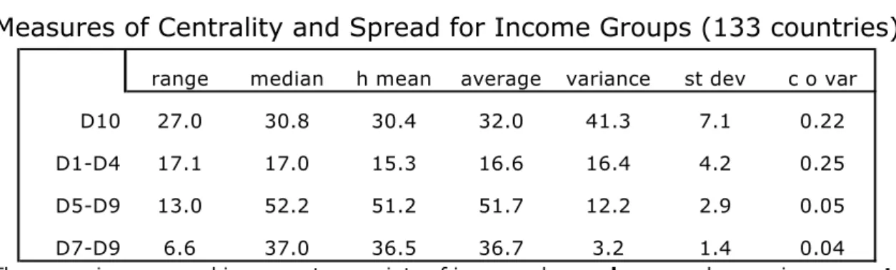
Table 1 presents a set of statistics for the whole sample, which emphasise the extraordinary contrast between the world distributional-heterogeneity at the top and bottom of the income distribution and the remarkable homogeneity in the middle.
TABLE 1
Measures of Centrality and Spread for Income Groups (133 countries)
range median h mean average variance st dev c o var
D10 27.0 30.8 30.4 32.0 41.3 7.1 0.22
D1-D4 17.1 17.0 15.3 16.6 16.4 4.2 0.25
D5-D9 13.0 52.2 51.2 51.7 12.2 2.9 0.05
D7-D9 6.6 37.0 36.5 36.7 3.2 1.4 0.04
● The range is expressed in percentage points of income-shares; h mean=harmonic mean; st dev=standard deviation; c o var=coefficient of variation. Botswana and Namibia (extreme outliers) are excluded.
Of all the statistics in Table 1, the coefficient of variation best shows the distributional contrast between the homogeneous middles and the heterogeneous tails — the figures for both D10, and ‘D1–D4’ are four and five times greater than that for ‘D5–D9’. Furthermore, they are about six times larger than that for ‘D7–D9’. This suggests that middle (or ‘median’) classes across the world seem to be able to benefit (as a group) from a distributional safety net — i.e. regardless of the per capita income level of the country, the characteristics of the political regimes, the economic policies
implemented, the structure of property rights, or whether or not they belong to countries that managed to get their prices ‘right’, their institutions ‘right’, or their social capital ‘right’, the 50 per cent of the population located in ‘D5–D9’ seems to have the capacity to appropriate as a group about half the national income.26 In other words, despite the remarkable variety of political-institutional settlements in the world, the resulting distributional outcomes have one major thing in common: half of the population in each country is able to acquire as a group a ‘property right’ to about half the national income.27
There is no such luck for the bottom 40 per cent of the population. For them, characteristics such as those mentioned above (such as the nature of political regimes and institutions, the economic policies implemented, and so on), can make the
difference between getting as much as one-quarter of national income (as in Japan and the Nordic countries), or as little as one tenth or less: six countries in Latin America, including Brazil and Colombia, and middle-income Southern Africa have a share below 10 per cent. In turn, for D10 the sky is (almost) the limit, with oligarchies in five Latin American countries (again including Brazil and Colombia) and in Southern Africa
managing to appropriate a share of about (and in some cases, well above) 45 per cent of national income. For Botswana and Namibia, and for some Latin American countries and South Africa at specific points in time, the figure is above 50 per cent (like in Brazil and Chile just before the presidential elections that marked their return to democracy; see Appendices 1 and 3).28
26 Surely the exceptions to this rule must be those countries with political regimes that do not even allow for household surveys in their own countries, such as many in the oil-producing Middle East.
27
Note that this seems to be a ‘group’s right’, rather than a right of the individuals within the group (which, as evidenced in household surveys, can be upwardly or downwardly mobile).
In other words, what is crucial to remember is that the regional distributional structure suggested by the Gini index only reflects the income disparities of half the world’s population — those at the very top and at the bottom of the distribution — but it tells us little about the remarkable distributional homogeneity of the other half. This raises serious questions regarding how useful the Gini index is as an indicator of
overall income inequality, especially because (from a statistical point of view) the Gini is supposed to be more responsive to changes in the middle of the distribution. That is, the most commonly used statistic for inequality is one that is best at reflecting distributional changes where changes are least likely to occur! As a result, the overall geometry of inequality as shown by the Gini is likely to underestimate income
disparities across countries. The problem is that alternative inequality statistics that have the advantage of being more responsive to changes at the top and bottom of the distribution (such as the Theil) tend to have the huge disadvantage of being extremely vulnerable to measurement errors precisely at the tails of the distribution (and, above all, at the top; see Paraje, 2004).29
In terms of historical trends, the US seems to indicate that the cross-section ‘homogeneity in the middle vs. heterogeneity at the tails’ tends to translate into a historical path of ‘stability in the middle vs. instability at the tails’; see Figure 13.
FIGURE 13
● 3-year moving averages. P=percentile.
●Source: US Census Bureau (2010; right-hand panel, author estimates — see below).
As the source only reports data for quintiles and the top 5 per cent, the left-hand panel of Figure 13 divides the population in a slightly different way from the one discussed so far (top 5 per cent, ‘D5–D9’ plus ‘P91–P95’, and bottom 40 per cent). There are two remarkable features in this panel. One is the changing fortunes of the top 5 per cent and bottom 40 per cent: starting in 1947 from a situation in which both received about 17 per cent, by the mid-1970s the bottom 40 per cent was getting three percentage points more. However, after 1980 the top 5 per cent began their remarkable
comeback (sometimes called the ‘revenge of the rentier’; see Palma, 2009), and ended up appropriating eight percentage points more than the bottom 40 per cent (21.5 per cent and 13.5 per cent). Oddly enough, according to these household surveys, a significant proportion of this distributive ‘damage’ took place during the Clinton
administration. The other noteworthy feature is that the 55 per cent of the population who make up this ‘enlarged middle’ appropriates a remarkably stable share of income throughout (about two-thirds). In fact, the range in which the share of this 55 per cent of the population fluctuates in this 62-year period is just four percentage points of income (and its coefficient of variation is only 0.02 — compared with 0.13 for the top 5 per cent, and 0.09 for the bottom 40 per cent).
In the right-hand panel, I estimated D10 from the information provided by the US Census Bureau on the top 5 per cent and the top quintile, using information on the structure of D10 from Piketty and Sáez (2003). This tentative approximation is done only to show the distribution following the pattern analysed so far (D10, ‘D5-D9’ and ‘D1-D4’). In either case, ‘the stability in the middle vs. the instability at the tails’ is unmistakable.
However, a closer look at the limited historical evidence we have on some particularly highly unequal developing countries (e.g., Chile and South Africa; see Appendices 1 and 3) indicates a different picture: once the bottom 40 per cent has been squeezed almost out of existence, the only way that the seemingly unstoppable ‘centrifugal forces’ at the top can continue to operate is by squeezing the middle. Thus, the real question regarding the huge levels of inequality found in some Latin American countries and Southern Africa seems to be what makes the ‘centrifugal forces’ at the top so powerful that in a few cases the usual boundary for their operation — middle and upper-middle groups with a remarkable capacity to hold their own — seems to falter?
Nevertheless, even in Latin America this phenomenon is limited to a few countries, with six of the nineteen countries of this region in the sample (Uruguay, Venezuela, Costa Rica, El Salvador, Argentina, and Mexico) having share of income for the ‘D5-D9’ group above 50 per cant; and eight more above 47 per cent. In fact, it is only in Brazil, Chile, Colombia, and Haiti where this share is systematically below this level (SEDLAC, 2010).
FIGURE 14
● Botswana, Namibia and Haiti (the three main outliers) are excluded. Countries are ranked according to the income share of ‘D1-D4’.30
Regional distributional homogeneity in the middle and upper-middle of the distribution also casts doubts on the role that ‘human capital’ is supposed to have on income distribution according to mainstream economics and UN reports (see, for example, Neal and Rosen, 2000; see also ECLAC, 2010a and b). According to this theory, the level of education is a crucial variable (if not the most crucial variable) in the
determination of income inequality. However, in all regions of the world (developed and developing; Latin American and non-Latin American), the top income decile is made up of individuals with relatively high levels of education, while those in the bottom four deciles have either relatively little schooling, or (in the more advanced countries), schooling of a very doubtful quality. So why do these two relatively
homogeneously ‘educated’ groups (one homogenously ‘highly-educated’, the other homogenously ‘little-educated’) have the greatest distributional diversity across countries? In turn, if most of the world’s educational diversity (both in terms of quantity and quality) is found among the population in ‘D5–D9’ — e.g. in terms of the share of the population with secondary and (especially) tertiary education — why does one find extraordinary similarity across countries in the shares of national income appropriated by this educationally highly heterogeneous group?
For example, apart from Argentina and Cuba, Chile has the largest tertiary education enrolment among all developing countries, with more than 50 per cent enrolment (World Bank, 2010).31 However, in 2003 the 30 per cent of its population in
30 My friend Bob Sutcliffe suggested that I should graph in this way what he likes to call “Palma’s Law” of homogeneous middle vs. heterogeneous tails...
31
‘D7–D9’ were only able to appropriate the third lowest income share in the whole sample of 135 countries, with only diamond-rich Botswana and Namibia posting lower shares. Despite the fall in overall inequality between 2003 and 2006 (the Gini fell from 0.55 to 0.52), Chile still ranked 6th lowest for this 30 per cent of the population (having only surpassed Mozambique, Haiti and Cote d'Ivoire in the intervening period).
Furthermore, and despite the fact that the Gini remained stable afterwards (2006–09), the share of this group fell again between 2006 and 2009.32 So, in terms of the
(overemphasised) rôle of education in the distribution of income, it is important not to lose sight of the multifaceted nature of the relationship between increased ‘equality of opportunities’ in education and increased ‘distributional equality’ in terms of income — and of the fact that education (or any other factor that may be influencing the
distribution of income) can only operate within a broader institutional dynamic (see endnote 1).
Obviously, more research needs to be done on the forces shaping the income shares of different groups along such different paths, particularly in such opposite ‘centrifugal’ and ‘centripetal’ directions. Surprisingly, this simple observation does not seem to have been emphasised before. Moreover, it seems odd that most of the recent literature on income ‘polarisation’ has produced indices that emphasise distributional changes around the middle of the distribution, exactly where there is greater income-homogeneity.33 In fact, the higher degree of heterogeneity at the very top and bottom of the income distribution makes simple income ratios, particularly those of ‘D10/D2’ and ‘D10/(D1–D4)’, more statistically-sensitive indicators of distributional disparities across the world — highlighting even better, for example, Latin America’s and Southern Africa’s huge income inequality (and the unique voracity of their oligarchies); see below. Finally, for anyone aiming at lowering inequality the policy implications of this ‘homogeneity-in-the-middle vs. heterogeneity-in-the-tails’ are as crucial as they are straightforward (see the Conclusions).
4.- Income polarisation
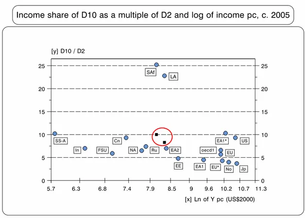
As there are many well-known problems with data reporting in D1, Figure 15 looks at income polarisation by the income shares ‘D10/D2’ and ‘D9/D2’.34
32
Not surprisingly, regardless of the subject studied, university graduates in Chile take longer to recuperate the cost of their studies than in any comparable country (Ibid.).
33
Wolfson (1997), for example, started the whole ‘polarisation’ literature by developing an index that cuts the Lorenz curve right in the middle!
FIGURE 15
● As Figure 3; and Gh=Ghana (SS-A median country). The last observation in ‘D10/D2’ is Namibia=75.
Figure 15 shows the remarkable difference between these two multiples. The ranges for the rankings are very different: while ‘D10/D2’ extends from 3.6 to 75 (33.2
without Namibia), that of ‘D9/D2’ only does so from 2.3 to 15 (12.5 without Namibia). Moreover, while in ‘D10/D2’ income polarisation kicks in at the beginning of the last fourth of the sample (at ranking 100, exactly where Latin American countries start reporting), in ‘D9/D2’ there is a much smaller break in the trend, and this happens well after the appearance of Latin American countries.
Of the statistics measuring inequality, ‘D10/D2’ probably best reflects the
uniqueness of income-polarisation in Latin America and Southern Africa. In the case of the former, at a median value of 19.4, its multiple for ‘D10/D2’ is more than twice the median value for the seventy ‘non-Latin-American LDCs’ (see Table 2). Latin America’s polarisation would be even higher, of course, if distributional data were properly
adjusted by national accounts. As already mentioned, in Chile, for example, the official data for income distribution (reported in World Bank, 2010) adjust for the unreported incomes of the poor and the subsidies that they receive but, oddly enough, they do not correct for either the unreported monetary incomes of the rich, or for the many
subsidies that they receive. It has been estimated that, as a result, the income distribution data for 2006 under-reported the national disposable income by no less than 41 per cent. In turn, if data were also adjusted for the unreported incomes of the rich (via national accounts), the ‘D10/D2’ multiple would more than double, and the multiple of ‘D10/D1’ would jump from 31 to 88 (for family income), or from 53 to 148 (income per capita).35
35
Table 2: Region Median Values for Different Income Ratios
D 10/D 1 D 10/D 2 D 9/D 2 D 10/D 1-D 4 Q 4/Q 2 Q 3/Q 2
Southern Africa 35.1 25.2 10.0 5.2 3.4 1.8
Latin Am erica 33.9 19.4 7.1 4.0 2.7 1.7
C aribbean 16.6 10.5 4.9 2.3 2.2 1.5
Sub-Saharan Africa 15.5 10.3 4.6 2.3 2.2 1.5
East Asia-1* 17.7 10.3 5.1 2.3 2.3 1.5
LD Cs 15.5 10.2 4.7 2.2 2.2 1.5
U nited States 19.8 9.3 4.8 2.1 2.4 1.6
China 13.2 9.3 4.9 2.0 2.2 1.5
N on-LA LD Cs 13.1 8.9 4.3 2.0 2.1 1.4
East Asia-2 11.0 7.8 4.2 1.8 2.1 1.5
N orth Africa 11.1 7.6 3.8 1.7 2.0 1.4
R ussia 11.0 7.4 4.1 1.6 2.1 1.4
India 8.6 7.0 3.2 1.6 1.8 1.3
O ECD -1 12.5 6.6 3.8 1.5 2.0 1.4
Form er Soviet U nion 9.4 6.5 3.5 1.5 1.9 1.4
European U nion 9.2 5.6 3.3 1.3 1.8 1.3
Easter Europe 7.3 5.1 3.0 1.2 1.7 1.3
East Asia-1 7.8 4.5 3.0 1.0 1.7 1.3
N ordic countries 6.1 4.0 2.5 1.0 1.6 1.2
Japan 4.5 3.7 2.4 0.9 1.5 1.2
All 11.7 8.1 4.1 1.8 2.0 1.4
● Regions are ranked according to ‘D10/D2’. Median values; but in East Asia-1, multiples correspond to Korea; in East Asia-1* to Singapore; and in Southern Africa to South Africa. OECD-1 excludes the US, and FSU Russia, as they are reported separately. OECD-1 excludes the US, and FSU Russia, as they are reported separately.
As Table 2 indicates, the greater inequality in Southern Africa and Latin America decreases rapidly closer to the middle of the distribution. For example, while Latin America’s multiples of ‘D10/D1’, ‘D10/D2’ and ‘D10/(D1–D4)’ are about twice those of the next three regions and China, there is little difference between them towards the middle of the distribution. Surprisingly, many theories purporting to explain Latin America’s greater inequality refer to phenomena in this middle of the distribution. That is the case, for example, with the 1960s’ import-substituting industrialisation related ‘labour aristocracy’ hypothesis, and with the 1990s’ import-liberalisation related ‘skill-biased technical change’ proposition.
The first hypothesis, widely invoked during the 1960s and 1970s, particularly by the World Bank and its many consultants and later on by the emerging ‘Washington Consensus’, argued that one of the main causes of inequality in Latin America was the price distortions associated with import-substituting industrialisation (ISI). These are supposed to have distorted the values of sectoral marginal productivities, allowing for artificially high wages in manufacturing (à la Stolper and Samuelson). That is, wage differentials were higher than if free trade predominated (see, e.g., Krueger, 1983; World Bank, 1987). However, there was little then (as now) to differentiate Latin America from the rest of the world — developing and developed, ISI and non-ISI — in terms of the income distribution among groups that would include ‘aristocratic’ and ‘non-aristocratic’ labour (found in, say, the ratio of ‘Q3/Q2’ in Table 2, or ‘D5/D3’ in Figure 16 below).
The second proposition basically recycled the ‘labour-aristocracy’ hypothesis for the post-1980 globalisation era, as a way of explaining the supposedly unexpected increase in inequality in many developing countries after the implementation of
inequality took place because import liberalisation had allowed for new production techniques which were intensive in the use of skilled workers (a scarce factor in most LDCs), therefore increasing wage differentials. However, as is obvious from previous graphs, Table 2 and Figure 16 below, what really differentiates Latin America’s inequality is located at the tails of the distribution of income — hardly where skilled workers are located. Therefore, even if import liberalisation did introduce the new production techniques, evidence suggests that this, by itself, does not account for much of the region’s increased inequality.36 Again, the case of Chile provides a good
example (Figure 16).
FIGURE 16
● As Figure 4. 3-year moving averages.
Even though Chile implemented one of the most radical (and swift) trade and financial liberalisation policies, and in spite of the fact that this policy has now been in place for four decades, there is nothing in Chile’s data regarding the relative income of skilled and unskilled labour (proxied in Figure 16 by ‘D5/D3’ — or, in an extreme scenario, by ‘D9/D2’) to support the recycled ‘labour-aristocracy’ hypothesis (i.e., the ‘skill-biased technical change’ proposition). In fact, even ‘D9/D2’ has hardly had any change, ending in the 2000s exactly where it began in the (‘import-substituting’) 1950s.
Moreover, in the cross-sectional scenario above there is no statistical evidence either of any significant diversity in ‘D5/D3’ or ‘D9/D2’ between countries where skilled labour is abundant or scarce.
Basically, the message from Figure 16 is that massive political upheavals,
together with radical economic reforms and greater integration with the world economy and finance, have tended to have significant effects at the tail ends of the distribution,
but little effect in between. In other words, one of the most important lessons emerging from Latin America is that the traditional mainstream explanations for income disparities are looking at the wrong side of the distribution, and at factors that are not the fundamental causes of the huge inequalities found there. As with the case of the influence of education discussed above, the distributional impacts of the ‘skill-biased technical change’ phenomenon should be understood as factors operating within a broader political economy and institutional dynamics — none more important than the centrifugal forces that are squeezing income from the bottom and directing it to the very top (including, of course, the political economy of Latin America’s labour markets).37
Perhaps those following the Washington Consensus should give their ideology a sabbatical and go back to their drawing boards, and start thinking again about why the capitalist élites in Latin America and South Africa are able to appropriate a share of national income that is so much higher than anybody else’s. In particular, so much higher than in other middle-income countries — such as those in North Africa, the former Soviet Union, Eastern Europe, the Caribbean, and the second-tier NICs — where often there are more markets rigidities; where prices, institutions and social capital are less ‘right’; where property-rights are often less defined and less well-enforced; where there is often more educational segmentation; where the educational systems for the poor are even more dismal; where there is even greater gender discrimination; even more shortages of skilled labour; where democracy could be described as more ‘low-intensity’; where there are more problems of ‘governance’; where success or failure in business depends even more on political connections and corruption, and so on.
In fact, the monotonous insistence of so many mainstream economists in blaming Latin America’s huge inequality on ‘exogenous’ factors, such as the nature of technology, the abundance of natural resources, market distortions, or the unfortunate institutions created at the start of the colonial past, half a millennium ago, such as the
mita and the encomienda (an institution that was already pretty much gone by the end of the sixteenth century), reminds us of Edmund’s speech in King Lear:
“This is the excellent foppery of the world, that, when we are sick in fortune — often the surfeit of our own behaviour — we make guilty of our disasters the sun, the moon, and the stars: as if we were villains by necessity, fools by heavenly compulsion, knaves, thieves, and treachers, by spherical predominance, drunkards, liars, and adulterers, by an enforced obedience of planetary influence; and all that we are evil in, by a divine thrusting on: an admirable evasion of whoremaster man, to lay his goatish disposition to the charge of a star!” (1.2.132)
In other words, as Figures 17 and 18 show (and Adam Smith’s quote below on the issue of ‘vanity’ helps to illuminate), any new distributional theory that attempts to understand the huge inequality of Latin America and South Africa needs to grasp the basic distributional stylised fact that, as the middle classes in Latin America are able to hold their own, the ‘excess’ vanity of Latin America’s oligarchies can only be subsidised with the income of the bottom 40 per cent. And since what really matters in
distributional terms is the income-share of the rich — while the rest ‘follows’ —
perhaps, whilst constructing the much-needed new distributional theories, mainstream economists and everybody else should follow the example of Clinton’s campaign strategist by sticking a note on their notice boards saying, “It’s the share of the rich, stupid!”.
Furthermore, another crucial issue that any new distributional theory should address is why — as the Chilean case shows — distributional gains in Latin America seem to be rather difficult to sustain (see Figures 4 and 16 above, and Appendix 1 below). In Mexico as well, most of the distributional gains made between 2002 and 2006 were also reversed afterwards. Therefore, improvements in inequality have had
so far a tendency to be temporal, while deteriorations have been more permanent. From this perspective, the jury is still out regarding the sustainability of the widely reported recent (relatively minor) decrease in Latin America’s huge inequality (see especially ECLAC, 2010a; Gasparini et al., 2009; López-Calva and Lustig, 2010). Moreover, the evidence of the dataset collected for Figure 2 above (updated to the late 2000s with SEDLAC, 2010) indicates that, rather than a decrease in the region’s
inequality, what is really happening is a movement towards a greater degree of
homogeneity in inequality. That is, countries with the worst income distribution in 1985 (Brazil, Chile, Guatemala, Nicaragua and Panama) have had a tendency to reduce their inequality (although often by a relatively minor amount), while those with lower inequality in 1985 (Uruguay, Costa Rica, Argentina and Mexico) have had a tendency to increase their inequality in this twenty-five year period. As a result, both the Gini’s harmonic mean and median have remained practically unchanged (50.6 and 50.2, 51.8 and 51.2, respectively), but its coefficient of variation has declined (from 0.11 to 0.08).38
Figure 17 shows the overall regional geography for the multiple of ‘D10/D2’.
FIGURE 17
● EU*=continental Europe with a multiple of less than 4.5 (Germany and Austria). Black squares within the circle in the middle of the graph indicate the ‘D9/D2’ multiple for South Africa and Brazil (Latin America’s median value for ‘D9/D2’ is El Salvador=7.1).
If anybody still doubted that Latin America and Southern Africa live in a distributional
limbo of their own — as if they were on a different planet — Figure 17 should make them think again. In fact, if their D10 (and appropriate level of national income) were to disappear altogether, and their current multiples for ‘D9/D2’ became magically their ‘D10/D2’ ones, even then these new multiples would be larger than most ‘D10/D2’ ones for other regions — see black squares within the circle in Figure 17.39 For example, if South Africa’s multiple for ‘D9/D2’ became its ‘D10/D2’, it would still rank as the 88th highest ‘D10/D2’ within the sample; Brazil would rank 76th. The same happens with their multiples for ‘D10/(D1–D4)’ (see Figure 18); in this case, if one replaces South Africa’s multiple ‘D10/(D1–D4)’ for its multiple ‘D9/(D1–D4)’, it would still rank as the 84th highest; Brazil would be 60th highest.
FIGURE 18
● EU*=continental Europe with a multiple of less than 1.05 (Germany and Austria). Black squares within the circle indicate the multiple of ‘D9/D1-D4’ for South Africa and Brazil (median value for Latin America for this multiple is Guatemala=1.5).
These are such unique income polarisations, and analytically present such a
challenging issue (how can these oligarchies get away with this, even after many years in democracy, and often with the ‘new’ left in government?), that their study would require a separate paper — one that would go beyond mechanical ‘path-dependency’ explanations.40 Briefly, in my view Latin America’s and Southern Africa’s distributional
39
When I analyse what would happen if the top decile in Latin America and Southern Africa would disappear altogether, this is just a logical exercise, not a policy proposal...
40 Can ‘path-dependency’ be the omnipresent explanation for every complex social and ideological process that occurs? As it is often the case, a very useful concept can easily be misused as an analytical equivalent of cutting a knot that cannot be unravelled. In fact, as the ‘excessive’ use of mathematics in economics, the over-reliance on this concept is often a
settlements are unique not simply because somehow the rich are able to appropriate a larger share of national income than their counterparts in other regions. They are unique because the rich there do not seem to have proper counterparts elsewhere, except, in all probability, for countries in the oil-producing Middle East for which there are no data. One could even use as a metaphor the Darwinian term of ‘living fossils’, both in the sense that these oligarchies do not seem to have close living relatives, and that they appear to be similar to social and political ‘organisms’ otherwise only known to us from the study of (social and political) fossils.41 In other words, these ‘species’ may only be in existence today because they are better equipped than oligarchies in other regions in the world to survive (and resist) major (social and political)
evolutionary upheavals (see Appendix 1 for the case of Chile). Many economic and political institutions have changed (some significantly), but the underlying distribution of political power has not — and neither have the narrow interests of the élite (see also Oliveira, 2003, and Arantes, 2007). In fact, the unique comparative advantage of the Latin American oligarchies lies precisely in being able to use different institutions (sometimes quite astutely) to achieve their fairly immutable goals. Few oligarchies in the world have shown such skills in their struggle for the ‘persistence of élites’ despite significant institutional change (Acemoglu and Robinson, 2006). Of course they have used violence for this (sometimes extreme violence; in some cases so extreme that the outcome can only we describe as genocide, as in Guatemala), but oligarchies in many other parts of the world have been equally vicious at times, and the outcome has been different.
At the same time, the distributional outcomes of Latin America and Southern Africa are so extremely unequal that (following Pigou) the welfare implications for a hypothetical improvement in their degree of inequality are rather obvious:
“[...] it is evident that any transference of income from a relatively rich man to a relatively poor man of similar temperament, since it enables more intense wants, to be satisfied at the expense of less intense wants, must increase the aggregate sum of satisfaction. The old "law of diminishing utility" thus leads securely to the proposition: Any cause which increases the absolute share of real income in the hands of the poor, [...] will, in general, increase economic welfare.” (Pigou, 1920)
However, there is not much evidence for the law of ‘diminishing marginal utility’ (or ‘less intense wants’) at work in my part of the world, or Southern Africa — which is such an important cornerstone of neo-classical analysis, particularly as far as income distribution (and status, power, or greed) is concerned. Perhaps Adam Smith can give us a better clue:
“[W]hat is the end of avarice and ambition, of the pursuit of wealth, of power, and pre-eminence? Is it to supply the necessities of nature? The wages of the meanest labourer can supply them [...]. [W]hy should those who have been educated in the higher ranks of life, regardit asworse than death, to be reduced to live, even without labour, upon the same simple fare with him, to dwell under the same lowly roof, and to be clothed in the same humble attire? [...] It is the vanity, not the ease, or the pleasure, which interests us.” (1759; emphasis added).
Vanity indeed!42As the Argentinian cartoonist quoted above once said, for Latin
as discussed in Appendix 1, if path-dependency is what is taking place, it is one with a rather short memory... In fact, as mentioned above, it is really difficult to understand how so many still look at the institutions created at the start of Latin America’s colonial past for mechanical answers to this issue.
41 According to Darwin (1859), ‘“living fossils” [...] like fossils, connect to [...] orders now widely separated in the natural scale. [...] they have endured to the present day, from [...] having been exposed to less severe competition’.
42