❊♥s❛✐♦s ❊❝♦♥ô♠✐❝♦s
❊s❝♦❧❛ ❞❡
Pós✲●r❛❞✉❛çã♦
❡♠ ❊❝♦♥♦♠✐❛
❞❛ ❋✉♥❞❛çã♦
●❡t✉❧✐♦ ❱❛r❣❛s
◆◦ ✸✼✸ ■❙❙◆ ✵✶✵✹✲✽✾✶✵
▼❛❝r♦❡❝♦♥♦♠✐❝ P♦❧✐❝② ❆♥❞ P♦✈❡rt② ■♥ ❇r❛③✐❧
❊❞✇❛r❞ ❏♦❛q✉✐♠ ❆♠❛❞❡♦✱ ▼❛r❝❡❧♦ ❈♦rt❡s ◆❡r✐
❖s ❛rt✐❣♦s ♣✉❜❧✐❝❛❞♦s sã♦ ❞❡ ✐♥t❡✐r❛ r❡s♣♦♥s❛❜✐❧✐❞❛❞❡ ❞❡ s❡✉s ❛✉t♦r❡s✳ ❆s
♦♣✐♥✐õ❡s ♥❡❧❡s ❡♠✐t✐❞❛s ♥ã♦ ❡①♣r✐♠❡♠✱ ♥❡❝❡ss❛r✐❛♠❡♥t❡✱ ♦ ♣♦♥t♦ ❞❡ ✈✐st❛ ❞❛
❋✉♥❞❛çã♦ ●❡t✉❧✐♦ ❱❛r❣❛s✳
❊❙❈❖▲❆ ❉❊ PÓ❙✲●❘❆❉❯❆➬➹❖ ❊▼ ❊❈❖◆❖▼■❆ ❉✐r❡t♦r ●❡r❛❧✿ ❘❡♥❛t♦ ❋r❛❣❡❧❧✐ ❈❛r❞♦s♦
❉✐r❡t♦r ❞❡ ❊♥s✐♥♦✿ ▲✉✐s ❍❡♥r✐q✉❡ ❇❡rt♦❧✐♥♦ ❇r❛✐❞♦ ❉✐r❡t♦r ❞❡ P❡sq✉✐s❛✿ ❏♦ã♦ ❱✐❝t♦r ■ss❧❡r
❉✐r❡t♦r ❞❡ P✉❜❧✐❝❛çõ❡s ❈✐❡♥tí✜❝❛s✿ ❘✐❝❛r❞♦ ❞❡ ❖❧✐✈❡✐r❛ ❈❛✈❛❧❝❛♥t✐
❏♦❛q✉✐♠ ❆♠❛❞❡♦✱ ❊❞✇❛r❞
▼❛❝r♦❡❝♦♥♦♠✐❝ P♦❧✐❝② ❆♥❞ P♦✈❡rt② ■♥ ❇r❛③✐❧✴
❊❞✇❛r❞ ❏♦❛q✉✐♠ ❆♠❛❞❡♦✱ ▼❛r❝❡❧♦ ❈♦rt❡s ◆❡r✐ ✕ ❘✐♦ ❞❡ ❏❛♥❡✐r♦ ✿ ❋●❱✱❊P●❊✱ ✷✵✶✵
✭❊♥s❛✐♦s ❊❝♦♥ô♠✐❝♦s❀ ✸✼✸✮
■♥❝❧✉✐ ❜✐❜❧✐♦❣r❛❢✐❛✳
0$&52(&2120,&32/,&<$1'329(57<,1
%5$=,/
Edward Amadeo
2Marcelo Neri
3
5
5
(
(
6
6
8
8
0
0
2
2
O Brasil é um país onde os 50% mais pobres se apropriam aproximadamente de 10% da
renda agregada, e os 10% mais ricos detêm quase 50% deste mesmo. O colorário desse alto grau de
desigualdade é que se uma pessoa está somente preocupada em maximizar o nível de GPD, a função
de bem–estar social implícita adotada devota parte do seu peso ao bem-estar de 10% da população.
Em outras palavras, a concentração brasileira de renda cria uma anomalia dentro da perspectiva de
agente representativo implícito na análise macroeconômica aonde as pessoas valem aquilo que
ganham. A análise da pobreza inverte esse peso estrutural da população, estipulando zero de peso
para o segmento não pobre da sociedade e atribuindo pesos aos indivíduos que aumentam com suas
necessidades insatisfeitas.
Esse projeto estuda as conexões entre a evolução macroeconômica Brasileira recente e da
pobreza. A análise é dividida em duas partes: A primeira parte descreve a evolução da pobreza
brasileira e seus principais determinantes macroeconômicos durante os últimos 15 anos. A segunda
parte tira proveito das mudanças da pobreza e desigualdades medidas durante o período 1993-96
para estudar seus principais determinantes macroeconômicos. Dado a maior importância do Plano
Real, uma especial atenção foi dada a análise dos impactos da desinflação no nível e na distribuição
de renda e a possível sinergia entre essas duas dimensões de determinação da pobreza. A terceira
parte do projeto decompõe as mudanças dos diversos índices de pobreza através dos diferentes
grupos dado pelas características dos chefes de família (i.e.; sexo, anos de estudo, raça, classe
trabalhadora, setores de atividades, região, densidade populacional). Depois essa decomposição é
avançada um passo desatrelando as mudanças nessa diferentes células de pobreza em termos de suas
respectivas mudanças em termos de desigualdade da renda per capita. Esse perfil de pobreza ajuda a
mapear as diferentes fontes de mudança da pobreza na análise histórica e fornece consistência
interna para os exercícios de análises contra-factuais.
Brazil is a country where the 50% poorest detain nearly 10% of its aggregate income and
where the 10% richest detain almost 50% of aggregate income4. The corollary of this high degree of
inequality is that if one is only concerned with maximizing the level of the GDP, the implicit social
welfare function adopted devotes half of its weight to the well being of 10% of the population. In
other words, Brazilian concentration of income creates anomalies within the representative agent
assumptions implicit in macroeconomic analysis where people are worth what they earn. Poverty
analysis invert this population weight structure assigning zero weight to the non-poor segments of
society and ideally attributing weights to individuals increasing with their unsatisfied needs.
This project studies links between macroeconomic developments in Brazil and poverty. The
analysis is divided in two parts: The first part describes the evolution of Brazilian poverty and its
main macroeconomic determinants during the last 15 years. The second part takes advantage of the
wild swings of poverty and inequality measures during the 1993-96 period to study their main
macroeconomic determinants. Given the major importance of the Real plan, special attention will be
paid to the analysis of the disinflation impacts on the level and the distribution of income and to
possible synergism between these two dimensions of poverty determination. The third part of the
project decomposes changes of various poverty indexes across different groups assigned by
characteristics of the heads of households (i.e.; gender, years, schooling, race, working class,
sectors of activity, region, population density). Next this decomposition is taken one step further by
disentangling changes in these different poverty cells in terms of their respective changes in mean
inequality of per capita income. These poverty profiles helps to map the sources of poverty changes
in historical analysis and it gives internal consistency to counter-factual exercises.
4
([HFXWLYH6XPPDU\
This paper aims to discuss structural and macroeconomic determinants of poverty in the
recent Brazilian experience. The third and final part of the paper looks at the evolution of the main
structural determinants of poverty in Brazil during the last two decades. It decomposes changes of
various poverty indexes across different groups assigned by characteristics of the heads of
households (i.e.; gender, years, schooling, race, working class, sectors of activity, region, population
density). Next this decomposition is taken one step further by disentangling changes in these
different poverty cells in terms of their respective changes in mean and in the degree of inequality of
per capita income. These poverty profiles helps to map the sources of poverty changes in historical
analysis and it gives internal consistency to counter-factual exercises. The main lesson here is that
inequality reduction is a fundamental component of poverty alleviation policies.
The first part of the paper describes the evolution of poverty, inequality and macroeconomic
developments in Brazil during the last decade. It also develops an aggregate monthly time series
analysis of the determinants of poverty in the 1980-96 period. This analysis shows that higher
inflation and higher unemployment imply lower per capita earnings for all deciles. The direct effects
of inflation on per capita family earnings were somewhat milder and decreases as we move to the
upper tail of the distribution. In other words, poverty tend to be more adversely affected by higher
inflation rates than mean incomes. Similarly, the unemployment elasticity of per capita earnings
decreases as we move towards the upper tail of the distribution.
The real minimum wage elasticity of per capita earnings turns out to be positive and
statistically different from zero. Although, economic theory does not provide definite answers with
respect to the sign impact of the minimum wage on per capita earnings, the partial elasticity of per
capita earnings with respect to the minimum is greater in module than the sum of inflation and
unemployment partial elasticities in all deciles under analysis. Furthermore, the module of minimum
wage partial elasticities estimated also tend to decrease with earnings levels.
A partial regression analysis showed that real minimum wages explains one half of the
unexplained variance of the head-count ratio when only inflation and unemployment rates are taken
into account. In sum, a negative partial elasticity of poverty with respect to minimum wages is a
robust result for the Brazilian case during the 1980-96 period. Still, this regression analysis does not
warrant a casual interpretation of minimum wages hikes as a poverty alleviation device.
determinants of poverty during the Brazilian experience from 1993 to 1996. Given the major
importance of the Real plan, special attention was paid to the analysis of impacts of the disinflation
process on the level and the distribution of income, and to possible synergism between these two
dimensions of poverty determination.
One set of effects are related to the impact of the Real plan on mean per capita income that
operates through aggregate demand channels. We devote special attention to the impact of the
disinflation process on aggregate consumption like the reduction of inflation tax losses. Besides
this redistributive effect, we also take into account the effects of reductions of inflationary
uncertainties such as the reduction of precautionary savings and increases in the supply and demand
of consumer credit. The main lesson here is that the increases of aggregate demand observed after
the Real may be largely financed by disaving and not by increases in the purchasing power of
income (i.e., redistributive mechanisms).
Although, the paper identifies redistributive effects of the Real plan, there were fewqualifications made to the reduction of inequality observed after July 1994 and its possible links
with the launching of the Real Plan. First, inequality of current monthly income has fallen more
than the inequality of income measured for longer periods. The difference between these two
inequality measures can be explained in terms of the fall of the temporal variability of individual
income. As its name suggests one key implication of a successful stabilization program is to make
actual earnings more stable and to reduce measurement error on earnings. However, one should be
careful not to mix reductions in the temporal variability of earnings, actual or measured, with
changes in VWULFWRVHQVX inequality.
Second, the basis of comparison for the analysis of the post Real plan is very low: during
June 94 inequality was close to its historic record.
Third, the increase in inequality observed during the period of accelerating inflation before
the Real plan is perhaps a better evidence of the adverse effects of inflation on earnings distribution
than the post-stabilization period. The whole disinflation technology applied in the Real plan
attempted to keep the VWDWXVTXR of income distribution before and after the stabilization through the
imposition of conversion rules to wages (i.e., the URV mechanism). Of course, there are specific
impacts of the stabilization such as changes in the relative prices between tradable and non-tradable
goods and the reduction of inflation tax losses on income distribution that were not neutralized.
However, one should look at characteristics impacts of the stabilization on inequality like the two
impacts just mentioned or on the reduction of the temporal variability of earnings and not treat
Finally, although our analysis indicated that the poorest Brazilian that faced higher losses in
the high inflation period that preceded the Real and that this same group experienced higher gains in
post stabilization period, it does not necessarily implies that the Real plan is the sole reason for the
improvement of social indicators. Stabilization may be seen more as a necessary, than a sufficient,
condition for inequality reduction.
But what else explains the reduction of poverty and inequality observed in the last three
years? The month by month analysis of poverty and inequality indicators revealed that the bulk of
the fall of poverty and inequality observed after the Real plan happened exactly in May 1995, nine
months after stabilization. Maybe it was just a long pregnancy before the baby, namely the benefits
of stabilization, was delivered. In our opinion, other forces besides lagged effects of stabilization on
income distribution should be looked after as well. The May 95 minimum wage hike seems to us a
3$570$&52(&2120,&6'(7(50,1$1762)329(57<
62&,$/,1',&$7256$1'0$&52(&2120,&'(9(/230(176
Besides the census, there are two main sources of household income at a micro level that can
be used to evaluate the evolution of per capita income distribution in Brazil: PNAD and PME.
PNAD offers the possibility of covering different income sources at a national level. In this respect,
PME basically covers labor earnings in the six main metropolitan regions. On the other hand, PME
allow us to work with per cata family earnings. Therefore, earnings based social measures,
generated either from PNAD or from PME, capture income effects of changes in unemployment and
´precariousness` of jobs.
However, one must have in perspective that PNAD presents just one picture at one point in
every year that the survey is carried out. Since PME is a monthly survey it can provide a better idea
of what happened during the whole year to a less comprehensive set of variables than PNAD. In
sum, PNAD offers a detailedSLFWXUHRQFHD\HDUof Brazilian social indicators while PME offers a
not so detailed PRQWKO\ILOP of the same object. This and the next part of the paper will use PME to
capture macroeconomic aspects of social welfare while the last part will use PNAD to study
structural aspects of poverty.
PNAD is implemented in a given week of the third quarter of the year. Graphs 1A and 1B
present the evolution of the head-count ratio5and the Gini coefficient of per capita family earnings
in the months that PNAD went (or was supposed to go) to the field. These graphs compare these
indicators with their respective yearly average figures and allow us to check how possibly changing
seasonal patterns of these indicators may undermine temporal comparisons based on PNAD data.
*5$3+$*5$3+% +($'&28175$7,23 ,1(48$/,7<*,1, <($5/<$9(5$*(6;31$''$7(6 <($5/<$9(5$*(6;31$''$7(6 0.15 0.17 0.19 0.21 0.23 0.25 0.27 0.29 0.31 0.33 0.35
85 86 87 88 89 90 91 92 93 94 95 96 Yearly Average PNAD Date
0.56 0.57 0.58 0.59 0.60 0.61 0.62 0.63
82 83 84 85 86 87 88 89 90 91 92 93 94 95 96
Yearly Averages PNAD Date
Source: PME
We present now a brief overview of the evolution of poverty and inequality from 1985 to
1996 and their relationship with the main macroeconomic developments. Graph 2 presents the
evolution of the growth rate of each tenth per capita earnings on a yearly basis.
During the recent period, starting with the 1RYD 5HSXEOLFD in 1985, social indicators were
dominated by the macroeconomic instability observed. This period is characterized in
macroeconomic terms by the launching of the so-called heterodox stabilization plans. There were
six stabilization plans: Cruzado (February 1986), Bresser (June 1987), Verão (January 1989), Collor
(March 1990), Collor II (February 1992) and Real (July 1994). These plans produced sharp drops
oscillations in inflation rates, as shown in Graph 3A, and in the level of economic activity, captured
in Graph 3B by the unemployment rate.
*5$3+*52:7+5$7(62)$9(5$*(3(5&$3,7$($51,1*6%<'(&,/(0RQWK0$ 0% 5% 10% 15% 20% 25%
2 3 4 5 6 7 8 9 10 0%
10% 20% 30% 40% 50% 60%
2 3 4 5 6 7 8 9 10 -10%
-8% -6% -4% -2% 0%
2 3 4 5 6 7 8 9 10
-6% -4% -2% 0% 2% 4% 6%
2 3 4 5 6 7 8 9 10
0% 1% 2% 3% 4% 5% 6% 7% 8% 9% 10%
2 3 4 5 6 7 8 9 10 -12%
-10% -8% -6% -4% -2% 0%
2 3 4 5 6 7 8 9 10
-25% -20% -15% -10% -5% 0%
2 3 4 5 6 7 8 9 10
-30% -25% -20% -15% -10% -5% 0%
2 3 4 5 6 7 8 9 10
-2% 0% 2% 4% 6% 8% 10%
2 3 4 5 6 7 8 9 10
-10% -5% 0% 5% 10% 15% 20%
2 3 4 5 6 7 8 9 10
0% 5% 10% 15% 20% 25%
2 3 4 5 6 7 8 9 10
0% 1% 2% 3% 4% 5% 6% 7%
2 3 4 5 6 7 8 9 10
*5$3+$0RQWKO\,QIODWLRQ5DWH*5$3+%0RQWKO\8QHPSOR\PHQW5DWH 2% 3% 4% 5% 6% 7% 8% 9% 10%
Jun/80 Set/81 Dez/
8
2
Mar
/8
4
Jun/85 Set/86 Dez/
8
7
Mar
/8
9
Jun/90 Set/91 Dez/
9
2
Mar
/9
4
Jun/95 Set/96
0% 10% 20% 30% 40% 50% 60% 70% 80% 90% Ja n/80 Abr /81 Ju l/82
Out/83 Jan/85 Abr
/86
Ju
l/87
Out/88 Jan/90 Abr
/91
Ju
l/92
Out/93 Jan/95 Abr
/96
During 1985 and 1986, we observe positive growth rates for all deciles with higher rates for
lower deciles. This implied a sharp reduction on both poverty and inequality indices. 1986 is the
best year of the series in terms of poverty reduction, all deciles present growth rates above 24%
pushed by the Cruzado stabilization plan consumption boom, generous conversion rules for all
wages and a minimum wage hike. During 1987 inequality falls slightly but poverty also rises
slightly because lower deciles also suffer income losses (first five deciles loose between 8 and 9 %).
The period between 1988 and 1990 presents a sharp deterioration of inequality measures.
Notwithstanding, poverty changes are not marked in the 1988-89 period. During the 1990-92 period
a deep recession reaches the economy as a result of stabilization attempts by the Collor government
that not only attempted to curb price rises with incomes policies (i.e., price freezes, exchange rate
pegging, wage conversions) but also through vigorous and interventionist demand restrained
policies. In March 1990, two thirds of M4 were decreed illiquid in the financial system. This asset
freeze would last 18 months. The result was the largest recession in the statistically documented
Brazilian economic history. The patterns of changes assumed by the degree of earnings
concentration in this period are quite diverse: rise in 1990, sharp fall in 1991 and slight increase in
1992. Despite of this diversity, poverty indices increase during each of these years.
The 1993-94 period is marked by steadily increasing already high inflation rates. The
economy presents aggregate growth but the lowest deciles face incomes loses, worsening inequality.
As a consequence, poverty and inequality measures reach new records in 1994, the year the Real
plan was launched. This stabilization plan produced an instantaneous fall from hyperinflationary
levels of 50% per month with no immediate consequences on unemployment rates. In 1995, there
was a sharp reduction on both poverty and inequality. In May 1995, minimum wages got a 43% hike
while inflation were already at level of the 2 % per month. In 1996, poverty kept falling at a slower
pace but inequality remained constant. The causes behind the wild swing of earnings based social
indicators in the period immediately before and after the Real plan will be studied in detail in the
7,0(6(5,(6$1$/<6,62)329(57<
This sub-section presents an analysis of correlation patterns between inflation,
unemployment and real minimum wages, on the one hand, and earnings based social indicators, on
the other. We use monthly PME data in logs for the June 1980 to December 1996 period. Table 1
presents the ordinary least square estimation of the partial elasticity of the mean income of different
deciles with respect to inflation rates, unemployment rates and real minimum wages. Inflation and
unemployment elasticities are not only statistically different from zero but present the expected sign.
Higher inflation and higher unemployment imply in lower per capita earnings for all deciles. The
direct effects of inflation on per capita family earnings are somewhat milder6. The
inflation-elasticity decreases from -0.079 in the second decile to -0.066 as we move to the upper tail of the
distribution. In other words, the poorest segments of the population tend to be more adversely
affected by higher inflation rates. Similarly, the unemployment elasticity of per capita earnings
decreases as we move towards the upper tail of the distribution. This elasticity falls monotonically
from -0.556 to -0.23.
The real minimum wage partial elasticity of per capita earnings is positive and statistically
different from zero. Although, economic theory does not provide definite answers with respect to
the sign impact of the minimum wage on per capita earnings, the partial elasticity of per capita
earnings with respect to the minimum is greater in module than the sum of inflation and
unemployment partial elasticities in all deciles under analysis. Furthermore, the module of minimum
wage partial elasticities also tend to decrease with earnings levels. The only exception is the upper
decile where the elasticity reaches 0.443 reaching a value close to the one observed in the fifth
decile. Nevertheless, this result indicates that per capita earnings mostly correlated with minimum
wages are, in general, located in the bottom of the per capita income distribution.
7$%/(7+(,03$&72)0,1,080:$*(6,1)/$7,21$1'81(03/2<0(1721 $9(5$*(3(5&$3,7$($51,1*6%<'(&,/(
Inflation Unemployment Minimum
Rate Rate Wage 5A
---- ---- ---- ---- ---- ----
-6,050 -9,358 15,157
-8,690 -9,935 14,925
-9,642 -9,965 15,068
-10,197 -10,000 15,279
-10,559 -10,068 15,653
-10,916 -10,238 15,986
-11,123 -10,346 16,034
-11,208 -10,311 15,458
-7,255 -5,568 12,291
OBS: a)Small numbers correspond to t-statistics. b)Constant and seasonal dummies omitted. Source: PME
Next, we turn to the analysis of the correlation patterns between inflation, unemployment
and minimum wages, on the one hand, and poverty measures, on the other. Table 2 presents OLS
estimates of the elasticity the head-count-ratio with respect to the set of macroeconomic variables
mentioned before. As one would expect , given the results of Table 1 the module of these
elasticities are greater for lower poverty lines7.
Given the major importance of the minimum wage on explaining poverty variation we move
to a partial regression analysis of this variable. Graph 4 presents a bivariate plot of minimum wages
and the residual component of the head-count ratio once a constant, seasonal dummies, inflation and
unemployment rates are taken into account. Minimum wages explains 49% of the unexplained
variance of the first stage regression. Still, regression analysis does not warrant a casual
interpretation of the impact of minimum wages hikes on poverty.
7$%/(*5$3+63$57,$/5(*5(66,21$1$/<6,6
+($'&28175$7,230,1,080:$*(6;81(;3/$,1('329(57<
0,1,080:$*(6;81(;3/$,1(' 0217+/<'$7$,1/2*6
%5$=,/
3RYHUW\/LQH /2: 0(',80 +,*+
,QIODWLRQ
5DWH
8QHPSOR\PHQW
5DWH
0LQLPXP
:DJH
’OBS: a)Small numbers correspond to t-statistics * Residual of the regression of P0 against inflation and unemployment b) Constant and seasonal dummies omitted Source: PME
3$577+(,03$&72)7+(5($/3/$121329(57<
This part starts using PME to study dynamic aspects of income distribution that are not
available using PNAD. At an aggregate level PME allows us to measure possible lags in the
response of social indicators to policy changes. At a micro level, the possibility offered by PME of
following the same household through short periods of time allows us to capture mobility aspects
and to use different time aggregating procedures in calculating earnings based social measures.
The analysis of the impact of the Real plan on income based social indicators through PNAD
data is specially problematic since the survey was not collected in 1994. This section assesses the
impacts of the Real plan on earnings distribution from PME data using an approach that in normal
conditions would be also be feasible to implement using PNAD. As the analysis proceeds we will
explore a rich variety of dynamic aspects available from PME.
35($1'326767$%,/,=$7,21',675,%87,9(&+$1*(6
The analysis of changes in income distribution will be divided in three stages: first, the
period before the Real plan (from June 93 to June 94), the transition period from high inflation to
stable prices (from July to September 94) and the post-transition period (from September 94 to
September 95). The second stage, characterized as a transition period, is hard to assess gauged since
it involves incomes earned in currencies of different natures and different inflation levels. The
evaluation of changes in the purchasing power of income involves necessarily assumptions with
respect to the dates of receipts and payments. For now we restrict ourselves to the first and the third
period mentioned above, where the analysis is more direct.
proposed for the two poverty lines proposed in part 1 during the two periods under analysis. The
results are consistent with the analysis of the mean and the inequality of per capita earnings
presented above: first, we observe a deterioration of all poverty indices during the 12-month period
that preceded the Real plan. Since the earnings loss was more strongly felt in lower deciles, the rise
in poverty indices tend to be inversely related to the poverty line used. For example, the proportion
of poor (P0) rises 15,7% for the low poverty line and 2,6% for the high poverty line.
7DEOH&KDQJHVLQ3RYHUW\DQGWKH5HDO3ODQ
3RYHUW\,QGH[ 3 3 3 3 3 3
3RYHUW\/LQH /RZ +LJK /RZ +LJK /RZ +LJK
0RQWKV%HIRUH5HDO3ODQ
PRQWKDIWHUWUDQVLWLRQ
6RXUFH30(,%*(
In contrast, from September 94 to September 95 there was a substantive improvement in all
poverty indices. During this period, the proportion of poor (P0) falls 21.8% for the low poverty line
and 9,2% for the high poverty line. This movement reflects the fact that lower deciles had bigger
gains in earnings during this period. Similarly, the average income gap of the poor (P1) falls 16.5%
for the low poverty line and 14.3% for the high poverty line. On the other hand, the average squared
income gap falls 12.1% for the low poverty line and 15.9% for the higher poverty line, inverting the
trend seen in the previous analyzed indices to present bigger falls for lower poverty lines.
7+(0$&52())(&762)7+(5($/3/$121329(57<
This part pursues a macro oriented analysis of poverty determinants during the 1990s in
Brazil. Given the major importance of the Real plan, special attention will be paid to the period
immediately before and after the stabilization. In particular, we attempt to assess the impacts of the
disinflation process on the level and the distribution of income, and to possible synergism between
these two dimensions of poverty determination.
Illustration 1 presents the main impacts of stabilization on poverty to be studied in this
section: the first set of poverty determinants analyzed are related to redistributive effects. These
effects include characteristic impacts of stabilization programs on income distribution such as
changes in relative prices between tradable and non-tradable goods and the reduction of inflation tax
incidence. We will also argue that the increases in the nominal minimum wage in a context of stable
prices played a major role in explaining the observed reduction in poverty after the Real plan.
The second set of effects are related to the impact of the Real plan on mean per capita
of the disinflation process on aggregate consumption like the reduction of inflation tax losses. We
also take into account the effects of reductions of inflationary uncertainties such as the reduction of
precautionary savings and increases in the supply of consumer credit. The main lesson here is that
the increases of aggregate demand observed after the Real plan, specially in the poorest segment of
the Brazilian economy, may be largely financed by disaving and not only by increases in the
purchasing power of per capita income.
,OOXVWUDWLRQ
7+(0$&52())(&762)7+(5($/3/$121329(57<
7+('(7(50,1$1762),1&20(',675,%87,21
&+$1*(6,15(/$7,9(35,&(6($51,1*6$1'329(57<
The Real plan is part of the family of “exchange-rate” based stabilization plans in which the
exchange rate plays an important part in imposing a ceiling for the prices of tradable goods. The
reduction in tariff and non-tariff protection which preceded the plan had essentially the same effect.
The prices of the non-tradable goods did not suffer from the opening of the economy and the
appreciation of the exchange rate. Hence there is a change in relative prices against the tradable
sectors and in favor of the non-tradable sectors. It is possible to show that the poor workers are
n Reduction in inflation tax
n Changes in relative prices tradables/non-tradables
n 43% minimum wage hike in a stable economy
Impact of stabilization on inequality:
Distribution of income
n Reduction in inflation tax and liquidity constrains
n Reduction in income variability and precautionary savings
n Reduction in income variability and greater demand and supply of credit
Impact of stabilization on aggregate
demand and level of activity:
Per capita
income
Poverty
concentrated in some of the non-tradable sectors notably personal services. In the labor market, they
are concentrated among the informal wage earners and the self-employed. In the educational scale,
they are concentrated among the less educated (see the poverty profiles in part 3). Hence, there are
reasons to believe that the change in relative prices has had important redistributive effects8.
67$%,/,=$7,210,1,080:$*($1'329(57<
This sub-section studies the role played by the May 95 minimum wage hike of 42.86% in
the path followed by social indicators. Graphs 5 and 6 present the evolution of the real minimum
wage vis a vis, respectively, the evolution of the proportion of poor and the Gini coefficient of per
capita earnings. *5$3+0,1,080:$*($1'7+(3523257,212)32253 *5$3+0,1,080:$*(6$1',1(48$/,7<*,1, 60 70 80 90 100 110 120 130 140 Dez /91 Ma i/ 9 2 O u t/9 2 Ma r/9 3 A go/ 93 J an/ 94 J un/ 94 Nov /94 Ab r/9 5 Se t/9 5 Fe v /9 6 Ju l/ 9 6 Dez /96 58% 59% 60% 61% 62% 63% 64%
Minimum Wage GINI
60 80 100 120 140 Dez /91 Ma i/ 9 2 O u t/9 2 Ma r/9 3 A go/ 93 J an/ 94 J un/ 94 Nov /94 Ab r/9 5 Se t/9 5 Fe v /9 6 Ju l/ 9 6 Dez /96 23% 25% 27% 29% 31% 33% 35% 37%
minimum wage proportion of poor
During the period of high inflation, up to July 1994, we observe synchronous movements of
poverty and inequality indices and the minimum wage. That is, when minimum wages are in a local
maximum (i.e., a readjustment date) poverty and inequality indices are on their local minimum. This
pattern is specially true when a low poverty line is chosen. This result is consistent with the idea that
minimum wages operate mostly at lower tail of per capita income distribution.
The first substantive fall in poverty after the Real plan was launched occurred in September
94 when the minimum wage was adjusted from R$64 to R$ 70, which corresponded to a nominal
rate of change of 9,4% while monthly inflation rate was around 2.11% per month. Table 4 shows
that the fall of the number of poor individuals occurred this month ranged from 5% using the low
poverty line to 1.2% using the high poverty line.
7DEOH&KDQJHVLQ3RYHUW\DQG0LQLPXP:DJH$GMXVWPHQWV
3RYHUW\,QGH[ 3 3 3 3 3 3
3RYHUW\/LQH /RZ +LJK /RZ +LJK /RZ +LJK
0:&KDQJH6HSWHPEHU
0:&KDQJH0D\
PRQWKSHULRGDIWHUVWDELOL]DWLRQ
Last and most important, the 42,86% nominal adjustment of May 95 when the minimum
changes moved from R$ 70 to R$ 100 as contemporaneous to a substantial fall in all poverty
indices. During may 95 the monthly inflation rate was around 2.14%. Table 4 shows that the fall of
the number of poor individuals ranges from 10.5% to 3.2% between April and May 95. Once again
the minimum seems to have greater impact when a lower poverty line is used. If we use the lower
poverty line around 40% of the fall of the poverty observed during the 15 month period that started
after the Real plan was launched occurred in May 95.
In sum, the analysis of the comovements between the minimum wage and poverty and per
capita income inequality indices can be viewed as a reduced form of a series of effects of minimum
wages on the labor market. These effects include heads and non-heads earnings, employment levels,
precariousness of jobs and so on. The preliminary evidence presented here can be divided in two
parts: during the high inflation period most of the minimum wage increases seemed to have a
transitory impact on poverty and inequality. The combination between the frequency of adjustments
and the level of inflation seems to influence the seasonal pattern of various poverty indices. After
the stabilization, changes in the minimum wage appear to have a more permanent impact on
poverty. In particular, around one half of the fall of the number of poor using a low poverty line
observed between June 94 and September 95 happened in the two months the minimum was
readjusted.
Our basic conjecture is that the analysis of the observed fall of inflation induced by the Real
plan is not enough to explain the improvement of various poverty measures based on earnings. It
seems as if stabilization increased the role placed by minimum wages in affecting poverty.
Obviously, the extraction of a definite casual relationship between minimum wages and poverty
requires an additional research effort.
,1)/$7,217$;$1',1&20(',675,%87,21
This section evaluates the impact of inflationary losses incurred in the interval between
incomes are paid and spend on povertyHigh inflation also implies in the adoption of costly
procedures to economize on cash balances. Some of these costs do not accrue to the emissaries of
debts fixed in nominal terms (for example, the time cost of waiting in a banking cue).
poverty during the stabilization period The key feature of the simulation of relative inflationary
losses (defined as the ratio between short run financial losses to family consumption) is to impose a
restriction of access to short run assets . In quantitative terms poor individuals without access to
bond markets get a net increase in the purchasing power of approximately10% with stabilization9. In order to simulate the poverty alleviation effect of the reduction of relative inflationary
losses , we incorporated a 10% increase in the poor income just after the disinflation process took
place. Table 5 shows that he poverty indices during the transition period that goes from May 94 to
September 1994 presents a fall the inflation tax effect correspond to about one half of the reduction
observed. For example, the proportion of poor using a low poverty line falls by 11.2% between May
and September 1994 if the inflation tax effect of 10% is added on top of labor income. This same
statistic drops to 5.7% if the inflation tax effect is not considered. In sum, if one accepts our set of
hypothesis, the impact of the inflation tax effects on the proportion of the very poor amounts to a
reduction around 5.50%.
7DEOH&KDQJHVLQ3RYHUW\DQG,QIODWLRQ7D[,QFLGHQFH
3RYHUW\,QGH[ 3 3 3 3 3 3
3RYHUW\/LQH /RZ +LJK /RZ +LJK /RZ +LJK
7UDQVLWLRQ3HULRGZLWK,7(
7UDQVLWLRQ3HULRGZLWKRXW,7(
(*) ITE - refers to the Inflation Tax Effect of 10%. Source: PME
7(0325$/&203$5,62162),1&20(',675,%87,21
The availability of monthly data also allow us to work with yearly averages and not
only with one point in time as in PNAD. This allow us to avoid problems of changes in
the seasonal structure of the series. The relevance of both points can be exemplified by
the path of poverty and inequality indices showed in Graphs 5 and 6. Table 6 presents
yearly averages of the share of the 20% richest and the 50% poorest in terms of per capita
earnings.
7$%/(7KH5HFHQW(YROXWLRQRI3RYHUW\DQG,QHTXDOLW\
INCOME SHARE OF 50 % POOREST* 12,8 13,6 13,1 12,5 11,3 12,2 12,3 INCOME SHARE OF 20 % RICHEST* 62,8 60,9 61,1 62,1 64,7 62,6 62,4 PER CAPITA GDP GROW TH -5,9 -1,3 -2,3 2,7 4,5 2,8 1,5
SOUR CE:PM E - YEARLY AVER AGES OF M ONTHLY ESTIM ATES
Graph 7 presents average yearly incomes rates of change across different deciles for all six
years of the 1990´s decade grouped two by two:
*UDSK$QQXDO5DWHRI*URZWKRI<HDUO\$YHUDJH3HU&DSLWD,QFRPH
E\'HFLOH *UDSK&XPXODWLYH'LVWULEXLWLRQ)XQFWLRQ5HDO3HU&DSLWD(DUQLQJV$GMXVWPHQW
',675,%8,dÆ2&808/$7,9$)$725'(9$5,$d2'$5(1'$ '20,&,/,$53(5&$3,7$(175(6(7(0%52D6(7(0%52
6RXUFH30(6L[0HWURSROLWDQ5HJLRQV 6RXUFH30(6L[0HWURSROLWDQ5HJLRQV -30%
-20% -10% 0% 10% 20%
2 3 4 5 6 7 8 9 10
92/90 94/92 96/94
0 0.5 1 1.5 2 2.5 3 3.5 4 4.5 5 5.5
3 7 11 15 19 23 27 31 35 39 43 47 51 55 59 63 67 71 75 79 83 87 91 95 99
Poor Non Poor
During the first period, corresponding roughly to the Collor administration (1990-92), we
observed a fall in per capita earnings for all deciles, so in spite of the observed fall in inequality,
there was a severe social welfare loss. During the 1992-94 period, corresponding to the Itamar
Franco administration, it becomes clear the inequality enhancing effect rising inflation can produce.
Although, GDP grew during these years (see table 6 ), the lower income groups suffered net earning
losses. These losses are reverted as we move towards the upper tail of the earnings distribution. In
this period the top decile got an average yearly earnings increases above 10%.
The 1994-96 period, corresponding to the changes observed during the first two years of the
Fernando Henrique Cardoso administration, reverted the direction of the income concentration
process observed until then: the lowest deciles of the distribution that presented higher losses
during the period of rising inflation, gets the highest earnings increase. As we move towards the
upper tail of the distribution we observe a decrease of earnings gains. The top decile that presented
the higher growth rates during the previous high inflation period presents the lowest earnings gain.
The redistributive effects of this relative loss is expressive given the high share of the top decile on
aggregate earnings (49.8% of total earnings during 1995 according to PNAD). Nevertheless, since
all deciles experienced net absolute earnings increases, one can say that there was a increase in the
/21*,78',1$/&203$5,62162),1&20(',675,%87,216
The possibility offered by PME of following the same dwelling during short periods of time
allow us to improve comparisons between income distributions before and after stabilization. The
longitudinal aspect of PME makes it possible to analyze earnings changes at an individual level.
The option adopted here was to analyze the distribution of real per capita earningsDQQXDOUDWHVRI
FKDQJH for different sub-groups of the population. Graph 8 plots the cumulative distribution
function of the ratio of real earnings between September 1994 and September 1995 (i.e., one plus
their UDWHRIFKDQJH for two groups of individuals classified as poor and non-poor if their initial
earnings are above or below according to the specific month median . Note that the axis of graph
are inverted with respect to the usual representation of distribution functions.
Graph 7 shows that the distribution of earnings changes of the poor first-order stochastically
dominates the corresponding distribution of the non-poor segment.. This means that any percentile
of the distribution of real per capita earningsDQQXDOUDWHVRIFKDQJH of the poor is never below the
corresponding percentile of the non-poor segment.
Another basic result of Graph 7 is that while 20% of the initially poor individuals obtained
real earnings reductions during the post-stabilization period (i.e., ratio between real earnings below
one). This number raise to 45% in the case of the initially non poor individuals. This statistic may
be interpreted as the distance in terms of proportion of individuals with respect to a Pareto
improvement in income distribution between September 1994 and September 1995. Note that the
longitudinal aspect of earnings data allow us to relax the hypothesis of anonymity (or alternatively
that there are not ranking inversions) in temporal comparisons between income distributions.
($51,1*65,6.$1'($51,1*6,1(48$/,7<
Longitudinal data up to four consecutive months can also be obtained from PME. The
analysis of the recent evolution of the distribution of per capita earnings will use two components:
the cross-sectional variance of logs of average per capita earnings during the four month period and
the average temporal variance of log per capita earnings around its mean during the four-month
periodcomplement each other as measures of dispersion.
As in a standard ANOVA decomposition, the sum of these two components equals to the
total variance of logs of observed during any four month period. In other words, the total variance of
logs for any four month period, when the different observations of the same individual are treated
independently, can be decomposed into two terms: a) a term corresponding to the temporal
cross-sectional dispersion of the average income earned during the four month period for the different
individuals included in the sample.
Table 7 presents the behavior of total dispersion and the two components mentioned above
in two periods: a) four month periods just before the stabilization (March-June 94); b) one and a
half years after the launching of the Real Plan (March-June 96).
7DEOH$QDO\VLVRI9DULDQFH 0DUFK0DUFK &URVVVHFWLRQDOYDULDQFHRIORJHDUQLQJVPRQWKE\PRQWK &URVVVHFWLRQDOYDULDQFHRIORJHDUQLQJVDYHUDJHPRQWKV 7HPSRUDOYDULDQFHRIORJHDUQLQJVDFURVVWKHPRQWKV Source: PME
The analysis of variance of table 7 shows that while the true cross sectional variance
(cross-sectional variance of log earnings average 4 months)falls 5.88% during the period under
consideration, the usual cross-sectional variance of monthly earnings (cross-sectional variance of
log earnings month by month) falls by 9.28%. This difference is explained by the huge fall of the
volatility measure used (mean of temporal variance of log earnings across the 4 month period). In
particular, the share of average earnings dispersion on total dispersion increases by 3.5%. This
result points to an overestimation of the fall of earnings inequality according to the main household
surveys available in Brazil. (that is, PNAD, PME etc.) .
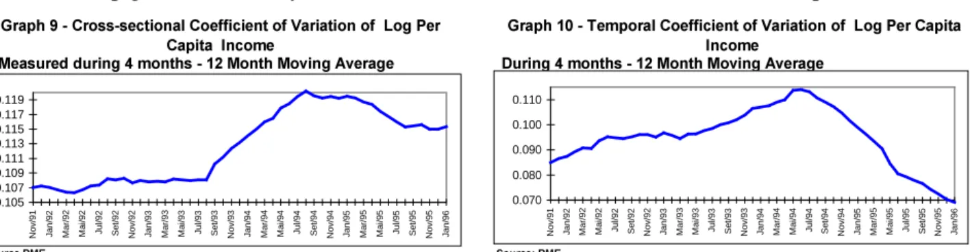
Graphs 9 and 10 illustrate the path of two components of total dispersion of per capita log
earnings. The PRQWK PRYLQJ DYHUDJH of the cross-sectional coefficient of variation of log
earnings averaged over a 4 month period shows three different stages: a) mild growth until August
1993; b) sharp growth until May 1995; c) moderate fall until the end of the series (April 1996).
*UDSK&URVVVHFWLRQDO&RHIILFLHQWRI9DULDWLRQRI/RJ3HU
&DSLWD,QFRPH *UDSK7HPSRUDO&RHIILFLHQWRI9DULDWLRQRI/RJ3HU&DSLWD,QFRPH 0HDVXUHGGXULQJPRQWKV0RQWK0RYLQJ$YHUDJH 'XULQJPRQWKV0RQWK0RYLQJ$YHUDJH 6RXUFH30( 6RXUFH30( 0.105 0.107 0.109 0.111 0.113 0.115 0.117 0.119 No v /9 1 Jan/92 Ma r/ 9 2 Ma i/ 9 2
Jul/92 Se
t/92 No v /9 2 Jan/93 Ma r/ 9 3 Ma i/ 9 3
Jul/93 Se
t/93 No v /9 3 Jan/94 Ma r/ 9 4 Ma i/ 9 4
Jul/94 Se
t/94 No v /9 4 Jan/95 Ma r/ 9 5 Ma i/ 9 5
Jul/95 Se
t/95 No v /9 5 Jan/96 0.070 0.080 0.090 0.100 0.110 No v /9 1 Jan/92 Ma r/ 9 2 Ma i/ 9 2
Jul/92 Se
t/92 No v /9 2 Jan/93 Ma r/ 9 3 Ma i/ 9 3
Jul/93 Se
t/93 No v /9 3 Jan/94 Ma r/ 9 4 Ma i/ 9 4
Jul/94 Se
t/94 No v /9 4 Jan/95 Ma r/ 9 5 Ma i/ 9 5
Jul/95 Se
t/95 No v /9 5 Jan/96
The analysis of the temporal dispersion of individual per capita earnings, captured here by
the coefficient of variation we observe two stages: a) continuous growth until the launching of the
Real Plan in July 1994 (i.e.; it includes the URV period); b) sharp fall until the end of the series
In sum, the analysis developed in this sub-section reveals that traditional measures of
earnings inequality used in Brazil based on monthly earnings tend to overestimate the fall of
earnings inequality measured for longer periods. On the other hand, the improvement of social
welfare measures based on labor earnings were not restricted to the binomial mean-inequality. In
particular, there was a fall of 33% in the temporal variability of log per capita earnings calculated at
a desegregated level in the post-stabilization period. Reductions in the temporal earnings variability
will also play a key role in explaining the rise of consumption booms after the stabilization This
issue will be studied in more detail next section.
7+('(7(50,1$1762)3(5&$3,7$,1&20(
Graph 11 reveals that the evolution ofthe 12-month moving average of the mean per capita
income from 1992 onwards presents three different sub-periods: a) a fall until the end of the Collor
administration (October 1992); b) moderate growth until the launching of the Real Plan (July 1994);
c) sharp increase in the growth rate in the post-stabilization period.
*UDSK0HDQRI/RJ3HU&DSLWD,QFRPH*UDSK,QGXVWULDO3URGXFWLRQ 0HDVXUHGGXULQJ0RQWKV 7RWDODQG&RQVXPSWLRQ*RRGV 0RQWKV0RYLQJ$YHUDJH 7.6 7.7 7.8 7.9 8.0 No v /9 1 Fev/ 92 Ma i/ 9 2 Ago/92 No v /9 2 Fev/ 93 Ma i/ 9 3 Ago/93 No v /9 3 Fev/ 94 Ma i/ 9 4 Ago/94 No v /9 4 Fev/ 95 Ma i/ 9 5 Ago/95 No v /9 5 70 80 90 100 110 120 130 140 150 N ov/91 Ab r/ 9 2 Se t/92 Fe v/93 Ju l/93 Dez/ 9 3 Ma i/94 O u t/94 Ma r/9 5 A go/95
Consumption Goods Total Production
Source: PME-IBGE Source:PIM-IBGE
This section attempts to offer an integrated view of possible sources for the rise in the
growth rate of per capita income after the Real plan. The first point to note is that this process was
consumption driven, as shown by the comparison between index of total industrial production and
of consumption goods production in Graph 12.. Illustration 1 in section 2.2 presents the main
channels behind the Real plan consumption boom. In principle, the operation of redistributive
mechanisms like the incidence of the inflation tax should not have substantial effects on aggregate
consumption. However, if there is a coincidence between lack of access to short run financial assets
and lack of access to credit then one can postulate a negative relation between inflation tax
incidence and aggregate consumption. Economies of scope establish a close connection between
asset and liabilities sides of household units. The idea is that banks consumer credit availability is
larger to their own customers, who are more easily monitored.
short run financial assets. This restriction implied in purchasing power losses due to inflation tax
incidence. Since this segment of the population is less likely to have access to credit, they are more
likely to face binding liquidity constraints10. In this sense a fall in inflation does not only increases
the wealth of the poorest segments of the population but also increases the share of liquid wealth in
the hands of liquidity constrained individuals.
Another channel through which a fall in inflation would affect the share of liquidity
constrained individuals in the population is through an increase in the supply of consumer credit.
The idea is that the reduction in inflationary uncertainty would low monitoring costs of loan
suppliers and thus increase the supply of credit. While the inflation tax effect raises the share of
liquidity constrained individuals in income at the expense of other segments of the economy, this
effect grants access to credit to agents that were before restricted in credit markets. In this sense, this
effect would correspond to a Pareto improvement proportioned by stabilization.
The empirical relevance of the share of liquidity constrained consumers in Brazilian GDP
can be assessed from recent time series estimates of Reis et alii (1996). These authors find that
around 80% of aggregate income accrues to individuals with a unitary marginal propensity to
consume of their income. Given the degree of inequality observed in Brazil this would correspond
to the share of income that accrues to the 95% poorest segments of the Brazilian economy.
One last impact of stabilization on consumption is related to the lower demand for savings
and a higher demand for credit associated with the reduction of inflationary uncertainties. The idea
is that in the presence of instabilities consumers postpone their consumption decisions to the future
waiting for uncertainty resolution. That is, uncertainty implies in a exchange of present consumption
for future consumption ( i.e., a steeper consumption profile) and consequently higher savings stocks
to buffer adverse income shocks. In this context, an abrupt fall of earnings risk produces a flatter
temporal consumption profile and smaller savings demand (or alternatively higher demand for
credit). Accordingly, the rise of the consumption boom would be financed by disaving (and not by
an increase of the poor segment income). In other words, according to this channel one should
stress the risk alleviation side of stabilization and not its inequality reducing impact.
3$576758&785$/'(7(50,1$1762)329(57<
We start discussing the evolution of the mean and inequality of per capita income during the
1976-95 period. Table 8 shows that between 1976 and 1985 per capita GDP grew at an average rate
of 1.81% per year while inequality decreased: the Gini coefficient dropped from 0.619 to 0.605
while the Theil-T index fell from 0.922 to 0.750. During the 1985-95 period per capita GDP growth
rate fell to 0.21% and inequality increased. The Gini coefficient and the Theil T increased from
0.605 to 0.620 and from 0.750 to 0.799, respectively.
7DEOH(YROXWLRQRIWKH0HDQDQG,QHTXDOLW\RI3HU&DSLWD(DUQLQJV
* UR Z WK 5 D WH ,Q H T X D OLW\ 0 H D V X UH V < H D UV 3 H U& D S LWD * ' 3 * LQ L 7 K H LO7
6 R X UF H V 3 1 $ ' H
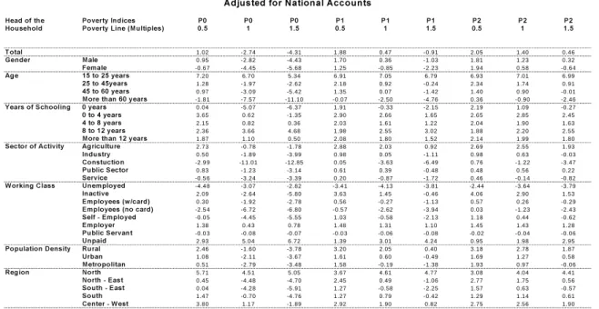
329(57<352),/(
This section traces a poverty profile according to the main attributes of the heads of
households (i.e.; gender, age, schooling, race, sectors of activity, working class, population density
and region) using the latest PNAD available. Table 9 presents the three FGT poverty indexes for the
basic poverty line proposed by Rocha (1993) plus one half and one and half times its value, making
a total of nine poverty measures. The analysis in the text will be centered around the head-count
ratio for the Rocha’s poverty line (i.e., the second column of Table 9).
3RYHUW\3URILOHLQ%UD]LO
6DP SOH$OO+RXVHKROGV
+HDG R IWK H 3 R YHUW\,Q GLFHV 3 3 3 3 3 3 3 3 3 7 R WDO
+R X VHK ROG 3 R YHUW\/ LQH0X OWLS OHV 3 RS XODWLR Q
7 R WDO 11 .0 5 27.68 4 2.71 5.73 1 2.45 20 .1 0 4 .4 2 8.07 12.78 10 0.0 0
* HQ GHU 0DOH 9.96 26.53 4 1.58 4.79 1 1.40 19 .0 1 3 .5 2 7.09 11.75 82.79
) HP DOH 16 .3 3 33.22 4 8.14 10 .2 7 1 7.47 25 .3 4 8 .7 5 1 2.8 1 17.76 17.21
$J H / HVVWKDQ\ HDUV 31 .5 5 36.99 4 1.90 28 .7 9 3 1.40 34 .5 0 28.21 2 9.6 3 31.55 0 .02
WR\HDUV 22 .6 7 42.95 5 8.67 16 .6 6 2 4.71 33 .6 3 15.25 1 9.4 9 25.08 5 .73
WR\HDUV 13 .0 4 31.71 4 7.25 6.62 1 4.49 22 .8 9 5 .0 0 9.38 14.74 51.24
WR\HDUV 8.87 23.88 3 8.25 4.00 1 0.02 17 .0 8 2 .7 9 6.08 10.36 27.87
0RUHWK DQ \HDUV 3.93 15.25 2 9.49 1.73 5.32 11 .0 5 1 .2 9 2.95 5.9 3 15.13
<HDUVR I6 FK RR OLQ J \HDUV 17 .3 5 43.06 6 2.13 7.88 1 9.18 30 .5 5 5 .4 1 1 1.8 4 19.36 21.04
WR \HDUV 14 .4 6 36.16 5 4.17 6.95 1 6.19 26 .0 0 5 .0 8 1 0.2 0 16.47 21.56
WR \HDUV 9.59 25.09 4 1.06 5.26 1 0.96 18 .3 6 4 .2 9 7.23 11.48 31.13
WR \ HDUV 5.70 14.10 2 4.74 3.91 6.71 10 .8 5 3 .4 8 4.86 7.0 8 19.51
0RUHWK DQ \HDUV 2.79 3 .8 5 5.11 2.60 2.94 3.48 2 .5 5 2.72 3.0 0 6 .76
5DFH ,Q GLJ HQ RX V 23 .8 2 53.17 6 6.82 12 .9 4 2 7.64 39 .0 8 9 .5 3 1 8.2 3 27.00 0 .11
: KLWH 6.74 18.07 3 0.36 3.88 7.89 13 .3 1 3 .2 3 5.26 8.3 0 53.03
% ODFN 16 .0 1 38.82 5 7.11 7.83 1 7.68 27 .9 6 5 .7 6 1 1.2 9 17.94 46.31
< HOOR Z 7.36 10.86 1 5.70 5.31 7.24 9.12 4 .8 5 5.99 7.2 3 0 .54
,J QR UHG 6.99 26.63 3 3.53 2.27 8.74 15 .0 4 0 .7 4 3.93 8.6 0 0 .02
6HFWRUR I$FWLYLW\ $J ULFXOWXUH 16 .6 3 39.81 5 7.01 7.60 1 7.99 28 .3 5 5 .1 4 1 1.2 0 18.12 24.69
,Q GX VWU\ 6.11 21.25 3 6.23 2.39 7.83 14 .7 6 1 .5 2 4.26 8.2 8 15.89
&R QVWXFWLR Q 7.28 27.36 4 6.39 2.70 9.75 18 .8 4 1 .7 8 5.17 10.40 9 .96
3 X EOLF6HFWR U 4.61 15.80 2 7.62 1.61 5.85 11 .1 9 0 .8 9 3.09 6.1 9 10.18
6 HUYLFH 6.78 21.38 3 5.92 2.48 8.17 15 .0 2 1 .5 4 4.49 8.5 5 39.28
: R UNLQJ & ODVV 8Q HPS OR\ HG 54 .9 5 74.02 8 2.25 42 .2 7 5 3.43 61 .7 6 38.57 4 6.1 4 52.82 3 .18
,Q DFWLYH 14 .2 5 28.42 4 2.52 10 .0 0 1 5.45 22 .2 2 8 .9 7 1 1.9 0 15.88 17.17
( PS OR\ HHVZ FDUG 4.40 19.74 3 6.66 1.42 6.36 13 .5 8 0 .8 4 3.11 7.0 1 27.16
( PS OR\ HHVQ RFDUG 13 .2 0 40.09 5 9.81 4.30 1 5.57 27 .3 3 2 .2 2 8.30 15.90 15.43
6 HOI( PS OR\HG 12 .3 3 30.75 4 6.02 5.20 1 3.40 21 .7 8 3 .2 9 8.05 13.54 31.12
( PS OR\ HU 2.41 5 .3 7 1 0.68 1.66 2.73 4.46 1 .5 1 2.03 2.8 9 5 .95
3 X EOLF6HUYDQW 4.52 15.44 2 7.45 1.64 5.81 11 .1 2 0 .9 7 3.10 6.1 5 10.04
8Q SDLG 24 .3 2 38.20 5 0.98 19 .5 1 2 5.61 32 .1 8 18.11 2 1.6 0 25.79 2 .27
3R SX ODWLRQ 'HQVLW\ 5X UDO 13 .8 4 33.70 4 9.98 7.40 1 5.61 24 .5 1 5 .6 5 1 0.2 3 15.89 21.10
8 UE DQ 9.94 25.36 3 9.95 5.06 1 1.36 18 .6 0 3 .8 7 7.26 11.69 49.25
0HWURS ROLWDQ 10 .9 2 27.24 4 2.11 5.65 1 2.00 19 .4 5 4 .4 6 7.88 12.38 29.65
5HJLR Q 1R UWK 19 .9 0 44.23 6 1.54 8.69 2 0.67 31 .5 9 5 .9 5 1 2.9 6 20.57 4 .47
1R UWK( DVW 18 .2 5 43.12 6 1.25 9.05 2 0.32 31 .3 4 6 .5 7 1 3.0 1 20.43 29.56
6 R XWK( DVW 7.62 20.94 3 5.70 4.25 8.94 15 .3 1 3 .5 0 5.87 9.4 3 43.39
6 R XWK 4.97 13.49 2 3.18 2.95 5.80 9.94 2 .5 5 3.92 6.1 6 15.16
&HQWHU: HVW 9.56 24.61 3 8.39 5.04 1 0.19 17 .1 5 4 .1 1 6.82 10.76 7 .41
6RXUFH31$ ',%* (
7$%/(
' H F R P S R V LW LR Q R I 3 R Y H U W \ ,Q G LF H V D F F R U G LQ J W R & K D U D F W H U LV W LF V R I W K H + R X V H K R OG V 6 D P S OH $ OO + R X V H K R OG V
+ H D G R IWK H 7 R WD O & R Q WU LE X LWLR Q WR 7 R WD O3 R Y H U W\
+ R X V H K R OG 3 3 3 3 R S X OD WLR Q 3 3 3
* H Q G H U
M a l e 2 6 . 5 3 1 1 . 4 0 7 . 0 9 8 2 . 7 9 7 9 . 3 5 7 5 . 8 4 7 2 . 6 9 F e m a l e 3 3 . 2 2 1 7 . 4 7 1 2 . 8 1 1 7 . 2 1 2 0 . 6 5 2 4 . 1 6 2 7 . 3 2
$ J H
L e s s t h a n 1 5 y e a r s 3 6 . 9 9 3 1 . 4 0 2 9 . 6 3 0 . 0 2 0 . 0 3 0 . 0 6 0 . 0 9 1 5 t o 2 5 y e a r s 4 2 . 9 5 2 4 . 7 1 1 9 . 4 9 5 . 7 3 8 . 8 9 1 1 . 3 8 1 3 . 8 4 2 5 t o 4 5 y e a r s 3 1 . 7 1 1 4 . 4 9 9 . 3 8 5 1 . 2 4 5 8 . 7 0 5 9 . 6 6 5 9 . 5 5 4 5 t o 6 5 y e a r s 2 3 . 8 8 1 0 . 0 2 6 . 0 8 2 7 . 8 7 2 4 . 0 4 2 2 . 4 3 2 1 . 0 0 m o r e t h a n 6 5 y e a r s 1 5 . 2 5 5 . 3 2 2 . 9 5 1 5 . 1 3 8 . 3 3 6 . 4 7 5 . 5 3
< H D U V R I6 F K R R OLQ J
0 y e a r s 4 3 . 0 6 1 9 . 1 8 1 1 . 8 4 2 1 . 0 4 3 2 . 7 4 3 2 . 4 3 3 0 . 8 6 0 t o 4 y e a r s 3 6 . 1 6 1 6 . 1 9 1 0 . 2 0 2 1 . 5 6 2 8 . 1 7 2 8 . 0 5 2 7 . 2 5 4 t o 8 y e a r s 2 5 . 0 9 1 0 . 9 6 7 . 2 3 3 1 . 1 3 2 8 . 2 1 2 7 . 4 0 2 7 . 8 8 8 t o 1 2 y e a r s 1 4 . 1 0 6 . 7 1 4 . 8 6 1 9 . 5 1 9 . 9 4 1 0 . 5 2 1 1 . 7 5 m o r e t h a n 1 2 y e a r s 3 . 8 5 2 . 9 4 2 . 7 2 6 . 7 6 0 . 9 4 1 . 6 0 2 . 2 7
5 D F H
In d i g e n o u s 5 3 . 1 7 2 7 . 6 4 1 8 . 2 3 0 . 1 1 0 . 2 2 0 . 2 5 0 . 2 6 W h i t e 1 8 . 0 7 7 . 8 9 5 . 2 6 5 3 . 0 3 3 4 . 6 2 3 3 . 6 3 3 4 . 5 8 B l a c k 3 8 . 8 2 1 7 . 6 8 1 1 . 2 9 4 6 . 3 1 6 4 . 9 4 6 5 . 8 0 6 4 . 7 6 Y e l l o w 1 0 . 8 6 7 . 2 4 5 . 9 9 0 . 5 4 0 . 2 1 0 . 3 1 0 . 4 0
6 H F WR U R I$ F WLY LW\
A g r i c u l t u r e 3 9 . 8 1 1 7 . 9 9 1 1 . 2 0 2 4 . 6 9 3 5 . 5 1 3 5 . 6 8 3 4 . 2 7 In d u s t r y 2 1 . 2 5 7 . 8 3 4 . 2 6 1 5 . 8 9 1 2 . 2 0 1 0 . 0 0 8 . 3 9 C o n s t r u c t i o n 2 7 . 3 6 9 . 7 5 5 . 1 7 9 . 9 6 9 . 8 5 7 . 8 1 6 . 3 8 P u b l i c S e c t o r 1 5 . 8 0 5 . 8 5 3 . 0 9 1 0 . 1 8 5 . 8 1 4 . 7 9 3 . 9 0 S e r v i c e 2 1 . 3 8 8 . 1 7 4 . 4 9 3 9 . 2 8 3 0 . 3 3 2 5 . 8 0 2 1 . 8 6
: R U N LQ J & OD V V
U n e m p l o y e d 7 4 . 0 2 5 3 . 4 3 4 6 . 1 4 3 . 1 8 8 . 5 0 1 3 . 6 4 1 8 . 1 6 In a c t i v e 2 8 . 4 2 1 5 . 4 5 1 1 . 9 0 1 7 . 1 7 1 7 . 6 4 2 1 . 3 2 2 5 . 3 2 E m p l o y e e s ( w / c a r d ) 1 9 . 7 4 6 . 3 6 3 . 1 1 2 7 . 1 6 1 9 . 3 7 1 3 . 8 7 1 0 . 4 6 E m p l o y e e s ( n o c a r d ) 4 0 . 0 9 1 5 . 5 7 8 . 3 0 1 5 . 4 3 2 2 . 3 5 1 9 . 3 0 1 5 . 8 7 S e l f - E m p l o y e d 3 0 . 7 5 1 3 . 4 0 8 . 0 5 3 1 . 1 2 3 4 . 5 7 3 3 . 5 0 3 1 . 0 2 E m p l o y e r 5 . 3 7 2 . 7 3 2 . 0 3 5 . 9 5 1 . 1 5 1 . 3 0 1 . 4 9 P u b l i c S e r v a n t 1 5 . 4 4 5 . 8 1 3 . 1 0 1 0 . 0 4 5 . 6 0 4 . 6 8 3 . 8 6 U n p a i d 3 8 . 2 0 2 5 . 6 1 2 1 . 6 0 2 . 2 7 3 . 1 3 4 . 6 6 6 . 0 7
3 R S X OD WLR Q ' H Q V LW\
R u r a l 3 3 . 7 0 1 5 . 6 1 1 0 . 2 3 2 1 . 1 0 2 5 . 7 0 2 6 . 4 7 2 6 . 7 4 U r b a n 2 5 . 3 6 1 1 . 3 6 7 . 2 6 4 9 . 2 5 4 5 . 1 2 4 4 . 9 4 4 4 . 3 2 M e t r o p o l i t a n 2 7 . 2 4 1 2 . 0 0 7 . 8 8 2 9 . 6 5 2 9 . 1 8 2 8 . 5 9 2 8 . 9 4
5 H J LR Q
N o r t h 4 4 . 2 3 2 0 . 6 7 1 2 . 9 6 4 . 4 7 7 . 1 4 7 . 4 2 7 . 1 8 N o r t h - E a s t 4 3 . 1 2 2 0 . 3 2 1 3 . 0 1 2 9 . 5 6 4 6 . 0 6 4 8 . 2 6 4 7 . 6 6 S o u t h - E a s t 2 0 . 9 4 8 . 9 4 5 . 8 7 4 3 . 3 9 3 2 . 8 2 3 1 . 1 8 3 1 . 5 3 S o u t h 1 3 . 4 9 5 . 8 0 3 . 9 2 1 5 . 1 6 7 . 3 9 7 . 0 7 7 . 3 7 C e n t e r - W e s t 2 4 . 6 1 1 0 . 1 9 6 . 8 2 7 . 4 1 6 . 5 9 6 . 0 7 6 . 2 7 S
The overall proportion of poor (P0) during 1995 was 28%. As expected, the groups with
higher head-counts ratios were headed by: females (33%), young families (15 to 25 years old
(43%)), illiterates (43%), non-whites (indigenous (53%) and black (38%)), inhabitants of rural
working in agriculture (40%) and construction (27%), unemployed (74%) and informal employees
(40%). Table 10 presents the contribution to aggregate poverty indices of each of these cells:
Since a few restricted groups (minorities) tend to present higher poverty rates, the
contribution of the poorest groups mentioned in the previous paragraph to poverty is not always
substantial: females (20 %), young families (15 to 25 years old 8.9 %), illiterates (32%),
non-whites (indigenous (0.22%) and black (65%)), inhabitants of rural areas (25%), inhabitants of the
Northern part of Brazil (North (7.1%) and North-east region (46%)) , working in agriculture (35%)
and construction (9.8%), unemployed (8.5%) and informal employees 22.3%). Tables below
replicate Tables 10 and 11 for the poverty line of 1985 PPP 60 US dollars per month proposed by
Rob Vos. This amounts to 97 current Reais of September 1995. It is important to notice that these
latter estimates are not adjusted for cost of living regional differences within Brazil, like the ones
used in Tables 9 and 10. The appendix also present the same tables for female and male headed
households for 1995.
&+$1*(6,17+(329(57<352),/(%(7:((1$1'
Table 11 presents the percentile differences between the 1985 and 1995 poverty profiles
adjusted for a rather small rate of per capita GDP growth of 2.09% during the period:
7$%/(
'HFRPSRVLWLRQRI3RYHUW\&KDQJHV7RWDO&KDQJH $GMXVWHGIRU1DWLRQDO$FFRXQWV
+HDGRIWKH 3RYHUW\,QGLFHV 3 3 3 3 3 3 3 3 3
+RXVHKROG 3RYHUW\/LQH0XOWLSOHV
7RWDO 1 .02 -2.74 -4 .31 1 .88 0.47 -0.91 2.05 1.40 0.46
*HQGHU 0DOH 0 .95 -2.82 -4 .43 1 .70 0.36 -1.03 1.81 1.23 0.32
)HPDOH -0.6 7 -4.45 -5 .68 1 .25 -0.85 -2.23 1.94 0.58 -0.64
$JH WR\HDUV 7 .20 6.7 0 5.34 6 .91 7.05 6.79 6.93 7.01 6.99
WR\HDUV 1 .28 -1.97 -2 .62 2 .18 0.92 -0.24 2.34 1.74 0.91
WR\HDUV 0 .97 -3.09 -5 .42 1 .35 0.07 -1.42 1.40 0.90 -0.01
0RUHWKDQ\HDUV -1.8 1 -7.57 -11.10 -0.0 7 -2.50 -4.76 0.36 -0.90 -2.46
<HDUVRI6FKRROLQJ \HDUV 0 .04 -5.07 -6 .37 1 .91 -0.33 -2.15 2.19 1.09 -0.27
WR\HDUV 3 .65 0.6 2 -1 .35 2 .90 2.66 1.65 2.65 2.85 2.45
WR\HDUV 2 .15 0.8 2 0.36 2 .03 1.61 1.22 2.04 1.90 1.63
WR\HDUV 2 .36 3.6 6 4.68 1 .98 2.55 3.02 1.88 2.20 2.55
0RUHWKDQ\HDUV 1 .87 1.1 0 0.50 2 .08 1.80 1.52 2.14 1.99 1.80
6HFWRURI$FWLYLW\ $JULFXOWXUH 2 .73 -0.78 -1 .78 2 .88 2.03 0.92 2.69 2.55 1.93
,QGXVWU\ 0 .50 -1.89 -3 .99 0 .98 0.05 -1.11 0.98 0.63 -0.03
&RQVWXFWLRQ -2.9 9 -1 1.01 -12.85 0 .05 -3.63 -6.49 0.76 -1.22 -3.47
3XEOLF6HFWRU 0 .83 -1.23 -3 .14 0 .61 0.39 -0.48 0.48 0.56 0.22
6HUYLFH -0.5 6 -3.24 -3 .39 0 .20 -0.87 -1.72 0.46 -0.14 -0.82
: RUNLQJ&ODVV 8QHPSOR\HG -4.4 8 -3.07 -2 .82 -3.4 1 -4.13 -3.81 -2 .44 -3.64 -3.79
,QDFWLYH 2 .09 -2.64 -5 .80 3 .63 1.45 -0.46 4.06 2.90 1.53
(PSOR\HHVZFDUG 0 .30 -1.92 -2 .78 0 .56 -0.27 -1.13 0.57 0.26 -0.29
(PSOR\HHVQRFDUG -2.5 4 -6.72 -6 .80 -0.5 7 -2.62 -3.94 0.03 -1.23 -2.43
6HOI(PSOR\HG -0.0 5 -4.45 -5 .55 1 .03 -0.58 -2.13 1.18 0.44 -0.62
(PSOR\HU 1 .38 0.4 3 0.78 1 .48 1.31 1.10 1.45 1.43 1.28
3XEOLF6HUYDQW -0.0 3 -0.08 -0 .07 -0.0 3 -0.06 -0.08 -0 .02 -0.04 -0.06
8QSDLG 2 .93 5.0 4 6.72 1 .39 3.01 4.24 0.95 1.98 2.95
3RSXODWLRQ'HQVLW\ 5XUDO 2 .46 -1.60 -3 .78 3 .20 2.05 0.40 3.18 2.78 1.87
8UEDQ 1 .08 -2.11 -3 .67 1 .61 0.60 -0.49 1.69 1.27 0.58
0HWURSROLWDQ 0 .51 -2.79 -3 .48 1 .58 -0.19 -1.38 1.93 0.97 -0.06
5HJLRQ 1RUWK 5 .71 4.5 1 5.05 3 .67 4.61 4.77 3.08 4.04 4.41
1RUWK(DVW 0 .45 -4.48 -4 .70 2 .45 0.49 -1.06 2.77 1.75 0.56
6RXWK(DVW 0 .04 -4.28 -5 .91 1 .27 -0.58 -2.25 1.57 0.63 -0.57
6RXWK 1 .47 -0.70 -4 .76 1 .27 0.79 -0.42 1.29 1.14 0.61
&HQWHU: HVW 3 .80 1.1 7 -1 .89 2 .92 1.90 0.82 2.75 2.56 1.90
6RXUFH31$ ',%* (
Table 11 shows that using the basic poverty line the proportion of poor fell by 2.74
when higher weights are given to societies poorest segment poverty indices actually rise in the last
decade. For the basic poverty line, the poverty gap (P1) rose 0.47% percentage points while the
average squared poverty gap (P2) rose 1.4 percentage points.
The inequality increase also implied that all poverty indices present either greater falls or
smaller increases when higher poverty lines are used. For the low poverty line the head-count ratio
rose 1.02 percentage points and fell 4.31 percentage points when the highest poverty line were used.
This respective statistics are 1.88 and -0.91 for the average poverty gap (P1) and 2.05 and 0.46 for
the average squared poverty gap (P2). These results altogether implied that the pattern of
unbalanced growth across different segments of the Brazilian economy generated different results
depending on the binomial poverty measure-poverty line used. This lack of robustness of poverty
changes is also influenced by the low per capita GDP growth rate observed in the period (average
0.2% per year).
The head-count ratio fell more intensively among individuals belonging to female headed
families (-4.45 percentage points). The fall of poverty is also positively related with household head
age (e.g. (6.7 percentage points) in the 15 to 25 years of age group and (-7.57 percentage points) for
the more than 60 years of age group). The head-count fall is inversely related with the formal level
of education attained by household heads (e.g., (-5.57 percentage points) for the illiterate and (1.1
percentage points) for the group with more than 12 years of completed schooling). In geographical
terms the fall of poverty was more pronounced in regions with larger populations (e.g., (-4.48
percentage points) in the North-east and (-4.28 percentage points) in the South-east) and more
densely populated regions ((-2.79 percentage points) in metropolitan areas).
The sector of activity analysis of poverty reduction shows that greater head-count falls were
observed in families headed by individuals employed in civil construction (-11.1 percentage points)
and in the service sector (-3.24 percentage points). Families headed by individuals employed in the
so-called informal sector presented greater poverty reductions ( (-6.72 percentage points) for
employees without work permit and (-4.45 percentage points) for self-employed individuals).
'(&20326,7,212)329(57<&+$1*(6%(7:((1$1'
This section replicates Datt and Ravallion (1992) decomposition methodology of poverty
changes into a balanced growth component, a change in inequality component and residual term for
the 1985-95 period. This decomposition throws light in what is driving the poverty change process