Spillovers in a Decentralized Health Economy
∗Marcelo Castro† Enlinson Mattos‡ Fernanda Patriota§ November, 2016
Abstract
We estimate the direct as well as the spillover effect of a federal grant (Municipalities’ Participation Fund, FPM)) on local health indicators in Brazilian municipalities. We use a Regression Discontinuity Design (RDD) when exploring the FPM distribution rule according to population brackets, and we disentangle each effect considering neighbouring towns near different thresholds. Our quasi-experimental estimates show that the FPM spillovers improve local health indicators but reduce the provision of public goods, especially when the neighbouring municipality receiving the additional transfer is small. In particular, our results show that the decentralization of health services could lead to an under-provision of health services in terms of the number of doctors (-0.35% and -0.87%, respectively, for cities with smaller populations), especially general practitioners and surgeons (-1.84% and -2.45%, for the most populous cities in our sample). At the same time, the direct effect is positive as expected, particularly in the Family Health Programme — the main preventive programme in small towns — where there is an increase in PSF visits (1.59%) and PSF visits with a doctor (1.8%) or a nurse (2%). We also find positive effects on hospitalization and complex services in the major cities in the sample and reductions in the infant mortality rate (-0.18%) and morbidity rate (-0.41%). The direct impacts are reduced when we control for neighbours’ FPM, which shows that the spillover effects and spatial interactions are important for explaining the FPM effect on health outcomes. We test whether the negative spillovers are caused by the lack of policy coordination among neighbouring cities, aside from the reduction in regional demand for health services. We find that the spillover effects are stronger when there is more competition in mayoral elections and when neighbouring mayors are not from the same party, which shows that political incentives are important for explaining the observed spillovers. Keywords: Programme Evaluation, Urban Economics, Health Economics.
JEL codes: I13, H41, C13
∗
We are grateful to Sergio Firpo (Insper), Rodrigo Soares (FGV/EESP), Claudio Ferraz (PUC-RJ), Stephan Litschig (Barcelona GSE), Andre Portela (FGV/EESP), Raphael Corbi (USP), Rafael Terra (UNB), Klenio Barbosa (FGV/EESP), Veronica Orellano (FGV/EESP), Paulo Arvate (FGV/EESP) and Fabiana Rocha (USP) for helpful comments. We also thank Rebeca Regatieri, Sergio Gadelha and Felipe Luduvice, from National Treasury, and Tatiana Soares (Court of Audit) for help with restrictive data, federal transference details and suggestions; Marcio Mitsuo Minamiguchi (IBGE) for detailed information on population estimates of Brazilian municipalities; and CAPES for financial support. A special thanks to Albert Fishlow (Columbia University). Finally, we thank two anonymous referees for very direct and robust suggestions. All remaining errors are the sole responsibility of the authors.
†
Escola de Economia de S˜ao Paulo (EESP-FGV). Email: [email protected].
‡
S˜ao Paulo School of Economics (EESP-FGV). Email: [email protected].
§
1
Introduction
The determinants of fiscal variables, such as spending, taxation, and social outcomes, as health indicators are empirically correlated across a nearby jurisdiction. Additionally, the population can migrate from one city to another in search of better services or lower taxation, which can generate multiple equilibria (Tiebout, 1956). According to Brueckner (2000), the theoretical models for spatial interactions can be classified as spillover models and resource-flow models. The former category incorporates cases in which a public service that is locally provided can be exploited by people from neighbouring municipalities, such as highway construction, environmental cooperation and efforts to reduce crime. The latter category includes tax and welfare competition models as well as the yardstick competition model (Besley and Case, 1995), in which voters consider the taxes and public services delivered in neighbouring municipalities before re-electing the mayors.
In this paper, we estimate the direct and indirect effects of a federal grant to local governments in Brazil, the FPM (Fundo de participa¸c˜ao dos Munic´ıpios in Portuguese), on the municipalities’ health outcomes and services. We estimate the direct effect in the cities receiving additional grants together with spatial spillovers — the indirect impact when a neighbouring city also receives the transfer. Spillovers into bordering cities’ health outcomes are very plausible because the Brazilian health system is highly decentralized and the supply and demand shocks for health services are correlated among nearby cities. Additionally, the poorest individuals usually travel from small towns searching for health services in the regional centres. We estimate a fuzzy Regression in Discontinuity Design (RDD) exploring the FPM transference rule according to population brackets, which generates discontinuities in the transfer. We consider municipalities close to one threshold for the estimation of the direct effect and neighbours near different thresholds to estimate the spillover effects.
Wilson (1999) defines three general ways in which local expenditures could spill over into neighbouring cities. First, tax competition models consider many small jurisdictions, and local taxes are chosen in a strategic fashion, considering the inverse relationship between a jurisdiction’s tax rate and its base. A related body of literature focuses on welfare competition, specifically on income redistribution by local governments when the poor migrate in reaction to differing welfare benefits. A third body of literature analyses the strategic interactions caused by benefit spillovers.
Typically, it is difficult to separate the channels for spillovers because many models lead to similar empirical results. Unobserved determinants of fiscal decisions are usually correlated across neighbouring areas, whereas in a federalist economy, these jurisdictions’ decisions can be simultaneously determined in an equilibrium. The previous empirical literature that aimed to test for fiscal spillover used instruments for neighbours’ fiscal behaviour based on neighbours’ idiosyncratic characteristics or lags in the variables of interest (Case, Rosen and Hines, 1993; Figlio, Kolplin and Reid, 1999; Saavedra, 2000; Brueckner and Saavedra, 2001; Devereux, Lockwood and Redoano, 2007, 2008; Bordignon, Cerniglia and Revelli, 2003; Buettner, 2003). More recently, the empirical literature has addressed the identification problem using a more robust strategy (Baicker, 2004, 2005; Knight and Schiff, 2010; Isen, 2014), and our paper aims to contribute to this recent literature. Our paper is more closely related to Isen (2014) in that
we also attempt to identify exogenous variation in neighbours’ fiscal variables using the RDD strategy.
Spillovers in the economics of health are largely described in the literature because health markets typically exhibit strong externalities. Usually, the spillovers are caused by a reduction in the contagious diseases. Edward and Kremer (2004) document the positive effects of a deworming programme on both non-treated students in eligible schools and students from neighbouring schools. Additionally, studies have attributed diseases to the health conditions of families or spouses, as in the case of mental illness (Holmes, 2003; Fletcher, 2009). Timmermans et al. (2014) show that the lack of health insurance causes more absenteeism in basic schools, while Pauly and Pag´an (2007) find that increasing the proportion of insured citizens benefits uninsured people in the community. Grabowskia and Hirthb (2003) find that the non-profit market of nurses increases the overall nursing quality. More similar to our study, Fernandez and Forder (2015) and Moscone et al. (2007a, 2007b) show that spatial spillovers explain part of the local health spending variation in England.
Spillovers into health spending and outcomes are more frequently demand driven because the increase in spending in one city decreases the regional demand for health in nearby cities. The public system is highly decentralized, but the small cities do not have sufficient revenue and scale to have more specialists and improve health complex services. Brazilian citizens search for public health services in nearby cities when they do not find these services in their own city, which leads to a high dependence of small cities’ populations on regional health centres’ services. The correlation in demand for health and spending can generate political incentives for the mayors to retain health investments or react more to the neighbours’ spending. We test the two hypothesis of spatial correlation separating the pure ”spillovers”, in which citizens use public health services in nearby cities, and ”research-flows”, in which neighbouring mayors play a strategic game regarding health spending. As we explain later, we measure the political channel estimating regressions controlling for local political variables.
To the best of our knowledge, this is the first attempt to jointly estimate the direct causal impact of an intergovernmental transfer on health outcomes and the spatial spillover effects using RDD strategy and Brazilian data. We analyse the FPM effects for a variety of health inputs and outputs. We look for the effects on public health outcomes, such as infant mortality, morbidity rates and the number of ambulatory consultations, and the most important preventive health programme in Brazil, the Family Health Programme (Programa Sa´ude da Fam´ılia, PSF, in Portuguese), which consists of health professional visits to vulnerable families. Additionally, we examine the impact on local public health goods, services and professionals, typically including the number of doctors, separated by specialization, and the number of hospital beds and health centres.
Our identification strategy is similar to Brollo et al. (2013), Litcshig and Morrison (2013), Arvate et al. (2013), Castro and Regatieri (2014) and Corbi et al. (2014) in that they exploit a key feature of FPM distribution: this transfer increases sharply at given population thresholds as defined by a federal law. We estimate the FPM impact using cities with similar populations near the thresholds, some of which receive a larger amount of additional federal funds because of small increases in the population to the right of the thresholds, and we compare them to those
remaining on the left.
Most of the robust results indicate beneficial direct impacts of FPM on health outcomes and resources. We aggregate all the thresholds to estimate its effect using RDD strategy, and we find a reduction in infant mortality (0.27%) and increases in ambulatory consultations (0.52%), PSF visits (1.1%) and PSF visits with a doctor (0.94%) (due to a 1% increase in per capita FPM). There are also positive direct impacts on health resources, especially on the number of doctors (0.36% and 0.75%) and hospital beds (almost 0.4%).
We select bordering cities near different thresholds and we find negative spillover elasticities in most of the health variables: infant mortality (-1%), morbidity (-0.1%), PSF coverage (-0.15%) and visits (-1.36%), vaccination (-0.40%), number of doctors (-1%) and nurses (-1.98%), number of hospitals (-0.42%) and hospital beds (-0.32%), health centres (-0.58%), and the number of doctors according to the main specialties, such as generalists (-0.67%), preventive care specialists (-0.7%), paediatricians (-0.61%) and surgeons (-2.56%). The direct and spillover effects vary according to the relative population size, but generally, the spillovers from the smallest cities to the largest neighbours are more significant.
We consider two main hypotheses for the negative spillover. First, the reduction in contagious and deteriorating diseases, especially due to the investment in preventive measures, may reduce demand in the overwhelmed public health systems in nearby cities. On the other hand, the negative spillover into health services and goods provisions may indicate the adverse impacts of health policy decentralization. If the cities’ investments in health influence the neighbours’ observed outcomes, the mayors may act strategically to determine the health policy. Specifically, we expect that the spillovers should be greater when the local politicians face more political competition. We consider the neighbouring cities’ mayors that won local elections by a small margin and from different parties when political coordination is costly, and we find that in this case, the spillovers are stronger, especially in morbidity (-0.85%) and ambulatory (-2.75%) rates. We also address the issue of public health system accountability with a robust estimation strategy and while considering spatial interactions. Channa and Faguet (2012) find that only a few papers have estimated the effects of public spending on health outcomes as being ”highly credible” based on the nature of the data and the identification strategy. Primary health care is the cities’ responsibility in Brazilian federalism, and many studies find positive effects of FPM on local health spending, especially on expenditures in public health-related primary care (Castro et al., 2015; Arvate et al., 2013; Gadenne, 2016). Parmagnani (2013) finds that for every R$1 increase in the conditional transfer and unconditional transfers, R$0.80 and R$0.18 per capita are spent on health, respectively. Most studies find a negative impact of sub-national health expenditures as a proportion of the national health expenditure on the childhood mortality rate (Robalino, Picazo et al. 2001, Jimenez-Rubio and Smith 2005; Jimenez-Rubio 2011). However, there is no paper that robustly estimates the impacts of health expenditures caused by unconditional grants on public health goods and outcomes in Brazil.
Our paper is divided into six sections below following this introduction. In the next section, we detail the database and list stylized facts and the main remarks concerning the FPM institutional evolution and Brazilian public health financing in the last decades. In Section 3, we present the empirical strategy and the econometric methodology. We test the hypothesis,
which demonstrates causal identification in Section 4. We present the results in Section 5, including the FPM’s own and spillover effects on public health outcomes, services and resources. In Section 6, we use specific samples of bordering cities facing more political competition in local elections with mayors from different parties, which should increase coordination costs to implement a regional health policy. We present the main conclusions in Section 7.
2
Data Description and Institutional Background
Brazilian public health financing. The Brazilian Federal Constitution guarantees public health care to the entire population, and it is a shared responsibility of the union, the states and the cities. In addition, the Constitution created a decentralized system, whereas the municipalities had an obligation to provide primary care and the states had to provide more complex services, usually in the capitals or in the main regional cities. Most of the health spending is executed by sub-national governments in Brazil, as is done in the majority of developing economies (Glassman and Duran, 2011; Glassman and Sakuma, 2014). Nonetheless, the public system is financed by a national unified fund, which attempts to equalize the national discrepancies: the Unified Health System (Sistema ´Unico de Sa´ude – SUS)1. Nevertheless, Duarte et al. (2009) show that existing intergovernmental Brazilian health transfers present strong horizontal inequalities. States with the highest infant mortality rates and low private health insurance coverage are treated similarly to those with low child mortality and high private health coverage. Currently, over 70% of the Brazilian population depends exclusively on SUS for medical and hospital care, representing approximately 150 million citizens.
Municipalities may use their own resources, including unconditional grants from the Federal Government as the FPM and conditional transfers from SUS to finance the public health system 2. The main federal conditional transfers are the National Health Fund (Fundo Nacional de Sa´ude - FNS), which is directed to states, and the Primary Care Expanded Fixed Floor (Piso da Aten¸c˜ao B´asica Fixo - PABF), which is directed to municipalities, guarantees the minimum amount to be applied locally. In addition to the fixed part of the PAB, there is a conditional amount that is transferred only to municipalities that adopt the government’s priority programs, such as the Community Health Agent Programme (Programa de Agentes Comunit´arios de Sa´ude – PACS) and the Family Health Programme (Programa Sa´ude da Fam´ılia - PSF)3.
FPM is the most important resource of small municipalities in our sample (fewer than 30,000 residents), corresponding on average to more than 30% of the budget revenue. The national amount directed to FPM is a percentage of the Income Tax and the Tax on Industrialized Products collected by the Union. Each municipality share is calculated by the Court of Audit
1
The main landmarks of the public health system regulation were the Laws 8.080 and 8.142, both from 1990. The first covers SUS financing. The second provides the requirements for municipalities, states and the federal districts to be eligible to receive SUS resources. In 2000, the Institutional Amendment 29 (EC - 29) implemented the rules for public health financing.
2
Conditional and mandatory grants have a specific destination. The unconditional grants, in turn, do not have a predefined destination, which can be decided by the mayors. FPM is considered an unconditional grant since each municipality has the prerogative to spend that money where there is greater need while complying with the constitutional obligation to spend at least 15% of total budget expenditures on health.
3
PSF program is one of the outcomes used in the regressions. As explained here, it is funded by the municipalities together with the federal governments, but it has to be at least partially funded by the local governments.
(Tribunal de Contas da Uni˜ao - TCU), with 10% of the FPM being destined for the state capitals and the national capital, 86.4% being allocated to cities with less than 142,633 inhabitants, which are known as “country cities”, and 3.6% is allocated to cities with higher population levels. Our sample consists only of “country cities”, in which the calculation takes into account the percentage of participation of each state (Table 1 of Appendix A) in the national FPM amount to interior cities, and the interior cities’ coefficients are determined by local population brackets (Table 2 of Appendix A)4.
Health evolution in Brazilian municipalities. The Brazilian population increased from 170 million to 191 million in the 2000s, an increase of approximately 10%. This increase in population, especially in older individuals who use public health services more intensely, increases the demand for medical and hospital care. Thus, the resources allocated to public health financing should at least match this growth in demand.
There was a 102.6% increase in the amount spent on the provision of health services, reaching R$79 billion in 2010. In per capita terms, there is an increase of almost 90% in health spending, starting at R$221 and increasing to R$414 per capita during this period. Again, the increase in health spending exceeded the population growth, and the observed increase in the resources transferred to SUS. This finding suggests that the use of the municipalities’ own resources, which were destined for public health funding, may have increased. The principal revenue in small cities, the FPM, increased 68.4%, reaching R$57 billion in 2010 and highlighting the years 2005, 2007 and 2008, when the annual growth surpassed 10%.
Based on these statistics, we should expect substantial improvements in the health status of the Brazilian population. However, such improvements are not evident. For example, between 2002 and 2010, there is a 15.8% increase in overall mortality. On the other hand, there is a sharp decrease of more than 30% in infant mortality, children under the age of 1, and children ages 1-4 years. For children aged 5-14 years, there is also a significant 16% decrease.
Hospital morbidity, which is the number of hospitalizations in hospital beds funded by SUS, decreased in the 2000s from 11.7 million to 11.4 million. This trend may have two causes. First, the cities began to give preference to investments in preventive measures, which is less expensive and important for stopping contagion and the increase of avoidable diseases. Second, there was a decrease in the number of hospital beds during the decade and consequently to an over demand for intensive treatment and an increase in overall mortality. We indirectly verify this hypothesis by analysing the changes in preventive actions, number of hospital beds and home hospitalization, in addition to morbidity data.
Preventive measures are public health services that aim to prevent the population from acquiring diseases. The first prophylactic measure addressed here refers to immunization coverage — that is, the number of applied vaccination doses in the eligible population. We also carefully analyse the Family Health Programme (PSF), the principal preventive programme in Brazil, which focuses on poor families. The programme consists of health professional team visits to vulnerable families. This programme grew significantly throughout the country between 2002 and 2010, increasing from 86 million registered inhabitants to 124 million, a growth of 44% in these nine years. In the period between 2002 and 2010, there was an increase of 75.7% in the 4We explain further the FPM distribution according to population brackets when we explain the econometric
number of PSF visits, which can generate very positive results in terms of reducing avoidable diseases.
The PSF visits can be divided by the qualification of the health professionals who participate in the visits, including doctors, nurses, other higher-education professionals (college) and mid-level professionals (high school). There was a decrease in the number of PSF visits with a doctor (-8.6%) during the 2000s, whereas for the other three categories, there is an increase in home visits, especially mid-level professional visits, which increased by 46.5% over the period.
Other information considered in the Family Health Programme performance is the medical referral for specialized care. The data include the number of referrals for specialized treatment, including for example, physiotherapy, speech therapy, occupational therapy and psychology. Between 2002 and 2010, there was a large increase in the number of referrals for specialized care, from 2.8 to 8.7 million. Home care is the last PSF variable analysed, which consists of medical referrals to home hospitalization.
Data. We use a panel of municipalities between 2002 and 2007, the same period analysed in Brollo et al. (2013). We take FPM data from FINBRA (Brazil’s Finance System of the Finance Ministry) and information about the municipalities’ finances, such as budget spending, revenue, and health expenditures. The nominal values from 2002 to 2007 are updated to January 2014 using the official inflation rate (´Indice de Pre¸cos ao Consumidor Amplo - IPCA). We also include the official population used by a federal court (Tribunal de contas da Uni˜ao - TCU) to calculate the FPM coefficients. We calculate the FPM values that should have been transferred to municipalities according to the legal rules, which we call theoretical FPM (as in Brollo et al., 2013, and Castro et al., 2015). The health outcome variables are collected from DATASUS, which is compiled by the Health Ministry. Table 1 of Appendix B presents a description of the health variables used in this paper. This information is collected from the entire country and is compiled by the central government.
We present some descriptive information about the data in Table 1, in which we consider municipalities that are 10% distant from the thresholds and the outcomes in the years 2003-2007. We present the descriptive statistics of the health variables, FPM and population considering the mean, standard deviation, and minimum and maximum values. Overall, there are 5,548 municipalities in Brazil in this period5. Appendix J includes maps showing the distribution of infant mortality, number of doctors and FPM in the southeast cities.
3
Empirical strategy
Intended To Treat. Our identification strategy to identify the FPM causal impact follows Brollo et al. (2013) and Litschig and Morrison (2013), in exploring the FPM rule based on population brackets as an exogenous instrument for the grant variation in the cities near the thresholds. Our aim is to identify the FPM causal effects on health inputs and outputs in Brazilian cities. We use the data from 2000 to 2007, as in Brollo et al. (2013), who find no evidence of manipulation in the population in this period. We concentrate on the first four FPM 5Complete information for all interior cities is not available for each year, which implies in an unbalanced panel
Table 1: Descriptive analysis
Variable Obs. Mean Std. Dev. Min Max
FPM declared 2699 486.0649 100.9349 0 1089.046 theoretical 2699 444.0618 154.7843 26.30722 1319.679 population 2699 13474.74 2775.403 9680 17829 mortality 2699 0.005182 0.001737 0.0006116 0.010826 morbidity 2699 0.069632 0.027365 0.0006616 0.256333 ambulatory 2682 9.747856 4.998099 0.000575 68.12457 vaccination doses 2699 0.855025 0.249055 0.3679661 2.294722 PSF users 2578 0.872454 0.227086 0.0003422 2.038461 PSF visits 2699 0.322819 0.517124 0 12.80842
PSF visitor’s degree doctor 2406 0.069122 0.094735 0.0000979 1.615033
nurse 2479 0.103703 0.116945 0.0000581 1.64768
college 1831 0.036607 0.324665 0.0000562 12.67113
high school 2397 0.158896 0.292656 0.0000581 9.929444
home care 1615 0.002712 0.006339 0.0000562 0.092284
special referral 2353 0.040861 0.273689 0.0000712 13.14155
Source: Datasus and FINBRA. Elaborated by the authors. Note: Per capita values. Municipalities within a 10% distance from the thresholds (Considering the definition in the methodological section, score < 10%).
thresholds because they produce the most clearly identifiable discontinuities in per capita FPM and health spending.
RDD validation using panel data requires that all variables determined before the assignment be independent of the treatment status near the thresholds (Lee, 2008). Therefore, as a randomized experiment, the differences in the post allocation results are not confounded by omitted variables (regardless of whether they are observable). As in Lee and Lemieux (2010), we assume a pair of potential health outcomes for each city i: Yi0 if the municipality is to the left of one of the thresholds and Yi1 if the municipality is on the right. Therefore, the FPM Intended to Treat Effect (ITT) is the difference between the potential outputs Yi1− Yi0, while the Local Average Treatment Effect (LATE) is the difference between these potential outputs for the complies: cities that indeed receive more FPM when crossing the population threshold. Although a small possibility of fraud exists, crossing the thresholds does not necessarily increase the FPM because there are other rules underlying FPM transference6In this scenario, the effects of crossing the thresholds are highly heterogeneous.
It is not possible to observe the pair of potential results simultaneously for the same city, but RDD strategy explores exogenous variation with the probability of being treated near the thresholds (or in the intensity of treatment). Indeed, the limit of this estimator at the thresholds can be approximated comparing the cities in small windows to the right of the thresholds, which we call the “eligible group” for the treatment, i.e., those receiving more FPM, with cities in small windows to the left of the thresholds — those that are “not eligible”. Under the assumption that the other potential variables that influence the results are continuous, the potential outcomes
6
can be estimated comparing the eligible and ineligible groups:
IT T = T − C =
limε→0+E[Yi|Pi = c + ε] − limε→0−E[Yi|Pi = c + ε] = E[Yi1− Yi0|P = c]
T is the average health output in the eligible group, and C is the average health output in the ineligible group. Yi is the health public outcome in city i and P is the local population (our forcing variable), meaning that the average FPM increases if P > c. The difference between these two groups is asymptotically equal to the average treatment effect on the population, which is conditional on P=c. In our regressions, we use the difference of local population and the nearest threshold, which is weighted by the population threshold, as the forcing variable, which we call “score”:
scoreih=
populationi− ch ch
(1) scoreih is the percentile difference of city i’s population to threshold ch, where ch ∈ {10, 188.5; 13, 584.5; 16, 890.5; 23, 772.5} is the closest threshold to i’s population, indexed by h ∈ {1, 2, 3, 4}. Therefore, the municipalities to the left of the cut-offs have a negative score (ineligible group), and the municipalities to the right of the cut-offs have a positive score (treatment group). We index the nearest threshold from city i as hi.
Consider Whit = 1 if city i is in a window to the right of threshold hi at period t, with 0 < scorehit < 0.1, and Whit= 0 if city i is in an estimation window to the left of threshold at period t, with a −0.1 < scorehit< 0. For our Intended to Treat (ITT) strategy, we compare a city that changed from the control to treatment groups in 2 consecutive years to another city that remained in the control group in these years. In the experimental econometrics notation, we define an eligibility dummy for city i close to threshold hi: Tit = 1 if Whi,t− Whi,t−1 = 1, and Tit= 0 if Whi,t− Whi,t−1 = 0..
We separately regress the health outputs on k lags of T, k ∈ {1, 2, 3, 4}:
Hit= lagkTit+ εit (2)
We also consider the spillover effects of crossing the thresholds on the smallest neighbour’s health outputs:
Hjt = lagkTit+ εjt (3)
where Hjt are j’s public health outcomes in period t, and j is city i’s smallest neighbours (i.e., with less population) in period t. We cluster the variance by city i. We also consider the spillover effect on the neighbour with a higher population in period t, J:
HJ t= lagkTit+ εJ t (4)
Local Average Treatment Effect. We take cities i near one threshold with neighbours j near one of the other thresholds to measure the direct and indirect FPM impacts. The cities near
the fourth threshold, 23,772 inhabitants, are potentially regional centres, which provide health services of middle or high complexity. The smallest cities, approximately 10,189 residents, generally spend more on primary care. Nonetheless, cities of different thresholds are roughly similar and comparable because they are all small or small-to-mid-sized cities with populations of up to 30,000 inhabitants.
The possibility of a population correlation among neighbouring municipalities may lead to a correlation between the FPM received by them — that is, the probability of one city changing the FPM coefficient increases the chance of the neighbour also changing the bracket (Castro et al., 2015) if both were previously at the thresholds. Local population correlation guarantees imprecise control to estimate RDD, but on the other hand, the correlation among the neighbours treatment status may lead to a bias in the direct impact if we do not control for FPM spillovers. Additionally, political incentives and strategic interaction may be enhanced when both the city and the neighbours face a high probability of changing the brackets.
We consider a particular sample of bordering cities near different thresholds to capture both the direct and spillover effect on the health outcomes (we call “late sample”). Specifically, we consider cities i in one of the 4 thresholds, hi, with neighbours j near one different threshold, hj, with hi 6= hj. We explore the heterogeneity in the spillover between neighbouring cities i and j with different relative population sizes when controlling for city i’s thresholds and allow j’s threshold to vary . With this particular sample, we analyse how the existence of neighbours with different population sizes can interact with their own FPM effects. We indeed find a negative spillover effect on health spending in most specifications and a lower direct impact when we control for the neighbours’ spillovers. We consider the maximum scores of 5% as estimating RDD in our main regressions (scoreihit< .05 and scorejhjt< .05.). Conversely, we also control for neighbours j at one of the thresholds and cities i at any of the other three (We present these results in the Appendix).
We use the FPM declared on FINBRA by the mayors, which may lead to an underestimation bias (Angrist and Lavy, 1999), even in a situation of random declaration errors, so we consider the FPM value that should has been transferred to the municipalities according to the legal rules as an instrument, which we call a theoretical FPM, as in Brollo et al. (2013). However, here, we incorporate the financial reducer, a formula applied to the municipalities that saw reduced populations in the 1990s. Using the continuous variables for declared theoretical FPM accounts for the heterogeneity among the cities from different states, as the population brackets are not the sole rule for FPM distribution and well as for the denied groups, municipalities that do not receive the exact amount determined by the population rule due to a financial reducer (For more details on Financial reducer and theoretical FPM, see Castro et al., 2015).
We follow a linear specification for the methodology as in Castro et al. (2015) by using theoretical FPM as an instrument for the declared FPM. In the first stage, we jointly estimate city i and neighbours j’ that declared FPM as functions of i and j’s theoretical FPM’s. In the second stage, we estimate the effects of the city i and neighbour j’ FPM on i’s health outcomes, considering i and j at different estimation windows:
where we first define i’s threshold window hit∈ {1, 2, 3, 4}, and conditional on that, we define hjt ∈ {1, 2, 3, 4}, with hjt 6= hit. αi1 and αj1 are the Local Treatment Effect, and H is one of the local health outcomes or resources. f(lscore) is a vector of the previous year score, the RDD ”assignment variable” (Lee and Lemieux 2010), and its quadratic term, both for i and j. ηit is the idiosyncratic error for city i in period t, t ∈ [2003, 2007]. ρt captures aggregate shocks that are common to all locations in a given year. We make the estimations in a 2SLS procedure controlling for the fixed effects at the city level, γi, correcting for the generated variance in the first stage and clustering the standard error by city i (Wooldridge, 2002).
4
Internal Validity
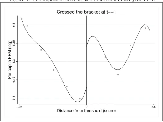
First Stage Impacts. The FPM discontinuities due to the population thresholds are well established in the literature (Brollo et al., 2013; Listchig, 2013; Gadenne (2016)). We use Calonico et al. (2014b)’s fourth order estimator and the last year score that is lower than 5%7 to measure the threshold impacts on the logarithm of the Declared FPM. We show in Figure 1 that there are a sharp discontinuity in the per capita FPM comparing cities with Ti,t−1 = 1 (eligible, on the right) and Ti,t−1= 0 (not eligible, on the left).
Figure 1: The impact of crossing the brackets on next year FPM
6.1
6.15
6.2
6.25
6.3
Per capita FPM (log)
−.05 0 .05
Distance from threshold (score)
Crossed the bracket at t=−1
Source: FINBRA. Elaborated by the authors. Note: Calonico et al (2014b)’s fourth order polynomial estimator. Each dot represents the variable sample average in a given bin, considering cities in 5% windows around the thresholds. We consider the declared FPM. The impact on theoretical FPM is quite similar.
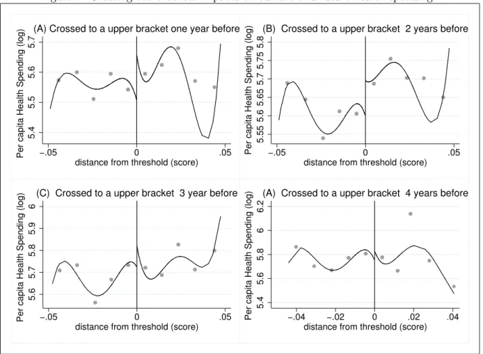
We also look for the effects on Public Health spending in Figure 2, considering the lags of eligibility: Ti,t−1, Ti,t−2, Ti,t−3 and Ti,t−4. We find that the higher impacts on health spending
7
The only noticed discontinuity at the thresholds is on FPM, and only for the interior municipalities that we take in our sample.
occur 2 years after the city changes the population bracket. There are no effects of crossing the thresholds on health spending 3 and 4 years afterward.
Figure 2: Crossing the brackets impacts on current and future health spending
5.4
5.5
5.6
5.7
Per capita Health Spending (log) −.05 0 .05
distance from threshold (score)
(A) Crossed to a upper bracket one year before
5.55 5.6 5.65 5.7 5.75 5.8
Per capita Health Spending (log) −.05 0 .05 distance from threshold (score)
(B) Crossed to a upper bracket 2 years before
5.6
5.7
5.8
5.9
6
Per capita Health Spending (log) −.05 0 .05
distance from threshold (score)
(C) Crossed to a upper bracket 3 year before
5.4
5.6
5.8
6
6.2
Per capita Health Spending (log) −.04 −.02 0 .02 .04 distance from threshold (score)
(A) Crossed to a upper bracket 4 years before
Source: FINBRA. Elaborated by the authors. Note: Calonico et al (2014b)’s fourth order polynomial estimator. Each dot represents the sample average of per capita health spending (in logarithm) in a given bin, considering cities in 5% windows around the thresholds. (A) One year lag of treatment dummy T, (B) 2 years lag, (C) 3 years lag, (D) 4 years lag.
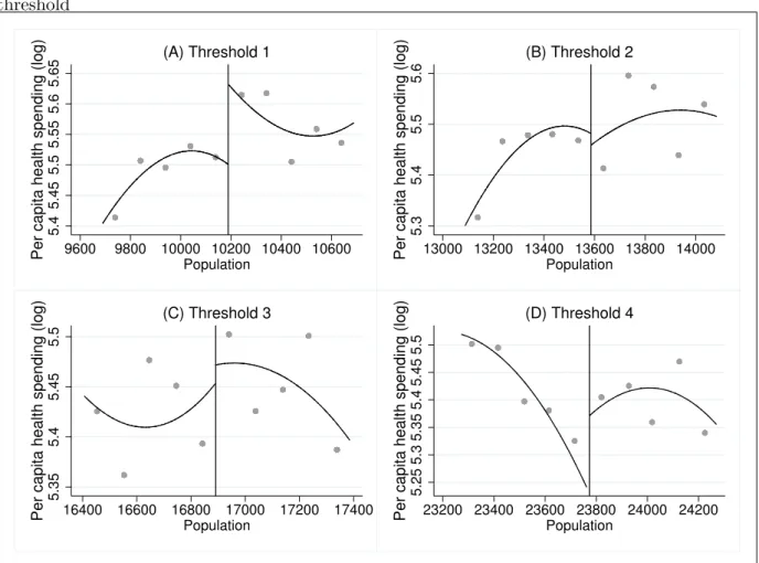
Finally, in Figure 3, we consider the FPM threshold impacts on health spending in considering our LATE sample: cities near the thresholds in the time between 2002 and 2006, with bordering cities near different thresholds. We find that the smallest cities of this sample (approximately 10,189 inhabitants) benefited the most in terms of increases in per capita health spending, which is considered in a logarithm. There is also a sharp increase in health spending in cities near threshold 4 (23,773 inhabitants). The graphical impacts at thresholds 2 and 3 are not conclusive. Forcing Variable continuity In our regressions, we are concerned about the possibility of local population manipulation as indicated by Monasterio (2013) and Litshig (2012). Monasterio (2013) and Avezani (2014) find a larger frequency of cities immediately to the right of the thresholds after 2007, but this is not reinforced by Arvate et al. (2013). Monasterio (2013), using McCrary’s (2008) strategy, argues that there may be three ways to influence the census: (i) the municipalities may in fact present this number of residents because they have created
Figure 3: Previous year population and health spending in city i - neighbor j near different threshold 5.4 5.45 5.5 5.55 5.6 5.65
Per capita health spending (log) 9600 9800 10000 10200 10400 10600
Population (A) Threshold 1 5.3 5.4 5.5 5.6
Per capita health spending (log) 13000 13200 13400 13600 13800 14000
Population (B) Threshold 2 5.35 5.4 5.45 5.5
Per capita health spending (log) 16400 16600 16800 17000 17200 17400
Population (C) Threshold 3 5.25 5.3 5.35 5.4 5.45 5.5
Per capita health spending (log) 23200 23400 23600 23800 24000 24200
Population
(D) Threshold 4
Source: FINBRA. Elaborated by the authors. Note: Calonico et al (2014b)’s fourth order polynomial estimator. Each dot represents the sample average of per capita health spending (in logarithm) in a given bin, considering cities in a 500 citizens estimation windows around the FPMthresholds. (A) City i near threshold 1 (10,189 inhabitants), (B) threshold 2 (13,585 inhabitants), (C) threshold 3 (16,891 inhabitants), (D) threshold 4 (23,773 inhabitants). We consider in this graph the LATE sample of bordering cities i and j close to different thresholds. We use data from the period 2002-2006.
incentives to attract migrants, (ii) municipalities have the population numbers but are mindful of the threat of losses and mobilize for the census visits, and (iii) deliberate fraud of the population census.
The main assumption for the causal inference is the balance of potential outcomes between eligible and non-eligible cities8. The forcing variable manipulation is not a problem if it is imperfect — that is, if there is a random assignment near the thresholds that the participants cannot control (Lee and Lemieux, 2010; Van der Klaauw, 2002). Nevertheless, any discontinuity in the forcing variable is a signal of unbalancing. Brollo et al. (2013) find no manipulation evidence in the period 2002 to 2007, the same period used in our sample. There are no possibilities of manipulation in this period because the population is estimated annually by
8
the National Institute of Statistics (Instituto Brasileiro de Geografia e Estat´ıstica - IBGE) according to the previous 2 censuses and using the country and the city’s region variation. The population census is independent of the municipal administration, and the coefficients for FPM redistribution are fixed.
We test for discontinuities in the forcing variable using the McCrary (2008) command in Figure 2 and using all cities (A) and cities with scores lower than 1% (B), 5% (C) and 10% (D). There is no indication of manipulation and imbalance between the municipalities’ frequency to the left or to the right of the thresholds in any estimation window when we use the aggregate data of the period 2002-2006. In Figure 6 of Appendix C, we present the population histograms for each year separately, and there is no indication of manipulation in any year from the period 2002-20069.
Figure 4: Mccrary (2008) tests for population manipulation
0 .01 .02 .03 density −60 −40 −20 0 20
distance from threshold (%)
(A)
0 .2 .4 .6 .8 1 density −2 −1 0 1 2distance from threshold (%)
(B)
0 .05 .1 .15 density −10 −5 0 5 10distance from threshold (%)
(C)
0 .02 .04 .06 .08 density −20 −10 0 10 20distance from threshold (%)
(D)
Source: FINBRA. Elaborated by the authors. Note: Mccrary (2008)’s test for forcing variable manipulation. Each dot represents the sample average density in a given bin. (A) All data, (B) 1% estimation windows around the thresholds, (C) 5% estimation windows and (D) 10% estimation windows.
Observables Balancing We conducted balancing tests between eligible cities, Tit = 1, and eligible cities, Tit = 0, considering the outcomes in t, when Wi,t−1 = 0 for the control and
9
These are the years used in the theoretical FPM calculation, as the population of the previous year is used to determine the FPM share in the current year.
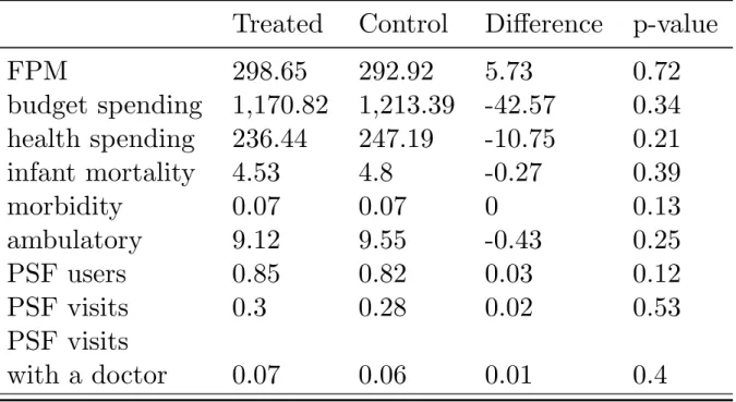
treatment groups. In other words, we suppose that a city i to the right of an FPM threshold and y on the left were balanced, one year before i crossed from the left to the right window. Table 2 shows that the eligible and ineligible groups are ex-ante balanced in relation to all the outcomes analysed, which shows that the mayors do not anticipate the spending before receiving the extra FPM 10. The evidence suggests again that the increase in health spending is concentrated on the second year after crossing the thresholds and one year after starting to receive the new FPM amount.
Table 2: Balancing between control and treatment group outcomes at t-1, when i is treated when crossing to a upper bracket at t
Treated
Control
Difference
p-value
FPM
298.65
292.92
5.73
0.72
budget spending
1,170.82
1,213.39
-42.57
0.34
health spending
236.44
247.19
-10.75
0.21
infant mortality
4.53
4.8
-0.27
0.39
morbidity
0.07
0.07
0
0.13
ambulatory
9.12
9.55
-0.43
0.25
PSF users
0.85
0.82
0.03
0.12
PSF visits
0.3
0.28
0.02
0.53
PSF visits
with a doctor
0.07
0.06
0.01
0.4
Note: Variables in level and in per capita values, except infant mortality, which is the number of deaths of children aged up to 1 year old divided by the corresponding population. We consider the city that crossed from the left window to the right window at t=-1 as the treated group, Ti,t−1= 1, compared with cities that remained on the
left (control),Ti,t−1= 0. We show the p-value considering the ttest for the nule hypothesis of the outcomes being
equal between the groups, against the alternative of being different.
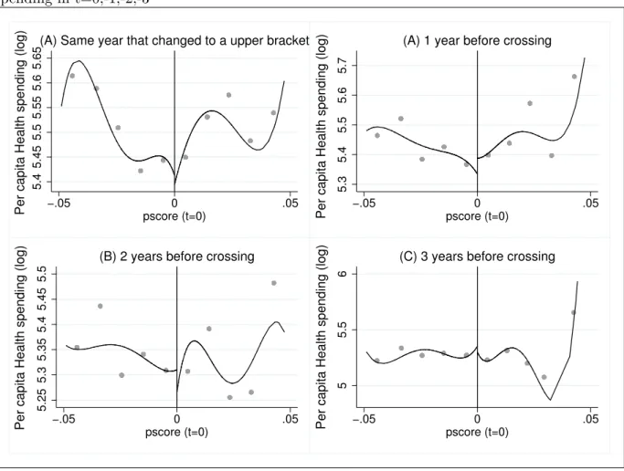
As an additional balancing test, we consider the effects of crossing the brackets at t= 0 on health spending at t = 0, −1, −2, −3. Eligible and ineligible groups are equal before the treated unity starts the treatment. Figure 5 shows that health spending remains unaffected in the years before the change in FPM coefficients. The results show that local budgets do not follow a “Ricardian Equivalence” approach because the mayors do not anticipate future spending. An explanation is that our sample is composed of small cities in the Brazilian national spectrum, which faces strong borrowing constraints. Additionally, there is a legal restriction to increasing local spending without a corresponding increase in local revenues.
Figure 5: Placebo and balancing test: effect of changing to a upper bracket in t=0 on health spending in t=0,-1,-2,-3 5.4 5.45 5.5 5.55 5.6 5.65
Per capita Health spending (log) −.05 pscore (t=0)0 .05
(A) Same year that changed to a upper bracket
5.3
5.4
5.5
5.6
5.7
Per capita Health spending (log) −.05 pscore (t=0)0 .05
(A) 1 year before crossing
5.25 5.3 5.35 5.4 5.45 5.5
Per capita Health spending (log) −.05 pscore (t=0)0 .05
(B) 2 years before crossing
5
5.5
6
Per capita Health spending (log) −.05 pscore (t=0)0 .05
(C) 3 years before crossing
Source: FINBRA. Elaborated by the authors. Note: Calonico et al (2014b)’s fourth order polynomial estimator. Each dot represents the sample average of per capita health spending (in logarithm) in a given bin, considering cities in 5% windows around the thresholds. (A) Health outcomes in t, (B) Health outcomes in t-1, Health outcomes in t-2, (D) Health outcomes in t-3.
5
Direct and Indirect effects on Public Health outputs
5.1 Intended To Treat.
Graphical Analysis. We first perform a Reduced Form estimation using RDD benchmark graphs. We use a 2-year lag of the forcing variable, score (distance from thresholds), as the major increase in health spending that occurs 2 years after changing the brackets. Figure 6 presents the differences in RDD eligible and ineligible groups on the main health outputs by municipal level. The main increase is in PSF coverage. We look for the effects on the neighbour with less population in Figure 7, and we find a sharp increase on the neighbours’ morbidity rate and the per capita number of PSF visits with a doctor. The effect on the largest neighbour’s outcomes is shown in Figure 8. We find a major impact on the PSF coverage and the number of PSF visits with a doctor.
Figure 6: Discontinuity in health outcomes .003 .004 .005 .006 −.05 0 .05
distance from threshold (score)
(A) Infant mortality
.05 .06 .07 .08 .09 −.05 0 .05
distance from threshold (score)
(B) Morbidity
.6 .7 .8 .9 1 1.1 −.05 0 .05distance from threshold (score)
(C) PSF coverage
0 .05 .1 .15 −.05 0 .05distance from threshold (score)
(D) PSF visits with a doctor
Source: DATASUS. Elaborated by the authors. Note: Calonico et al (2014b)’s fourth order polynomial estimator. Each dot represents the health outcome sample average in a given bin. We consider the effects on health outcomes 2 years after the city crossed the thresholds (eligible, Ti,t−2= 1, on the right), compared to cities that remained
on the left (not eligible, Ti,t−2= 0, on the left).
increase in the number of doctors and PSF teams. The number of health centres and hospital beds remains unaltered due to the bracket changing. Figure 10 shows the spillovers into the smallest neighbour in the period. There are visible discontinuities with the reduction in the number of doctors and an increase in the number of hospital beds, while there is a noisy increase in the number of health centres. The spillovers increase the number of doctors in the largest neighbour, the number of PSF teams and the number of health centres, as shown in Figure 11. The number of hospital beds remains unchanged.
Overall, the results show positive direct effects on the number of doctors and on the PSF program, which increases the coverage and number of teams, although they are not necessarily more qualified because the number of PSF visits with a doctor does not increase. There are no graphical direct impacts on the morbidity rate, infant mortality rate, number of health centres and hospital beds. These findings suggest that mayors spend more on preventive measures due to FPM, especially in a PSF program, which is a cost-free programme and can easily be expanded. At the same time, the cities hire more doctors, professionals that are in high demand
Figure 7: Discontinuity in the smallest neighbor’s Public Health outcomes .01 .015 .02 .025 −.05 0 .05
distance from threshold (score)
(A) Infant mortality
.04 .06 .08 .1 .12 −.05 0 .05
distance from threshold (score)
(B) Morbidity
.9 .95 1 1.05 1.1 −.05 0 .05distance from threshold (score)
(C) PSF coverage
.05 .1 .15 .2 −.05 0 .05distance from threshold (score)
(D) PSF visits with a doctor
Source: DATASUS. Elaborated by the authors. Note: Calonico et al (2014b)’s fourth order polynomial estimator. Each dot represents the sample average of per capita health outcome (in level) in a given bin. We consider the effects on health outcomes 2 years after the city crossed the thresholds (eligible, Ti,t−2= 1, on the right),
compared to cities that remained on the left (not eligible, Ti,t−2= 0, on the left). in the small cities.
The spillover effects into the smallest neighbour are positive on the morbidity rate and the number of PSF visits with a doctor, health centres and hospital beds while decreasing the overall number of doctors in the city. The evidence suggest that bordering cities compete for doctors and the largest cities benefit more, while there is an adverse effect on the smallest cities. Meanwhile, small cities invest in other service of mid-level complexity to compensate for the loss of qualified health professionals, aside from expanding PSF visits, especially with doctors. This also may occur because there are direct impacts on morbidity rates (i.e., the number of patients with chronic diseases), the number of doctors and the PSF program, but the middle and high complexity services and resources, as with the number of hospital beds, are not affected. Because there is not an unquestionable direct effect on the supply of health goods, small cities have to invest more in PSF visits with doctors as the overall number of doctors decreases. The spillovers into the largest neighbour also increase preventive actions, as with the PSF coverage and the number of PSF teams and PSF visits with a doctor, but increase the overall number of
Figure 8: Discontinuity in the biggest neighbor’s Public Health outcomes .014 .016 .018 .02 .022 .024 −.05 0 .05
distance from threshold (score)
(A) Infant mortality
.06 .07 .08 .09 .1 −.05 0 .05
distance from threshold (score)
(B) Morbidity
.6 .7 .8 .9 −.05 0 .05distance from threshold (score)
(C) PSF coverage
.02 .025 .03 .035 .04 −.05 0 .05distance from threshold (score)
(D) PSF visits with a doctor
Source: DATASUS. Elaborated by the authors. Note: Calonico et al (2014b)’s fourth order polynomial estimator. Each dot represents the sample average of the per capita health outcome (in level) in a given bin. We consider the effects on health outcomes 2 years after the city crossed the thresholds (eligible, Ti,t−2= 1, on the right),
compared to cities that remained on the left (not eligible, Ti,t−2= 0, on the left).
doctors and health centres. The number of hospital beds is again not affected.
Reduced Form. The impacts on health spending using equations (2) and (3) are presented in Table 3 considering one- to four-year lags of the treatment dummy, T. The first 2 columns present the direct effects, and columns 3 and 4 present the spillovers into the smallest neighbour. The direct and indirect effects are estimated considering 2 specifications for the eligible group: (1) changing from an ineligible to eligible group the year before, between years k-1 and k (k < 5), and (2) excluding cities that changed the brackets in one of the other 3 years. The second specification accounts for a city that changed from an ineligible to eligible group more than once in the period, and cities that reverted to the ineligible group after crossing to an upper bracket. Taking these situations out of the estimation sample allows us to estimate a more basic ITT effect. For now, we estimated the spillovers into the smallest neighbour.
The significant increases in health spending occurs 2 years after changing to an upper bracket, ranging from 10% to 16%, with high significance in both specifications due to a 1% increase in FPM (considering per capita values). Additionally, when i crosses the bracket at period
Figure 9: Discontinuity in Public Health Services and Goods .0002 .0003 .0004 .0005 −.05 0 .05
distance from threshold (score)
(A) Doctors
.0003 .0004 .0005 .0006 −.05 0 .05distance from threshold (score)
(B) PSF teams
.0001 .0002 .0003 .0004 −.05 0 .05distance from threshold (score)
(C) Health Centers
.0015 .002 .0025 .003 .0035 −.05 0 .05distance from threshold (score)
(D) Hospital beds
Source: DATASUS. Elaborated by the authors. Note: Calonico et al (2014b)’s fourth order polynomial estimator. Each dot represents the sample average of the per capita health outcome (in level) in a given bin. We consider the effects on health outcomes 2 years after the city crossed the thresholds (eligible, Ti,t−2= 1, on the right),
compared to cities that remained on the left (not eligible, Ti,t−2= 0, on the left).
t, city j’s health spending decreases 13% to 19% percent at period t+1, considering j is i’s smallest neighbour. These findings suggest that neighbours react first to the FPM increase, which is a signal that political incentives are more important for explaining the spillover than the effects on demand for health services (which must occur after the increase in health spending). Additionally, the ITT estimation confirms the graphical conclusions that the impact on health spending is stronger 2 years after crossing the threshold. We look for the effects on the number of doctors when considering the same specifications as before. The spillovers into the smallest neighbours are not significant for the all the 4 subsequent years, but the direct impact is positive and significant for treatment lags of 2, 3 and 4 years, ranging from 15% to 30%.
Figure 10: Discontinuity in the smallest neighbor’s Public Health Services and Goods
.0004
.0006
.0008
−.05 0 .05
distance from threshold (score)
(A) Doctors
.0004
.0006
.0008
−.05 0 .05
distance from threshold (score)
(B) PSF teams
−.0005 0 .0005 .001 .0015 −.04 −.02 0 .02 .04distance from threshold (score)
(C) Health Centers
.001 .002 .003 .004 −.05 0 .05distance from threshold (score)
(D) Hospital beds
Source: DATASUS. Elaborated by the authors. Note: Calonico et al (2014b)’s fourth order polynomial estimator. Each dot represents the sample average of the per capita health outcome (in level) in a given bin. We consider the effects on health outcomes 2 years after the city crossed the thresholds (eligible, Ti,t−2= 1, on the right),
compared to cities that remained on the left (not eligible, Ti,t−2= 0, on the left).
5.2 Local Average Treatment Effects
Childhood mortality, morbidity and ambulatory. All models are estimated with and without controlling for the neighbours’ FPM to disentangle the direct and indirect (the spillover) effect on the public health system. That is, we estimate the effect of their own FPM and the neighbours’ FPM jointly. Additionally, to determine whether the results differ for each of the cut-offs, the models are estimated considering the four discontinuities together and each one separately. For this, we use in our sample cities near one of the thresholds with neighbours near different thresholds. We focus on the first four population cut-offs (c1=10,188.5; c2=13,584.5; c3= 16,980.5 and c4= 23,772.5).
We first present the results for mortality, morbidity, and ambulatory. Table 5 shows the estimates when we take municipalities with scores lower than 10%, 5% and 1% considering the 4 thresholds together. We estimate 2SLS and 2SLS controlling for a Fixed Effect (FE) using the 4 main health outcomes as the dependent variable. There are significant impacts on the infant mortality (children up to 1 year old) rate, ranging from -0.18% to -0.27% from each 1%
Figure 11: Discontinuity in the biggest neighbor’s Public Health Services and Goods .0002 .0004 .0006 −.05 0 .05
(A) Doctors
.0001 .0002 .0003 .0004 .0005 −.05 0 .05(B) PSF teams
.00005 .0001 .00015 −.05 0 .05(C) Health Centers
.001 .002 .003 .004 −.05 0 .05(D) Hospital beds
Source: DATASUS. Elaborated by the authors. Note: Calonico et al (2014b)’s fourth order polynomial estimator. Each dot represents the sample average of the per capita health outcome (in level) in a given bin. We consider the effects on health outcomes 2 years after the city crossed the thresholds (eligible, Ti,t−2= 1, on the right),
compared to cities that remained on the left (not eligible, Ti,t−2= 0, on the left).
increase in the per capita FPM. The morbidity rate tends to decrease due to FPM, more than 0.3%, but this result is less robust when we use FE. Controlling for FE eliminates the influence of fixed factors that affect the results. Additionally, there is a positive impact on ambulatory consultations: increases of 0.46% to 0.84%.
Table 6 repeats the estimation for own FPM impacts as in Table 5, but now we consider the LATE sample: cities near one of the thresholds that have neighbours near one of the others. The results are similar to those previously estimated. There is a -0.55% reduction in infant mortality at threshold 2 due to a 1% increase in FPM. The morbidity rate declines again, an elasticity of -0.17 at the threshold 3, but increases 1% at threshold 4. The ambulatory consultation rate also increases for all the thresholds.
At the bottom of Table 6, we add the bordering cities’ FPM in the regressions. The majority of estimated spillovers from city j’s FPM on city i’s health outcomes are negative. Adding spillovers reduces their own FPM effect, and the spillovers are stronger than the direct effect in most specifications. For example, spillovers in infant mortality is stronger (elasticity near -1)
Table 3: Direct and spillover effects on health spending, considering lags of eligibility
Effects Direct Spillover
Eligible (1) (2) (1) (2) Lag 1 0.0524* 0.0003 -0.1389*** -0.1918*** (0.03) (0.04) (0.05) (0.06) Obs. 514 369 512 368 Lag 2 0.1001*** 0.1688*** -0.052 -0.0778 (0.04) (0.06) (0.07) (0.12) Obs. 331 230 334 231 Lag 3 0.0276 0.0756 0.0283 -0.0198 (0.04) (0.06) (0.09) (0.08) Obs. 236 164 237 164 Lag 4 0.0034 -0.0145 0.0353 0.001 (0.05) (0.08) (0.07) (0.1) Obs. 137 84 137 84
Note: We consider the FPM impacts on own and on the smallest neighbor’s per capita health spending (Log). In specification (1) we use lags of eligibility, and in specification (2) we use the lags, but we exclude cities that changed brackets more than once in the last four years. ∗p < 0.10, ∗ ∗ p < 0.05, ∗ ∗ ∗p < 0.01. Standard errors in parenthesis.
than the own effect, which becomes insignificant, and there is a major reduction in i’s morbidity when i is at threshold 4 and j is smaller.
Preventive measures. There are significant impacts on the preventive measures when we consider all the thresholds together in Table 7. In the first specification, we estimate Equation 5 using a 2SLS procedure with the theoretical FPM as an instrument in the first stage. In general, the effects are stronger when we consider 2SLS with FE in the second specification. The results are robust to different distances from the thresholds. The effects are positive on the number of citizens registered in PSF (almost 0.35%) and total PSF visits (0.95%). The number of qualified PSF visits with a doctor also increases sharply (0.94%)11.
We add the neighbours’ FPM considering the LATE sample in Table 8. We find that most of the increases in preventive measures are concentrated in small towns, especially near the first threshold. The positive impacts on cities near threshold 3 occurs in the total number of PSF visits (0.83%)12. The increases in doctors’ visits are larger in cities near the first threshold, 1.8%. Overall, the results suggest that the small cities spend money more effectively for public health,
11
Also, there are strong increases in the number of PSF visits wit a nurse (1.12%) medical referral for specialized treatment (1.64%). Despite these results, there is a significant and negative impact on the number of per capita vaccination doses (0.26%). We let these results to the Appendix G.
12Also, there are increases in the number of visits with a nurse (0.88%) and in PSF medical referrals (1.89%).
PSF visits with a nurse is greater at threshold 1 (2%), while the effects on medical referrals is bigger at threshold 2, 2.19%. When we add the neighbors’ FPM, the negative effects of own FPM on vaccination coverage are no more significant, and becomes positive at threshold (0.18%), but there is a negative spillover from the neighbors. We let there results to Appendix G.
Table 4: Direct and spillover effects on the number of doctors, considering lags of eligibility
Effects
Direct
Spillover
Eligible
(1)
(2)
(1)
(2)
Lag 1
0.0477
0.0916
-0.0139
0.1207
(0.06)
(0.07)
(0.08)
(0.09)
Obs.
376
284
318
242
Lag 2
0.1596**
0.2631**
-0.0756
-0.0933
(0.07)
(0.11)
(0.09)
(0.13)
Obs.
325
225
274
193
Lag 3
0.1895**
0.2938**
0.0213
0.0674
(0.08)
(0.12)
(0.1)
(0.14)
Obs.
233
162
198
142
Lag 4
0.1927*
0.2786*
0.0795
0.083
(0.11)
(0.16)
(0.12)
(0.17)
Obs.
136
84
119
76
Note: We consider the FPM impacts on own and on the smallest neighbor’s per capita number of doctors (Log). In specification (1) we use one to four lags of eligibility, and in specification (2) we use the lags, but we exclude cities that changed brackets in more than one period. ∗p < 0.10, ∗ ∗ p < 0.05, ∗ ∗ ∗p < 0.01. Standard errors in parenthesis.
Table 5: FPM impacts on health outcomes - aggregate thresholds
distance - thresholds 10% 5% 1% 10% 5% 1% 10% 5% 1% general health mortality morbidity ambulatory
FPM IV -0.18** 10.06 -0.14 -0.41*** -0.31*** -0.53** 0.84*** 0.84*** 0.46** (0.08) (0.10) (0.23) (0.06) (0.08) (0.21) (0.08) (0.11) (0.21) FPM FE-IV -0.27*** -0.19 0.54 -0.05** 0.03 -0.08 0.52*** 0.49*** -0.15
(0.08) (0.14) (0.43) (0.02) (0.04) (0.13) (0.05) (0.08) (0.3)
obs. 5769 3004 644 5188 2573 547 5169 2563 546
Note: ∗p < 0.10, ∗ ∗ p < 0.05, ∗ ∗ ∗p < 0.01. Covariates omitted. Standard errors in parenthesis. We use logarithms of per capita FPM and health outcomes. We use cities near 10% from each of the thresholds. We consider the childhood mortality, that is, from children with up to 5 years old. We use data from the period 2002-2007.
Table 6: FPM direct and spillover effects on health outcomes - bordering cities i and j near different thresholds
i’s thresholds (1) (2) (3) (4) (1) (2) (3) (4) (1) (2) (3) (4)
general health mortality morbidity ambulatory
Direct effect FPMi -0.16 -0.55** 0.08 -0.32 -0.11 -0.16** -0.17** 1.01*** 0.28* 0.29* 0.54*** 0.57*** (0.31) (0.23) (0.19) (0.34) (0.08) (0.07) (0.07) (0.14) (0.16) (0.17) (0.13) (0.15) obs 1169 982 901 542 1169 982 901 542 1162 973 900 542 Spillovers FPMi 0.1511 0.0576 0.5823 -0.0139 -0.01 -0.0009 -0.0018 0.13*** 1.55 3.33** 4.56** 3.95 (0.64) (0.36) (0.38) (1.1) (0.01) (0.01) (0.01) (0.04) (2.62) (1.67) (1.79) (4.71) FPMj -0.4983 -0.9795*** -1.0774** -0.2746 -0.01 -0.01** -0.03** -0.11*** 1.96 -0.59 1.34 1.14 (0.49) (0.38) ( 0.44) (1.18) (0.01) (0.01) (0.01) (0.04) (2.07) (1.74) (2.02) (5.06) obs 1061 945 886 540 1169 982 901 542 1162 973 900 542
Note: ∗p < 0.10, ∗ ∗ p < 0.05, ∗ ∗ ∗p < 0.01. Covariates omitted. Standard errors in parenthesis. We use logarithms of per capita FPM and health outcomes. We use cities near 10% from each of the thresholds. We consider the childhood mortality, that is, from children with up to 5 years old. We use data from the period 2002-2007.
Table 7: FPM impacts on the main preventive program (PSF) - aggregate thresholds
distance - thresholds 10% 5% 1% 10% 5% 1% 10% 5% 1%
PSF coverage visits doctor
FPM IV 0.08 0.04 0.14 0.55*** 0.97*** 1.57*** 0.30* 0.43* 0.62
(0.05) (0.06) (0.15) (0.17) (0.23) (0.48) (0.17) (0.23) (0.47)
FPM FE-IV 0.36*** 0.35*** -0.32 1.10*** 0.95*** 0.66 0.75*** 0.94*** 0.2
(0.03) (0.05) (0.4) (0.1) (0.17) (0.73) (0.11) (0.19) (0.78)
obs. 4930 2453 521 4757 2367 505 4596 2292 483
Note: ∗p < 0.10, ∗ ∗ p < 0.05, ∗ ∗ ∗p < 0.01. Covariates omitted. Standard errors in parenthesis. We use logarithms of per capita FPM and health outcomes. We use cities near 10% from each of the thresholds. We consider the childhood mortality, that is, from children with up to 5 years old. We use data from the period 2002-2007.
especially on preventive action13. There is a strong and negative FPM spillover effect on the number of PSF visits in the largest cities and on the total visits with a doctor — further evidence that the cities may compete for these professionals. Indeed, there are positive impacts on PSF coverage and on the number of PSF visits, especially at the first and the fourth thresholds, 1.81% and 2.46%, respectively, but the small towns show increases in doctor visits (2.24%), as with the total PSF visits at threshold 314.
Table 8: FPM direct and spillover effects on Family Health Program (PSF) - bordering cities i and j near different thresholds
i’s thresholds (1) (2) (3) (4) (1) (2) (3) (4) (1) (2) (3) (4)
PSF coverage visits doctor visit
Direct effect FPMi 0.47*** 0.43*** 0.35*** 0.79*** 1.81*** 0.69** 0.63*** 2.46*** 2.24*** 0.45 0.71*** 0.34 (0.1) (0.07) (0.1) (0.18) (0.44) (0.28) (0.22) (0.47) (0.52) (0.34) (0.28) (0.42) obs 1107 948 891 511 1086 914 858 510 1060 873 843 499 Spillovers FPMi 0.44*** 0.44*** 0.61* 0.61* 0.23 0.73*** -0.19 1.71*** 0.32*** 0.13*** -0.02 0.05 (0.15) (0.07) (0.31) (0.31) (0.45) (0.16) (0.13) (0.54) (0.08) (0.04) (0.02) (0.06) FPMj -0.12 -0.15* -0.19 -0.19 0.14 -0.46*** 0.38** -1.36** -0.22*** -0.12*** 0.02 -0.07 (0.11) (0.08) (0.34) (0.34) (0.36) (0.17) (0.15) (0.58) (0.06) (0.04) (0.02) (0.06) obs 1107 948 511 511 1169 982 901 542 1060 873 843 499
Note: ∗p < 0.10, ∗ ∗ p < 0.05, ∗ ∗ ∗p < 0.01. Covariates omitted. Standard errors in parenthesis. We use logarithms of per capita FPM and health outcomes. We use cities near 10% from each of the thresholds. We consider the childhood mortality, that is, from children with up to 5 years old. We use data from the period 2002-2007.
Public Health goods and professionals. We extend our analysis to health-related objects that are publicly provided — the number of hospitals, health centres for primary care and hospital beds — and to health professionals — the number of doctors, nurses, professionals. All these variables are taken per capita. The estimates present the same evidence for negative spillover on health goods, as we find for health outcomes and services. Table 9 presents the estimated impacts of FPM on health professionals. The regressions without controlling for spillover (on the left) show positive and significant effects on the per capita number of nurses (1.3% at threshold 1) and on the per capita number of PSF teams (2.13% at threshold 4). When we add the neighbours’ FPM (on the right), the spillover on the number of doctors is negative (-1% at threshold 2), while the effects on nurses and the PSF team are even larger (2.29% and 3.28% at threshold 4).
In Table 10, we see positive effects on the number of hospitals, health centres and hospital beds (0.48%, 0.39% and 0.37%, respectively, at threshold 2) without controlling for spillover. When adding FPM for j , the significant spillovers are concentrated at threshold 1: -0.42%, -0.58% and -0.24%, respectively, reinforcing the negative correlation on health, now in the health
13
We present in Appendix E the Litschig and Morrison (2013)’s spefication. The estimation are pretty less significant because the authors consider a sharp RDD in a cross section design. Differently, we consider the transition from the left to the right window in our ITT regressions.
14Meanwhile, the number of PSF visits with a college degree (8.66%) or high school professional (2.42%)
increases more in the more populous towns in our sample. There is a reduction in the vaccination coverage and positive spillovers on PSF with a college degree professional at threshold 3 and the effects on special referral when i is close to threshold 3 or 4. We let these results to the Appendix G.
Table 9: FPM direct and spillover effect on the number of health professionals - bordering cities i and j near different thresholds
only own FPM control for spillover
doctors nurses health professionals PSF teams doctors nurses health professionals PSF teams
i’s threshold: 1 FPMi -0.03 1.30*** 0.60*** 1.08*** 0.08 1.46*** 0.62** 0.77* (0.3) (0.25) (0.23) (0.34) (0.36) (0.3) (0.27) (0.41) FPMj . . . . -0.12 -0.37* -0.07 0.48* . . . . (0.23) (0.21) (0.18) (0.27) obs. 645 678 686 627 645 678 686 627 i’s threshold: 2 FPMi 0.36* 1.18*** 1.18*** 1.91*** 0.75*** 0.98*** 1.24*** 1.59*** (0.21) (0.22) (0.27) (0.29) (0.24) (0.25) (0.3) (0.31) FPMj . . . . -1.00*** 0.61** -0.12 0.94*** . . . . (0.27) (0.27) (0.32) (0.33) obs. 534 563 570 505 534 563 570 505 i’s threshold: 3 FPMi 0.2 0.72*** 0.70*** 1.79*** 0.45* 0.73*** 0.80*** 1.92*** (0.18) (0.16) (0.13) (0.27) (0.24) (0.22) (0.18) (0.35) FPMj . . . . -0.49* -0.02 -0.18 -0.23 . . . . (0.27) (0.23) (0.2) (0.4) obs. 532 540 552 528 532 540 552 528 i’s threshold: 4 FPMi -0.23 1.04*** -0.11 2.13*** 1.44 2.29*** 0.72 3.28*** (0.32) (0.27) (0.23) (0.36) (0.93) (0.76) (0.62) (1.2) FPMj . . . . -2.64** -1.98* -1.31 -1.74 . . . . (1.34) (1.11) (0.88) (1.7) obs. 298 298 302 277 298 298 302 277
Note: ∗p < 0.10, ∗ ∗ p < 0.05, ∗ ∗ ∗p < 0.01. Covariates omitted. Standard errors in parenthesis. We use logarithms of per capita FPM and health outcomes. We use cities near 10% from each of the thresholds. We use data from the period 2002-2007.
establishments.
Table 10: FPM direct and spillover effect on the number and types of health establishments -bordering cities i and j near different thresholds
only own FPM control for spillover
hospitals health centers hospital beds hospitals health centers hospital beds i’s threshold: 1 FPMi -0.22 0.15 0.02 0.06 0.32 0.21 (0.18) (0.2) (0.1) (0.22) (0.21) (0.13) FPMj . . . -0.42*** -0.58*** -0.24** . . . (0.15) (0.16) (0.09) obs. 179 393 461 179 393 461 i’s threshold: 2 FPMi 0.48*** 0.39*** 0.37*** 0.48*** 0.49*** 0.44*** (0.06) (0.09) (0.13) (0.06) (0.1) (0.15) FPMj . . . 0.01 -0.24 -0.13 . . . (0.11) (0.15) (0.17) obs. 153 354 468 153 354 468 i’s threshold: 3 FPMi 0.38*** 0.29 0.36*** 0.03 0.01 0.52*** (0.12) (0.24) (0.09) (0.22) (0.33) (0.13) FPMj . . . 0.95* 0.19 -0.32** . . . (0.53) (0.33) (0.15) obs. 165 332 497 165 332 497 i’s threshold: 4 FPMi -0.01 0.32** -0.03 0.52 0.33 -0.11 (0.47) (0.14) (0.07) (0.89) (0.37) (0.16) FPMj . . . -3.8 -0.01 0.14 . . . (2.73) (0.48) (0.22) obs. 80 205 295 80 205 295
Note: ∗p < 0.10, ∗ ∗ p < 0.05, ∗ ∗ ∗p < 0.01. Covariates omitted. Standard errors in parenthesis. We use logarithms of per capita FPM and health outcomes. We use cities near 10% from each of the thresholds. We use data from the period 2002-2007.
Finally, we look at the effects on medical specialties in Table 11. We find a positive effect of a 1% FPM increase on the number of general practitioners (0.76%), paediatricians (0.58%) and gynaecologists (0.81%) in cities near threshold 2. There is a negative spillover for all specialties except for gynaecologists. Overall, there is evidence of increases in medical specialization due to FPM, but these effects should be marginally greater if there were no spillovers.