Visualization and differential analysis of protein
expression data using R
Tomé S. Silva
1and Nadège Richard
21SPAROS Lda., Área Empresarial de Marim, Lote C, 8700-221 Olhão, Portugal. 2CCMAR, Centre of Marine Sciences of Algarve, University of Algarve, Campus de
Gambelas, 8005-139 Faro, Portugal.
Running head: Analysis of protein expression data using R
Corresponding author: Tomé S. Silva
SPAROS Lda.
Área Empresarial de Marim, Lote C, 8700-221 Olhão, Portugal.
Phone: +351 936222203 E-mail: [email protected]
Abstract
Data analysis is essential to derive meaningful conclusions from proteomic data. This chapter describes ways of performing common data visualization and differential analysis tasks on gel-based proteomic datasets using a freely-available statistical software package (R). A workflow followed is illustrated using a synthetic dataset as example.
Keywords
Proteomics, R, two-dimensional gel electrophoresis, data visualization, differential analysis, feature selection, multidimensional scaling, independent component analysis, heatmap, hypothesis testing
1. Introduction
Correct inference from proteomic data depends not only on good experimental design and practice, but also on an adequate analysis of the results. There is extensive discussion on both theoretical and practical issues underlying the inference of biological conclusions from protein expression data, both in this book and elsewhere (e.g. see (1, 2) and references therein), and so this chapter focuses on illustrating a practical workflow for analysis of proteomic data using a standard and freely-available tool.
The open-source statistical computing environment R is increasingly being used as the analysis tool of choice by the users of high-throughput profiling technologies (colloquially dubbed "omics"). This chapter guides the reader through a practical analysis workflow on R, using a synthetic 2DE dataset as example.
A thorough discussion of the R language and its full range of capabilities is outside the scope of this chapter. Nevertheless, given the non-trivial learning curve of any programming language, we advise the reader to consult some of the many books (3, 4) and online tutorials on this language.
2. Materials
2.1. Dataset
2DE gel scans are usually analysed using specialized image analysis software (see Note 1). Many software packages can be used for this purpose, each of them with a specific type of approach (5–7), but the end result is usually a table containing measurements for a common set of features (usually "protein spots") across all samples (i.e. gels). Though this chapter and the provided examples assume the user has a 2DE dataset with "protein spots" as features, its methods also generally apply to other types of multivariate "large p, small n" datasets, proteomic or otherwise (see Note 2).
A common data format, and the one assumed in this chapter, is such that each row represents a sample (in this case, a 2DE gel) and each column represents a measured variable (in this case, a protein spot), as a plain text file (see Note 3). Furthermore, besides the dataset table, it is useful to have sample metadata and feature metadata tables, with additional information that can be used in the analysis. In the case of sample metadata, it is common to have information on the technical context of the 2DE gel (e.g. IEF and SDS-PAGE batch), along with the relevant information on the corresponding biological sample (experimental factors and other co-measured variables). In the case of feature metadata, any available information on the protein spots (e.g. XY position in the gel image, mean spot area, estimated background, protein identity) should be included.
The example files used throughout the chapter can be obtained at http://dx.doi.org/10.6084/m9.figshare.1284620 or at any of the two other mirrors (http://tomesilva.com/2DExample/ and http://tomessilva.github.io/2DExample/).
2.2. Analysis software
To follow the analysis workflow described in this chapter, you need to have a specific set of software packages installed on your computer:
1. Install the latest version of R for your platform, either from the CRAN website (http://cran.r-project.org/bin/) or from your operating system's repositories; 2. Install the latest version of RStudio for your platform
(http://www.rstudio.com/products/rstudio/download/);
3. Run RStudio and install the required R packages for this example (see Note 4), by running this code:
install.packages(c("caret","klaR", "e1071", "effsize", "pROC","pcaPP","mixOmics","fastICA","pheatmap","statmod")) source("http://bioconductor.org/biocLite.R")
biocLite()
3. Methods
3.1. Importing protein expression data
1. To import a dataset, either use the "Import Dataset" button (if using RStudio) or run one of the following commands:
# if using period as decimal separator and TAB as field separator input.data <- read.delim(file.choose(),dec=".",sep="\t")
# if using comma as decimal separator and TAB as field separator input.data <- read.delim(file.choose(),dec=",",sep="\t")
For illustrative purposes, we will use an example dataset, by running: input.data <-
read.delim("http://files.figshare.com/1860747/example_dataset.txt",dec=".") 2. You should check whether the dataset was correctly imported:
View(input.data)
head(input.data) # alternative way
3. It is also necessary to import any eventual metadata available on the samples (e.g. experimental factors). For this simple example, metadata consists simply of a binary variable denoting class-membership of the samples:
input.metadata <-
read.delim("http://files.figshare.com/1860748/example_sample_metadata.txt", dec=".")
head(input.metadata) # check if it was correctly imported treatment <- input.metadata$treatment
3.2. Normalizing and transforming protein expression data
Normalization refers to scaling of protein abundance estimates so that comparisons across gels are possible. This step is required due to technical factors (e.g. different protein load per gel, different staining intensity per gel, different dye efficiencies) that make direct comparisons inadequate (see Note 5). Many methods have been proposed to normalize 2DE protein abundance data, from simple ones (total gel volume, total spot volume, quantile normalization) to more specialized ones (VSN method, LOESS normalization). As part of the normalization process, it is common to transform the data (using e.g. log, arsinh, power transforms), for variance stabilization purposes. Extensive discussion on the different normalization and transformation approaches is available elsewhere (8).
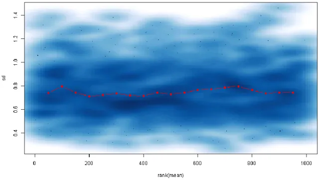
1. Check the distribution of abundance values for each gel and any dependence of the standard deviation with the mean:
boxplot(t(input.data)) require(vsn)
meanSdPlot(t(input.data))
2. If you get a trend similar to Fig. 1 (i.e. standard deviation increases dramatically for high-abundance spots), then you probably have raw data. A quick way of normalizing and transforming the data (using the VSN method) is:
require(vsn)
norm.data <- t(justvsn(t(as.matrix(input.data))))
3. You can confirm that the norm.data variable contains your normalized dataset, using the same approach as in step 1:
boxplot(t(norm.data)) require(vsn)
As can be seen in Fig. 2, the mean and the standard deviation of each spot have become decorrelated, making the assumption of heteroscedasticity (required by many regression approaches and hypothesis tests) more plausible.
3.3. Visualizing protein expression data
Data visualization should be seen as an essential step in a proteome analysis workflow, as it allows the researcher to assess data quality and to detect any unexpected heterogeneities that can compromise the validity of downstream statistical tests.
As with other type of multivariate datasets, the classical tools for data visualization (e.g. scatterplots) are inadequate for protein expression data unless some sort of dimensionality reduction step is applied.
While the most popular approach here consists in performing a Principal Component Analysis (PCA), many other approaches can be undertaken using R. A typical analysis workflow could include steps such as:
1. Perform PCA with scaled variables to confirm whether the experimental factor is the main source of variability in terms of protein expression (see Fig. 3):
results.pca <- prcomp(norm.data,scale=TRUE,retx=TRUE) plot(results.pca) # scree plot
cumsum((results.pca$sdev)^2) / sum(results.pca$sdev^2)
biplot(results.pca) # biplot of scores and loadings (not very clear) plot(results.pca$x[,1],results.pca$x[,2],col=1+treatment,
xlab="PC1",ylab="PC2",pch=15)
2. As an alternative, plot samples according to their similarity in terms of a scale-independent measure (such as Kendall's tau correlation), using Multidimensional Scaling (MDS):
require(pcaPP)
inter.gel.distances <- as.dist(1 - cor.fk(t(norm.data))^2) results.mds <- cmdscale(inter.gel.distances)
plot(results.mds,col=1+treatment,
xlab="Dimension 1",ylab="Dimension 2",pch=15) legend("top",c("class 0","class 1"),col=1:2,pch=15)
3. You can also perform Independent Component Analysis (ICA) to confirm that the direction of maximum non-Gaussianity is orthogonal to the hyperplane that separates samples from the two groups (i.e. that most observed non-Gaussian variation can be attributed to the experimental factor):
require(fastICA)
results.ica <- fastICA(norm.data,2)
plot(results.ica$S,col=1+treatment,xlab="IC1",ylab="IC2",pch=15) legend("top",c("class 0","class 1"),col=1:2,pch=15)
4. Finally, the use of a heatmap, where both variables and samples are ordinated using hierarchical clustering and expression levels are represented with colours, is also a popular way of visualizing proteomic datasets:
require(pheatmap)
pheatmap(t(norm.data),scale="row",show_rownames=FALSE)
3.4. Differential analysis of protein expression data
When the visualization step supports the hypothesis that a significant fraction of observed variation in protein expression is due to the experimental factor(s), the experimenter is usually interested in assessing which specific proteins are being affected (see Note 6). This
step of "differential analysis" is usually centered on the use of univariate hypothesis testing approaches (e.g. Student’s t-test, ANOVA, Wilcoxon-Mann-Whitney U-test, Kruskal-Wallis test) with some form of multiple comparison correction (in order to control the false discovery rate).
Other forms of feature selection, often based on the use of classifiers, are also available within R. One should have into account, though, that a set of "useful features" (from a classification point-of-view) does not necessarily contain all "relevant features" (from a biological point-of-view), which is why the classical approach of (corrected) univariate hypothesis testing is the most widely used for the purposes of "differential analysis". 1. A first step should be univariate hypothesis testing with multiple comparison
correction, in this case using Smyth's moderated t-test (9) with Storey's q-value method (10) to control the FDR, a combination which has been shown to be adequate for the differential analysis of 2DE datasets (11). It is also important to know (and report) estimates of the effect size (e.g. fold-change or, in this case, Cohen's d): require(limma) require(qvalue) require(effsize) design.mtrx <- cbind(rep(1,length(treatment)),treatment) data.transposed <- t(norm.data) fit <- lmFit(data.transposed,design=design.mtrx,method="robust",maxit=1024) fit <- eBayes(fit,robust=TRUE) qval <- (qvalue(fit$p.value[,2],pi0.method="bootstrap"))$qvalues fx.size <- apply(norm.data,2, function(d,f) cohen.d(d,f)$estimate,f=factor(treatment)) sig.spots <- names(qval[qval < 0.1]) # FDR < 10%
n.sig.spots <- length(sig.spots) # number of significant spots spot.class <- as.numeric(colnames(norm.data) %in% sig.spots)
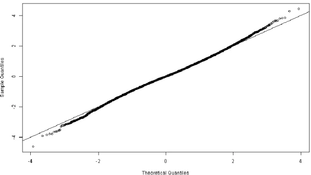
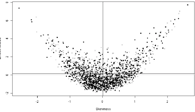
2. One of the assumptions of the t-test is that errors are normally distributed. It is therefore advisable to check if this assumption is plausible by looking at the distribution of the residuals. A few options are to either studentize the per-spot residuals, pool them all and compare the resulting distribution with a normal distribution via a Q-Q plot (Fig. 4) or to look at the skewness and kurtosis distributions of the per-spot residuals (Fig. 5):
require(e1071)
# pooled studentized residuals approach
fit.residuals <- residuals(fit,data.transposed)
fit.residuals.student <- as.vector(scale(fit.residuals)) qqnorm(fit.residuals.student)
abline(0,1)
# skewness/kurtosis approach set.seed(1) # make it reproducible skew2 <- function(x) skewness(x,type=2) kurt2 <- function(x) kurtosis(x,type=2) normal.variates <-
matrix(0,ncol=ncol(fit.residuals),nrow=nrow(fit.residuals)) for (i in 1:nrow(fit.residuals)) normal.variates[i,] <- rnorm(ncol(fit.residuals),0,1) normal.skew <- apply(normal.variates,1,skew2) normal.kurt <- apply(normal.variates,1,kurt2) residual.skew <- apply(fit.residuals,1,skew2) residual.kurt <- apply(fit.residuals,1,kurt2) plot(NA,xlab="Skewness",ylab="Excess kurtosis", xlim=c(min(c(normal.skew,residual.skew)),max(c(normal.skew,residual.skew))), ylim=c(min(c(normal.kurt,residual.kurt)),max(c(normal.kurt,residual.kurt)))) points(normal.skew,normal.kurt,pch=".",cex=5,col="grey") abline(v=mean(normal.skew),col="grey") abline(h=mean(normal.kurt),col="grey")
points(residual.skew,residual.kurt,pch=".",cex=5) abline(v=mean(residual.skew))
abline(h=mean(residual.kurt))
Both plots suggest that the distribution of the residuals is approximately normal, which supports the application of statistical tests that assume errors to be normally
distributed (see Note 7).
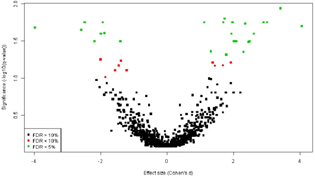
3. The results of univariate hypothesis testing can be visualized using a volcano plot (Fig. 6) and written to a text file (see Note 8):
spot.colours <-
as.numeric(colnames(norm.data) %in% names(qval[qval < 0.05])) + 1 + spot.class
plot(fx.size,-log(qval)/log(10),col=spot.colours,
xlab="Effect size (Cohen's d)",ylab="Significance (-log10(q-value))", pch=15,cex=0.7) legend("bottomleft",c("FDR > 10%","FDR < 10%","FDR < 5%"),col=1:3,pch=15) univariate.results <- data.frame(spot.name=colnames(norm.data),p.value=fit$p.value[,2], q.value=qval,effect.size=fx.size,significant=spot.class) write.table(univariate.results,"univariate_results.txt", row.names=FALSE,sep="\t")
4. An alternative method for feature selection is, for example, the application of a classifier with regularization, such as Sparse Partial Least Squares Discriminant Analysis (sPLS-DA) (12) (see Note 9):
require(mixOmics)
results.splsda <- mixOmics::splsda(norm.data, as.factor(treatment), ncomp=2, keepX=c(n.sig.spots,n.sig.spots))
tmp.load <- ((results.splsda$loadings)$X)[,1]
5. Another possible alternative is to use Recursive Feature Elimination (RFE) with some classification method (in this case, with Naive Bayes classifiers) (13) (see Note 9): require(caret)
require(klaR) require(e1071)
rfeCtrl <- rfeControl(functions = nbFuncs,method = "LOOCV") results.rfe <- rfe(norm.data,factor(treatment),
sizes=n.sig.spots,rfeControl=rfeCtrl)
sig.spots.nbrfe <- rownames(varImp(results.rfe))[(1:n.sig.spots)]
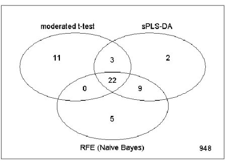
6. It can be useful to compare the level of overlap between the different feature selection strategies using a Venn diagram:
require(limma)
all.spots <- colnames(norm.data)
tmp.counts <- matrix(0, nrow=length(all.spots), ncol=3) for (i in 1:length(all.spots)) {
tmp.counts[i,1] <- all.spots[i] %in% sig.spots
tmp.counts[i,2] <- all.spots[i] %in% sig.spots.splsda tmp.counts[i,3] <- all.spots[i] %in% sig.spots.nbrfe }
colnames(tmp.counts) <- c("moderated t-test","sPLS-DA","RFE (Naive Bayes)") vennDiagram(vennCounts(tmp.counts))
The results (shown in Fig. 7) demonstrate that, though each strategy selects a distinct set of spots, there is a high degree of overlap between these sets.
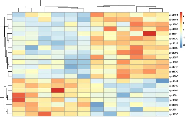
7. A final summary of the results, showing the 22 spots of the consensus set, can be generated as a heatmap (Fig. 8):
consensus.set <-
intersect(sig.spots,intersect(sig.spots.splsda,sig.spots.nbrfe)) require(pheatmap)
4. Conclusion
In this chapter, we demonstrated how to analyse a 2DE dataset from a simple one-factor experiment using R. Though real proteomic experiments often have more complicated experimental designs and richer metadata (i.e. more measured covariates for each sample/experimental unit), R can usually accommodate any type of analysis with relative ease, given its flexibility and the wide range of statistical tools available as R packages.
5. Notes
1. Some of these software packages can generate datasets with missing values. Though we assume the analysis of datasets without missing values, R has functions to address such situations, namely through either single imputation (implemented in packages such as impute, yaImpute, pcaMethods, missForest, Amelia, VIM, rrcovNA, missMDA and softImpute) or multiple imputation approaches (implemented in packages mi and mice).
2. While the provided example is a standard 2DE dataset, the described analysis approach can also be applied to multiplex 2DE (i.e. DIGE) datasets, even though the type of data is slightly different (abundance ratios rather than raw abundance values).
3. If the dataset does not have the required structure, R has specific functions that can help the user express his dataset in an appropriate form for analysis (e.g. function t(), to exchange rows with columns; functions melt() and acast(), from package reshape2, to convert datasets between formats).
4. If problems arise during this step due to operating system permission restrictions, the use of a local library is advised. Alternatively, this type of problem can often be bypassed on Windows by running R as administrator during package installation.
5. Most 2DE analysis software packages already perform some form of normalization. If you know that your analysis software performs adequate data normalization, you can skip this step.
6. On the other hand, when the visualization step suggests that most of the variation is not due to the experimental factors, or otherwise shows some level of heterogeneity (e.g. each of the two experimental groups is seemingly separated in two sub-clusters), it is essential to determine this source of variation. Possible sources of variation can include both biological (e.g. male vs. female, subject weight, subject age) and technical factors (e.g. different IEF/SDS-PAGE runs, different technicians, different dyes in the case of DIGE), which is why it is important to have as much metadata as possible about each “statistical sample” (i.e. each single 2DE gel or each single DIGE channel) and the underlying biological sample (“experimental unit”). In order to accurately assess the effects of the experimental factors, it is important to have into account the concurrent effect of non-experimental factors.
7. If a significant deviation from normality is observed, it suggests that there was either a problem with the data pre-processing (normalization and transformation) or that the classical linear models are not adequate to analyse the dataset. In the latter case, using more flexible models (e.g. generalized linear and generalized additive) or rank-based approaches (Wilcoxon-Mann-Whitney U-test, Kruskal-Wallis test) may be advisable. In either case, one should go back to the visualization step in order to determine a viable analysis strategy.
9. This code has been adapted to select only the X most "relevant" spots, where X is the number of spots considered differentially expressed by the univariate hypothesis testing approach.
Acknowledgement
Nadège Richard was supported by a post-doctoral grant (SFRH/BDP/65578/2009) from the Portuguese Foundation for Science and Technology (FCT).
References
1. Dowsey A.W., Morris J.S., Gutstein H.B. et al. (2010) Informatics and statistics for analyzing 2-D gel electrophoresis images. In: Hubbard J.S., Jones A.R. (eds) Proteome bioinformatics, Humana Press, New York, pp. 239–255.
2. Silva T.S., Richard N., Dias J.P. et al. (2014) Data visualization and feature selection methods in gel-based proteomics. Curr Protein Pept Sc 15, 4–22.
3. Hothorn T., Everitt B. (2009) A handbook of statistical analyses using R, 2nd edn.
Chapman & Hall/CRC, London.
4. Crawley M.J. (2012) The R Book. John Wiley & Sons, Ltd., Chichester, England.
5. Dowsey A.W., English J.A., Lisacek F. et al. (2010) Image analysis tools and emerging algorithms for expression proteomics. Proteomics 10, 4226–4257.
6. Rye M., Fargestad E.M. (2012) Preprocessing of electrophoretic images in 2-DE analysis. Chemometr Intell Lab 117, 70–79.
7. Wheelock M., Buckpitt A.R. (2005) Software-induced variance in two-dimensional gel electrophoresis image analysis. Electrophoresis 26, 4508–4520.
8. Chich J.-F., David O., Villers F. et al. (2007) Statistics for proteomics: Experimental design and 2-DE differential analysis. J Chromatogr B 849, 261–272.
9. Smyth G.K. (2004) Linear models and empirical bayes methods for assessing differential expression in microarray experiments. Stat Appl Genet Mol 3, 1–25.
10. Storey J.D., Tibshirani R. (2003) Statistical significance for genomewide studies. P
11. Artigaud S., Gauthier O., Pichereau V. (2013) Identifying differentially expressed proteins in two-dimensional electrophoresis experiments: Inputs from transcriptomics statistical tools. Bioinformatics 29, 2729–2734.
12. Cao K.-A.L., Boitard S., Besse P. (2011) Sparse PLS discriminant analysis: Biologically relevant feature selection and graphical displays for multiclass problems. BMC
Bioinformatics 12, 253.
13. Guyon I., Elisseeff A. (2003) An introduction to variable and feature selection. J Mach
Figures
Fig. 1. Scatterplot of each spot’s standard deviation against the rank of its mean value, before dataset normalization. The red line indicates a running median.
Fig. 2. Scatterplot of each spot’s standard deviation against the rank of its mean value, after dataset normalization. The red line indicates a running median.
Fig. 3. PCA scores plot, showing the PC1 and PC2 values for each sample (i.e. gel). The colour of each square (black or red) denotes class membership.
Fig. 4. Quantile-quantile plot (or Q–Q plot) that compares the quantiles of the distribution obtained by pooling all residuals (after studentizing them) against the theoretical quantiles of a standard normal distribution. The black line shows where the two agree (y = x).
Fig. 5. Scatter plot of excess kurtosis vs. skewness, for the residue distributions of each protein spot model. Black points show actually observed residue distributions (with the black vertical and horizontal lines showing the mean value). Grey points represent draws of standard normal variates with the same number of degrees of freedom as the empirical residue distributions (with the grey vertical and horizontal lines showing the mean value).
Fig. 6. Volcano plot, where effect significance (-log10(q-value)) is plotted against an estimate of effect size (Cohen’s d), for each spot. Green spots would be considered significant by taking “FDR < 5%” as selection criterion, while both green and red spots would be considered significant by taking “FDR < 10%” as selection criterion.
Fig. 7. Venn diagram displaying the number of spots selected by each feature selection approach, along with the level of overlap between the approaches.
Fig. 8. Heatmap displaying the expression of the 22 most relevant proteins using color-coding (red for “high expression” and blue for “low expression”). Samples (i.e. gels) and variables (i.e. spots) were ordinated using agglomerative hierarchical clustering.