Methodological proposal for the evaluation
of journalistic applications based on cards
Rita de Cássia Romeiro Paulino & Marina Lisboa Empinotti
Abstract
More and more journalistic content for smartphones is no longer based on other vehicles of the company, analogic or digital, and become appropriate for the new mobile environment. The card-based news design presents itself as a good solution for creating native mobile interfaces. In this work we discuss the major contributions of the “card” type interfaces for news applications for smartphones and describe an evaluation model for this type of content in order to offer a tool for systematizing and classifying researches in the areas of journalism, design, among others.
Keywords
App; cards; design; mobile journalism; smartphone
Resumo
Cada vez mais os conteúdos jornalísticos para smartphones deixam de ter como base outros veículos da empresa, analógicos ou digitais, e passam a ser próprios para o novo meio. O design de notícias baseado em cards se apresenta como uma boa solução para criação de in-terfaces nativamente móveis. Neste trabalho discorremos sobre as maiores contribuições das
interfaces do tipo cards ou “cartão” para aplicativos de notícias para smartphones e descrevemos
um modelo de avaliação para este tipo de conteúdo, a fim de oferecer uma ferramenta de siste-matização e classificação de pesquisas das áreas de jornalismo, design, entre outras.
Palavras-chave
Aplicativo; cards; design; jornalismo móvel; smartphone
Introduction
In 2017, smartphone usage continued to grow, following a trend of previous years, although with less force (Graph 1). Data from the Reuters Institute Digital News Report1 (RIDNR) 2017 shows that more people use their smartphone to access news, while less depend on a desktop computer to do so. Whereas older users are only now transition-ing from computers to smartphones, many in the younger generation have skipped the computer and only accessed news through the small screens.
1 Retrieved from: https://reutersinstitute.politics.ox.ac.uk/sites/default/files/Digital%20News%20Report%202017%20
Graph 1: The graphs show the rise of cell phone use in news consumption (a) and decline in the use of television and print as news sources (b) Source: Adapted from Newman, Fletcher, Kalogeropoulos, Levy & Nielsen, 2017
Also according to the Report (Newman, Fletcher, Kalogeropoulos, Levy, & Nielsen, 2017), smartphones have surpassed computers as the main device for accessing news. Mídia Dados (Media Data) shows a significant increase in preference for smartphone usage, with 92% versus 25% of users prefering the tablet. This scenario emphasizes the need to produce and debate journalistic content for smartphones.
In the early years of mobile applications development, the movement to adapt was similar to that observed when the Internet arrived, when printed products were entirely transposed into the network. Simply transporting web content to the mobile media did not offer a good user experience. Texts and media were not adapted to the size of the various cell phones on the market, and there was a need for a language that would adapt the content to different screen sizes. This situation gave rise to responsive design, a technique of structuring HTML and CSS, in which the site adapts to the user’s browser without having to define several style sheets for each resolution.
The use of responsive design when programming HTML sites ensures a more adapted visualization for texts, images and videos in mobile devices without loss of the content. But if on the one hand this technique solved the problem of visualization, on the other we lost the originality and exploration of the use of native resources. The texts are simply adapted in blocks and images and restructured for the size of the equipment.
As an alternative to mere automatic adaptation comes the organization through cards, which allows adaptation to the mobile environment without abandoning other conventions of Internet access and adds to the code of the page with properties related to the device or to the organization of the content (Mello et al., 2015). In this work, we will detail the design through cards in order to have sufficient foundation to present a methodological system of evaluation and study of this type of interface.
Cards – origin and applications
The organization of information in cards involves using small rectangles to expose images and texts that serve as entry points for more detailed information. The word “cards” is an excellent metaphor for the digital interface studied here, since they look like tangible real-world cards in user interfaces.
Before the web and mobile applications, cards were already common objects in different contexts, such as entertainment or personal presentation, making it intuitive to know that webdesign cards are just a piece of content, like the “offline cards”. As in real life, cards can be good for the application interface in many contexts, including news. Some of the applications that cards are best suited to are:
1. fragmentation of content: when developing content for websites, cards consolidate the idea of frag-menting it in chunks. This facilitates online reading, or scanning of the information, since large blocks of text can lead users to abandon reading. Cards divide content into coherent sections, much like organizing text in paragraphs;
2. agility: cards are a great tool for communicating fast stories, making content attractive without looking too long or too time consuming. Users can get involved in what interests them in any way they want;
3. ideal for finger navigation: a card-based interface is simple enough that it can be perfectly used with the tip of the thumb only even when using the device with a single hand. When one imagines the sliding of physical cards (in a deck, for example), one notices the similarity of the movement in order to move between pieces of information;
4. nice visualization: card interfaces use many images, and therefore also depend on them. The large exploration of visual content makes them attractive and provides a point of entry to the user’s gaze when navigating between cards.
This is why cards are particularly suitable for an interface to access news content on mobile devices: they are fast, shallow and usually in motion, at free intervals of the day that can be filled by phone usage (Mello et al., 2015). As the authors emphasize, these features are not suited for the access model in browsers or hybrid applications, which uses web pages within an application structure, because they involve a very long loading time and a long reading session, which is not compatible with the way information is consumed on devices such as smartphones.
Many of the most popular websites and applications currently benefit from card-based design. In social networks, we have Facebook (Figure 1a) as an example of the use of cards in the timeline of events. Cards summarize the content: in the case of news, for example, there is the title, a short summary, and a picture, which, after the click, takes the user to the complete material. In the case of Google+ (Figure 1b) cards are arranged in a similar way, in three columns, and grouped by theme.
(a) (b) Figures 1a and 1b: Facebook (a) and Google+ (b) interface
Reproduction Facebook and Google+
Applications like Tinder exemplify how cards offer expectation and a sense of “dis-covery”. The interface suggests sliding a card (Figure 2a) to the right if the person on the card is interesting (Figure 2b) and to the left if not interesting The expectation of not knowing what is contained in the next card incites the movement.
(a) (b)
Figures 2a and 2b: Tinder interface Source: Reproduction Tinder
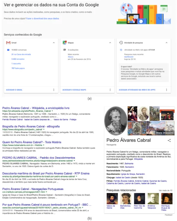
Besides Google+, Google makes extensive use of cards in its products. Figure 4a shows how the user finds all the information used in company programs in one place: Gmail, Google Maps, Google search, etc. In the latter, cards are still used when search-ing for content available on Wikipedia, for example. The information contained there generates an information block (Figure 3b) that appears to the user, without the need of selecting a related site in the search feed to find the information that the user is probably seeking.
(a)
(b)
Figure 3: Google and Google search interface Source: Reproduction Google
In the following topic we will present the specifics of the cards, when applied to the development of mobile interfaces. The shape of the cards can serve as a basis for texts, images and videos on small screens. From there it will be possible to introduce the de-veloped evaluation system.
Guidelines and card models for mobile development
Interfaces developed for mobile use follow visual patterns related to Android and iOS platforms. These have sophisticated visual component bases, with many customiz-able features and effects (Paulino & Empinotti, 2017). Thus, new ways of producing for mobile devices have been emerging and changing the journalistic practice, adding new values to the productive routines:
from this point of view, this means that mobile communication technolo-gies open new possibilities in journalism and, at the same time, have draw-backs that need to be investigated as a result of the same expression on the traditional practices affected in a zone of permanent tension. (Silva, 2013, p. 101)
It was the consolidation of tablets as communication devices, however, that en-couraged the development of aspects of the design of publications aimed at this new medium, since the layout and its features are central aspects of the user experience. Castellet (2012) highlights the improvements achieved in the HTML5 markup language, created in 2008, but consolidated in 2014, when the main layout tools adopted it, even if partially: Blink (Chrome and Opera), Gecko (Mozilla), Trident (Microsoft), and WebKit (iOS, Safari). HTML – Hypertext Markup Language – is used to structure and present content on the Web, and the number 5 indicates its fifth version, which can be seen as a viable alternative to the current applications system of the mobile scenario, according to the Spanish author. The organization based on cards allows for adaptating the con-tent to the mobile realm without abandoning other conventions of Internet access and for increasing the code of the page with properties related to the device or to the better organization of the content (Mello et al., 2015).
Specifically on touchscreen interfaces, cards support movements such as sliding (one finger slides across the screen in horizontal or vertical motion) and pick-up-and-move, and the possibility of multiple graphic arrangements. They also provide an entry point for information and prioritize the use of images; its content and quantity may vary following a standard aesthetic.
The entry point of a piece of information may contain a hierarchy within the card to direct the users’ attention to the most important information. Images can reinforce other content. However, their size and placement within the card depend on the size of the main content or how they are being used to complement other texts. Cards have a width defined by the application type and a variable height for content. Maximum height is limited to the amount of space available on a platform, but may be expanded tempo-rarily (for example, to display a comment field).
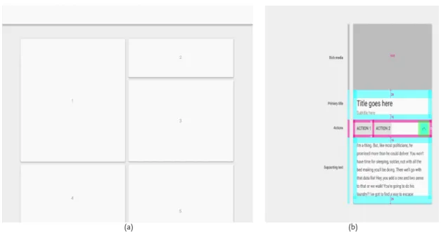
As seen in the examples in the previous topic, cards are often not presented alone but in collections, which can be ordered or filtered by date, file size, alphabetical order, or other parameters. The first item in the collection is positioned in the upper left corner. The order proceeds from left to right and from top to bottom. Cards can be built using content blocks that include: an optional header; A primary title; Rich Media (videos and audios); Support text; Actions.
Blocks can be organized to promote different types of content. For example, in titles the body of text can be emphasized by increasing its typographic scale. On the tab-let / desktop, the cards should follow the 24dp-dots orientation. It is recommended to limit the sliding gestures within an interface, so that they do not overlap each other. The pick-up-and-move gesture can be used if it is important for the user to be able to sort the cards within a collection.
For a visually harmonic grouping, similar characteristics are desirable: shape, color, direction, texture, etc. Gomes Filho (2015) portrays aspects that help in the graphic com-position for printed media. Gestalt comcom-position laws, which encompass patterns of vis-ual behavior, can be applied to digital media platforms (Figures 4a and 4b).
(a) (b)
Figures 4a and 4b: Cards with different sizes, but similar formats – Gestalt law (a) and card layout with areas for media, texts and links (b)
Source: Adapted from Paulino & Empinotti, 2017
Cards are highly adaptable to any breakpoints of the screens, and are therefore ide-ally suited to meet the adaptability criteria of responsive designs. Lined up side by side in a desktop interface, the interface can become vertical when viewed on small screens. Figure 5 (a and b) gives an example of this change.
(a) (b) Figures 5a and 5b: Cards on desktop (a) and mobile (b) interfaces
Source: Playback The Verge
Finally, when designing cards, one should always consider simplicity in reading and understanding of the textual part. The basic rule for typographic design, therefore, is to use simple types and contrasting color schemes. Solid color backgrounds maximize the ability to read letters, in tones opposite to the background (dark-light or vice versa). In addition, types on the same card should be varied with caution, taking into account that a single type should always be enough to express the contents of the card.
Nielsen and Budiu (2014) emphasize that cards have a presentation canvas of fixed size, that is, the developer positions the information within the predefined two-dimen-sional space until satisfied, which allows good layouts, but not to make it greater. It is therefore necessary for the user to proceed to a new card to obtain more information.
In the case of scrolling, the developer provides extended space as desired: “this way users have to skip less, but at the cost of a less interesting layout, because the designer cannot control what the users are seeing at a given moment”(Nielsen & Budiu, 2014, p. 50):
... scrolling caused major usability issues, especially since users often had to battle websites that were not optimized for mobile devices. In contrast to what happened in 1990, the problem was not that the users did not roll, it was that they rolled a lot. On mobile devices, they had to move their tiny viewing space back and forth so often that they lost control of where they were and what was on the page. Often, they rolled right through something without realizing it. (Nielsen and Budiu, 2014, p 51)
Theoretical framework for developing the evaluation system
The methodological evaluation system described here, based on the interface com-ponents of journalistic applications, is based on two previous studies and has already had a pilot test, presented in Paulino and Empinotti (2017), where three applications were evaluated according to the proposed model. The first study provides an approach of categories initially developed for the analysis of applications for tablets (Oliveira, 2013) based on two aspects: the interface studies of Bardin (1977), Nielsen (1993, 1995, 2011), Saffer (2009), and Bastien and Scapin (quoted in Cybis, 2003) with emphasis on the basic elements of interface development, such as cognitive, visual, ergonomic and in-teractive aspects; and in a conceptual relation between the features of webjournalism: interactivity, content customization, hypertextuality, multimedia and memory (Bardoel & Deuze, 2001, Palacios, 1999).
Pellanda et al. also investigate cards as a possibility for the presentation of jour-nalistic content. For the authors, the format facilitates the user’s reading experience by allowing “a way of handling and interacting with content that is specific to the digital medium, which may result in grouping information and sharing content” (2015,p. 179).
Nielsen and Budiu point to the importance of a clear presentation of content on mobile devices as they offer an impoverished user experience: “tiny screens, slow con-nectivity, higher interaction cost (especially when typing, but also due to users’inability to ‘double click’ or ‘hover’), and less precision in pointing due to the ‘fat finger’ prob-lem”(2014, p. 61).
First, then, Bardin’s reflection on categories creation, which presupposes, accord-ing to the author, the identification of similarities and groupaccord-ing of common elements, is appropriate here.
The analysis by thematic categories tries to find a series of meanings that the coder detects by means of indicators that are connected to it; (...) to encode or to characterize a segment is to place it in one of the classes of equivalences defined from the meanings, (...) according to the judgment of the encoder, (...) which requires complementary psychological qualities like the fineness, the sensitivity, the flexibility, from the coder to apprehend what matters. (Bardin, 1977 quoted in Caregnato & Mutti, 2006, p. 683)
Nielsen’s (1995) studies guide the notion of usability: a “quality attribute that as-sesses how easy user interfaces are to use” or “the quality of a user’s experience when interacting with a product or system” (Nielsen, 1993, p. 26). Two of the author’s studies are important in this scenario. The first evaluates the interfaces of websites accessed via desktop (1995) and the second uses iPads for usability evaluation (2011). In the case of websites, the categories applied (Oliveira, 2013) were:
• feedback / visibility of the status of the system; • suitability to the user’s language / correspondence; • control and liberty;
• consistency and patterns / conventions;
• error prevention;
• learning and recognition x memory and recall;
• flexibility and efficiency (shortcuts);
• aesthetics, dialogue and simple design;
• good error messages;
• help and documentation.
Subsequently, the usability evaluation in tablets was based on the following criteria (Oliveira, 2013):
• error: touch areas have basic errors;
• error: back button confusion;
• more applications on the market make users more familiar;
• forms are not well accepted on ipads;
• out-of-context animations irritate users;
• excessive browsing possibilities confuse the user; • applications should be user-initiated;
• when content focus is interaction, applications are more appropriate than websites; • ipads are used for games, e-mails, videos, social networks, and news.
The work of Saffer (2009) with gestural interfaces complements the findings of Nielsen (1995, 2011). There are ten categories listed: detectability; reliability; responsive-ness; adaptation and adaptation to the context; intelligence; meaningfulresponsive-ness; subtlety; fun; aesthetics; ethics. Finally, Bastien and Scapin (quoted in Cybis, 2003) defined eight ergonomic criteria that guarantee quality when building humanocomputer interfaces: conduction; work load; explicit control; adaptability; error management; homogeneity; meaning of codes and denominations; and compatibility.
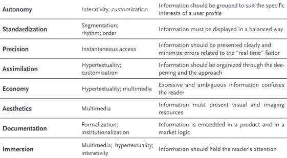
Oliveira (2013) offers a new approach (Table 1), grouping the already related catego-ries, but based on the their relationship with what the author calls “categories of online journalism” (Bardoel & Deuze, 2001; Palácios, 1999, 2004): interactivity; customization / customization of content; hypertextuality; multimedia / convergence; memory; instan-taneous access.
Summary of categories Related categories Meaning
Orientation Hypertextuality Information needs to be arranged in multiple
layers and multidirectional flows
Autonomy Interativity; customization Information should be grouped to suit the specific interests of a user profile
Standardization Segmentation; rhythm; order Information must be displayed in a balanced way
Precision Instantaneous access Information should be presented clearly and
minimize errors related to the “real time” factor
Assimilation Hypertextuality; customization Information should be organized through the dee-pening and the approach
Economy Hypertextuality; multimedia Excessive and ambiguous information confuses
the reader
Aesthetics Multimedia Information must present visual and imaging resources
Documentation Formalization; institutionalization Information is embedded in a product and in a market logic
Immersion Multimedia; hypertextuality; interativity Information should hold the reader’s attention
Table 1: The categories of the form of journalism in tablets, compilation of the interface with “online journalism” Source: Adapted from Oliveira, 2013
We sought to search for a more systemic view involving independent elements linked to technologies, more adequate to a card design application. The study by Silveira (2016) presents an approach on mobile digital narratives and approaches categories that define a pervasive environment based on previous studies (Bertocchi, 2014; Ramos, 2011; Saffer, 2009).
However, Silveira (2016) approaches the studies of specific categories for mobility and considers that the categories (Table 2) are directly related to the context of the differ-ent designs of the mobile devices and systemic narrative formats. We need to, therefore, analyze such categories when observing the interface presented by journalistic products created with this specificity.
Category Description
Geolocation Identification of the user’s geographic location.
Layered navigation Possibility of deepening the content according to the will and need of the user. Push notifications Automatically send alerts from user’s authorization.
Data streams Ability to store contents already seen by the user and, consequently, do not repeat them. Content customization Possibility to define what content you want to view.
Relationship with online social networks
Facilitating the ability to share content with other applications without necessarily having to leave the first one.
Use of algorithms Use algorithms to capture user data and from this define reading and consumption preferences.
Use of usability concepts The product is intuitive, offers feedback to the user of its actions and does not require instructions for use.
Table 2: Context related categories of different mobile devices designs and systemic narrative formats Source: Adapted from Silveira, 2016
Evaluation tool developed
It should be noted that many characteristics presented and defined by the catego-ries in Tables 1 and 2 are repeated, and complement or reveal new aspects about each other. For the cards methodology we define a new approach, removing the repeated categories or those that do not apply in the case selected. There are three aspects of in-terface analysis in cards, each with three or four categories:
• Aspects of the Form: Personalization, Precision, Aesthetics;
• Aspects of Mobile Journalism: Hypertextuality, Multimidiality (convergence); Memory, Interactivity; • Aspects of the Adopted Technology: Geolocation, Push notifications, Relationship with online social
networks, Movement.
Firstly, it is necessary to define a new category, with no theoretical precedents in the previous tables, which refers to the Movement (animations related to forms), an aspect suitable to mobile applications. The movement shows how an application is organized and what it can do:
• guidance between views;
• suggestions about what will happen if a user completes a gesture;
• hierarchical and spatial relationships between elements;
• distraction from what is happening behind the scenes (such as fetching content or loading the next view);
• have character, be aesthetic and playful.
Movements can attract other elements and join them as they approach each other. A transition from one card to another helps guide the user to the next step in an interac-tion, in addition to bringing focus to elements that need user attention.
Figure 6: Example of a movement (animation) in which a piece of information is initially presented as a topic and clicking on it expands the detailing of the information and actions (links)
Other aspects of the technology items refer to geolocation, push notifications, and social networking. In the first item we should consider aspects that include the location of the user and the content offered. “It is the application itself that promotes this cus-tomization, according to the georeferencing sensor: from the user location, the applica-tion interface displays the news directly related to the region from which it is accessed” (Palacios, Barbosa, Firmino e Cunha, 2014, p. 27). For this, sensors are built in to the devices: in general, current smartphone models rely on the barometer, magnetometer / compass and, above all, the GPS. Complementarily, it is considered that connections via wi-fi or mobile networks are also active, because systems such as Android have Assisted GPS (aGPS), which obtains the approximate location of the device through cell towers and wi-fi networks.
Push notifications are related to options so that the user receives alerts about infor-mation that interest them. If once it was necessary for the user to go search for content by free initiative (pull), with mobile journalism this reaches the user by others’ initiative, in the form of notices, alerts (push) (Fidalgo & Canavilhas, 2009). There are applications that besides offering the service (activate / deactivate), also allow the personalization of the subjects and / or of its frequency.
Regarding social networks, we identify the possibilities of integration between apps and social networks, both to capture information and to offer users the chance to share what they want quickly. For Essenfelder and Rainieri, there is nothing better to character-ize present times than the ubiquity of social networks on the Internet and the possible intersections between them: “people, spaces and technologies are all hyperconnected at the same time. Knowledge is individual but collective, crossed and shared” (2015, p. 10):
mobile device’s inclination and geolocation, when cross-referenced to user behaviors in social networks, for example, allow the customization of con-tent and services (Bardoel & Deuze, 2011) to be transposed to levels that are difficult to reach with other types of devices. (Canavilhas, 2014a, p.6)
Following to the Aspects of Form, we have: Personalization, Precision, and Aesthet-ics. The first item refers to the possibility of defining which content the user wants to view. Because they are personal, individual, mobile devices have a far superior potential for personalization than computers, possibly a shared device. “This customization should consider all contextual elements, such as where the consumer is, the time of access, type of activity he is doing, other preferences, etc.” (Canavilhas & Colussi, 2016, p. 206).
In Precision the instantaneous access is considered. In addition to being clearly presented, the information should not contain errors related to the “real-time” factor. Finally, Aesthetics is where items related to multimedia are framed. Visual and imaging resources should be incorporated into information and design.
Lastly, in Aspects of Mobile Journalism we have: Hypertextuality, Multimidiality (convergence), Memory, and Interactivity. In the first one the organizations applied to the information (links, connections) are studied in order to provide a deepening of what is being read and / or related facts, that may be of interest of the user. In the second, in
addition to the already seen Aesthetic item, we evaluate if there is excess information and / or ambiguities that make content confusing.
In Memory, we evaluate the ways of connecting news to the company’s database or to previously submitted content, so that the information provided is completed with pre-vious information. We also evaluate the possibility of search within the application. The last item to be considered is Interactivity, in which the intuitive ability of the application is sought, offering feedback to the user of their actions, with no need for instructions for use. Information should be grouped in a way that meets the specific interests of those who use it and should capture their attention. Table 3 shows the synthesis of the clas-sificatory system developed.
Aspects of the Form
Customization Information must be displayed in a balanced way; It should be possible to define which content the user wants to view Precision Information should be presented clearly and minimize errors rela-ted to the “real time” factor
Aesthetics Information must present visual and imaging resources
Aspects of Mobile Journalism
Hypertextuality Information should be organized and provide detailing and diffe-rent approaches
Multimedia Excessive and ambiguous information confuses the reader
Memory Connection to the company database or to previously submitted content; Search tool should be available Interactivity Interaction between the media and the readers in the instances of selection, intervention, and participation
Aspects of the Adopted Technology
Geolocation Information must present visual and imaging resources
Push notifications Automatically send alerts, if authorized by the user
Relationship with
on-line social networks Allow to share content with other applications without necessarily having to leave the first one
Movement Animations related to formats; They show how the app is organi-zed and what options can be triggered from each movement
Table 3: Synthesizing the classification model developed to evaluate card-based apps
This system can be applied in several manners, and here we recommend three dif-ferent ways:
1. Considering the presence or the absence of the evaluated items. In this case, one draws a table similar to Table 3, adding only one column called “present” and one called “absent”, to the right. After the evaluation of the application, the option found should be marked
2. Considering the level found for each evaluated item in each application. Similar to the previ-ous one, but with three levels of classification: “implemented”, “partially implemented”, or “not implemented”.
3. In a free discourse way, as Oliveira (2014) did. In this case, one does not work with a table, but with free text, in which the observed behavior is described, item by item. One example is the author’s model for evaluating Brazilian apps for tablets: “the three applications are connected to the visual identity of the other media of their journalistic organizations. The Diário Catarinense and Estadão Noite are modest applications when compared to the O Globo A Mais, This last app draws special attention photographs, videos, infographics, illustrations and animations “(Oliveira, 2014, p. 186).
Final considerations
This paper presents a methodology for the evaluation and systematization of jour-nalistic application interfaces for mobile devices based on cards. We have seen how the organization of information in cards refers to different forms in everyday life, applying to the mobile scenario to present fragmented content, in an agile and visually pleasing way, among other advantages listed.
The space for content provision is small in mobile devices, but with the movement (animation) of the cards we can use layers of information. Animation on cards holds more content in layer sub-levels. This form of visualization favors an immersion in layers of media, layers of texts that in the end are grouped in new cards. Therefore, we decided to add an item related to the Movement to the categories of analysis proposed, derived from previous studies by Oliveira (2013), and Silveira (2016). The effective use of these movements deserves attention in future works, in order to find new ways of organizing mobile content.
We reaffirm that the methodological evaluation system described here, based on interface components of journalistic applications, has already had a pilot test, presented in Paulino and Empinotti (2017). The analysis of three applications did not find the in-corporation of Movement items, but detailed the appropriation of the other categories included in the methodological proposal. We emphasize the use of cards as a mobile interface option, and we recommend more in-depth research that follows the user’s ex-perience in interacting with the cards and includes tests with form aspects and editorial elements such as texts, media types, links and visual organization to see if what is being developed meets the needs of consumers.
Translated by Marina Lisboa Empinotti References
Bardoel, J. & Deuze, M. (2001). Network journalism: converging competences of media professionals and professionalism. Australian Journalism Review, 23(2), 91-103.
Bardin, L. (1977). Análise de conteúdo. Lisboa: Edições 70.
Bertocchi, D. (2014). Dos dados aos formatos: o sistema narrativo no jornalismo digital. Paper presented at XXIII Encontro Anual da Compós, Belém.
Canavilhas, J. (2014). A reportagem paralaxe como marca de diferenciação da Web. In P. R. Rey & C. G. Pisonero (Eds.), Contenidos innovadores en la universidad actual (pp. 119-129). Nova Iorque: McGraw-Hill Education.
Canavilhas, J. & Colussi, J. (2016). Jornalismo em ambientes multiplataforma: diálogos convergentes.
ÂNCORA-Revista Latino-Americana de Jornalismo, 3(1), 194-213.
Caregnato, R. & Mutti, R. (2006). Qualitative research: discourse analysis versus content analysis. Texto
Castellet, A. (2012). El ecosistema del contenido móvil: actores, líneas de evolución y factores de disrupción. Tese de Doutoramento, Universidad de Murcia, Murcia, Espanha. Retrieved from https://dialnet.unirioja.es/ servlet/tesis?codigo=95771
Cervo, A. L. & Bervian, P. A. (1983). Metodologia científica: para uso dos estudantes universitários. São Paulo: McGraw-Hill do Brasil.
Cybis, W. de A. (2003). Engenharia de usabilidade: uma abordagem ergonômica. Retrieved from http://www. unicamp.br/~ihc99/Ihc99/AtasIHC99/AtasIHC98/Cybis.pdf
Fidalgo, A. & Canavilhas, J. (2009). Todos os jornais no bolso: pensando o jornalismo na era do celular. In C. Rodrigues (Ed.), Jornalismo on-line: modos de fazer (pp. 96-146). Rio de Janeiro: PUC Rio.
Gomes Filho, J. (2015). Gestalt do objeto: sistema de leitura virtual da forma. São Paulo: Escrituras Editora. Mello, A. F. de, Pase, A. F., Goss, B. M., de Souza, D. R., Pellanda, E. C., dos Santos, F. F. & Sica, K. (2015).
Jornalismo adaptado a novas telas: um estudo da linguagem jornalística nas novas interfaces móveis. In J. Canavilhas & I. Satuf, Jornalismo para dispositivos móveis: produção, distribuição e consumo (pp. 83- 102). Covilhã: Livros LabCom.
Newman, N., Fletcher, R., Kalogeropoulos, A., Levy, D. A. & Nielsen, R. K. (2017). Reuters Institute Digital
News Report 2017. Retrieved from https://reutersinstitute.politics.ox.ac.uk/sites/default/files/Digital%20
News%20Report%202017%20web_0.pdf
Nielsen, J. (1993). Usability engineering. Boston: Academic Press.
Nielsen, J. (1995) 10 usability heuristics for user interface design. Retrieved from http://www.nngroup.com/ articles/ten-usabilityheuristics/
Nielsen, J. (2000). Projetando websites. Rio de Janeiro: Editora Campus.
Nielsen, J. (2011). iPad app and website usability. Retrieved from https://www.nngroup.com/reports/ ipad-app-and-website-usability/
Nielsen, J. & Budiu, R. (2014). Usabilidade móvel. Rio de Janeiro: Elsevier.
Oliveira, V. R. de (2013). Interfaces jornalísticas em tablets: o design digital da informação nos aplicativos móveis. Masters dissertation, Universidade Federal de Santa Catarina, Florianópolis, Brasil. Retrieved from https://repositorio.ufsc.br/handle/123456789/122597
Palacios, M. (1999). O que há de (realmente) novo no jornalismo on-line. Conference given on occasion of the public tender for Professor Titular at na FACOM/UFBA, Salvador, Bahia.
Palacios, M., Barbosa, S., Firmino, F. & Cunha, R. (2014). Aplicativos jornalísticos vespertinos para tablets. Cartografia do fenômeno ante o desafio de uma produção original e inovadora. Sur le journalisme About
journalism Sobre Jornalismo, 3(2), 40-55.
Paulino, R. & Empinotti, M. (2017). Interatividade e visualização de notícias em apps: um design baseado em
cards. Paper presented at 15 SBPJOR, São Paulo.
Pellanda, E. C., Pase, A. F., de Mello, A. F., da Silva, F. C. V., dos Santos, F. F. & da Cunha, K. S. (2015). Estudo sobre “Cards” como uma linguagem do jornalismo para um contexto de telas com diferentes funções.
Contemporanea-Revista de Comunicação e Cultura, 13(1), 177-192.
Ramos, D. O. (2011). Formato, condição para a escrita do jornalismo digital de bases de dados: uma contribuição
da semiótica da cultura. Doctoral thesis, Universidade de São Paulo, São Paulo, Brasil. Retrieved from
Rodrigues, J. M., Pereira, J. A., Sardo, J. D., de Freitas, M. A., Cardoso, P. J., Gomes, M. & Bica, P. (2017).
Adaptive card design UI implementation for an augmented reality museum application. Paper presented at
International Conference on Universal Access in Human-Computer Interaction, Vancouver, Canadá. Saffer, D. (2006). Designing for interation. Creating innovative applications and devices. San Francisco: New
Riders Publishing.
Silva, F. F. da (2013). Jornalismo móvel digital: uso das tecnologias móveis digitais e a reconfiguração das rotinas
de produção da reportagem de campo. Doctoral thesis, Universidade Federal da Bahia, Salvador, Brasil.
Retrieved from https://repositorio.ufba.br/ri/handle/ri/13011
Silveira, S. (2016). Design de conteúdos jornalísticos pervasivos: o formato da narrativa digital móvel. Paper presented at XXXIX Congresso Brasileiro de Ciências da Comunicação, São Paulo.
Biographical notes
Rita de Cássia Romeiro Paulino is a PhD Full Professor at the Journalism Under-graduate Programe and the Graduate Program in Journalism of the Federal University of Santa Catarina (UFSC)
E-mail: [email protected]
Address: Rua Estilac Leal, 129 bloco C h105, Florianópolis – Brazil – 88080760 Marina Lisboa Empinotti is a journalist and Master in Journalism from the Federal University of Santa Catarina (UFSC), Brazil. She is a PhD student in Communication Studies – FCT at the University of Beira Interior (UBI), Portugal.
E-mail: [email protected]
Address: Estrada da Circunvalação, 7762E h23, Porto – Portugal – 420-162 * Submitted: 30.11.2017