ABSTRACT: Even though data visualization is a common analytical tool in numerous disciplines, it has rarely been used in agricultural sciences, particularly in agronomy. In this paper, we discuss a study on employing data visualization to analyze a multiplicative model. This model is often used by agronomists, for example in the so-called yield component analysis. The multiplicative model in agronomy is normally analyzed by statistical or related methods. In practice, unfortu-nately, usefulness of these methods is limited since they help to answer only a few questions, not allowing for a complex view of the phenomena studied. We believe that data visualization could be used for such complex analysis and presentation of the multiplicative model. To that end, we conducted an expert survey. It showed that visualization methods could indeed be useful for analysis and presentation of the multiplicative model.
Keywords: multiplicative model, complex trait, graphical methods
Data visualization in yield component analysis: an expert study
Agnieszka Wnuk1*, Dariusz Gozdowski1, Andrzej Górny2, Zdzisław Wyszyński3, Marcin Kozak4
1Warsaw University of Life Sciences/SGGW – Dept. of Experimental Design and Bioinformatics, Nowoursynowska 159 – 02-776 – Warsaw, Poland.
2Institute of Plant Genetics Polish Academy of Sciences, Strzeszyńska 34 – 60-479 – Poznań, Poland. 3Warsaw University of Life Sciences/SGGW – Dept. of Agronomy.
4 University of Information Technology and Management in Rzeszów – Dept. of Quantitative Methods in Economics, Sucharskiego 2, 35-225 – Rzeszów, Poland.
*Corresponding author <[email protected]>
Edited by: Thomas Kumke
Received November 23, 2015 Accepted May 23, 2016
Introduction
Agronomists and plant breeders often conduct factorial experiments to study influence of yield com-ponents on crop yield. This influence is described by the multiplicative model (e.g. Sparnaaij and Bos, 1993; Piepho, 1995; Kozak and Mądry, 2006):
1 2
1
k
k i
i
Y X X X X
=
= ⋅ ⋅ ⋅ =
∏
(1)where Y is a complex trait (e.g. plant grain yield per unit area), while X1, X2, … , Xk are multiplicative components of the complex trait (e.g. of plants per unit area and mean plant yield). Methods of so-called yield component anal-ysis are used to analyze the model (1). These methods should take into account an order in which yield com-ponents develop during ontogeny: they can develop in a particular sequence or at the same time. Different meth-ods are used for these two scenarios: sequential yield component analysis (e.g. Eaton and Kyte, 1978; Eaton and MacPherson, 1978) for the former and non-sequential yield component analysis (e.g. Piepho, 1995; Kozak, 2004) for the latter. In addition, a valid method for the yield component analysis will not ignore the multiplicative na-ture of the model (1). A proper analysis of the model (1) allows one to answer some questions about that model: Which components in the multiplicative model have the strongest influence on the complex trait? Is this influence positive or negative? Unfortunately, these methods usu-ally provide only a small amount of information about model (1) and offer poor interpretation possibilities for agronomists and plant breeders (for more details see Fra-ser and Eaton, 1983; Sparnaaij and Bos, 1993; Kozak and Mądry, 2006; Kozak and Verma, 2009).
These drawbacks can be overcome by using data visualization to support analysis and interpretation of data following the model (1). Unfortunately, agronomy has missed its chance to use data visualization even though many scientific fields benefit from data visualiza-tion (Kozak, 2010a). This paper, thus, aims to study the usefulness of graphical methods in analyzing the multi-plicative model (1) in agronomy and plant breeding re-search. We will study this by means of the expert study. It will be the first report of this type of research.
Materials and Methods
Visualization techniques
The visualization techniques used in the survey were as follows (Figure 1):
A) Bubble plot (e.g. Cleveland, 1994; Jacoby, 1998; Harris 1999). This graph is used for the 3D data. Two variables are presented on the axes of the plane while a third vari-able is coded by size (area or diameter) of a circle; other symbols are seldom used. We used the circle diameter, which is usually considered the best choice (e.g. Wilkin-son, 2005; Markus and Gu, 2010 ; Madsen, 2011; Rou-gier et al., 2014). One can use the circle color to code information about possible groups in the data.
maxi-Figure 1 − Types of graphs studied in the expert survey. Starting from the left, the types are : (A) bubble plot, (B) parallel coordinate plot, (C) two-side plot, (D) MM-contour plot, and (E) HEX-MM-contour plot.
mum of the variable they represent. On axes, only two values are shown (minimum and maximum values). One can use color and type of line to code information about groups.
C) Two-side plot. This graph is used for 3D data. It is built based on a 2D scatter plot, but the x-axis is di-vided into two axes (each for one variable) while the y-axis remains unchanged. The lines in the graph area connect data points for the same observation unit. One can use color and type of points to code information about groups.
D) MM-Contour plot (Wnuk et al., 2013). This graph is used for 3D data. It is based on a contour plot in which two variables are presented on the axes. The third vari-able is represented by additional lines inside the plotting region; these lines are determined by the multiplicative model and can be treated as a third axis. One can use color and type of points to code information about groups. E) HEX-MM-Contour plot, that is, the hexbinplot (Carr et al., 1987) joined with the MM-Contour plot. This graph
is used for large 3D data. The original hexbinplot is use-ful for large 2D data sets. It is based on a 2D scatter-plot, but instead of plotting single observations, they are combined into bins. Frequency of the observations in the bins is represented by the bin color. The HEX-MM-Contour plot uses additional lines added to the plotting region (like those in the MM-Contour plot) to present 3D data. In this graph, it is not possible to code information about groups.
Plant material
The graphs studied were used for data from two field experiments: (i) with winter wheat and (ii) with spring barley.
Winter wheat
The data were obtained from a filed experimental conducted in Poznań in 2006. The one-factor experiment was arranged in the randomized complete block design with 32 genotypes (factor levels) of winter wheat (breed-ing lines included) in three replications. The experiment was set up at the light, sandy-loam soils with low content of plant-available nitrogen; soil was classified as medium or low quality. Nitrogen fertilizer was applied at the dose 76 kg N ha−1 (divided in three sub-rates); other fertilizers
were supplied at optimal rates. During the vegetation season, the fields were irrigated and standard chemical protection was applied. Field was divided into plots (size 1.7 m−2; about 300 plants m−2). Grain yield and biomass
yield (only vegetative parts) were measured from about 20 randomly selected plants per plot. The harvest in-dex (HI) was calculated according to the formula HI = grain yield / biomass yield. We considered a multiplica-tive model of grain yield (t ha−1) as a product of two
non-sequential components: biomass yield (t ha−1) and
harvest index. This model was visualized in a bubble plot, a parallel coordinate plot, a two-side plot, and an MM-Contour plot.
Spring barley
This field experiment with spring barley was conducted in Chylice, Poland, in three growing sea-sons (1999, 2001, 2002). A three-factor experiment ar-ranged as a split-plot design was conducted in four replications. The following factors were studied: geno-type (2 levels), sowing date (2 levels) and N fertiliza-tion (4 levels). Experiment was set up on phaeozem classified as good quality soil. In the main plots (sub-blocks), genotype and sowing date were distributed randomly in blocks, and N fertilization within sub-blocks. From these plots, various yield-contributing characters were calculated or measured. Full data con-tain 48 combinations and about twenty-two thousand observations. We analyzed a sequential multiplicative
model of grain yield per spike (mg) as a product of number of grains per spike and average grain weight per spike (mg) (usually represented by thousand grain weight). Average grain weight per spike was calcu-lated as ratio of grain yield per spike and number of grains per spike, which two variables were directly measured. In the expert study, this model was visual-ized by HEX-MM-Contour plot.
In the expert survey bubble plot, MM-Contour plot, parallel coordinate plot and two-side plot were de-veloped for two research situations with raw data for 7 and 32 genotypes of winter wheat in three replica-tions (respectively n = 21 and n = 96), and HEX-MM-Contour plot was made for 1 genotype of spring bar-ley in 8 experimental combinations (n = 4086). These research situations differ in number of observations, number of factors and their levels in the experiment, as well as order of development of yield components during ontogeny.
Expert survey
We conducted an expert survey in Sept and Oct 2012 among ten experts from eightuniversities and re-search institutes in Poland. Five experts were agrono-mists working with factorial experiments, including studies on yield components' and the other five experts were statisticians (specialized in statistics for agricul-tural sciences). At the beginning of each interview, the experts were informed about the objective of the study, its outline, and expectations from the expert. The per-son conducting the survey (Agnieszka Wnuk) explained and described the graphs to the expert (on a color pa-per sheet). Later, the expa-perts also received a color papa-per sheet with each graph, with a description of the experi-ment and the model (see the subsection Plant material). The experts were asked to read this material and answer the questionnaire (in unlimited time).
The survey questionnaire included eight tions. However, in this paper we focus on two key ques-tions where the experts evaluated the usefulness of the graphs in two aspects of their use: possibility of (i) reading and (ii) interpreting data in the multiplicative model. These questions were as follows: “Please rate simplicity of reading data from this graph” and “Please rate simplicity of interpreting data in the multiplica-tive model from this graph”. The questions were closed and we used a five-point scale to describe whether the graph is: very easy, easy, medium, difficult, very diffi-cult in these aspects. To be effective in reading data, the graph must allow for decent visual estimation of the values for most observations. It means that the graph does not have elements that can obscure observations, scales must help estimate the values of all variables, all groups need to be easily identified and distinguishable in the graph, etc. On the other hand, a graph is effective in interpreting data in the multiplicative model when it allows one to study data structures, i.e., relationships between the variables in the model, outlier values, vari-Figure 2 − Trellis version of scatter plot for artificial data with 3
ability of the variables, etc. Raw data are analyzed to study relationships between the variables in the model for each level of the grouping factor or factor combina-tions (Kozak and Verma, 2009). These graphs should al-low one to determine which components have a greater influence on the complex trait (e.g. yield). Coding all three variables in the model must be effective and should allow for an easy analysis of the relationships between these variables.
For each scale point from the five-point scale val-ues +2, +1, 0, –1, –2 were assigned. The total rating of graph for the group (independently) takes range form +10 to –10, where:
– total rating from +10 to +4 represents a graph that is very easy or easy in reading/interpreting data
– total rating from +3 to –3 represents the graph that is at medium difficulty in reading/interpreting data
– total rating from –4 to –10 represents a graph that is difficult or very difficult in reading/interpreting data
Mean absolute deviation (MAD) was used to es-timate variability of the expert opinions (within each group) about usefulness of the graphs. A high MAD val-ue represents a large variation in the opinion of the ex-perts (in groups) on the reading or interpreting data from the graph, while a low value represents small variation (so, large agreement).
All graphs and calculations in this paper were performed in R (R Core Team, 2015) with the help of the packages graphics (R Core Team, 2015) and lattice (Sarkar, 2008).
Results
Figure 3 shows the results of the expert survey. For raw data with seven genotypes of winter wheat in three replications, bubble plot, MM-Contour plot and two-side plot, according to both groups of experts, allowed for easy or very easy reading and interpreting data on the multiplicative model. However, for the two-side plot, an average mean absolute deviation (MAD = 0.96) was ob-served in the agronomist group for interpretation data in the multiplicative model (Figure 4). Three out of five experts claimed that this graph was very easy to use, but the two others claimed it was at medium difficulty. However, only one of these two experts reported doubts about possibilities of interpretation 2D relationship be-tween variables on the divided axes (OX). There was also some variation connected with reading data (MAD = 0.72). For these both aspects, statisticians considered the two-side plot easy or very easy to use with small MAD (Figure 4). Both groups evaluated parallel coordi-nate plot as offering a medium difficulty for reading data (with average MAD within groups; Figure 4). However, the groups assessed its interpretation possibilities differ-ently (Figure 3): for agronomists it was easy to use, while for statisticians it was of medium difficulty. In both cas-es, the opinions had average variability (Figure 4). For such data, as discussed above (with the small number of observations, 7 groups 3 replications each), they showed minor differences in usefulness between the graphs.
The second column in Figure 3 shows the results of the expert survey for the data with 32 genotypes of winter wheat (in 3 replications). The larger number of observations (n = 96) and groups (32 genotypes) caused a substantial decrease of the usefulness for all graphs
compared to the previous situation (Figure 3). Accord-ing to the experts, this was mainly due to difficulties in recognizing the genotypes and overlapping of the points. Reading and interpreting the data in bubble and paral-lel coordinate plots were difficult or very difficult (both groups were very consistent in this assessment − note the small MADs in Figure 4). Genotypes were very dif-ficult to recognize because of the large overlap and the color use to code information on 32 genotypes. Note that for parallel coordinate plot and bubble plot, it is also possible to use type of line or circle line to differ-entiate genotypes; however, for so many observations it would not be effective either (e.g. Cleveland and McGill, 1984b; Mackinaly, 1986; Wilkinson, 2005).
A relatively smaller decrease of usefulness than that observed for the two above-mentioned graphs was observed for the MM-Contour plot and two-side plot. Both groups of experts claimed that reading data and interpreting of the multiplicative model from two-side plot is of medium difficulty (Figure 3). However, for statisticians, an average MAD was observed while for agronomists, the answers were more scattered (Figure 4). Seven out of ten experts reported problems with over-lap and ineffective recognition of some genotypes, and, therefore, difficulties with interpretation of the 2D re-lationship between the divided axes. The MM-Contour plot was evaluated as easy for reading data by agrono-mists, but with high MAD of 1.44 (Figure 4). This was because three agronomists considered this graph very easy to read, but the other two claimed it was difficult. However, these two experts did not offer any particu-lar comments to justify such a low grade. The agrono-mists evaluated interpretation of the model as medium difficulty, with MAD = 1.28. In this case, three experts
evaluated the graph as very easy or easy, one expert as of medium difficulty, and one as difficult to interpret data. Statisticians, however, claimed that the usefulness of the MM-Contour plot was of medium difficulty for both aspects. They were not consistent in their assessments, with MAD of 0.80 for reading and 1.12 for interpreting data (Figure 4). Both the MM-Contour plot and two-side plot are more useful for a large number of observations than the bubble plot or parallel coordinate plot. This is probably because these graphs use color and type of point to code information about groups, which makes the groups easier to recognize when overlap is large.
For data with 32 genotypes (in three replications), most of the studied graphs are difficult to use. The MM-Contour plot and two-side plot are more useful than the other graphs; nevertheless, the user may have problems to recognize genotypes. This can make data interpreta-tion almost impossible in some cases (e.g. with bubble plot or parallel coordinate plot). We must remember that for raw data, it is crucial to analyze the relative strength of the components influence on the complex trait for each genotype. This is why we decided to use a trel-lis version of the graphs. Instead of coding information about groups in color, type of points, or both, they are now placed in separate panels (like in Figure 2). This makes reading and interpreting data for a single geno-type easier.
Summary of the expert survey
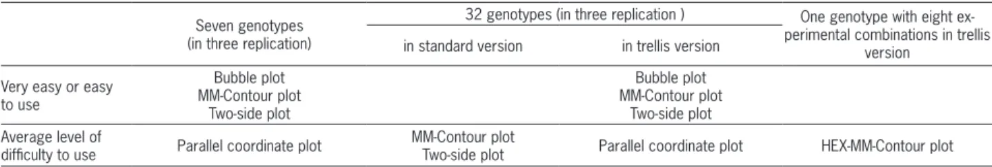
Table 1 shows graphs that can be recommended for analysis and presentation of raw data in the multipli-cative model. For data with seven genotypes of winter wheat (in 3 replications), the bubble plot, MM-Contour plot and two-side plot can be used. The parallel coor-dinate plot might be used as well, but clearly, its use-fulness is smaller than that of the previous graphs. In the case of data with 32 genotypes of winter wheat (in 3 replications), one can use the MM-Contour plot and two-side plot (in their standard versions) (Table 1). The MM-Contour plot and two-side plot in standard versions require sufficient attention by the user; nevertheless, their trellis versions will be more useful. Reading and interpreting data will be easier, and groups will not have to be differentiated by color or type of point; but at the same time, such graphs require more space. Both bubble and parallel coordinate plots showed to be useful only in the trellis version. For data with a large number of ob-servations and factors, HEX-MM-Contour plot (in trellis version) is of medium difficulty.
Discussion
Data visualization is a rapidly developing disci-pline of knowledge. Thanks to the development of com-puter techniques, graphs are better and better adapted to specific tasks of data analysis than a few years ago (e.g. Cleveland and McGill, 1984a, 1985; Cleveland 1993; Krzanowski, 1997; van Wijk, 2005). The analysis and presentation of the multiplicative model in agron-omy and plant breeding are examples of such specific tasks. As far as we know, graphical methods have rarely been used for this purpose. Usually, a scatterplot was used, but it focuses on presenting a 2D relationship be-tween traits. Thus, how could it be effective? Not only does the model (1) include at least three variables, but also the variables are in a specific (non-linear) relation-ship. To support this task, then, we proposed several three- and multidimensional graphs and conducted the expert survey to verify whether they can be useful to analyze the model (1).
Expert studies are often used in various areas of science, wherever deep knowledge about a certain top-ic is required. For example, to evaluate such complex topic as the multiplicative model, one should have in-terdisciplinary knowledge of statistics, agronomy, and evaluations for interpretation, with MAD = 1.12 (Figure
4). This resulted from an extreme grade of one of the experts, in whose opinion the graph was very difficult to use. Since this expert did not have any specific com-plains, we do not know why he gave such a low grade. The remaining experts evaluated the trellis version of bubble plot as very easy or easy to interpret data. Both groups evaluated parallel coordinate plot in the trellis version as easy for reading data, but of medium diffi-culty for interpreting data (Figure 3). The within-group experts’ opinions on this graph were more varied for the trellis version than for the standard version (Figure 4). The trellis version of the two-side plot was evaluated as easy or very easy to use. MAD, however, was smaller (as compared to its standard version) but still on the average level for agronomists; statisticians were more consistent (Figure 4). The trellis version of MM-Contour plot was evaluated as easy or very easy to use for both aspects (Figure 3). Also, the within-group variability for this graph was much lower than for the standard version. It is rather clear, then, that when 32 genotypes were stud-ied, the graphs in the trellis version were much more useful than their respective standard forms. This was because the groups were easier to distinguish when pre-sented in separate panels than by different points or line types.
The HEX-MM-Contour plot was presented only in the trellis version because of the large number of ob-servations and factor combinations of the data we used. The experts evaluated this graph for one genotype of spring barley, in eight experimental combinations (n = 4086). The results are not shown in the graphical version because this graph would include only two observations. Statisticians claimed that both reading and interpreting data in the multiplicative model had medium difficulty (mean grades were 3 and 2 with respective MADs of 0.72 and 0.48). Agronomists, on the other hand, evaluat-ed this graph as easy or very easy in both these aspects: six for reading data (MAD = 0.96) and four for interpret-ing data in the model (MAD = 1.44). MAD for inter-preting data was so large because three experts claimed that this graph was very easy to use, one of them that it was of medium difficulty, but one that it was very dif-ficult to use. A similar situation was observed for reading data. The experts in both groups reported problems with proper interpretation of the strength and direction of the relationships between all variables.
Table 1 − Graphs that can be recommended for analysis and presentation of raw data in the multiplicative model. The table contains graphs that were evaluated by the experts as very easy, easy or of medium difficulty to use at least.
Seven genotypes (in three replication)
32 genotypes (in three replication ) One genotype with eight ex-perimental combinations in trellis
version in standard version in trellis version
Very easy or easy to use
Bubble plot MM-Contour plot
Two-side plot
Bubble plot MM-Contour plot
Two-side plot Average level of
difficulty to use Parallel coordinate plot
MM-Contour plot
plant breeding. Expert studies are common, but they have rarely been used to evaluate usefulness of data visualization. Rare examples are studies conducted by Donaldson-Selby et al. (2007), evaluating the credibility and potential usefulness of the photo-realistic visualiza-tion of urban greening; Sanyal et al. (2010), evaluating the usefulness of visualization for operational weather forecasting; or Opiyo and Horvath (2010), evaluating the usefulness of the holographic displays for 3D product vi-sualization. Our study showed that the proposed graphs could indeed be complementary to traditional yield com-ponent analysis. The graphs actually allow for an easy analysis and comprehensive interpretation data in the multiplicative model, helping to answer questions that methods of multiplicative model analysis might fail to answer. The study also showed that the experts were willing to use the proposed graphs in their work with the multiplicative model.
A number of observations and a method of coding information about groups are the key criteria of whether a graph will be useful to analyze the multiplicative mod-el. For a small number of groups and observations (such as seven genotypes of winter wheat with three replica-tions per genotype), all proposed graphs could be used. Still, the parallel coordinate plot will likely be slightly less effective than the others due to its atypical coordi-nate system. For such data, the way of coding informa-tion only slightly differentiates usefulness of the graphs. However, for a larger number of groups and observations (e.g., 32 genotypes of winter wheat with 3 replications per genotype), it would be difficult to use any of the pro-posed graphs. The reason is a large overlap of points and difficulties in recognizing groups. A combination of color and type of points (like used in MM-Contour plot and two-side plot) is usually more useful to code information about groups than color only (like in parallel coordinate plot and bubble plot). The use of color for this purpose is less effective because it strongly depends on a possibility of recognizing and distinguishing colors by the reader (a difficult task for color blind people) or equipment qual-ity (monitor, printer, projector) (e.g. Few, 2006; Zeileis et al., 2009; Wegman and Said, 2011). According to many researchers, using both color and type of points provides the highest distinguishability especially for a large num-ber of observations and groups (e.g. Chamnum-bers et al., 1983; Cleveland and McGill, 1984b; Cleveland, 1994).
Another important issue is a way of coding all three variables in a graph. It can affect quality of both reading and interpreting the data. According to Cleveland and McGill (1984a), the position of the symbol along the axis is the most precise reading of observation values, more precise than for example by length or area of the symbol. For the two-side plot, which uses axes to present all vari-ables in the model (1), experts reported problems only with reading data for a large number of observations (32 groups), but they still considered the graph useful. Ex-perts also pointed out small problems with interpreting the relationship between variables represented on the
divided axes. Although the direction of the relationship between these variables is easy to see, determining its strength is not. Although possible, it is not as intuitive as in the standard scatter plot (the modification of which two-side plot is). It usually takes time to get used to such untypical graphs. The parallel coordinate plot is also an untypical graph. Both agronomists and statisticians reported many additional problems with it. Although commonly used for multidimensional data sets (Ge et al., 2009; Kozak 2010b; Kusano et al., 2011; Eastham et al., 2012; Winderbaum et al., 2012), it is relatively new. Its unusual coordinate system can be problematic for a new user (Wegman, 1990; Wegman and Carr, 1993; Kozak, 2010b). It has advantages, such as possibility of present-ing more than three variables, which is not the case with most of the other graphs studied. However, this does not affect our conclusion that the parallel coordinate plot is not useful for the multiplicative model.
The remaining graphs (bubble plot, MM-Contour plot and HEX-MM-Contour plot) present two variables on the axes of the plane and a third variable by using a reference line or diameter of the circle. Coding infor-mation about a third variable is always problematic, because it is linked to reducing quality of reading or interpreting data on the graphs (e.g. Jacoby, 1998; Few, 2006). The bubble plot is one of the most commonly used graphs for 3D data in many fields of science (e.g. Varma et al., 2008; Comas et al., 2012). For many users, its main advantage is simplicity, and it is indeed simple to use. Its construction makes data interpretation very intuitive: the larger circle size, the greater value of the third variable. However, some experts reported difficul-ties with evaluating the value of the third variable and comparing the sizes of bubbles. This happened even for a small number of observations and groups. In the MM-Contour plot and HEX-MM-MM-Contour plot, the third vari-able is represented by lines, which can be used as an additional axis. According to the experts, reading data relative to these lines on the MM-Contour plot is only a little less accurate than reading in relation to the axes of the graph. This problem is more serious for the HEX-MM-Contour plot because it does not allow for typical reading of individual observations – they are combined into bins, which can be troublesome for new users. The experts also noticed that for both graphs interpreting the relationship between variables on the axes and the one represented by reference lines is slightly more dif-ficult than that between the variables represented by the axes.
interpretation of relationships between variables and their comparison for all considered levels of the stud-ied factor. The trellis display is not limited to standard graphs, but it could also be used for any new graph. Despite its obvious advantages, the trellis display is still rarely used, especially in plant sciences (rare examples of its use are Čobanović et al., 2007; Szabó et al., 2008; Kozak et al., 2010; Wnuk et al., 2013).
In addition to showing the usefulness of data vi-sualization in agronomy, we showed that expert studies could be very useful to evaluate visualization of methods. The direct interview supported by the questionnaire en-ables one to ask the experts detailed questions and learn their impression about the studied graphs. In our case, including two groups of experts enabled us to consider various sides of the problem studied. Agronomists evalu-ated graphs primarily in terms of their use in practice (e.g., ease to use and clear representation of the biologi-cal phenomena). Statisticians focused on capabilities for data analysis and interpretation of the multiplicative model, with the focus on statistical accuracy. Obviously, we might have included a third group of experts, mainly those in visualization, which might offer some more in-formation about the graphs. Unfortunately, the very small number of experts in visualization working for agrono-my and plant breeding made it practically impossible. We hope that our study will trigger a change in thinking about data analysis in agronomy by showing that not only can data visualization be helpful, but it can also support complex data analyses by statistical methods.
References
Becker, R.A.; Cleveland, W.S. 1996a. S-PLUS Trellis Graphics User's Manual. MathSoft, Seattle, WA, USA.
Becker, R.A.; Cleveland, W.S.; Shyu, M.J.; Kaluzny, S.P. 1994. Trellis Displays: User’s Guide. AT&T Bell Laboratories, Berkeley Heights, NJ, USA. (Technical Report).
Becker, R.; Cleveland, W.S.; Shyu, M. 1996b. The visual design and control of trellis display. Journal of Computational and Graphical Statistics 5: 123−155.
Carr, D.B.; Littlefield, R.; Nicholson, W.; Littlefield, J. 1987. Scatterplot matrix techniques for large N. Journal of the American Statistical Association 82: 424−436.
Chambers, J.M.; Cleveland, W.S.; Kleiner, B.; Tukey, P.A. 1983. Graphical Methods for Data Analysis. Wadsworth, Pacific Grove, CA, USA.
Cleveland, W.S. 1993. Visualizing Data. Hobart Press, Summit, NJ, USA.
Cleveland, W.S. 1994. The Elements of Graphing Data. 2ed. Hobart Press, Summit, NJ, USA.
Cleveland, W.S.; Fuentes, M. 1997. Trellis Display: Modeling Data from Designed Experiments. AT&T Bell Laboratories, Berkeley Heights, NJ, USA. (Technical Report).
Cleveland, W.S.; McGill, R. 1984a. Graphical perception: theory, experimentation, and application to the development of graphical methods. Journal of the American Statistical Association 79: 531−554.
Cleveland, W.S.; McGill, R. 1984b. The many faces of a scatterplot. Journal of the American Statistical Association 79: 807−822. Cleveland, W.S.; McGill, R. 1985. Graphical perception and
graphical methods for analyzing scientific data. Science, New Series 229: 828−833.
Comas, C.; Avilla, J.; Sarasúa, M.J.; Albajes, R.; Ribes-Dasi, C. 2012. Lack of anisotropic effects in the spatial distribution of Cydia pomonella pheromone trap catches in Catalonia, NE Spain. Crop Protection 34: 88−95.
Čobanowić, K.; Nicolić-Ðorić, E.; Matavdžić, B. 2007. Use of trellis graphics in the analysis of results from field experiments in agriculture. Metodološki Zvezki 4: 71−92.
Donaldson-Selby, G.; Hill, T.; Korrubel, J. 2007. Photorealistic visualisation of urban greening in a low-cost high-density housing settlement, Durban, South Africa. Urban Forestry & Urban Greening 6: 3−14.
Eastham, S.D.; Coates, D.J.; Parks, G.T. 2012. A novel method for rapid comparative quantitative analysis of nuclear fuel cycles. Annals of Nuclear Energy 42: 80−88.
Eaton, G.W.; Kyte, T.R. 1978. Yield component analysis in cranberry. Journal of the American Society for Horticultural Science 103: 578−583.
Eaton, G.W.; MacPherson, E.A. 1978. Morphological components of yield in cranberry. Horticultural Research 17: 73−82.
Few, S. 2006. Information Dashboard Design: The Effective Visual Communication of Data. O'Reilly, Sebastopol, CA, USA.
Fraser, J.; Eaton, G.W. 1983. Applications of yield component analysis to crop research. Field Crop Abstracts 36: 787−796. Ge, Y.; Li, S.; Lakhan, V.C.; Lucieer, A. 2009. Exploring uncertainty in
remotely sensed data with parallel coordinate plots. International Journal of Applied Earth Observation and Geoinformation 11: 413–422.
Harris, R.L. 1999. Information graphics: A Comprehensive Illustrated Reference. Management Graphics, Atlanta, GA, USA. Inselberg, A. 1985. The plane with parallel coordinates. The Visual
Computer 1: 69−91.
Inselberg, A. 2002. Visualization and data mining of high-dimensional data. Chemometrics and Intelligent Laboratory Systems 60: 147– 159.
Jacoby, W.G. 1998. Statistical Graphics for Visualizing Multivariate data. Sage, Thousand Oaks, CA, USA. (Sage University Papers Series, 7−120).
Kozak, M. 2004. New concept of yield components analysis. Biometrical Letters 41: 59−69.
Kozak, M. 2010a. Basic principles of graphing data. Scientia Agricola 67: 483−494.
Kozak, M. 2010b. Use of parallel coordinate plots in multi-response selection of interesting genotypes. Communications in Biometry and Crop Science 5: 83−95.
Kozak, M.; Mądry, W. 2006. Note on yield component analysis. Cereal Research Communications 34: 933−940.
Kozak, M.; Verma, M.R. 2009. Multiplicative yield component analysis: what does it offer to cereal agronomists and breeders? Plant, Soil and Environment 55: 134−138.
Krzanowski, W.J. 1997. Recent trends and developments in computational multivariate analysis. Statistics and Computing 7: 87−99.
Kusano, M.; Redestig, H.; Hirai, T.; Oikawa, A.; Matsuda, F.; Fukushima, A.; Arita, M.; Watanabe, S.; Yano, M.; Hiwasa-Tanase, K.; Ezura, H.; Saito, K. 2011. Covering chemical diversity of genetically-modified tomatoes using metabolomics for objective substantial equivalence assessment. PLoS One 6: e16989.
MacKinaly, J. 1986. Automating the design of graphical presentations of relational information. ACM Transactions on Graphics 5: 110−141.
Madsen, B. 2011. Statistics for Non-Statisticians. Springer, Berlin, Germany.
Markus, K.A.; Gu, W. 2010. Bubble plots as a model-free graphical tool for continuous variables. p. 65-94. In: Vinod, H.D., ed. Advances in social science research using R. Springer, New York, NY, USA.
Opiyo, E.Z.; Horvath, I. 2010. Exploring the viability of holographic displays for product visualisation. Journal of Design Research 8: 169−188.
Piepho, H.P. 1995. A simple procedure for yield component analysis. Euphytica 84: 43−48.
R Core Team. 2015. R: A Language and Environment for Statistical Computing. R Foundation for Statistical Computing, Vienna, Austria.
Rougier, N.P.; Droettboom, M.; Bourne, P.E. 2014. Ten simple rules for better figures. PLoS Computational Biology 10: e1003833.
Sanyal, J.; Zhang, S.; Dyer, J.; Mercer, A.; Amburn, P.; Moorhead, R.J. 2010. Noodles: A tool for visualization of numerical weather model ensemble uncertainty: visualization and computer graphics. IEEE Transactions 16: 1421−1430.
Sarkar, D. 2008. Lattice Multivariate Data Visualization with R. 2008. Springer, New York, NY, USA.
Sparnaaij, L.D.; Bos, I. 1993. Component analysis of complex characters in plant breeding. I. Proposed method for quantifying the relative contribution of individual components to variation of the complex character. Euphytica 70: 225−235. Szabó, G.; Elek, Z.; Szabó, S. 2008. Study of heavy metals in the
soil-plant system. Cereal Research Communications 36: 403−406. Van Wijk, J.J. 2005. The value of visualization. p. 79-86. In: VIS 05.
IEEE Visualization, Piscataway, NJ, USA.
Varma, V.A.; Pekny, J.F.; Blau, G.E.; Reklaitis, G.V. 2008. A framework for addressing stochastic and combinatorial aspects of scheduling and resource allocation in pharmaceutical R&D pipelines. Computers and Chemical Engineering 32: 1000–1015. Wegman, E.J. 1990. Hyperdimensional data analysis using parallel
coordinates. Journal of the American Statistical Association 85: 664−675.
Wegman, E.J.; Carr, D.B. 1993. Statistical graphics and visualization. Handbook of Statistics 9: 857−958.
Wegman, E.J.; Said, Y. 2011. Color theory and design. WIREs Computational Statistics 3: 104−117.
Wilkinson, L. 2005. The Grammar of Graphics. 2.ed. Springer, New York, NY, USA.
Winderbaum, L.; Ciobanu, C.L.; Cook, N.J.; Paul, M.; Metcalfe, A.; Gilbert, S. 2012. Multivariate analysis of an LA-ICP-MS trace element dataset for pyrite. Mathematical Geosciences 44: 823– 842.
Wnuk, A.; Górny, A.G.; Bocianowski, J.; Kozak, M. 2013. Visualizing harvest index in crops. Communications in Biometry and Crop Science 8: 48−59.