LAND COVER MAPPING ANALYSIS AND URBAN GROWTH
MODELING USING REMOTE SENSING TECHNIQUES
Case Study: Greater Cairo Region - Egypt
LAND COVER MAPPING ANALYSIS AND URBAN GROWTH
MODELING USING REMOTE SENSING TECHNIQUES
Case Study: Greater Cairo Region - Egypt
Dissertation supervised by
Mário Caetano, PhD
Pedro Cabral, PhD
Fliliberto Pla, PhD
Joel Silva, MSc
ii
ACKNOWLEDGMENTS
I would like first to thank God, The most Merciful, The Most Generous and The Most
Gracious, for helping me accomplish this work. This thesis would not have existed
without
God’s
guidance and grace.
Then, I would like to express my deep gratitude to all my supervisors for their
cooperation and aspiring guidance that allowed me to finalize this thesis and to make it
as perfect as we can. I am grateful for the efforts you all made, your support, immense
knowledge and your insightful comments that helped me to improve the work and
finish the thesis in the best way possible. I am really honored to have you as my
supervisors.
Special thanks to Joel Silva for his help, patience, continuous encouragement through
this journey to finish the thesis, and his advice to solve the problems I faced during
this work, as well as his valuable suggestions regarding the way results are presented. I
am lucky to have you among my co-supervisors.
I would like to express my warm thanks to Information Management School
–
IMS’s
staff members who facilitated all services and provided me with the aids I asked for in
order to carry out this work. My sincere thanks goes to Professor Marco Painho, the
coordinator of this
master’s
program, who made valuable comment suggestions on my
work during the thesis follow-up sessions which he managed. His advice and feedback
always gave me an inspiration to improve my work. This type of professionalism and
commitment to the highest level of student
’s satisfaction has to be acknowled
ged.
iii
LAND COVER MAPPING ANALYSIS AND URBAN GROWTH
MODELING USING REMOTE SENSING TECHNIQUES
Case Study: Greater Cairo Region
–
Egypt
ABSTRACT
The rapid growth of big cities has been noticed since 1950s when the majority of world population turned to live in urban areas rather than villages, seeking better job opportunities and higher quality of services and lifestyle circumstances. This demographic transition from rural to urban is expected to have a continuous increase. Governments, especially in less developed countries, are going to face more challenges in different sectors, raising the essence of understanding the spatial pattern of the growth for an effective urban planning.
The study aimed to detect, analyse and model the urban growth in Greater Cairo Region (GCR) as one of the fast growing mega cities in the world using remote sensing data. Knowing the current and estimated urbanization situation in GCR will help decision makers in Egypt to adjust their plans and develop new ones. These plans should focus on resources reallocation to overcome the problems arising in the future and to achieve a sustainable development of urban areas, especially after the high percentage of illegal settlements which took place in the last decades.
The study focused on a period of 30 years; from 1984 to 2014, and the major transitions to urban were modelled to predict the future scenarios in 2025. Three satellite images of different time stamps (1984, 2003 and 2014) were classified using Support Vector Machines (SVM) classifier, then the land cover changes were detected by applying a high level mapping technique. Later the results were analyzed for higher accurate estimations of the urban growth in the future in 2025 using Land Change Modeler (LCM) embedded in IDRISI software. Moreover, the spatial and temporal urban growth patterns were analyzed using statistical metrics developed in FRAGSTATS software.
iv
KEYWORDS
Urban change Detection
Binary Maps
Land Change Modeler
Support Vector Machines
Urban Growth Modeling
v
ACRONYMS
AUC – Area Under Curve
CAPMAS – Central Agency for Public Mobilization and Statistics CCDM – Comprehensive Change Detection Method
DEM – Digital Elevation Model FOM – Figure Of Merit GCR – Greater Cairo Region KI – Kappa Index
LCLU – Land Cover Land Use LCM – Land Change Modeler LUCC – Land-Use & Cover Change
MC-CA – Markov Chain – Cellular Automata MCE – Multi-Criteria Evaluation
ML – Maximum Likelihood MLP – Multi-Layer Perceptron MMU – Minimum Mapping Unit
NDBI – Normalized Difference Built-up Index NDVI – The Normalized Difference Vegetation Index NIR – Near Infrared
OLI – Operational Land Imager RGB – Red Green Blue
ROC – Relative Operating Characteristic SIS – State Information Service
SVM – Support Vector Machines TM – Thematic Mapper
TRIS – Thermal Infrared Sensor UN – United Nations
vii
INDEX OF THE TEXT
ACKNOWLEDGMENTS ... ii
ABSTRACT ... iii
KEYWORDS ... iv
ACRONYMS ... v
INDEX OF TABLES ... viii
INDEX OF FIGURES ... ix
1. INTRODUCTION ... 1
2. THEORETICAL FRAMEWORK ... 5
2.1 Image Classification ... 6
2.2 LUCC Detection ... 8
2.3 LUCC Modelling ... 11
3. STUDY AREA ... 15
4. METHODS ... 19
4.1 Data... 21
4.3 Binary Maps Production ... 21
4.4 Image Classification ... 22
4.2 Image Pre-processing... 24
4.5 Image Post-classification ... 24
4.6 Accuracy Assessment ... 24
4.7 LUCC Detection ... 25
4.8 Analysis of Spatial Urban Growth Pattern... 25
4.9 LUCC Modelling ... 26
5. RESULTS AND DISCUSSION ... 30
5.1 Change / No-change Maps ... 30
5.2 Image Classification ... 34
5.3 Accuracy Assessment ... 41
5.4 LUCC Detection ... 43
5.5 Spatial Urban Growth Pattern ... 46
5.6 LUCC Modelling ... 50
viii
INDEX OF TABLES
Table 1. Districts belong to GCR in Giza city ... 17
Table 2. Districts belong to GCR in Qalyubiyah city ... 18
Table 3. Districts belong to GCR in Sharqiyah city ... 18
Table 4. Imageries attributes ... 21
Table 5. Parameters description ... 23
Table 6. Optimum parameter values ... 24
Table 7. Spatial metrics ... 26
Table 8. Accuracy assessment results of the LCLU maps ... 42
Table 9. LUCC 1984 – 2003 ... 43
ix
INDEX OF FIGURES
Figure 1. Historical shift of the urban/rural population ratio ... 1
Figure 2. Contribution of urban and rural population growth to total population growth 1950–2030 ... 2
Figure 3. Greater Cairo’s legal and illegal urbanization ... 3
Figure 4. General work approach ... 5
Figure 5. Image classification procedure ... 6
Figure 6. Linear support vector machine example... 7
Figure 7. LUCC detection techniques ... 9
Figure 8. Top–down allocation procedure ... 11
Figure 9. Alternative neighbourhoods used in cellular automata models ... 12
Figure 10. Egyptian borders ... 15
Figure 11. Study area: Greater Cairo – Egypt ... 16
Figure 12. Egypt governorates population in 2013 ... 16
Figure 13. GCR’s population growth ... 17
Figure 14. Methodology ... 20
Figure 15. Thresholds determination ... 22
Figure 16. The applied procedure in collecting training samples ... 23
Figure 17. Accuracy assessment example ... 25
Figure 18. Modelling Process ... 26
Figure 19. NDVI normalization ... 31
Figure 20. NDVI, NIR and Red difference combination approach ... 32
Figure 21. Two approaches for binary maps production - changed pixels are in white ... 34
Figure 22. Training samples in areas of no change – no change areas are in white ... 35
Figure 23. Misclassification of unplanted agricultural fields ... 35
Figure 24. LCLU maps ... 38
Figure 25. Urban expansion between 1984 and 2014 ... 39
Figure 26. Urbanization spatial trends ... 40
Figure 27. LCLU transitions in hectares ... 44
x
Figure 29. Waste water treatment ponds expansion – all at a fixed scale ... 46
Figure 30. False change from water to vegetation ... 46
Figure 31. Temporal urban growth signatures of spatial metrics ... 49
Figure 32. The model’s driving forces ... 51
Figure 33. Transition potential maps ... 52
Figure 34. 2014's prediction results ... 53
Figure 35. Visual validation - Map of correctness and error based on 2003 (reference), 2014 (reference) and 2014 (simulated) LCLU maps ... 54
Figure 36. 2025's LCLU estimated map ... 56
Figure 37. Urban growth in GCR ... 57
Figure 38. Three different cultural heritage areas representing 1- Pharaonic, 2- Islamic and 3- Modern history ... 58
1
1. INTRODUCTION
Urbanization is the demographic transition from rural to urban which is associated with shifts from an agriculture-based economy to mass industry, technology, and service (WHO, 2014). Recent studies indicate the fact that our world is undergoing the largest wave of urban growth in history (UNFPA, 2014). The world urban residents began to increase significantly since 1950s with a population expansion of more than 3% per year, nearly 60 million every year nowadays (WHO, 2014). In the future, the growth rate of the urban population is expected to grow approximately 1.84% per year between 2015 and 2020, 1.63% per year between 2020 and 2025, and 1.44% per year between 2025 and 2030, and by 2050 the urban population is expected to almost double, increasing from approximately 3.4 billion1 in 2009 to 6.4 billion (WHO, 2014). Figure 1 shows that in 1980 around 40% of the total world population had lived in cities, and this percentage increased to 50% (half of the world population) in 2010 (UN, 2014). In other words, one hundred years ago, 2 out of every 10 had lived in an urban area, growing to be 6 in 2030, and 7 out of 10 is the estimation for the urban residents in 2050 (WHO, 2014).
Figure 1. Historical shift of the urban/rural population ratio
The proportion of people living in urban areas is larger in developed countries than in less developed ones. Both are expected to increase in 2050, but at a more moderate rate in developed countries than in developing ones (Figure 2), because population densities of cities in developing countries are generally three times higher than in industrial countries (Thorpe, 2014). The urban population in less developed
2
countries has an average growth rate of 165 000 person per day and is estimated to keep increasing from 2.5 billion in 2009 to more than the double in 2050 (5.2 billion) (WHO, 2014).
Figure 2. Contribution of urban and rural population growth to total population growth 1950– 2030
Consequently, this massive increase in urban population in developing countries makes governments, policy makers and civil society organizations face many challenges in different fields; accommodation, poverty, employment, and other administrative issues, and despite they have already reacted to some of them, still no longer enough to come up with this significant increase (UNFPA, 2007).
3
Figure 3. Greater Cairo’s legal and illegal urbanization2
Consequently, an effective shortage in public services such as water, wastewater, electricity, energy, and other services have been noticed. These problems are interrelated with the uncontrolled urbanization invading GCR nowadays, which requires definitive administrative plans to detect, analyze and estimate its magnitude and extent.
Major and critical LUCC (Land-Use & Cover Change) in areas that contain big cities of high urbanization trends can be described as other type of land-use converting into urban land. Unfortunately, the conventional survey and mapping techniques are expensive and time consuming for urban expansion estimations. Such information is not available for most of the urban centers, especially in developing countries (Huang et al., 2008). Thus, governmental and private research centers have turned to use GIS (Geographic Information Science) and remote sensing tools in monitoring, detecting, and analyzing urban growth. They were found to be cost effective and technologically efficient (Epstein et al., 2002), and in some cases, they can be the only reliable source for a sufficient monitoring. Satellite images provide a synoptic overview for large regions recorded always with a
2Helwan and 6th October Cities were officially independent governorates in 2008. In 2011they went back again to be only cities
4
5
2. THEORETICAL FRAMEWORK
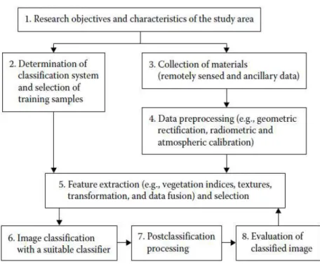
A simulated LCLU (Land Cover Land Use) map is a result of a sequence of different procedures that precede the prediction phase (Figure 4). Multiple satellite scenes for the same study area, obtained in different time stamps, are classified in order to produce LCLU maps. This classification is validated through an accuracy assessment process which is performed with the aid of validation data (e.g. reference maps) to ensure that the classification matches the ground truth classes. The validation is followed by the change detection step in which the amount of each class in time t1 that turned to another class in time t2 is determined. These transitions are recorded in a change matrix which represents the input to the subsequent step; calibrating and modeling the transitions of interest. The previously classified LCLU maps contribute in validating the predictive capacity of the model, which once validated, yields a LCLU map of a future date.
6
2.1 Image Classification
Because classification results are the basis for many environmental and socioeconomic applications (Lu and Weng, 2007), classifying remotely sensed data into a thematic map is an essential step towards further analysis and applications such as LUCC detection and simulation prediction models. Figure 5 represents major steps involved in the image classification procedure (Lu et al., 2011).
Figure 5. Image classification procedure
The deep awareness of the study area and the study objectives contribute in the determination of most interesting classes, minimum allowed accuracy for each class and for the whole image, MMU (Minimum Mapping Unit), available and required data, and time cost and labor constraints (Lu et al., 2011). Classification system should be informative, exhaustive, and separable, based on the user’s need
and imagery spatial resolution. Training samples should be provided in sufficient number and degree of representativeness, to ensure consistent accuracy assessment process after classification. They are usually collected from fieldwork, or fine spatial resolution aerial photographs and satellite images (Lu and Weng, 2007).
7
Image classification approaches can be grouped into different categories: supervised versus unsupervised based on type of learning, parametric (e.g. ML (Maximum Likelihood)) versus nonparametric (e.g. decision tree and neural network) based on assumption on data distribution, hard versus soft (fuzzy) based on the number of outputs for each spatial unit, in addition to per-pixel, sub-pixel, and per-field classifications (Lu and Weng, 2007). The selection of the classifier is affected by the image spatial resolution, data sources, classification system, and classification software (Lu et al., 2011).
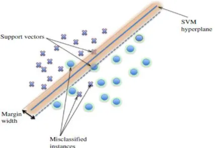
SVM (Support Vector Machines) represent a noticeable development in machine learning research (Pal and Mather, 2005) particularly appealing in the remote sensing field due to their ability to well generalize, even with limited training samples, which is a common limitation for remote sensing applications (Mountrakis et al., 2011). SVM are supervised non-parametric statistical learning approach in which a hyperplane is built to separate examples of different classes, maximizing the distance (margin) of the examples lying nearby it (support vectors) (Sáez et al., 2013). Figure 6 illustrates a simple scenario of a two-class separable classification problem in a two-dimensional input space (Mountrakis et al., 2011).
A better generalization is achieved when the distances from the examples of both classes to the hyperplane are larger (Sáez et al., 2013). Pal and Mather (2005) compared SVM with ML and ANN (Artificial Neural Network) algorithms in terms of classification accuracy. The study indicated that SVM can achieve high classification accuracy with high dimensional data, even if the size of the training dataset is small. Benarchid and Raissouni (2013) used SVM to automatically extract buildings in suburban areas in Tetuan city in Morocco, using very high resolution satellite images. 83.76% of existing buildings have been extracted by only using color features. The study stated that the result can be improved by adding other features (e.g., spectral, texture, morphology and context). Singh et al.
8
(2014) applied SVM classifier to estimate the LCLU of Pichavaram forest, in India, using a multi-temporal Landsat images captured in 1991, 2000, and 2009. The classified images recorded high accuracy of 89.4, 94.1 and 94.5%, respectively.
Post-classification process is applied to enhance the classification process previously done. It includes the recoding of LCLU classes, removal of “salt-and-pepper” effects, and the modification of the classified image using ancillary data or expert knowledge (Lu et al., 2011). Finally, the classified images are evaluated based on expert knowledge (e.g. qualitative evaluation) or sampling strategies (e.g. quantitative accuracy assessment) to generate error matrix and other derived accuracy assessment elements, such as overall accuracy, omission error, commission error, and KI (Kappa Index) (Lu et al., 2011).
2.2 LUCC Detection
Land-cover refers to the physical characteristics of earth’s surface, captured in the distribution of vegetation, water, soil and other physical features of the land, including those created solely by human activities. While land-use refers to the way in which land has been used by humans and their habitat, usually with accent on the functional role of land for economic activities. It is the intended employment of management strategy placed on the land-cover type by human agents, and/or managers (Ramachandra and Kumar, 2004).
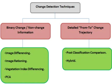
Change detection is the process of identifying differences in the state of an object or phenomenon by observing it at different times (Singh, 1989). Generally, it involves the application of multi-temporal data sets to quantitatively analyze the temporal effects of the phenomena of interest. It acts as a main base towards a better interpretation of the relationships and interactions between human and natural phenomena to ensure better resource management and usage (Lu et al., 2011). Figure 7 illustrates the main two groups of change detection techniques: binary change/no-change information in which the output has only two possibilities; weather the class has changed on not changed within two specific time stamps. The second approach yields a detailed “from-to” change trajectory which results into a
9
Figure 7. LUCC detection techniques
Singh (1989) described briefly each technique in both groups. In image differencing, spatially registered images of two time stamps are subtracted mathematically, pixel by pixel, to produce a further image which represents the change between both of them. Pixels with high change are found at the end of the histogram that represents pixel distribution in each band, while pixels with no change are grouped around the mean. In regression technique, pixels from time t1 are assumed to have linear relation with those from time t2. It accounts for differences in the mean and variance between pixel values for both dates, whereas in rationing, two images from different dates are rationed, band by band and are compared on a pixel by pixel basis. In areas of change the ratio value would be significantly greater or less than 1, depending on the nature of the changes between the two dates.
The idea of vegetation index differencing is the strong vegetation absorbance in the RED and strong reflectance in the NIR (Near Infrared) part of the spectrum, thus vegetation is more likely to appear darker in the RED part and brighter in the NIR part. There are several vegetation indices commonly used in vegetation studies when using Landsat MSS (Multispectral Scanner) data, the ratio vegetation index is one of the popular, which represents the ratio between NIR band 4 and red band 2. So, if the difference between band4/band2 for two images obtained in different time stamps is significant, that is an indication of vegetation change occurrence. PCA (Principal Components Analysis) is similar to image differencing and image regression techniques, except that in PCA two four-band Landsat scenes of the same area but different dates, are treated as a single eight band data set, aiming at reducing the number of spectral components to fewer principal components accounting for the most variance in the original multispectral images.
10
in addition to the threshold itself is highly subjective and scene dependent, depending on the analyst’s
familiarity with the study area (Lu et al., 2011).
On the other hand, post classification comparison technique consists of an independent classification of each image, followed by a thematic overlay of the classifications resulting into a complete “from-to”
change matrix of the conversion between each class on the two dates (Tewolde and Cabral, 2011). The problem in this technique is the high effect of errors resulting from image classification on the change map. For example, if two images classified with 80% accuracy might have only a 0.80 x 0.80 x 100= 64% correct joint classification rate (Singh, 1989). Combination image enhancement/post-classification technique was mentioned in (Mas, 1999), where the change image is recoded into a binary mask consisting of areas that have changed between the two dates. The change mask is then overlaid onto the second time stamp image and only those pixels that were detected as having changed are classified in the t2 imagery. A traditional post- classification comparison can then be applied to yield complete
“from-to” change information. This method may reduce change detection errors.
A lot of work has been conducted extensively regarding urban growth. Tewolde and Cabral (2011) studied the spatiotemporal LUCC in the Greater Asmara Area – Eritrea. 1989, 2000, and 2009 satellite images were classified by NN (Nearest Neighbor) algorithm using eCognition Developer 8. Overall accuracy and KI for the three classified images were above the minimum acceptable level of accuracy (85%). LUCC detection was performed using post-classification comparison technique. Jin et al. (2013) presented a new CCDM (Comprehensive Change Detection Method) for updating the NLCD (National Land Cover Database). It integrates MIICA (Multi-Index Integrated Change Analysis) model and a novel change model called Zone, which extracts change information from two Landsat image pairs. MIICA uses four spectral indices to obtain the changes that occurred between two images of different time stamps. CCDM contains a knowledge-based system, which uses critical information on historical and current land cover trends combined with the likelihood of the land cover to change, in order to gather the changes from MIICA and Zone. CCDM was recommended because of its simplicity and high capability of capturing disturbances associated with land cover changes. On the other hand, CCDM suffers some limitations, as it detects change for only one class, in addition, it can produce certain amount of commission errors. Haas and Ban (2014) investigated land cover changes in China's three largest urban agglomerations: JJJ (Jing-Jin-Ji), YRD (Yangtze River Delta) and PRD (Pearl River Delta). Six images (two images per region, in 1990 and 2010) were classified using random forest decision tree ensemble classifier. The average overall accuracy for JJJ, PRD, and YRD for 1990 and 2010 images were 85% and 87%, while KI was 0.83 and 0.86, respectively.
11
2.3 LUCC Modelling
Models are simplifications of reality, they are theoretical abstractions that represent systems in such a way that essential features crucial to the theory and its application are identified and highlighted (Batty, 2009). LUCC models are tools to support the analysis of the causes and consequences of LUCC for better understanding of the system functionality, and to support land-use planning and policy. Models are useful for simplifying the complex suite of socioeconomic and biophysical forces that influence the rate and spatial pattern of LUCC and for estimating the impacts of changes (Verburg et al., 2004).
Verburg et al. (2004) listed six important concepts worth to be taken into consideration while modelling LUCC. They are: level of analysis, cross-scale dynamics, driving forces, spatial interaction and neighborhood effects, temporal dynamics, and level of integration.
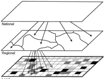
Level of analysis is directly related to the used perspective; micro-level perspective, which relies on simulation of individuals behavior, or macro-level perspective, that relies on macro-economic theory or apply the systems approach. Both perspectives refer to the issue of scale, which is known by extent and resolution. Extent is the magnitude of a dimension used in measuring (e.g. area covered by a map), while resolution is the precision used in this measurement. Several LUCC models are structured hierarchically, so multiple levels are taken into consideration. Pure cellular automata models determine the number of cells that change in each step of the simulation based on cellular dynamics. Figure 8 represents the different levels of top-down allocation procedure (Verburg et al., 2004).
Figure 8. Top–down allocation procedure
12
between land-use and driving forces can be determined using empirical methods or expert knowledge (Verburg et al., 2004).
Spatial autocorrelation exist as a result of spatial interactions between land-use types themselves (e.g. urban expansion is often situated in areas next to the already existing ones). Spatial autocorrelation in land use patterns is scale dependent, for example in small scale, residential areas have a positive spatial
autocorrelation, while in a larger scale, a parcel’s probability of development decreases as the amount of existing neighboring development increases (negative spatial autocorrelation), due to the negative spatial effects generated from the development, such as crowd (Verburg et al., 2004). Spatial connectivity also occurs as a result of spatial interactions acting over larger distances (e.g. land-use in the upstream part of a river affects the land-use in the downstream of the same river). Cellular automata is a common method that considers spatial interactions, in which the state of a pixel is calculated based on its initial state, the structure of the surrounding pixels (Figure 9), and a set of transition rules (Verburg et al., 2004).
Figure 9. Alternative neighbourhoods used in cellular automata models
The temporal dimension of the model is related to model validation, which is most often based on the comparison of model results for a historic period with the actual changes in land-use as they have occurred. Such a validation makes it necessary to have land-use data for another year than the data used in model parameterization. The difference between the two timestamps used in model validation should be the same of the difference for which future scenario simulations are made. Finally, the determination of integration level is important for LUCC modelling, which usually controlled by model scale and purpose (Verburg et al., 2004).
13
Agent-based models are defined at a micro-level and can consist of one or more types of agents (individuals or institutions), as well as an environment in which the agents are embedded. Therefore, systems can be studied at many scales and parts (Brown et al., 2004).
MC-CA (Markov Chain – Cellular Automata) integrated model is one of the most common tools for modelling urban land-use expansion. CA is a spatially explicit model which relies on the iteration of a given dimensional cell based on supporting socio-economic and geographical data, to change into urban or nonurban form within a given time frame. On the other hand, MC model determines the actual amount of change between land use categories non-spatially, in other words, MC is a stochastic process model that describes the probability that one state (e.g., cropland) changes to another state (e.g., built-up areas) within a given time period, while CA determines where this conversion to urban will take place (Vaz et al., 2012). In CA, there are cellular entities that independently vary their states, as well as their immediate neighbours, according to predefined transition rules. Various ways of defining transition rules make CA models function differently and, consequently, produce dissimilar outputs (Arsanjani et al., 2013).
Selecting the driving forces that affect LUCC is essential for modeling process, on which transitions rules rely to determine the cell state, varying along with the variation of its neighborhood states. MCE (Multi-Criteria Evaluation) is one of the popular methods for selecting the most suitable driving forces that are believed to highly effect urban growth in the future. AHP (Analytic Hierarchy Process) is one approach that allows weighting of land-use transition potential on the basis of a set of potential maps. It incorporates growth constraints and determines the weights of the (fuzzy) potential maps by means of pairwise assessments. Values are standardized from 0 to 1 indicating least and most suitable sites, respectively. The weighting parameters are usually determined by expert knowledge or qualitative interviews, and consistency ratio are used to verify meaningless of the selected weights, consequently, the suitability of the weighting schema. Sigmoid, J-shaped, and Linear are examples of membership functions to determine degree of suitability between the control points (Moghadam and Helbich, 2013).
Gong et al. (2015) used MC-CA model in IDRISI, for urban growth prediction in 2007 using classified imageries of years 1989, 2001 and 2007 for Harbin, China. They used MCE module to determine driving forces, some of them were soil properties, elevation, slope, rainfall, water, population density, accumulative temperature, distance from roads and settlements. In that way suitability maps for each land-use classes were produced. The VALIDATE module results in KI with values above 0.8, when compared to the actual maps of 2007.
Another well-known modeling tool is LCM (Land Change Modeler), which is embedded as well in IDRISI software (Tewolde and Cabral, 2011). Only thematic raster images with the same land cover categories listed in the same sequential order can be inputted in LCM for analysis, and background areas must be identified on maps coded with 0. It evaluates land cover changes between two different times, calculates the changes, and displays the results with various graphs and maps. Then, it predicts future LCLU maps on the basis of relative transition potential maps (Roy et al., 2014).
14
Perceptron) neural network was applied to generate transition potential maps, which were used with MC modeler and transition probability grid to predict year time-t (2009). The driving forces for the study were distance to existing urban areas and distance to road network. The accuracy of 2009 simulated map was examined against the previously classified one of the same year, with an average KI of 83%.
Roy et al. (2014) used LCM to predict LUCC in 2011 in a Mediterranean catchment in South Eastern
France. The predicted images were compared to the real 2011 map. Different times were used for predictions: short (2003-2008), intermediate (1982-2003), and long (1950-1982). Driving forces were
selected by Cramer’s coefficient. However, altitude, slope, and distance from roads had the greatest impact among other tested variables. The results indicated that shorter time scales produce better prediction accuracy. Stable land covers are easier to be predicted than cases of rapid change, and quantity is easier to be predicted than location for longer time periods.
Vega et al. (2012) compared biodiversity loss modelling results in western Mexico using a combined unsupervised / supervised approach using two spatially explicit models: DINAMICA model that uses the Weights of Evidence method, a supervised approach in which the weights can be selected and edited by a user, and LCM which relies upon neural networks. DINAMICA had better results at the per transition level, but the overall change potential map generated using LCM is more accurate, because neural networks outputs are able to express the change of various land cover types more adequately than individual probabilities obtained through the weights of evidence method.
LUCC models are tested through three different processes: calibration, validation, and verification, in order to prove and confirm that the theory matches with facts. Calibration is the process of dimensioning a model in terms of finding a set of parameter values that enable the model to reproduce characteristics of the data in the most appropriate way. This is different from validation, which seeks to
optimize a model’s goodness of fit to data, such as how close the predictions are to the observed data. It could be measured by KI and / or sensitivity analysis. On the other hand, model verification accords to
testing the model for internal consistency and is often separate from testing how good the model’s
15
3. STUDY AREA
Egypt is located in the northeastern corner of the African continent. It is bordered by Libya to the west, Sudan to the south, the Red Sea to the east, and the Mediterranean Sea to the north, with an approximate area of one million square kilometers (Figure 10).
Figure 10. Egyptian borders
Egypt has the largest and most densely settled population among the Arab countries. It has a total inside population of 86 million with a density of 1100 capita / km2 in populated areas, and 8 million of
16
Figure 11. Study area: Greater Cairo – Egypt
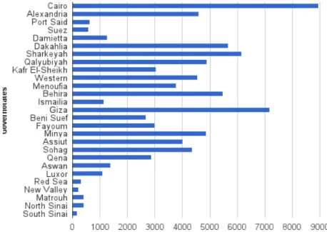
GCR is considered one of the fastest growing mega cities worldwide, with the highest population and population density among other Egyptian governorates (SIS, 2014) (Figure 12). Cairo city was the most populous among other Egyptian cities in 2013 (SIS, 2014), with almost 9 million capita, representing 10.7% of total population recorded in the same year.
Figure 12. Egypt governorates population in 2013
17
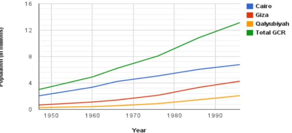
education (Kipper and Fischer, 2009). In 1947, GCR hosted around 3 million representing 12.5% of total Egyptian population at that time. This number kept growing to 13 million in 1996, representing 17.3% of total Egyptian population. (Figure 13) (Kipper and Fischer, 2009). In 2006, the total population in GCR reached 16.1 million capita (CAPMAS, 2014).
Figure 13. GCR’s population growth
Population data about GCR is always a problematic issue, due to the change of administrative boundaries of the governorates, thus its population vary considerably, depending on the geographical definition used to identify the region. Tables 1, 2 and 3 obtained from (CAPMAS, 2014) list the districts in Giza, Qalyubiyah, and Sharqiyah cities that belong to GCR, respectively, based on the latest official geographic boundaries declarations.
District Qism / Markaz
Dokki Qism
Ahram Qism
Aguza Qism
Badrashin Markaz
Hawamdeyah Qism
Giza Qism
Giza Markaz
Omraneyah Qism
Warrak Qism
Sheikh-Zayed Qism
6th October First Qism
6th October Second Qism
18
District Qism / Markaz*
Qanater
AlKhayreya Markaz
Obour Qism
Ossim Markaz
Bulak AlDakrour Qism
Imbaba Qism
Kirdasa Markaz
Table 2. Districts belong to GCR in Qalyubiyah city
District Qism / Markaz
Qalyoub Qism
Qalyoub Markaz
Shubra AlKhima 1st Qism
Shubra AlKhima 2nd Qism
Table 3. Districts belong to GCR in Sharqiyah city
Different studies have been carried out previously for LUCC detection and modelling in GCR. Yin et
al. (2005) used ISODATA clustering procedure for image classification and image differencing
technique for the LUCC detection between 1986 and 1999 with an overall accuracy of 87% for both images. The study indicated that urban areas increased from 344.4 km2 in 1986 to 460.4 km2 in 1999.
At the same time, the population density increased from 7 158 person / km2 to 9 074 person / km2. The
spatial pattern distribution of urban and population was compared in order to reveal the relation between urban areas and population. It was found that population per unit of urban land decreased from 27.188 person / km2 in 1986 to 25.799 person / km2 in 1999.
Mohamed (2012) used ML classifier using ERDAS for the LUCC detection in 1973 and 2006 with an overall accuracies of 92% and 86%, and KI of 0.87% and 0.78, respectively. The study applied post-classification comparison technique for LUCC detection. Results showed that urban areas expanded from 223.8 km2 in 1973 to 557.9 km2 in 2006, with total agricultural cut-offs and urbanized desert of
136.7 km2 and 187.3 km2, respectively.
19
4. METHODS
20
21
4.1 Data
Three cloud free satellite imageries for years 1984, 2003, and 2014 that cover the entire study area were obtained from Landsat scenes available for free download on EarthExplorer, accessible on
http://earthexplorer.usgs.gov/. Further information about the imageries is illustrated in Table 4, which appears below.
Acquisition
date Sensor resolution Spatial Path/Row Landsat Number of bands3
Radiometric resolution
15/03/2014 OLI - TIRS 30 m 176/39 Landsat 8 11 16 bits
07/07/2003 TM 30 m 176/39 Landsat 5 7 8 bits
02/07/1984 TM 30 m 176/39 Landsat 5 7 8 bits
Table 4. Imageries attributes
4.3 Binary Maps Production
To produce maps of change / no change, NDVI difference technique was first applied. The difference in NDVI between same satellite images obtained in different dates is a common method to produce binary maps of change / no change information. Radiometric normalization between same images recorded with the same sensor, but in different times, is essential for change detection, because theoretically, they are assumed to store similar digital levels, but practically, they do not, due to the effect of different atmospheric conditions and sun geometry from different recorded dates, so that pixels from the same terrain can show different radiance values, and, therefore, different values in their digital levels (Broncano et al., 2010). Linear normalization is the technique that was applied in NDVI normalization. Afterwards, two NDVI differences were calculated to produce the binary maps of the change / no change occurred between 1984 – 2003 and 2003 – 2014 as well. For thresholds determination, firstly, around 500 points of change and no change per each difference where collected by the visual comparison of each pair of images; 1984 with 2003, and 2003 with 2014, in order to adjust the accuracy of the thresholds values. These thresholds determine the range of NDVI differences mandatory to decide whether the pixel had been subjected to change or not (Figure 15). After this, thresholds were tuned to match most of the change / no change points, previously collected.
22
Figure 15. Thresholds determination
4.4 Image Classification
23
Figure 16. The applied procedure in collecting training samples
First, training samples were collected for all classes, based on 2014 image, in areas of no change over the study period, 1984 – 2014. In that way only one training dataset was used in the classification of the three images, to save effort and time.
Afterwards images were classified using SVM classifier, with the LIBSVM4 (SVM Library) enabled in
Matlab 8.3. SVM is a supervised non-parametric statistical learning approach, meaning that it has multiple parameters, hence, the classification was carried out in several trials per image, each with different values of the same parameter, aiming at producing maps that best represent the reality. Table 5 gives brief descriptions of the different parameters used to obtain the best representative maps, while Table 6 shows the optimum values of each parameter.
Parameter Description
s SVM type: 0 for C-SVC, 1 for nu-SVC, 2 for one-class SVM, 3 for epsilon-SVR (regression), 4 for nu-SVR (regression) type.
t Kernel function: 0 for linear, 1 for polynomial, 2 for exponential, 3 for sigmoid, and 4 for pre-computed kernel. All except linear, are functions of gamma, coefficient, and degree.
d Degree of the kernel function. g Gamma of the kernel function. r Coefficient of the kernel function.
c Cost parameter for C-SVC, epsilon-SVR, and nu-SVR types.
Table 5. Parameters description5
4Available from: http://www.csie.ntu.edu.tw/~cjlin/libsvm/
24
Image s t d g r c
2014 0 1 3 0.25 1 1
2003 0 1 3 0.25 1 1
1984 0 0 - - - 1
Table 6. Optimum parameter values
Areas of no change were only classified once in order to guarantee time consistency. For each image, areas of change were classified separately by using the training samples defined on the no-changed areas.
4.2 Image Pre-processing
This phase generally includes geometric, atmospheric, and radiometric corrections, however both, geometric and atmospheric corrections were skipped. Firstly, satellite scenes from Landsat are usually offered with geometric correction done, secondly, all three images have clear sky and there was no need for an absolute atmospheric correction.
4.5 Image Post-classification
Image post-classification focus on enhancing the quality of the produced maps to be more representative to the landscape. Each raster map was converted to map of polygons, and then was generalized to a MMU of one hectare, by selecting all polygons of an area less than one hectare and eliminating them. In the elimination process, each selected polygon is merged to the largest adjacent polygon. Finally, the maps were converted to raster again.
4.6 Accuracy Assessment
To validate the maps, 100 random points per class were generated for each map and visually classified via Google Earth maps as ancillary data. The “Historical View” tool in Google Earth engine was used
to validate the old maps; 1984 and 2003.
25
Figure 17. Accuracy assessment example
4.7 LUCC Detection
For LUCC determination, only areas of change were thematically overlaid with each present map; areas of change between 1984-2003 were overlaid with 2003 map, likewise, areas change between 2003-2014 were overlaid with 2014 map, thus change matrices were produced, giving information about the amount of land use that turned from a class to another.
4.8 Analysis of Spatial Urban Growth Pattern
For better urban sprawl interpretation, FRAGSTATS software, version 4.2, was used to calculate some statistical spatial metrics for the urban class over 30 years, from 1984 to 2014, based on the LCLU maps of 1984, 2003 and 2014. The selected subset of matrices which was applied in the study is given in Table 7. They are the most commonly used and explored matrices in similar studies (e.g. Araya et
al., 2010; Herold et al., 2003).
Metrics Description Units Range
CA—Class Area
The sum of the areas of all urban patches, that is, total urban area in the
landscape. Hectares CA > 0, no limit
NP—Number of
Patches The number of urban patches in the landscape. None NP ≥1, no limit
ED—Edge Density The sum of the lengths of all edge segments involving the urban patch type, divided by the total landscape area.
Meters/
26
LPI—Largest PatchIndex
The area of the largest patch of the corresponding patch type divided by total area covered by urban.
% 0 < LPI ≤ 100
ENN_MN—Euclidian Mean Nearest
Neighbor Distance
The distance mean value over all urban patches to the nearest neighboring urban patch, based on shortest edge-to-edge distance from cell center to cell center.
Meters EMN_MN > 0, no limit
AWMPFD—Area
Weighted Mean Patch Fractal Dimension
Area weighted mean value of the fractal dimension values of all urban patches, the fractal dimension of a patch equals two times the logarithm of patch perimeter divided by the logarithm of patch area; the perimeter is adjusted to correct for the raster bias in perimeter.
None
1 ≤ AWMPFD ≤
2
CONTAG—Contagion Measures the overall probability that a cell of a patch type is adjacent to cells of
the same type. %
0 < CONTAG ≤
100
Table 7. Spatial metrics
4.9 LUCC Modelling
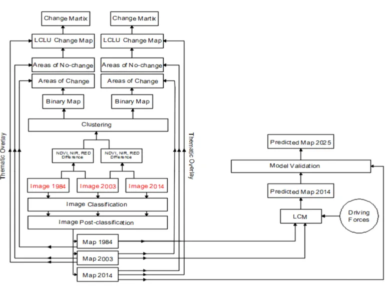
LCM is an integrated software environment within IDRISI for the analysis of LUCC. It is a powerful tool to assess historical land cover data and to use that assessment to predict future scenarios. LCM embedded in IDRISI 17.0 was used in this study to predict the LCLU map in 2025 through the procedure shown in Figure 18.
27
Both LCLU maps of 1984 and 2003 were the input to the LCM to predict a map of 2014 and then
compare it with 2014’s LCLU map to validate the model. In the first step, the change analysis process was carried out, in which the changes were assessed between 1984 and 2003. These changes represent the transitions from one class to another, which are important to identify the dominant transitions to urban and target them for modeling.
The second step was the transition potential modeling using MLP neural network. This step is responsible for determining the location of the change. It results into a number of transition potential maps equal to the significant transitions to urban, considered in the first step (Eastman, 2012). These transition potential maps represent the suitability of a pixel to turn to urban in each transition based on a group of factors, named “Driving Forces”, that are used to model the historical change process. This step is usually managed through a transition sub-model that contains a group of all LCLU transitions, in case they are thought to have the same underlying driving forces. Otherwise, multiple transition sub-models will be used, containing a single LCLU transition, each with different group of driving forces. The driving forces can be either static or dynamic. The static variables are those which remain unchanged over time, while the dynamic ones are time-dependent drivers, consequently they are recalculated over the prediction period (Eastman, 2012). LCM provides an optional quick test of the potential explanatory power of each driving force represented by Cramer’s V. This value varies from 0
to 1, indicating a discarded variable and an excellent potential one, respectively. Although this test is not precise, it acts as a guide to determine whether the driving force is worth to be considered or not (Eastman, 2012). Once the variables are selected, each transition sub-model can be modeled.
In this way, the model was calibrated, as the parameter values (driving forces and transition potential maps) which enable the model to reproduce characteristics of the data appropriately, were determined. The model was ready for the third step; future scenarios prediction. In this step, LCM uses the change rates calculated from the first step as well as the transition potential maps produced from the second step, to predict a future scenario for 2014. This step is responsible for determining the quantity of change to urban in each transition in 2014 using MC analysis, in which the class of a pixel is determined by knowing its previous state in 2003 and the probability of transitioning from it to urban. It figures out exactly how much land would be expected to transition from 2003 to 2014 based on a projection of the transition potentials into the future.
There are two basic types of prediction: the hard and soft predictions (Eastman, 2012). The hard prediction yields a projected map of 2014, where each pixel is assigned one land cover class, the class that is most likely to change to. The soft prediction is however different, it produces a vulnerability map in which each pixel is assigned a value from 0 to 1 indicating the probability of the pixel to turn to urban in 2014. The hard prediction yields only a single realization, while the soft prediction is a comprehensive assessment of change potential.
The validation process aims to determine the quality of 2014’s predicted map in relation to 2014’s
28
statistical method may fail to detect. However, it is subjective and can be misleading, therefore the statistical approach is essential to be carried out (Pontius et al., 2006).
In the visual validation, a 3-way cross tabulation between 2003’s LCLU map, 2014’s predicted map, and the map of reality was run to illustrate the accuracy of the model results. The output is a map of four categories:
1- Hits: Model predicted change and it occurred in reality.
2- False alarms: Model predicted change to urban while it persisted in reality. 3- Misses: Model predicted persistence and it changed to urban in reality. 4- Null success: Model did not predict change and it did not occur in reality.
False alarms and misses represent the errors that resulted from the model as a disagreement between
the simulated map (2014’s predicted map) and the reference map (map of reality), while hits and null success represent the model correctness.
On the other hand, there are an infinite number of different ways to compare maps statistically. They varies in terms of ease of interpretation, offering a valuable output which can contribute in the enhancement of the model because the purpose of the assessment is to find ways to improve the method of making the predicted map agrees more closely with the map of reality, and showing the similarities between the predicted and the reference maps (Pontius et al., 2006). A good statistical validation model should show the degree of agreement between both maps, in each LCLU class, in terms of quantity of cells and location of cells. IDRISI enables a hard statistical validation using the VALIDATE module, and a soft statistical validation using the ROC (Relative Operating Characteristic) module.
The VALIDATE module examines the agreement between two pair of maps that show any categorical variable, which can have any number of categories (Pontius et al., 2006). The map of reality acted as the reference map, while 2014’s predicted map was the comparison map. On the other hand, the ROC module is more concerned about examining only the urban concentration in areas of relatively high suitability. In other words, it focuses on how well the suitability map predicts the locations of new urban settlements in 2014, based on the changes in urban between 1984 and 2003. In measures the maps agreement in terms of cells locations in a certain LCLU class rather than their quantity in each class.
To check the agreement between the new urban areas in 2014’s predicted map and the map of reality in the ROC approach, the reference map was a Boolean map of new urban development in which all cells of new urban settlements (since 2003) in 2014’s LCLU map were assigned a value of 1, whereas 0 elsewhere. The comparison map was the suitability map resulted previously from the LCM with a
29
reclassified suitability map and plots the results into the ROC curve, where the AUC (Area Under Curve) represents the overall agreement between the two maps. An AUC value of 0.5 indicates complete randomness between the two maps, whereas a value of 1 indicates perfect spatial agreement (Olmedo et al., 2013).
Although this is the most common type of ROC analysis, its restricted focus on predicting a certain type of change (urban development) by masking parts of the study area may be misleading, as it can hide weaknesses or strengths of the model. Hence a ROC analysis of a null model was performed to predict persistence only. In this run, the reference map remained exactly the same as the first run, while the comparison map changed to be a Boolean map of the urban areas in 2003’s LCLU map that were assigned 1, and 0 elsewhere.
Once the model was validated, it was used to predict 2025’s LCLU map, with the same driving forces,
30
5. RESULTS AND DISCUSSION
5.1 Change / No-change Maps
In this study, NDVI (ranges from -1 to +1) was calculated by Equation 1, for each image., then a linear normalization was performed, in which the relationships between NDVI 1984 – NDVI 2003 and NDVI 2003 – NDVI 2014 were both assumed to be linear (Broncano et al., 2010). NDVI 2014 acted as a master against NDVI 2003 (O'Connell et al., 2013), likewise, NDVI 2003 against NDVI 1984. Meaning that values of NDVI 2003 were corrected to follow the linear equation with its master and NDVI 1984 followed the same procedure as well. To do so, an average of 1260 points of very high NDVI values (e.g. dense vegetation areas) and very low ones (e.g. desert and water areas) were collected for each NDVI, in order to draw the linear relation (Figure 19). After normalization, difference in NDVI (ranges from -2 to +2) could be calculated to produce binary maps required for LUCC detection.
NIR
RED
NIR
RED
NDVI
/
(1)Where:
NIR is the near infrared range, represented by band 4 in Landsat 5, RED is the red range, represented by band 3 in Landsat 5.
31
b. NDVI normalization 2003 – 2014
Figure 19. NDVI normalization
The tuning process resulted in thresholds values of ±0.06 for the NDVI difference between 2003 and 2014. These values matched 80% of the previously collected set of check points (see section 4.3). When applying NDVI difference method, and checking 2003–2014 binary map, unfortunately it was not able to capture all the pixels that turned from desert into urban. Worth to mention that decreasing the no-change range (±0.06) is not recommended at all, as when tried, wide parts of the desert were considered as areas of change, while in fact they are not, meaning that the method itself was incompatible with the aim of the study, the urban growth detection, leading to inaccurate results in LUCC, if it had been applied.
32
a. New urbanization in agriculture
b. New urbanization in desert
Figure 20. NDVI, NIR and Red difference combination approach
The different radiometric resolutions between 2003 and 2014’s imageries required performing a mathematical normalization in NIR and RED values before computing the differences. An 8-bit digital number (e.g. 2003’s imagery) ranges from 0 to 255 (2 ^ 8 - 1), whereas a 16-bit digital number (e.g. 2014’s imagery) ranges from 0 to 65535 (2 ^ 16 - 1). Hence, a simple normalization was carried out according to Equation 2 so that both; NIR and RED range from 0 to 65535, consequently NIR difference and RED difference could be computed.
V
min
RV
/(max
RV
MRV
)
NV
(2)Where:
33
minRV is the minimum range value (255), maxRV is the maximum range value (65535).Unsupervised classification was run for multiple times for both images. In each trial, every cluster was visually examined and compared to the satellite scenes in order to determine whether it was a cluster of change or no change. The points of change and no change previously collected for the thresholds tuning in NDVI difference technique (see section 4.3) were used to more accurately decide about the cluster; change or no change. The unsupervised classification of both image of differences matched around 93% of these points. In that way, binary maps were produced; pixels that belong to clusters of change had a value of 1, and those belong to clusters of no change had a value of 0.
Figure 21 shows a new city (6th of October city, west of GCR) which was built in 2003, and expanded
in 2014. The figure illustrates how the expansion was hardly captured using NDVI difference method, whereas it was precisely determined using the combination of differences of NDVI, NIR and Red.
a. 6th October City in 2003 – RGB colour composition
34
c. Changes between 2003 and 2014 in 6th ofOctober City in binary map using NDVI difference approach
d. Changes between 2003 and 2014 in 6th of October City in binary map using NDVI, NIR and Red differences approach
Figure 21. Two approaches for binary maps production - changed pixels are in white
5.2 Image Classification
35
Figure 22. Training samples in areas of no change – no change areas are in white
The visual inspection of the produced maps indicated the efficiency of the classifier in separating between pixels that belong to different land uses, however, it could not separate between urban areas and unplanted agricultural fields, that existed in 1984 and 2003 images, not because of the classifier, but because training samples were taken based on 2014’s image which had almost all agricultural fields planted. These unplanted agricultural fields shared a similar gray appearance with urban areas, but a little bit darker, thus were classified as urban instead of vegetation (Figure 23).
a. Examples of unplanted agricultural fields in 1984 image, viewed in RGB colour composition
b. Misclassification of unplanted agricultural fields in 1984 map
36
In order to avoid accuracy decrease in the classification, LUCC and modeling that might have resulted from such misclassification, it was essential to extract these unplanted agricultural fields from the urban class and reclassify them as vegetation. One suggested approach was to identify a new class for them, with additional training samples in images where they existed (1984 and 2003), but because they had relatively small areas and were surrounded by real urban pixels, it was difficult to take precise and adequate training samples for them. Another procedure that was successfully applied was to identify the urban areas using the NDBI (Normalized Difference Built-up Index) (Equation 3), in which urban areas appear very bright, and these unplanted agricultural fields remained included.
MIR
NIR
/(
MIR
NIR
)
NDBI
(3)Where:
MIR is the mid infrared range, represented by band 5 in Landsat 5, NIR is the near infrared range, represented by band 4 in Landsat 5.
Several unsupervised classifications were tried until it was possible to visually identify in which cluster(s) these unplanted agricultural fields were mostly included. Eventually a query could be performed to target all the pixels that were misclassified as urban and in the same time existed in the identified cluster(s), to the vegetation class. This query was applied in certain areas of the images, only where the problem of misclassification existed, in order to avoid turning some real urban pixels into vegetation.
37
a. LCLU map - 1984
38
c. LCLU map - 2014
Figure 24. LCLU maps
Figure 25 gives an overview of the urban expansion that occurred over the 30 years, from 1984 to 2014. New urban areas in 2003 were built mainly around the urban communities which already existed in 1984, with new built-up cities in the South of Cairo (e.g.15th May city) and to the South of Giza along the Nile River. Small urban settlements in the desert parts of Cairo and Giza cities were built in 2003 and are located to the East (e.g. Nasr city) and to the West of the study area (e.g. Sheikh-Zayed and 6th October cities). Whereas the new urbanization in 2014 took place significantly in the desert
39
Figure 25. Urban expansion between 1984 and 2014
40
a. Spatial trend of change to urban 1984 – 2003
b. Spatial trend of change to urban 2003 – 2014
41
5.3 Accuracy Assessment
Table 8 illustrates the accuracy assessment results of the LCLU maps for 1984, 2003 and 2014. The tolerance was calculated from Equation 4.
T
A
A
Tolerance
1
.
96
(
1
)
(4)Where:
A is the accuracy of the class,
T is the total number of points per class.
42
2014 2003 1984
User Accuracy Producer Accuracy User Accuracy Producer Accuracy User Accuracy Producer Accuracy
Urban 95% ± 4.3% 94.1% ± 4.6% 97% ± 3.3% 92.4% ± 5.1% 97% ± 3.3% 90.7% ± 5.5%
Vegetation 97% ± 3.3% 94.2% ± 4.5% 97% ± 3.3% 97% ± 3.3% 93% ± 5% 95.9% ± 4%
Desert 97% ± 3.3% 97% ± 3.3% 97% ± 3.3% 100% ± 0% 98% ± 2.7% 99% ± 2%
Water 95% ± 4.3% 99% ± 2% 98% ± 2.7% 100% ± 0% 97% ± 3.3% 100% ± 0%
Overall Accuracy 96% ± 1% 97.3% ± 0.8% 96.3% ± 0.9%
43
5.4 LUCC Detection
Tables 9 and 10 are the change matrices that represent the transition from one class to another in percentage and in hectares as well, which occurred between 1984 and 2003, and between 2003 and 2014.
2003 (%)
Urban Vegetation Desert Water
19
84
(
%)
Urban 97 2 1 0
Vegetation 13 86 0 0
Desert 3 1 96 0
Water 3 7 0 90
a- LUCC in percentage
2003 (hectare)
Urban Vegetation Desert Water
19
84
(
hec
tar
e) Urban 54 990 1 093 792 96
Vegetation 19 179 125 790 344 959
Desert 21 417 5 761 656870 192
Water 179 467 3 5 990
b- LUCC in hectares
Table 9. LUCC 1984 – 2003
2014 (%)
Urban Vegetation Desert Water
20
03
(
%)
Urban 100 0 0 0
Vegetation 12 87 0 0
Desert 5 0 95 0
Water 6 9 0 85
a- LUCC in percentage
2014 (hectare)
Urban Vegetation Desert Water
20
03
(
hec
tar
e) Urban 10 6938 61 343 110
Vegetation 16 486 115 497 122 222
Desert 31 045 3099 612 533 424
Water 393 1 322 13 55 66
a- LUCC in hectares
44
The most significant changes in both periods are the transitions from vegetation and desert to urban. Over 19 years, from 1984 to 2003, the vegetation lost 13% to urban, representing 19 179 hectares, and almost the same percentage (12%) within only 11 years, from 2003 to 2014, representing an amount of 16 486 hectares (Figure 27). This indicates the massive leveling of agricultural lands in GCR for urbanization purposes especially during the last decade, because of the absence and / or the inactivation of farmlands protection laws. While 3% of desert areas turned to urban between 1984 and 2003 which is equivalent to 21 417 hectares, larger than the amount of transition from vegetation to urban during the same period despite the lower percentage, due to the larger total desert area compared to the total agricultural ones. This percentage increased to 5% between 2003 and 2014, representing 31 045 hectares, resulting from the application of desert reconstruction strategies to build new communities outside the Nile Valley. The gains and losses in LCLU classes are given in Figure 28, where the significant gains in urban and the dramatic losses in vegetation and desert are noticeable.
45
Figure 28. LCLU gains and losses in hectare
46
1984 2003 2014
Figure 29. Waste water treatment ponds expansion – all at a fixed scale
Changes from water to urban were 3% and 6% or in other words, 179 and 393 hectares in both periods, respectively. Some of these changes are due to fill works in some canals, and others are resulted from capturing the satellite image while some wastewater treatment ponds were empty.
The change from water to vegetation is a false change, because of the growth of some unseasonal plants over the Nile River in one image while they were uprooted in another image. Figure 30 shows some vegetation pixels in yellow color which grew over the Nile River in one image and were uprooted in other image.
Figure 30. False change from water to vegetation