Eighteenth-century type in the Royal Printing Office
Eighteenth-century type in the Royal
Printing Office: the design and development
of an interpretive historical revival
Tipos de letra do século XVIII na Impressão
Régia: design e desenvolvimento de uma
interpretação histórica
Doutoramento em DesIgn
Tese especialmente elaborada para a obtenção do grau de doutor Documento DeFInItIVo, agosto, 2015
Orientadora
Doutora Maria Marques Calado de Albuquerque
Co-Orientador
Master of Fine Arts and Type Designer John D. Downer Jr. constItuIção Do JúrI
Presidente
Doutor Fernando José Carneiro Moreira da Silva
ProFessor cateDrátIco Da FaculDaDe De arquItetura Da unIVersIDaDe De lIsboa.
Vogais
Doutora Maria Marques Calado de Albuquerque
ProFessora assocIaDa aPosentaDa Da FaculDaDe De arquItetura Da unIVersIDaDe De lIsboa;
Doutor João Adriano Fernandes Rangel
ProFessor auXIlIar Da FaculDaDe De belas-artes Da unIVersIDaDe Do Porto; Doutora Maria Leonor Morgado Ferrão de Oliveira
ProFessora auXIlIar Da FaculDaDe De arquItetura Da unIVersIDaDe De lIsboa; Doutora Teresa de Jesus Olazabal Cabral
ProFessora auXIlIar Da FaculDaDe De arquItetura Da unIVersIDaDe De lIsboa; Doutor António Rebelo Delgado Tomás
ProFessor coorDenaDor Da escola suPerIor De artes e DesIgn Do InstItuto PolItécnIco De leIrIa.
À minha família,
a quem eu roubei tanto de mim para dedicar a este projecto.
Obrigado.
À Marta, aos meus filhos e aos seus avós, que foram uma contínua inspira-ção e apoio para me permitir chegar ao fim deste projeto.
Aos meus pais, que me proporcionaram poder ambicionar chegar até aqui. À Doutora Maria Calado e ao Master of Fine Arts and Type Designer John Downer, que me ajudaram muito para além da expectável coordenação. Aos incansáveis Francisca e Pedro, que, do início ao fim deste projeto, me ajudaram a discutir e organizar ideias, a resolver problemas. Uma grande ajuda para tantas outras coisas.
Pelas valiosas discussões, apoio na descoberta de informações e raciocínios onde eu não estava a ver nada, ou simplesmente por me ouvirem: Ricardo Santos, Aprígio Morgado, Paulo Ramalho, Luísa Barreto, Tânia Raposo, Frank Grießhammer, Enri Tormo, Gerry Leonidas, Fernando Coelho, Victor Quelhas, Pedro Amado, Teresa Cabral, Rui Oliveira e Emanuel Barreira. Pela cuidadosas revisões ortográficas do Thomas Williams, do André Mora e do António Massano.
Às instituições que me deram apoio para levar a cabo esta investigação: – Imprensa Nacional-Casa da Moeda, particularmente a: Dr. Alcides Gama, Margarida Ortigão Ramos, Maria João Gaiato, Maria de Lurdes Garcia e Ana Dias. Mas também ao Sr. Godinho e ao Sr. Rosado que, reformados desta instituição, contribuíram para o esclarecimento de factos que não se encontram escritos em documento nenhum;
– Museu Nacional da Imprensa, particularmente ao Diretor do Museu, Dr. Luís Humberto, ao Dr. José Miguel da Neves, ao Pedro e à Vânia; – Faculdade de Arquitetura da Universidade de Lisboa, particularmente ao Professor Doutor Moreira da Silva e à Professora Doutora Leonor Ferrão; – Biblioteca Nacional, particularmente à Dr.ª Madalena Sousa;
– Arquivo Nacional Torre do Tombo, particularmente à Dr.ª Odete Martins. Ao Rodrigo, a Hugo, à Margarida, ao Paulo e a todos os amigos que, apesar de não estarem aqui descritos, de algum modo me apoiaram e motivaram de inúmeras maneiras.
Thank you.
To Marta, to my children and to their grandparents, who have been the constant inspiration and motivation that got me to the end of this project. To my parents, who gave me the ability to aspire to get this far.
To Dr. Maria Calado and Master of Fine Arts and type designer John Downer, who helped me with much further than supervision.
To the tireless Francisca and Pedro, who supported me in this project from the very beginning to the end, discussing and organizing ideas and solving problems, and helped with so many other things.
For the valuable discussions and help finding information and reasoning where I could see none, or just for listening to me: Ricardo Santos, Aprígio Morgado, Paulo Ramalho, Luísa Barreto, Tânia Raposo, Frank Grießham-mer, Enri Tormo, Gerry Leonidas, Fernando Coelho, Victor Quelhas, Pedro Amado, Teresa Cabral, Rui Oliveira and Emanuel Barreira.
To Thomas Williams and André Mora for the thorough proofreading. To the institutions that gave me support to carry out this research: – Imprensa Nacional–Casa da Moeda, especially Dr. Alcides Gama, Dr. Margarida Ortigão Ramos, Dr. Maria João Gaiato, Maria de Lurdes Garcia and Ana Dias. Also thanks to Mr. Godinho and Mr. Rosado who, having worked at INCM, helped establish facts that were not recorded any-where in writing;
– Museu Nacional da Imprensa, especially the museum director, Dr. Luis Humberto, and Dr. José Miguel da Neves, Pedro and Vânia;
– Faculdade de Arquitectura da Universidade de Lisboa, particularly Professor Moreira da Silva and Dr. Leonor Ferrão;
– Biblioteca Nacional, particularly Dr. Madalena Sousa; – Torre do Tombo, particularly Dr. Odete Martins.
To Rodrigo, Hugo, Margarida, Paulo and all the friends who, although not named here, supported and motivated me in so many ways.
XIII
A presente dissertação pretende verificar a existência de tipos de letra ori-ginais na fundação da Impressão Régia, levando ao desenvolvimento de um novo tipo, com base na reinterpretação dos carateres originais desta insti-tuição no século XVIII.
Constitui um contributo para o conhecimento, quer ao nível da histó-ria dos tipos de letra em Portugal no século XVIII, quer ao nível do design, dando a conhecer um registo gráfico e tipográfico e, ainda, no desenvolvi-mento, sustentado ao detalhe, de um tipo de letra para a atualidade.
Revela-se a descoberta de outro fundidor de letra de imprensa, Henrique José Belinque, contemporâneo de Jean Villeneuve, e clarificam-se os seus papéis perante o poder real. O trabalho de ambos culmina na Impressão Régia e são o ponto de partida para o design do tipo de letra. No entanto, os punções originais desenvolvidos pelo francês Villeneuve, no século XVIII, seriam tidos como o elemento central deste projeto.
Para o redesign, que se pretende com um forte cunho histórico, além dos punções originais, são tidas em conta as impressões dos carateres, a influência da caligrafia, a História da Tipografia, bem como do contexto que permite fundamentar o design de cada carater, contribuindo para o conhe-cimento, quer ao nível prático, quer ao nível teórico.
Com o redesign que se propõe, contribui-se para o conhecimento, apre-sentando métodos e raciocínios que sustentam não só o design deste tipo de letra, mas também constitui a descrição de uma prática apoiada num conhecimento da história que, em grande parte, ainda aguarda a descrição das suas explicações.
Procura-se também contribuir para a construção de uma consciência e de uma cultura gráficas e tipográficas em Portugal, esperando que constitua um abrir de portas a novas investigações no âmbito da tipografia em geral e, em particular, a outras interpretações de tipos de letra.
Palavras chave Design de Tipos de Letra, Tipografia, Carateres
Tipográfi-cos, Impressão Régia, Portugal.
XV
This thesis aims to study and reinterpret the original 18th century charac-ters from the Impressão Régia (Royal Press) Foundry. A new typeface was developed, based on this research, and the methods and reasoning used are described in detail.
It is a contribution to knowledge about the history of typefaces in Portu-gal and about design, and provides theoretical and practical knowledge.
As regards history, another typefounder, Henrique José Belinque – who was a contemporary of Villeneuve – was discovered, and their roles in rela-tion with the king are established. The two typefounders’ work culminated in the Royal Press, and they are the basis for the design of the typeface. It is the original punches developed by the Frenchman Jean Villeneuve, howe-ver, that form the central element of this project.
The typeface redesign, which is intended to have a markedly historical nature, took into consideration other aspects beyond the original punches – prints of the characters, the influence of calligraphy, the history of typo-graphy, and the surrounding context – in order to substantiate each cha-racter’s design. A graphic and typographic register is revealed, and a useful tool is built for the present day.
The project contributes to knowledge by presenting methods and reaso-ning that support the design of this typeface. They also form a description of a practice based on an understanding of a piece of history that to a great extent still awaits depiction.
It is also intended to help create awareness and a graphic and typo-graphic culture in Portugal, in the hope that it can open the way to new research in typography in general and other typeface interpretations in particular.
Key words Type design, Typography, Movable Type, Lisbon National
Printing Office, Portugal.
XVII
Resumo XIII
Abstract VI
Contents XVII
Image list XXI
Chapter 1 Introduction 1.1 Enquadramento 3 Tipografia 4 Tipos de letra 4 1.1 Framework 7 Typography 7 Typefaces 8
1.2 Questions and research hypothesis 11
1.3 Aims and benefits of the research 13
1.4 Research methodology and procedure 15
1.5 Structure of the thesis 19 Chapter 2 Basics on type making
Nota introdutória 25
Introductory note 27
Terminology 29
2.1 Making type before the Industrial Revolution 31
2.1.1 Making type 33
Punches 33
Matrices 41
Molds 43
2.1.2 The bodies of type 45
2.1.3 Type specimens 47
2.2 Making type from Industrial Revolution up to today 49
Pantograph 49
Monotype and Linotype machines 50
Photo setting 52 Digital Type 53 Conclusive synthesis 57 Síntese conclusiva 59 Bibliographic references 61
Contents
Chapter 3 Historical context
Nota introdutória 65
Introductory note 67
3.1 Printing type until the 18th-century 69
3.2 Printing type in the 18th-century 75
3.2.1 The European context 75
Romain du Roi 75
Development of the metric system 77
Founders of international importance 79
3.2.2 Portuguese context 81
Printing Type in the Royal Academy of Portuguese History 83
Jean de Villeneuve, punch and matrix cutter of the Kingdom (…–1777) 87
Proof “zero” 88
First proof 89
Second proof 92
Third proof 92
Fourth proof 94
Henrique José Belinque’s type foundry (…–1762) 95
Trade Council public School/Type Foundry (1760-1769) 96
Villeneuve is called into the Trade Council Type Foundry 100
Impressão Régia [Royal Press] 103
First plan for a Royal Printing Workshop 103
Founding of the Impressão Régia 104
The Type Foundry annexed to the Impressão Régia (1769-19…) 104
Management records of the Impressão Régia and its Type Foundry 104
Regulations for the Impressão Régia Type Foundry 106
The workers 106
Type-making records 107
Purchasing type abroad 114
Other notes on the typefaces at the Type Foundry 114
3.3 Portuguese clandestine books and counterfeits 117
Chronological map 126
Conclusive synthesis 121
Síntese conclusiva 123
Bibliographic references 131
Chapter 4 Impressão Régia’s typefaces
Nota introdutória 137
Introductory note 139
4.1 Basics about letter shapes 141
XIX
4.3 Impressão Régia’s types 149
Villeneuve’s and Belinque’s typefaces 149
Belinque’s roman 156
Villeneuve’s roman 159
Villeneuve’s italic 168
Belinque’s italic 171
4.4 Impressão Régia’s initials 173
4.5 Selection for a revival 175
Conclusive synthesis 179
Síntese conclusiva 181
Bibliographic references 183 Chapter 5 Type development
Nota introdutória 187
Introductory note 189
5.1 Basics about letter shapes 191
5.2 Historical or contemporary interpretation 193
How 194
5.3 The materials for the revival 197
Smoke proofs vs. Printed proofs 199
5.4 From Dois pontos to titling typefaces 201
5.5 Revival development 207
The purpose of the typeface 210
5.5.1 Roman 213
Head and base concavity of serifs 213
Square rounded endings 215
Asymmetrical serifs 215
Apparent irregular slant 216
Character I 218
Proportions 220
Character H 222
Character O 224
Character D 226
Ink gain compensation 228
Bézier curves 230
The use of elements 230
Character spacing 236
Characters E F L T 244
Characters C G S 248
Character Q 253
Character J 264 Characters A V 268 Character U 271 Character W 272 Character M 274 Character N 276 Character X 280 Character Y 282 Character K 284 Character Z 286 Conclusive synthesis 293 Síntese conclusiva 297 Bibliographic references 301 Chapter 6 Closing Remarks
Conclusions and final considerations 305
Conclusões e considerações finais 311 Bibliographic list 317
Annexes
anneX a Villeneuve’s printed proofs 341
anneX b Belinque’s printed proofs 363
anneX c Books dated between 1732 and 1794 existing in the National Press Library, in 2014 369
anneX D Digital microscopic pictures 377
anneX e Smoke proofs’ selection 385
anneX F Decorated Initials 389
XXI
Image list
Chapter 2
FIg 2.1.1.1 18th-century punch. Author’s image, Museu Nacional da Imprensa, Porto 2012.
FIg 2.1.1.2 Post-industrial era punch. Author’s image. Museu Nacional da Imprensa, Porto 2012.
FIg 2.1.1.3 Face gauge (C) and italic gauge (D) (adapted). MOXON, J., 1978. Mechanick
exercises on the whole art of printing H.
Davis & H. Carter, eds., New York: Dover publications.
FIg 2.1.1.4 Gauges for calibre (1) and the slope of italic (2). FOURNIER, P.-S., 1995 [1764]. The Manuel Typographique of
Pierre-Simon Fournier le jeune. Together with Fournier on Typefounding. An English translation of the text by Harry Carter. In facsimile with an Introduction and notes by James Mosley, vol. 1, Plate III, Germany:
Darmstadt.
FIg 2.1.1.5 “A punch-like gauge. Measuring the high of the punch-in-the-marking is easy: just hold this gouge against the punch (…). The nick gives orientation to the baseline. You can also make smoke-proofs from the gauge and compare them with proofs from the punch” SMEIJERS, F., 1996.
Counterpunch, p.101, London: Hyphen Press.
2.1.1.6 Punchcutting by hand and tools. TRACY, W., 2003. Letters of credit. A view of
type design, p.34. Boston: David R Godine.
FIg 2.1.1.7 “Capital E being filed upon the top end of the punch”. DREYFUS, J. & MCKITTERICK, D., 1982. Aspects of
French eighteenth century typography: a study of type specimens in the Broxbourne Collection at Cambridge University Library,
p.3. Cambridge: Roxburghe Club. FIg 2.1.1.8 “The two approaches to making the counters of letters. Striking a counterpunch into the punch (left); and digging with a graver (right)” SMEIJERS, F., 1996. Counterpunch, p.75, London: Hyphen Press.
FIg 2.1.1.9 “Diagrams of counterpunching by Rudolf Koch” (adapted). CHAPPELL, W., 1970. A short history of the printed word, p.43. New York: Alfred A Knopf, Inc. FIg 2.1.1.10 “A counter-punch could be used to make the counters for more than one size of type” SMEIJERS, F., 1996. Counterpunch, p.127, London: Hyphen Press.
FIg 2.1.1.11 Jerónimo António Gil’s Counter-punches “1766-1778 – Disseny Hub Barcelona, Gabinet de les Arts Gràfiques” BALIUS, A. ET AL., 2009. Imprenta Real,
fuentes de la tipografía española, , p.226.
Madrid: Ministerio de Asuntos Exteriores y Cooperación.
FIg 2.1.1.12 “These are the basic counters for the roman lowercase character set. One can also see here how they relate – differently – to the x-height. The proportions of the counters are not fixed: they vary, and can sometimes be quite specific to a particular typeface design. Counterpunches are a great aid when fine-tuning the relations between these counters: they gain space and time for the punchcutter, quite literally” SMEIJERS, F., 1996. Counterpunch, p.110, London: Hyphen Press.
FIg 2.1.1.13 “Some typical plateaux left by counterpunch. An experienced punchcutter will probably use the same counterpunch for f and fl ligature. For the r, an n counterpunch may have been re-used” SMEIJERS, F., 1996.
Counterpunch, p.106, London: Hyphen Press.
FIg 2.1.1.14 “Stitching the slope of the face” (adapted). PAPUT, C., 1998. La lettre, la
gravure du poinçon typographique. The punchcutting, pp.50-51, Vendôme: TVSO
Éditions.
FIg 2.1.1.15 “Levelling floor of the counter” (adapted). PAPUT, C., 1998. La lettre,
la gravure du poinçon typographique. The punchcutting, p.53, Vendôme: TVSO
Éditions.
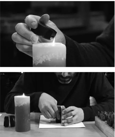
FIg 2.1.1.16 Carrying out smoke proofs with a punch from the 18th-century.
FONSECA A., PINTO, J. C., dirs. (n.d.). Doc tipos, Portuguese typeface
design documentary [FILM]. Portugal.
[UNPUBLISHED, more in: http://www.
FIg 2.1.1.17 Carrying out smoke proofs with a punch from the 18th-century.
FONSECA A., PINTO, J. C., dirs. (n.d.). Doc tipos, Portuguese typeface
design documentary [FILM]. Portugal.
[UNPUBLISHED, more in: http://www.
doctiposportugues.com].
FIg 2.1.1.18 Fitting scheme of an accented character punch. FOURNIER, P.-S., 1995 [1764]. The Manuel Typographique of
Pierre-Simon Fournier le jeune. Together with Fournier on Typefounding. An English translation of the text by Harry Carter. In facsimile with an Introduction and notes by James Mosley, vol. 1, Plate III, Germany:
Darmstadt.
FIg 2.1.1.19 Each accent was made one single time for each body size. Afterwards it was tied to each character to be accented, assuring the same shape for each accented character. Author’s image, Museu Nacional da Imprensa, Porto 2012.
FIg 2.1.1.20 “You cannot change the foreground without changing the background. It is a unity” SMEIJERS, F., 1996. Counterpunch, p.25, London: Hyphen Press.
FIg 2.1.1.21 “Striking by hand is very difficult because the punch must be held (1) perpendicular; (2) quite still so that it may not shift between the blows. Founders use an apparatus called ‘a striking’, in which the punch is held firmly and upright whilst a screw, acting upon the top, presses it gradually into the copper. A vernier scale shows the depth to which the punch has been driven. This puts less strain on the punch than a hammer” FOURNIER, P.-S., 1995 [1930]. The Manuel Typographique of
Pierre-Simon Fournier le jeune. Together with Fournier on Typefounding. An English translation of the text by Harry Carter. In facsimile with an Introduction and notes by James Mosley, vol. 3, p.84, Germany:
Darmstadt.
FIg 2.1.1.22 A punch and a matrix being struck. VERVLIET, H. D. L., 1968.
Sixteenth-Century Printing Types of the Low Countries, p.7, Amsterdam: Menno
Hertzberger & Co.
FIg 2.1.1.23 “1. A rough strike or matrix. 2. The strike filed smooth and square for casting. 3. It may be necessary to protect part of the matrix from being filed away by raising its edge with small dents (upper left) so that the file cuts away only undesired parts of the matrix (lower right) to achieve squareness. 4. “A matrix for a hand mould” (adapted). NELSON, S., 1985. Mould Making, Matrix Fitting and Hand Casting. In Visible Language. The quarterly concerned
with all that is involved in our being literate,
p.117. Cleveland.
FIg 2.1.1.24 Cooper matrices. Author’s image, Museu Nacional da Imprensa, Porto 2012.
FIg 2.1.1.25 Mold adjusted to the body size, view from the jet. The metal that can be seen over the screws is used, according to Alfredo de Carvalho (1889), to hold them in place, since the changes in temperature may cause them to become loose. Author’s image, Museu Nacional da Imprensa, Porto 2012. FIg 2.1.1.26 Opened mold. Author’s image, Museu Nacional da Imprensa, Porto 2012. FIg 2.1.1.27 “Matrix held in position by coiled spring at base of the mould” DREYFUS, J. & MCKITTERICK, D., 1982. Aspects of French eighteenth century
typography: a study of type specimens in the Broxbourne Collection at Cambridge University Library, p.3. Cambridge:
Roxburghe Club.
FIg 2.1.1.28 “Mould aperture adjusted to cast a wide letter” and “Mould aperture adjusted to cast a narrower letter” (adapted). DREYFUS, J. & MCKITTERICK, D., 1982. Aspects of French eighteenth century
typography: a study of type specimens in the Broxbourne Collection at Cambridge University Library, p.3. Cambridge:
Roxburghe Club.
FIg 2.1.1.29 “When the fount is cast the jet is separated from the body. This is called breaking. (…) the jet is wide and narrows towards the bottom, and that where it is joined to the letter it is only a third of the thickness of the body. Consequently, there is a thin neck where the jet will break off. This done, the letters are taken up again to be rubbed on a rough stone (…)” FOURNIER, P.-S., 1995 [1766]. The Manuel Typographique
of Pierre-Simon Fournier le jeune. Together with Fournier on Typefounding. An English translation of the text by Harry Carter. In facsimile with an Introduction and notes by James Mosley, vol. 2, plate VII, Germany:
XXIII
FIg 2.2.1 “By tracing the brass template with a pantograph, the letter image is replicated as a reduced-scale matrix” OSTERER, H. & STAMM, P. eds., 2009. Adrian Frutiger
typefaces. The complete works, p.25, Basel/
Boston/Berlin: Birkhäuser.
FIg 2.2.2 “The shape of the letter is traced around the raised template; and then the punch is cut by milling” OSTERER, H. & STAMM, P. eds., 2009. Adrian Frutiger
typefaces. The complete works, p.25, Basel/
Boston/Berlin: Birkhäuser. FIg 2.2.3 “Stages in display type manufacture by cutting punches. The patterns at the top of the pantograph are for 20 pt Helvetica light expanded. The punches are below them. The leftmost objects in the bottom row are matrix blanks. Next to them are matrices that have been struck but not justified. The finished matrices for use in a typecasting machine, are on the right.” SOUTHALL, R., 2005. Printer’s type in the
twentieth century: manufacturing and design methods, p25. London/NewCastle: The
British Library and Oal Knoll Press. FIg 2.2.4 “(…) pencil working-drawing on thin paper. This is the form in which the designs finally turned over (…)” DWIGGINS W. A., 1940. WAD to RR letter about
designing type, p.12, Massachusetts: Harvard
College Library, Department of Printing and Graphic Arts. Available at: https://
archive.org/details/WADtoRR1940 [Accessed
March 23, 2013].
FIg 2.2.5 “Cardboard template for making pencil-outline pattern drawings” DWIGGINS W. A., 1940. WAD to RR letter
about designing type, p.6, Massachusetts:
Harvard College Library, Department of Printing and Graphic Arts. Available at:
https://archive.org/details/WADtoRR1940
[Accessed March 23, 2013].
FIg 2.2.6 “Linotype Europa Quick line setting and casting machine – in the center is the keyboard and above is the matrix magazine” OSTERER, H. & STAMM, P. eds., 2009. Adrian Frutiger typefaces. The
complete works, p.86, Basel/Boston/Berlin:
Birkhäuser.
FIg 2.2.7 “Duplex matrices in normal and semibold – for correct sorting each matrix has a distinctive tooth pattern” OSTERER, H. & STAMM, P. eds., 2009. Adrian Frutiger
typefaces. The complete works, p.129, Basel/
Boston/Berlin: Birkhäuser.
FIg 2.2.8 “The Monotype keyboard apparatus with over 300 keys for six alphabets and 30 additional justification keys. The Monotype caster cast typefaces in sizes from 5 to 14 pt, with a large-slug apparatus for up to 36 pt” (Osterer and Stamm 2009, p.86).
FIg 2.2.9 “The matrix case continued up to 272 interchangeable individual matrices (…) – in each row all the matrices had to have the same unit modules” OSTERER, H. & STAMM, P. eds., 2009. Adrian Frutiger
typefaces. The complete works, p.129, Basel/
Boston/Berlin: Birkhäuser.
FIg 2.2.10 During the evolution of the technique, the physicality of the characters and the importance of the profession assumed bigger importance at each given period.
FIg 2.2.11 “Minuscule a of Concorde romain with all diacritics – final artwork with measurements in millimetres” OSTERER, H. & STAMM, P. eds., 2009. Adrian Frutiger
typefaces. The complete works, p.154, Basel/
Boston/Berlin: Birkhäuser.
FIg 2.2.12 “Based on outline drawings, Adrian Frutiger cut Iridiun freehand out to the masking film for reproduction” OSTERER, H. & STAMM, P. eds., 2009.
Adrian Frutiger typefaces. The complete works, p.236, Basel/Boston/Berlin:
Birkhäuser.
FIg 2.2.13 “Lumitype 200 disc; 14 fonts are arranged on seven rings, the inner ring with special characters and flying accents” OSTERER, H. & STAMM, P. eds., 2009.
Adrian Frutiger typefaces. The complete works, p.75, Basel/Boston/Berlin: Birkhäuser.
FIg 2.2.14 “Of the 256 characters in the ISO Latin set 1, some are inaccessible on the Mac keyboard (…) or on a PC (…). In addition, not all commercial fonts contain complete character sets (…)” BAINES, P. & HASLAM, A., 2005. Type and typography, p.113, 2nd ed., London: Laurence King Publishing. FIg 2.2.15 The outline window.
MACROMEDIA, 1996. Using Fontographer
4.1, p.13. San Francisco: Macromedia.
FIg 2.2.16 The bitmap window.
MACROMEDIA, 1996. Using Fontographer
FIg 2.2.17 Character ‘A’ in 12 and 24 point bitmap size. MACROMEDIA, 1996. Using
Fontographer 4.1, p.115. San Francisco:
Macromedia.
FIg 2.2.18 Screenshots from FontLab showing PostScript and TrueType outlines (Shaker by Jeremy Tankard, 2000).
BAINES, P. & HASLAM, A., 2005. Type and
typography, p.113, 2nd ed., London: Laurence
King Publishing.
FIg 2.2.19 OpenType features in use: swashes and contextual alternate characters (Aspect by Jeremy Tankard, 2002).
BAINES, P. & HASLAM, A., 2005. Type and
typography, p.114, 2nd ed., London: Laurence
King Publishing.
Chapter 3
FIg 3.1.1 “From the first flint weapon (…)” until “(…) the spre ad of printing throughout Europe” OGG, O., 1962. The 26 letters, p.208, 8th ed., New York: The Thomas Y. Crowell Company.
FIg 3.1.2 “Detail from the inscription on the base of the trajan column in Rome. Ad 114. From a photograph of the original” GRAY, N., 1986. A history of lettering, p.16. Oxford: Phaidon Press Limited.
FIg 3.1.3 “Carolingian miniscule. A detail from the Grandval Bible written at Tours c.840. London British Library. Add. Ms 10546” GRAY, N., 1986. A history of lettering, p.68. Oxford: Phaidon Press Limited. FIg 3.1.4 Humanist type. Detail from “Lorenzo Valla, Elegantiae… Venice: Nicolas Jenson, 1471” LOMMEN, M. ed., 2012.
The book of books, 500 years of graphic innovation, p.19, London: Thames & Hudson.
FIg 3.1.5 “Fiftheenth-century humanist manuscript hand” (LAWSON, A., 2010.
Anatomy of a Typeface, p.51, 5th ed., Boston:
David R. Godine Publisher.
FIg 3.1.6 Francesco Grifo italic type in “Chicago, the Newberry Library, WING ZP 535 .S7023. Francesco Petrarch, Opere. Printed in Fano, Italy, by Gershom Soncino in 1503. (…) Page size 156 x 96” KNIGHT, S., 2012. Historical Types – from Gutenberg to
Ashendene, pp.32-33. New Castle: Oak Knoll
Press.
FIg 3.1.7 The character shapes start to be released from the evident calligraphic stroke details. Robert Estiene printed type in “Chicago, the Newberry Library, WING ZP 535 .S7023. [Francois I], Exemplaria Literarum. Printed in Paris, France in 1537. Page size 194x147 mm” KNIGHT, S., 2012. Historical Types – from Gutenberg to
Ashendene, pp.38-39. New Castle: Oak Knoll
Press.
FIg 3.1.8 “Ascendonica Romain Cursif as shown in the 1768 Enschedé specimen. The roman is almost certainly by Van Dijk, the italic may be attributed to him with some certainty. Cf. John Dreyfus (ed.) Type Specimen Facsimiles, London 1963, p17 and John A. Lane, notes to The Enschedé type specimens of 1768 & 1773, pp 54-55)” MIDDENDORP, J., 2004. Dutch Type, 123. Rotterdam: 010 Publishers.
FIg 3.2.1.1 Board detail showing the construction drawings of Roman du Roi engraved by Louis Simmonneau in 1716. JAMMES, A., 1985. La naissance d’un
caractère Le Grandjean, Plate XVII. Paris:
Editions Promodis.
FIg 3.2.1.2 Free tranlation: Some of the letters engraved on cupper in 1695 [top] compared with Grangjean’s first punches, engraved in 1699 [below] (enlarged). Note the difference in G and S serifs or the a and e lower terminals. JAMMES, A., 1985.
La naissance d’un caractère Le Grandjean,
p.16. Paris: Editions Promodis. FIg 3.2.1.3 Lettre courantes Penchées by Louis Simmoneau in 1695 (adapted). JAMMES, A., 1985. La naissance d’un
caractère Le Grandjean, Plate IX. Paris:
Editions Promodis.
FIg 3.2.1.4 Cursive by Pierre de Rochefort in 1718 (adapted). JAMMES, A., 1985. La
naissance d’un caractère Le Grandjean, Plate
XXXI. Paris: Editions Promodis. FIg 3.2.1.5 Plate engraved for the Descriptions des arts et métiers for the section related to engraving typographic punches. St Bride Printing Library, London. MOSLEY, J. et al., 2002. Le Romain du Roi–
la typographie au service de l’État, 1702-2002,
p.19. Lyon: Musée de l’imprimerie. FIg 3.2.2.1 Plate 33 from Nova escola. Andrade de Figueiredo. FIGUEIREDO, A., 1975. Nova escola para aprender a ler,
escrever, e contar, Lisboa: Livraria Sam
XXV
FIg 3.2.2.2 Plate 30 from Nova escola. Andrade de Figueiredo. FIGUEIREDO, A., 1975. Nova escola para aprender a ler,
escrever, e contar, Lisboa: Livraria Sam
Carlos.
FIg 3.2.2.3 Fragment of Plate 44 from Nova escola. Andrade de Figueiredo.
The widths of the letters ‘n’ and ‘o’ do not conform to the grid (evaluating the space between them, by using only the grid, is unhelpful). The word ‘notícias’ in the second line, which has a lack of proportion between characters ‘no’ compared with ‘ot’, or ‘ic’ compared with ‘cia’. FIGUEIREDO, A., 1975.
Nova escola para aprender a ler, escrever, e contar, Lisboa: Livraria Sam Carlos.
FIg 3.2.2.4 Title page printing proof of VILLENEUVE, J. DE, 1732. Primeira
origem da arte de imprimir dada a luz pelos primeiros characteres, que João de Villeneuve formou para serviço da Academia Real da Historia Portugueza. Dedicada a El Rey Dom João V. seu Augustissimo Protector, Lisboa
Occidental: Joseph Antonio da Sylva. Portuguese National Library, Ref. H.G. 5270//7 A.
FIg 3.2.2.5 Reproduction of the page of the Maggs Bro[ther]s’ auction catalogue. Should be a final run, with improvements in details and typesetting. BROS., M., 1928.
Bibliotheca Typographica, p.63. London:
Maggs Bros.
FIg 3.2.2.6 Prova Quarta do Charactere (…) page. The only printed proof currently known of this specimen. Approximately half actual size. VILLENEUVE, J. DE, 1734. Prova quarta do charactere villeneuve. Available at: http://ephemerajpp.wordpress.
com/2009/03/08/coleccao-de-folhetos-varios-2-prova-quarta-do-charactere/
[Accessed March 14, 2013]. FIg 3.2.2.7 Description of punches and matrices by Manescal da Costa and Villeneuve. Author’s table based in: JUNTA DO COMÉRCIO, (n.d.) Livro 1o dos termos
de mestres fabricantes de nova invenção e outros. [MANUSCRIPT]. Maço 69. Arquivo
Nacional da Torre do Tombo, Lisboa. Available at: http://digitarq.dgarq.gov.pt/
details?id=1411653 [Accessed October 3, 2012].
FIg 3.2.2.8 Actual size details of a text page in Leitura (12pt), from each of the three previous books. SILVEIRA, MANUEL DA, 1759. Sermões póstumos [...], p.20. Lisboa: Officina de Miguel Manescal da Costa. UNKNOWN, 1761. Norte, e guia
para o caminho do ceo; e definições moraes dos dez mandamentos […] Lei de Deos […] ,
p63. Lisboa: Oficina de Antonio Rodrigues Galhardo. IRMANDADE DA GLORIOSA E MATYR SANTA CECILIA, 1766, Compromisso da Irmandade da gloriosa e matyr Santa Cecilia, p.04. Lisboa: Officina de Miguel Rodrigues.
FIg 3.2.2.9 Roman version in lower and upper case in the Leitura (≈ 12 pt). Collected from the same three books and printers. SILVEIRA, MANUEL DA, 1759. Sermões
póstumos [...], p.20. Lisboa: Officina de
Miguel Manescal da Costa. UNKNOWN, 1761. Norte, e guia para o caminho do ceo;
e definições moraes dos dez mandamentos […] Lei de Deos […] , p63. Lisboa: Oficina de
Antonio Rodrigues Galhardo. IRMANDADE DA GLORIOSA E MATYR SANTA CECILIA, 1766, Compromisso da Irmandade da gloriosa e matyr Santa Cecilia, p.04. Lisboa: Officina de Miguel Rodrigues. FIg 3.2.2.10 Description of the matrices found at the workshop by Villeneuve. Author’s table based in: JUNTA DO COMÉRCIO, (n.d.) Livro 1o dos termos
de mestres fabricantes de nova invenção e outros. [MANUSCRIPT]. Maço 69. Arquivo
Nacional da Torre do Tombo, Lisboa. Available at: http://digitarq.dgarq.gov.pt/
details?id=1411653 [Accessed October 3, 2012].
FIg 3.2.2.11 Number of body sizes casted by year. Author’s graphic based in IMPRESSÃO RÉGIA, 1769-1800. Documentos de caixa. [MANUSCRIPT]. Arquivo da Imprensa Nacional–Casa da Moeda, Lisboa: Impressão Régia.
FIg 3.2.2.12 Kilos casted by year. Author’s graphic base in ARAÚJO, N. DE & MENDES, A. J. P., 1912. Imprensa
Nacional de Lisboa – Memória histórica – notas de arte, antecedentes, descrições
[MANUSCRIPT]. Arquivo da Imprensa Nacional–Casa da Moeda, Lisboa: Arquivo da Imprensa Nacional–Casa da Moeda. FIg 3.2.2.13 Body sizes cast each year. Author’s graphic based in IMPRESSÃO RÉGIA, 1769-1800.
Documentos de caixa. [MANUSCRIPT].
Arquivo da Imprensa Nacional–Casa da Moeda, Lisboa: Impressão Régia.
FIg 3.2.2.14 Sum of years, between 1768 and 1800, with cast by body or version. Author’s graphic based in IMPRESSÃO RÉGIA, 1769-1800. Documentos de caixa. [MANUSCRIPT]. Arquivo da Imprensa Nacional–Casa da Moeda, Lisboa: Impressão Régia.
FIg 3.3.1 This version was printed using Villeneuve’s characters, either on the cover as in the text pages, implying that it must have been printed after 1730. [1598] Castro
Tragédia do Doutor António Ferreira, Pedro
rasbeeck, In the Portuguese National Press – National Mint Library.
FIg 3.3.2 First run of 1685. Another run eventually printed by António Pedroso Galrão, after 1730. MARTINS, M. T. P., 2012. Livros clandestinos e contrafacções
em Portugal no século XVIII. Lisboa: Editora
Colibri.
FIg 3.3.3 First run of 1696, and two other runs keeping the original date, but printed after 1730. MARTINS, M. T. P., 2012. Livros
clandestinos e contrafacções em Portugal no século XVIII, p.270, Lisboa: Editora
Colibri; CRUZ, A. (coord.), 1999. Tipografia
Portuguesa do séc. XVII: a colecção da Biblioteca Nacional, p.213, Lisboa: Biblioteca
Nacional de Lisboa.
FIg 3.3.4 Title page of the Facsimile of Nova Escola. FIGUEIREDO, A., 1975. Nova
escola para aprender a ler, escrever, e contar,
Lisboa: Livraria Sam Carlos; Front page of Nova Escola FIGUEIREDO, M. DE A. DE, 2010. Nova escola para aprender a ler escrever
e contar, Fac-sílime da edição de 1722, Rio de
Janeiro: Ministério da Cultura / Fundação Biblioteca Nacional.
Chapter 4
FIg 4.1.1 First, “an experienced hand that produces – without neglecting speed – a classical humanist italic”; the second, “by Imre Reiner (…) pure lettering, not trying to be anything else”; third, “Jonathan Hoefler’s Egiziano Filigree, clearly wants to imitate commercial hand lettering of the nineteenth century. (…) text set [in Egiziano Filigree] can be repeated exactly, provided the right specification is given. This, and only this, distinguishes typography from writing and lettering” (adapted). SMEIJERS, F., 1996.
Counterpunch, pp.20-23, London: Hyphen
Press.
FIg 4.1.2 Script possibilities. NOORDZIJ, G., 2005. The Stroke: Theory of Writing, p.7. London: Hyphen Press.
FIg 4.1.3 Left, broad nib, translation; right pointed nib expansion (adapted). BEIER, S., 2012. Reading Letters, designing for legibility, p43. Amsterdam: Bis Publishers.
FIg 4.1.4 “Returning construction” NOORDZIJ, G., 2005. The Stroke: Theory of
Writing, p.37. London: Hyphen Press.
FIg 4.1.5 “Serifs may be made in a tight curve at start and finish of strokes or given an acute sharpness” (adapted). HARVEY, M., 1996. Creative Lettering Today, ,p.36, 2nd ed., London: A & C Black Publishers Ltd. FIg 4.1.6 Adobe Caslon Pro roman and italic character’s stroke axis. Author’s image. FIg 4.2.1 Trajan, classical proportions versus Didot, Modern proportions. FIg 4.2.2 Renaissance. Consistent humanist axis stroke; Modulated stroke; Crisp traces show signs of broad nib pen; Modest contrast; Modest x-height. Italic: Independent from roman; Slant may vary from vertical up to 10º; Upright capitals were employed with the first italic types [italic capitals were eventually included]; Bilateral foot serifs or no serifs at all; Roman, Nicolas Jenson, two times actual size; italic, Ludovico degli Arrighi, two and a half times actual size (adapted). KNIGHT, S., 2012. Historical
Types – from Gutenberg to Ashendene, p. 27,
35. New Castle: Oak Knoll Press. FIg 4.2.3 Baroque Variable axis (usually oblique, sometimes with two slopes); Modulated stroke; Compared with Renaissance: – Heavier stroke weight; – Stronger contrast; – Generous x-height; – Condensed shapes; Variable stroke axis between roman and italic. Italic: Subsidiary and closely linked to roman; Various degrees of slant through the alphabet. Roman, Miklós Tótfalusi Kis, one and a half times actual size; italic, Miklós Tótfalusi Kis, one and a half times actual size (adapted). KNIGHT, S., 2012. Historical
Types – from Gutenberg to Ashendene, p. 57,
XXVII
FIg 4.2.4 Neoclassical Predominant vertical stroke axis; Modulated stroke; Generally large characters; Stronger contrast than Baroque typefaces. Italic: Stroke axis parallel with the slant; Fully subjugated to roman. Roman, John Baskerville, one and three quarters times actual size; italic, John Baskerville, one and a half times actual size (adapted). KNIGHT, S., 2012. Historical
Types – from Gutenberg to Ashendene, p. 73,
75. New Castle: Oak Knoll Press.
FIg 4.2.5 Romantic Rationalist structure; Vertical stroke axis intensified through exaggerated contrast; Occasionally secondary slanted stroke axis; Abrupt modulation of the stroke; Thin and linear serifs; Large character shapes. Italic: Fully subjugated with roman; Characters larger than neoclassical; Although rationalised still have identifiable calligraphic influence. Roman, Firmin Didot, one and a quarter times actual size (adapted). KNIGHT, S., 2012. Historical Types – from Gutenberg
to Ashendene, p. 77. New Castle: Oak
Knoll Press. Italic, Firmin Didot, one and three quarters times actual size (adapted). OLIVEIRA, C. J. DE, 1804. Diagnosis
typografica dos caracteres gregos, hebraicos, e arabigos, addicionada com algvmas notas sobre a divisão orthografica da lingua latina, e ovtras da Evropa, a que se ajvntão algvns preceitos da arte typografica para melhor correcção, e vso dos compositores, Lisboa:
Impressão Regia.
FIg 4.3.1 Formal comparison of Villeneuve’s and Belinque’s characters. The images of the characters on the next pages, are four times the actual size, in order to allow small details to be viewed in detail (adapted). VILLENEUVE, J. DE, 1732. Primeira
origem da arte de imprimir dada a luz pelos primeiros characteres, que João de Villeneuve formou para serviço da Academia Real da Historia Portugueza. Dedicada a El Rey Dom João V. seu Augustissimo Protector,
Lisboa Occidental: Joseph Antonio da Sylva. SILVEIRA, MANUEL DA, 1759. Sermões
póstumos [...] Lisboa: Officina de Miguel
Manescal da Costa.
FIg 4.3.2 Page from Primeira origem da arte de imprimir, printed by Joseph Antonio da Sylva, 1732. VILLENEUVE, J. DE, 1732.
Primeira origem da arte de imprimir dada a luz pelos primeiros characteres, que João de Villeneuve formou para serviço da Academia Real da Historia Portugueza. Dedicada a El Rey Dom João V. seu Augustissimo Protector,
p.3. Lisboa Occidental: Joseph Antonio da Sylva.
FIg 4.3.3 Detail from fig 4.3.2, line 10, enlarged four times. VILLENEUVE, J. DE, 1732. Primeira origem da arte
de imprimir dada a luz pelos primeiros characteres, que João de Villeneuve formou para serviço da Academia Real da Historia Portugueza. Dedicada a El Rey Dom João V. seu Augustissimo Protector, p.3. Lisboa
Occidental: Joseph Antonio da Sylva. FIg 4.3.4 Page from Sermões Póstumos, printed by Miguel Manescal da Costa, 1759. Silveira. SILVEIRA, MANUEL DA, 1759.
Sermões póstumos [...] Lisboa: Officina de
Miguel Manescal da Costa.
FIg 4.3.5 Detail from fig 4.3.4, line 15, enlarged four times. SILVEIRA, MANUEL DA, 1759. Sermões póstumos [...] Lisboa: Officina de Miguel Manescal da Costa. FIg 4.3.6 Formal comparison of Villeneuve’s and Belinque’s italic characters. The images of the characters in the next pages are four times the actual size, in order to allow the small details to be properly viewed (adapted). VILLENEUVE, J. DE, 1732.
Primeira origem da arte de imprimir dada a luz pelos primeiros characteres, que João de Villeneuve formou para serviço da Academia Real da Historia Portugueza. Dedicada a El Rey Dom João V. seu Augustissimo Protector,
Lisboa Occidental: Joseph Antonio da Sylva. ANDRADE, M. C. DE, 1790. Luz da liberal,
e nobre arte da cavallaria, offerecida ao
senhor D. João Principe do Brazil […] Lisboa: Regia Officina Typografica.
FIg 4.3.7 Page from Primeira origem da arte de imprimir, printed by Joseph Antonio da Sylva, 1732. VILLENEUVE, J. DE, 1732.
Primeira origem da arte de imprimir dada a luz pelos primeiros characteres, que João de Villeneuve formou para serviço da Academia Real da Historia Portugueza. Dedicada a El Rey Dom João V. seu Augustissimo Protector,
p.ii. Lisboa Occidental: Joseph Antonio da Sylva.
FIg 4.3.8 Detail from fig 4.3.7, line 2, enlarged four times. VILLENEUVE, J. DE, 1732. Primeira origem da arte
de imprimir dada a luz pelos primeiros characteres, que João de Villeneuve formou para serviço da Academia Real da Historia Portugueza. Dedicada a El Rey Dom João V. seu Augustissimo Protector, p.ii. Lisboa
Occidental: Joseph Antonio da Sylva. FIg 4.3.9 Page from Luz da liberal e nobre arte da cavallaria, printed by Impresão Régia, 1790. ANDRADE, M. C. DE, 1790. Luz da
liberal, e nobre arte da cavallaria, offerecida
ao senhor D. João Principe do Brazil […], p.20. Lisboa: Regia Officina Typografica.
FIg 4.3.10 Detail from fig 4.3.9, line 1, enlarged four times. ANDRADE, M. C. DE, 1790. Luz da liberal, e nobre arte da
cavallaria, offerecida ao senhor D. João
Principe do Brazil […], p.20. Lisboa: Regia Officina Typografica.
FIg 4.4.1 Villeneuve’s set of punches. Author’s image, Museu Nacional da Imprensa, Porto, 2012.
Chapter 5
FIg 5.2.1 Original Jenson (reduced to 50%), KNIGHT, S., 2012. Historical Types – from
Gutenberg to Ashendene, p.27, New Castle:
Oak Knoll Press. Robert Slimbach’s Adobe Jenson (100%) BURKE, C., 1996-97. Typeface review. Adobe Jenson. In Printing Historical
Society p.16-17. Bulletin 42. Winter. A. Boag,
ed. London: St Bride Printing Library, St Bride Foundation Institute. Bruce Roger’s Monotype Centaur (reduced to 33%) SUTTON J. AND BARTRAM A., 1988.
An Atlas of typeforms, p.24, New Jersey:
Chartwell Books.
FIg 5.2.2 “The twentieth century has seen the type libraries fulfiled with remakes of the Garamond style, some of them forgettable (like the ITC version), others really fine tributes (Adobe or Stempel). Here the most widely used in digital versions (24pt)” (adapted). CELSO, A. LO, 2000a.
A discussion on type design revivalism,
p.4, Department of Typography & Graphic Communication, The University of Reading. Available at: http://www.typeculture.com/
academic_resource/articles_essays/pdfs/tc_ article_23.pdf [Accessed June 5, 2012].
FIg 5.3.1 Two views of Villeneuve’s M punch at Museu Nacional da Imprensa.
Author’s image Museu Nacional da Imprensa, Porto 2012.
FIg 5.3.2 Digital microscopic pictures of the Dois pontos de Parangona pequena punches found at the Museu Nacional da Imprensa (the complete set of letters can be found in the annex). Author’s image Museu Nacional da Imprensa, Porto 2012.
FIg 5.4.1 Different glyphs for the letter a. Villeneuve’s Texto (≈16 pt): roman uppercase A, roman small cap A, roman lowercase a; Italic uppercase A, italic lowercase a; Roman Dois pontos, italic Dois pontos and Dois pontos swash. At the time, swash upper-case (similar to Dois pontos version) and italic small caps could also be found. Author’s image.
FIg 5.4.2 Title page fully set using Villeneuve types. Only the last two rows (printer and date) are set in body size used above. The two smaller sizes and “DA ALFANDEGA” are set using text versions, while the remainder are Dois pontos characters. UNKNOWN, 1774. Regimento
da Alfândega de Goa ordenado por ELREY D. José I. Nosso Senhor, Lisboa: Regia Officina
Typografica.
FIg 5.4.3 Two line character used with three lines of text. ORDEM SERAFICA, 1782.
Cerimonial do que se deve observar, e praticar na recepção, e profissão dos noviços da ordem serafica da santa provincia de Portugal, p.32,
Lisboa: Regia Officina Typografica.
FIg 5.4.4 Two line char acter used with four lines of text. UNKNOWN, 1747. Ordenações
e leis do reino de Portugal por mandado do muito alto e poderoso Rei D. João V. 4 VOLS
Lisboa: Mosteiro de S. Vicente de Fóra. FIg 5.4.5 Bitstream’s Iowan Old Style Titling weights and Monotype’s Perpetua Titling three weights. Myfonts (adapted). FIg 5.4.6 ITC Galliard and Carter and Cone’s Mantinia. My fonts and Font Bureau (adapted).
FIg 5.4.7 Adobe’s Waters Titling family with four weights and three widths. My fonts (adapted).
FIg 5.4.8 Microsoft Word Drop Cap menu options. Print screen from Microsoft Word 98.
FIg 5.4.9 InDesign Paragraph menu showing the options “Drop Cap number of lines” and “Drop Cap one or do more characters”. Print screen from Adobe Indesign CS6.
FIg 5.5.1 Villeneuve’s S and A Dois pontos de Parangona pequena smoke proofs (upper) and printed proofs (lower). Enlarged four times. From the Annex E – Smoke proof collection and from the Annex A – Villeneuve printed proofs.
XXIX
FIg 5.5.2 List of 18th-century books currently existing in the National Press – National Mint Library, from where were collected Dois pontos printed proofs. Reproduced actual size in the Annex A – Villeneuve printed proofs.
FIg 5.5.1.1 Groups of shapes by similarity. The first line includes letters with vertical stem on the left and bowl on the right; the second line has similar arm terminals; the fourth and fifth lines show angled letters; the sixth line has similar top endings; the seventh line has characters with similar base endings. ANDERSON, D. M., 1969. The art
of written forms. The theory and practice of calligraphy, p.240. USA: Holt, Rinehart and
Winston, Inc.
FIg 5.5.1.2 “Basic strokes (…) of the inscription alphabet”; “Dents in brush-written Imperial letters”; “Chisel cut, majuscule letter I” (adapted). CATICH, E. M., 1991. The origin of the serif, p.225, 186, 133, Iowa: Catich Gallery and St Ambrose University.
FIg 5.5.1.3 “Some reed-written (…), majuscule letter I” (adapted). CATICH, E. M., 1991. The origin of the serif, p.133, Iowa: Catich Gallery and St Ambrose University. FIg 5.5.1.4 “[A and B] The aesthetic qualities of the first n are those of simple rationality. Everything is neat and straight. This is the ideal. The second n is certainly an n, but not informed by any simple rationality. [C] The ideal cannot, however, be met in practice. Differences of lengh and angle in straight lines only cause worries. One deviation and the whole ideal falls apart. [D] Better to avoid this false problem and use shapes that allow the punchcutter visual margin. Differences between curves can be tolerated, and these forms also work better in text” (adapted). SMEIJERS, F., 1996. Counterpunch, p.144, London: Hyphen Press.
FIg 5.5.1.5 Sketch book detail, by Adrian Frutiger. OSTERER, H. & STAMM, P. eds., 2009. Adrian Frutiger typefaces. The
complete works, p.17, Basel/Boston/Berlin:
Birkhäuser.
FIg 5.5.1.6 “Concave serifs appear more elegant than ones with a flat base – serifs with a protruding base appear lumpy and misshapen” OSTERER, H. & STAMM, P. eds., 2009. Adrian Frutiger typefaces. The
complete works, p.65, Basel/Boston/Berlin:
Birkhäuser.
FIg 5.5.1.7 I punch digital microscopic picture. Author’s Image Museu Nacional da Imprenda, Porto 2012. From the Annex D – Digital microscopic pictures.
FIg 5.5.1.8 Asymmetrical serifs. Smoke proofs performed at Museu Nacional da Imprensa, Porto 2012.
FIg 5.5.1.9 From a formal Roman Imperial strokes to a single stroke and more fluid writing movement. The longest serifs are at opposite ends in each model. Author’s scheme.
FIg 5.5.1.10 Roman model with asymmetrical serifs and smooth slant. (adapted). BAKER, A., 2000. Calligraphy
by Arthur Baker, p4-9, New York: Dover
Publications.
FIg 5.5.1.11 Measuring the variation of main stem angle in differently shaped characters. Smoke proofs enlarged to double size. Remaining character measurements and averages in annex. Smoke proofs performed at Museu Nacional da Imprensa, Porto 2012. FIg 5.5.1.12 I punch smoke proof. Smoke proofs performed at Museu Nacional da Imprensa, Porto 2012.
FIg 5.5.1.13 Horizontally centered by the stem midline, showing the slant and bracketing distinction that balances the different serif lengths, keeping the character shape in equilibrium. Author’s scheme. FIg 5.5.1.14 Dois pontos character width variation over different body sizes. Printed proofs resized to Dois pontos de Texto. A solid line placed through the middle of the left vertical or rounded stroke marks the width guide starting point. The dotted line is placed by the first row along the right edge of the strokes while avoiding serifs,, which would otherwise jeopardise the results. For diagonal characters with no vertical or rounded ends, inflections were used as the edge. Gathered from the list of 18th-century books currently existing in the National Press – National Mint Library, from where were collected Dois pontos reproduced in actual size in the Annex A – Villeneuve Printed Proofs.
FIg 5.5.1.15 Blue marks the narrowest characters, and red indicates the widest ones. Comparing red and blue, for the same letter, clearly shows the difference in width between body sizes. A, E, and N from FIg 5.5.1.14. Author’s scheme.
FIg 5.5.1.16 Dois pontos de Texto has very wide A and E characters, and a rather narrow N. In Dois pontos de Miudinho there is a narrow A next to wide E and N. Author’s scheme.
FIg 5.5.1.17 Analogy of vertical proportions. Adrian Frutiger. AHRENS, T. &
MUGIKURA, S., 2014. Size-specific
adjustments to type designs. An investigation of the principles guiding the design of optical sizes p. 37, 2nd ed., Munich: Just Another
Foundry.
FIg 5.5.1.18 H character redesign process. FIrst row two I smoke proofs, one printed proof (red) plus smoke proof, all twice actual size. seconD row Process of redesign. Author’s scheme.
FIg 5.5.1.19 H and I superimposed to show the differences in the serifs. H serifs are shorter than I serifs to balance the blackness of the character.
FIg 5.5.1.20 A) In the upper right, the thrust is reminiscent of the broad nib stroke. The redesign shows that the thrust widens the counter in the same place to reinforce the slant. (B) The previous stroke axis slant to the right is adapted to the left, in the redesign. Smoke and printed proofs of Dois
pontos de Pequeno Canon, twice actual size.
Intermediate redesign version. Author’s scheme.
FIg 5.5.1.21 If a square and a circle have the same height, the circle will be perceived as being smaller. In order to make them appear to be the same size, the circular shape needs to be enlarged. The same concept applies to rounded and pointed shapes (Harvey 1975, p.31). In type design this adjustment on the baseline, cap line, and x-height is called overshoot. Author’s scheme.
FIg 5.5.1.22 (a) I and O with the same stroke thickness. The I is noticeably too heavy. (b) Compensated stroke thickness in order to make the strokes seem to have similar optical weight. Author’s scheme.
FIg 5.5.1.23 The thick strokes in O are too strong, resulting in a lack of equilibrium between the two stroke widths. Smoke and printed proofs of Dois pontos de Pequeno
Canon. From the Annex A and E.
FIg 5.5.1.24 Primary shape (blue) similar to the smoke proof and final slightly condensed shape (red). Author’s scheme.
FIg 5.5.1.25 D smoke proofs analysis, twice actual size. From the Annex E.
FIg 5.5.1.26 Humanist Script 15th-century. Note the acute angle at the top of the bowl connection, similar to Villeneuve’s D; Classical Italic Majuscule 18th-century, symmetrically shaped (adapted). MEIER, H. E., 1994. The development of script and type, p.35, 43, 2nd ed., Cham: Syntax Press. FIg 5.5.1.27 Serif variation throughout
Dois pontos body sizes. The first two (and
larger body sizes) are asymmetrical (one is horizontal and other points downward). In the other four (smaller) sizes, the serifs widen almost symmetrically (upward and downward), and are horizontally symmetrical (pointing backward). The
Dois pontos D character printed proofs
from six body sizes [page 220] on characters proportions] are proportionally resized to
Dois Pontos de Pequeno Canon.
FIg 5.5.1.28 The Renaissance-influenced version was abandoned when the characters B P and R were made. Their clearly rational influence demanded a similar concept as D, leaving no reason for the Romantic version to be kept. Author’s scheme.
FIg 5.5.1.29 As in O, a smooth thrust was added to the top right side. However, the bottom right section of the character needs a clearly stronger thrust, in order to provide stability. Author’s scheme.
FIg 5.5.1.30 Apparent symmetrical shape similarity. The upper half of the counter in white is reflected at the waistline to produce the relection filling the lower half in red. Clearly revealing a tiny difference in width. Author’s scheme.
FIg 5.5.1.31 Printed proof (red)
superimposed on smoke proof (blue). From the Annex A and E.
FIg 5.5.1.32 Redesign superimposed images before (blue) and after (red) compensation to balance the ink gain. In O, the thickness of the tick stroke was reduced to balance it with the remaining characters. Author’s scheme.
FIg 5.5.1.33 Comparison of smoke and printed proofs with digital interpretation. After trying to match the tonal color to smoke proofs, weight was added to each character to compensate the ink spread or “gain” from the printing process. Author’s scheme.
XXXI
FIg 5.5.1.34 Corner point – defines a corner. Might have no handles, a single side handle or double-sided independent handles; Tangent point – extension of a straight line segment with a single-sided handle; Curve point – handles on both sides of points that are connected to each other like a see-saw: lowering one will raise the other. Author’s scheme.
FIg 5.5.1.35 I, H, O and D, 700 pt (ten times the smoke proof size), intended to check the outline – curve, tangent and corner details – to avoid minor distortions. It is a proof to prove the character’s correct drawing shape. Author’s scheme.
FIg 5.5.1.36 O stroke contrast could almost, perfectly, fit the 1 to 5 scale, revealing to be a heavily contrasted character, suited for titling.
FIg 5.5.1.37 “Two counters that are different in shape but yet have more or less the same value: their surface area is about 200 mm2” SMEIJERS, F., 1996. Counterpunch, p.30 London: Hyphen Press.
FIg 5.5.1.38 “The area between the two n’s differs in shape from the area within each letter, but again its surface area is about 200 mm2” SMEIJERS, F., 1996.
Counterpunch, p.31 London: Hyphen Press.
FIg 5.5.1.39 Apparent stroke symmetry intends to balance counters with the space between characters. The spaces are geometrically different, although they are perceived to be evenly balanced (compare the spaces on each side of the u and the space inside it). OSTERER, H. & STAMM, P. eds., 2009. Adrian Frutiger typefaces. The
complete works, p.64, Basel/Boston/Berlin:
Birkhäuser.
FIg 5.5.1.40 “At the top: a very restless gathering of words. The spaces within characters (the counters), and between them, differs constantly. The thickness of strokes is irregular too. The second text looks better at first sight. Now the counters are harmonized and there are no longer any striking differences of weight. But space between characters is not balanced, and so reading the text is still a tough assignment. In the third example, space between characters has been improved: the text is easy for the eye to scan, and thus easy to read. If we want to make text legible, certain basic visual and perceptual facts have to be observed” SMEIJERS, F., 1996.
Counterpunch, p.27 London: Hyphen Press.
FIg 5.5.1.41 System of spacing by grouping letters by similarity. S should be spaced visually in between. TRACY, W., 2003.
Letters of credit. A view of type design, p.74,
Boston: David R Godine.
FIg 5.5.1.42 “The white spaces before and after the letters indicated in outline. The ‘H’ is symmetrical, so the white space on both sides is equal (…)” POHLEN, J., 2011. Letter
Fountain, p.133, Köln: Taschen.
FIg 5.5.1.43 Character side bearings to be extrapolated to similar shapes. Author’s scheme.
FIg 5.5.1.44 The following printed proofs are repeatedly made throughout the project design process to adjust characters and spacing until a balanced pattern is achieved, with a homogeneous sample tone. Author’s scheme.
FIg 5.5.1.45 Triangular terminal variations in E, F, L and T smoke proofs. From the Annex A.
FIg 5.5.1.46 Characters that contain sharp triangular terminals variations in printed proofs from six body sizes (detail from FIg 5.5.1.14, P.220).
FIg 5.5.1.47 Outer curve and inner connections of E and L lower terminals.
Dois Pontos de Texto, five times actual size.
(detail from FIg 5.5.1.14, P.220). FIg 5.5.1.48 Examples of triangular terminals in Portuguese books from 17th and 18th-century. FIrst row Detail from book title page JAYME, DUQUE DOM, 1730
Ultimas acções do Duque D. Nuno Alvares Pereira de Mello (…), Lisboa: Officina da
Musica. seconD row Detail from a book printed by Pedro Ferreira FONSECA, P. B., 1728, Lucerna Grammatical em que se explica
com brevidade, e clareza o modo de escrever e pronunciar, e compôr as partes da Oração,
Lisboa: Oficina de Pedro Ferreria, both twice actual size currently at National Press – National Mint Library.
FIg 5.5.1.49 Triangular terminals from foreign publications. FIrst row Four-line Small Pica Roman Capitals No. 20. From the Blaeu Foundry [used in 1631], actual size. ENSCHEDÉ, C., 1978. Typefoundries
in the Netherlands, from the fifteenth to the neneteenth century, p.119, L. Hellinga, ed.,
Haarlem: Stichting Museum Enschedé. seconD row “English-bodied Roman No.50. Resetting of part of the type specimen of H. S. Wetstein, c. 1742, reissued in 1743 by Izaak and Johannes Enschedé”, twice actual size. ENSCHEDÉ, C., 1978. Typefoundries
in the Netherlands, from the fifteenth to the neneteenth century, p.199, L. Hellinga, ed.,
Haarlem: Stichting Museum Enschedé. FIg 5.5.1.50 Triangular terminals from foreign publications from 17th-century. FIrst row “Stamperia Vaticana Specimen, Rome 1628”, actual size UPDIKE, D. B., 1923.
Printing types, their history, forms and use,
fig.113, 2 vols. London: Oxford University Press. seconD row “Cecchi, Florence, 1891”, twice actual size) UPDIKE, D. B., 1923.
Printing types, their history, forms and use,
fig. 119, 2 vols. London: Oxford University Press.
FIg 5.5.1.51 One of the first attempts used sharp triangular terminals. Sharp triangular serifs are too different from the stems and mid-arm serifs. Author’s scheme. FIg 5.5.1.52 Evolution of E, attempting to find the desired triangular terminal shape. The first was an early attempted shape and the fourth the smoothed inner connection and arched outer stroke serif. Author’s image.
FIg 5.5.1.53 Terminal shape studies from FIg 5.5.1.52. The stronger black line is the early attempt and the final shape is in red. Author’s image.
FIg 5.5.1.54 Similar head and baseline concavity and overshoot in the redesign, interpreted for the remaining characters’ arms. Author’s image.
FIg 5.5.1.55 Comparison of arm and serif shape with E. Author’s image.
FIg 5.5.1.56 Comparison of terminals length. Author’s image.
FIg 5.5.1.57 Dois pontos de Canon pequeno printed proof showing similarities between the characters.
FIg 5.5.1.58 Roman chiselled letters. Author’s image.
FIg 5.5.1.59 C overhooks are generally long and almost horizontal. Printed proofs of
Dois pontos de: Canon pequeno, Parangona pequena and Leitura, actual size. From the
Annex A.
FIg 5.5.1.60 C and O stroke and counter comparison. Smoke proofs superimposed, twice actual size. From Annex E.
FIg 5.5.1.61 Smoke proofs superimposed.
Dois pontos de pequeno canon, twice actual
size. From the Annex E.
FIg 5.5.1.62 Microscope images of Villenueve’s C and Ç punches. Note that the C serifs are not pointed because they are broken. Author’s image Museu Nacional da Imprensa, Porto 2012.
FIg 5.5.1.63 Rounded shapes superimposed to show the thrust and width adjustments. Author’s image.
FIg 5.5.1.64 “Augustan inscription in the Roman Forum 1 B.C.” CATICH, E. M., 1991.
The origin of the serif, p.240, Iowa: Catich
Gallery and St Ambrose University.
FIg 5.5.1.65 Printed proof versus redesigned shape. Author’s image. Smoke proof from the Annex E.
FIg 5.5.1.66 Didot character as an exponent of pure rationalism exhibits a straight spine stroke on a character with wide proportions. UPDIKE, D. B., 1923. Printing types, their
history, forms and use, p. 184, 2 vols. London:
Oxford University Press.
FIg 5.5.1.67 Printed proof showing the strong influence of ink spread and smoke proof revealing thin, sharp details. The bump easily seen in both proofs must be an error. It cannot be seen on the bottom side of the spine or in other versions, such as the italic punch (Annex D, p.377). The spine was kept fully curvilinear and smoothed in the redesign. Authors Image from Annexes A and E.
FIg 5.5.1.68 A comparison of serif shapes reveals adjustments to length, increasing for a large counters or decreasing for smaller counters. The head and base arch curvature vary modestly above the baseline or below cap height alignments, balancing perception of the shape. Author’s scheme.
FIg 5.5.1.69 Digital microscope pictures of punches. Distinct three-dimensional counter shape shows that two methods have been used. Author’s scheme, Museu Nacional da Imprensa, Porto 2012.